DINAMIK - multimedia identity

Facu Gerbino


DINAMIK - multimedia identity
DINAMIK is a boutique development studio focused on building precise human-computer interaction systems and UI with extreme attention to detail. They needed an identity that could grow with them as they explored new projects.
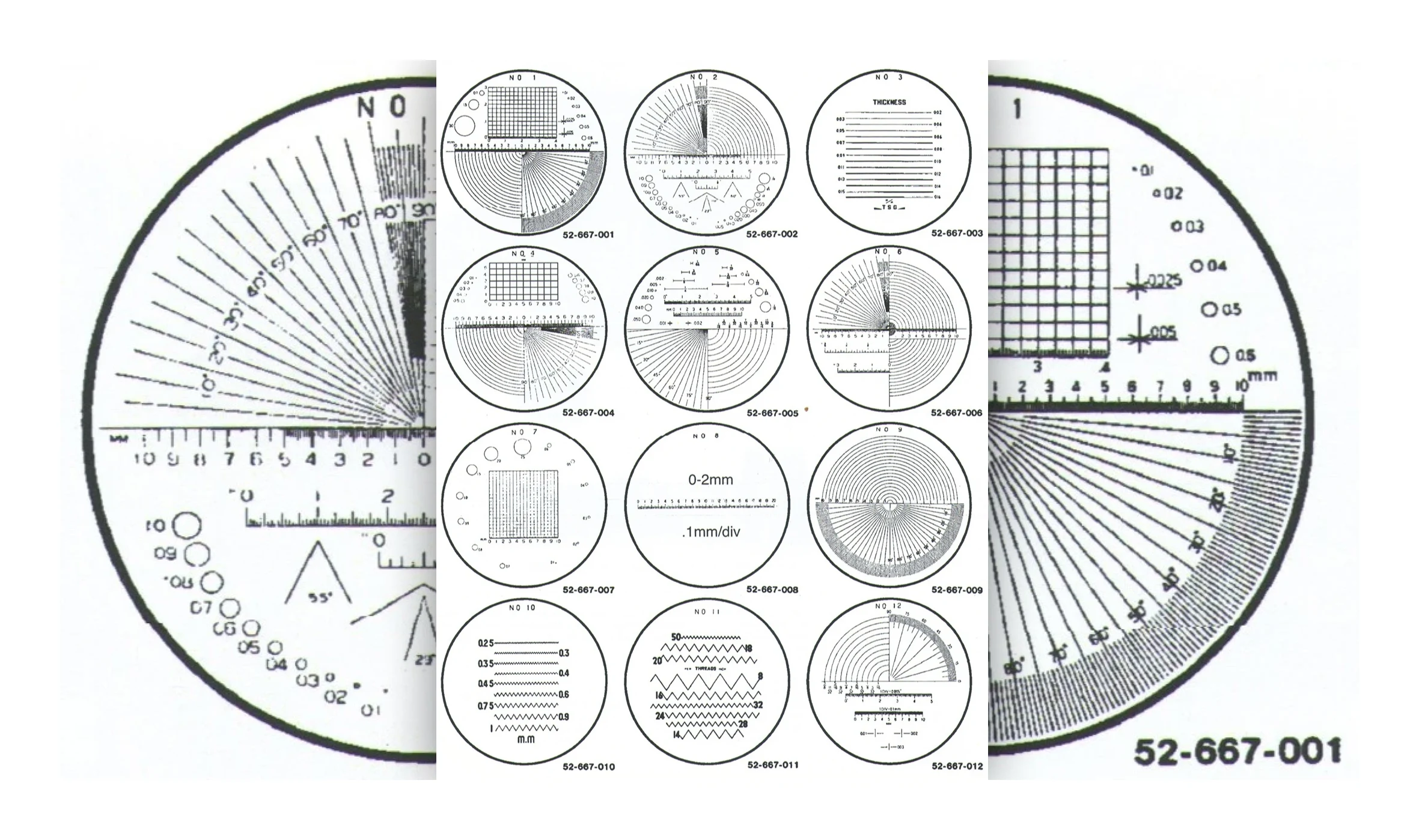
The visual system needed to reflect that same discipline: technical, precise, and focused without becoming cold. I built the visual language around the fascinating world of optics, calibration grids, reticles, and responsive interfaces.
Optics Inspiration
Optics in Motion
DINAMIK builds systems meant to be used by people, so the identity needed to feel active in the same way. Motion brings presence and warmth to assets that would otherwise remain sterile, making the visual system feel closer to an interface than a fixed brand toolkit.
The Tagline
The Become DINAMIK tagline was a long-running phrase the team used to explain their focus: adaptability through multi-domain workflows. It applies a UNIX mindset to create small, interconnected, tactile-feeling tools that do one thing well and compose with the rest.
Composability and Tools
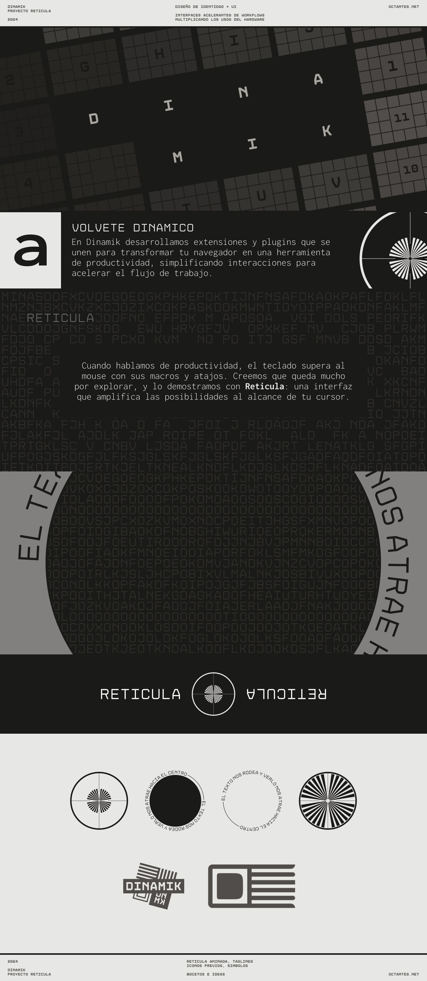
Because the studio creates different tools, each needs an identity derived from the same visual language. Reticula, their first tool, was renamed after the visual concept was approved. It is a radial interface for triggering key macros.
Reticula - Tool Identity
Reticula is differentiated by its radial form, so every part of the reticle was built from the ground up. The system carries DINAMIK’s precision into the interface while allowing for fully customizable motion and animation.
Identity Presentation
Like this project
Posted Sep 17, 2026
A multimedia identity for DINAMIK, a boutique development studio building precise human-computer interaction systems.