Thyme & Olive | Floral Honey Labels

Luís Camacho


Information
Client: Thyme and Olive
Challenge & Solution
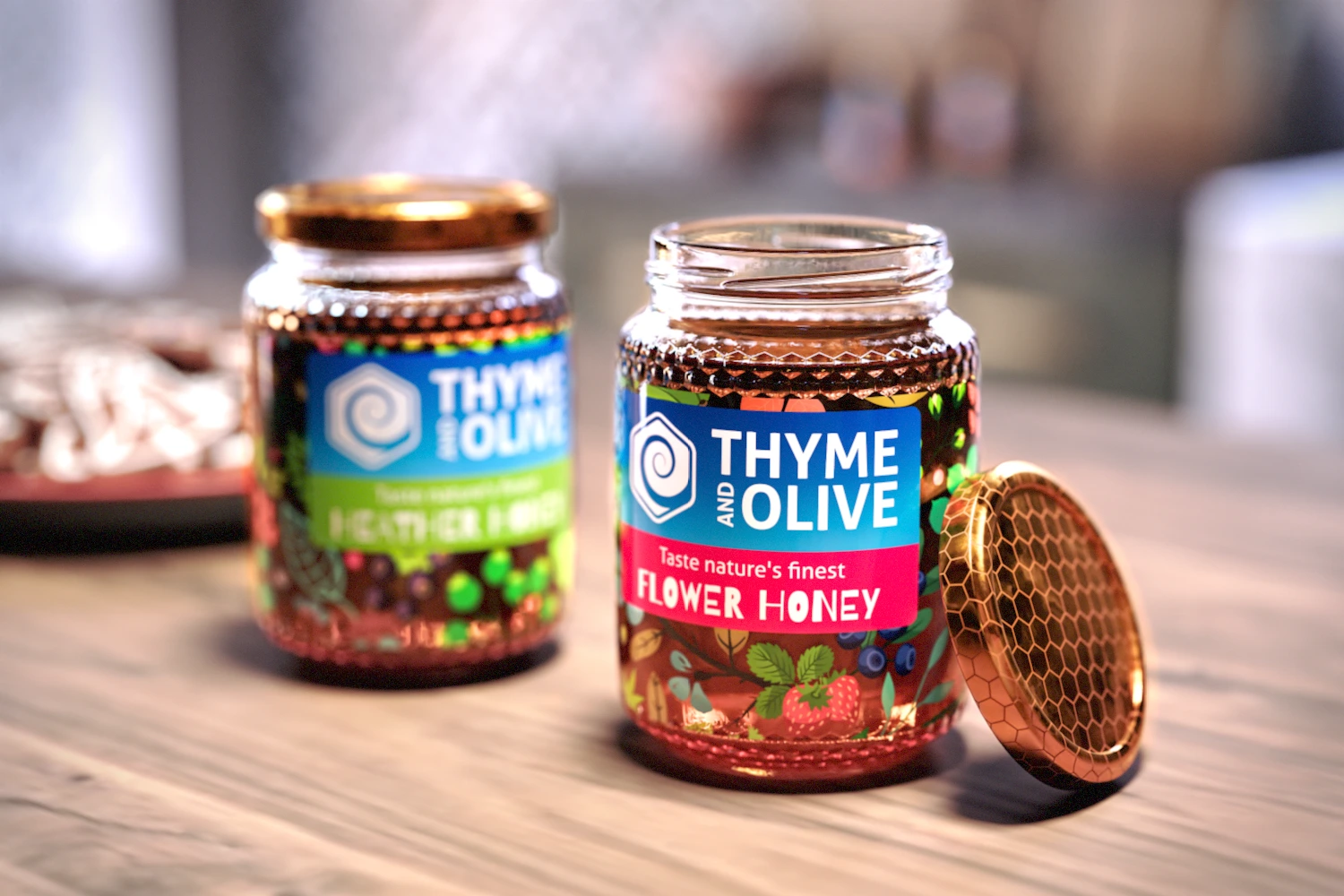
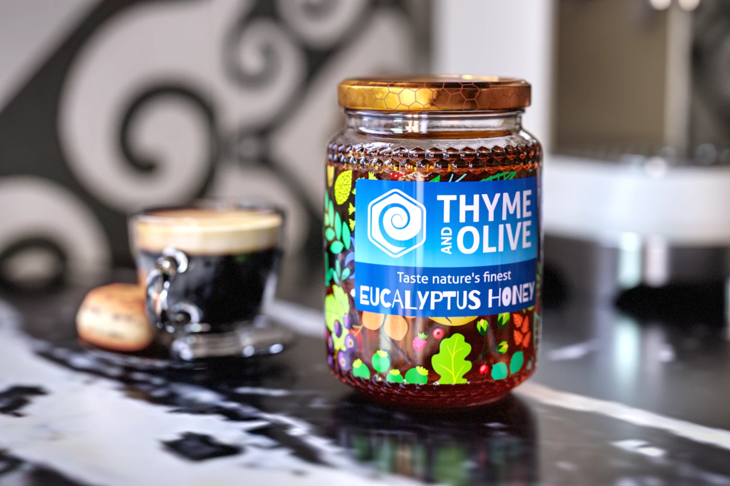
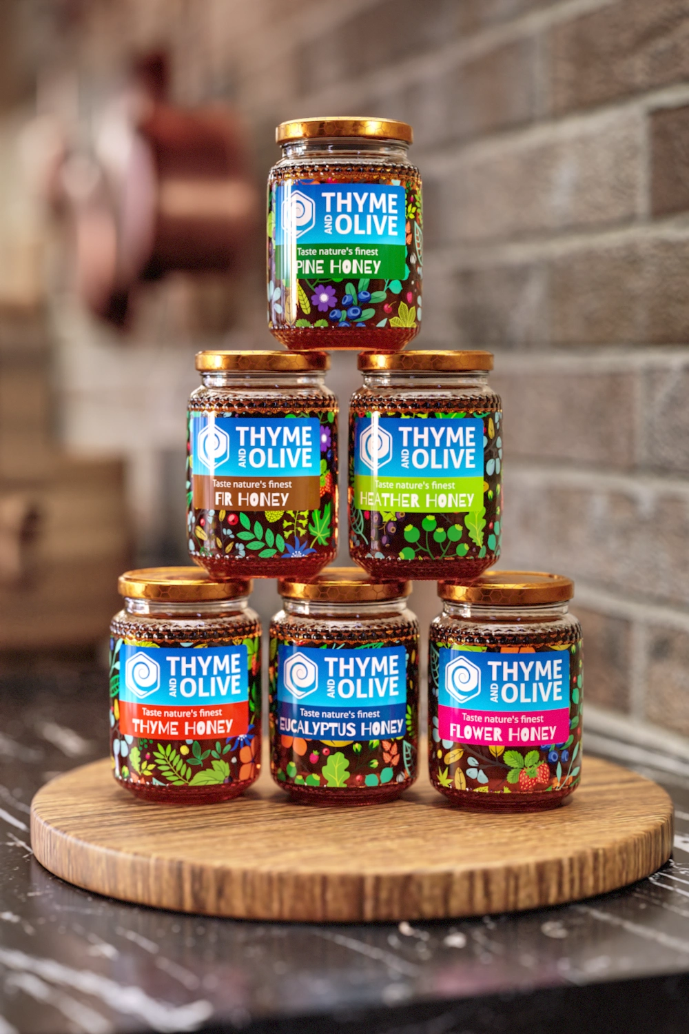
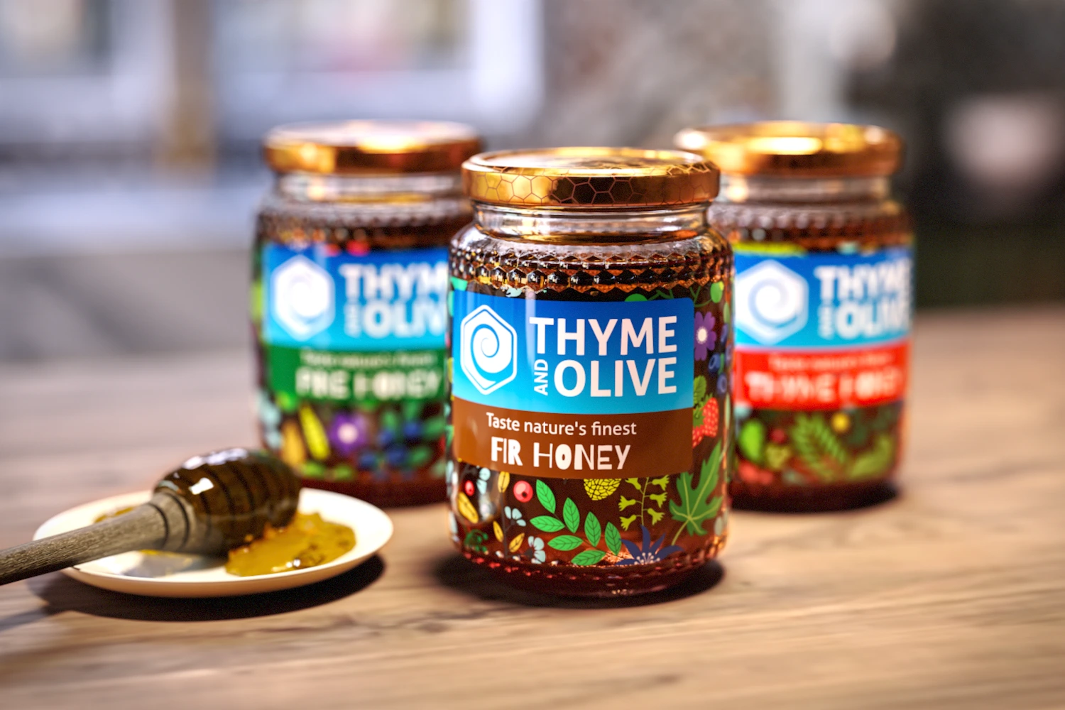
The mission was to design a logo and a label for a start-up selling raw honey.
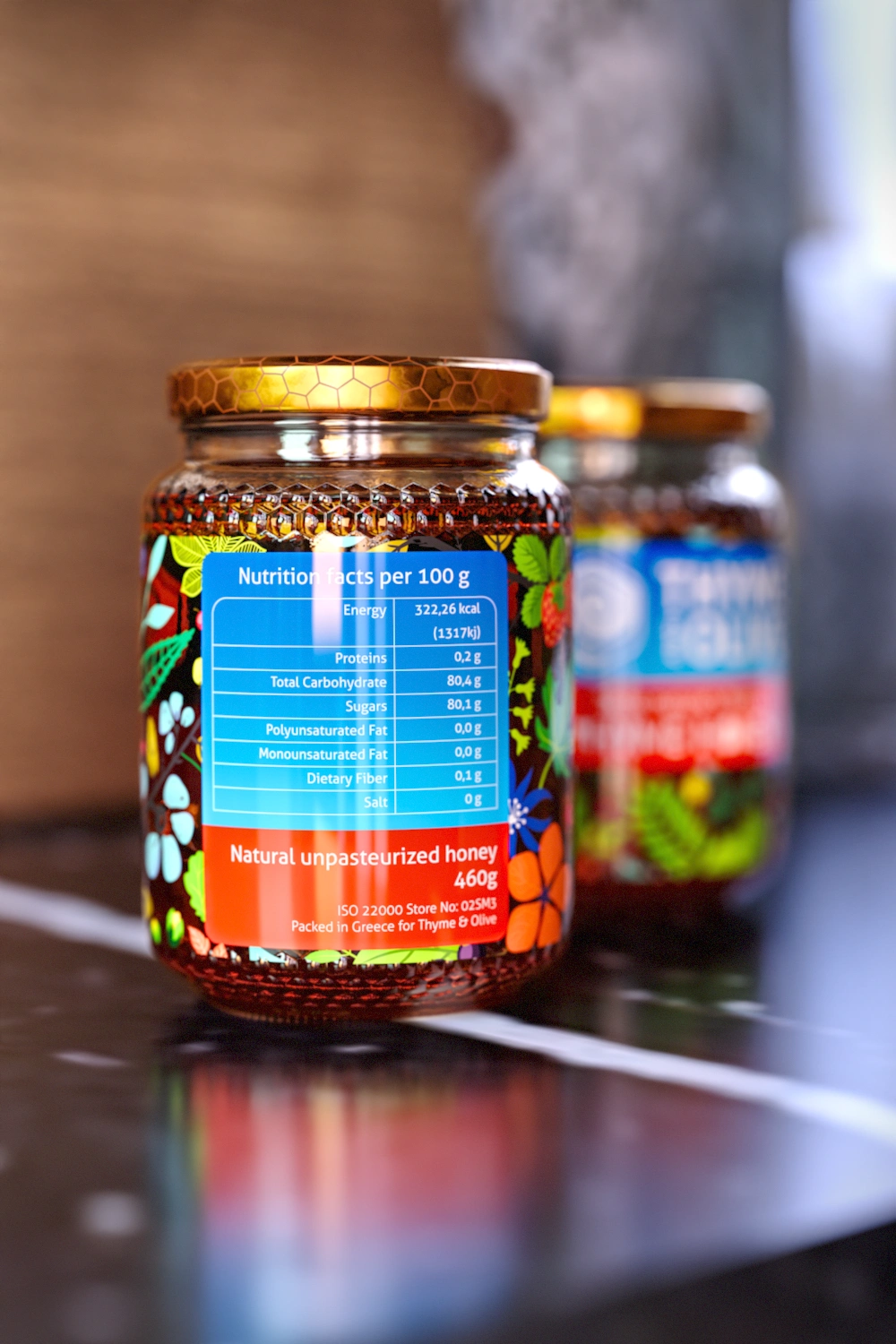
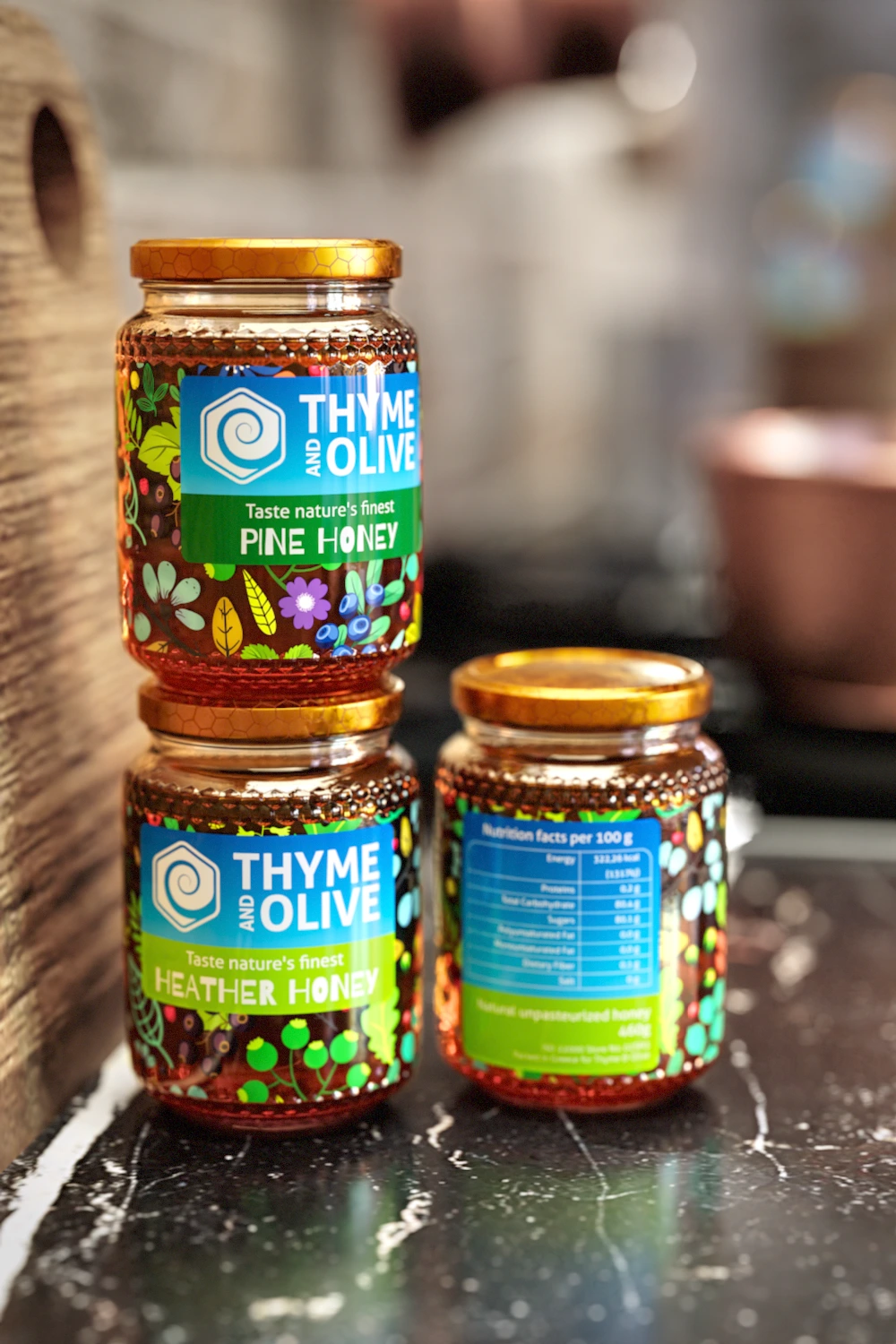
The logo base shape is a hexagon, alluring to a honey hive, while the inside is a swirl mimicking honey being poured. The client had a short budget, so all labels share the same floral pattern, by placing it with different offsets I managed to create the illusion of distinct patterns, solving the problem.
As these jars were to be sold exclusively online, there was no need for barcodes, allowing more space at the back for the nutritional table.
Like this project
Posted Apr 22, 2025
Developed cost-effective honey label system using single floral pattern in varied layouts, paired with honeycomb-inspired logo.


BBQ Gear | Product Line Design

GOcase | Headphone Case Tag
Singella | Yogurt Concept
MukGo | Feeding Bottle Carrier