Brand Identity for a Hair Salon
Jiri Silha @ Kolektive
Brand Identity, Website, and Photography for a Hair Salon
Vlasy v pohybu (Hair in Motion) is a hair salon run by a husband and wife duo with a strong, playful personality. The aim was to create a visual system that captures their energy while remaining professional, clear, and timeless.
Following an in-depth brand discovery session, we aligned on the key insight that movement would not be expressed directly through the logo. Instead, the logo was kept simple, modern, and restrained, allowing motion and personality to come through primarily via photography and video.
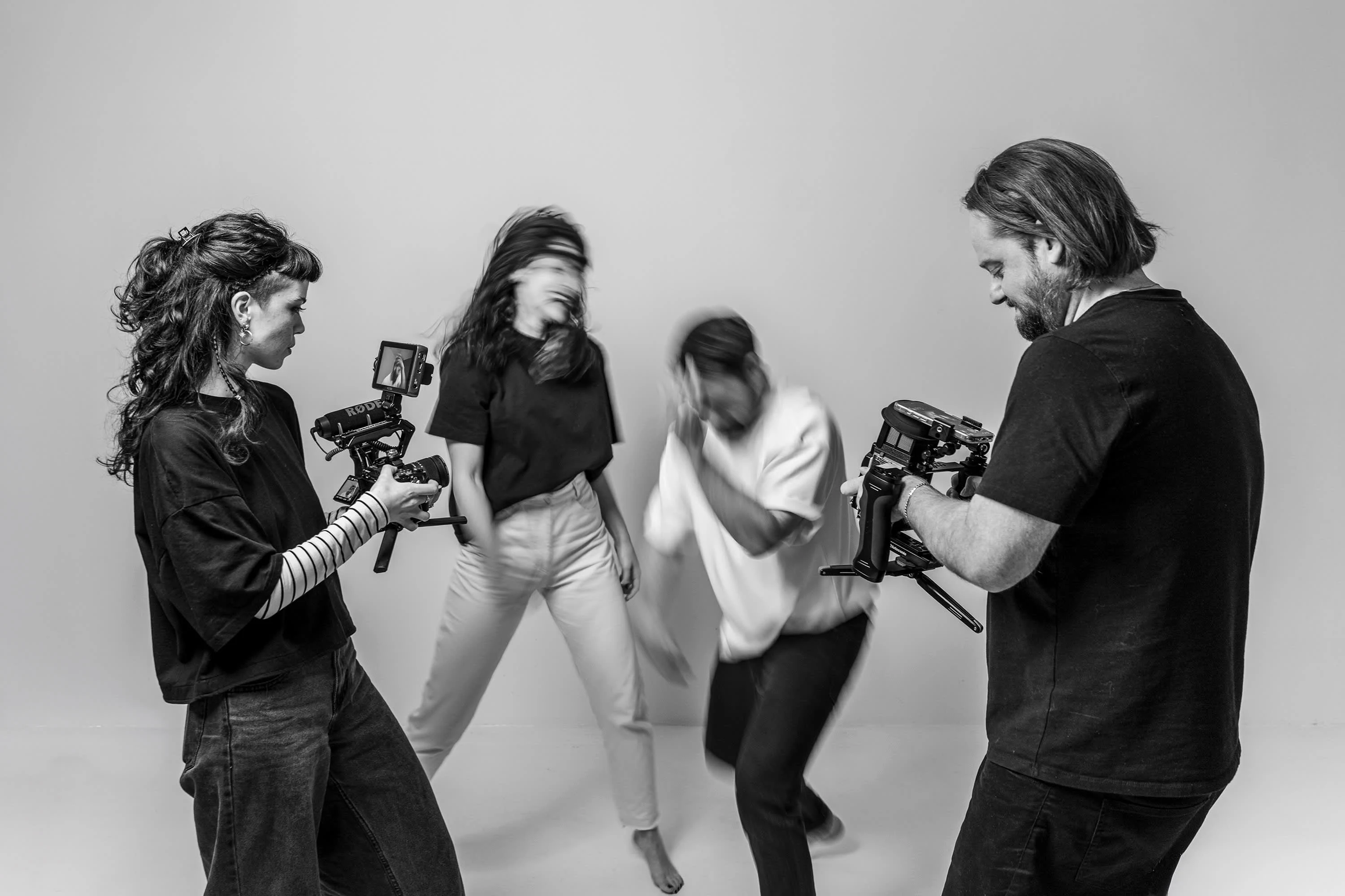
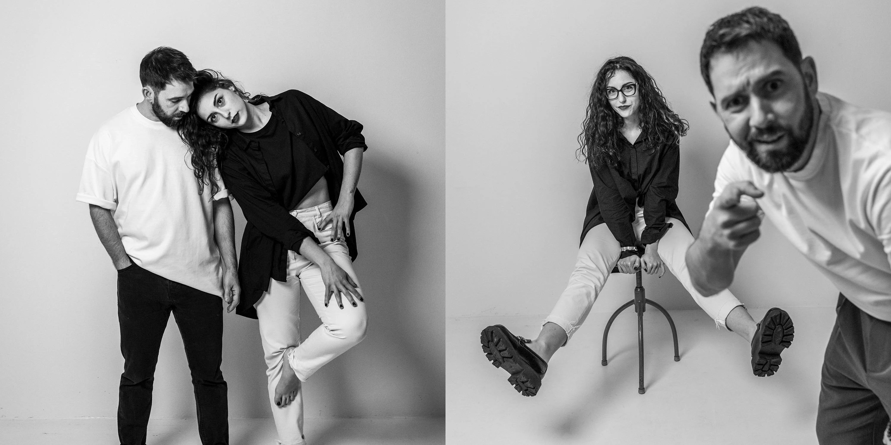
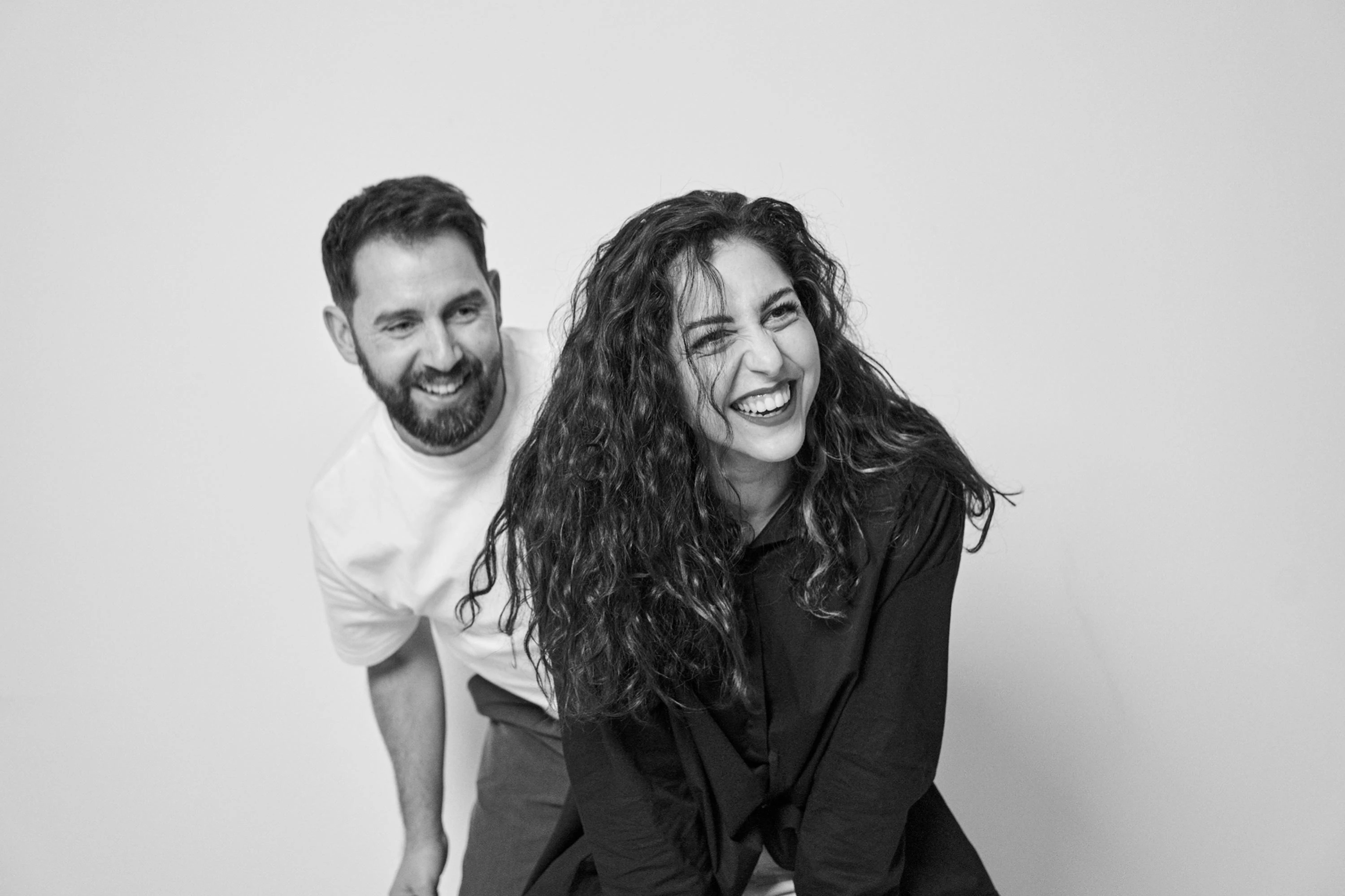
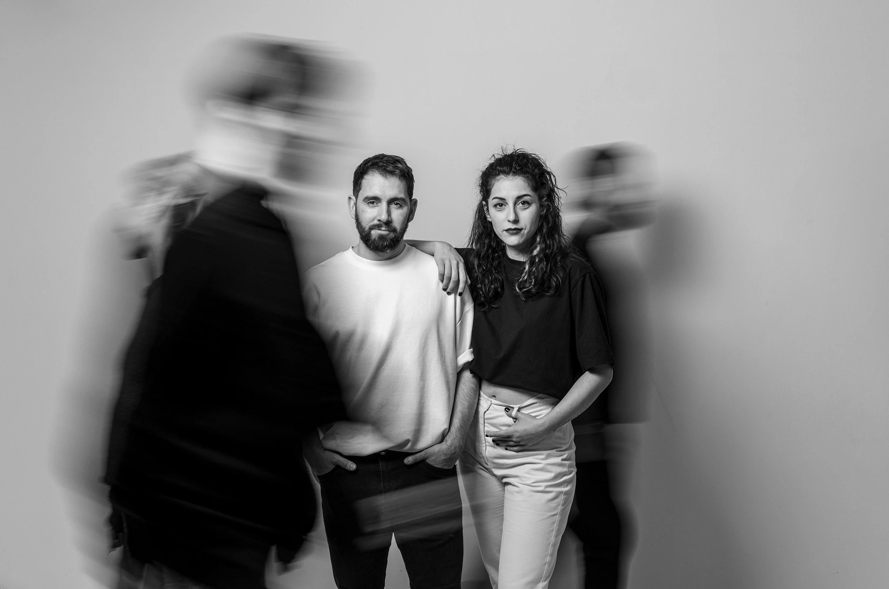
I led the project from art direction through execution, delivering a complete brand identity, website, and photography. I also organised and directed the photoshoot, creating the main profile imagery for social media as well as supporting visuals for the website. The result is a cohesive identity where structure and playfulness are carefully balanced.
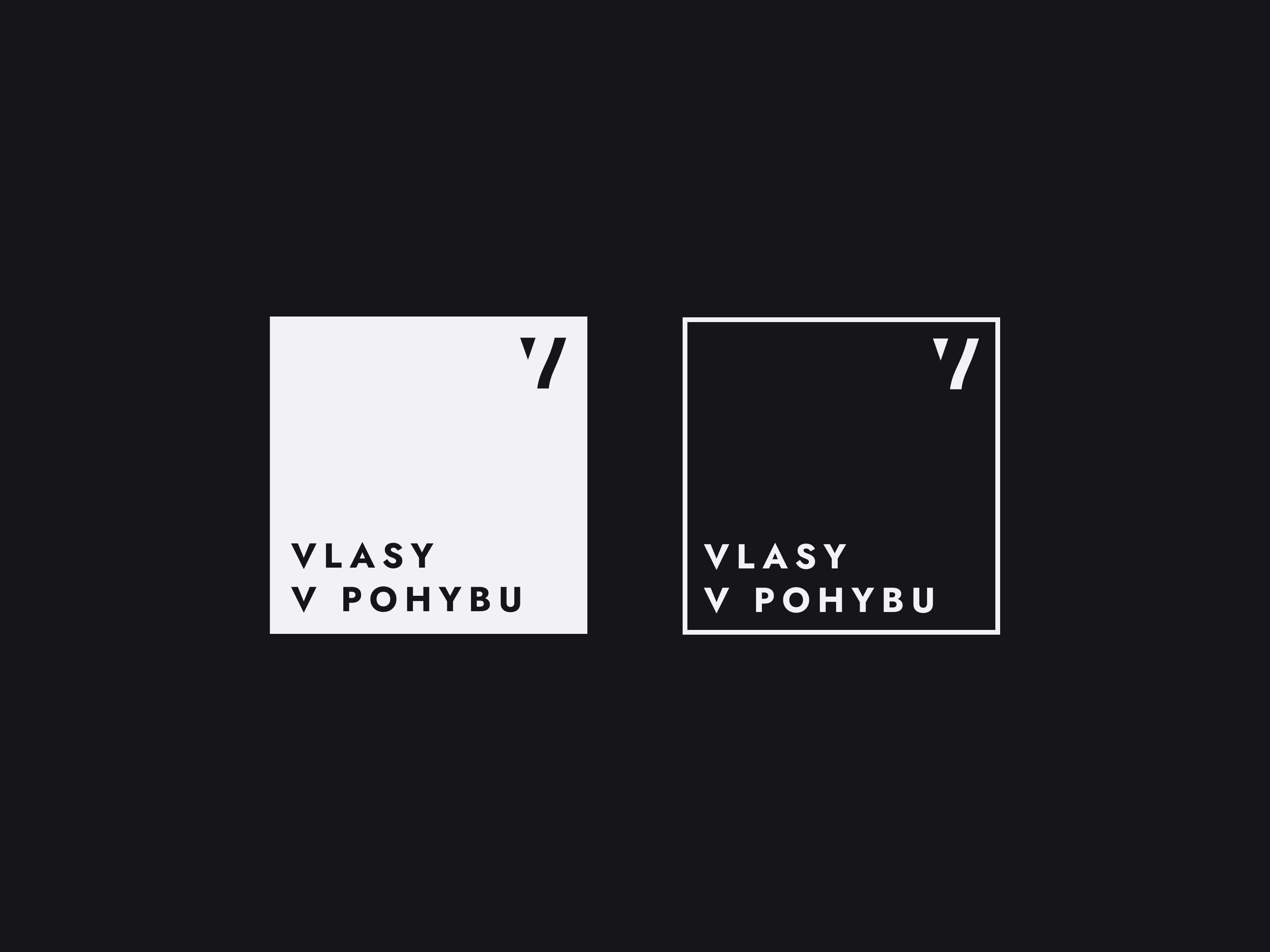
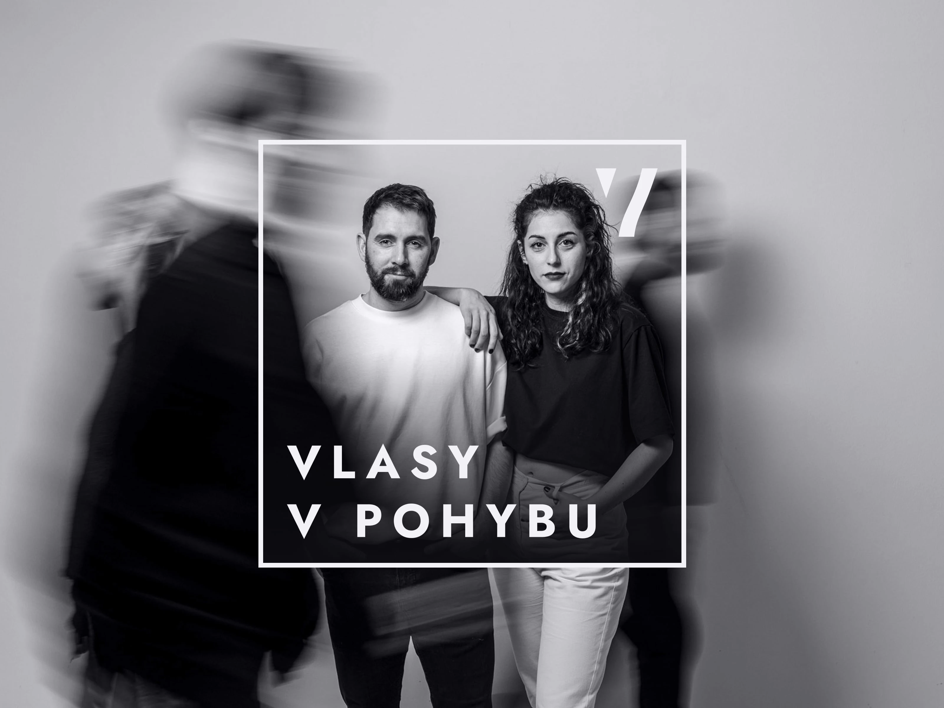
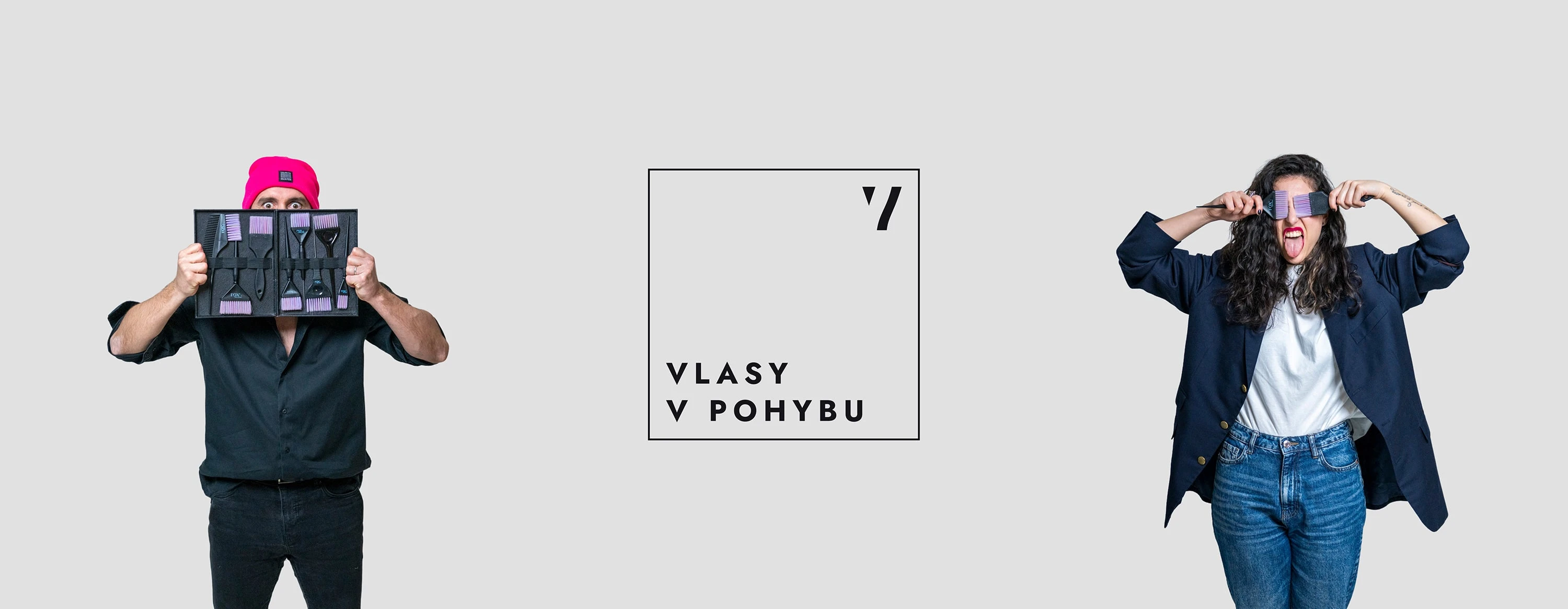
Primary logo system built around a simple square frame. The wordmark sits in the bottom left, while the standalone “V” symbol in the top right allows for flexible use across different brand applications.
This is where the “v pohybu / in motion” idea comes to life. Movement is expressed through video and looping imagery, visible through the hollow logo while the identity itself remains stable.
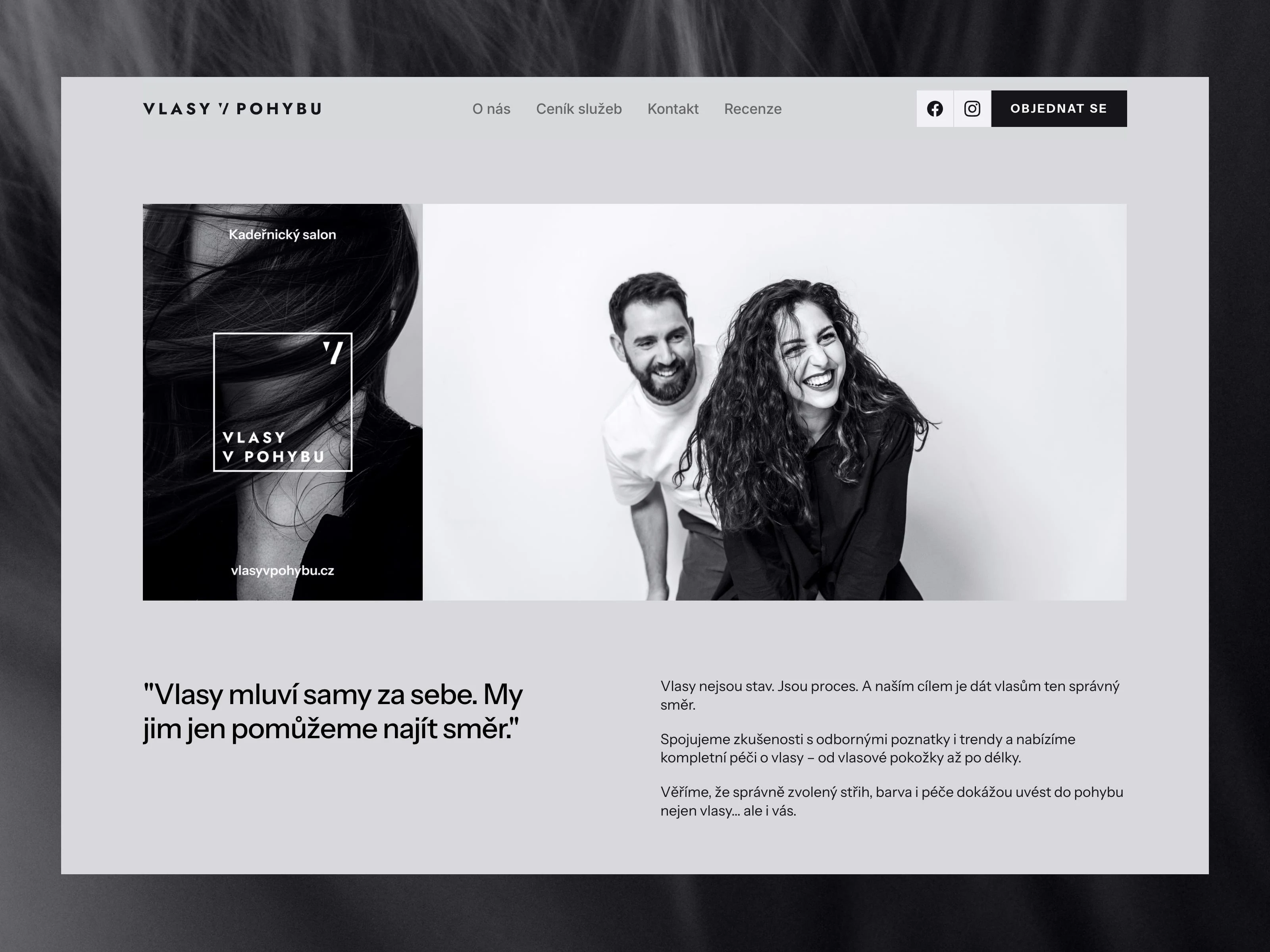
Website design built in Framer, using a restrained monochrome palette and custom photography as the primary visual language. A horizontal logo variation is used across the site, with the “V” symbol integrated directly into the name to reinforce the brand concept.
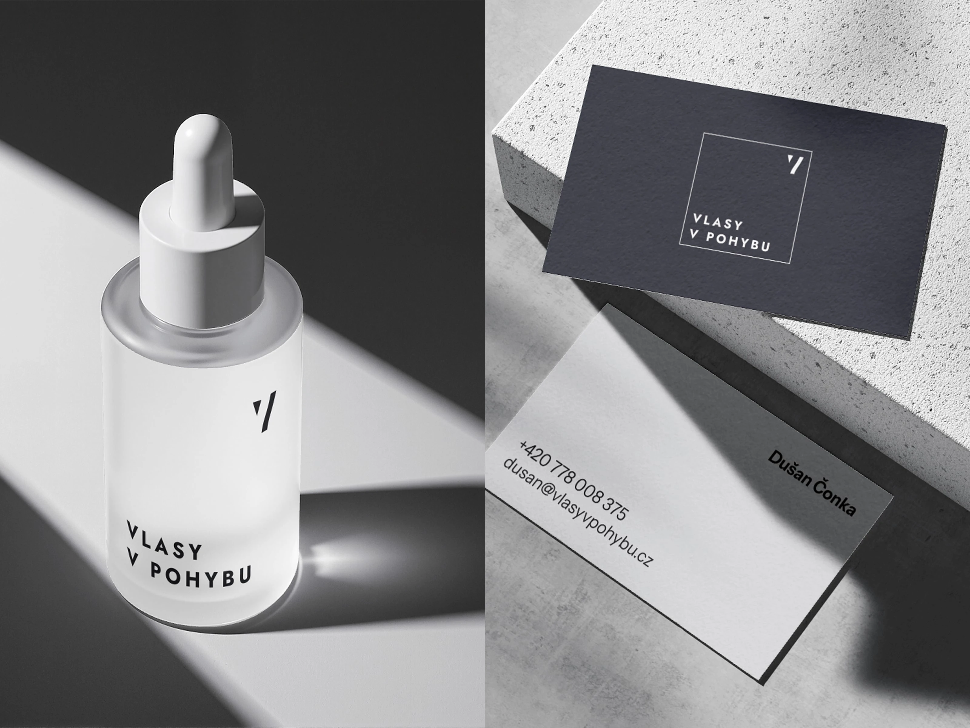
Logo applied across physical touchpoints, from potential product packaging to business cards. The system scales naturally across materials while keeping the identity clean, consistent, and recognisable.
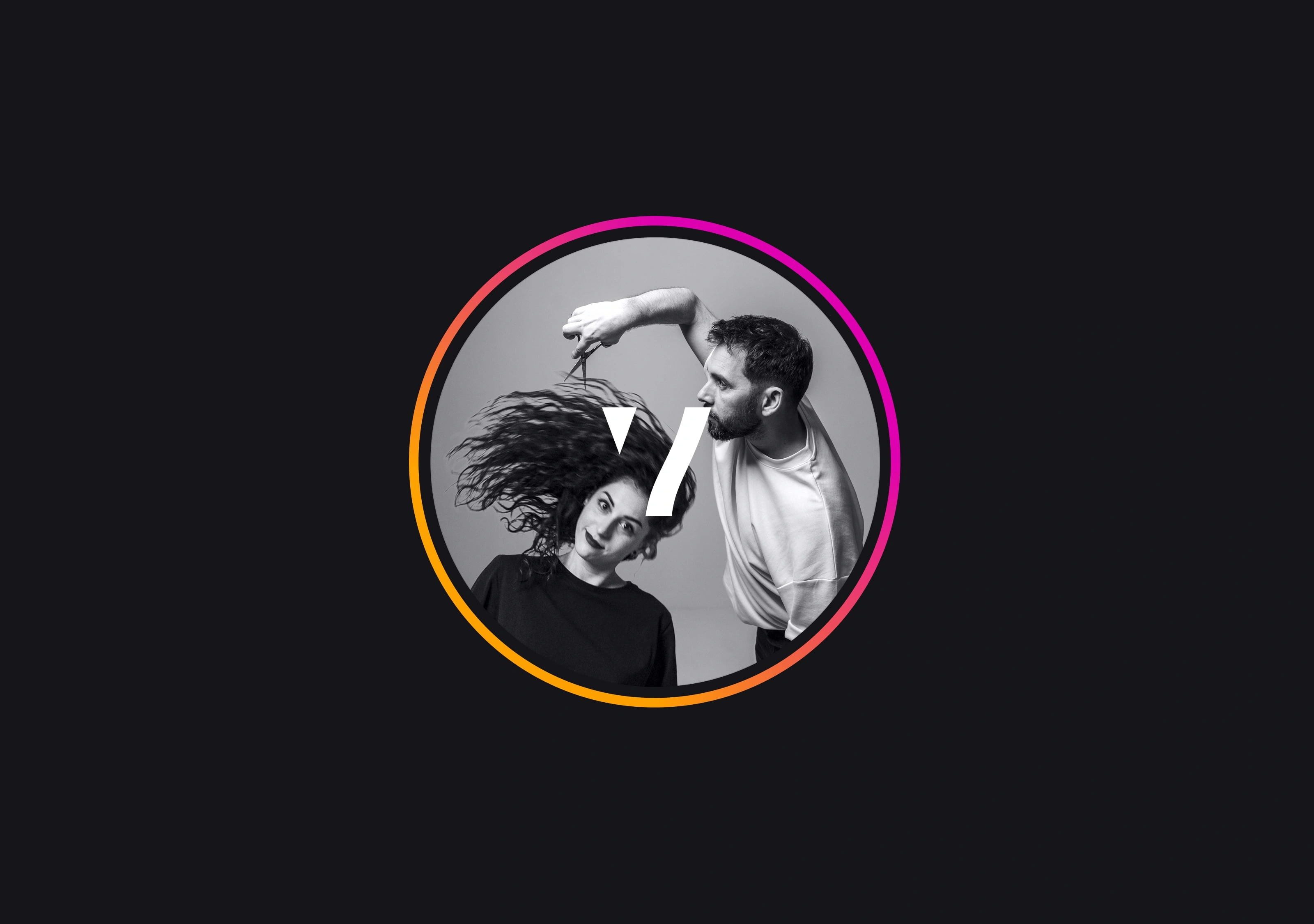
Social media profile imagery designed to capture movement and personality at a glance. The “V” symbol can be layered in when needed, allowing the image to work both with and without branding.
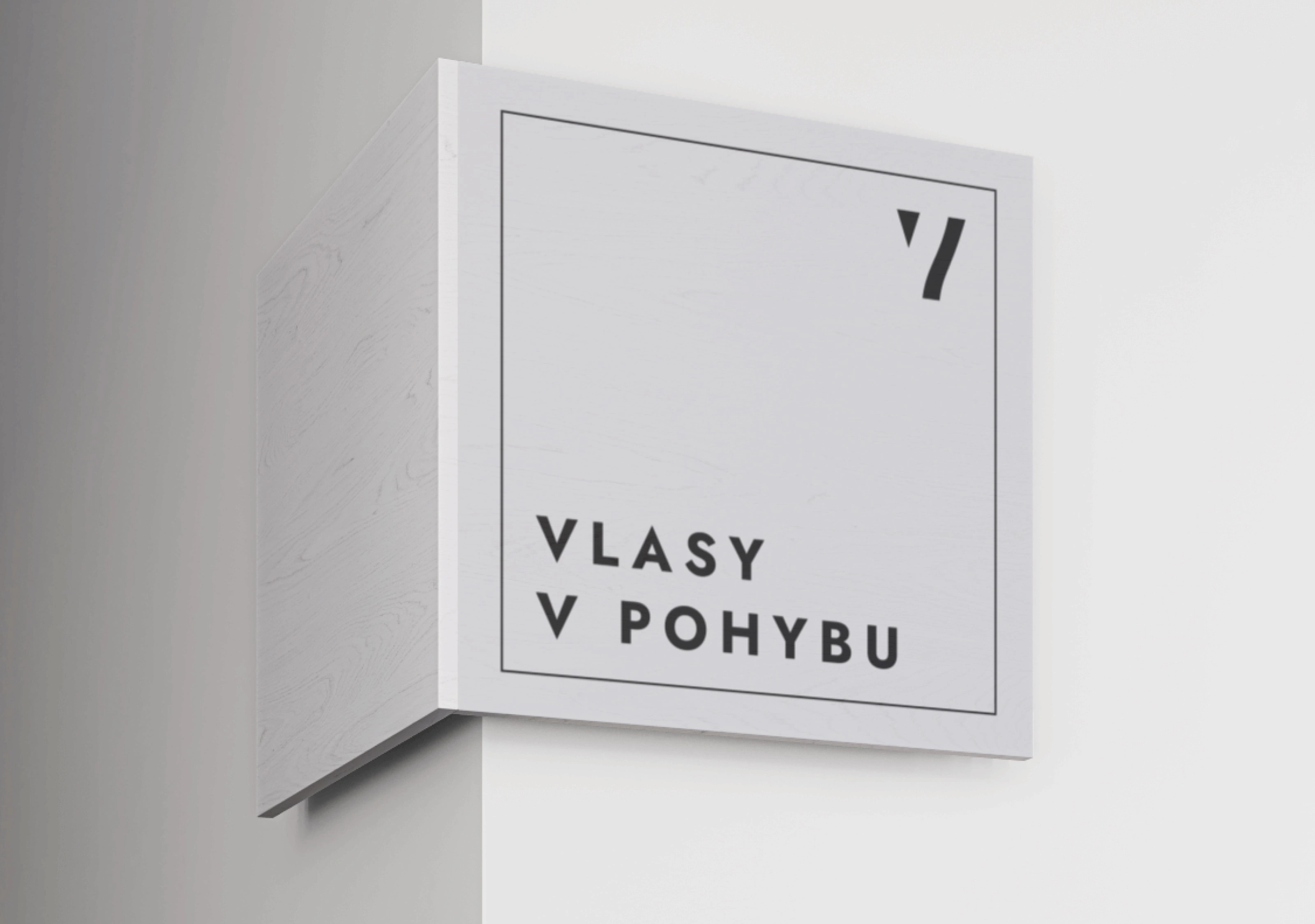
Exterior signage concept showing how the square logo translates into a clean, architectural form. The restrained layout keeps the focus on the name, while the frame and “V” symbol ensure clear brand recognition from a distance.
Photoshoot
Like this project
Posted Jan 12, 2026
A complete brand identity including logo design, website, and photography, built to balance a playful personality with a clean, modern visual system.
Likes
1
Views
7
Timeline
Dec 1, 2025 - Dec 31, 2025