Eye Candy design concept
Pavel Tsikhanavets
In design, "eye candy" refers to visuals that are flashy and attention-grabbing but lack depth or functionality. Think of a gorgeous website that’s impossible to navigate or a polished portfolio image that tells no story...
But here’s the twist: since I added a story to it, it’s no longer just eye candy. 🙂
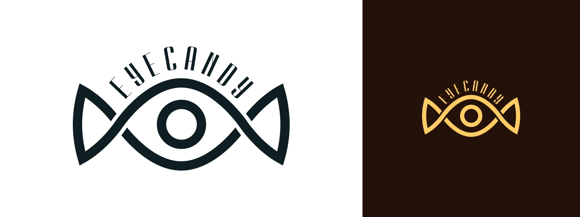
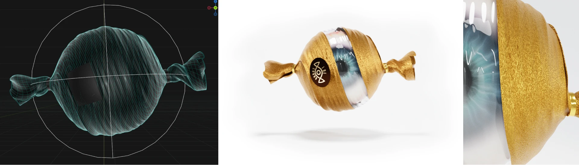
By framing it with context, it’s transformed into meaningful design, something with much more depth. Speaking of depth, can a surface-level idea be turned into a great one? Like designing eye candy logo with literally dosens of already existing.
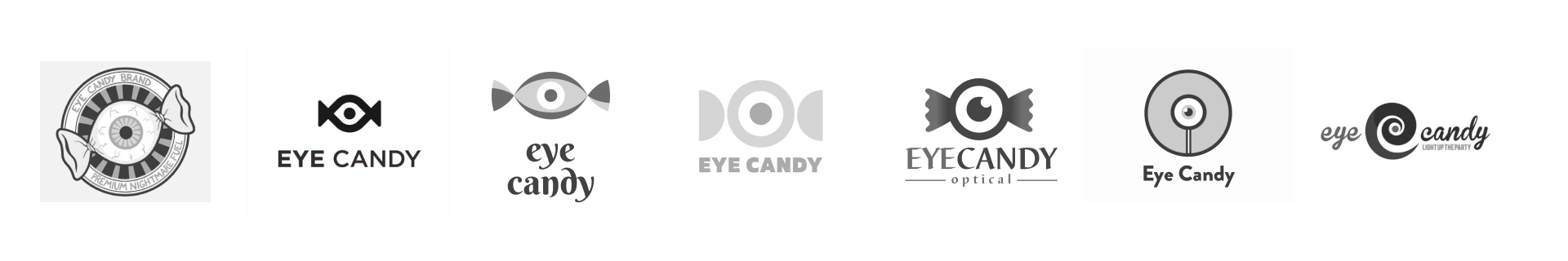
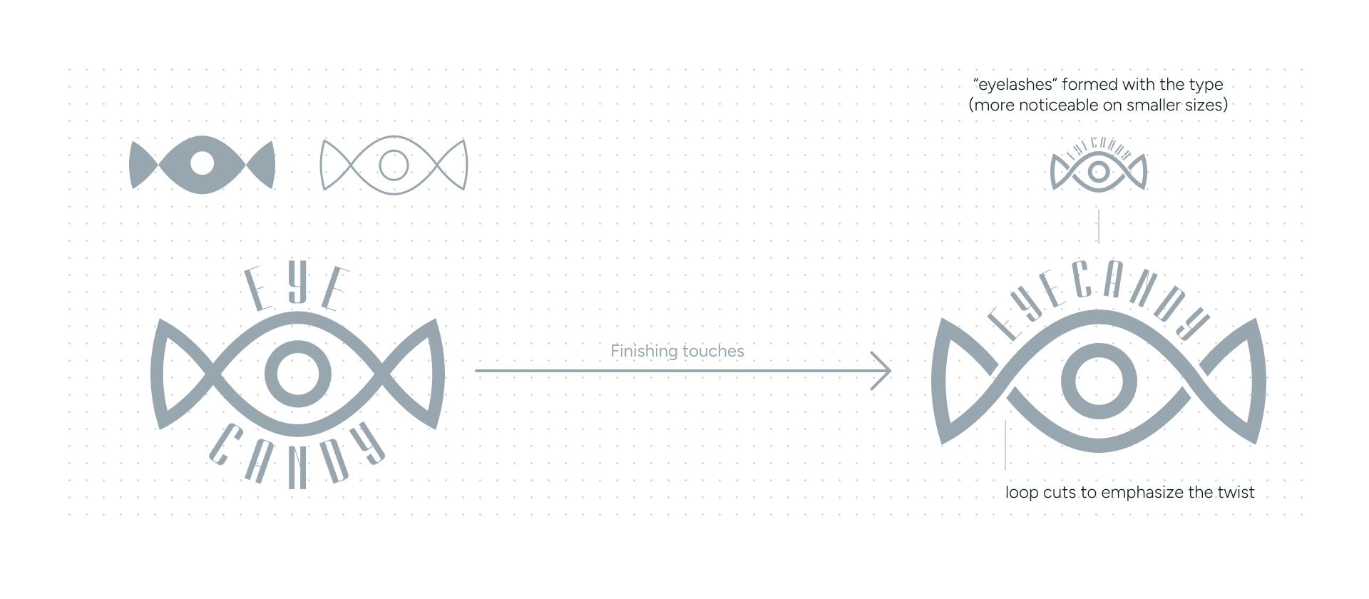
Lets try to find a new meaning or form to separate from the rest. Like “eyelashes” formed by the type within the logo itself (more noticeable on smaller sizes):
Well, we’ve created a design paradox: an eye candy that’s more than just eye candy. 🙂
By adding a story and purpose, it’s no longer just surface-level appeal — it’s a visual that critiques its own concept while proving how design can have both wit and depth. Fun, thoughtful, and a little ironic, it’s the kind of paradox that makes design exciting.
Like this project
Posted Apr 28, 2025
Transformed eye candy design into meaningful, story-driven visual.
Likes
0
Views
3