Yuzu Juice Can Design Project
George Kondoleon
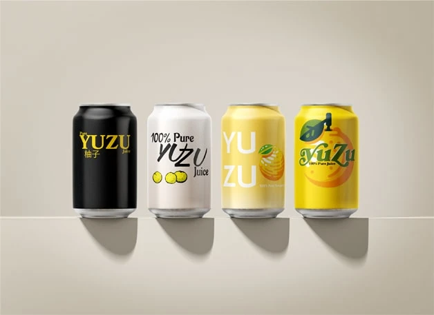
YUZU Juice Can Design Project
Prompt: Create a design for the client, who was selling a 100% Pure Yuzu Juice drink, that is easily replicated across other potential products.
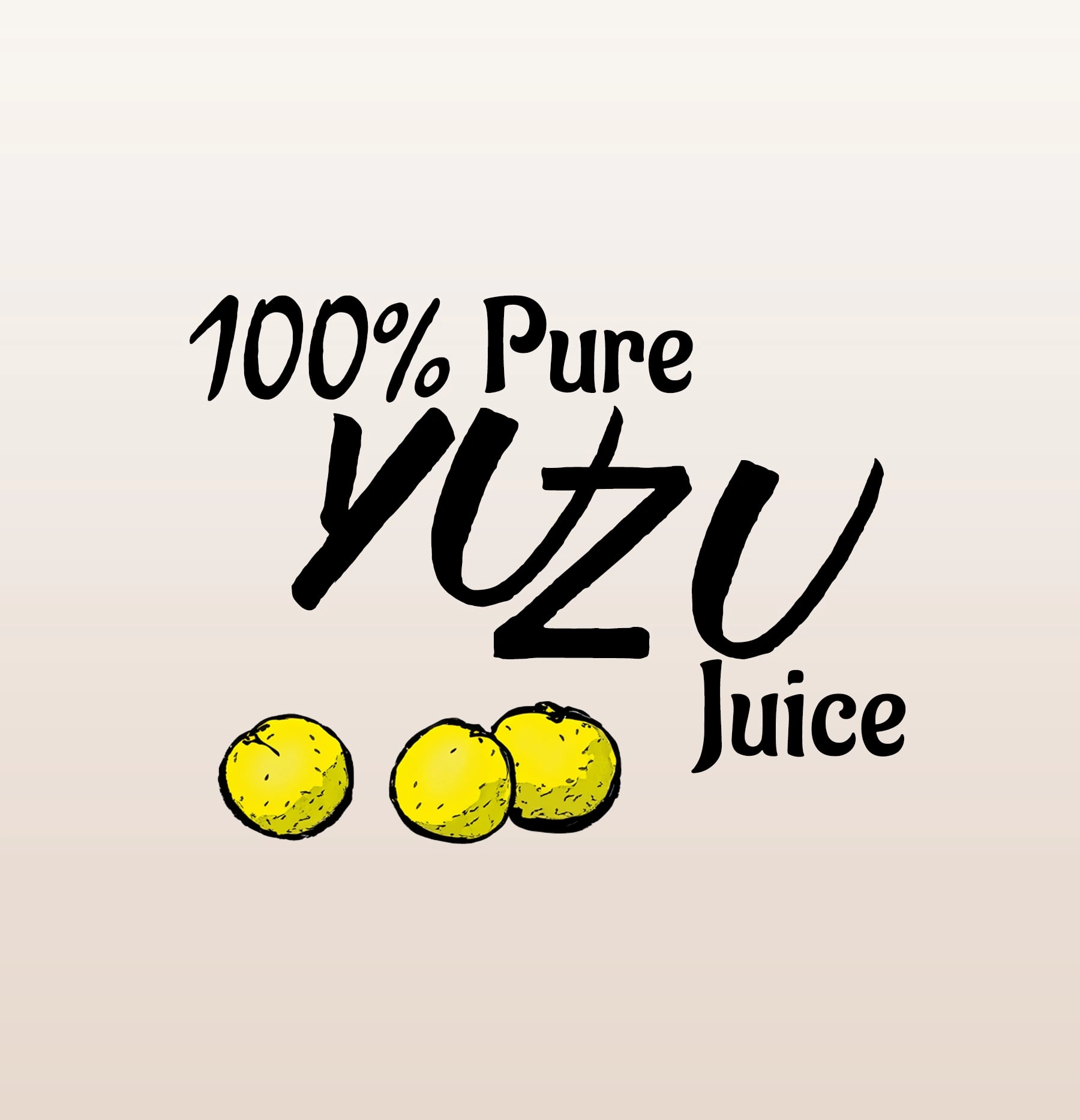
Can 1: Simple, clean, bold
Typography: Bookmania, Kozuka Gothic Pr6N
Inspiration: Opening episode card of Stranger Things.
Why: We wanted to emphasize authenticity with a sleek black can. YUZU is the star, but Pure and Juice are hugging it closely to remind the consumer the freshness of the product.
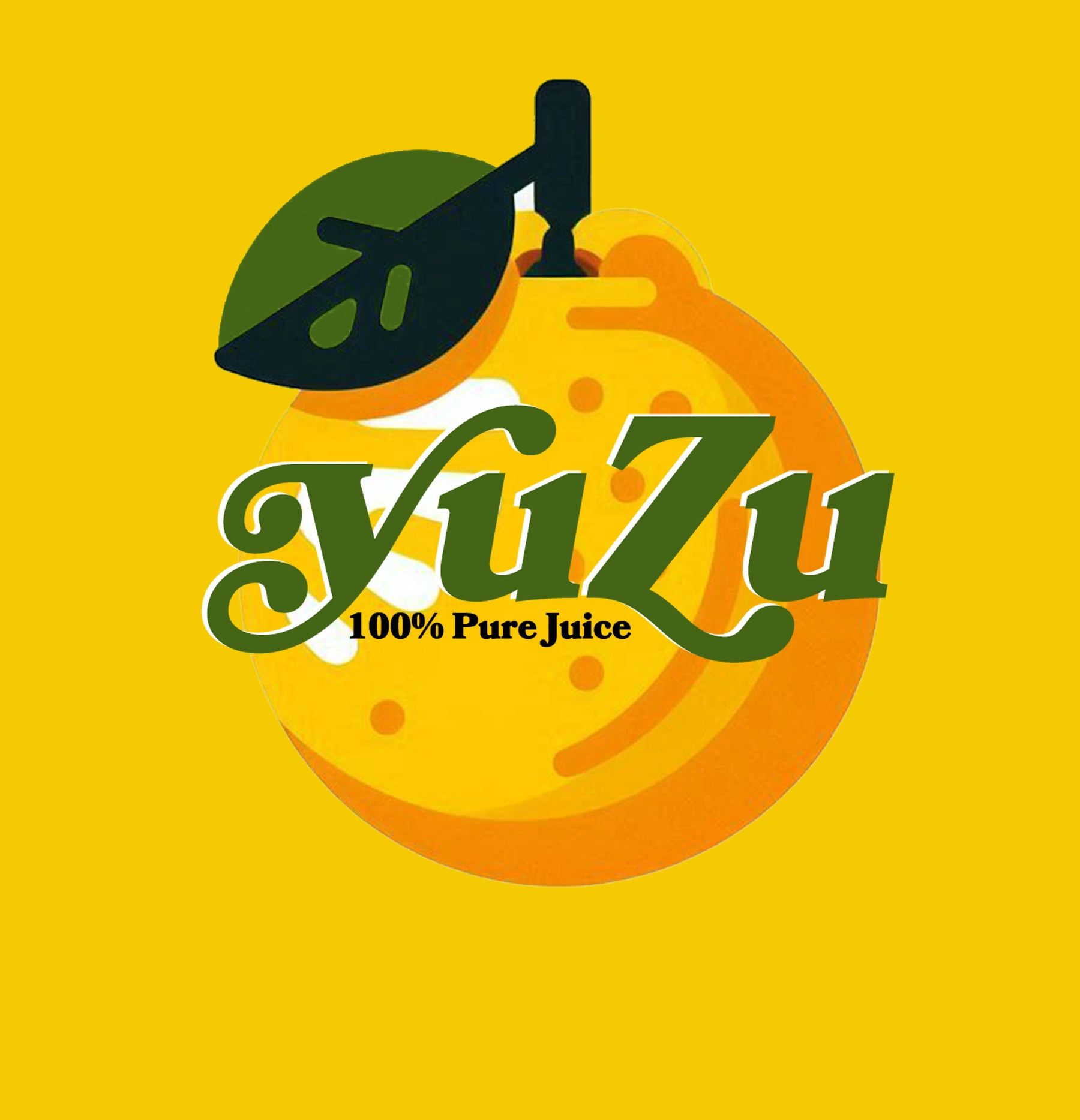
Can 2: Unique, whimsical, and memorable
Typography: Aladin, Brushland
Inspiration: Dragon Ball manga cover
Why: A can that stands out from the norm. Roughly drawn yuzu fruit gives a pop of color against an off-white can. Your eyes are drawn to the fruit, and are then hit with an edgy tangled YUZU Juice notice.
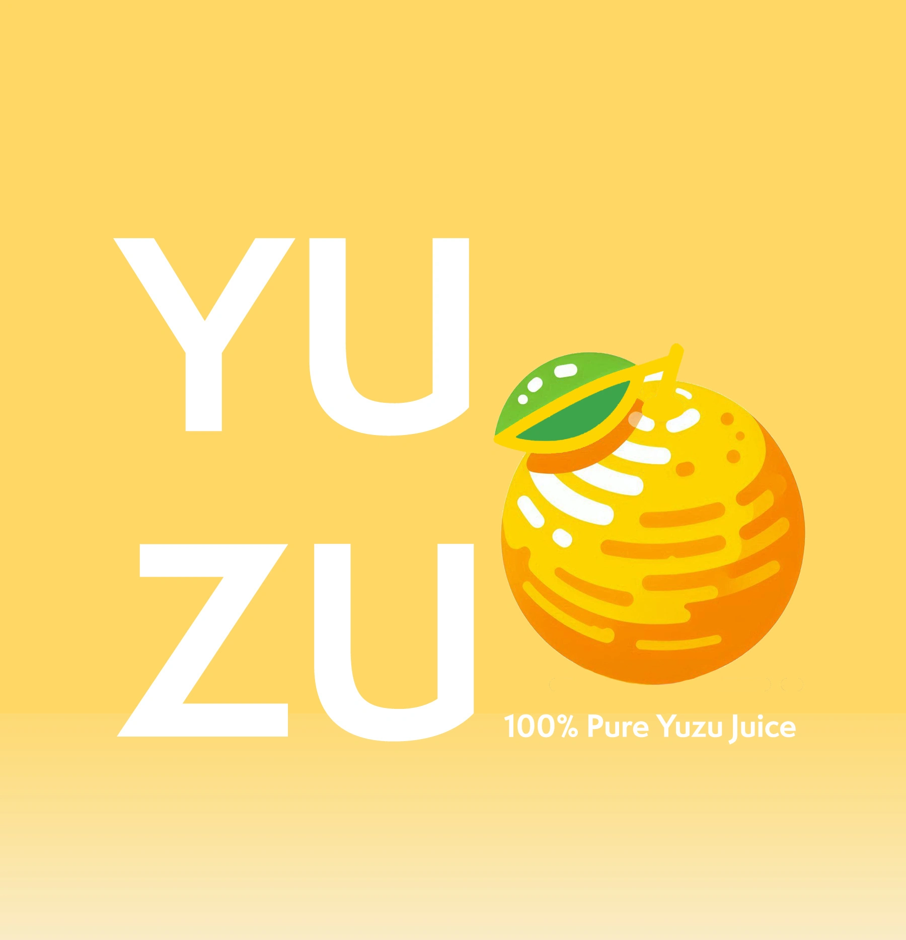
Can 3: Let's get trendy
Typography: Semplicita Pro
Inspiration: Ollipop, ZIMA
Why: Bright and beautiful colored can with a soft gradient helps build trust with the product. Strong YU and ZU lettering stacked up against each other alongside a vector illustration of the Yuzu fruit
Can 4: Lean into the fruit
Typography: Bookmania, Aladin
Inspiration: 90s Sprite can
Why: After all, it's about what the product actually is. We took a solid color can and stamped it with a vector drawing of the whole fruit. The can matches the color of Yuzu, the decorative font is the color of the leaf, and the can makes you thirsty for a citrusy beverage just by looking at it.
Like this project
Posted Jul 8, 2025
Designed four unique Yuzu Juice can designs emphasizing authenticity and trendiness.
Likes
2
Views
17