CASE STUDY — Trade screen HomeBroker
Federico Espinosa
CASE STUDY — Trade screen HomeBroker
A complete redesign of the trading interface for HomeBroker — reducing cognitive overload so traders can act with speed and confidence.
CLIENT: HomeBroker
ROLE: Solo Senior UX/ UI Designer
PLATFORM: Web - Desktop
FOCUS: Trade Screen

01 — OVERVIEW
The challenge
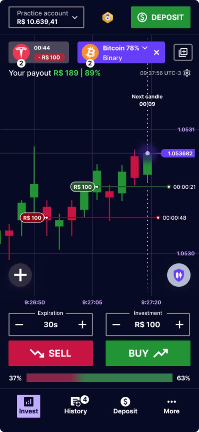
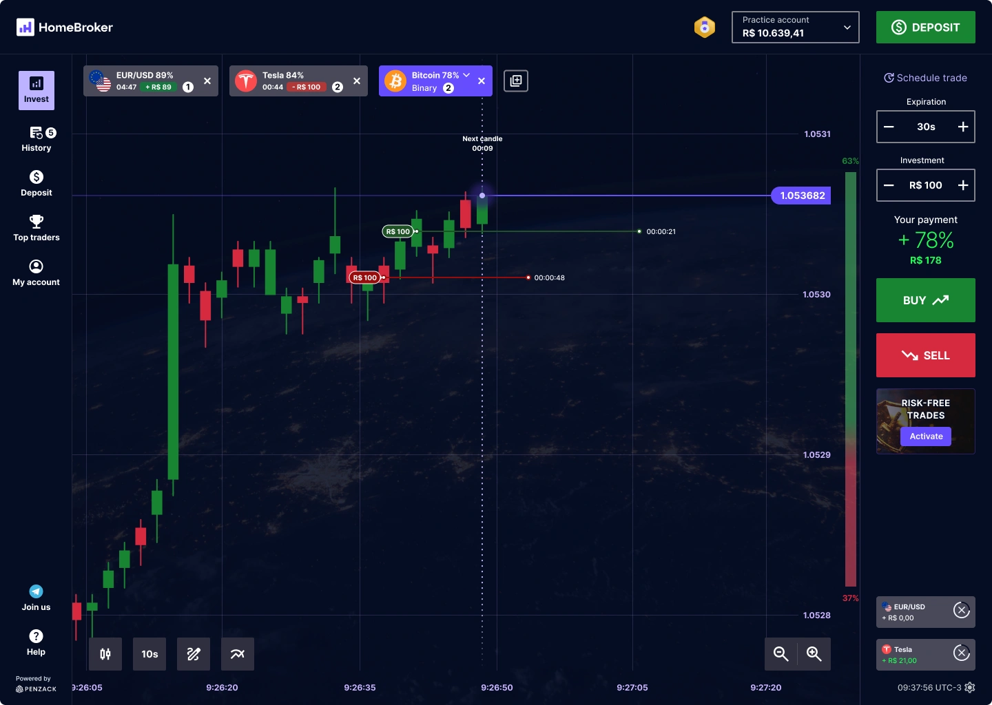
Trading platforms have a reputation for visual overload — dense panels, blinking numbers, and competing CTAs that overwhelm both new and experienced traders. HomeBroker needed a trade screen that felt powerful without being paralysing.
The core brief was straightforward: keep the screen less cluttered so traders can make faster, more confident decisions. But "less clutter" in a trading context is a design challenge — every element on screen has a functional reason to exist.
"The real design problem wasn't removing features — it was creating a hierarchy that lets traders see exactly what they need, exactly when they need it."
02 — COMPETITIVE ANALYSIS
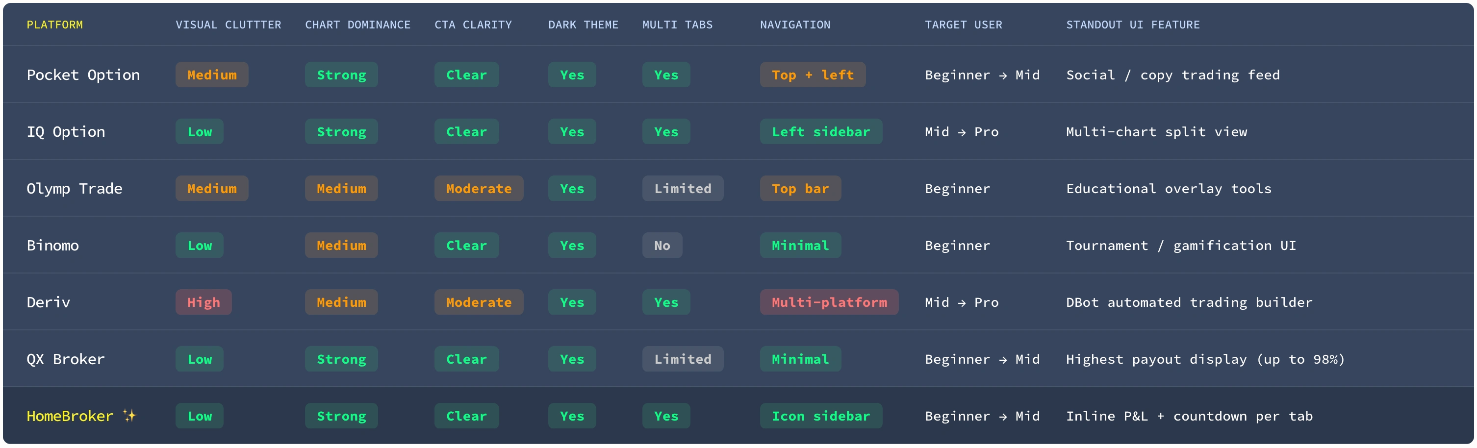
What was evaluated
Each platform was assessed across the same UX dimensions that drove the HomeBroker redesign brief: screen clutter, chart dominance, CTA clarity, navigation efficiency, and the ability to serve both beginner and experienced traders without friction.
The 7 platforms selected represent the primary competitive landscape in the LATAM and global binary/quick-trading market: Pocket Option, IQ Option, Olymp Trade, Binomo, Deriv, QX Broker (Quotex), and HomeBroker.
Side-by-side overview
A structured comparison across 7 UX-relevant dimensions. Ratings reflect interface quality, not financial product quality.
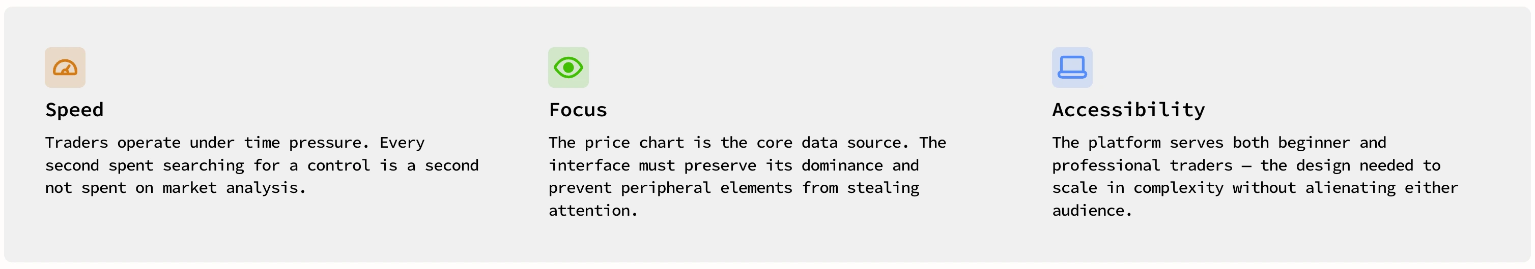
03 — RESEARCH & INSIGHTS
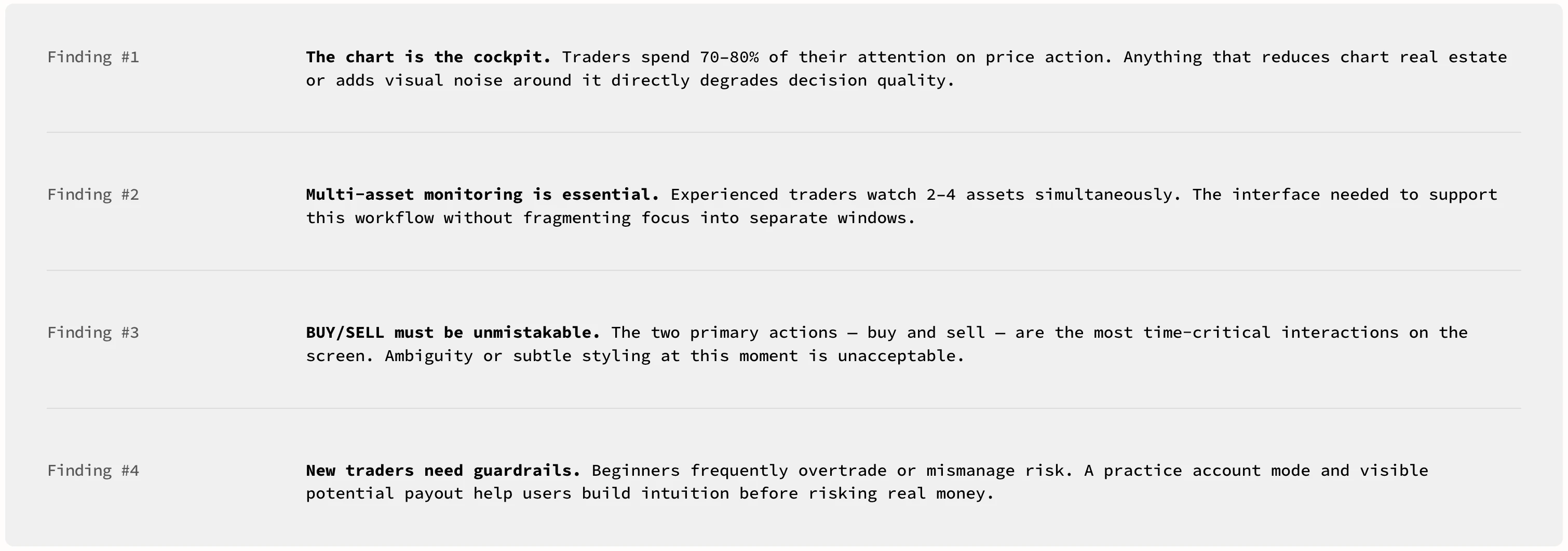
Understanding the trader's mindset
As the sole designer on this project, I led the research effort — conducting competitive analysis of leading binary options and forex platforms, and gathering qualitative feedback from active traders through interviews and usability observation sessions.
Several patterns emerged consistently across the research:
04 — DESIGN DECISIONS
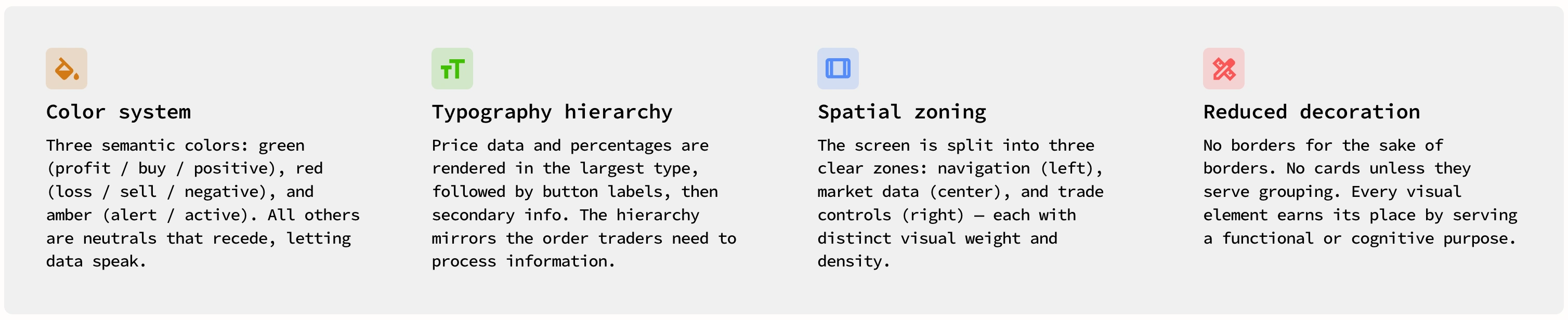
Translating insights into interface
Every design choice was made to serve one of the four insights above. Here's how the key decisions map to the research findings.

05 — VISUAL LANGUAGE
A system built for trust and speed
The visual system needed to communicate two things simultaneously: professionalism (this is a platform that handles real money) and urgency (trades happen in seconds). The design language achieves this through a tight set of choices.
06 — REFLECTIONS
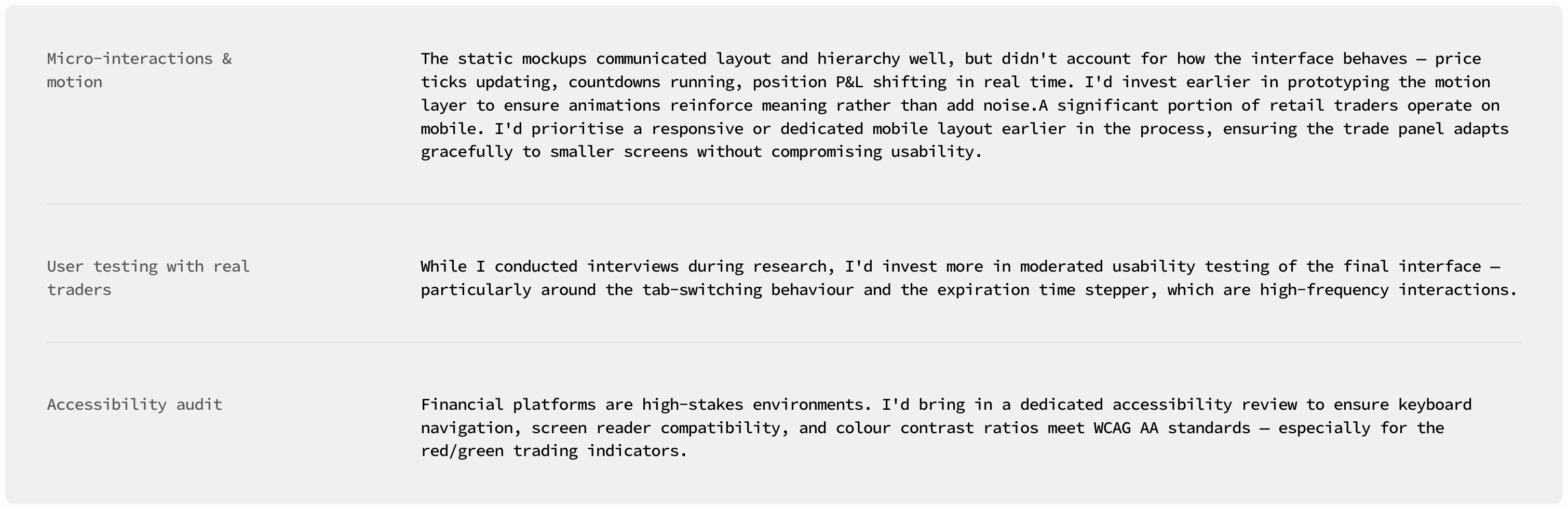
What I would do differently
Working as the sole designer on a complex financial product is demanding. Looking back, there are areas I'd approach differently with more time and resources.
Like this project
Posted May 13, 2026
A complete redesign of the trading interface for HomeBroker — reducing cognitive overload so traders can act with speed and confidence.