Trisecure - Visual Identity :: Behance
Harsh Bika
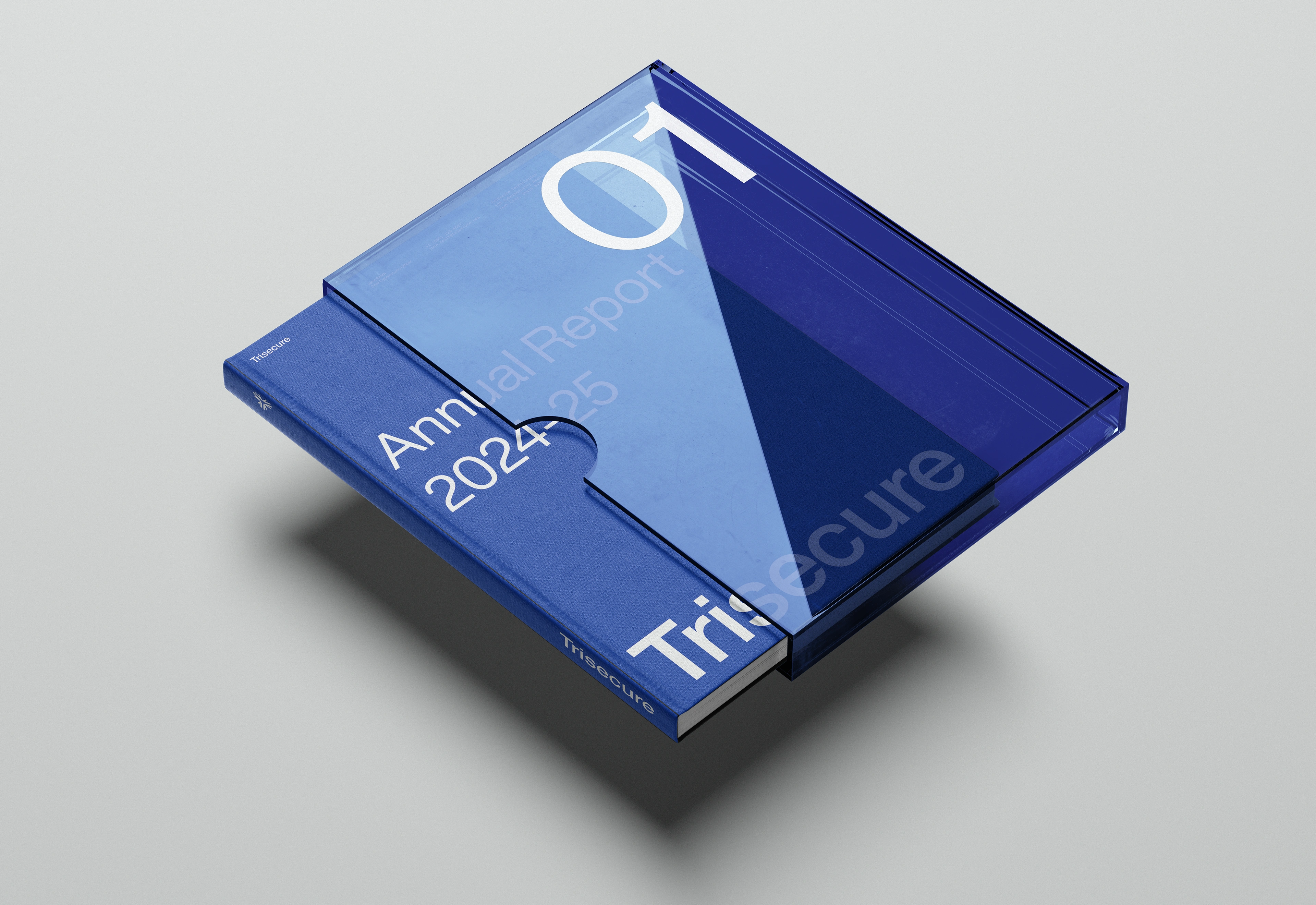
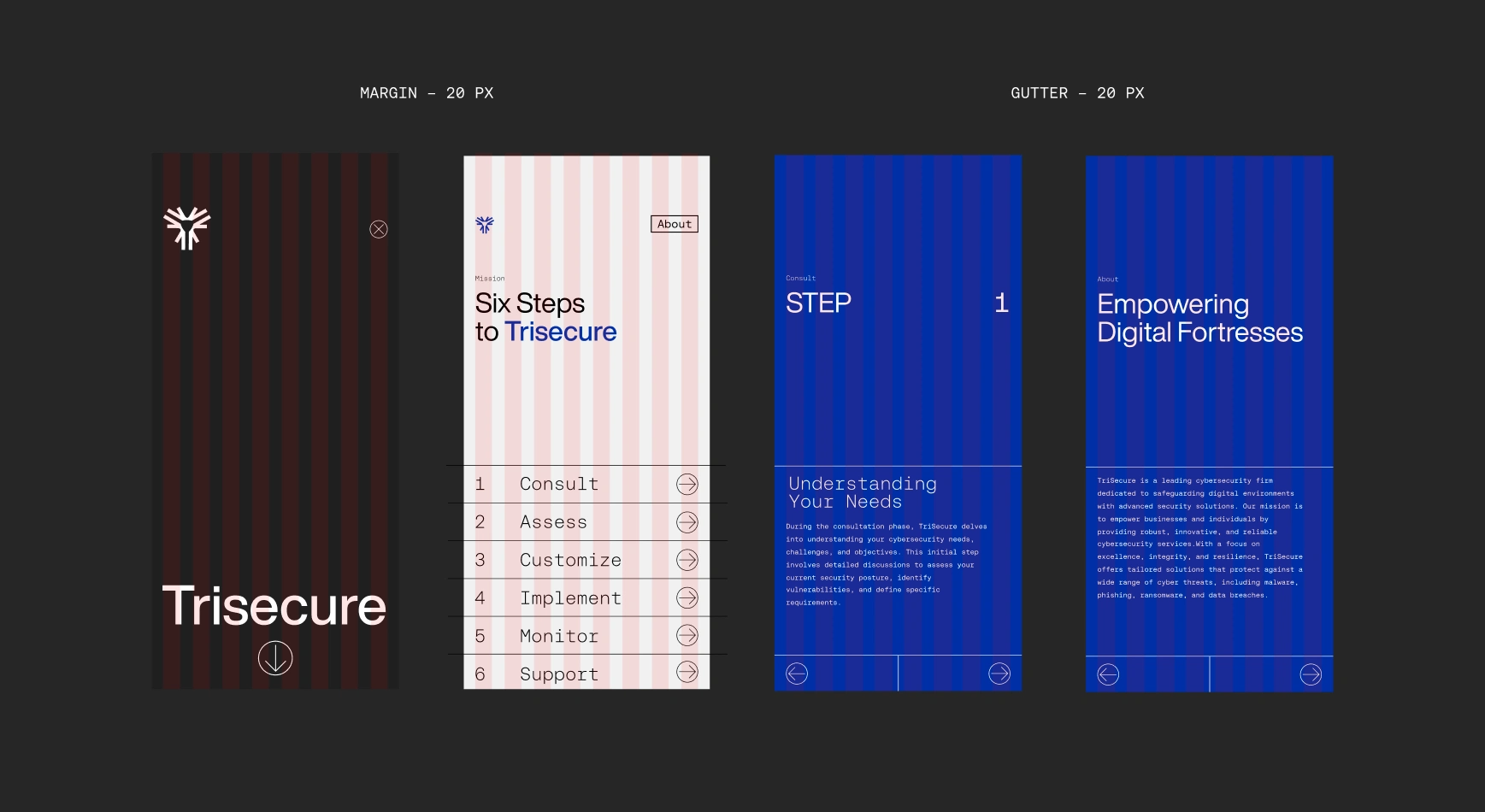
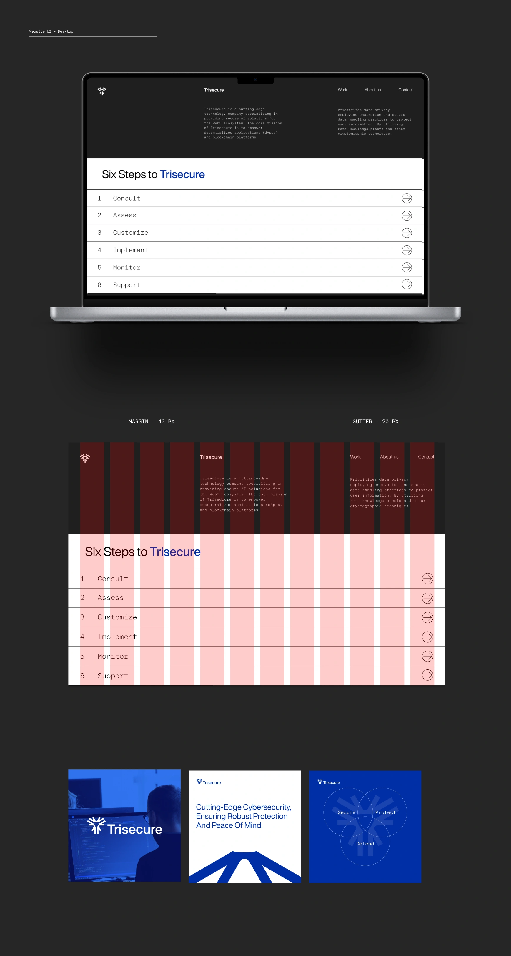
Trisecure
Security & Privacy
TriSecure is a leading cybersecurity firm committed to protecting digital environments with advanced solutions. Our mission is to innovate security measures that inspire trust and exceed expectations. We serve small to large enterprises and government agencies, offering robust cybersecurity frameworks tailored to safeguarding data integrity and privacy.
TriSecure stands for reliability, integrity, and resilience, delivering cutting-edge technology to mitigate cyber threats effectively. Our brand essence revolves around security, innovation, and trust, ensuring comprehensive protection in an ever-evolving digital landscape.
-
Project scope: Brand design & development
Brand Design & Art Direction: Harsh Bika
Motion Design: Ayush Sharma
**Brand Attributes**
**TriSecure** embodies innovation, trust, and excellence, leading the cybersecurity industry with cutting-edge technology and a commitment to safeguarding digital environments. Our integrity and professionalism build strong client relationships, ensuring transparent and reliable protection. Resilience is at the core of our solutions, designed to withstand and recover from evolving cyber threats. With a client-centric approach, we tailor our services to meet the unique needs of each client, providing personalized and effective security. TriSecure's proactive stance anticipates potential threats, delivering superior results and peace of mind.
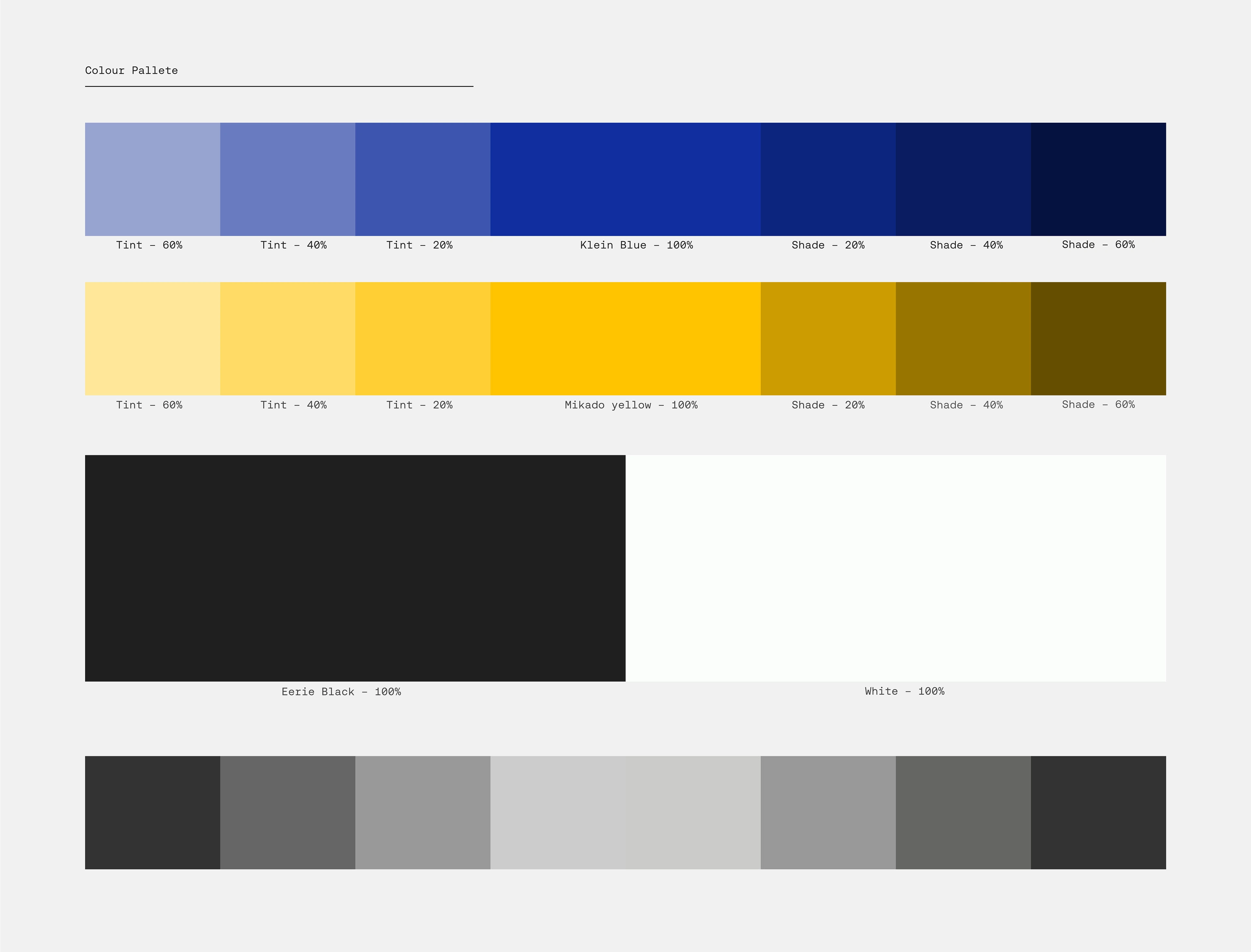
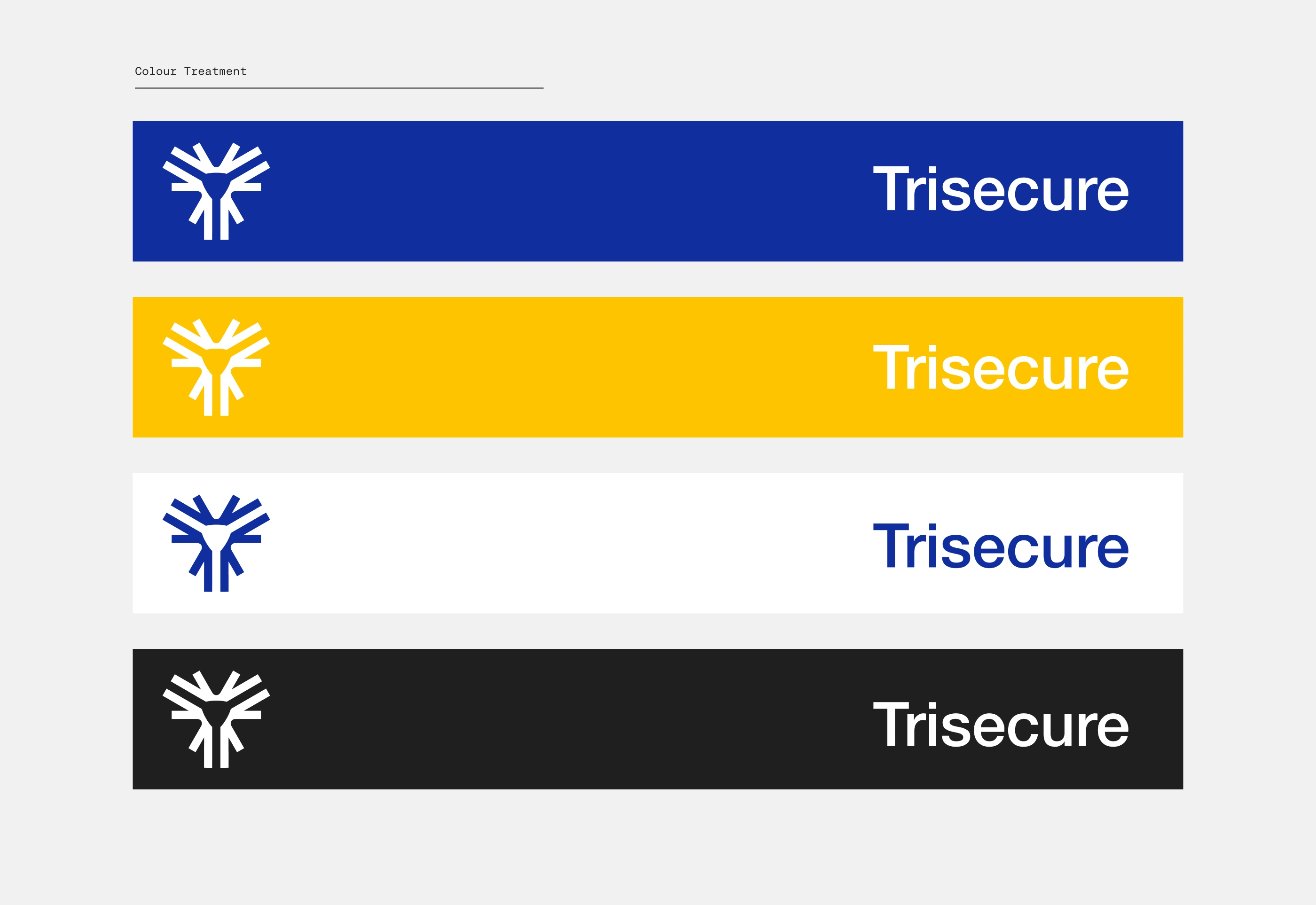
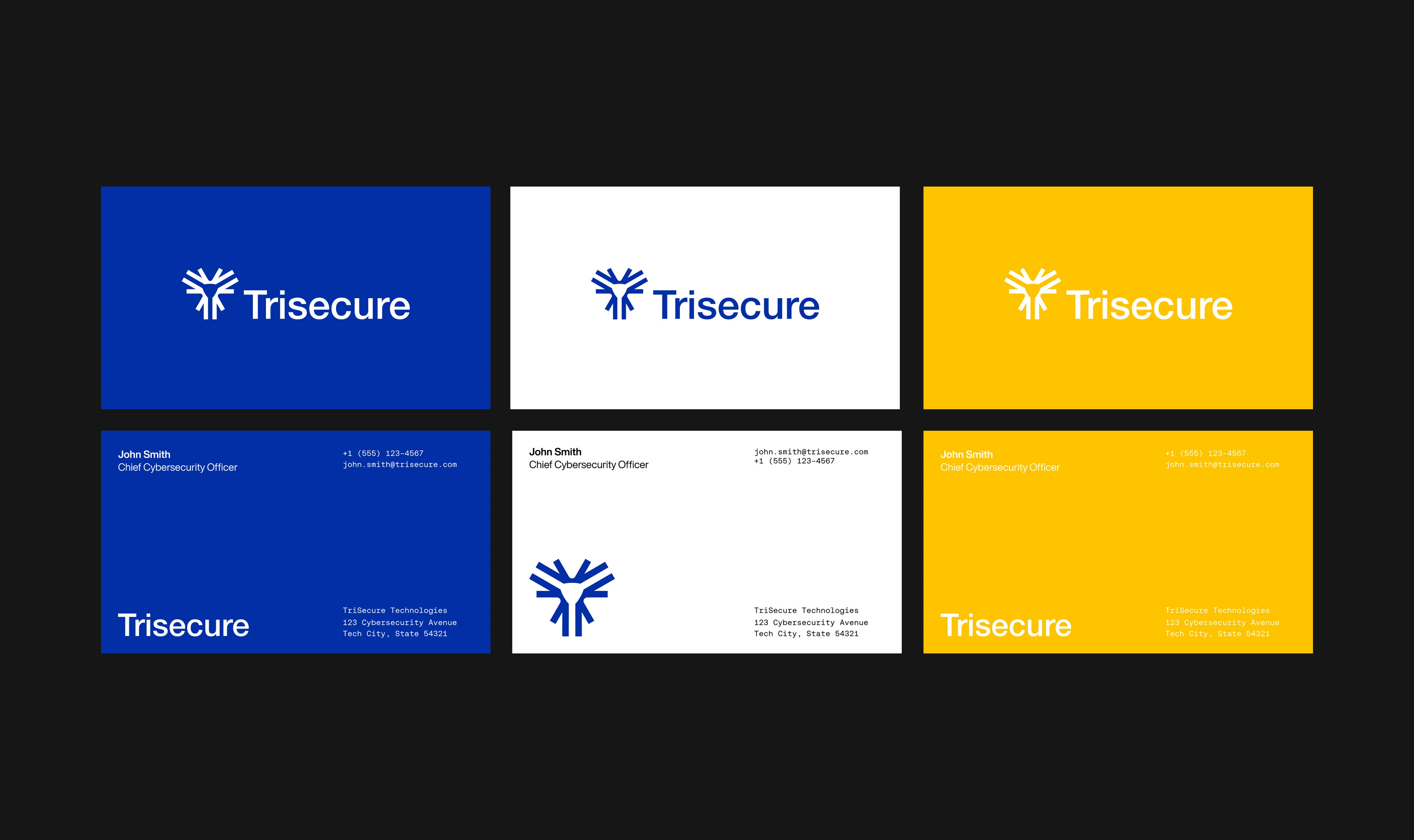
Colour Composition
TriSecure's brand identity leverages a carefully selected color scheme to embody our values of innovation, trust, and professionalism.
Klein Blue symbolizes reliability and modernity, making it ideal for our primary color.
Mikado Yellow adds energy and optimism, highlighting our innovative spirit.
Eerie Black introduces sophistication and authority, grounding the vibrant hues, while ;
White ensures clarity and balance, enhancing readability.
This dynamic combination reflects TriSecure's commitment to cutting-edge cybersecurity solutions and trustworthy service.
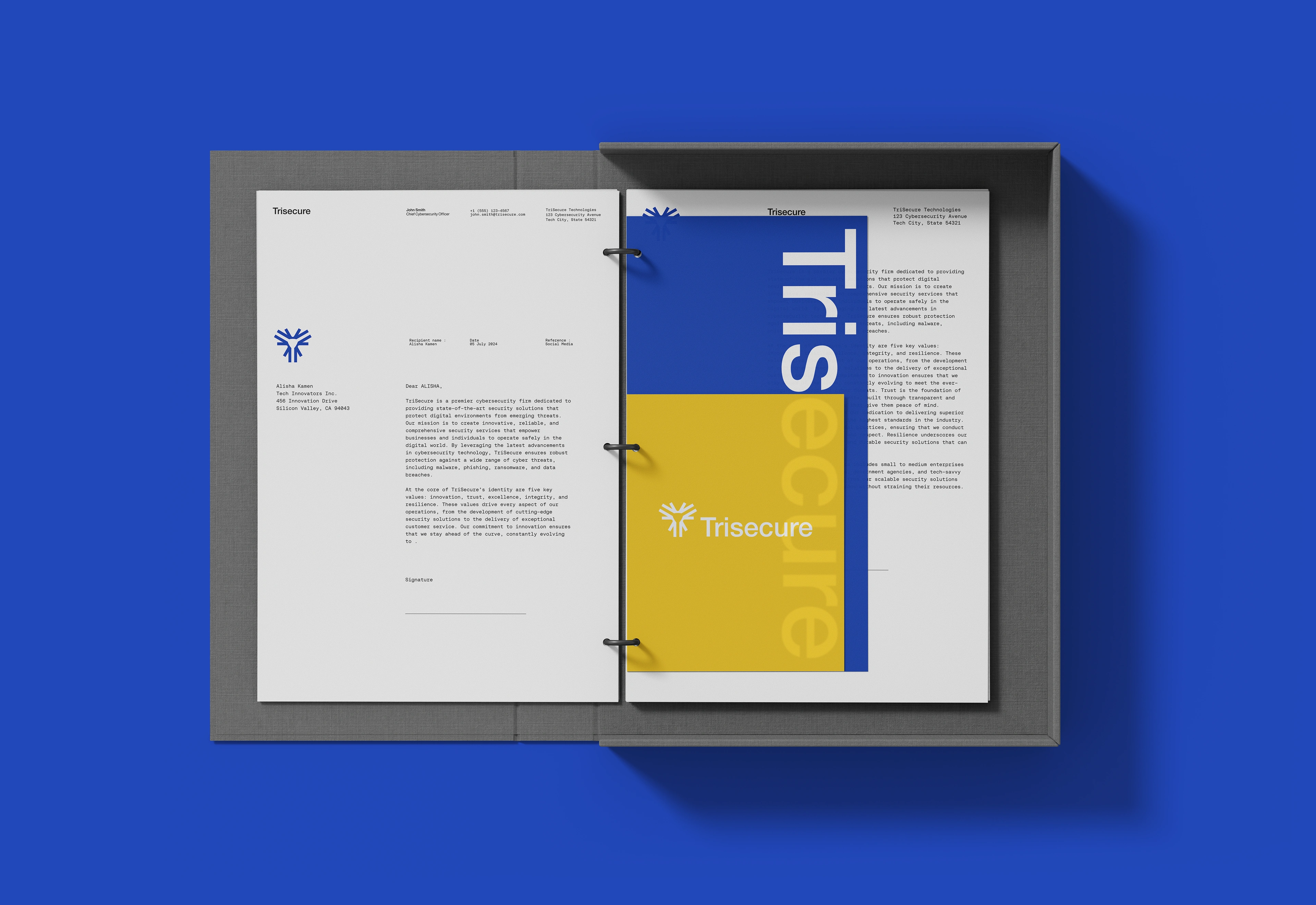
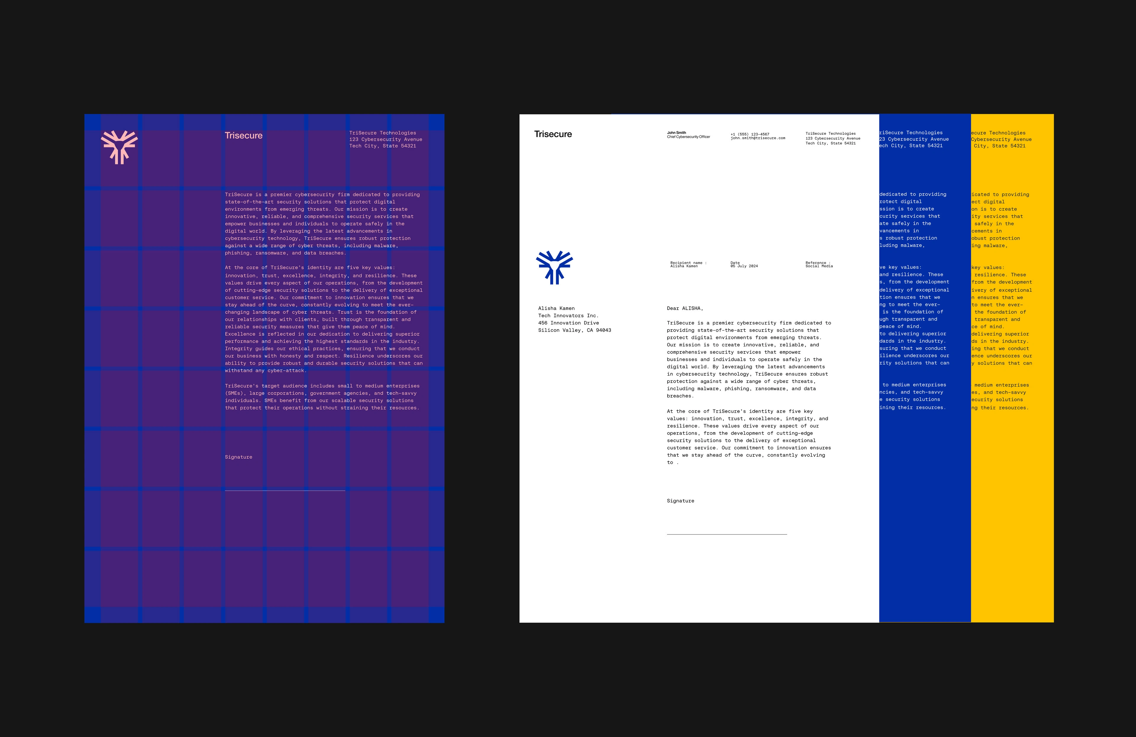
Typeface Selection
Helvetica Now Display serves as our primary typeface, offering a modern, clean, and highly readable design that aligns perfectly with our cutting-edge technology and commitment to transparency. Its timeless appeal and versatility make it an ideal choice for headings and prominent text, ensuring clarity and impact in our communications.
Aeonik Mono VF is used as the secondary typeface, providing a distinctive, tech-inspired aesthetic that enhances the futuristic and precise nature of our brand. The monospaced design of Aeonik Mono VF evokes a sense of technical accuracy and sophistication, making it apt for detailed information and supporting text. Together, these typefaces create a cohesive and visually compelling identity that reinforces TriSecure's position as a leader in the cybersecurity industry.
Like this project
Posted Aug 25, 2024
TriSecure is a leading cybersecurity firm committed to protecting digital environments with advanced solutions. To innovate security measures that inspire trust