Movie Snacks
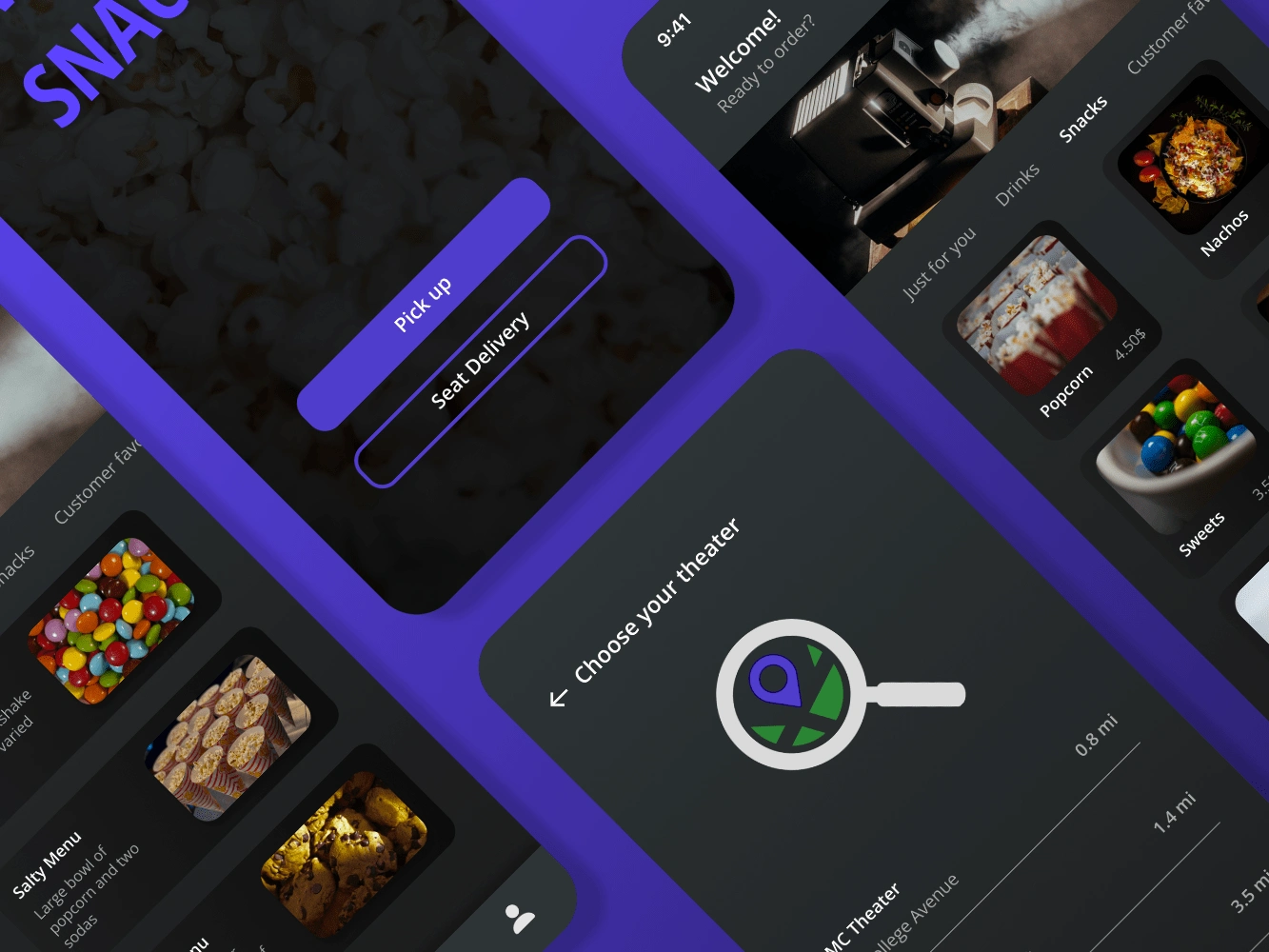
Studying the UX design professional certificate by google, I designed three case studies for my portfolio. Movie snacks is the first of them. Over the course of two weeks, I designed an app whose main purpose would be ordering snacks from the movie theater, whether you want them delivered to your seat or you wish to pre-order them and pick them up when you arrive at the cinema to avoid the line.
Project overview
The Challenge
As people grow up, they become busier, so the action of waiting to have something in order to have a good time can be frustrating. Also, in the cinema where the movie is not in your control, stepping outside to grab a snack is not pleasurable. Almost every restaurant nowadays has a delivery and a pick-up option, so why not the movie theater?
The Goal
Design a service that allows people pre-ordering their snacks to avoid lines, and at the same time provide the possibility of ordering from inside the movie theater and getting the order delivered to your seat
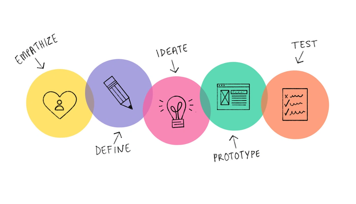
EMPHAZISE
Research
Introduction
In preparation to dive into my research, I first set some clear goals and created a research plan that would guide my research process.
Identify movie theater's target users
Identify food ordering app's target users
Understand the actual user journey
Understand the experiences people have online and on-site
Discover pain points that people encounter online and on-site
Its target audience is people who go to the cinema at least once a month and usually are too busy to wait in line for different reasons.
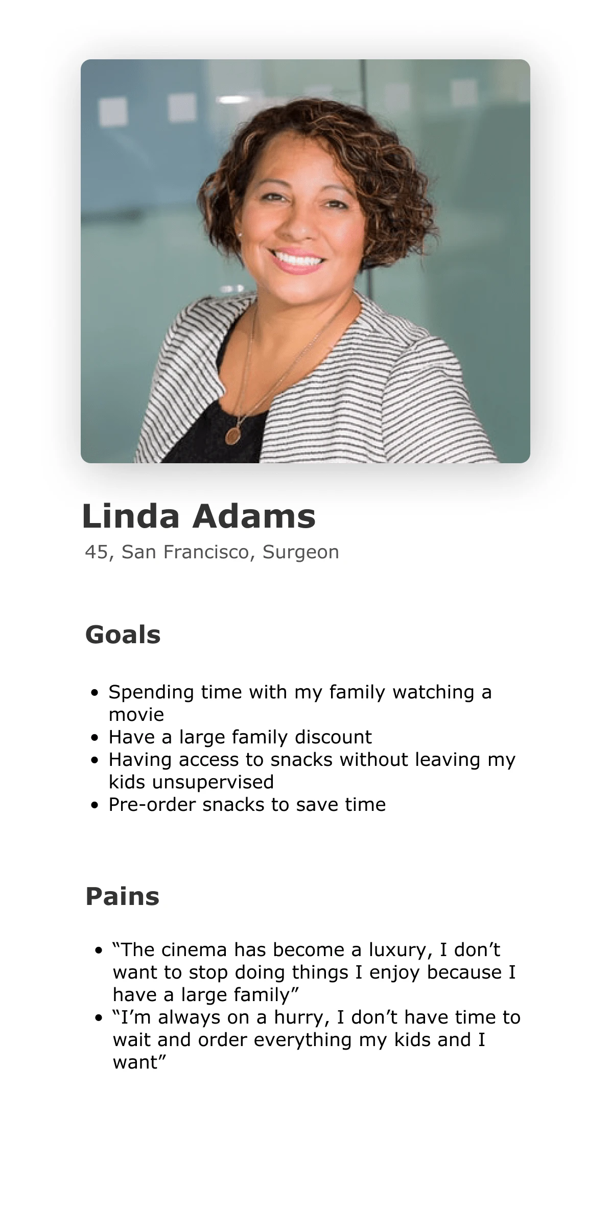
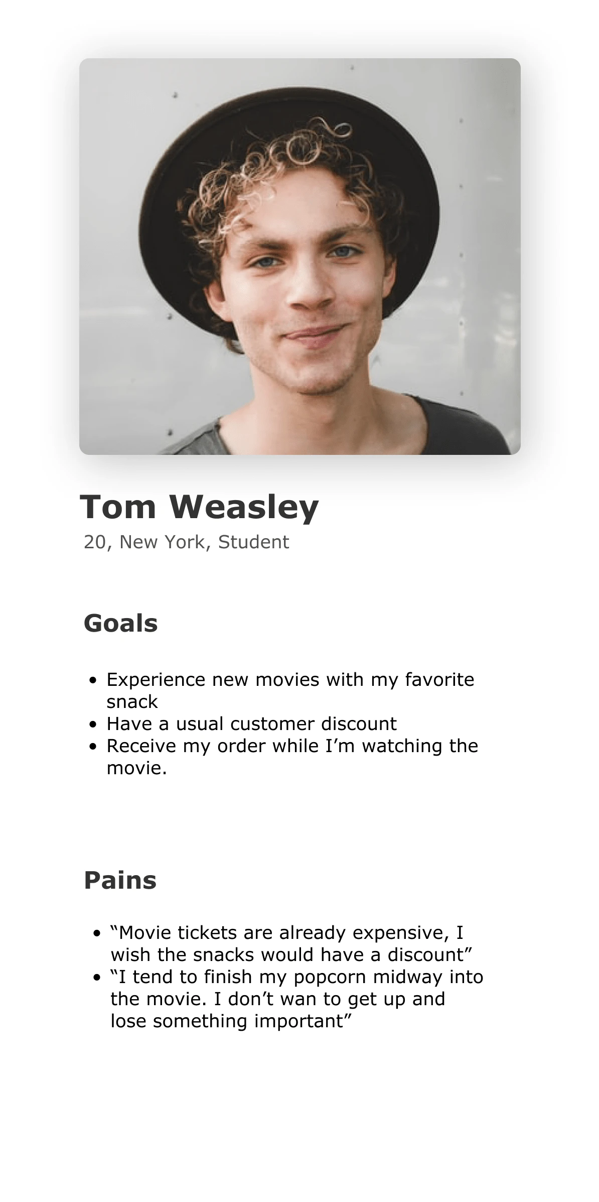
Using the qualitative and quantitative data from the secondary research I defined two provisional personas; Linda (mother and worker) and Tom (student) to better empathize with my main user groups and prioritize goals according to their needs.
Provisional user persona
User interviews
Now, it was time to validate these provisional personas through user interviews with movie theater's customers. During these interviews, I asked open-ended questions to learn as much as I could about their experiences and identify what the user’s needs truly are.
I conducted interviews with 5 people, about 15-20 minuteseach.
The questions asked were:
How much do you go to the movie theater during one year?
Do you always order snacks? Which ones?
Do you have to wait a long time in line? If you could choose another method which one would it be?
Have you ever run out of snacks during a movie? How do you approach it?
In your case, would discounts be desirable? Why?
A primary user group identified through research was families or big groups that didn’t want to wait in line. This user group confirmed the initial assumptions about movie theater clients.
Still, the research also revealed other needs that we could try to solve. People are not in control of the movie, so there should be an option for delivering the order directly to the seat. This way, the users would not lose a second of the film and will not have to leave their companion alone.
Empathy map
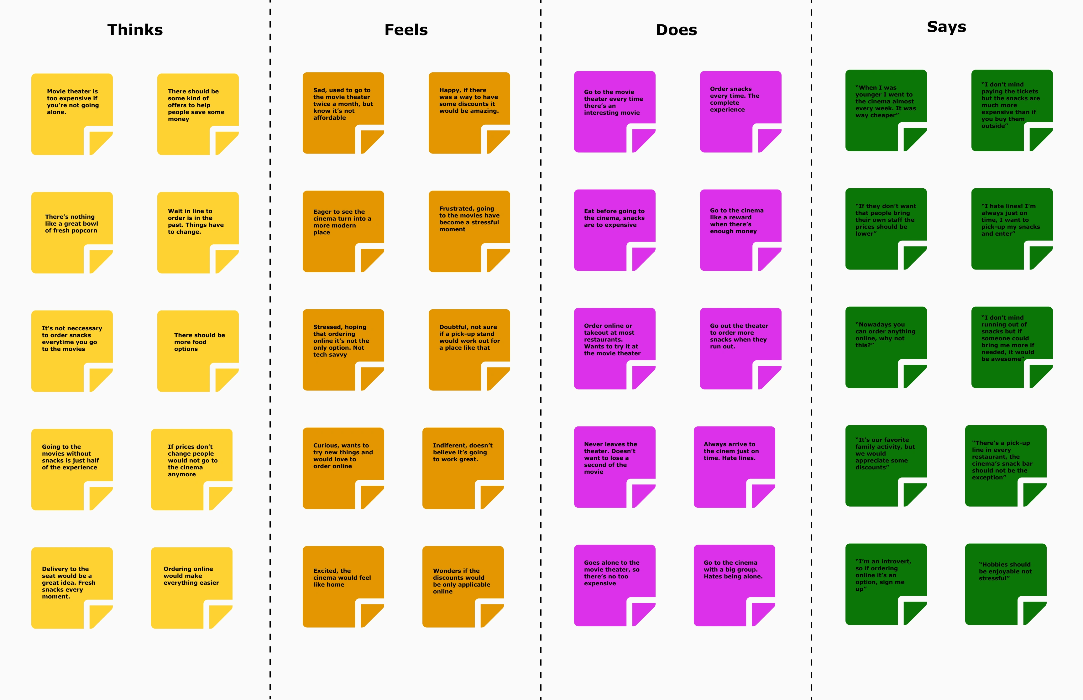
Using an empathy map, I synthesized all the information I gathered during the user interviews to uncover key insights that led to identifying movie theater's target user group.
I categorized my notes into the categories of Think, Does, Feels and Says to get an overall understanding of everything learned during my interviews with the different participants
INSIGHTS
People would like to save money.
People think online ordering would save time and avoid lines.
People want their food to be ready when they arrive.
People enjoy places that make their lives easier.
NEEDS
Need to know what kind of snacks are offered
Need to avoid waiting time and lines
Need discounts and offers to save money.
Need options that make their experience more enjoyable.
User persona
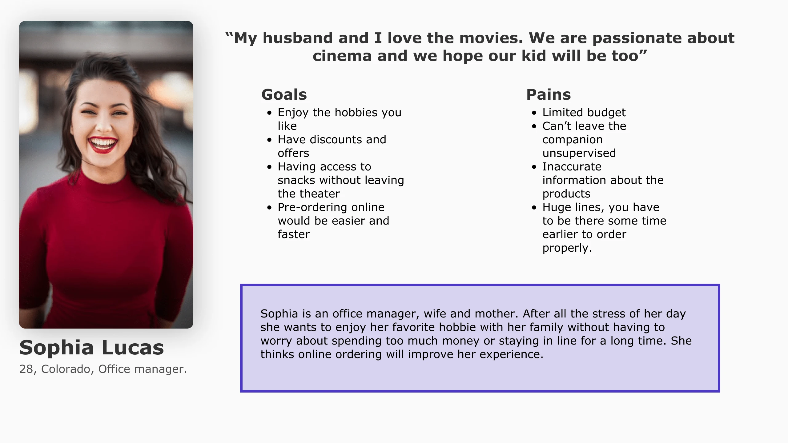
Through my secondary and primary research, I was able to get a clear picture of who movie theater's target users are and created a persona that would accurately represent them - meet Sophia! This persona continued to guide my decisions moving forward, making sure my design is centered on who our user Sophia is.
DEFINE AND IDEATE
Information arquitecture
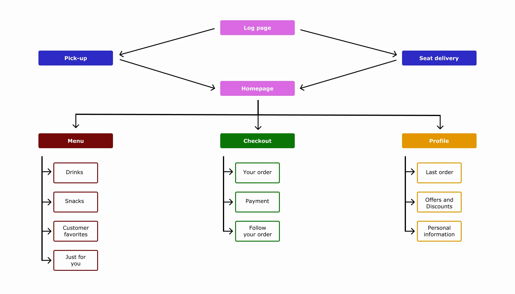
Sitemap
User flow
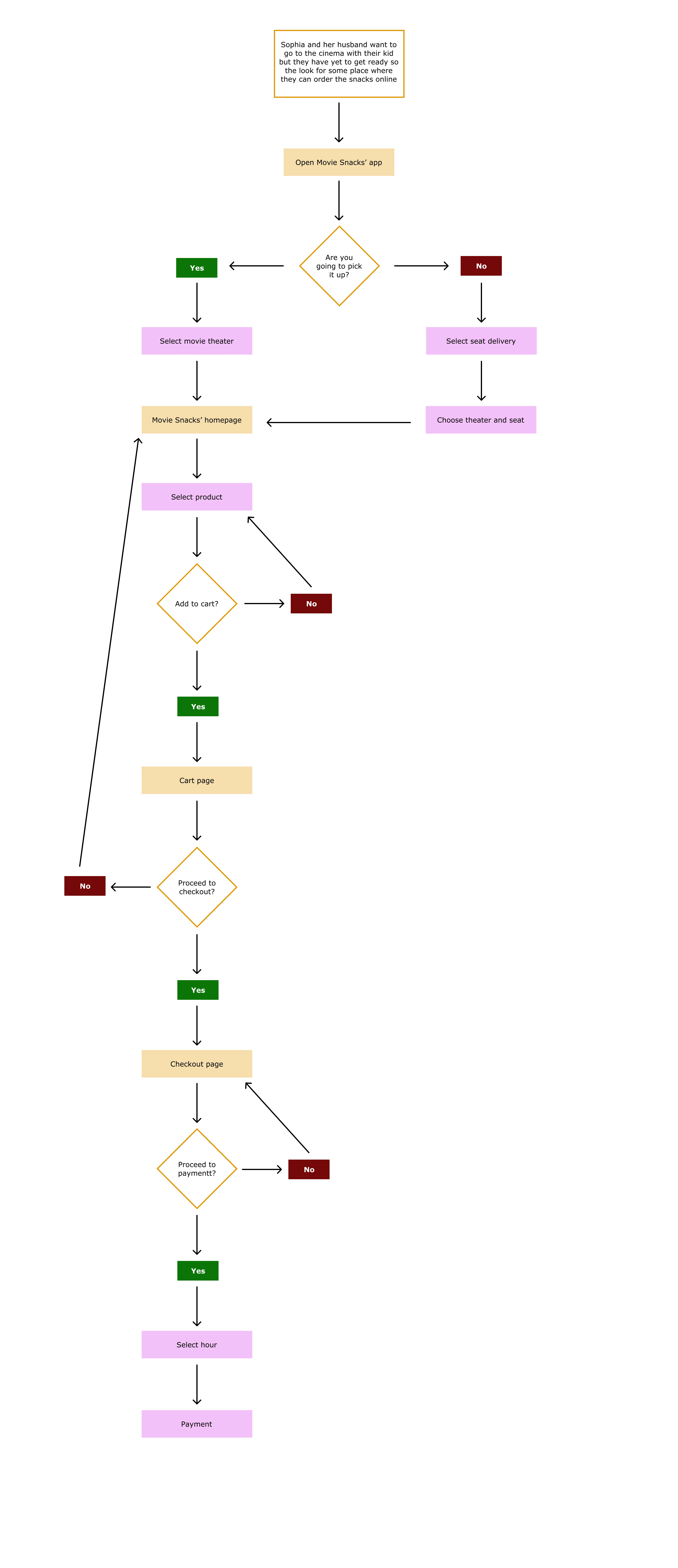
In order to empathize with Sophia, I created user flows in order to have a better understanding of her overall journey interacting with the app , taking a step into her thoughts and the different decisions she would make while trying to complete tasks in different scenarios.
Paper wireframes
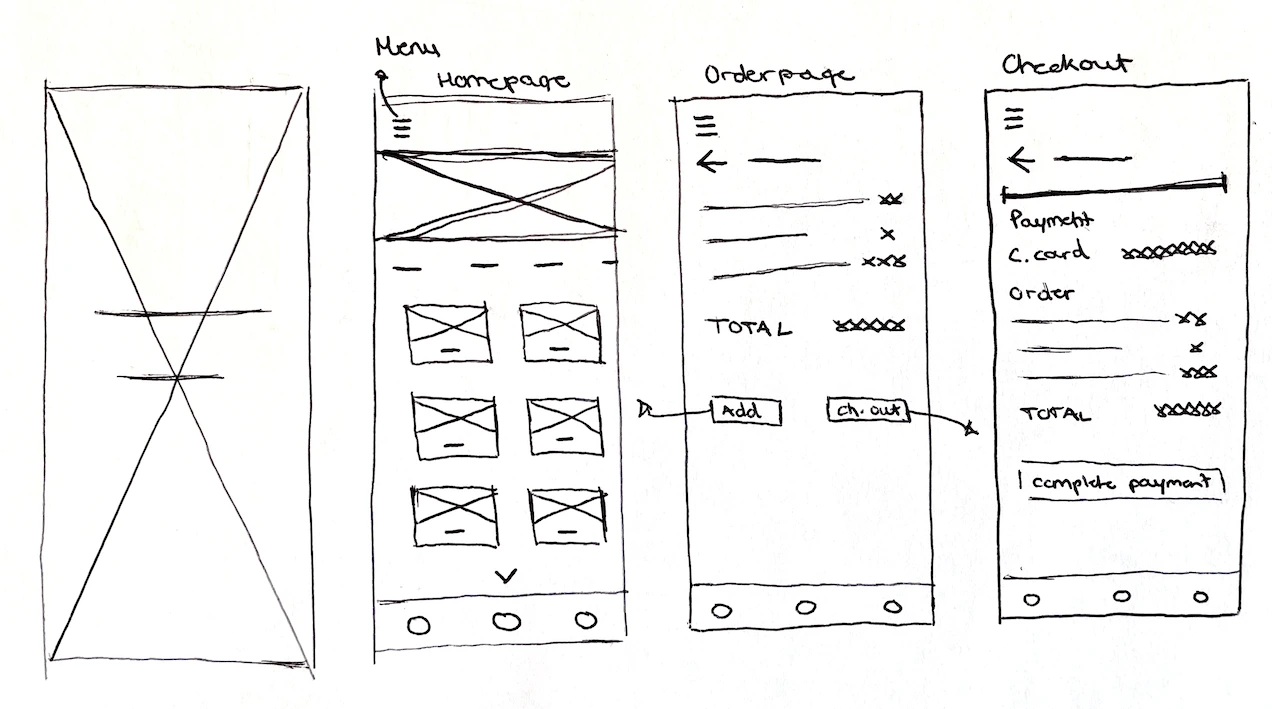
Taking what I’ve learned throughout my process to this point, I started to make decisions on how the content on Movie Snacks would be organized based on the project goals we want to meet.
PROTOTYPE AND TEST
Building a prototype
In order to make sure the design decisions I made in the lo-fi wireframes effectively help reach our project goals, I wanted to get to a point where we could test the design with real users.
Wireframes
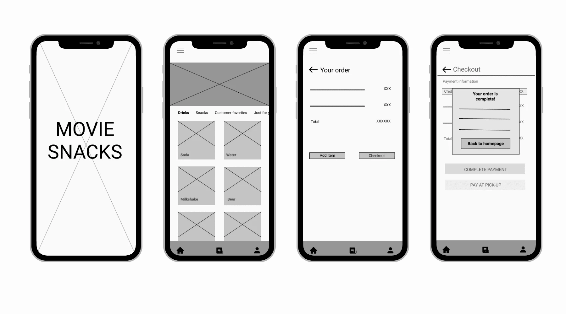
Taking the paper wireframes, I digitized them on Figma and added just enough information for users to be able to navigate through the pages and complete tasks I would present to them during usability testing. These mid-fidelity wireframes would help my focus on what needed to be improved in terms of the functionality of my design.
Usability testing
With my prototype completed, I started working on a test plan to guide the testing that would be conducted. I then recruited participants and conducted usability testing in order to see how users interact with my design and identify where improvements to the design can be made.
Test objectives
Test if users can easily complete the tasks
Observe the different paths users take to complete tasks
Assess areas of improvement to improve the usability of the design
Tasks
Order a drink, a snack and go to checkout
Order something to be delivered to your seat
Before payment you realize you forgot something, go back and add it to the cart
Select if you want to pay online or on-site
Summary
We conducted testing with 5 participants to made observations on how they interacted with the prototype and completed the tasks.
Method: Remote, moderated usability testing.
Participants: 5
Age: 18-60 years
Average Time: 5 minutes
Task Completion Rate: 100%
Error-Free Rate: 91.5%
Affinity map
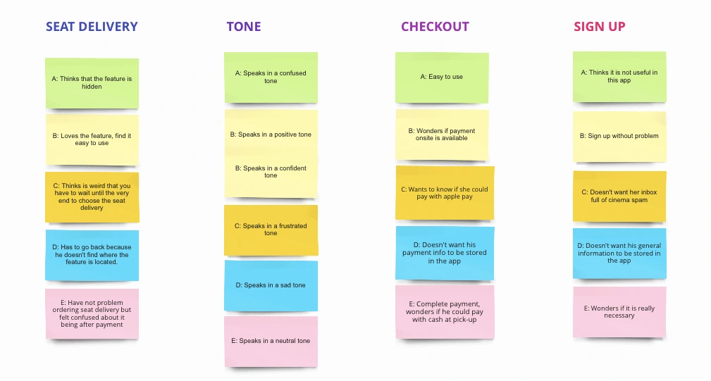
To get a better understanding of all the observations from testing, I used an affinity map to synthesize my findings. This helped me to get a better look at the different experiences users had and allowed draw connections and uncover key insights. These insights would help me identify what improvements would need to be made on our design to make sure we are helping our users painlessly meet their goals.
Pain points
3/5 users would prefer to know if they are ordering to pick-up or deliver from the beginning
4/5 users find unuseful to sign-up for this app
3/5 users felt unsure about which payment methods are accepted
4/5 users want to have access to their cart anytime
Insights
People want better differentiated options for pick-up and seat delivery when they first open the app
People want to order without signing up
People want to know the payment methods accepted and if they can only pay online
People want an option that allows them to review their order anytime
Recommendations
Choose between 'pick-up' and 'seat-delivery' prior to ordering.
Add an option that remembers your data instead of logging in.
Add both options 'pay online' and 'pay onsite' and reflect which payments are accepted
Add a cart page that's not only accessible at the time of checkout
Revisions
Having identified the specific design recommendations, I started making revisions to my design to improve the design:
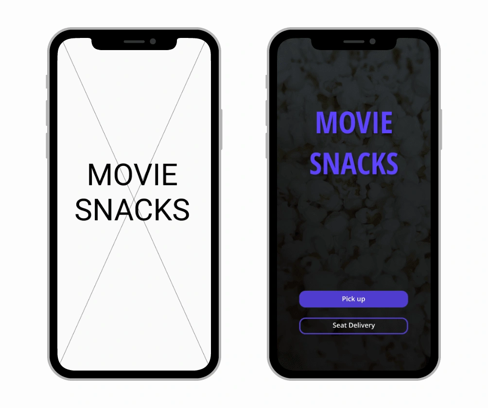
PICK UP/SEAT DELIVERY OPTION AT THE BEGINNING.
Users think it would be easier to know your options at the beginning, not when you’re already at checkout to avoid mistakes. To help this I added both options at the beginning; this way users can decide the type of order they want when they first open the app.
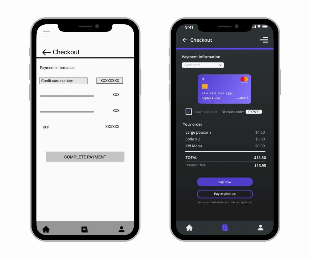
ADD PAYMENT INFORMATION ON THE CHECKOUT PAGE
Users get to the checkout without problem but once they are ready to pay, they would like to know which options they have. I decided to add two new buttons to choose between payment online or payment on-site and the payment methods accepted.
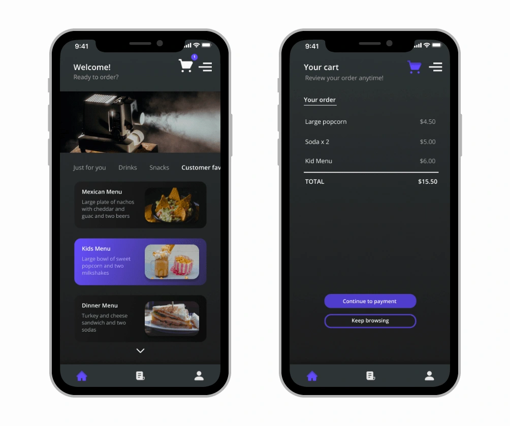
ADD A CART PAGE
Users don’t have any problems choosing the products they want and finishing the user flow but they think it would be useful to have a cart page where they could review their order anytime without having to reach the checkout page. I added a cart page at the top of the screen where they can look anytime and it would also show a new notification every time users add something.
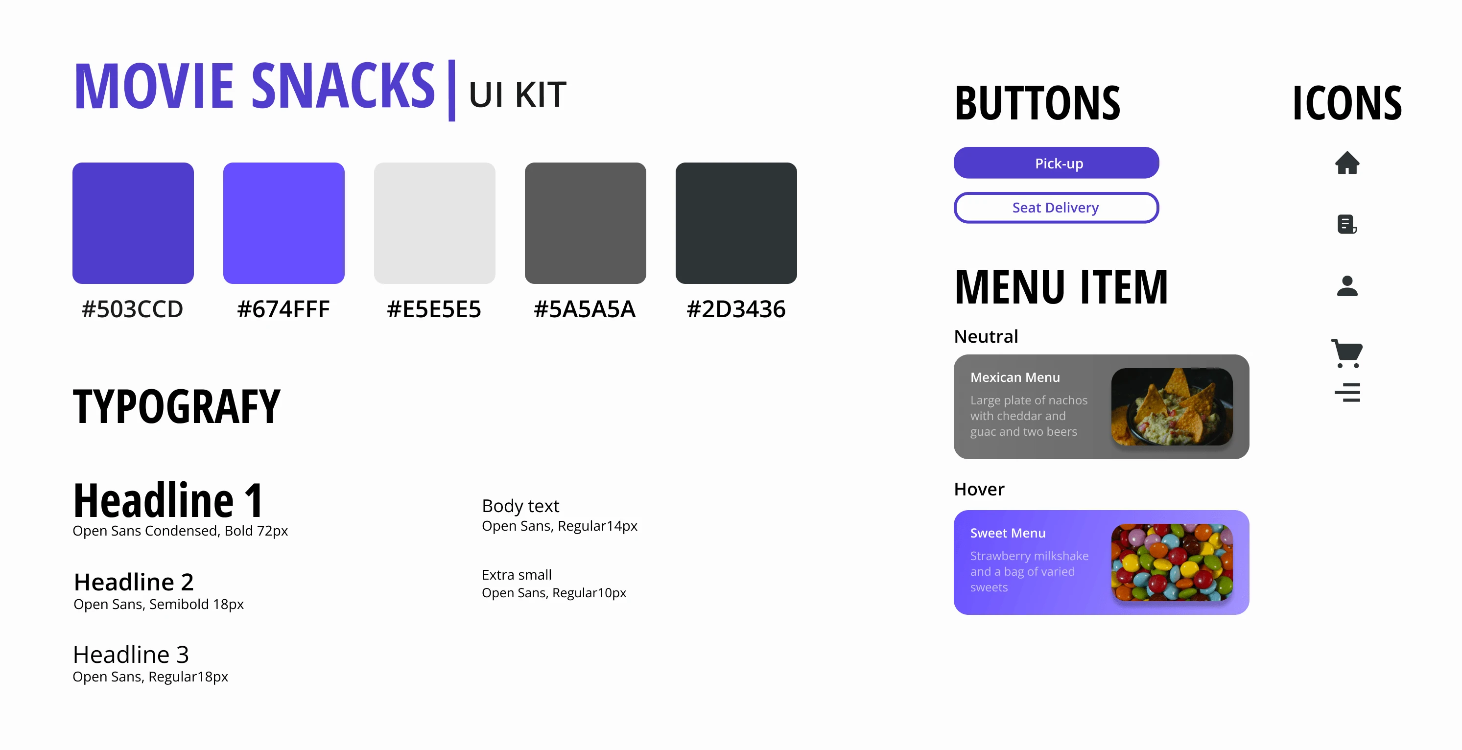
Movie Snacks' UI Kit
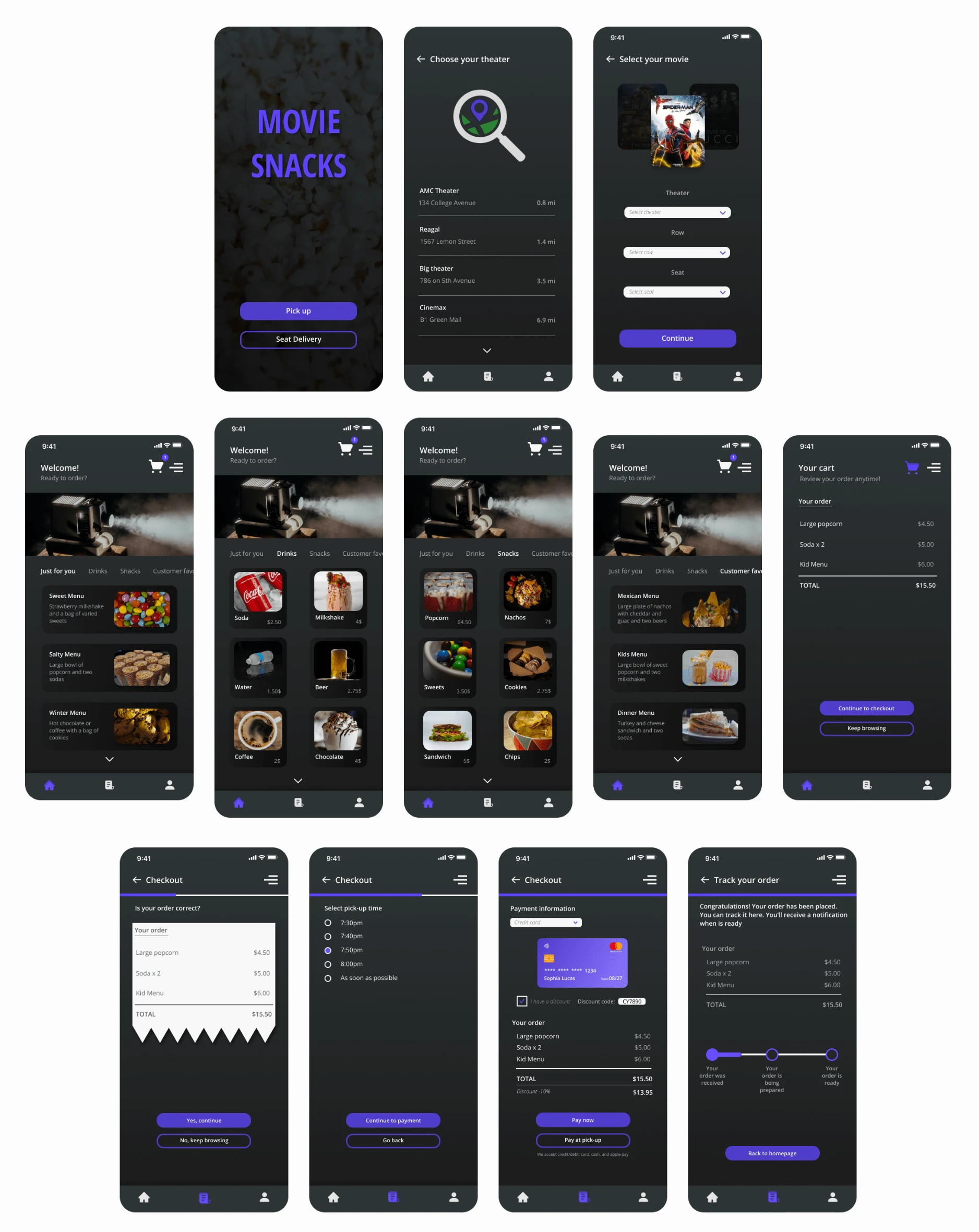
The objective of the Movie Snack’s brand was to draw attention to the products themselves. Being an app whose one of their main purposes will be ordering from inside the theater I decided to use Dark Mode.
High-fidelity wireframes
Incorporating visual elements in line with Movie Snack’s branding, I worked on the UI design of the website and created high fidelity wireframes.
Like this project
Posted Mar 24, 2022
Design of an app that allows pick-up snacks from the movie theater or seat delivery.
Likes
0
Views
678


