Airpods Max Web Redesign

Moew Studio
1 collaborator


Like this project
Posted Jul 7, 2025
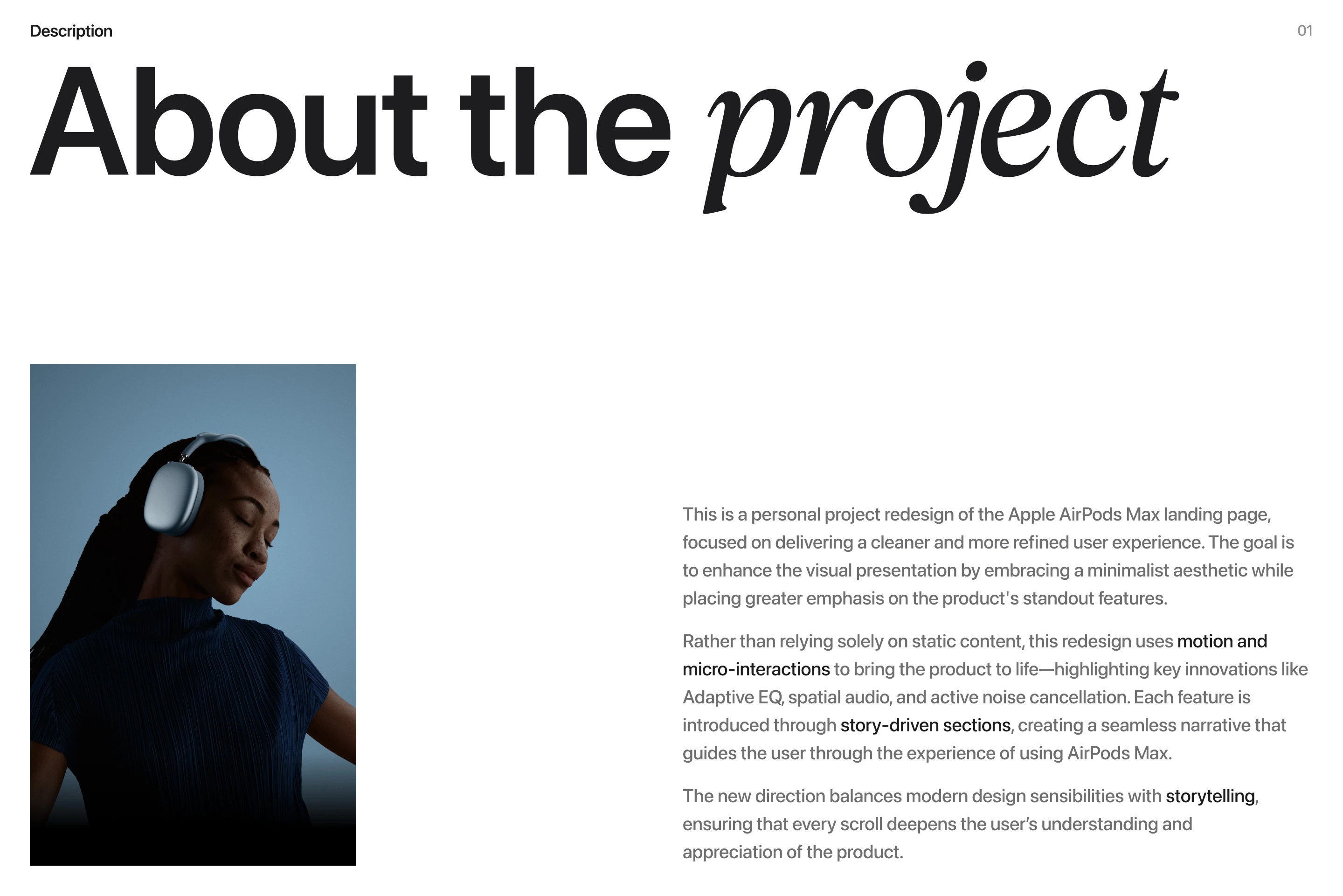
A personal project to redesign the AirPods Max landing page, combining editorial design and interactive elements to highlight the product’s key features
Likes
0
Views
13
Timeline
Sep 29, 2025 - Oct 28, 2025
Clients
Personal Project
Collaborators


Context & Challenge
The AirPods Max landing page needed a refreshed experience that could match Apple’s high-end aesthetic while offering a more interactive and editorial flow. The existing layout was minimal but lacked hierarchy and motion, resulting in limited emotional engagement from visitors.
Approach & Solution
The redesign focused on blending editorial storytelling with smooth motion and spatial rhythm—highlighting the premium quality of the product through contrast, type scale, and interaction. Each section was structured to guide users intuitively from features to experience.
Design Execution
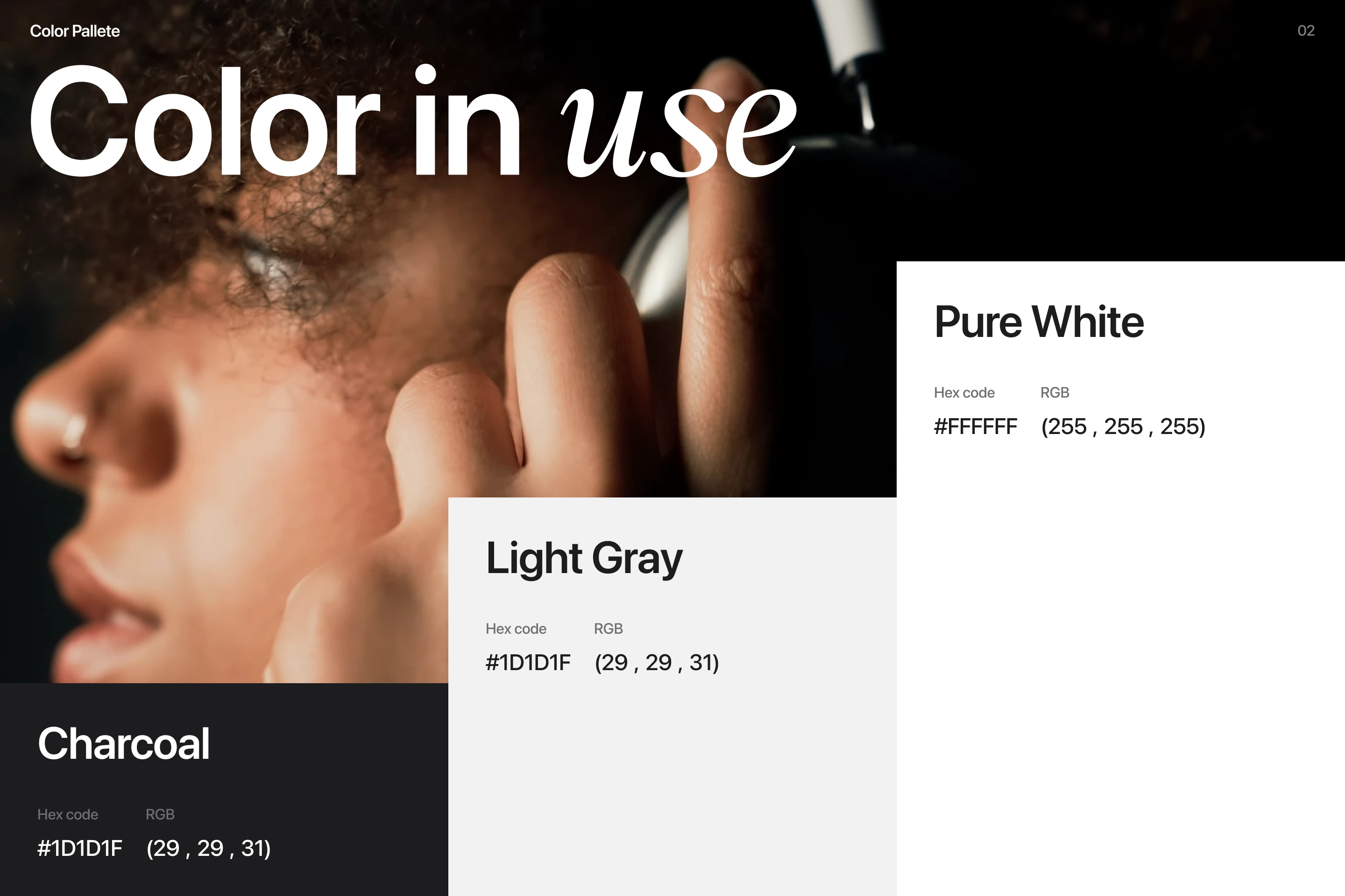
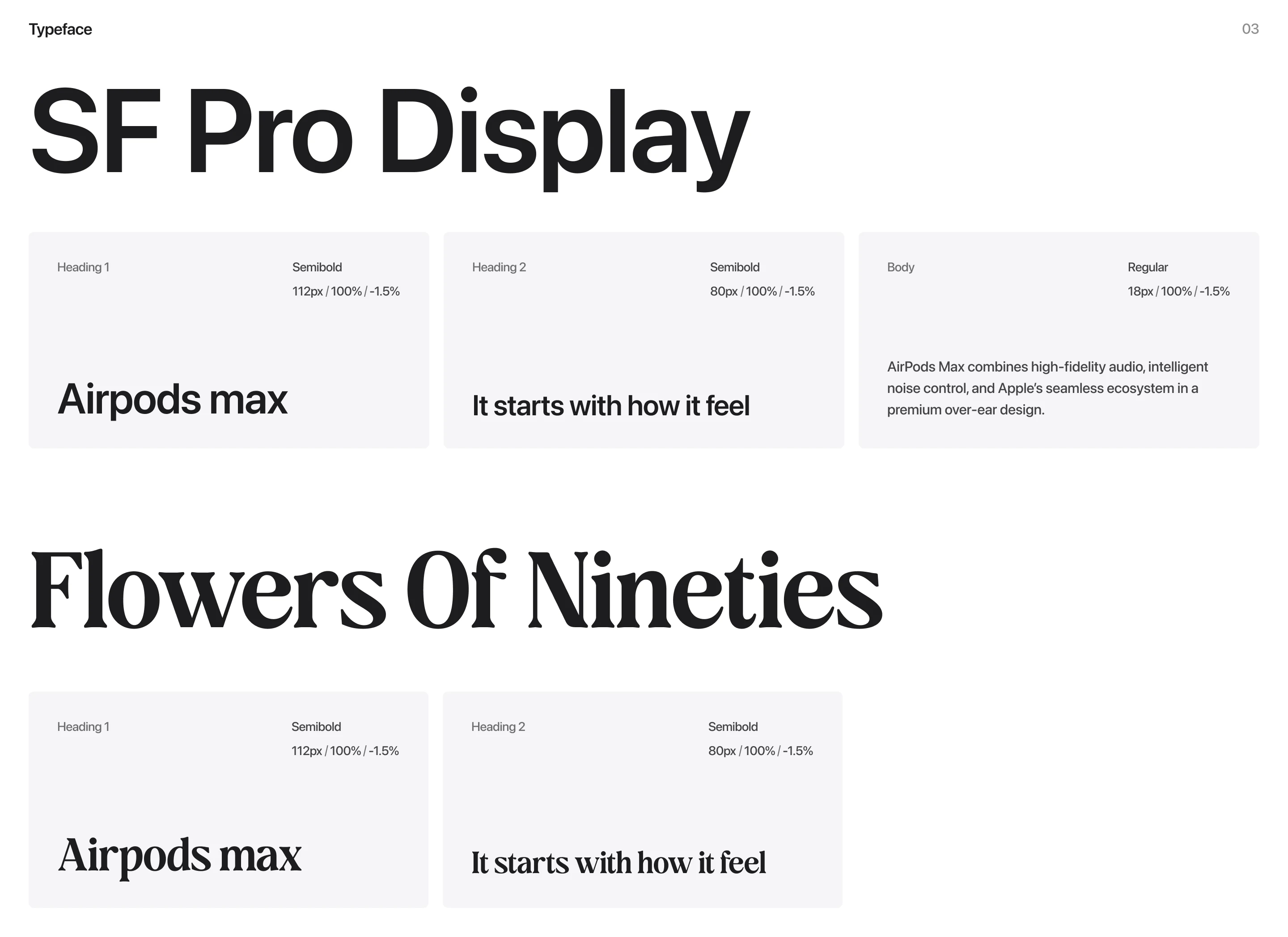
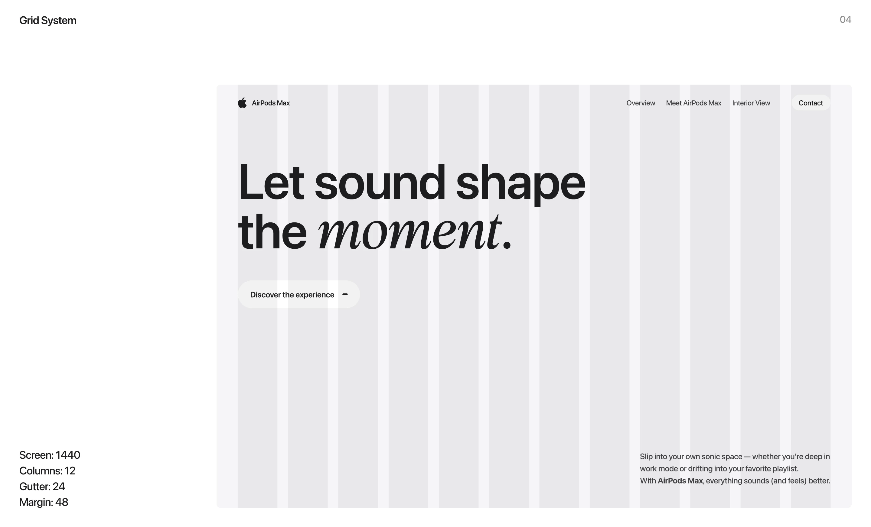
Built in Framer, the layout incorporated high-resolution imagery, typographic balance, and micro-interactions to enhance product perception. Scroll-based transitions, modular grids, and minimal color contrast helped achieve a sense of calm luxury while maintaining usability.
Outcome
The final design elevated the AirPods Max digital presence—turning a static product page into a dynamic brand experience that communicates innovation, precision, and refinement.