Label Design
Rehan Shahzad
Design by Pixelain
Lip Balm - Label Design
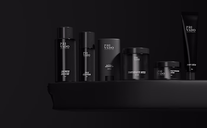
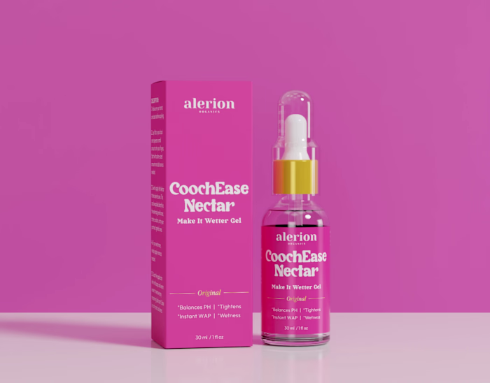
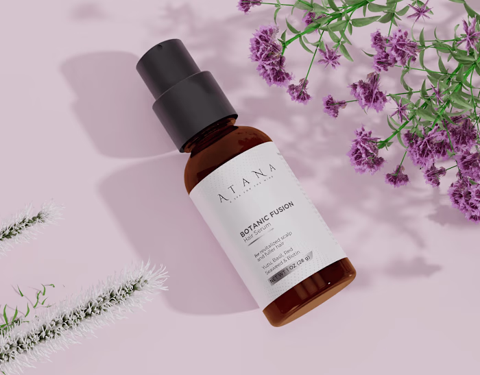
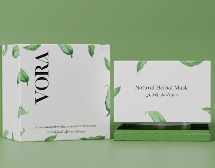
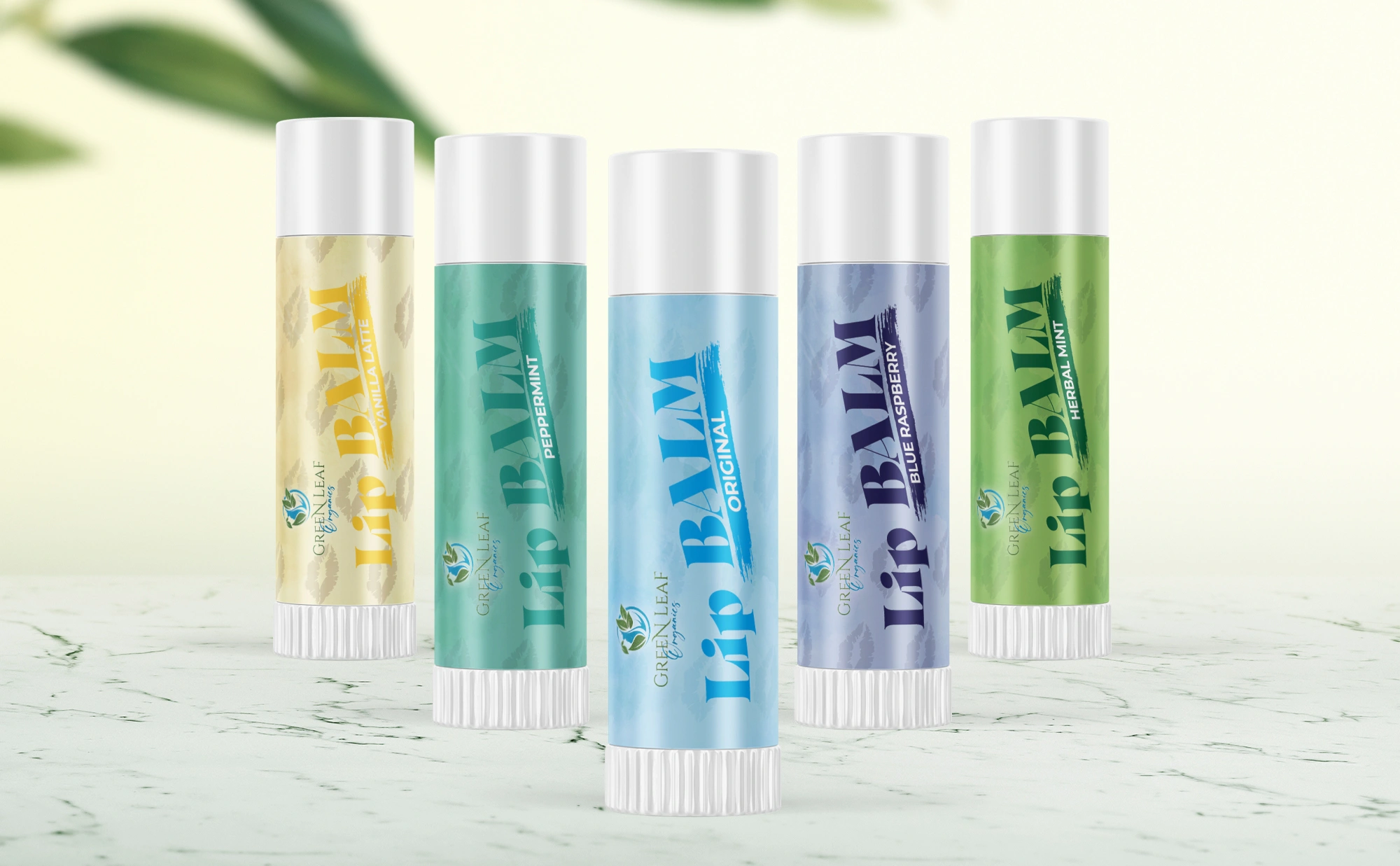
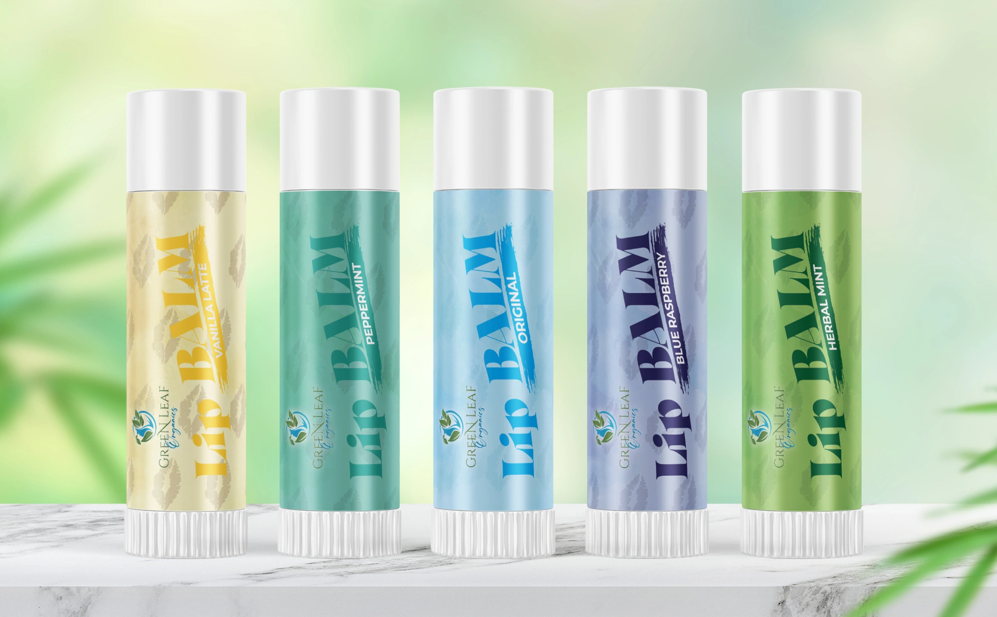
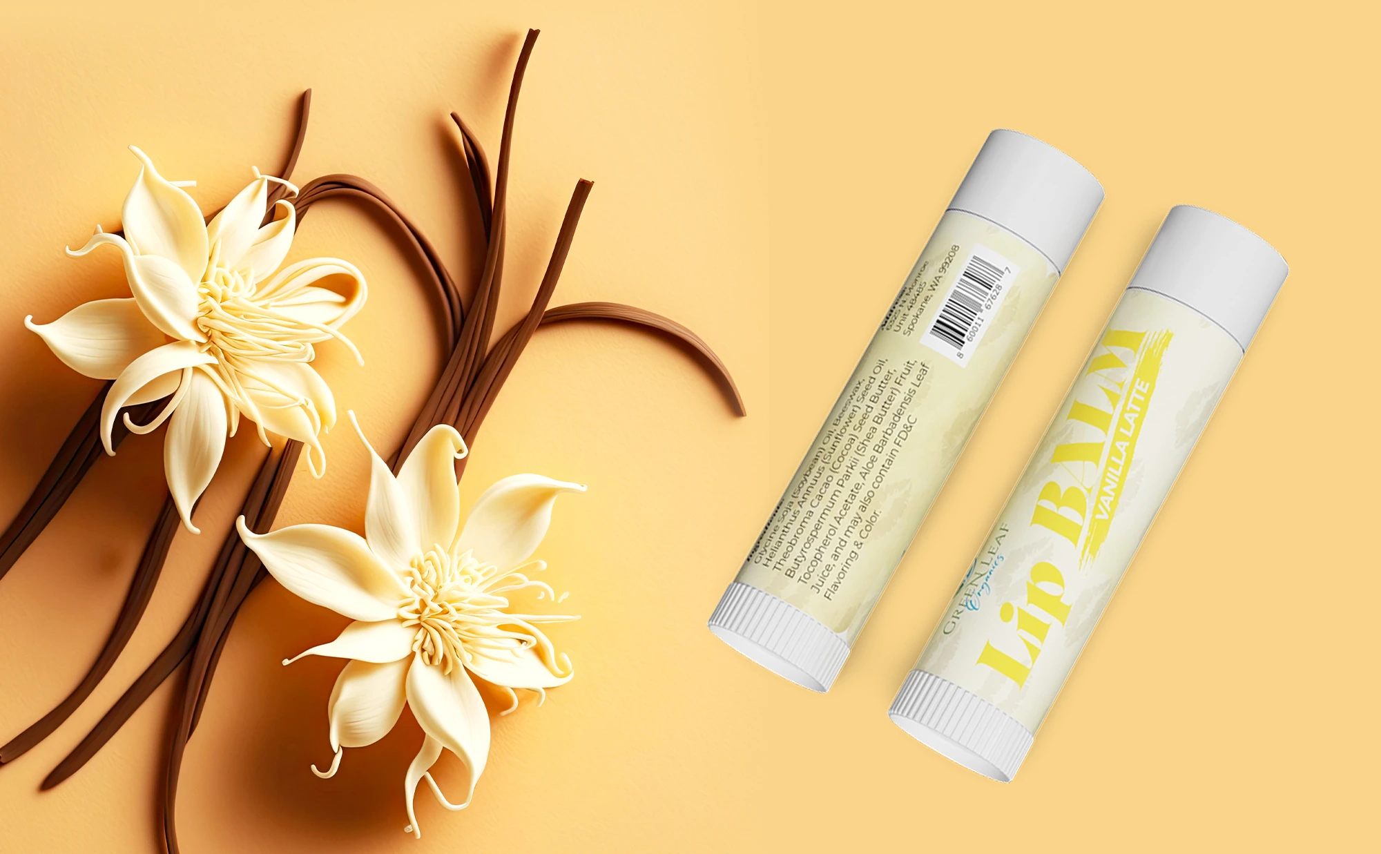
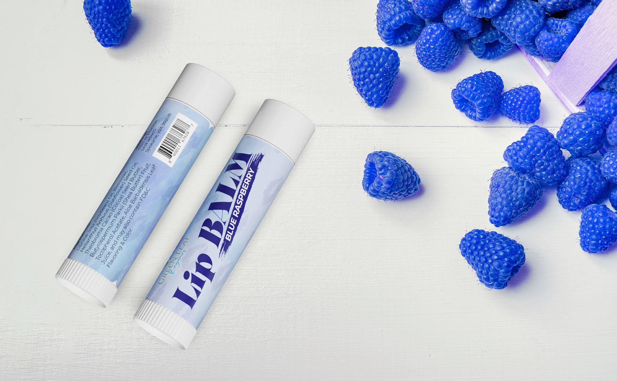
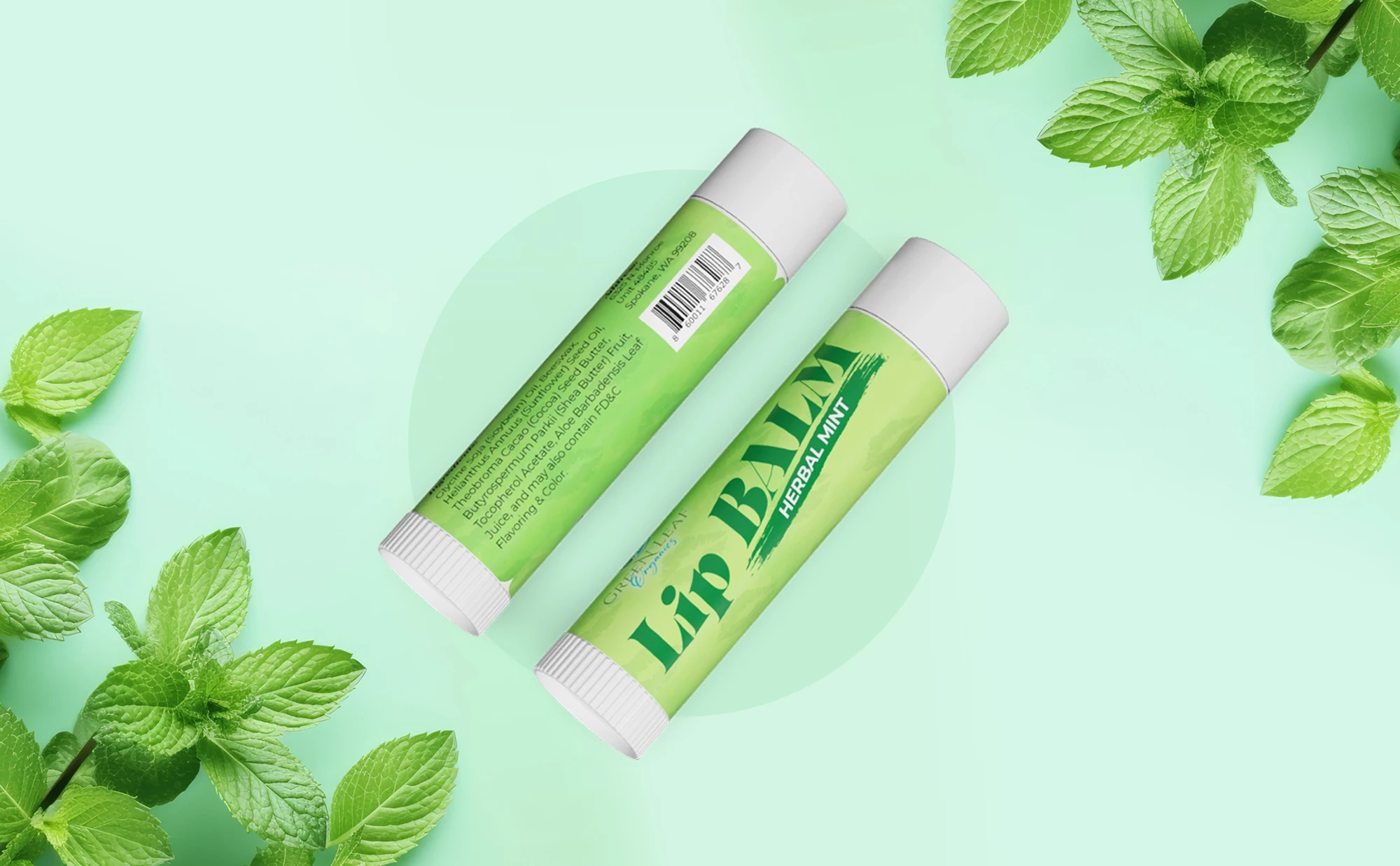
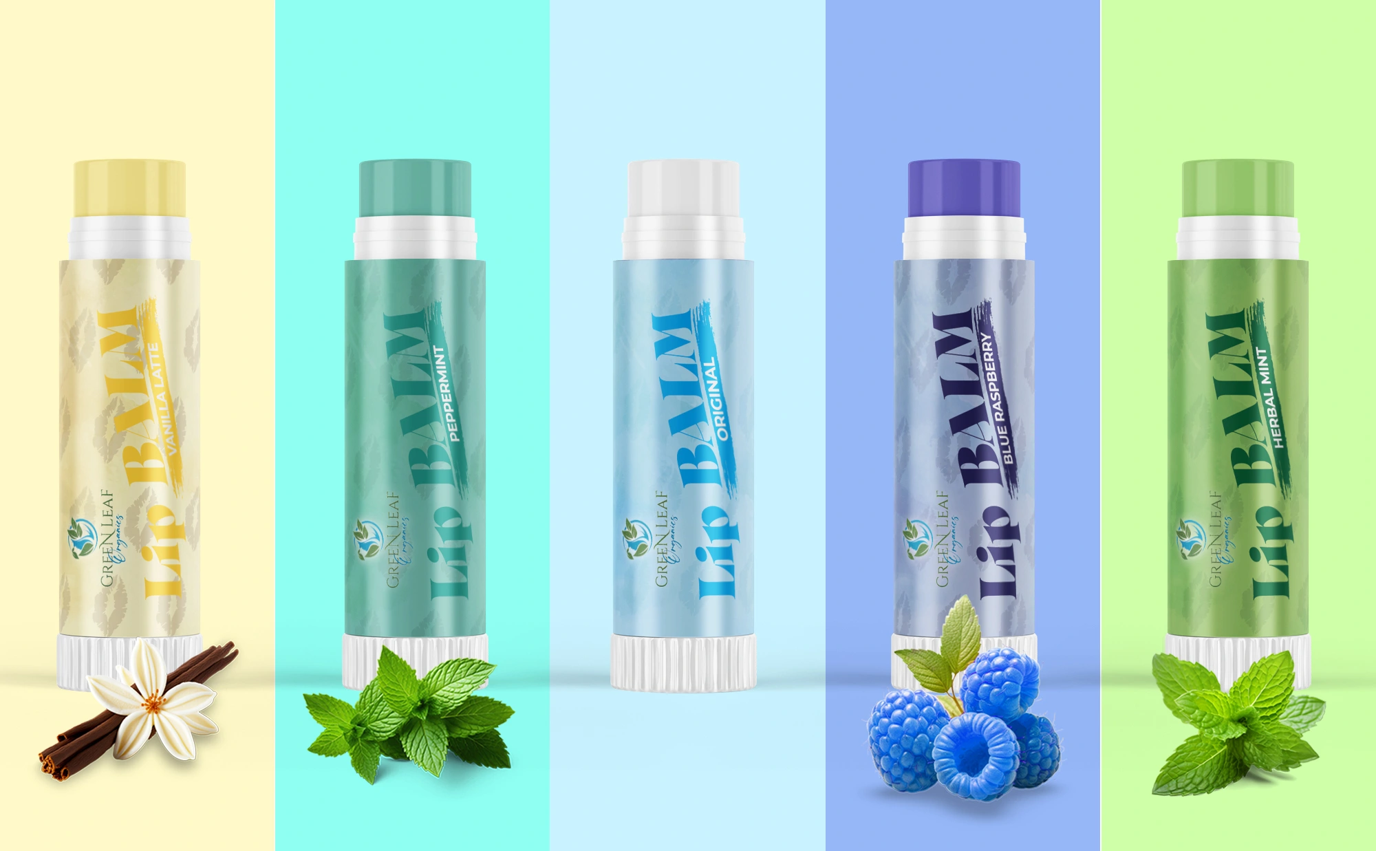
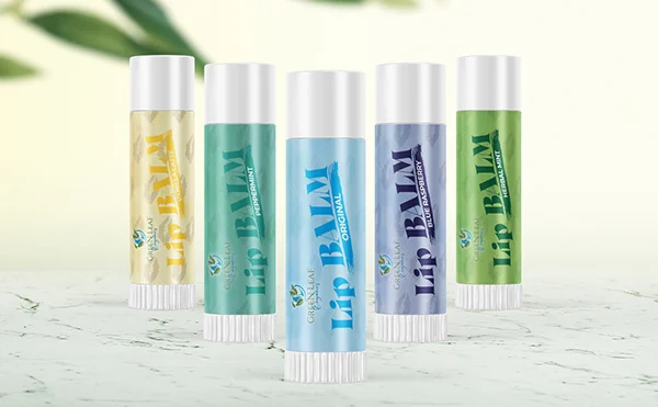
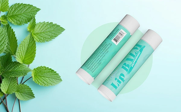
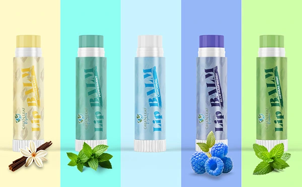
For this project, I designed a complete label system for a lip balm product line, focusing on clarity, freshness, and strong shelf appeal. The objective was to create a visually cohesive identity that clearly differentiates each flavor while maintaining consistent brand recognition.
The design used a minimal yet vibrant color palette, with each variant represented by its own distinctive tone and natural ingredient cues. Subtle textures and clean typography were applied to convey a fresh, soothing, and premium feel, aligning with the product’s herbal and natural positioning.
Special attention was given to:
Flavor differentiation through color coding
Clear hierarchy for product name, variant, and brand
Print-ready accuracy, ensuring readability and consistency across packaging
Modern, market-friendly aesthetics suitable for retail and e-commerce
The final outcome is a polished, versatile label design that enhances brand visibility, communicates product benefits instantly, and creates a cohesive product family across multiple variants.


Don’t forget to appreciate my work if you like the design
Design isn’t just what it looks like; it’s how it speaks.
If you’d like to collaborate or have any questions, feel free to reach out to me.
Let’s create something amazing together!
Like this project
Posted Jan 2, 2026
Enhanced brand visibility, communicated product benefits instantly, and created a cohesive product family across multiple variants.