Brand Strategy, Logo and Webflow Website Development for IIMH

Bernice Ebenezer
Verified


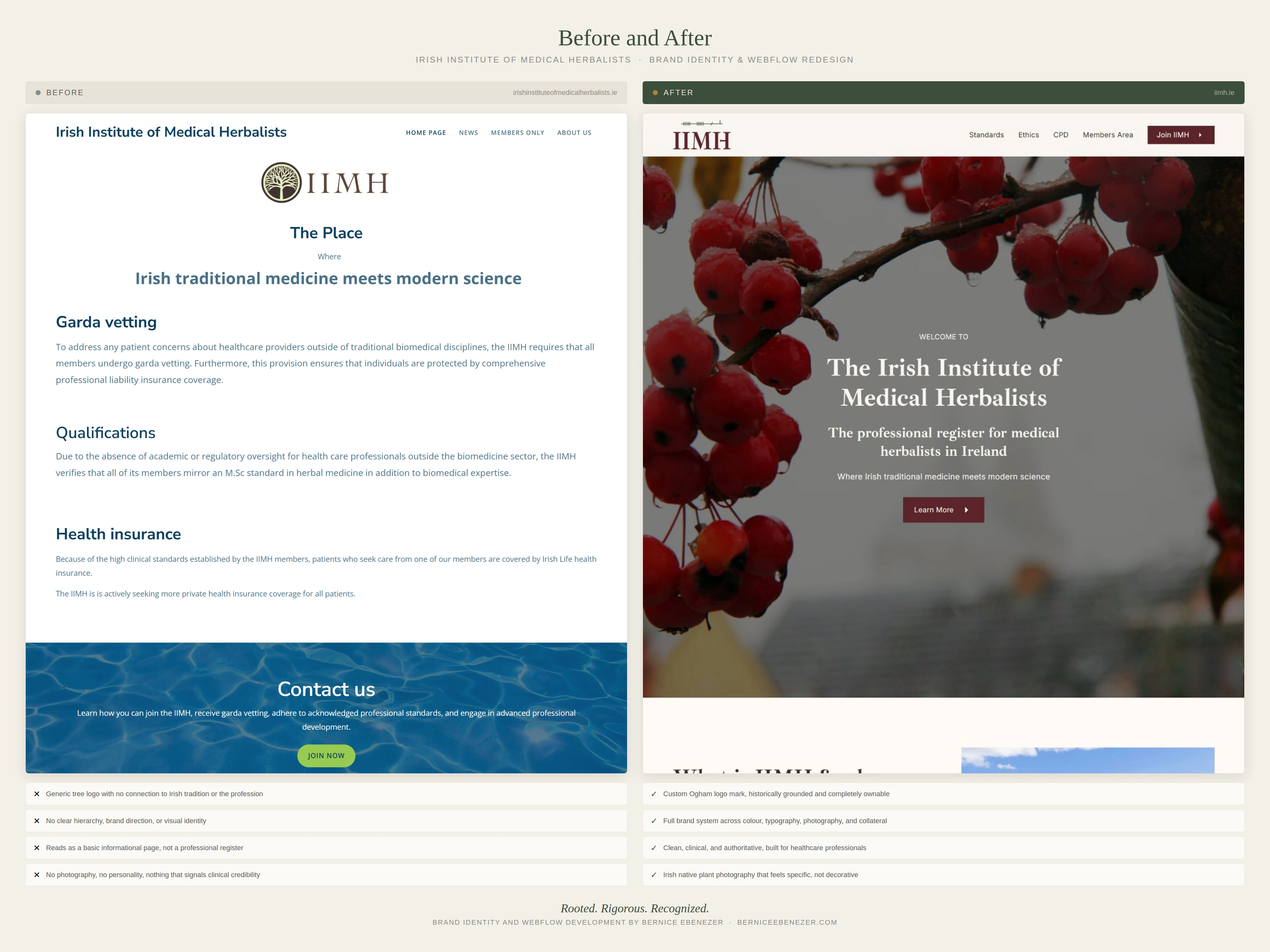
Building a Professional Register for Irish Herbal Medicine
Brand Strategy, Identity Design, and Webflow Development for the Irish Institute of Medical Herbalists
The Client
The Irish Institute of Medical Herbalists (IIMH) is the professional register for qualified medical herbalists in Ireland. Founded by Dr. Rosarie Kingston, a medical herbalist and PhD with decades of clinical practice and academic work at University College Cork, the IIMH exists to set and uphold the standards of practice, ethics, and continuing development for herbalists working in Ireland today.
This is not a wellness brand. This is an institution with clinical weight behind it, a Garda-nominated body, a formal code of ethics, and a direct pipeline from ICTIM, the Irish College of Traditional and Integrative Medicine. The challenge was making the visual identity and digital presence reflect exactly that.
The Brief
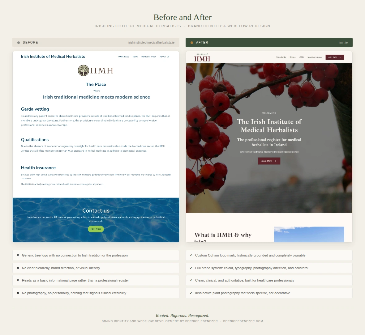
When Rosarie first came to me, the IIMH had an outdated website on a separate platform and no cohesive brand identity to speak of. The logo was disliked. The site didn't reflect the clinical standing of the institute. And there was no clear sense of who the site was speaking to or what it needed to do.
My job was to build the whole thing from the ground up. Brand strategy, creative direction, logo design, a Webflow website, and brand collateral including a letterhead and a branded Code of Ethics document.
The constraint that shaped every decision: this could not look like a herbal medicine website. No herb bundles. No wellness aesthetics. No soft greens and script fonts. The IIMH needed to look like a professional register, comparable to a medical college or a clinical accreditation body, while still carrying something genuinely, quietly Irish.
Brand Strategy
I started where I always start: strategy first, visuals second.
The key insight came from a discovery call with Rosarie and Anna-Maria Keaveney, the IIMH's co-director. They described two distinct audiences. The first is the prospective ICTIM student, typically a healthcare professional already working in medicine, who wants to know what professional life looks like after qualifying. The question they are asking is simple: if I complete this, will I be taken seriously? The second audience is existing IIMH members, qualified practitioners who need CPD resources, formal documentation, and a sense of professional community.
Those two audiences need very different things from the site, but they share one core requirement: credibility. If the site doesn't look serious, the primary visitor leaves immediately.
I built out a full primary persona, a GP in her mid-thirties completing the ICTIM Higher Diploma part-time. She is science-minded, clinically trained, and not drawn to wellness aesthetics at all. She wants facts, credentials, and clean clarity. She will read every word. She will look for signals of rigour from the first second she lands on the page.
The positioning work led to a clear Onliness Statement:
IIMH is the only professional register for medical herbalists in Ireland that combines clinical, board-level standards with a living connection to native Irish herbal tradition.
That sentence became the foundation for everything that followed.
The Big Idea:
Rooted. Rigorous. Recognized.
Creative Direction
With the strategy signed off, I moved into creative direction. The word dump covered four columns, brand character, audience, feeling, and competitors. The words that kept coming up were grounded, authoritative, quietly proud, clean, and distinctly Irish without being tourist-board.
The competitors were NIMH in the UK, a well-established but overly herby organisation, and Core College in Ireland, a sharp and commercially aggressive operation that has moved away from traditional herbalism. IIMH sits between them, more clinically serious than NIMH, more rooted in Irish tradition than Core College.
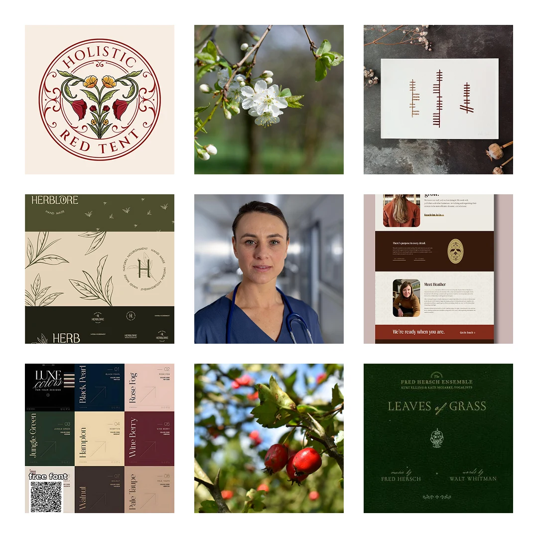
Moodboard-concept 1
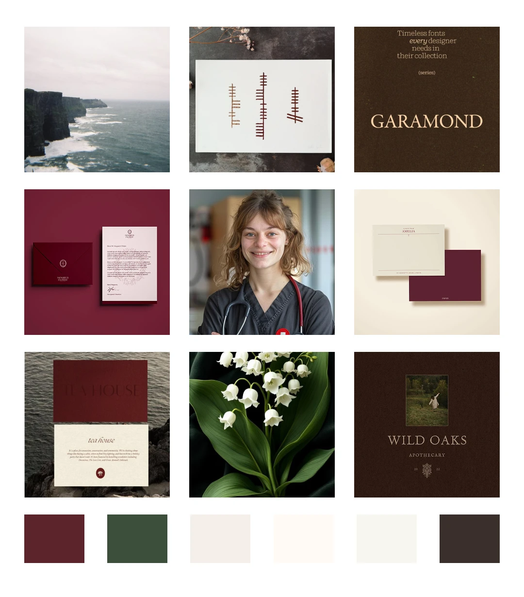
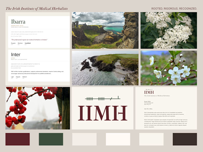
Moodboard-final
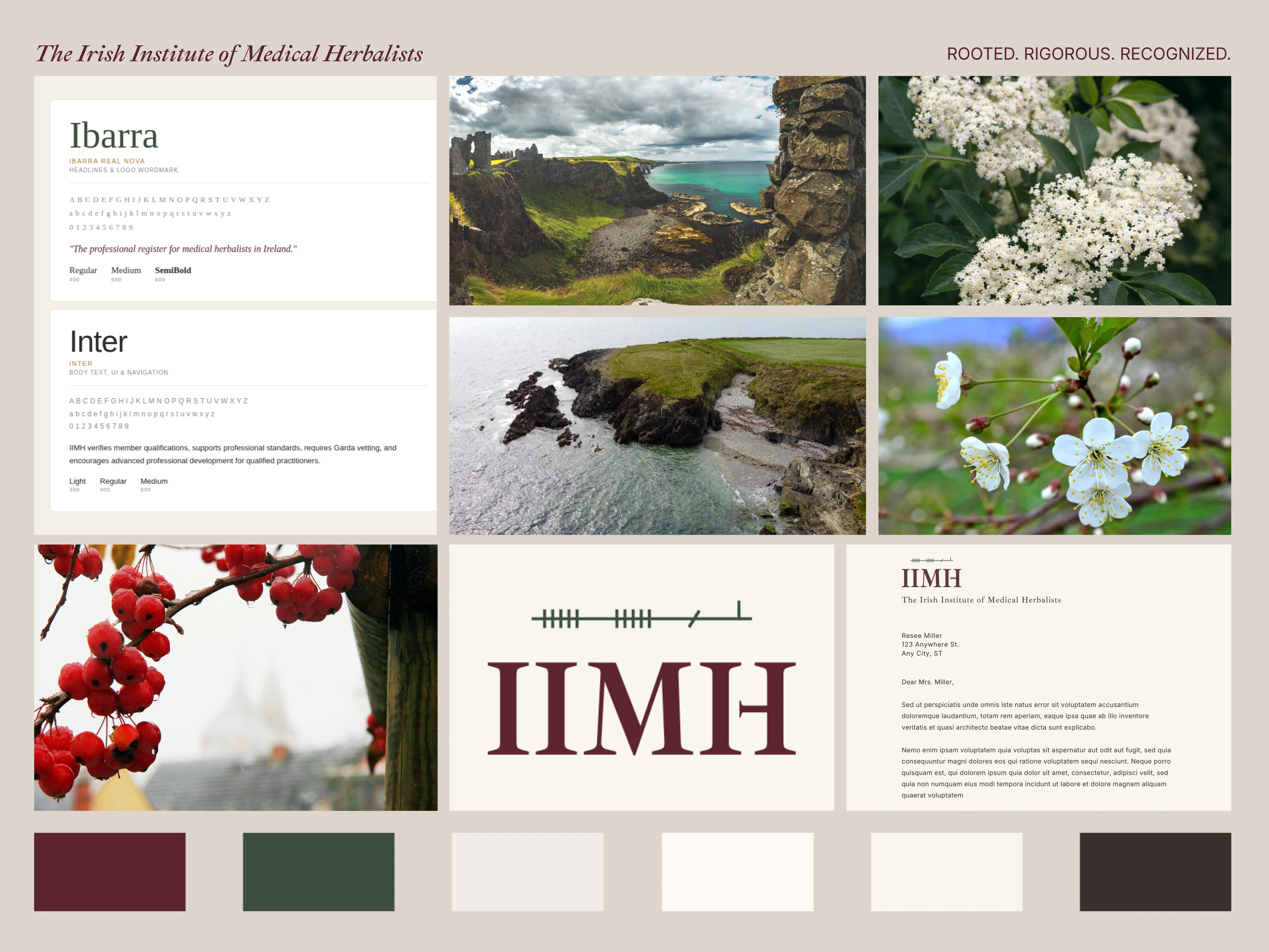
For colour, I deliberately avoided the obvious traps. No shamrock greens. No wellness earth tones. Instead I pulled from the actual Irish landscape: Hedgerow Green, a deep muted tone like a stone wall in November, Atlantic Limestone for the background, a warm off-white that reads as serious rather than clinical, Peat for body type, Amber Resin as a restrained accent pulled from old Irish manuscripts, and Hawthorn Berry, a deep dark red that became the primary brand colour.
For typography, I chose Ibarra Real Nova for headlines and the logo. It has genuine manuscript heritage, carries quiet authority, and holds up at small sizes better than the alternatives. Inter handles all body text and UI, keeping everything clean, legible, and connected to the clinical world the audience lives in.
The photography direction was equally specific. Irish native plants in close, clean natural light photography, Hawthorn, Oak, Gorse, Elder. Not styled herb bundles. Not dried botanicals on white linen. Real, named plants in real Irish light. Irish landscape used sparingly, cliffs, ancient wells, stone walls, the kind of images that say something specific rather than something general.
Logo Design
The logo went through genuine exploration before arriving at the final direction. I worked through five distinct concepts: an institutional wordmark, a Hawthorn sprig mark, an ancient well circle, an illuminated manuscript initial, and an Ogham mark.
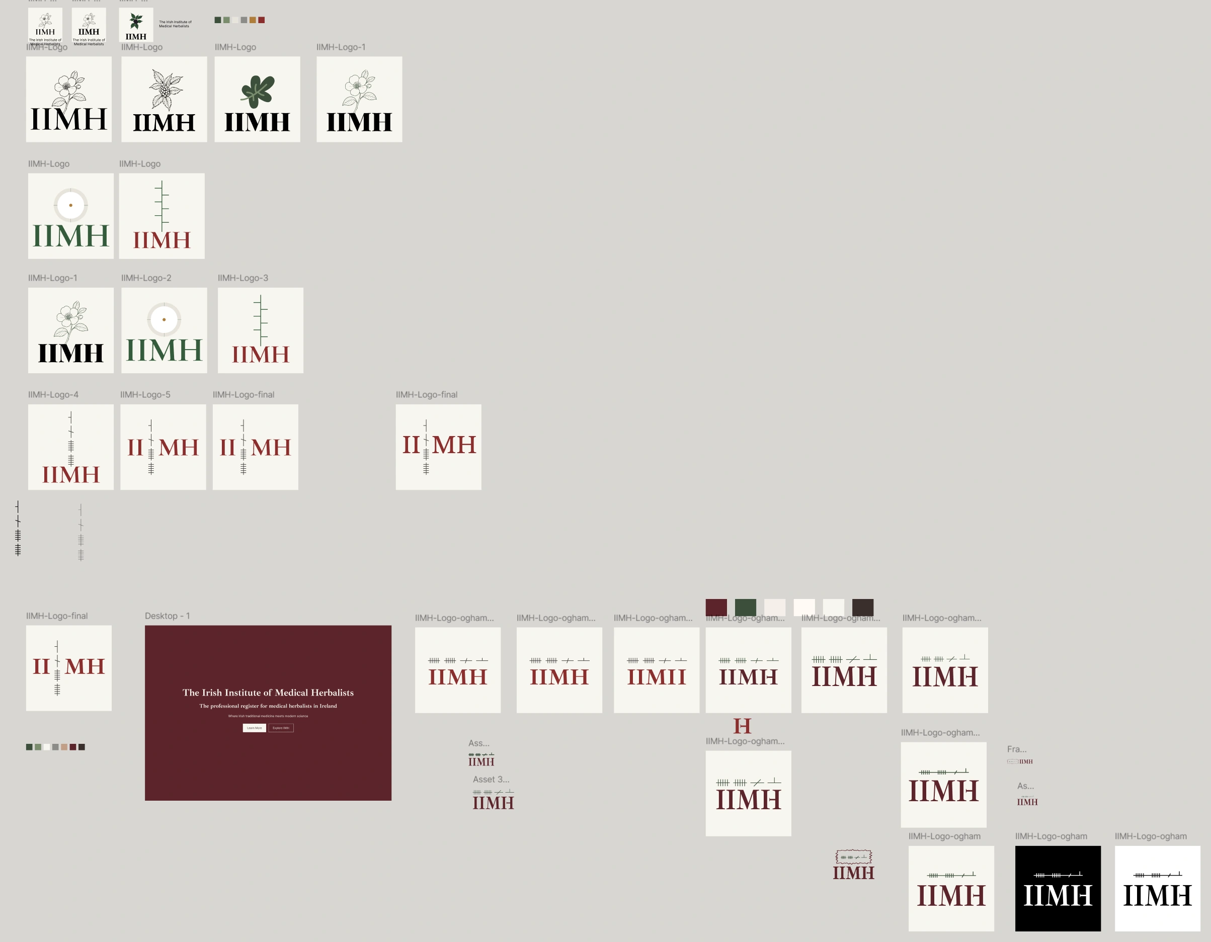
Logo concept
Ogham won. Ogham is the ancient Irish tree script carved into standing stones, made of horizontal or diagonal strokes crossing a vertical stem. It is the oldest written form of Irish language and carries exactly the kind of depth and specificity the brand needed. Unlike Celtic knotwork or shamrock motifs, Ogham is not decoration. It is language. It is specific. It rewards people who know what they are looking at.
A question came up mid-process from Rosarie herself, who asked about the historical accuracy of writing Ogham vertically versus horizontally. It was exactly the right question. Ogham was carved vertically on stone, reading upward from bottom to top. But in Irish manuscripts it was written horizontally, left to right. For a logo that needs to work at every size across a website, a certificate, a letterhead, and a favicon, the horizontal manuscript form is the correct choice, both historically accurate for the paper and digital context and practically superior for scalability.
The final mark pairs the horizontal Ogham script above the IIMH wordmark in Ibarra Real Nova. The Ogham strokes are in Hedgerow Green. The letterforms are in Hawthorn Berry. An amber accent appears on one of the Ogham strokes as a finishing detail. It is quiet, considered, and completely ownable.
Web Design
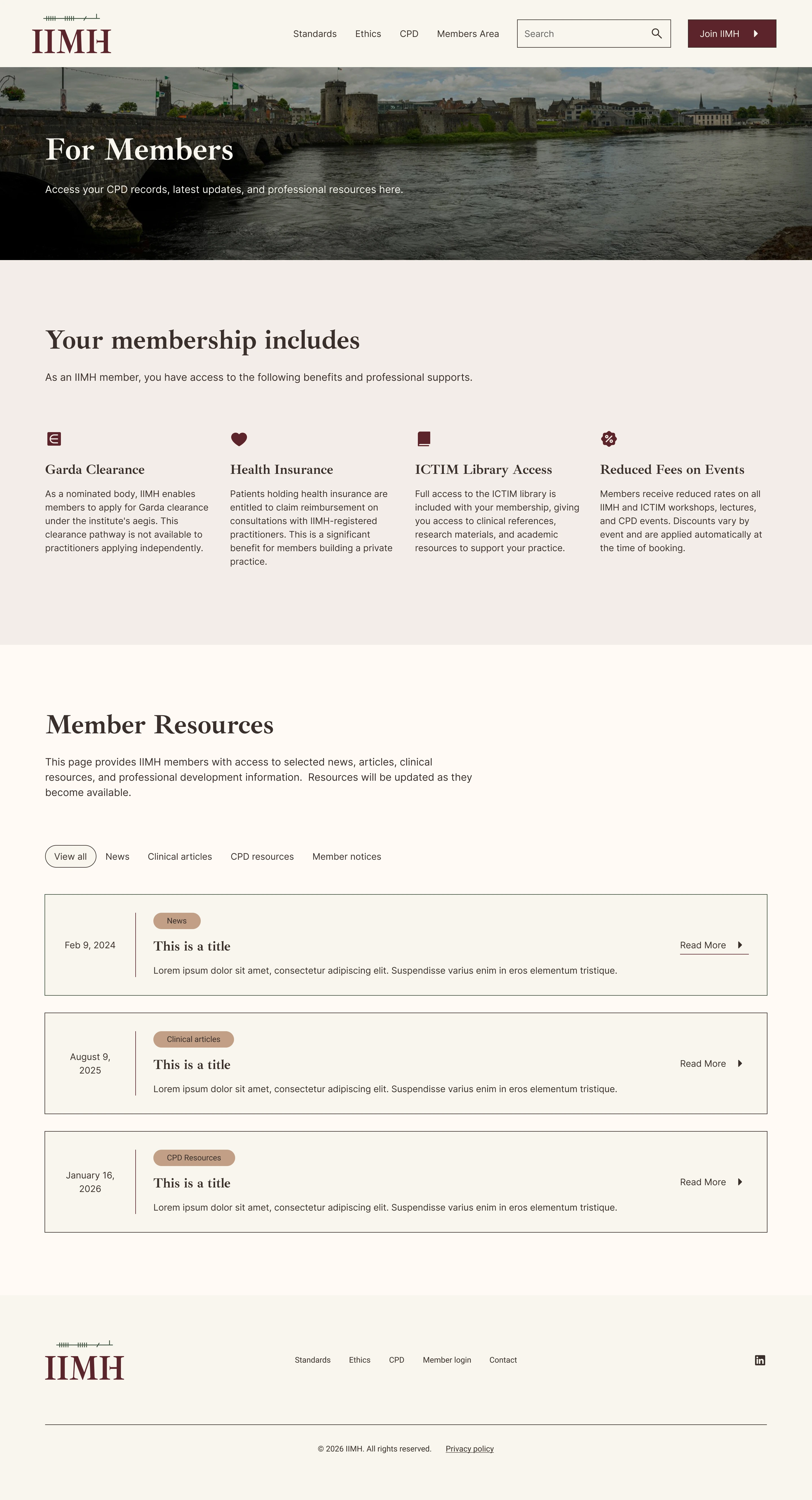
The site is two pages. A public homepage and a password-protected members area. That constraint, agreed in the initial brief, turned out to be a design strength. Every word had to earn its place.
The homepage is structured around a single question that the primary visitor is asking when she arrives: is this institution credible enough to join? The sections answer that question in order. What IIMH is and why it exists. What professional standards members are held to. The ethical foundation. What membership includes in concrete, practical terms. CPD access. The connection to ICTIM for training. And finally, a clear joining process with a form that accounts for two distinct application paths, ICTIM graduates who apply directly, and graduates of other colleges who complete an entrance assessment as part of the process.
The membership includes section deserved particular attention. It contains four benefits that are genuinely distinctive: Garda clearance through a nominated body pathway not available to independent practitioners, health insurance reimbursement for patients through qualifying insurers, full access to the ICTIM library, and reduced fees on all CPD events. These are not soft benefits. They are clinically and professionally significant.
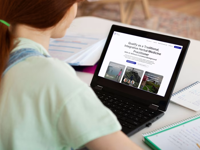
Design decisions across both pages were guided by one test: would a GP find this credible? Clean lines. Generous whitespace. No decorative elements. No gradients. The ICTIM site was the visual sibling reference throughout, and the IIMH site was designed to feel like a quieter, more settled companion to it.
Brand Collateral
Two pieces of brand collateral were produced alongside the website.
The letterhead places the logo prominently, uses the brand colour palette throughout, and carries the formal weight of an institution. It is the kind of document you would use to issue a membership certificate or formal correspondence.
The Code of Ethics is a full branded PDF, nine pages covering six rules and two appendices, built with Ibarra Real Nova for headings and Inter for body text. The IIMH logo appears in the header of every page. Amber rules separate each section. The document reads as a serious clinical instrument, which is exactly what it is.


This banner won!
Technical Build
The site was built in Webflow on iimh.ie, registered and managed through Blacknight. DNS was set up to point to Webflow's servers with SSL provisioned automatically. The contact form uses a honeypot field for spam protection. The password-protected members area uses Webflow's native page password function. The site is set up for ongoing maintenance under a monthly retainer.
A custom joining form was built with radio buttons to handle the two application paths, no conditional logic required, just a clean form that routes both types of applicants to the same inbox with enough context for Rosarie to respond appropriately.

The Result
The IIMH now has a brand identity and digital presence that reflects what it actually is: a clinically serious, historically grounded professional register for medical herbalists in Ireland. The Ogham mark is a detail that rewards people who notice it. The colour palette says Irish landscape, not Irish tourism. The typography says institution, not alternative therapy.
The site speaks directly to the primary visitor. It gives her what she needs to make a decision, clear credentials, a named code of ethics, a formal membership process, and a direct link to the training institution she already trusts.
When she tells a colleague about it, she will say: it's the professional register for medical herbalists in Ireland. It looks like the real thing. That was always the goal.
Brand Identity for IIMH
Before and After
Services delivered
Brand strategy and positioning, persona development, creative direction, colour and typography system, logo design, brand collateral design, Webflow website design and development, PDF document design, DNS and domain setup, ongoing retainer support.
Love my work? Let's chat!
Like this project
Posted Jul 6, 2026
Developed a new brand identity and website for the Irish Institute of Medical Herbalists.
Likes
0
Views
1
Timeline
Jun 3, 2026 - Jul 6, 2026
Clients
ICTIM