
Analysis: What Makes This Design Work
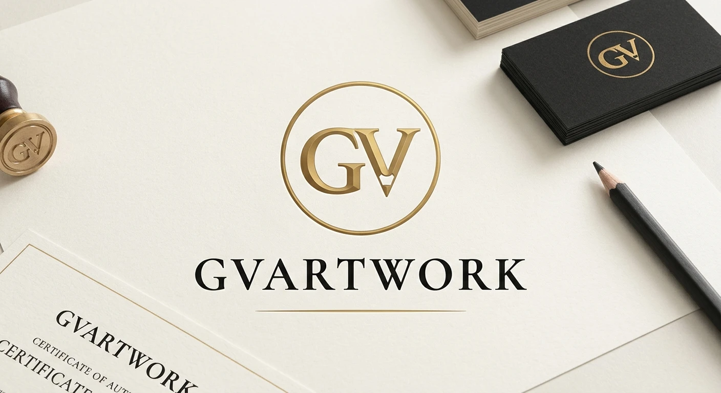
Professional Polish: The context is perfect. By showing the logo applied to tangible objects—a wax seal stamp, a clean certificate of authenticity, and high-quality business cards—the design demonstrates that this is a established, serious business, not just a casual portfolio.
Branding the Craft: The primary "GV" monogram inside the gold circle is very strong. The subtle vertical line through the 'V' mimicking a pencil tip is brilliant. It immediately communicates the core subject (drawing) without needing extra text, which is crucial for a brand built on traditional skills.
The Luxury Palette: The combination of obsidian charcoal (#121212) and burnished gold (#C5A059) on an off-white texture creates an expensive, gallery-standard aesthetic. It separates your work from digital artists and suggests your drawings are valuable collectibles.
Clarity: The full 'GVARTWORK' wordmark uses a sophisticated serif font (Cormorant Garamond/Playfair Display) that reads cleanly and pairs well with the minimalist monogram.
0 likes · 0 views · Nov 13, 2026
Analysis: What Makes This Design Work Professional Polish: The context is perfect. By showing the logo applied to tangible objects—a wax seal stamp, a clean ...