Zig Snacks Investor-Ready Pitch Deck Design

Umar Tanveer


Zig Snacks Pitch Deck Design | Product Design
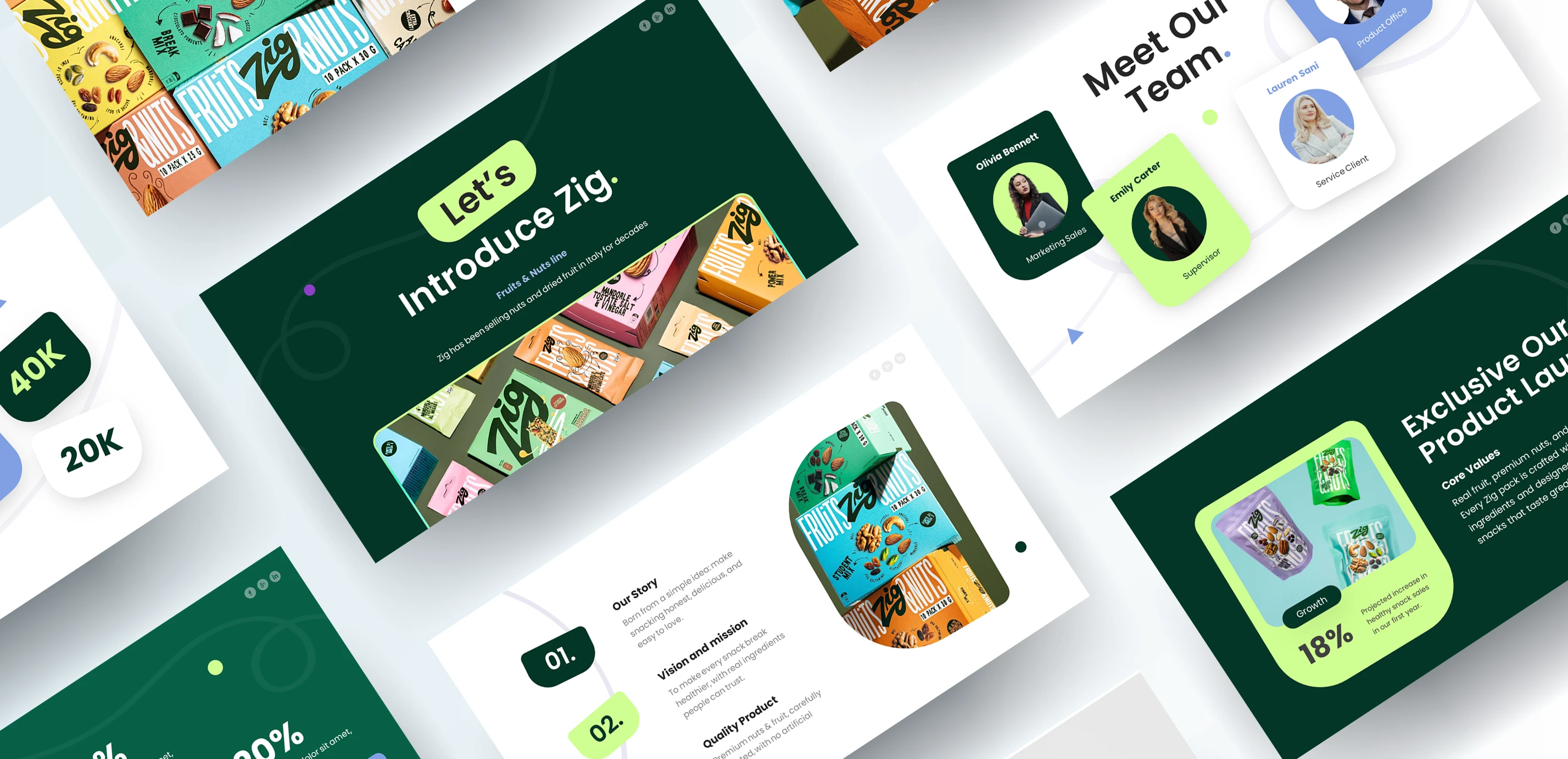
Zig is a fruit and nut snack brand known for colorful packaging and Italian roots. I designed a pitch deck that carries that energy into an investor-ready presentation. The goal was to make a food brand’s story feel as appetizing on screen as its products look on the shelf, while keeping every slide clear, credible, and easy to present.
Project snapshot
Client: Zig
Service: Pitch deck design, presentation design, visual identity application
Deliverable: 10 slide investor and launch presentation
Tools: [PowerPoint / Figma / Illustrator]
Timeline: [1 weeks]
The Challenge: Making a Snack Brand Look Investable
Food brands often struggle in pitch decks. Packaging is colorful and loud, but investors want clarity, numbers, and a believable growth story. The challenge was to balance appetite appeal with business credibility, so the deck feels fun to look at but serious enough to fund.
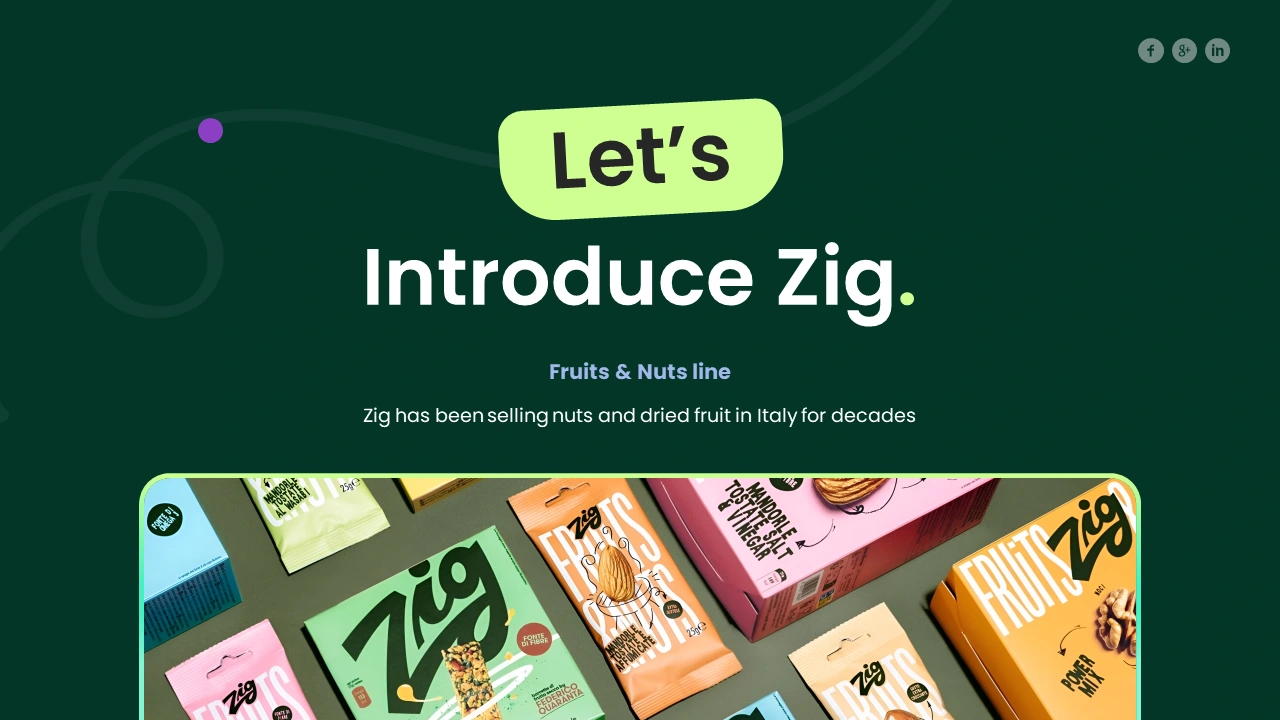
Zig snacks pitch deck design cover slide with green background and fruit and nut product photography
The Strategy: Product First, Story Second, Proof Third
I built the deck around a simple flow that investors can follow without effort:
Introduce the brand: a confident opening slide with the Fruits & Nuts line front and center.
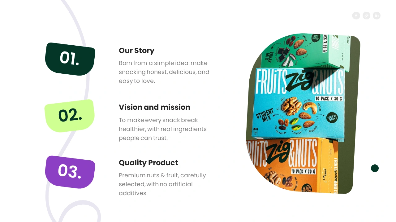
Explain the story and mission: three numbered sections covering story, vision, and quality.
Show the problem and solution: side-by-side cards that contrast market pain points with Zig’s answer.
Prove the growth: large, easy-to-read stat callouts that make key numbers stand out.
Introduce the people: a team slide that builds trust in the people behind the product.
The Design Approach
Color palette. Deep forest green anchors the deck and signals freshness and natural ingredients. A bright lime accent highlights key cards, stats, and calls to action, and it echoes the vibrant packaging.
Typography. A bold geometric sans-serif for headlines gives the deck confidence. A lighter weight for body text keeps dense slides readable.
Shapes and layout. Rounded, slightly tilted cards create a playful rhythm that matches the brand’s personality without hurting readability. Soft line illustrations in the background add movement while keeping content clear.
Photography. Product shots are cropped into organic, rounded frames so the packaging does the storytelling and the slide layouts never feel cluttered.

Key Slides Breakdown
Opening slide: a high-contrast green background with an oversized headline and a lime highlight pill, setting the tone immediately.
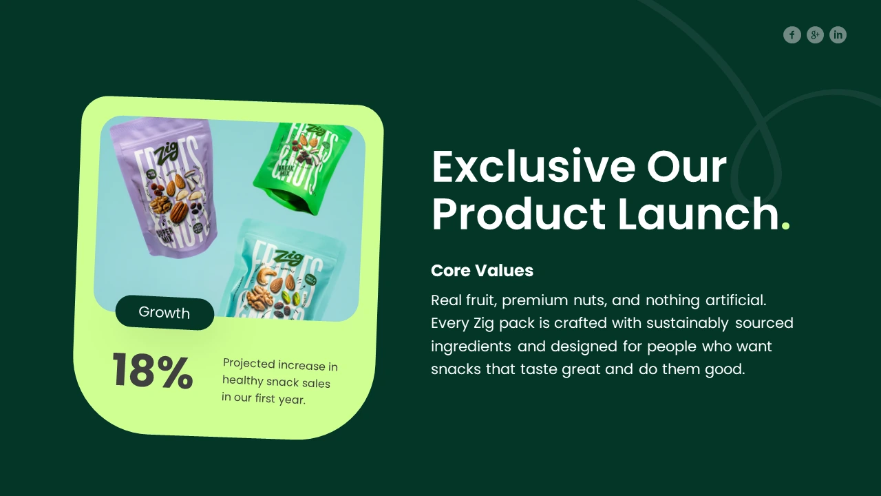
Product launch slide: a tilted feature card pairs product imagery with one headline statistic, so the key number gets noticed first.
Story, mission and quality slide: numbered color-coded tabs guide the eye down the page in a clear reading order.
Problem and solution slide: dark and light cards visually separate “what’s broken” from “how Zig fixes it.”
Team slide: color-coded profile cards give each person equal weight and keep the layout friendly.
What I Learned
Strong pitch deck design for food brands depends on restraint. Let the product photography carry the emotion, then use color, spacing, and hierarchy to make the numbers and message unmistakable.
Need a Pitch Deck for Your Brand?
I help startups and growing brands turn their ideas into presentations that look professional and persuade. My background in SEO, web development, and design means your deck, website, and brand all tell one consistent story.
Like this project
Posted Oct 27, 2026
I designed a creative pitch deck for a food brand, from story flow to slide layouts. See how Zig’s packaging became a persuasive presentation.