Calmora — A quiet house, drawn as a system

Elmira Demanou


Calmora — Home hero
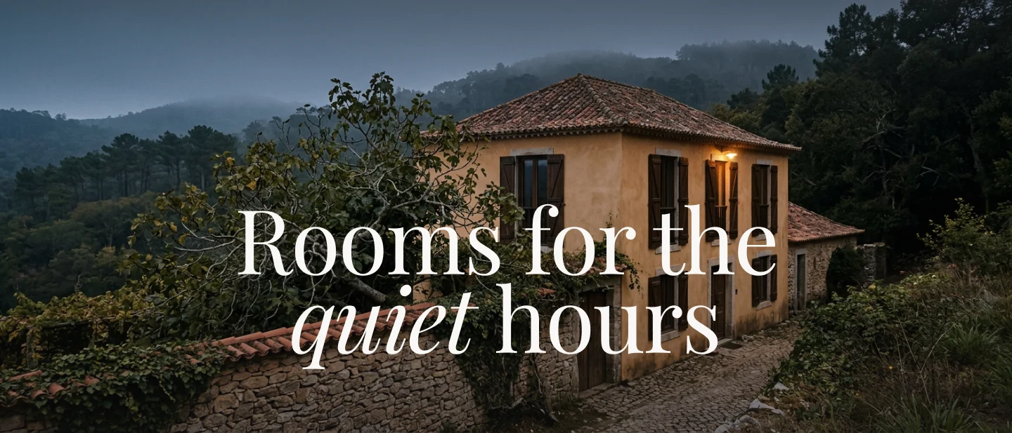
Home — the hero sets the whole system: one italic word, one inverted band, nothing shouting.
The brief was a feeling, not a spec
Calmora rents quiet: an evening, a night, a cedar bath, a room dark enough to actually sleep in. The product is rest, and rest is hard to sell without shouting — which is exactly what most hospitality sites do.
So I wrote the system as a set of prohibitions before I wrote it as a set of components. No pure black and no pure white. No bold serif, and never letterspaced. Exactly one italic word per display headline. Exactly one inverted section per page. The accent colour is allowed to be a one-pixel rule, a line of text, or a focus ring — it is never permitted to fill a shape.
Constraints like these are worth more than a component library, because they hold when the page is handed to somebody else.
Tokens first, always
Calmora — Foundations
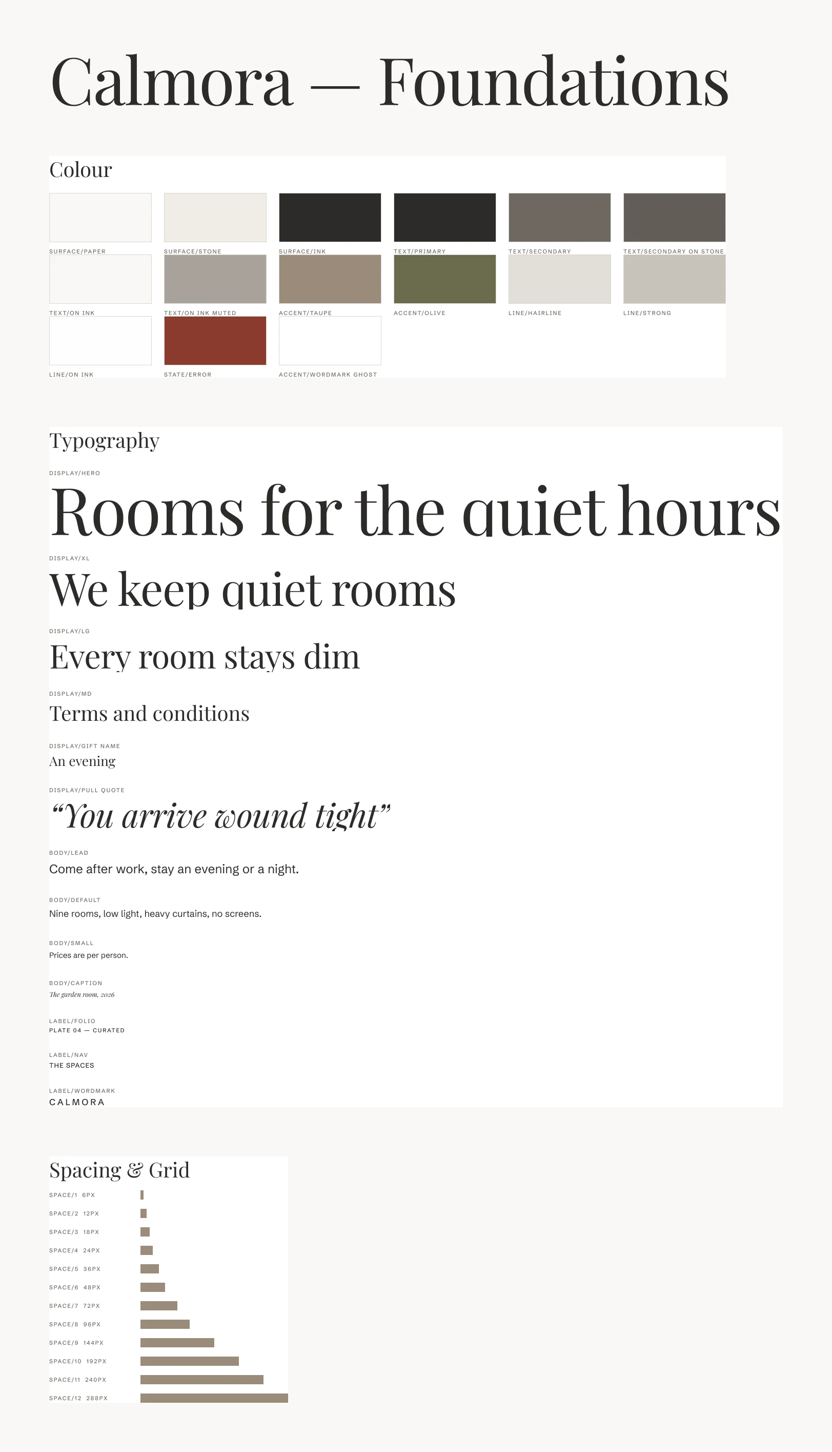
Foundations — 15 colour and 16 spacing variables, 13 text styles, each scoped and carrying its real CSS custom property.
Nothing in the file carries a hardcoded hex. Fills, strokes, spacing and radii all resolve through one variable collection, and every variable carries its real CSS custom property as code syntax — so Surface/Paper hands a developer
var(--bg-paper) rather than a swatch to eyeball.The vertical rhythm is a six-pixel baseline rather than the usual four, chosen so 18/30 body copy sits exactly on grid. Section rhythm runs to 288px on desktop — roughly forty percent more air than a standard template, and the first thing that would get compressed if the system didn't defend it.
Eleven components, built as one family
Calmora — Lookbook Card
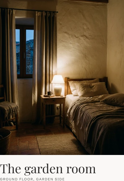
Lookbook Card — built on a Parallax Image instance with the caption switched off; the component ships in three ratios and two states.
Atoms before molecules: the folio marker, the button, the field and the locale switcher were finished and bound to tokens before anything composed them. The nav and footer are assembled from live instances rather than copies — editing the button updates both nav CTAs and every footer link at once.
The button alone carries twelve variants across style, tone and state, because the system needs a text button that draws a taupe underline from the left, a boxed variant reserved for booking, and both of those legible on paper and on ink.
Calmora — Footer
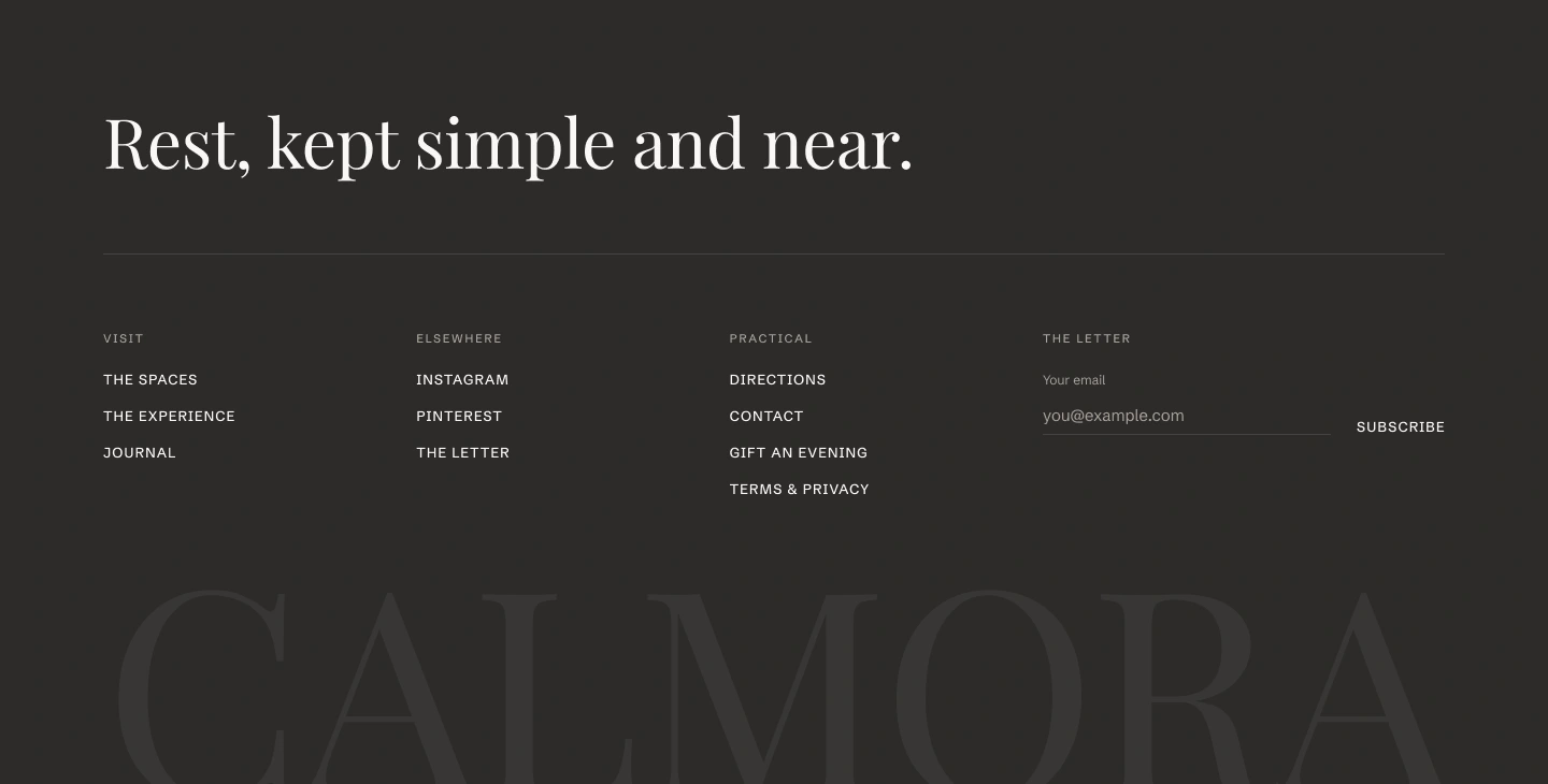
Footer — the wordmark set at 6% and cropped by the bottom edge, so it reads as a watermark in the paper rather than a headline.
Seven screens on one grid
A twelve-column grid at 1320 maximum with 96px margins, and a folio marker rotated into the left margin of every section — the signature device, and the thing that makes an unfamiliar page still read as Calmora.
Calmora — Spaces
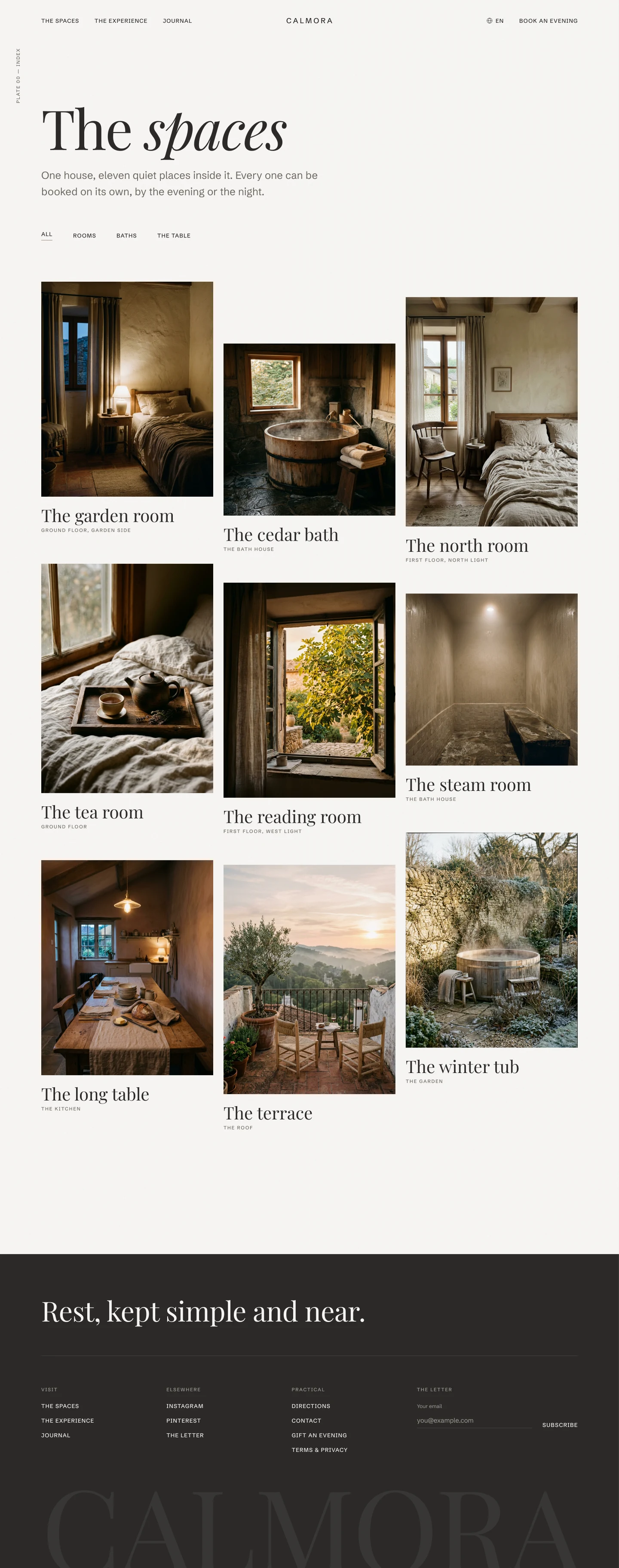
Spaces — nine rooms in a staggered three-column index, columns offset 0 / 144 / 36px.
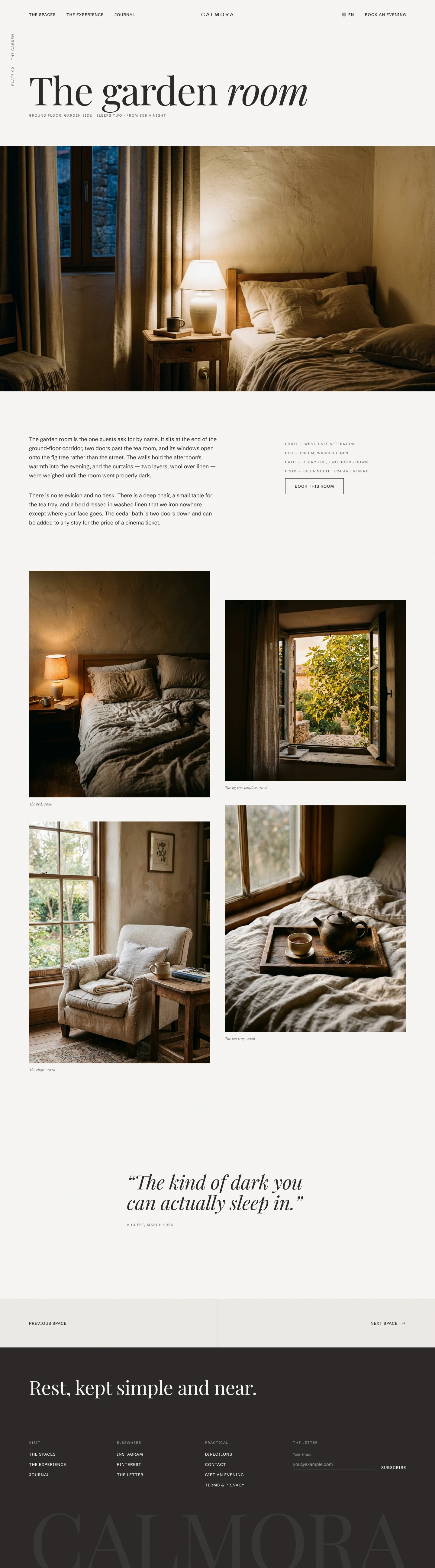
Calmora — Space detail
Space detail — narrative column with a sticky spec aside.
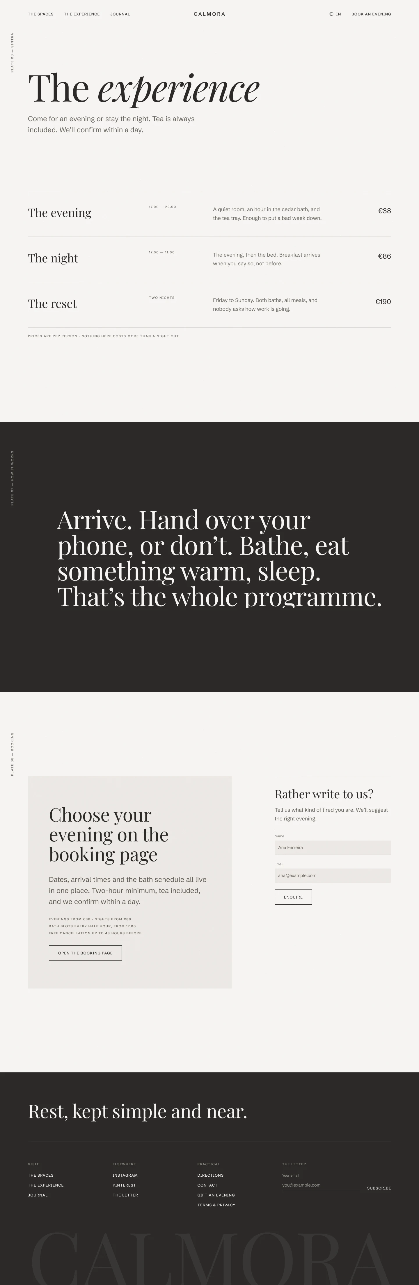
Calmora — Experience
Experience — an offers table, an ink band, and the one boxed button in the system.
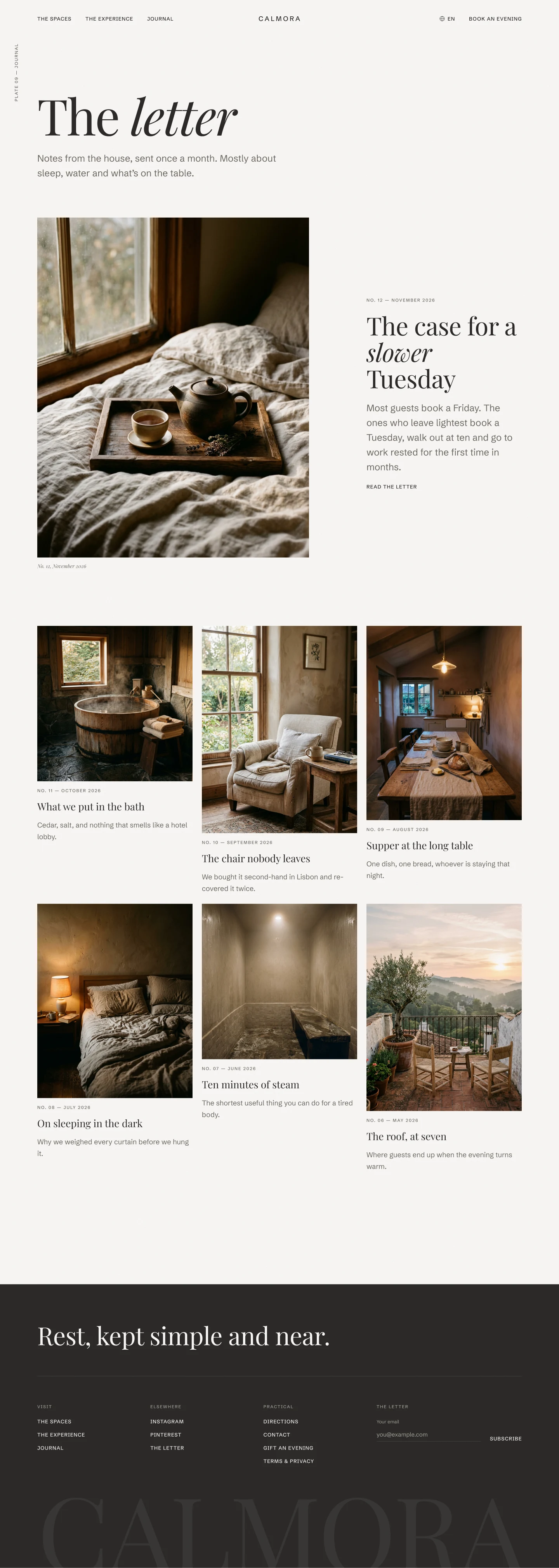
Calmora — Journal
Journal — a featured letter split from the six-entry grid.
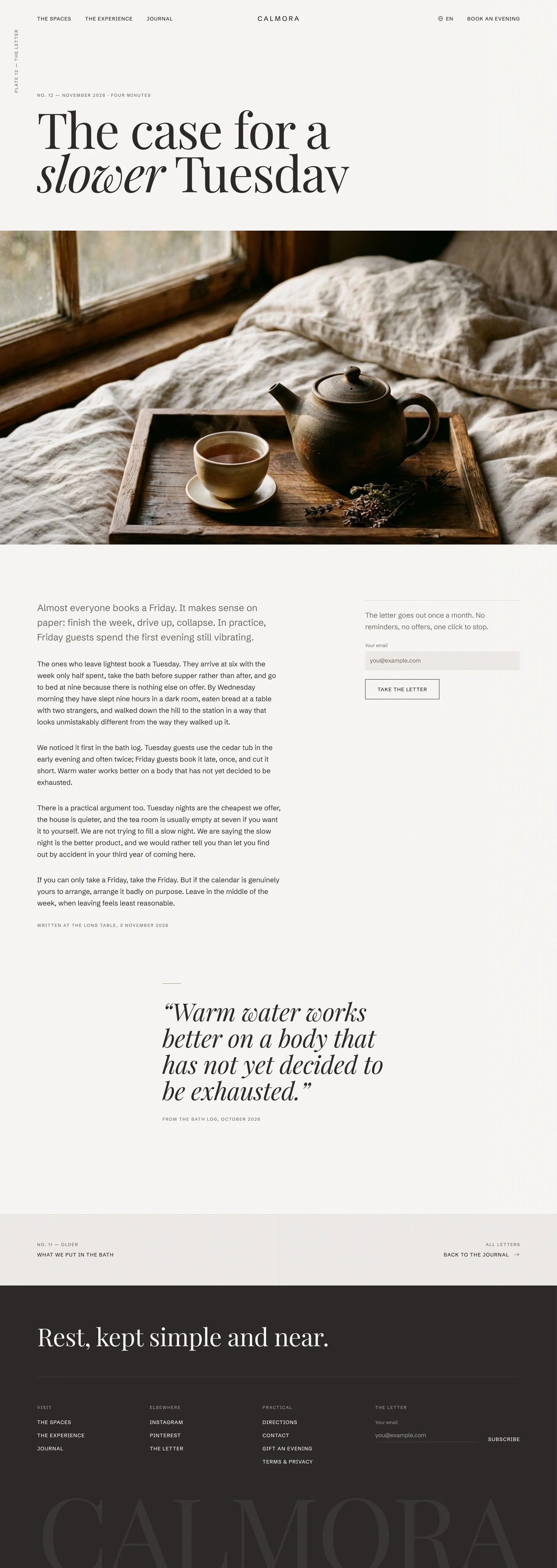
Calmora — Letter
Letter — long-form reading at a 70-character measure.
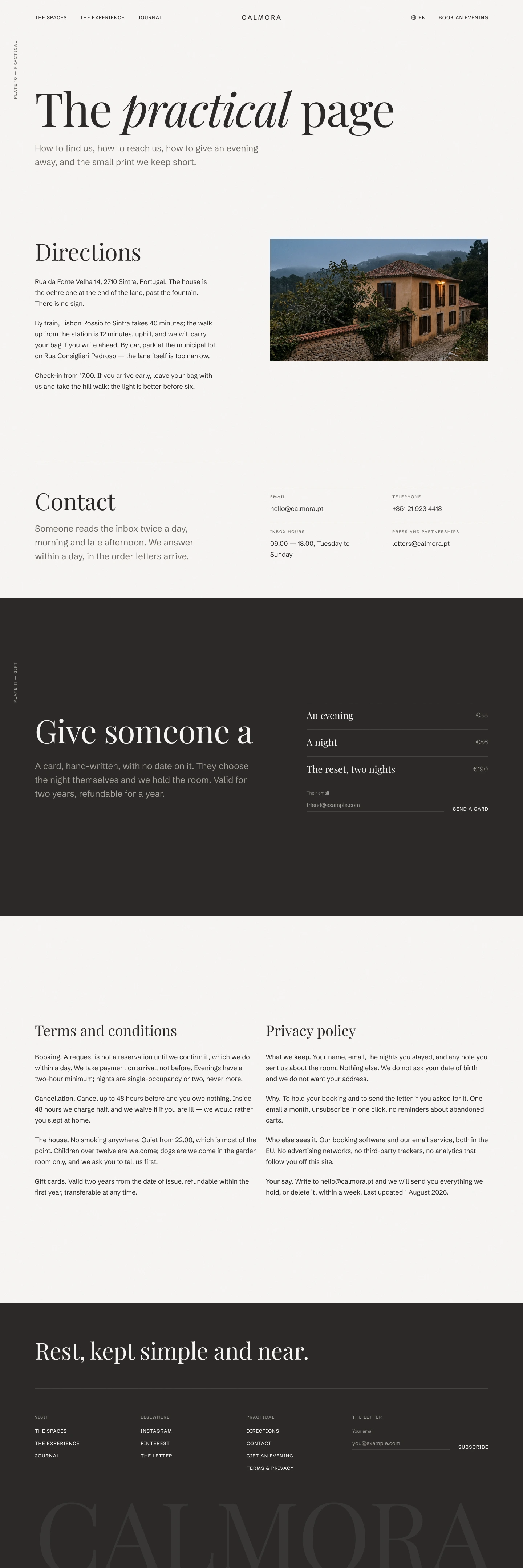
Calmora — Practical
Practical — directions, contact, the gift band, and the small print kept short.
The margin is the first thing to go
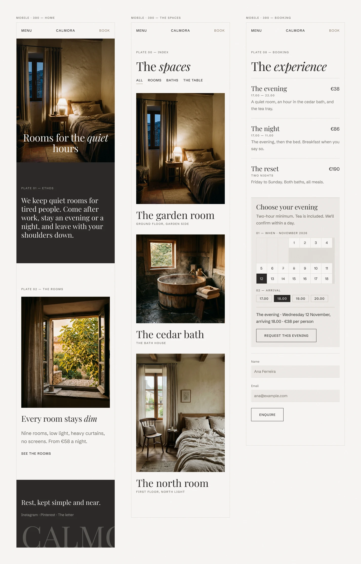
Calmora — Mobile
390px — home, spaces and booking. The folio turns horizontal once there's no margin to live in.
Three breakpoints: 1200, 810 and 390. The type ramp carries its own per-breakpoint slots rather than scaling by formula, so the hero drops 128 → 84 → 48px on decisions rather than arithmetic.
At 390 the grid margin falls from 96px to 20px, which removes the column the rotated folio lives in — so the folio turns horizontal and moves inline rather than being crushed. That is the kind of thing a breakpoint reveals and a mockup hides.
Decisions that only show up at 100%
Paper grain. A tiled texture at 3% opacity on multiply, above every layer and inert to the pointer. Invisible as an effect; the page looks flat and digital the moment you switch it off.
Underline draw. The text button draws its rule from the left over 400ms, and on exit retreats toward whichever edge the cursor left by.
Nothing snaps. The motion scale starts at 250ms and runs to 1100ms. There is deliberately no 120ms in the system.
Oldstyle figures. The serif runs ligatures and oldstyle numerals; prices and booking times switch to lining tabular figures so columns of digits align.
If a transition feels responsive, slow it by 200ms.
Delivered
7 screens at three breakpoints · 11 components with full variant matrices · 31 variables and 13 text styles, every one scoped and carrying code syntax · a walkable prototype wired with the system's own easing curves.
Like this project
Posted Aug 13, 2026
Seven screens, eleven components and thirty-one tokens for a small lifestyle boutique, built so every page inherits its restraint from the same source of truth.