Real Estate Branding & Visual Design

Fowowe Babasola Nelson


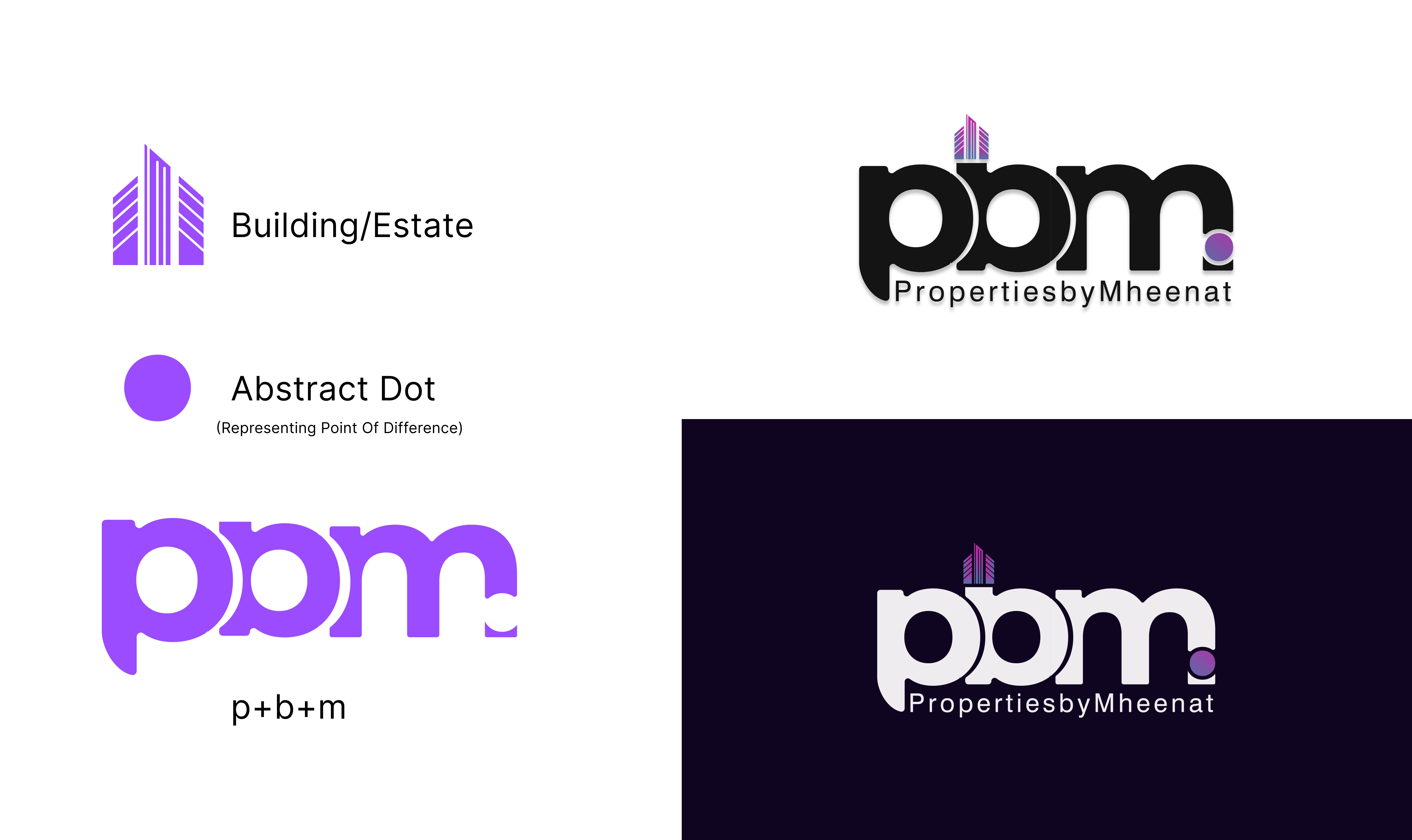
The design captures the essence of real estate through the building icon which stands for estate and the dot which represent the point of difference. The choice of purple color symbolizes with royalty, rarity, which the firm provides and also associates with femininity due to ownership by a female party. The design process began with thorough research into the real estate industry and understanding the client’s vision. After exploring several concepts, I refined the final design to align perfectly with the brand’s identity. This project also includes mockups demonstrating the logo in real-world applications, ensuring it resonates with the target audience and stands out in a competitive market. The final logo is a strong visual representation of Properties by Mheenat’s commitment to excellence and customer satisfaction. It’s designed to leave a lasting impression and effectively communicate the brand’s values.


Like this project
Posted Apr 3, 2025
The design captures the essence of real estate through the building icon which stands for estate and the dot which represent the point of difference. The choic…