Designing User-Centric Interfaces for B2B Healthcare Subrogation
Project Overview
• Title: “Streamlining B2B Healthcare Subrogation: A UX Design Case Study”
• Duration: Specify the timeline (e.g., 4 months).
• Role: Lead UX Designer
• Tools Used: Figma, Adobe XD, InVision, Miro, etc.
• Team: List any collaborators (e.g., product manager, developers, healthcare specialists).
2. Problem Statement
• Context: Describe the context of the project. The platform is designed to simplify and automate the subrogation process for healthcare companies.
• Challenges: Identify the primary challenges faced, such as:
• Navigating complex workflows unique to subrogation.
• Ensuring compliance with healthcare regulations while maintaining user efficiency.
• Integrating multiple data sources into a cohesive user interface.
3. Research
• User Research: Outline how you conducted research with the target users, such as claims adjusters, healthcare administrators, or legal teams.
• Personas: Create detailed personas representing the key user groups, focusing on their needs, pain points, and goals.
• Pain Points: Identify specific pain points related to the subrogation process, such as difficulty in tracking claims, data overload, or inefficient communication between stakeholders.
• Competitive Analysis: Analyze existing subrogation or healthcare B2B platforms. Highlight strengths and weaknesses, particularly in terms of UX.
• Key Insights: Summarize the main findings from your research. For example:
• Users need quick access to critical data and straightforward workflows.
• There’s a need for better visual representation of claim statuses and outcomes.
4. Design Process
• Information Architecture: Describe how you organized the platform’s content. Provide a sitemap or flowchart showing the user journey through different stages of subrogation.
• Wireframes: Share low-fidelity wireframes that illustrate the initial layout and navigation ideas.
• Prototyping: Detail how you transitioned from wireframes to interactive prototypes, emphasizing iterations based on user feedback.
• UI Design: Discuss your design choices, such as color schemes, typography, and iconography. Explain how these elements enhance usability and align with industry standards.
• Interaction Design: Focus on how you designed interactions to be intuitive, particularly for complex tasks like data entry, claim tracking, and report generation.
5. Usability Testing
• Testing Process: Describe the usability testing process, including the participants, methods used (e.g., remote testing, A/B testing), and tools.
• Findings: Highlight the most important findings from the tests. For example:
• Users appreciated the streamlined dashboard but requested more customization options.
• The workflow for submitting and tracking claims needed simplification.
• Iterations: Discuss the changes you made based on testing feedback. Provide before-and-after comparisons to demonstrate improvements.
6. Final Design
• Overview: Provide an overview of the final design. Include screenshots or a video walkthrough of the platform, focusing on key features.
• Key Features:
• Dashboard: A customizable dashboard that provides quick access to important metrics, claims, and notifications.
• Claims Management: An intuitive system for tracking, managing, and updating claims with visual indicators for status and priority.
• Data Integration: A seamless interface that integrates various data sources, ensuring that users have all the information they need at their fingertips.
• Compliance Tools: Features that help ensure that all actions comply with healthcare regulations, with built-in checks and reminders.
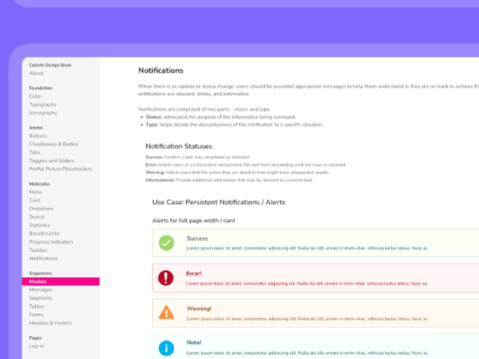
• Design System: Share components from the design system, such as buttons, forms, and tables, and explain how they maintain consistency across the platform.
7. Impact and Results
• User Feedback: Summarize feedback from users after the platform was implemented. Highlight any significant improvements in efficiency, accuracy, or user satisfaction.
• KPIs and Metrics: Present metrics that demonstrate the impact of your design, such as reduced time to complete tasks, increased user adoption, or lower error rates.
• Challenges Overcome: Reflect on the challenges you encountered and how you addressed them, such as balancing complexity with usability or ensuring regulatory compliance.
8. Reflection
• Learnings: Share what you learned from the project. For instance, insights on designing for B2B environments, handling complex workflows, or integrating multiple data sources.
• Next Steps: Suggest potential future improvements, such as adding new features, further usability testing, or expanding the platform to support more users or functionalities.
9. Conclusion
• Summary: Recap the project’s goals, the design process, and the outcomes.
• Acknowledgments: Thank any team members, stakeholders, or users who contributed to the project’s success.
Like this project
Posted Aug 20, 2024
Redesigned UX for a B2B Healthcare Subrogation platform, enhancing usability and efficiency through user-centered design, research, and iterative testing
Likes
0
Views
14


