Leed Services redesign
This redesign is part of my Hero Redo Series, which focuses on transforming hero sections for better engagement and conversions. For Leed Services, a content creation and marketing agency.
The goal was to create a more balanced, visually engaging hero section that helps B2B companies stand out through organic content marketing.
Project Intro (The Agency):
Leed Services specializes in helping B2B companies break through the noise by transitioning from outbound marketing to warm, organic content strategies.
They offer two main services: content strategy consulting/coaching and ghostwriting.
Their mission is to take clients from "cold" to "warm" through impactful, organic content.
Problems of the Old Design:
The original hero section had multiple issues:
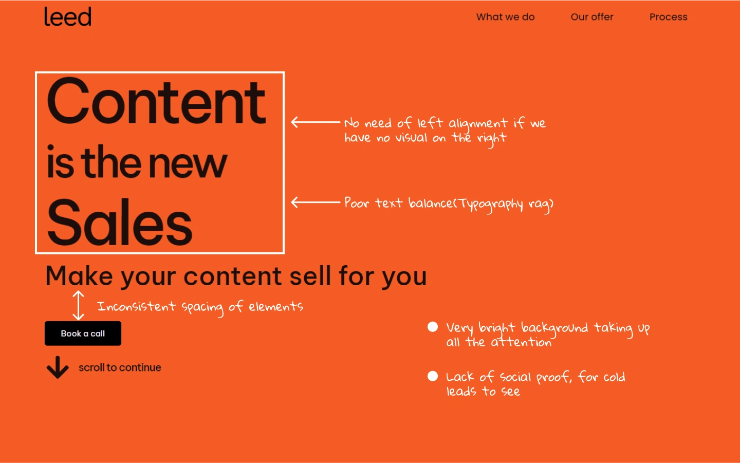
Distracting Background: The very bright orange background dominated the section, taking attention away from the content.
Unbalanced Typography: The left-aligned and unbalanced hero heading and subheading caused a typography rag, making it hard to read and visually unpleasant.
Inconsistent Spacing: There were inconsistencies in the spacing between elements, which hurt the overall layout.
No Visuals or Social Proof: The hero lacked any visual imagery to engage users and didn't include any social proof to build trust with new visitors.

Old design review
Process of the Redesign:
Research & Discovery: Analyzed Leed Services’ target audience and competitors to identify opportunities for a clearer, more engaging hero section.
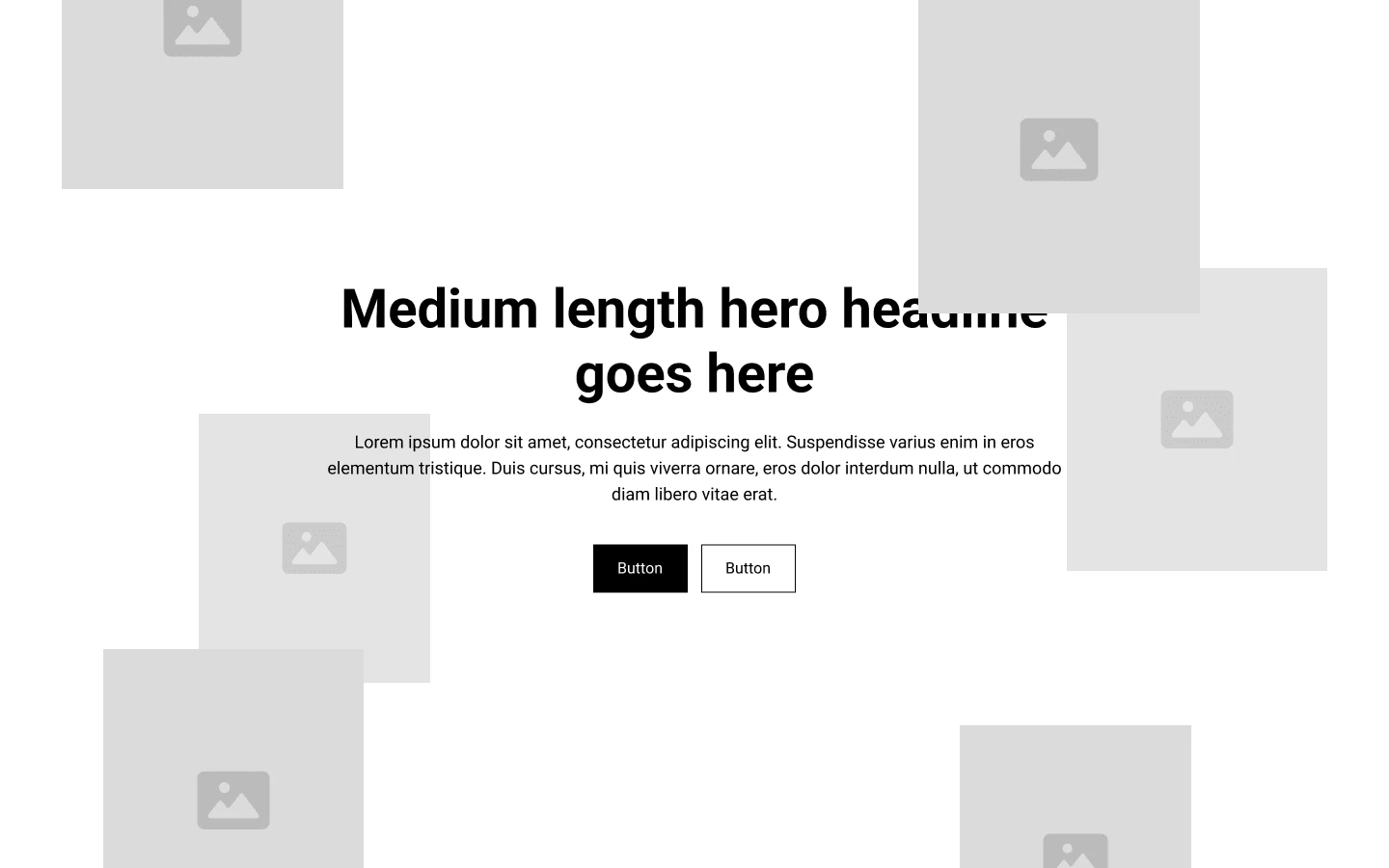
Wireframing: Created wireframes to address the layout imbalance and include new visual and trust-building elements like social proof.
UI Design: Focused on balancing the color palette, typography, and spacing while adding impactful imagery and testimonials.
Iteration & Feedback: Incorporated feedback and refined the design to better align with Leed Services' brand and objectives.

Wireframe concept for the new design
Solution:
The new hero section design features:
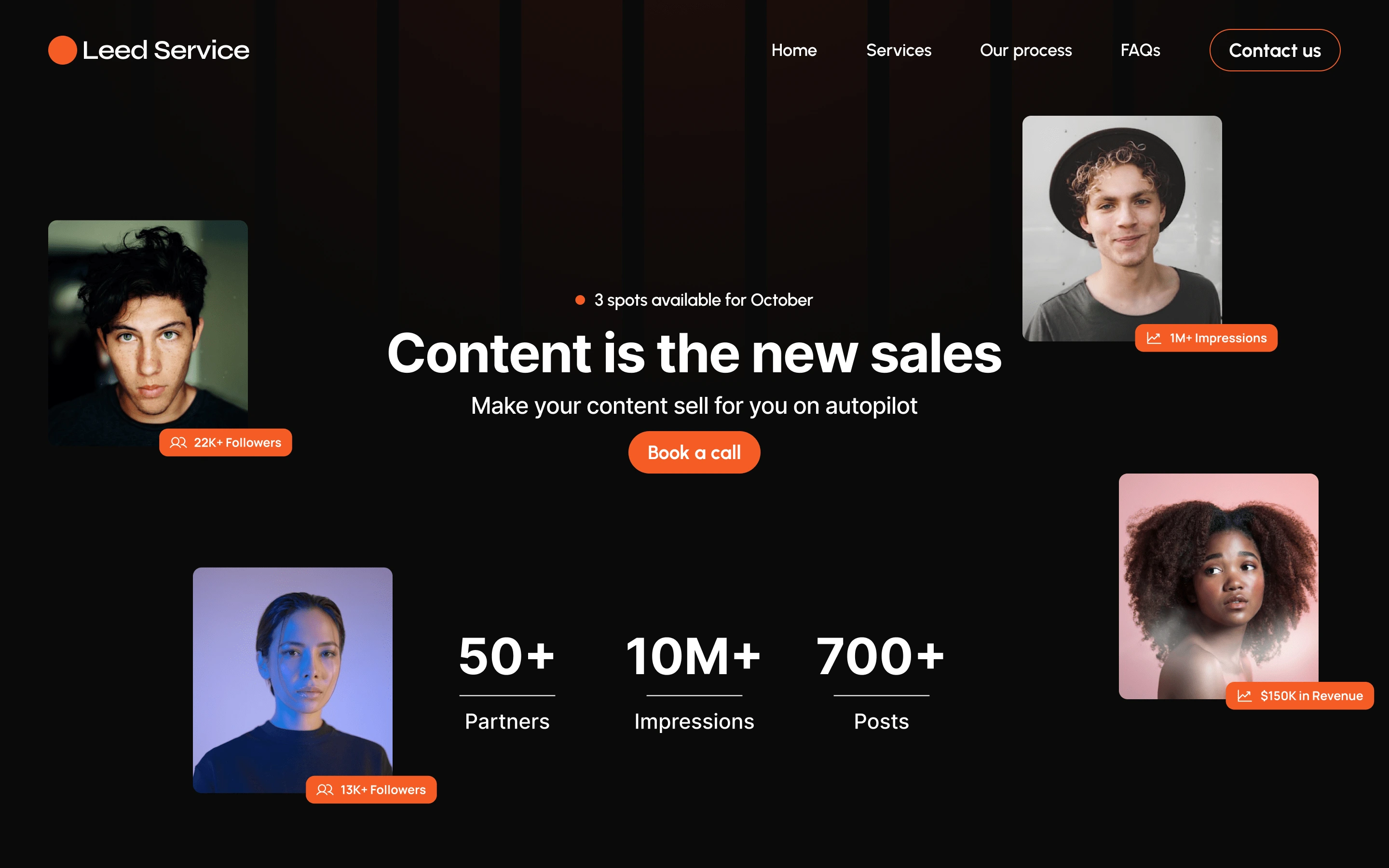
Balanced Color Palette: Toned down the bright orange to a more harmonious background color, making the content stand out more without overwhelming users.
Improved Typography: Adjusted the typography to center align the text and eliminate the ragged edges, ensuring it is more readable and professional.
Consistent Spacing: Streamlined the spacing between elements to create a clean, well-structured layout.
Visual Imagery & Social Proof: Added relevant visuals that resonate with B2B clients and included testimonials or logos to build credibility immediately.

New Hero design
Results and Impact of the New Design:
While speculative, the new design is expected to:
Enhance Readability and Balance: With improved typography and layout, users can easily digest the core message and navigate the site.
Increase Engagement: The addition of relevant visuals and social proof helps build trust and encourages users to explore further.
Improve User Experience: The toned-down color scheme and consistent spacing make for a more pleasant and professional user experience.
THAT'S ALL, THANK YOU FOR READING
I help agency owners book more calls using their websites/landing page.
If interested in working together Book a call here
Like this project
0
Posted Nov 14, 2024
Redesigned Leed Services' hero section to help improve booked calls for the agency.
Likes
0
Views
2


