
Most coffee brands shout. More flavours. More syrups. More noise.
MONO does the opposite.
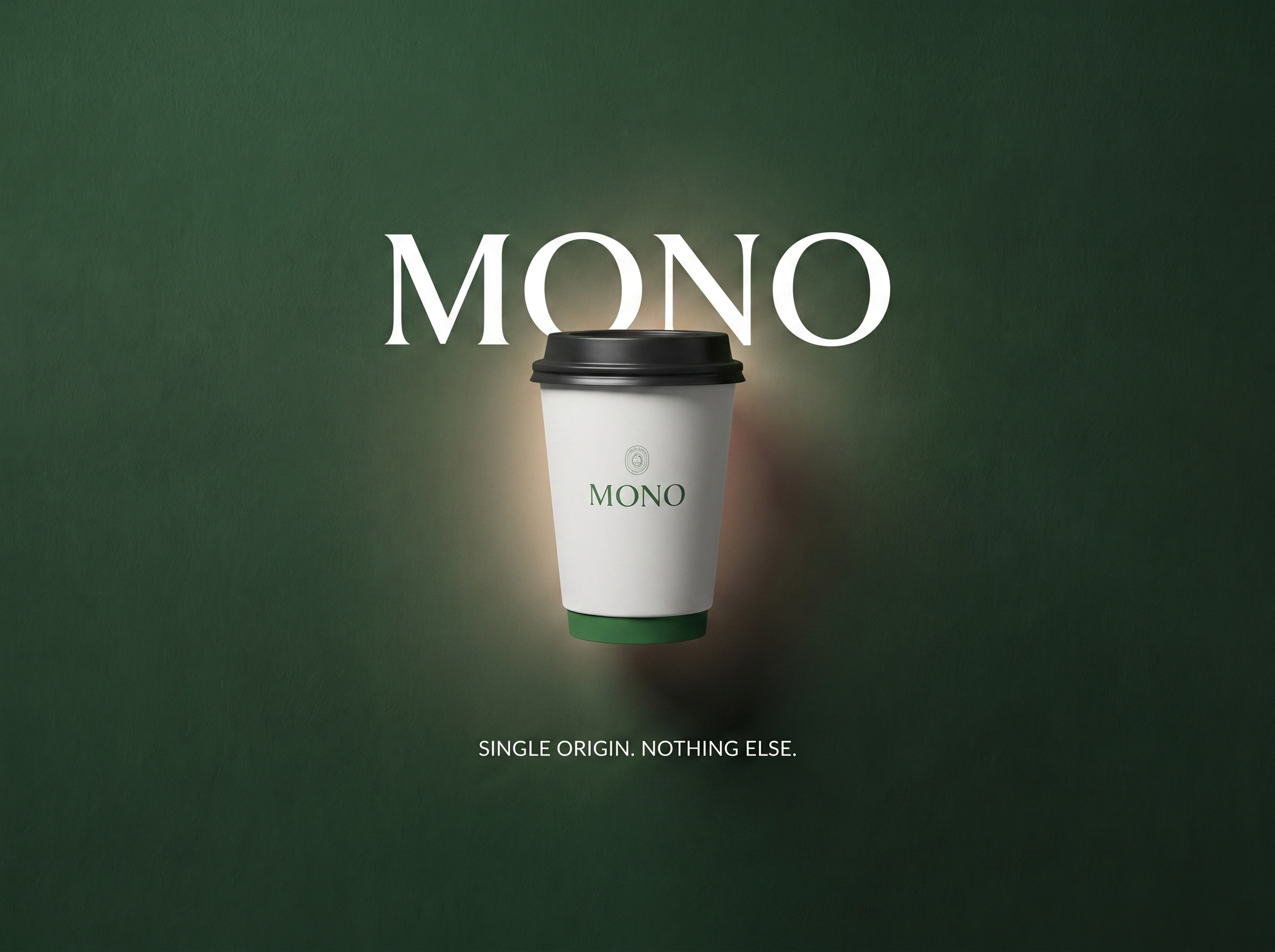
The name says everything: one origin, one bean, one intention.
No distractions, no seasonal gimmicks, nothing to hide behind.
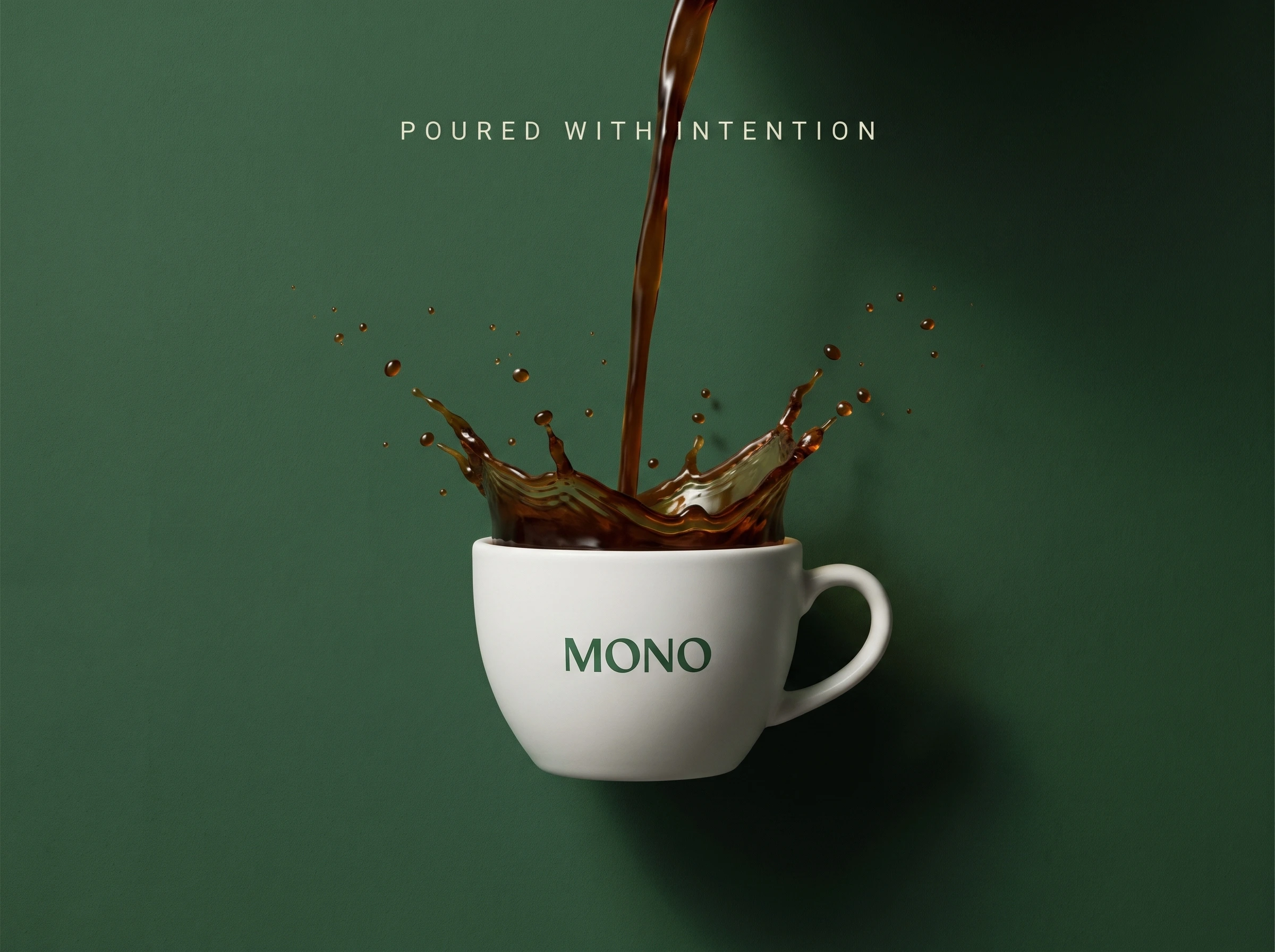
Just coffee, poured with purpose.
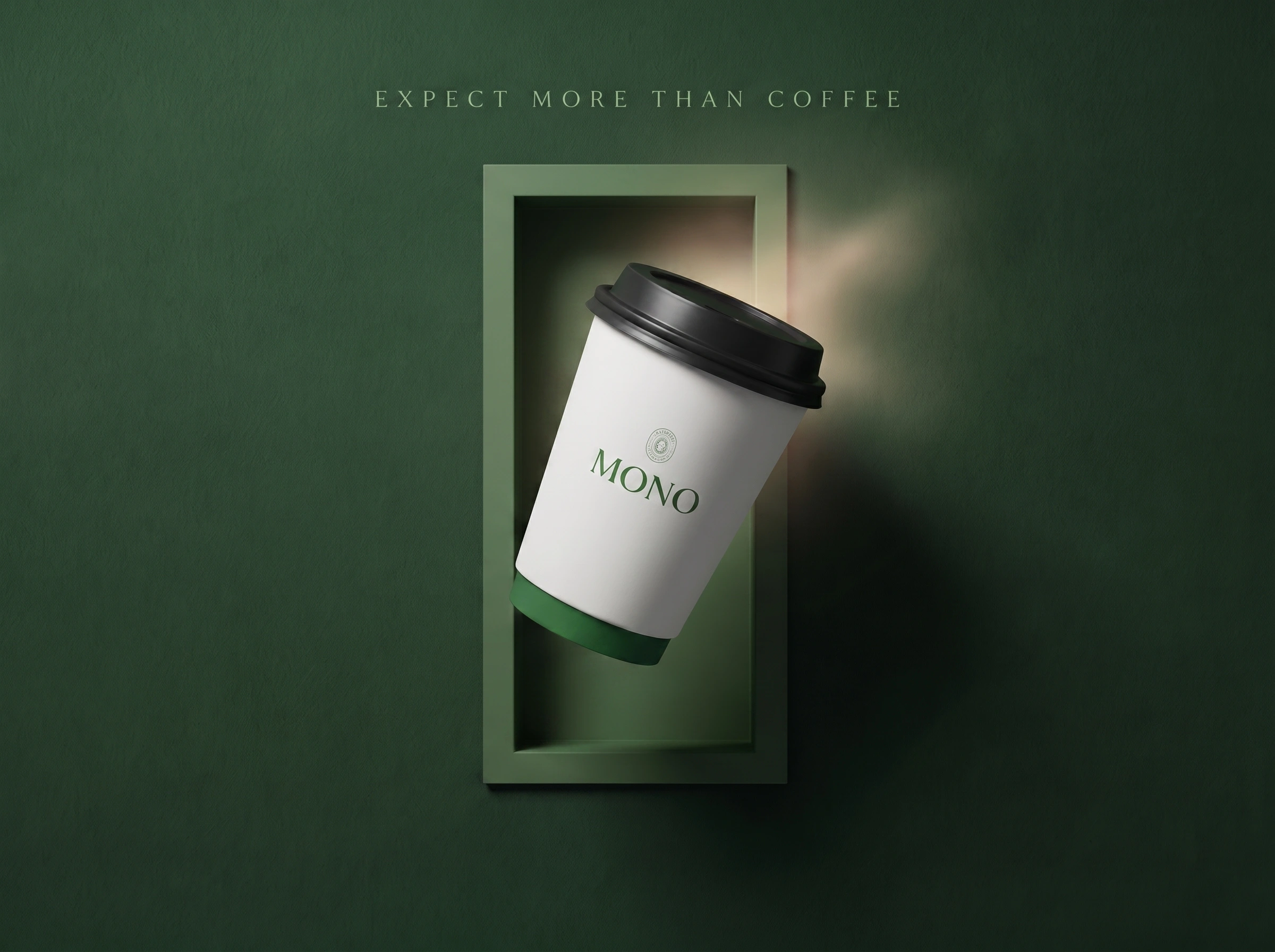
The visual identity had to feel the same way it tastes: deep forest green, clean white, generous negative space.
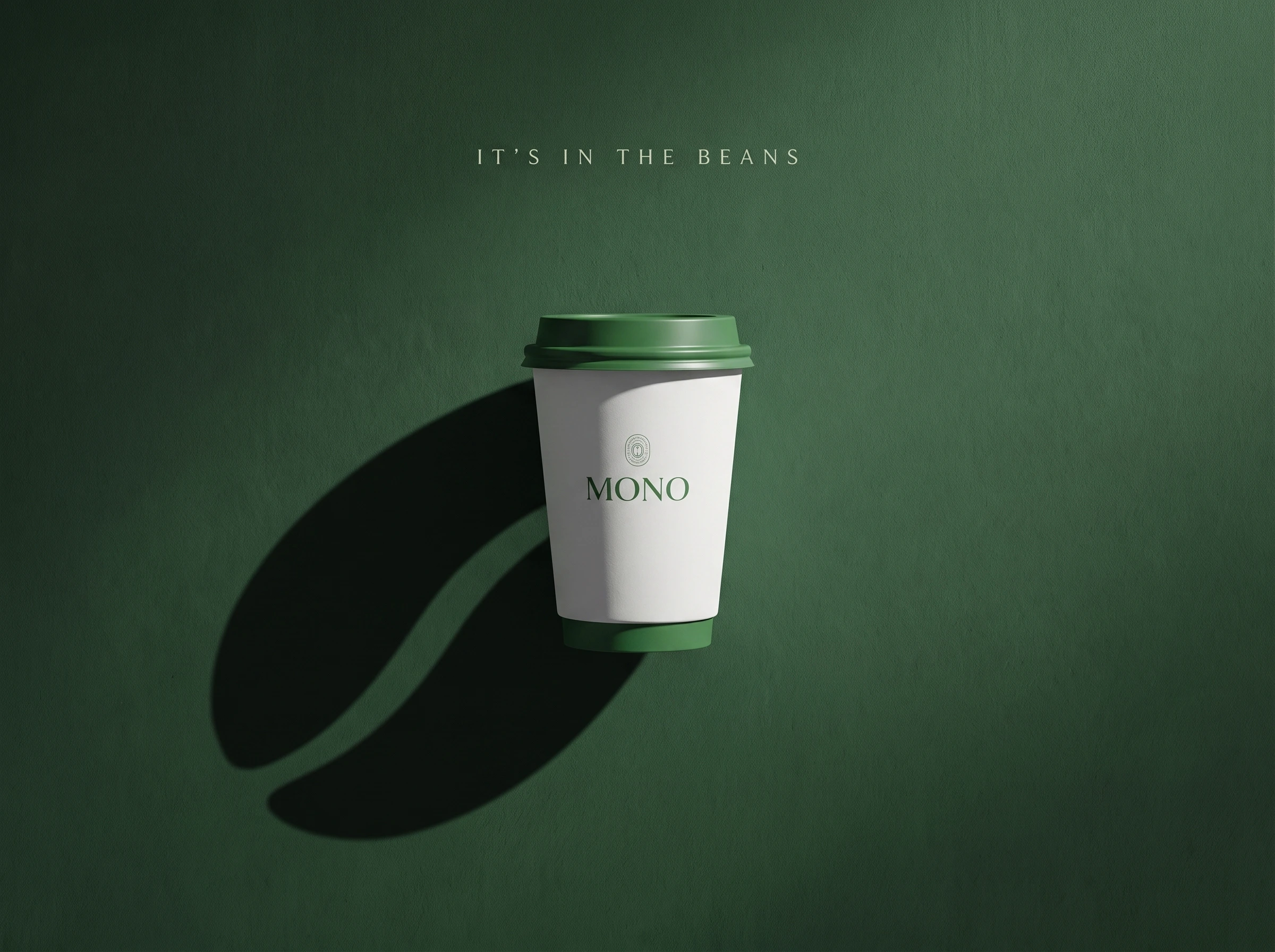
Every frame gives the cup room to breathe. And in the final shot, the shadow says what words can't, it's in the beans.
This is MONO. Single origin. Nothing else.
#branddesign #branding #visualidentity
0 likes · 17 views · Jul 4, 2026
Most coffee brands shout. More flavours. More syrups. More noise. MONO does the opposite. The name says everything: one origin, one bean, one intention. N...


