Increasing pet food & supplies sales on a pet pharmacy website

Background
Our client -- a budget-friendly pet pharmacy and pioneer in moving pet care out of brick-and-mortar stores -- served millions of customers and built a loyal base of pet parents.
With the rise of companies entering in the pet health e-commerce world, they saw an urgent need to become more than just a pharmacy by expanding the types of products customers go to them for — beyond medication and into food and supplies.
While they already carried non-medication items, these products saw very low conversion rates.
We needed to pinpoint why their customers only purchased medication and identify high-impact ways to get customers to engage with products in other categories.
Additionally, we needed to do it all without causing interruption or harm to their strong medication sales.
Outcome
By identifying and carefully analyzing user behaviors, building strategic design concepts, and testing our hypotheses via moderated and A/B tests, we tripled the amount of non-medication items sold on the website.
Mapping Key Flows
We set out mapping out key user flows to highlight what users are seeing and doing when they interact with PetMeds.
Given that we had been working with PetMeds for over a year already, we already knew a lot their journeys.
User 1: Existing Customer Reordering Medication

User 2: New/Existing Customer Shopping For a New Medication

User 3: New Customer Shopping for Pet Food

Personalized Homepage
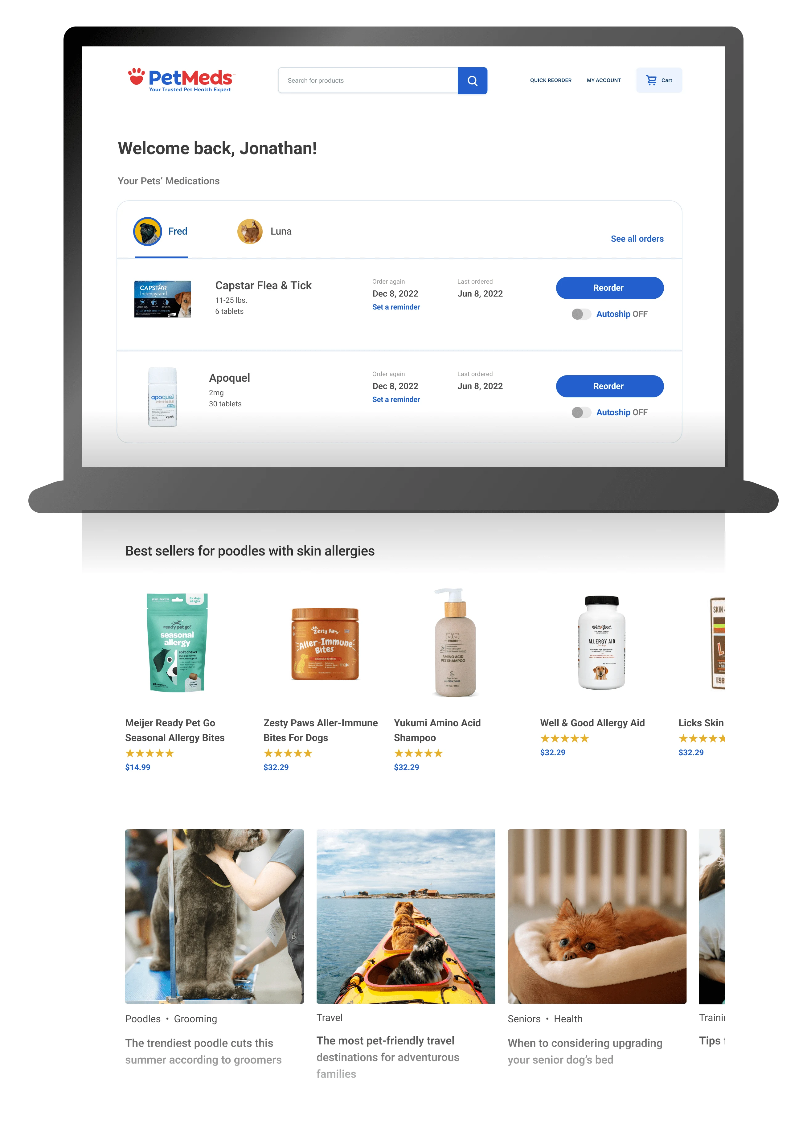
Instead of bringing customers to their My Account page to reorder a medication, we designed and tested a personalized homepage experience, where we not only improve the reordering experience but also could get their eyes on non-medication merchandise.
Beyond that, the merchandise we show customers aims to pique their interest by being personalized to each customer’s pets’ ages, breeds, and health conditions. Because most of PetMeds' customers have purchased a prescription item, and prescription items people to provide this detailed information about their pets, we wanted to leverage this data as much as possible.

Optimized Quickview
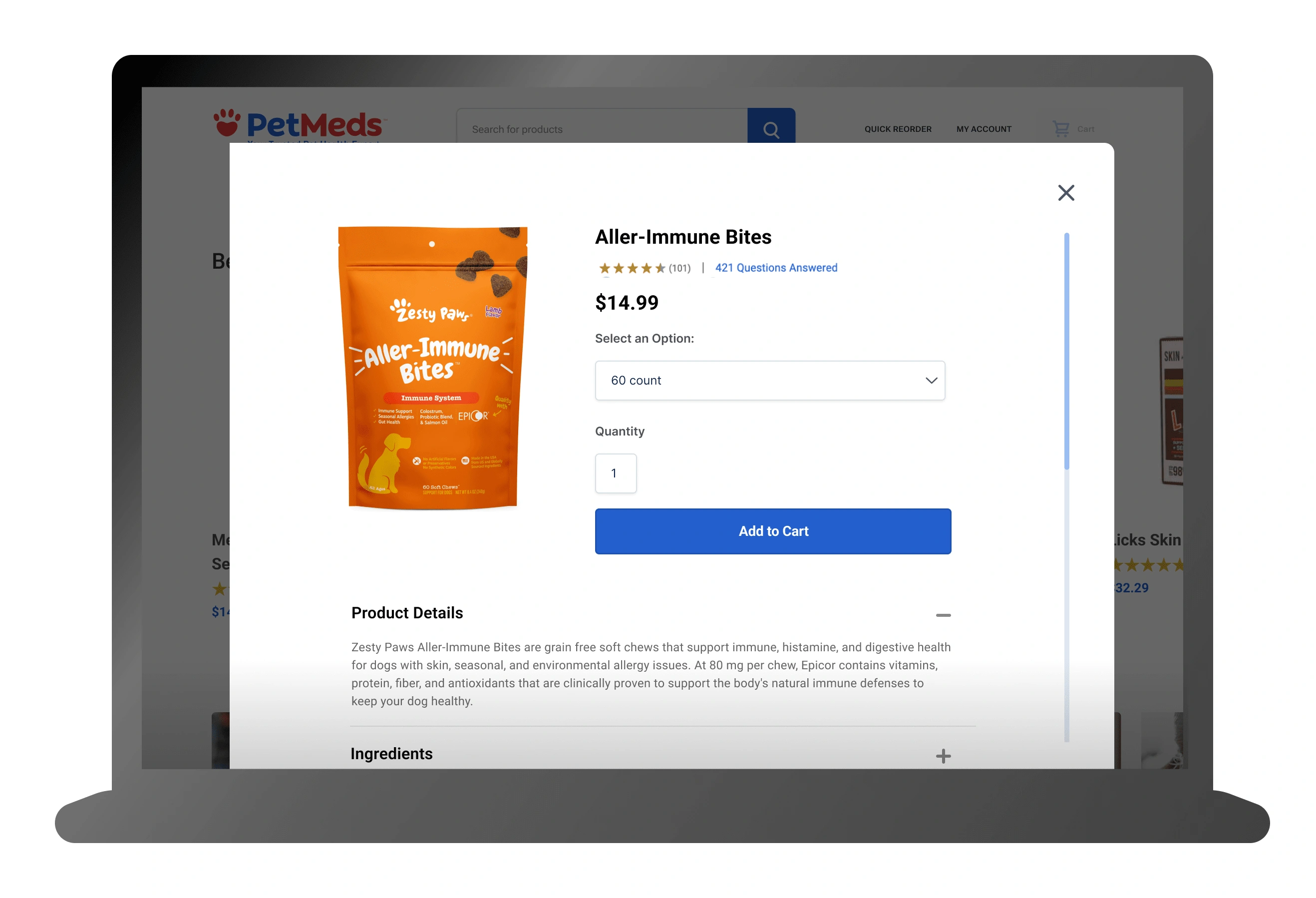
To maintain the effective medication reordering funnel (and thus high conversion rates) while encouraging customers to shop for other items, we needed to optimize the Quickview functionality.
Ideally, we want customers to add items to their cart without leaving this page. During our user testing sessions, we asked users what types of information they would need about common food & supplies before purchasing.
Many participants mentioned they need to look at ingredients before buying an edible item — often due to allergies or other health concerns — so our redesigned Quickview pulls in all product information.

Mini-Cart
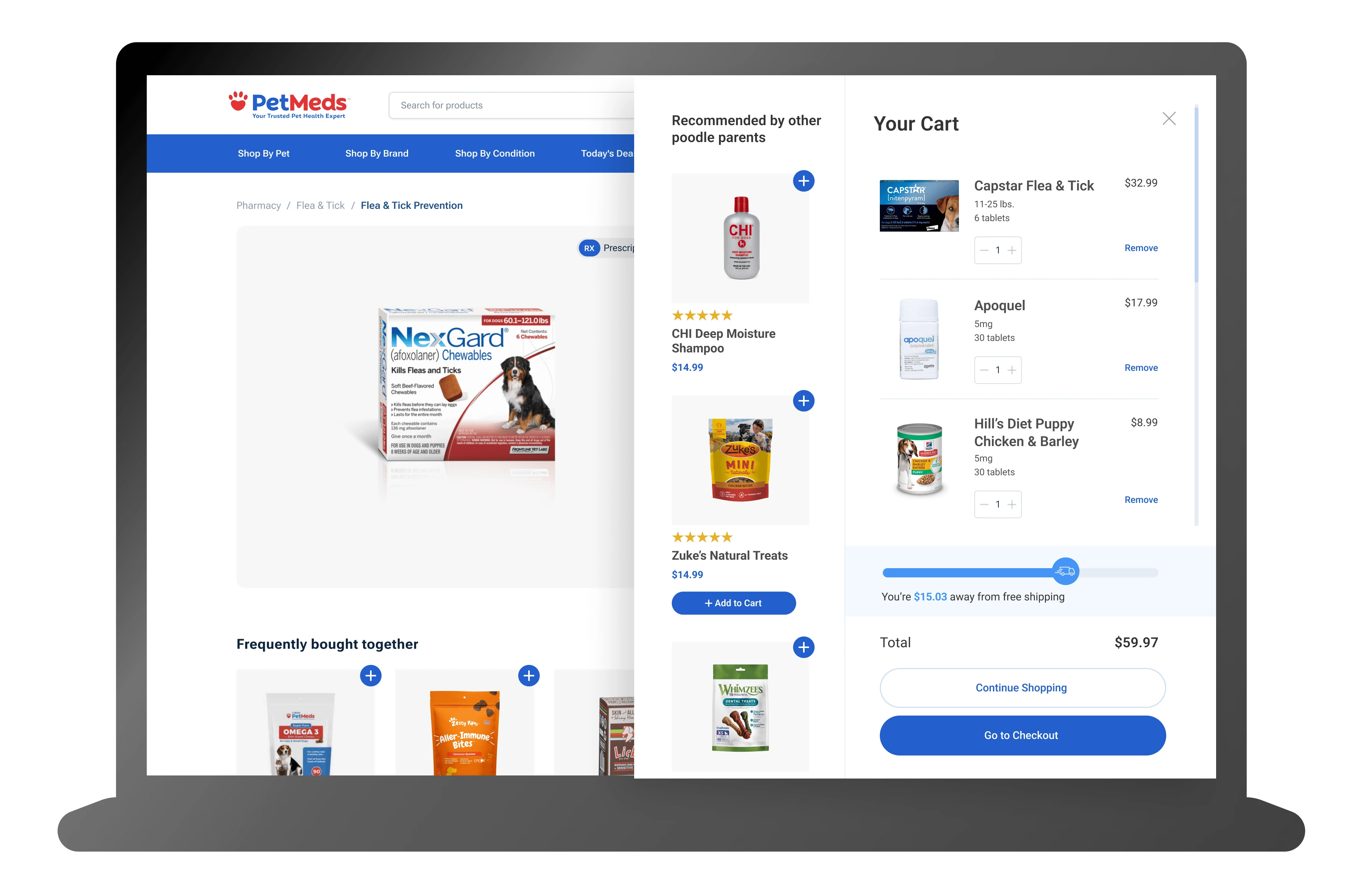
We wanted a way to catch even the most tunnel-visioned users, so we redesigned and built a new Mini-cart experience.
Upon adding an item to cart, users see a cart preview modal that includes a product carousel with the no-brainer items that user testing participants mentioned they often pick up at the pet store when buying necessary items for their pets.
This product carousel can (and will) change based on performance metrics over time — it can include personalized categories such as “Poodle parents also bought," sale-driven ones like “We found this for you in sale,” or simply “You May also like.”

Please visit the page below for the full case study (pw: CC24):
Like this project
Posted Aug 29, 2024
How we tripled targeted website sales by analyzing user behavior, and strategically implementing & testing key features
Likes
0
Views
2


