Sleek, Minimal UI for Social Music Website
Justin Emmanuel Sanchez
Rate My Tone is a social music website that allows users to share demos or snippets of songs they've produced or wrote and seek feedback from others. The creator, Eddie, reached out to me to redesign the entire website except the homepage. He asked me to go for a minimal but sleek look for the site specifically the Tone Feed and the Dashboard pages.
Try the Desktop Demo below:
The current website, according to Eddie, has gone through multiple iterations of design but he was never really happy with the UI. I spoke to him about this and asked him to send me screenshots of sites he felt inspired by and the vision of the aesthetic he was trying to go for.
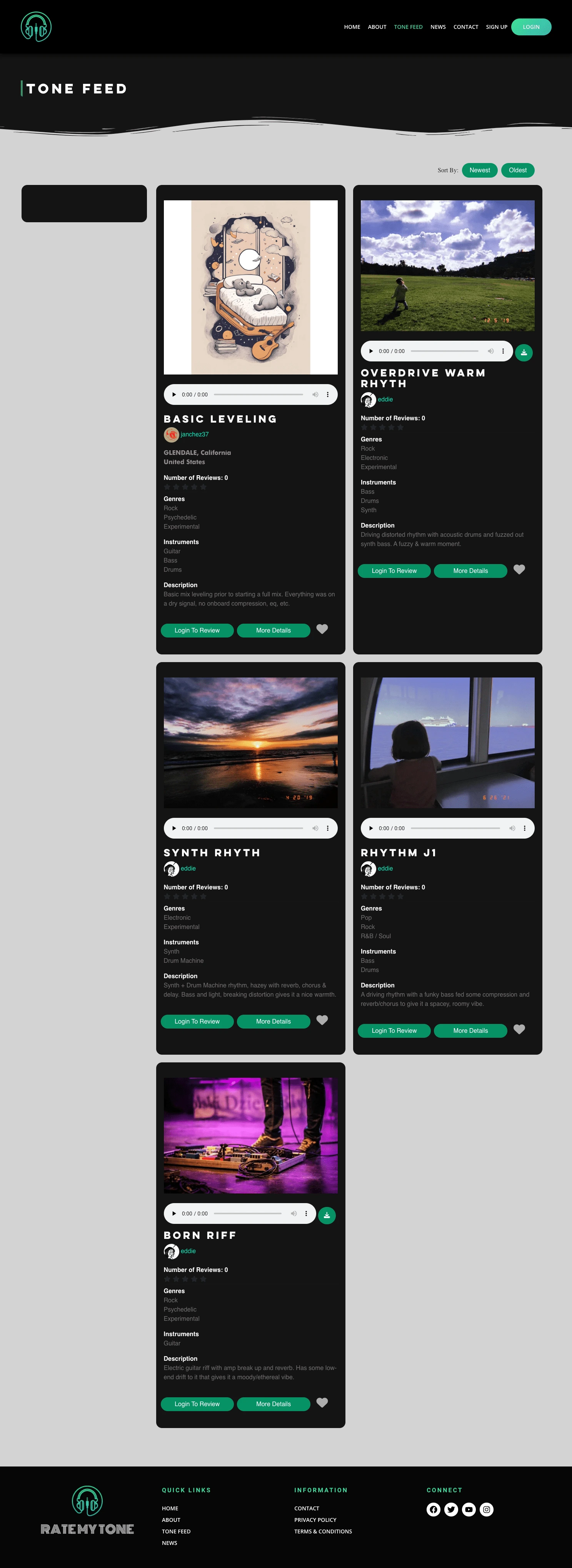
At this time, here are the screenshots of the current Tone Feed and Dashboard pages. These pages needed the most attention and spent the most time on shaping it out.
With Eddie's suggestions and my knowledge on music sharing websites, I created an inspiration board with ideas and what I wanted to design before I executed. I kept his current color palette and the logos that were already on the page. I was focused on the functionality and a minimized design that still fit the brand of the website.
Inspiration board/Planning
Once we were happy with the ideas on the board, I went to work in creating the Tone Feed frames. A lot of my inspirations came social media websites like instagram, facebook, in combination with Eddie's screenshots. I tested his tastes with a couple designed cards and the ones he was happy with, we stuck onto the Tone Page.
Hi-Fi Tone Feed page
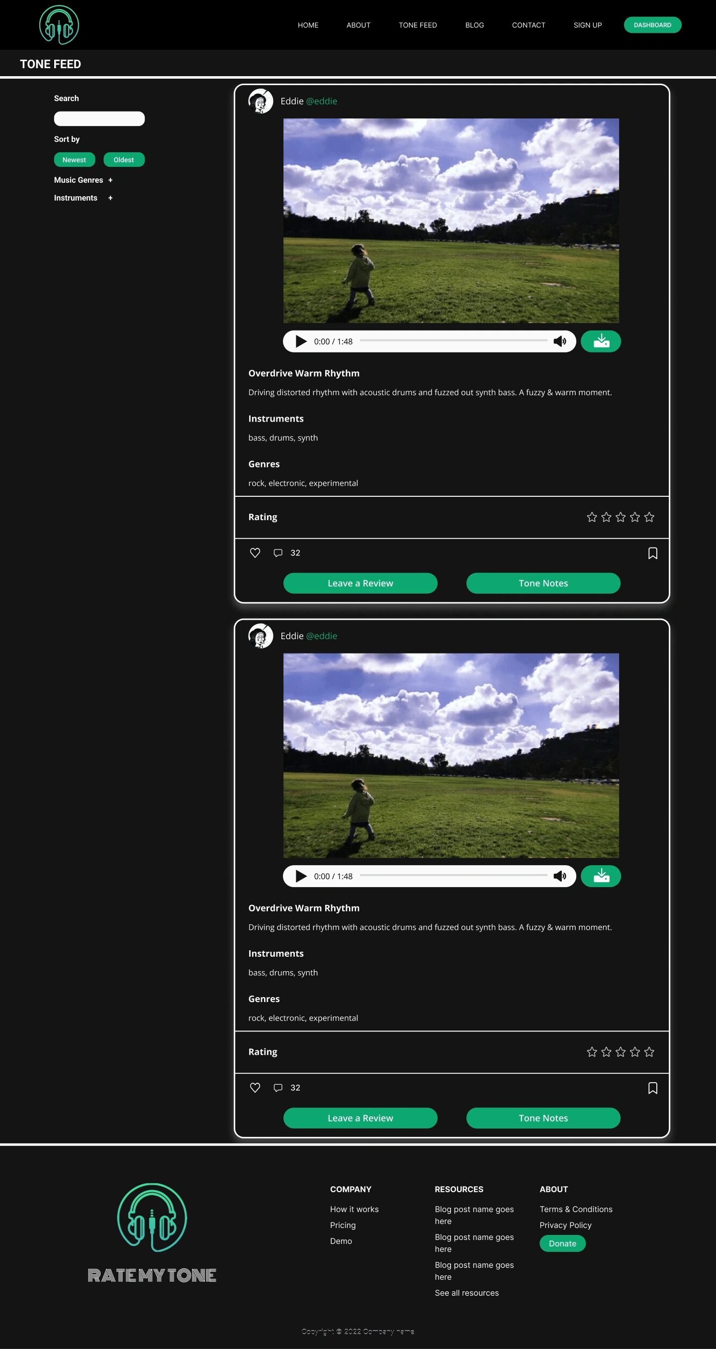
The updated Tone Feed page features a feed scroll in the middle and a sidebar. The sidebar's feature allows the user to search for different genres users have added to their posts. It's sticky and will scroll with the user all the way to the footer of the page.
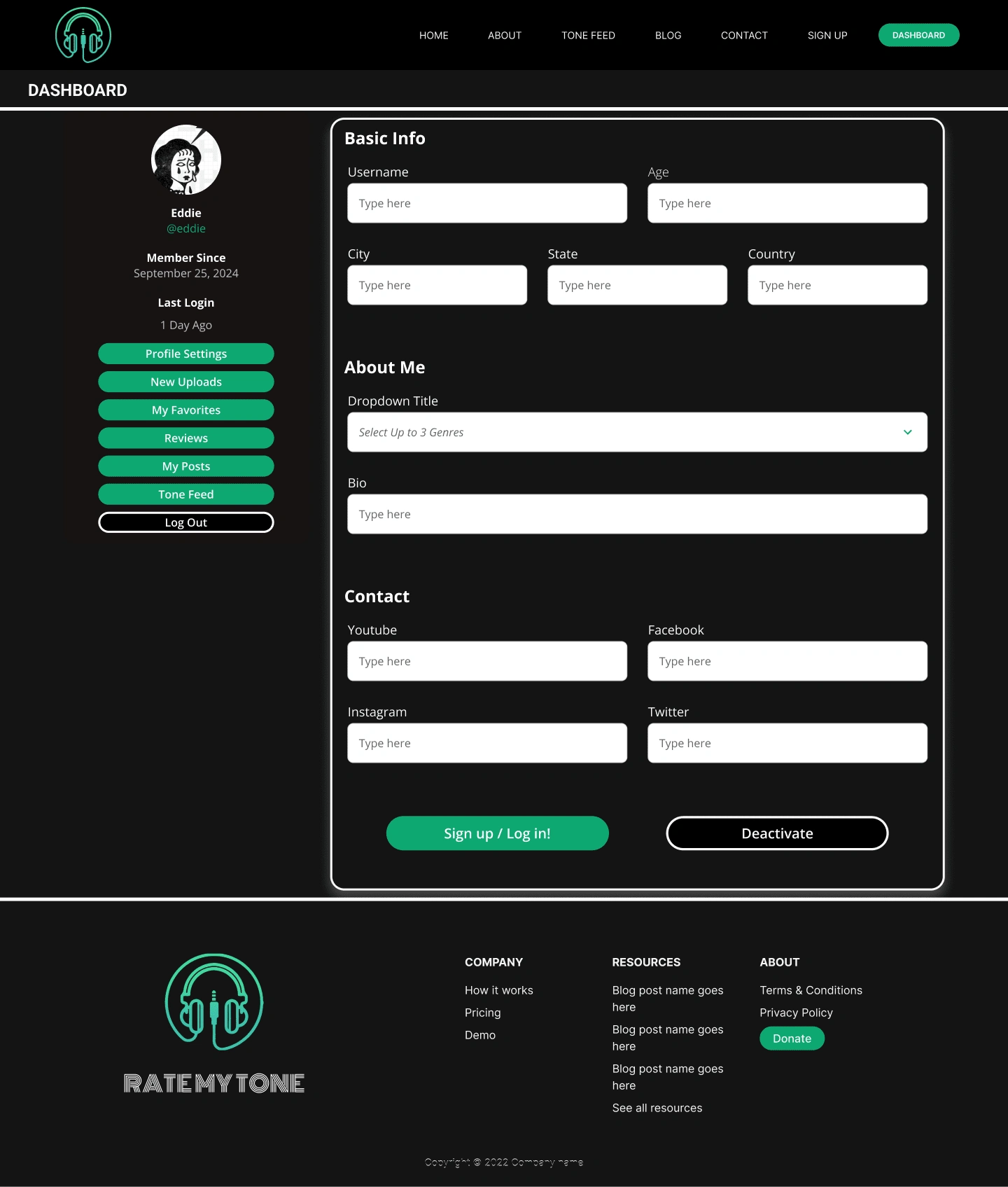
Dashboard pages
For the dashboard pages, I used the older site's look as a base and started redesigning from there.
Old Dashboard Page
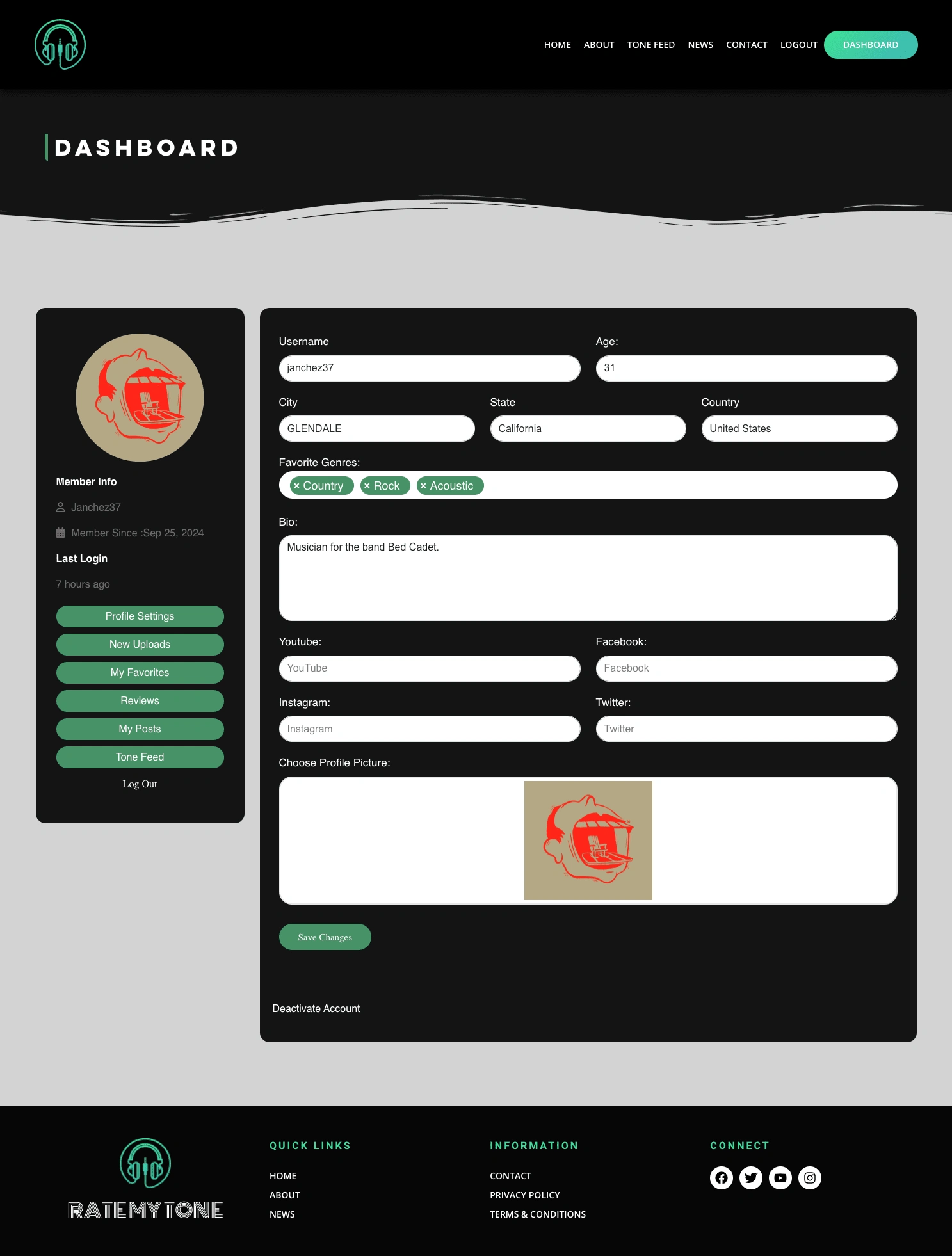
Similar to the Tone Feed, I utilized the black and green as the main colors. The layout changed slightly by organizing the forms and grouping input fields in their respective categories.
Revamp'd Design:
Results
By the end of completing the Dashboard and Tone Feed pages, Eddie wanted me to continue revamping the rest of the site (except the homepage since we agreed it already looked great). The end result came out to over 12 screens that have successfully been delivered to the developer. At the time of this case study being written, the developer only has the Tone Feed developed and is currently in the process of developing the rest of the pages.
If you would like to visit the website, check out ratemytone.com and sign up if you are interested in producing or writing music!
Like this project
Posted Oct 24, 2024
Justin led the redesign of a social music website, integrating a complete revamp to create an intuitive interface that enhanced usability and engagement.
Likes
0
Views
3