Hamilton Watch Poster Design
Eddie Mbugua
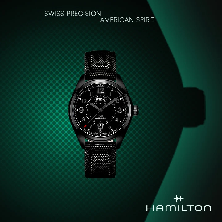
Hamilton Poster design.
Purpose or aim of this poster
The main aim of this poster is to showcase the watch. It just needs to show the viewer that Hamilton have a new watch and this how it looks like.
Thought Process
First went to Pinterest to look for a design that looks good and satisfies the main purpose of this design.
This poster needs to standout from the first glance. It should send the message to the viewer from one look or glance.
So the watch is the centerpiece of the design. The original picture was too bright and it would not fit the theme of this design. So made it slightly darker and made it pop using a few adjustment layers in Photoshop.
I choose a font that simple and easily readable, for this case I chose Poppins Thin.I did a quick search online of the company's slogan and came up with "swiss precision, American Spirit. I placed this text at the top of the design. Chose white as the color of the text to give it enough contrast.
For the colors, I chose black and a emerald green for the background. Black is usually thought of as bold and powerful. The emerald green signifies wealth and abundance. So the overall poster colors show power and wealth.
Then I placed the logo of the company at the bottom corner of the design.
Like this project
Posted Oct 5, 2025
Designed a poster for Hamilton's new watch using Photoshop and Pinterest for inspiration.
Likes
0
Views
4