Nike Poster Design for Social Media
Eddie Mbugua
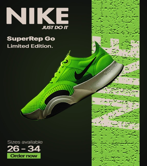
Here’s How I See My Nike Poster
Balance — Keeping It Steady but Exciting
I went for asymmetrical balance here. The bright green shoe on the right really grabs attention, while the bold “NIKE” and text on the left keep everything feeling grounded. I added that textured green strip with the repeated “NIKE” to give some visual weight and balance out the solid black on the left side. It feels like a perfect visual handshake to me!
Contrast — Making the Important Stuff Pop
I wanted the neon green shoe to really pop against the dark background — it’s bright and eye-catching without being overwhelming. The beige text stands out nicely against black, so everything’s easy to read. I also played with size differences, making “NIKE” big and bold while keeping other details smaller to guide the viewer’s eye naturally.
Alignment — Clean and Organized
All the text is lined up neatly on the left. I like how that keeps things tidy and easy to follow. The shoe’s diagonal tilt adds some dynamic energy, making the whole design feel alive — just like the product itself!
Repetition — Reinforcing the Brand
Repeating “NIKE” in the green textured area was a deliberate choice. It’s a subtle way to remind people who’s behind this awesome shoe without shouting it. Sticking to the same font family throughout also helps keep the poster cohesive and professional.
Proximity — Grouping Related Info
I grouped the info logically: brand and slogan at the top, product name in the middle, and size plus “Order now” at the bottom. This way, it’s easy to digest without feeling cluttered.
Hierarchy — Guiding the Viewer’s Journey
I made sure “NIKE” grabs attention first — it’s huge for a reason! Then the product name, and finally the details like sizes and ordering info. It’s like a natural conversation that flows smoothly.
Emphasis — What’s the Star?
The neon green shoe is definitely the star here — bright, bold, and impossible to ignore. The green “Order now” button is there to invite action, so viewers know exactly what to do next.
Colors — Bold and Energetic
I chose neon green because it screams energy and innovation — perfect for a cutting-edge shoe. Black adds sophistication and makes the colors pop. The beige text softens things just enough to keep it modern and easy on the eyes.
Fonts — Clean, Modern, and Sporty
I stuck to sans-serif fonts to keep things fresh and sporty. The big “NIKE” reminds me of classic geometric fonts like Futura — strong and iconic. The italicized “JUST DO IT” adds a nice sense of movement. The rest of the text is simple and clean, so everything’s easy to read and consistent.
Bonus
I created this poster in Adobe Photoshop, which was perfect for combining vibrant images, textured backgrounds, and crisp typography all in one place.
The image was sourced from Unsplash and the font from Google fonts. This is NOT Nikes official poster and should not be considered as Nike's.
Perfect for Social Media
I designed this poster to be bold and clear, so it works great on social media. Whether it’s Instagram, Facebook, or Twitter, it’s made to stop people mid-scroll and get them excited about the SuperRep Go.
Like this project
Posted Sep 23, 2025
Created a Nike poster emphasizing balance, contrast, and brand reinforcement.
Likes
0
Views
10