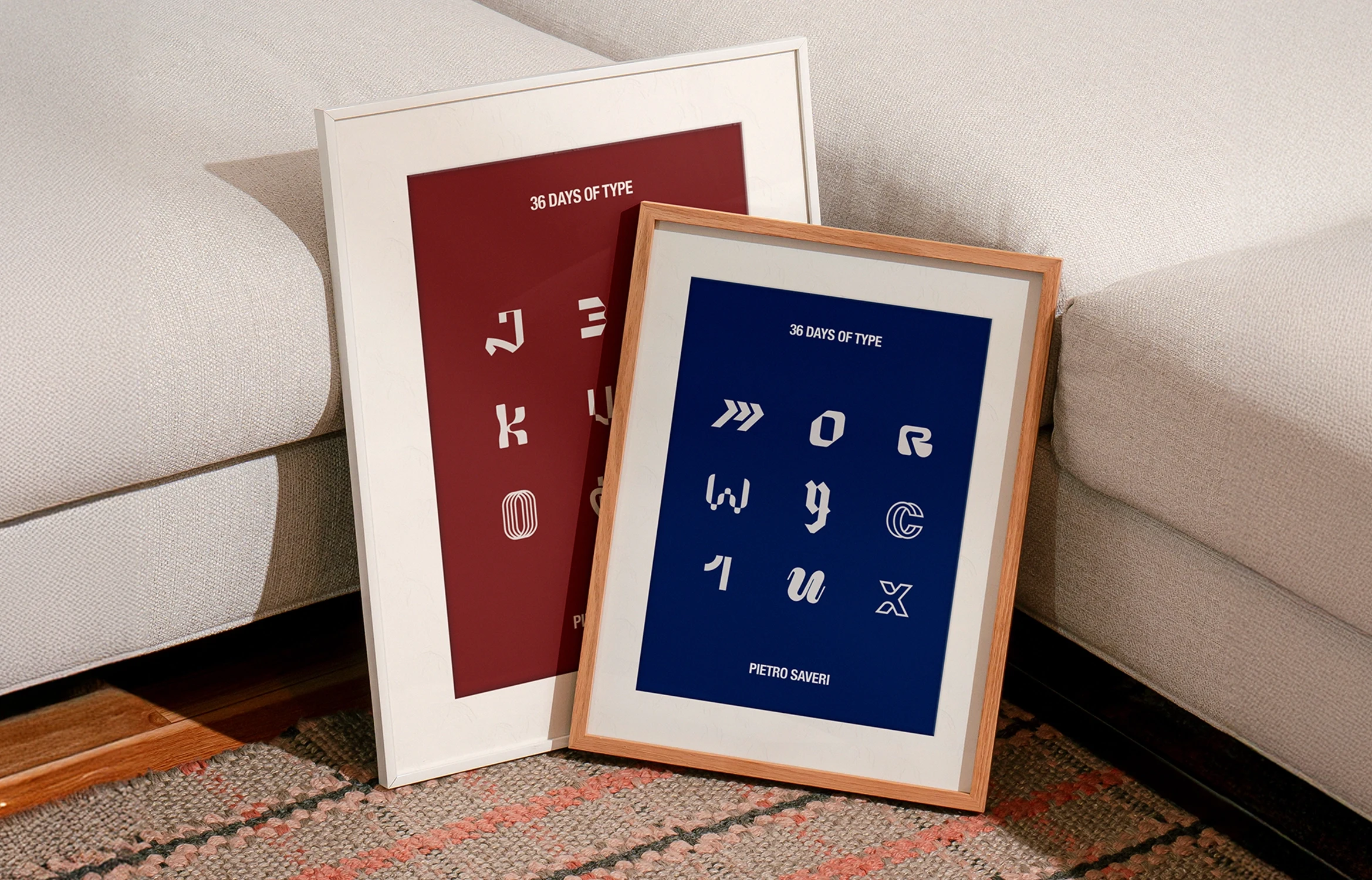
36 Days of Type
Pietro Saveri
36 Days of Type
Industry: Graphic Design
Client: Personal
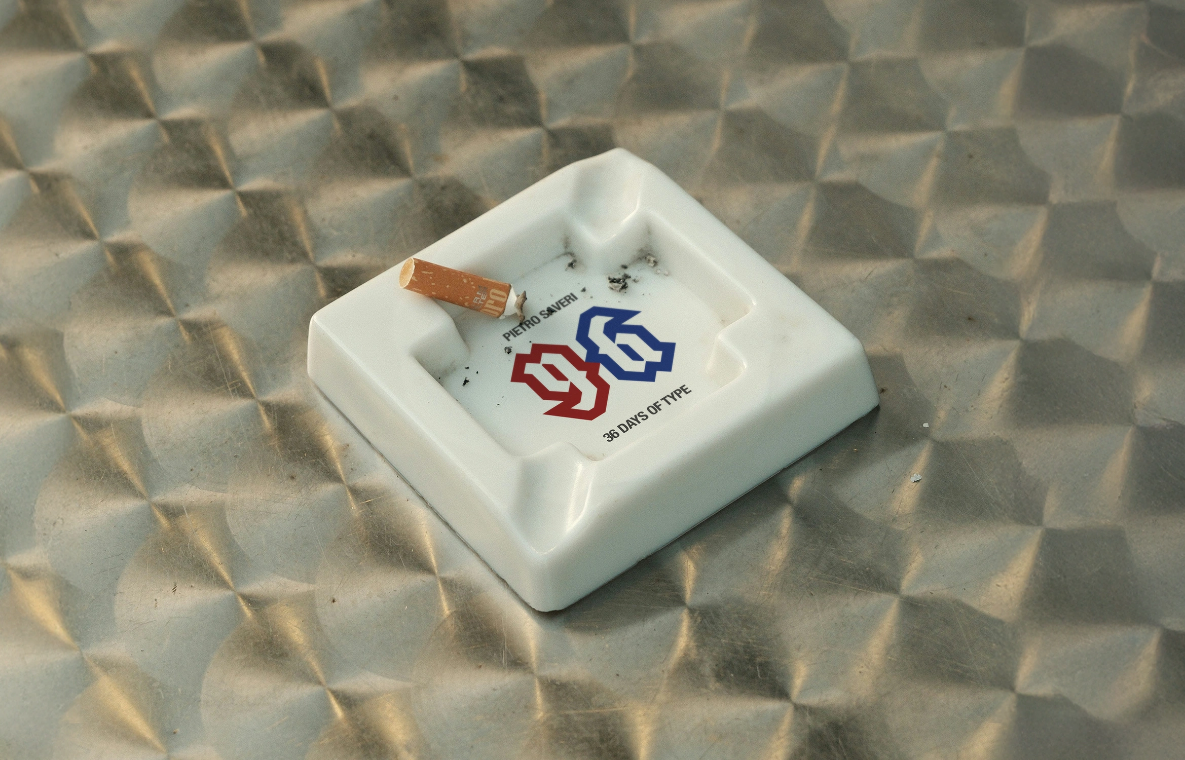
36 Days of Type was a personal exploration built through daily practice, using constraint and repetition to develop a clear visual language over time.
Rather than treating each letter as a standalone piece, every character was approached as part of a wider system. The focus was on keeping the set cohesive while leaving room for variation, balancing structure with experimentation.
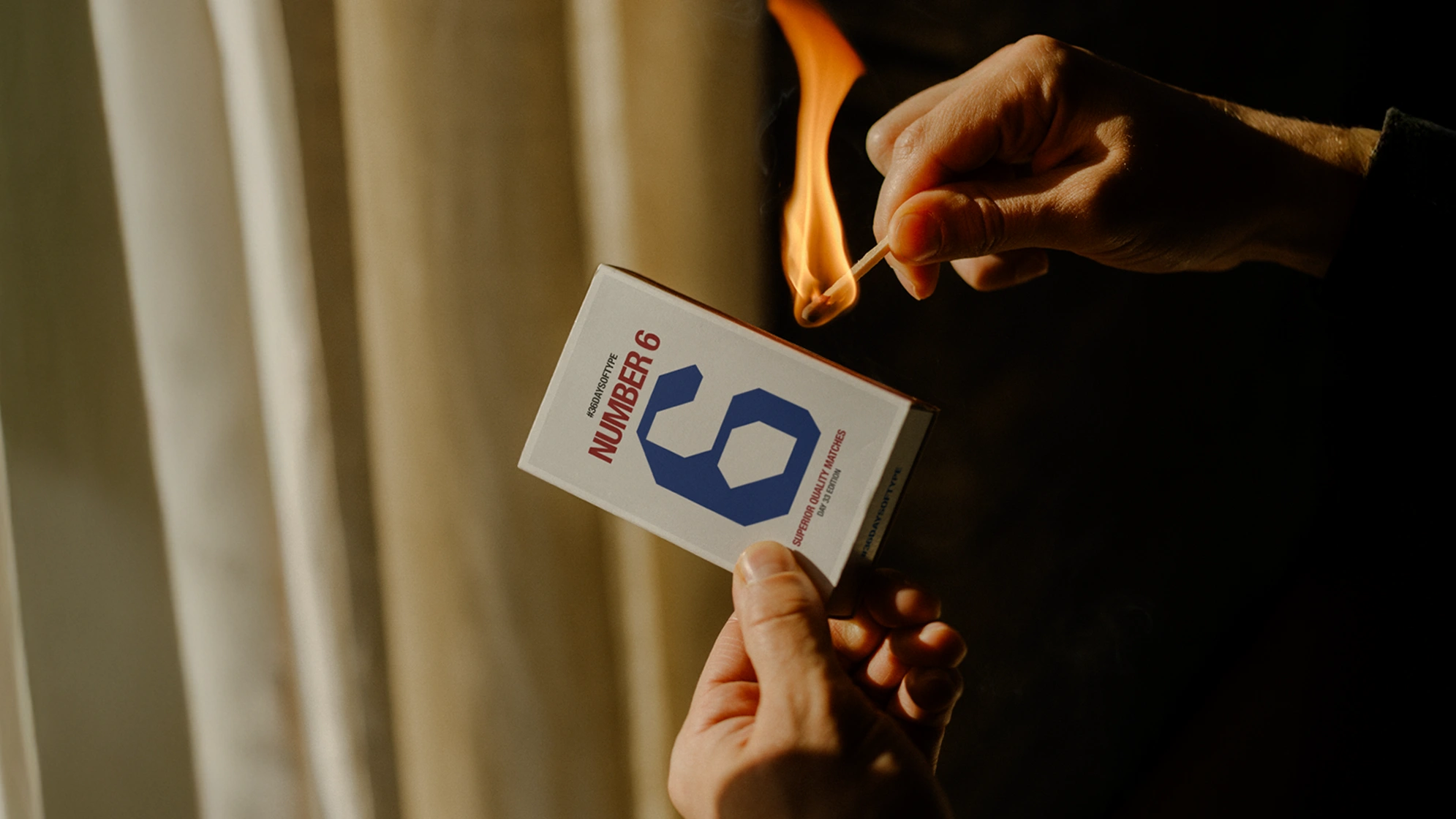
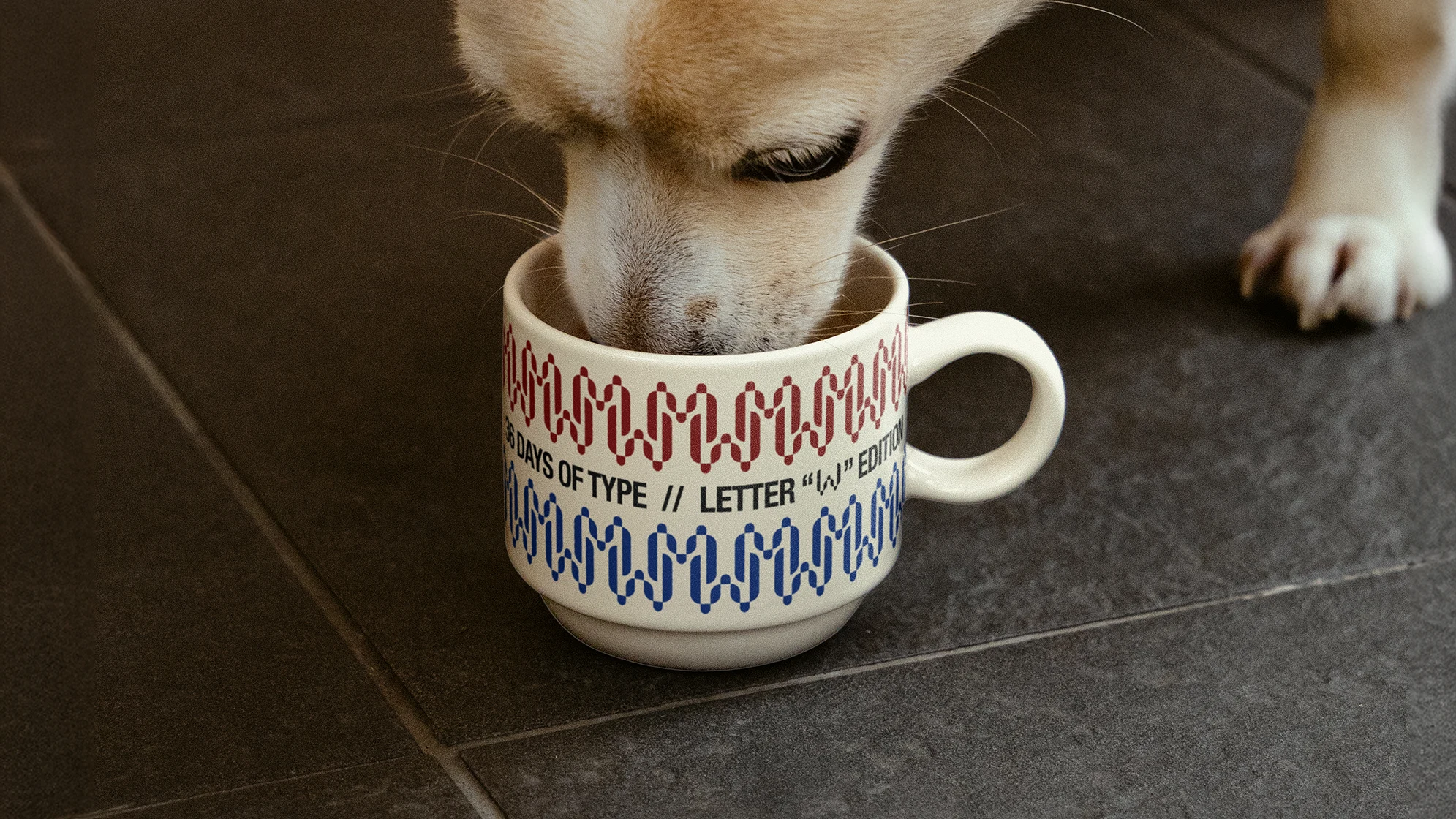
A series of typographic compositions developed across 36 days, exploring form, rhythm, and proportion. The process relied on iteration, refinement, and careful control from one piece to the next.
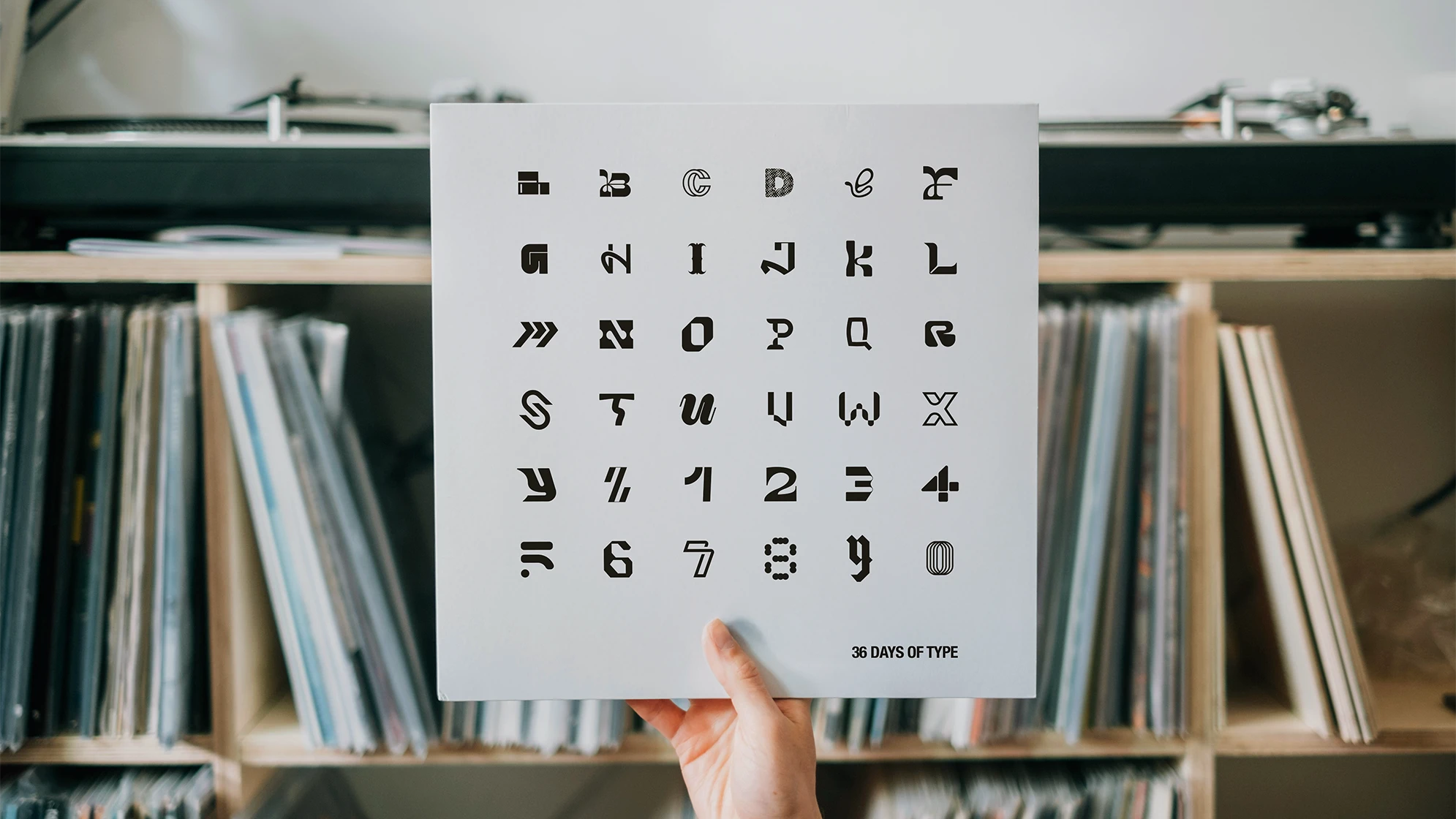
The project became a study in consistency and progression, showing how limitations can drive stronger creative decisions and a more unified visual language.
Like this project
Posted May 14, 2026
A personal exploration of typography through 36 days of design, focusing on visual language.