Moove — Fitness and Community for the 50+ Generation
Agatha Sanabria

Moove — Fitness and Community for the 50+ Generation
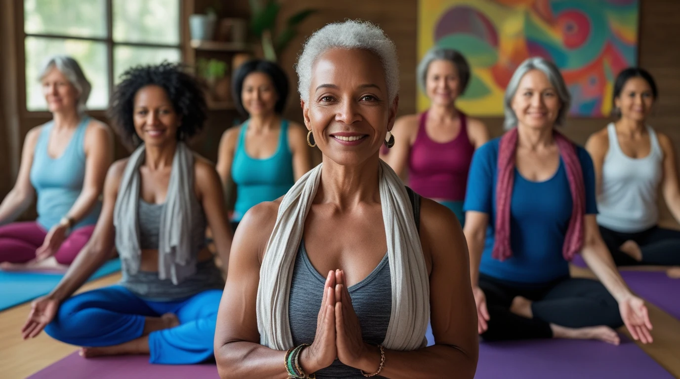
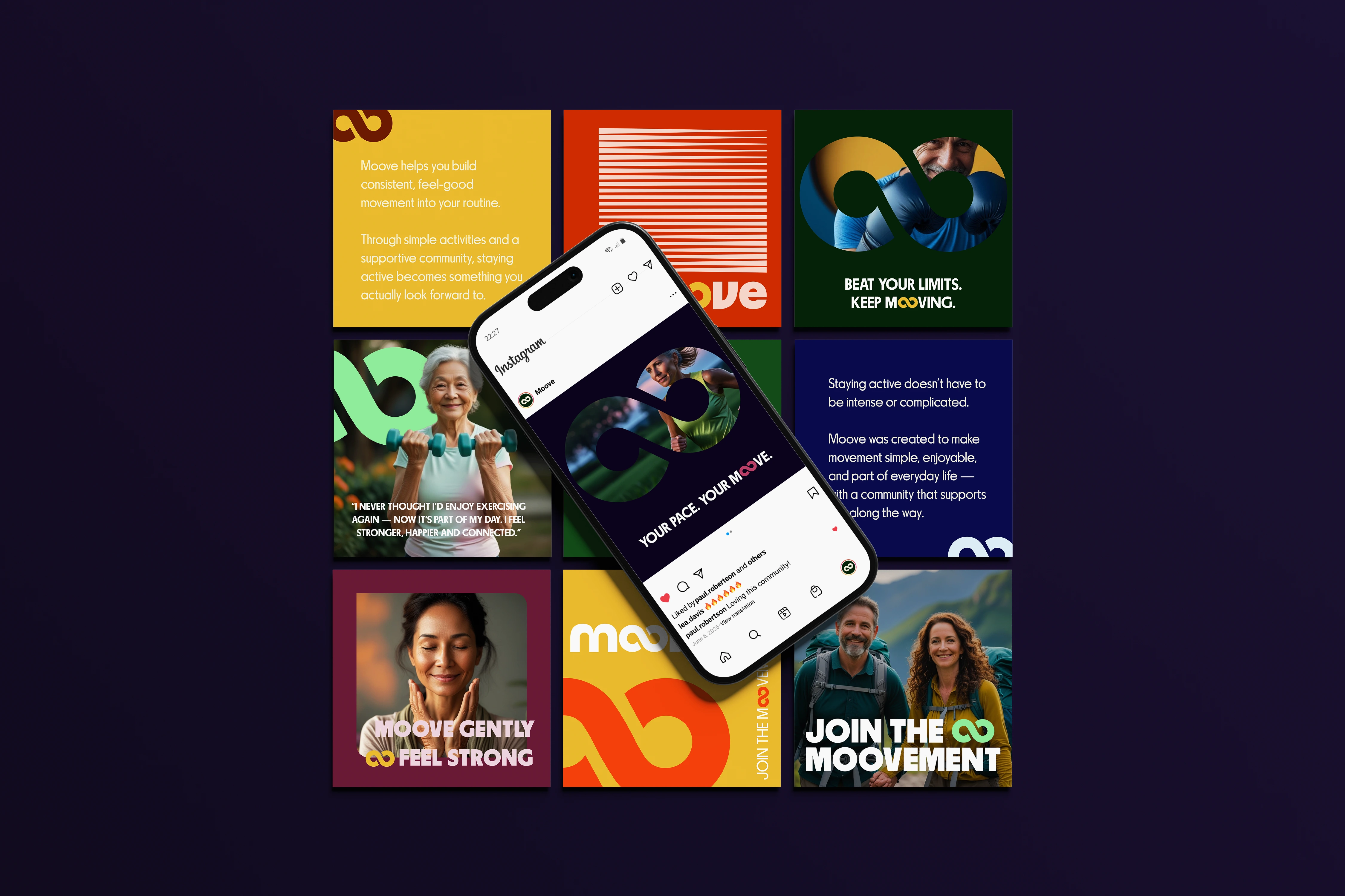
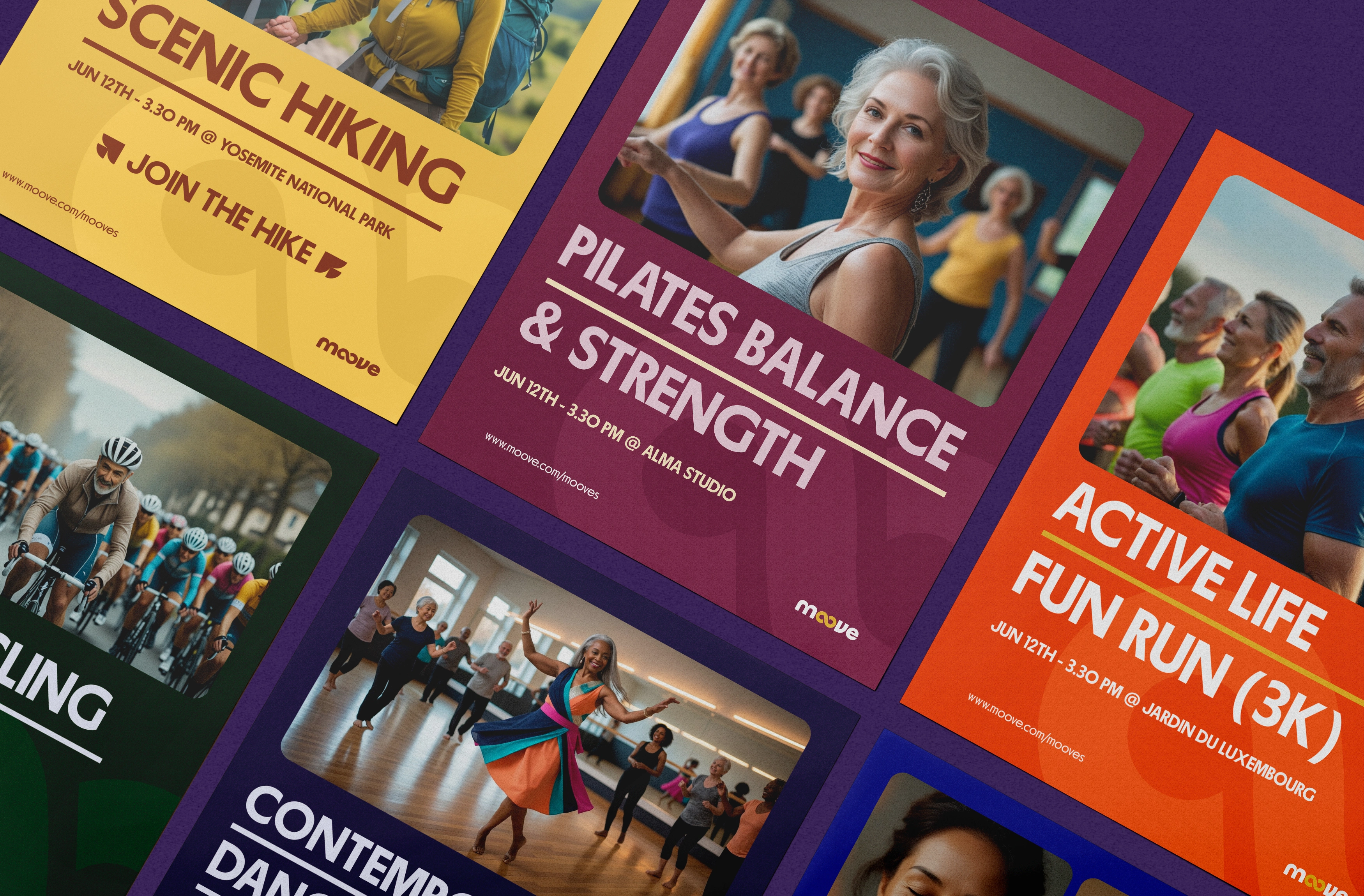
Moove is a fitness and community platform designed specifically for adults 50+, helping them rediscover movement in a way that feels simple, social, and genuinely enjoyable. Instead of focusing on performance, numbers, or intensity, the project reframes fitness as a lifelong journey rooted in consistency, connection and well-being.
The brand strategy centers on building healthy habits through everyday activities and shared experiences, encouraging users to stay active not by pushing limits, but by showing up — together. This platform transforms fitness from an individual obligation into a shared lifestyle — one that feels human, social, and sustainable.
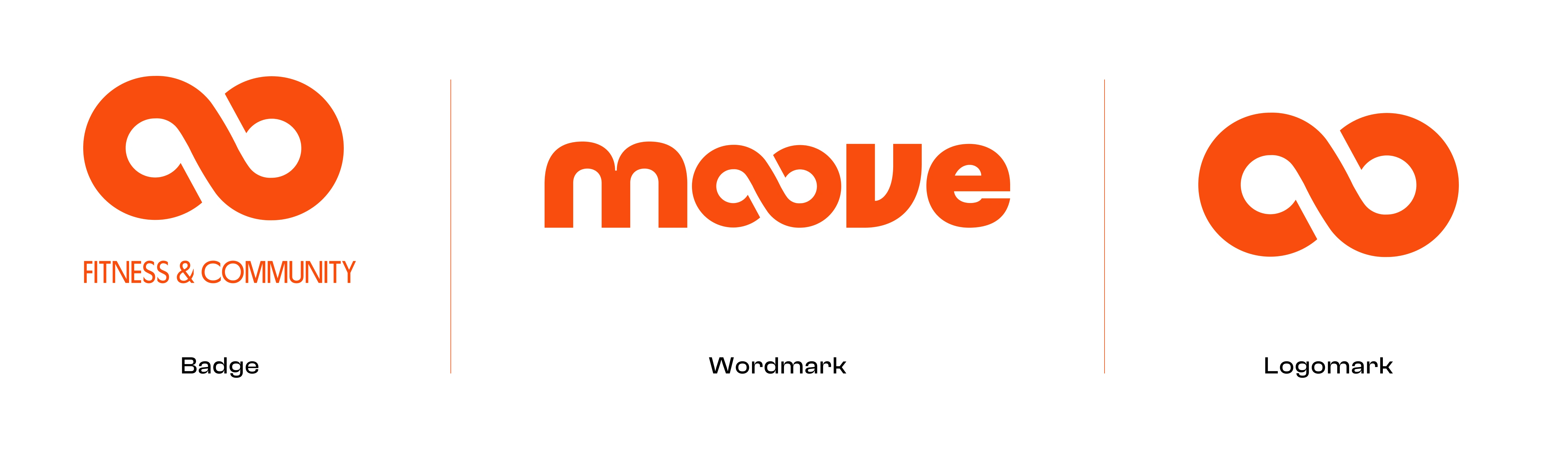
A Symbol of Continuity and Movement
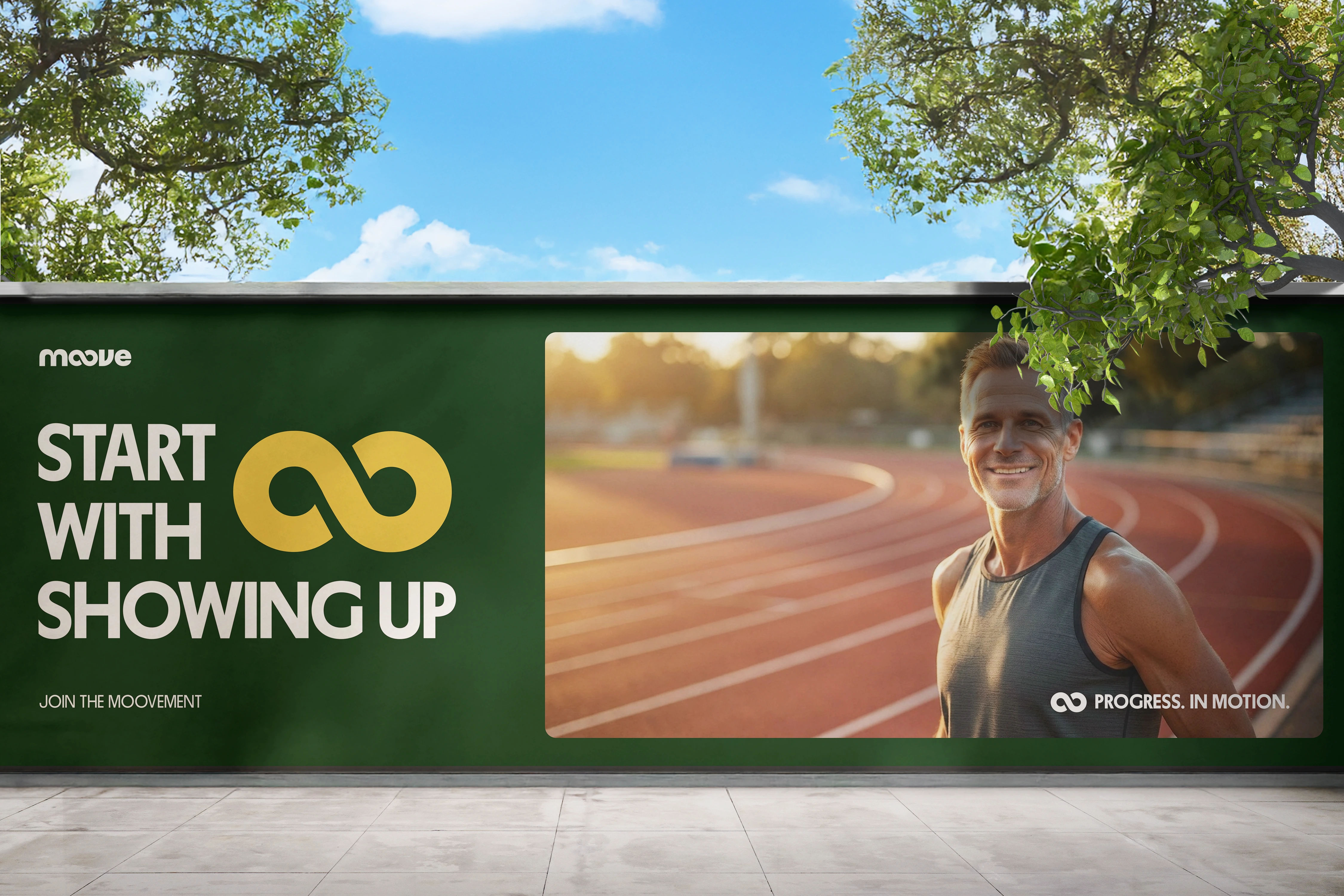
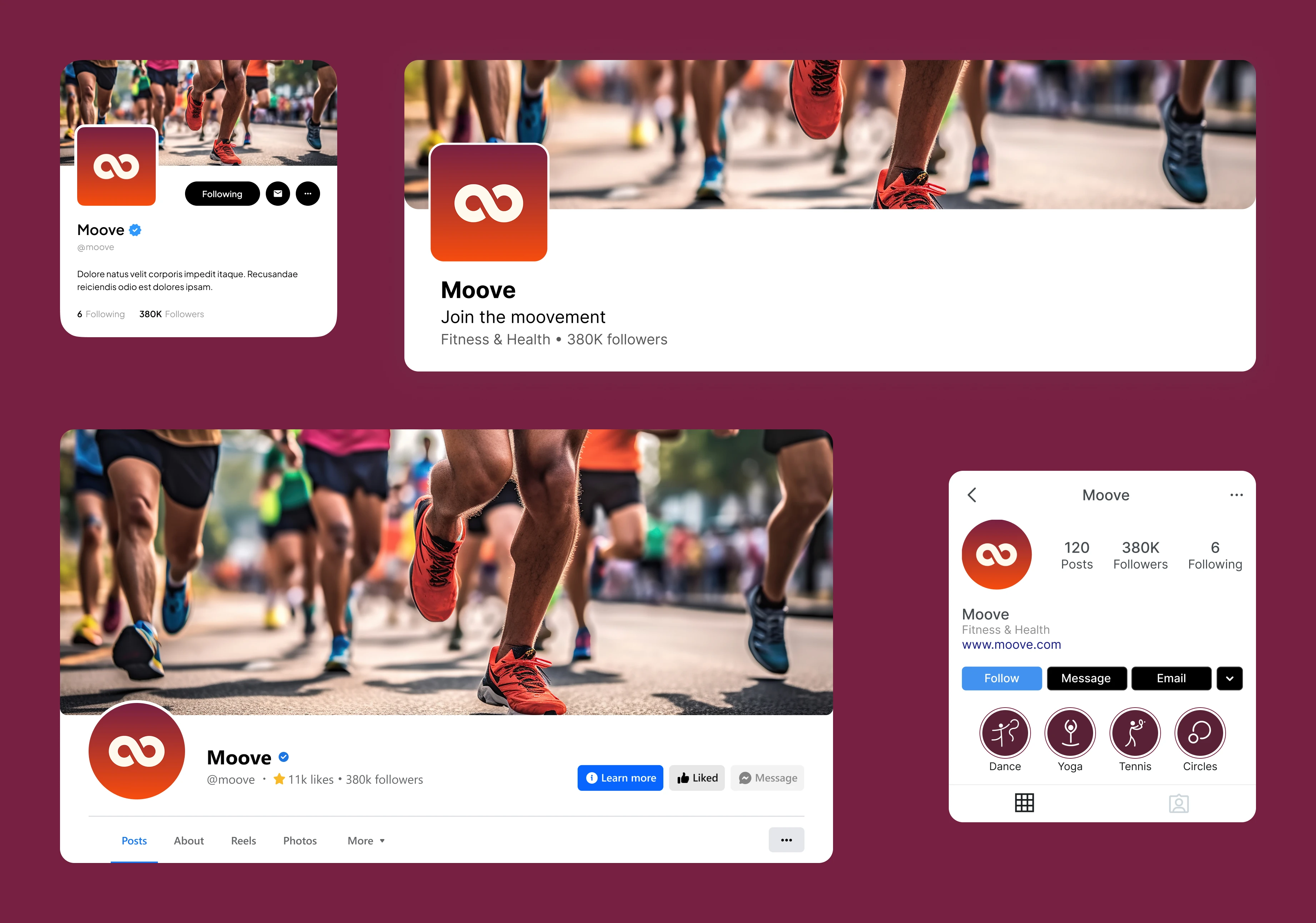
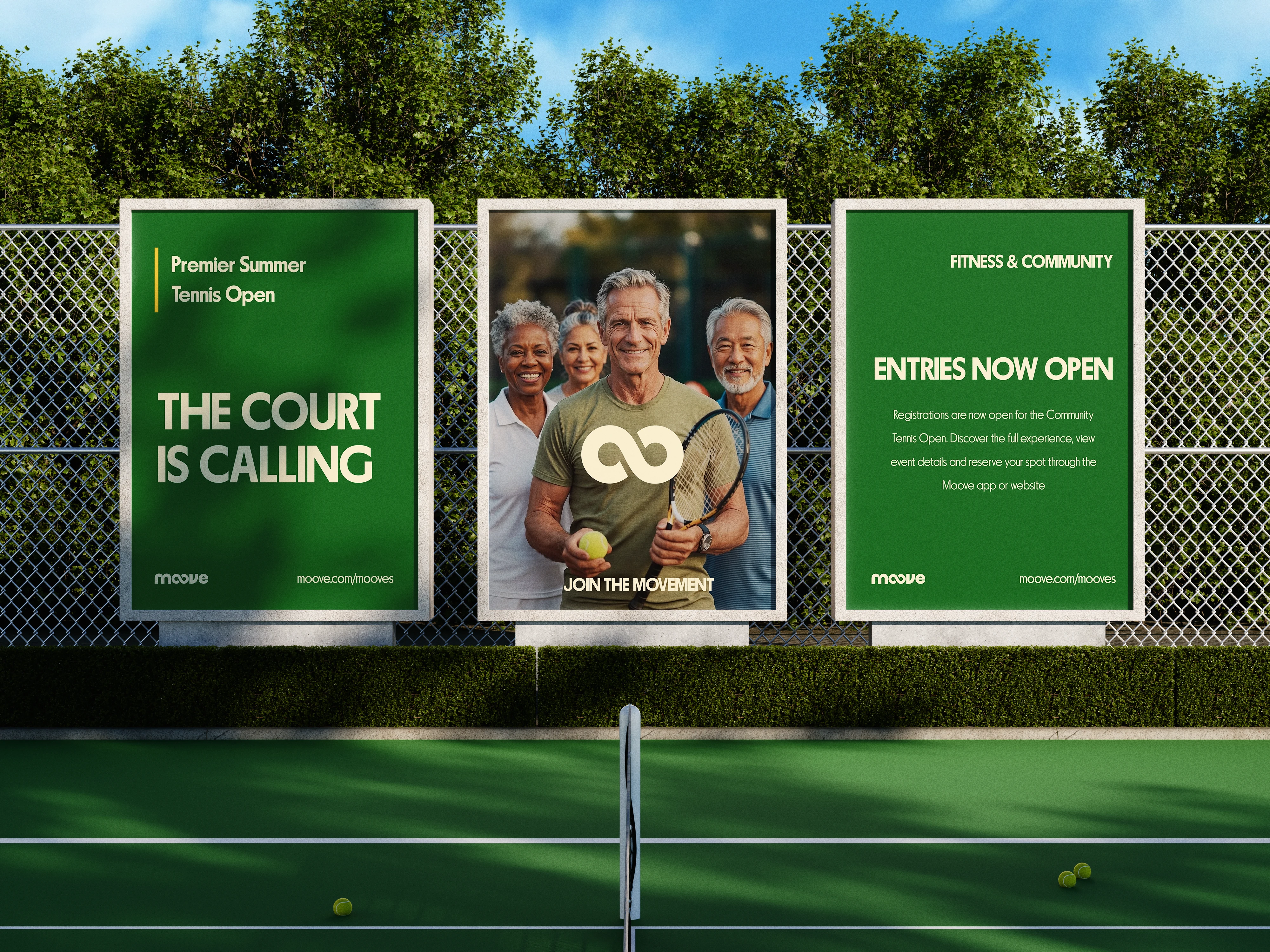
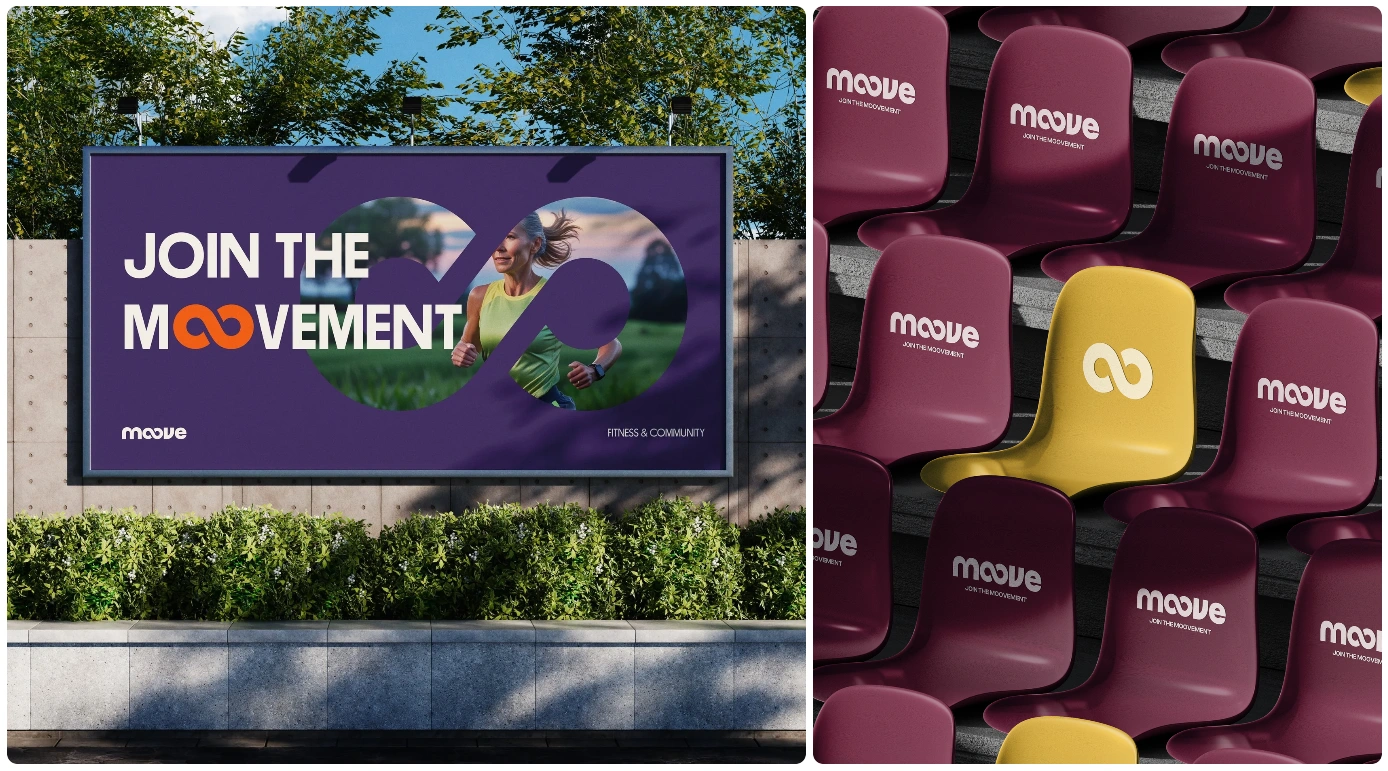
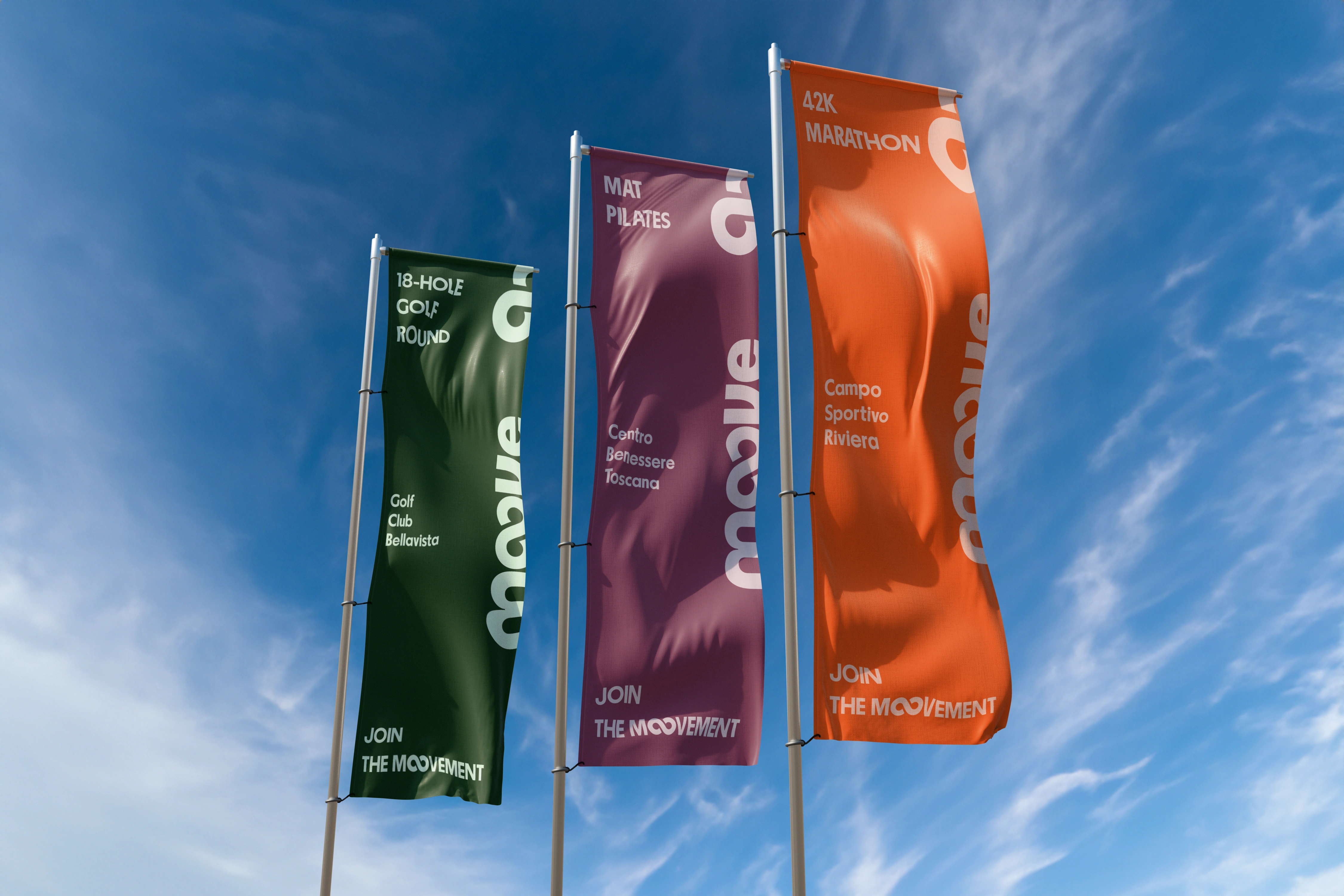
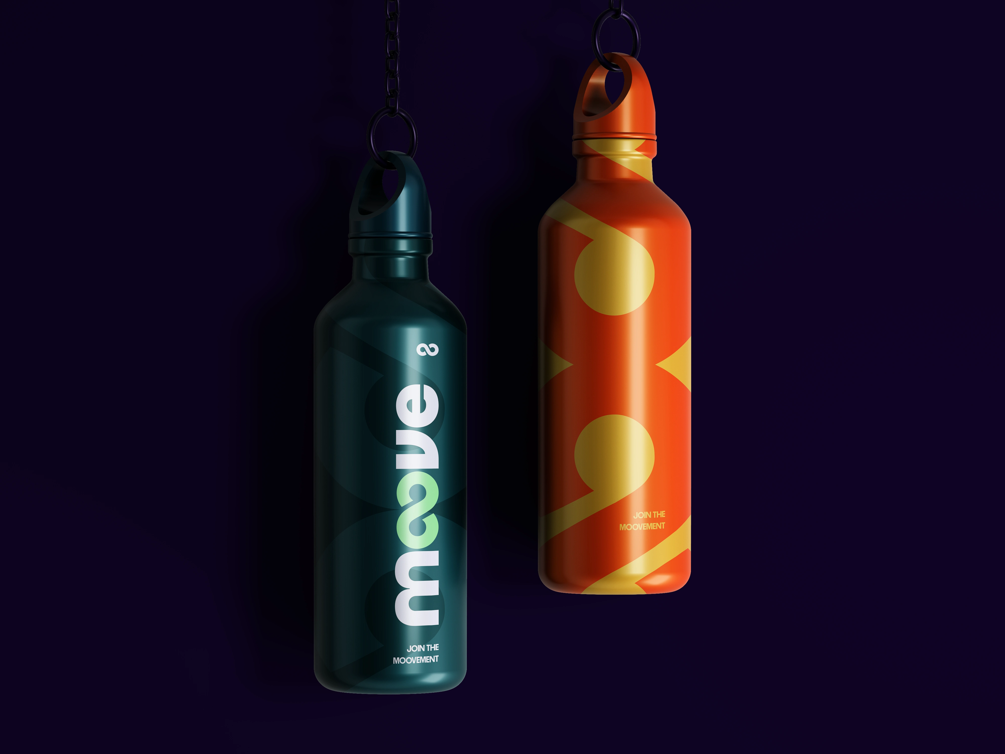
Moove’s logo captures the heart of the brand in one simple, fluid gesture. The two “o”s in Moove merge into an infinity symbol, representing continuity, progress and boundless energy. It’s a visual reminder that movement never really ends — it evolves. For some, it means it’s never too late to start; for others, it’s about pushing your limits and seeing how far dedication can take you.
The infinity loop reflects the ongoing rhythm of wellness, the natural flow between motion and rest and the lifelong journey of staying active. It's not just a mark it's a mindset: keep Mooving, keep growing, keep going.
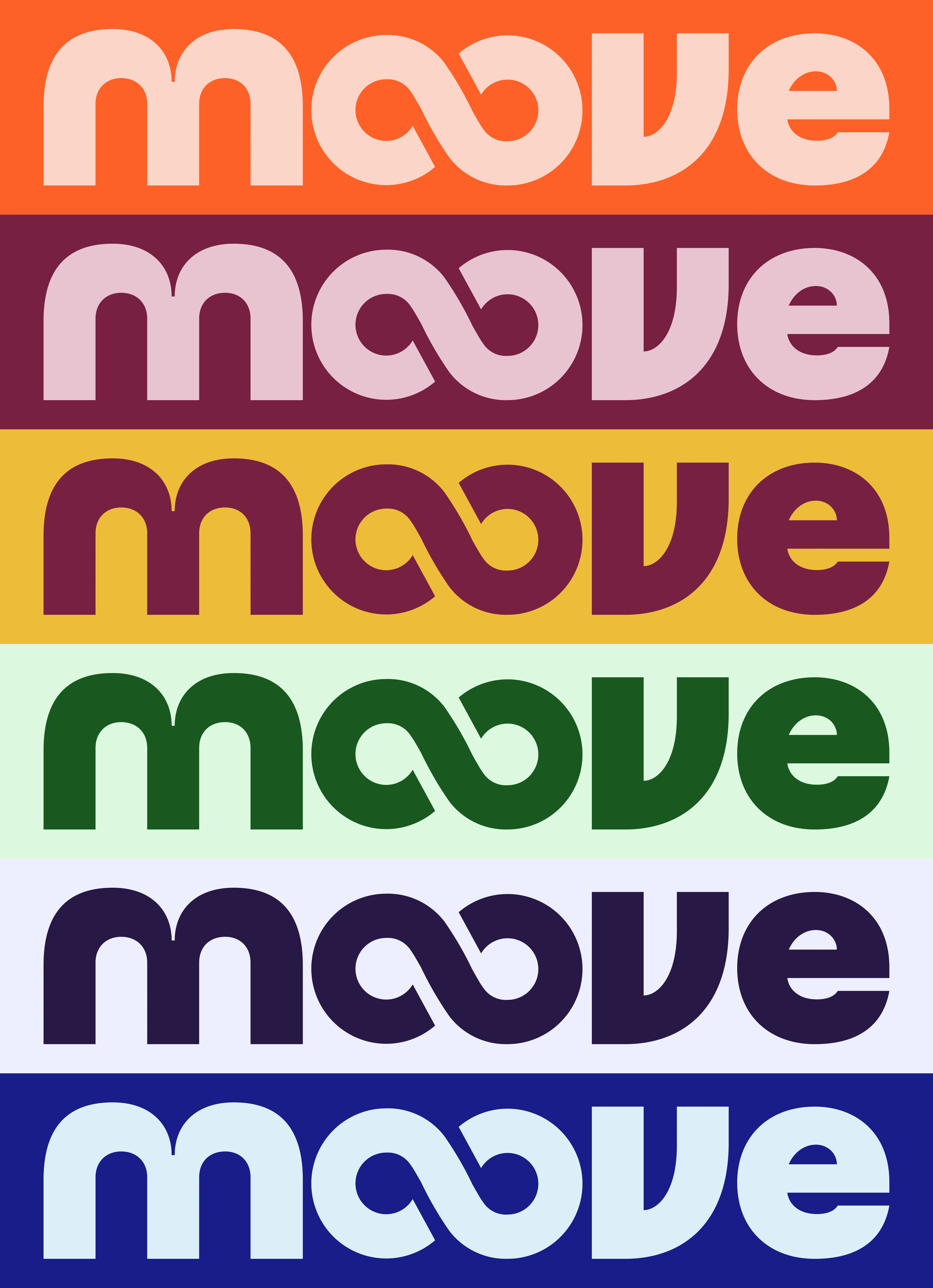
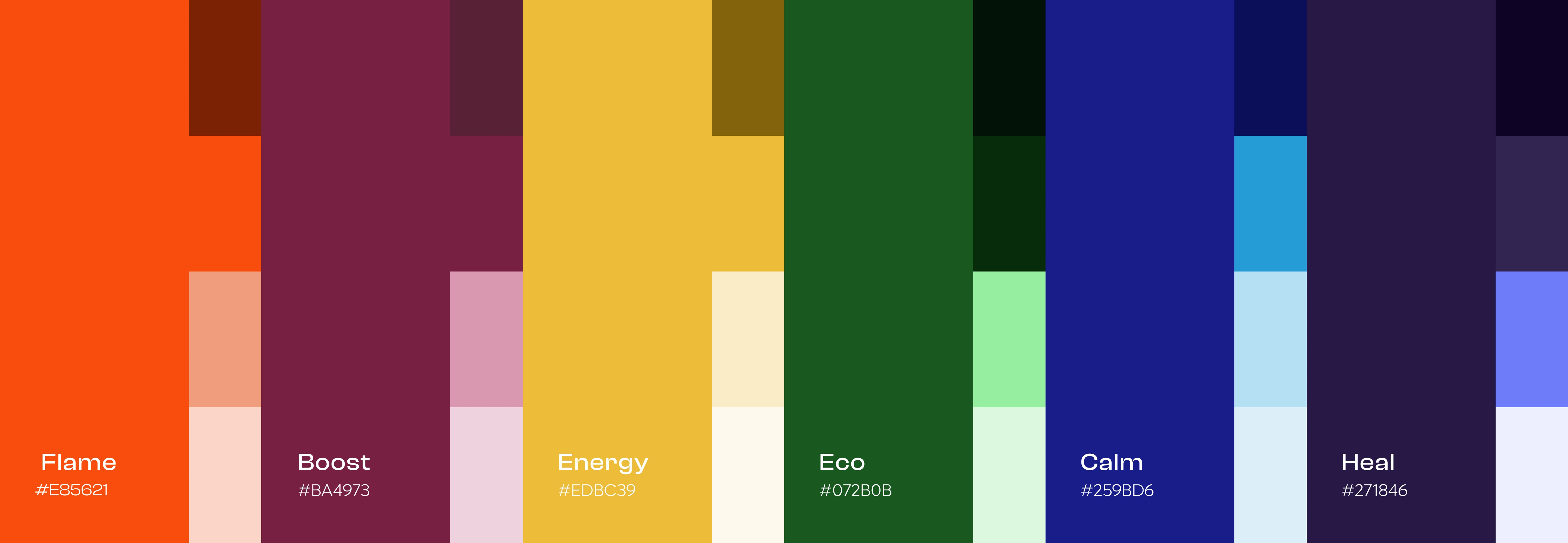
Color Palette — Energy in Motion
Moove’s color palette was created to reflect the energy, optimism, and emotional warmth of movement. Bold tones like electric coral, deep turquoise, and sunny amber bring a sense of vitality and positivity, inspired by the feeling of staying active and connected with others.
Balanced with soft neutrals and off-whites, the palette keeps the experience clean, accessible, and welcoming for the 50+ audience. Warm hues encourage motivation and joy, while cooler tones introduce calm and balance — together expressing Moove’s vision of active living with clarity, energy, and ease.
Designing with Empathy — Visual Interface and Accessibility
When designing Moove’s visual identity, one of my main priorities was respecting and understanding our audience. I wasn’t designing for digital natives; I was designing for adults aged 50 and up — a group that values clarity, simplicity and trust over flashy visuals or complex interactions. Instead of trying to impress with overly dynamic interfaces, I focused on making the experience feel effortless.
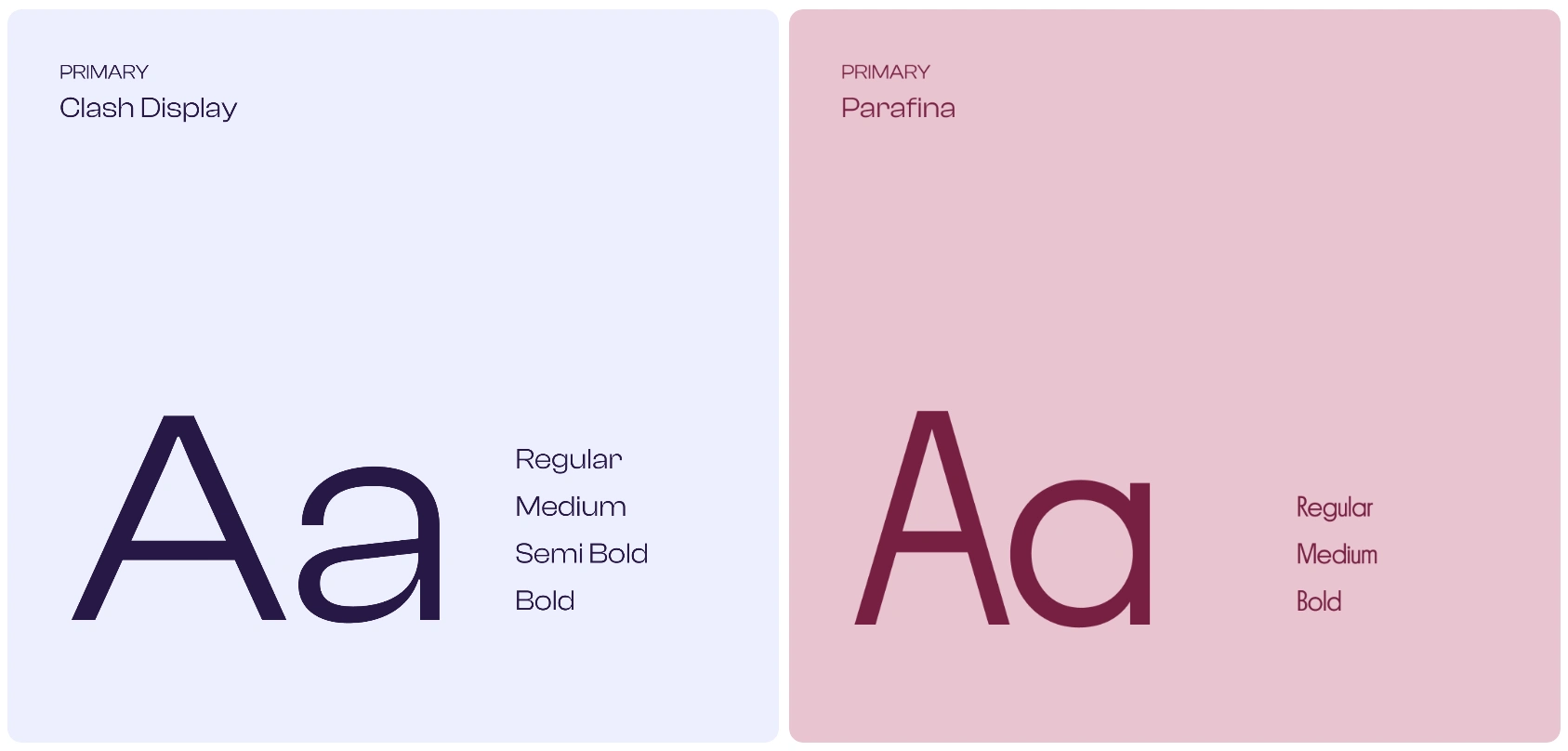
The overall visual identity is clean, minimalistic and text-first. I prioritized clear language, strong typography and direct labeling over heavy use of icons or complex visual metaphors. Many design elements that are typically represented by graphics — such as charts, badges, and progress indicators — were translated into simple, readable text or plain progress statements. This approach reduced cognitive load, avoided confusion and allowed users to focus on what really matters: their progress and their community.
Like this project
Posted May 22, 2026
Moove is a fitness community for adults 50+, making movement simple, social, and enjoyable through consistency, connection, and well-being.
Likes
0
Views
8
Clients
Moove