Finance App Redesign: Streamlining User Experience
Overhaul enhances usability, and security, and adds new features like more payment options and personalized recommendations, maintaining its popularity
Industry
Fintech
Headquarters
Pakistan
Founded
2024
Company size
50-101
Challenge
The current app isn’t reflecting Usability Challenges and Seamless Financial Interactions
Easypaisa's problems such as inconsistent service, unstable money transfers, incomplete transaction history, slow performance, and issues with Platinum subscriptions affect user happiness and smooth money management.
Goal
Elevating Easypaisa to Deliver Seamless Digital Banking Experience
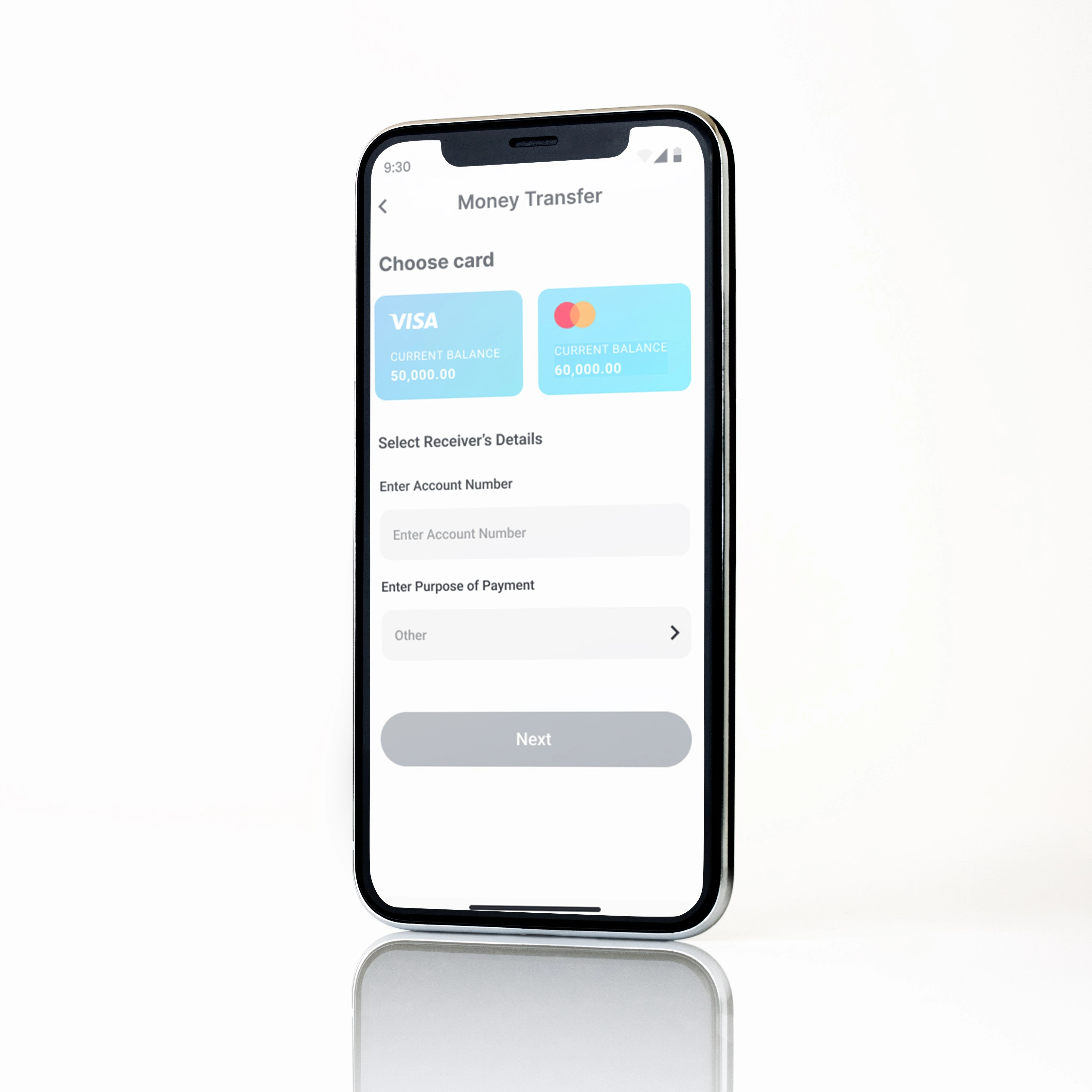
Enhance the Easypaisa app to provide users with a seamless, reliable, and intuitive digital banking experience, ensuring efficient financial transactions and high levels of user satisfaction.
Research
Method: User Journey
Before I began the project, I decided to explore the Easypaisa app to understand how it works and what users experience. Getting a feel for its features and usability. This helped me learn more about the app's strengths and areas where it could be improved.
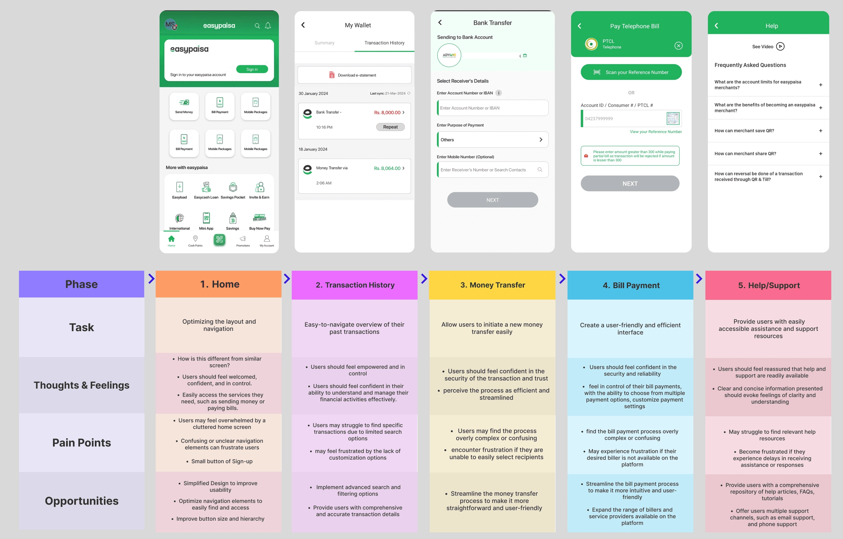
I divided the process into five clear phases.
Research
Ideation
Design
App icon change
Home
I listed the problems I faced during the process and found ways to make them better.
User Journey Map
I identified the pain points I experienced during the onboarding process and converted them into opportunities for improvement.
Design
The updated onboarding journey is designed to enhance the conversion rate.
WIREFRAME
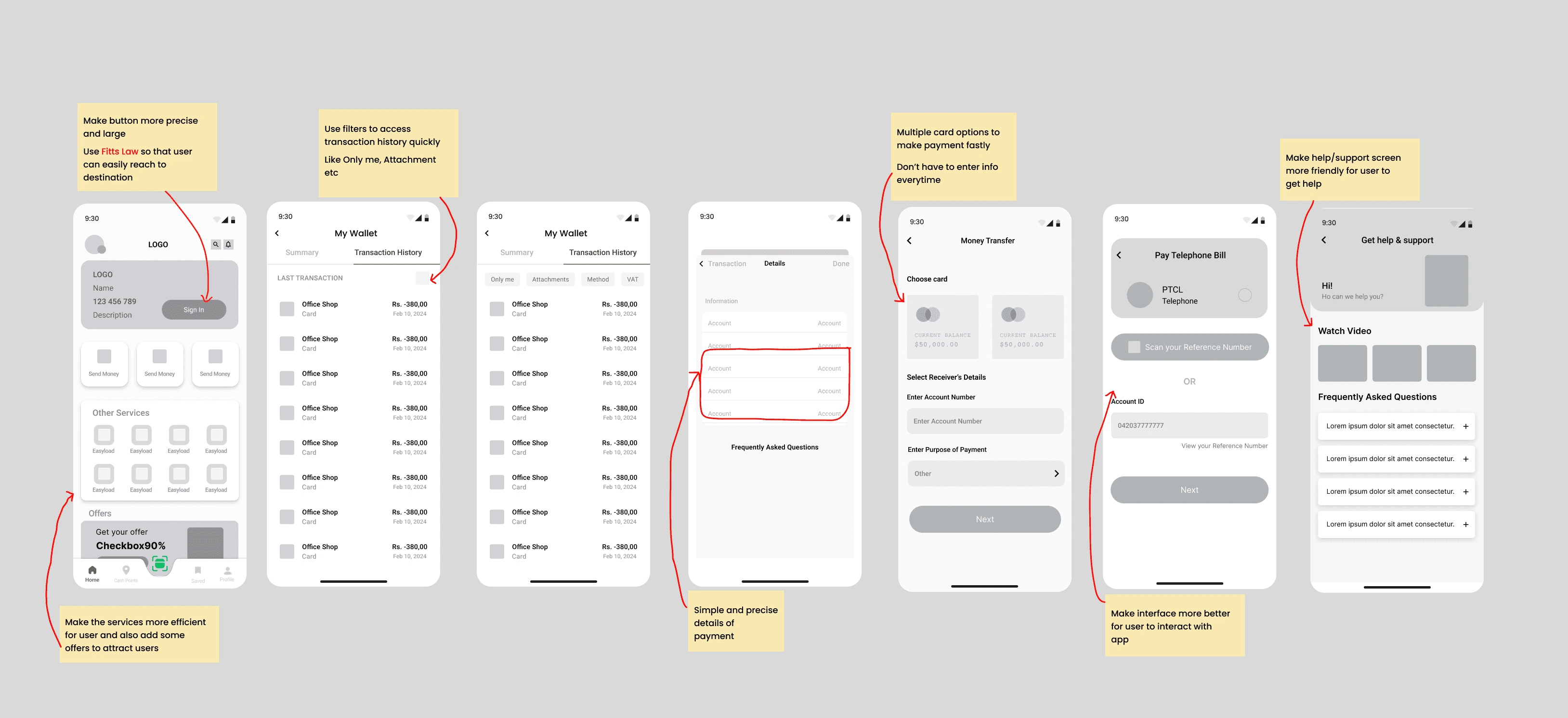
HOW?
Informative process → Users gain a thorough understanding of the product, enabling them to make informed decisions later on
Intuitive and consistent UI → User-friendly and consistent UI enhances the brand's professionalism
Reduced information clutter → Users can focus on what matters
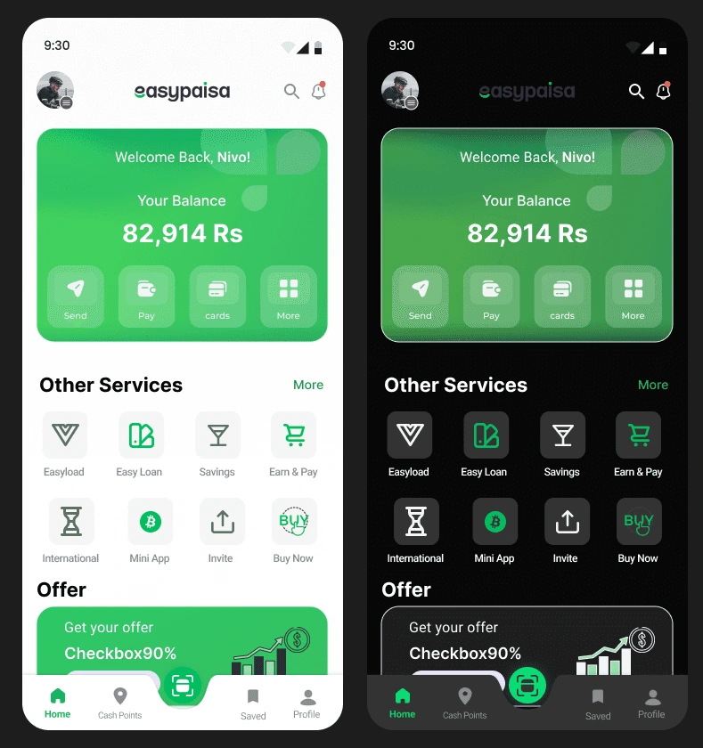
HOME SCREEN
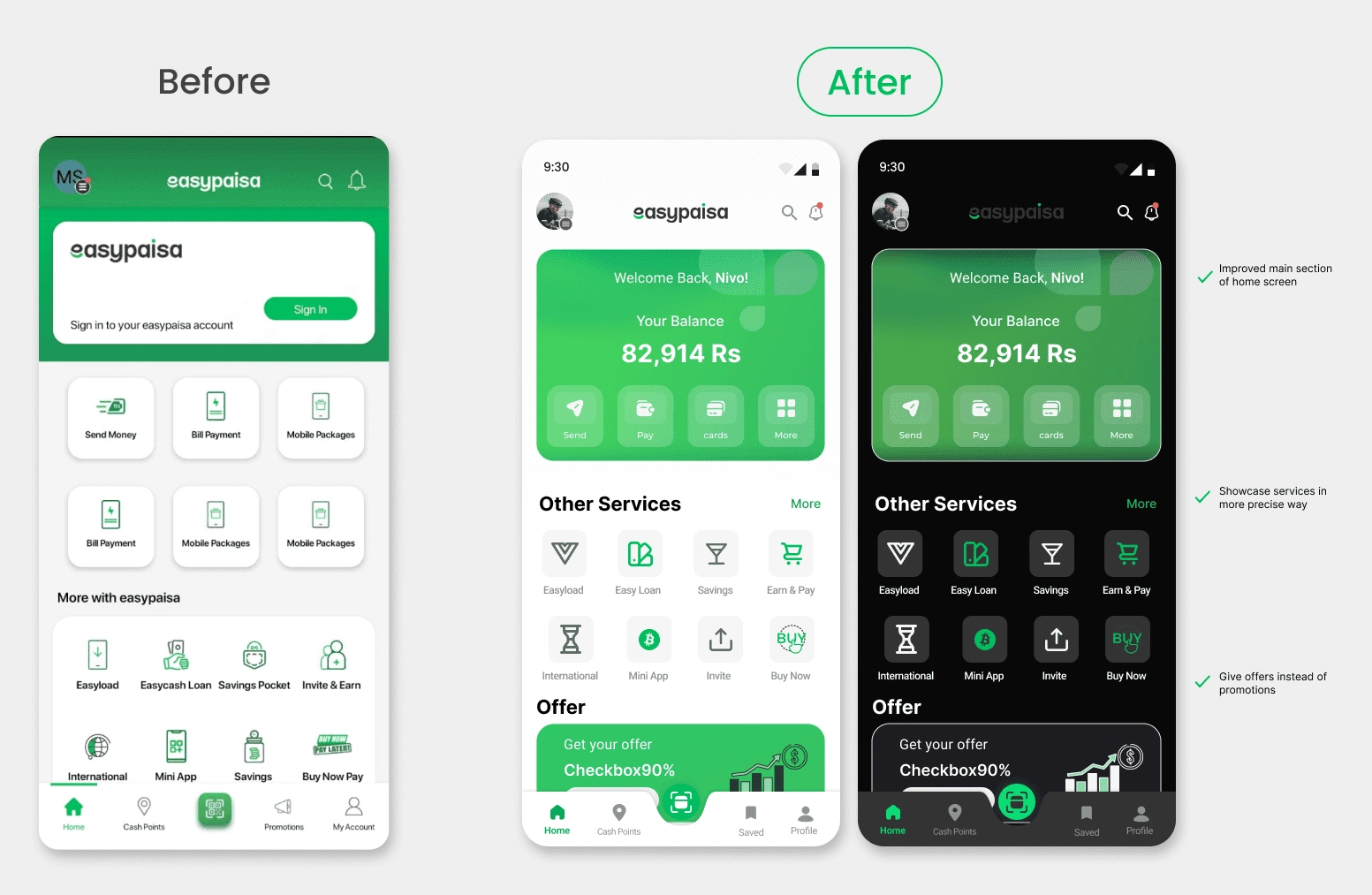
The original HOME SCREEN has multiple options repeatedly.
*I make them only once in the whole screen, the user can’t confuse them with multiple options.
My original plan didn’t work, when I was brainstorming and making wireframes I had different thoughts but in the final design, I changed my design.
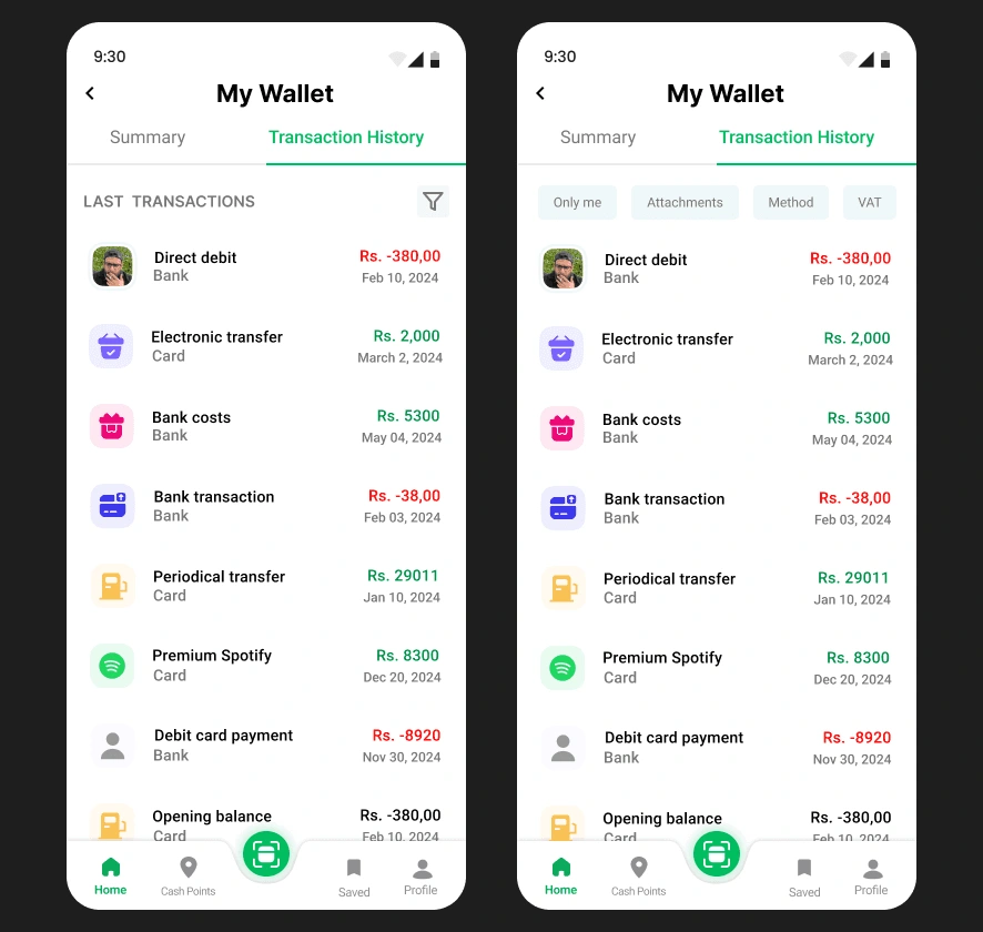
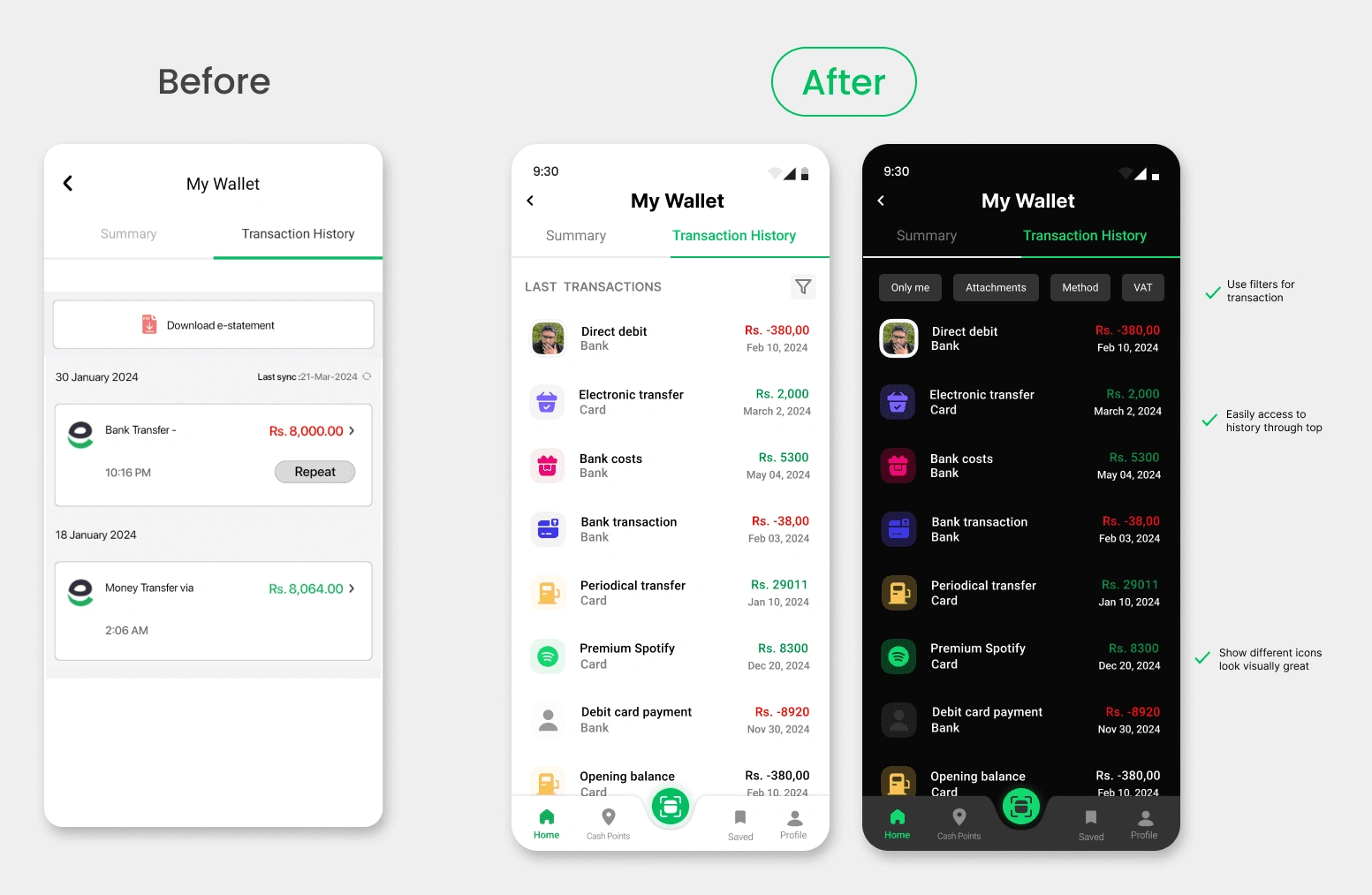
An easier way to see all transactions with filters
Easily select transaction on top
Create good visually appealing
Don’t have to go through all the transactions to find a specific one
———————————————————————————————————————————-
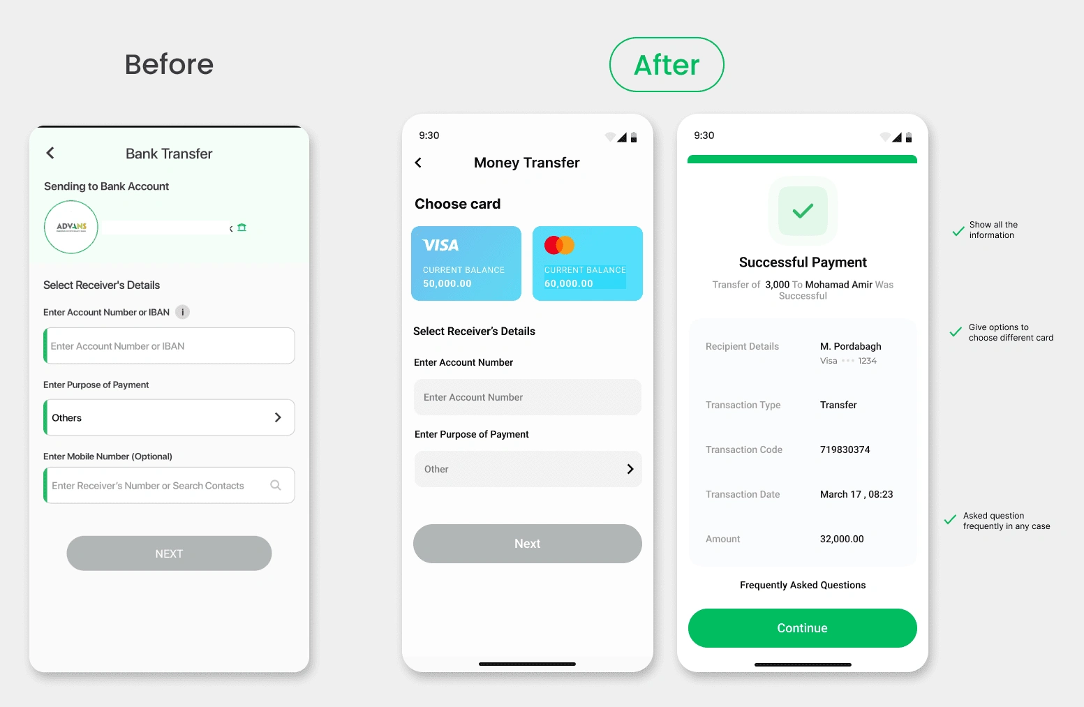
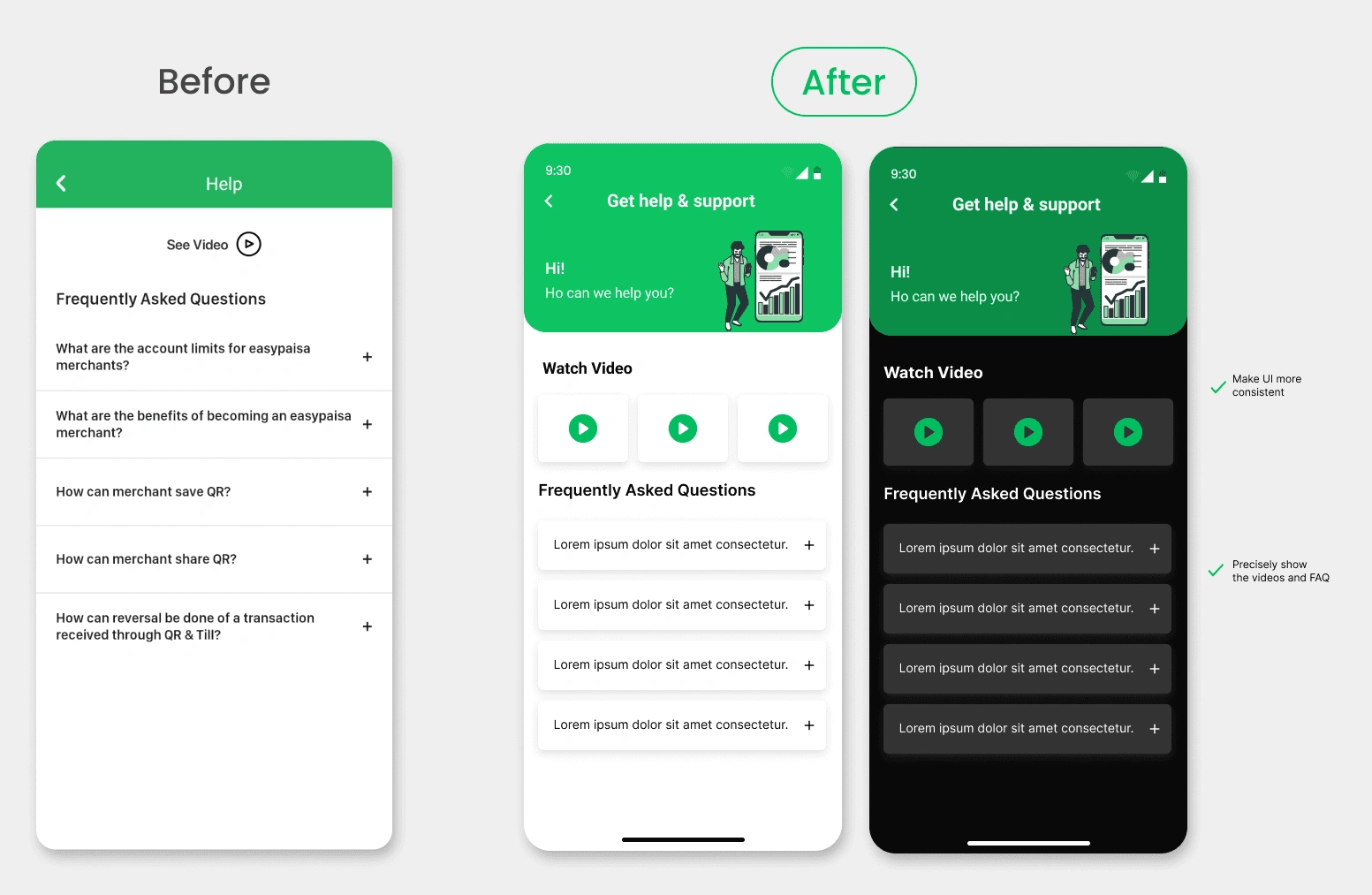
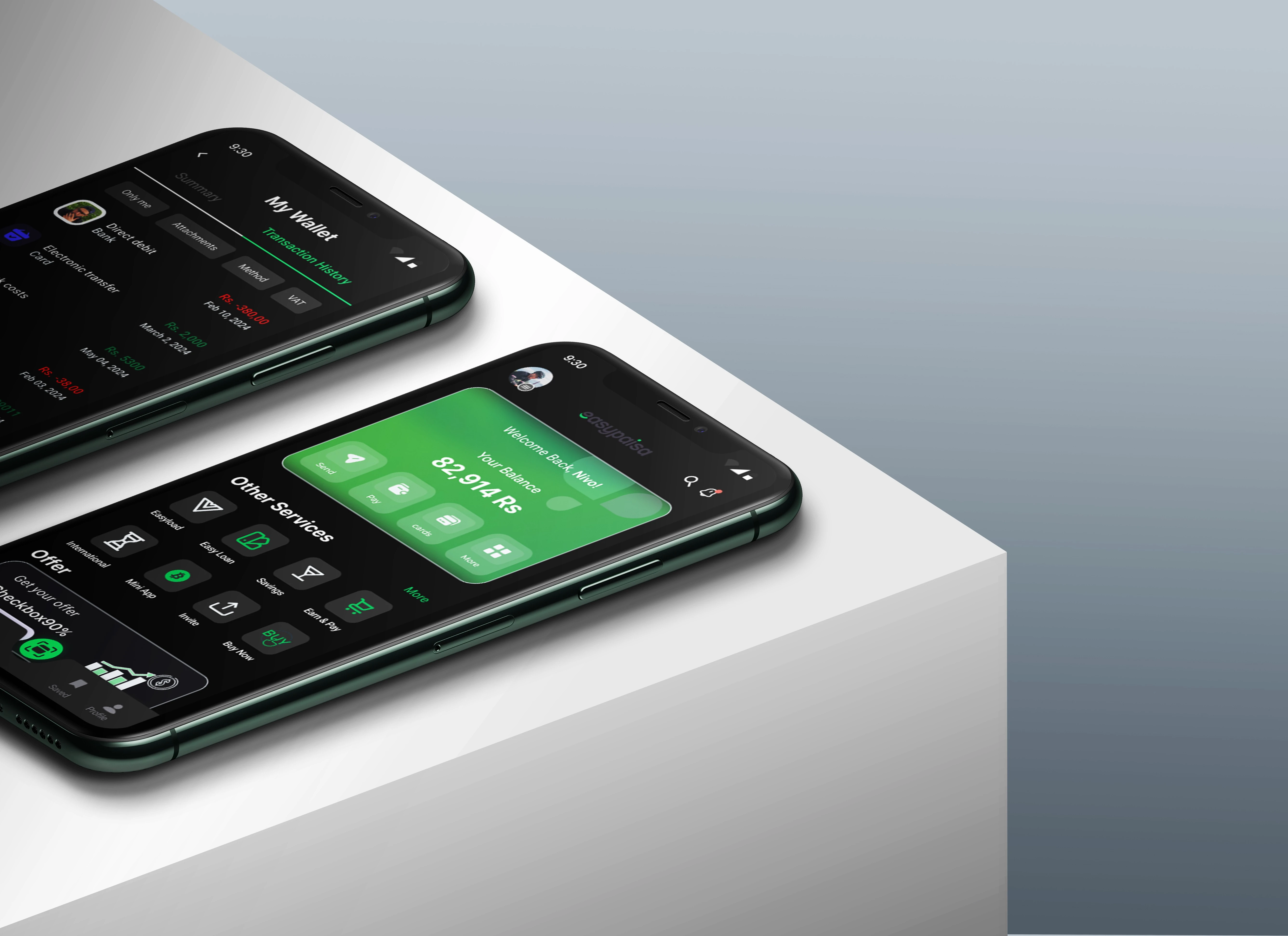
FINAL SCREENS
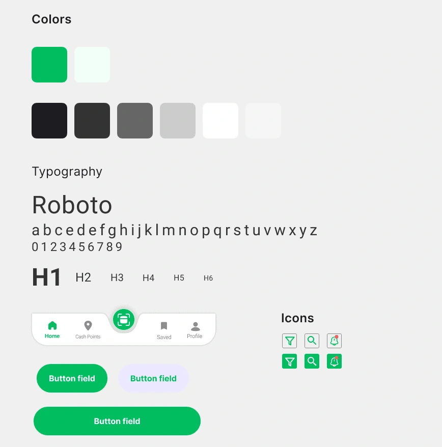
Design System
Conclusion
Engaging in the Easypaisa challenge allowed me to apply my UX design knowledge effectively to evaluate and enhance design decisions.
The redesign process predominantly centered around a single-user journey, offering an enjoyable storytelling experience but revealing inherent limitations.
With extra time, I would have embraced the chance to conduct more comprehensive research and testing to further refine the design.
Next Step
Record the original onboarding’s first impressions
Thorough research on Easypaisa competitors, their offerings
Test the final prototype with more users and make adjustments for improvement
Carry the re-design onto all the screens
35%
Improved Onboarding Process
25%
Increase in User Retention
84%
Increase in Time Spent on App
Wants to collaborate?
Send me a message
Like this project
Posted Jul 6, 2024
Hi, I'm Fizza Hafeez a UX Designer. I'm passionate about making websites and apps that convert your business into a successful future. I work for startups and …
Likes
0
Views
0

