Simplifying Data Science Complexity Through Design
Domino automates DevOps for data science, so you can spend more time doing research and test more ideas faster. Automatic tracking of work enables reproducibility, reusability, and collaboration.
MY ROLE
I took this project on a contract-to-hire role for the company’s first office in India. From UX to UI, everything was to be taken care of from a holistic perspective. Though the product came up with an old existing design language ( designed by someone they hired in SF, USA ). But It needed improvements & new feature additions as measured from research & testing through real users during the last couple of months.
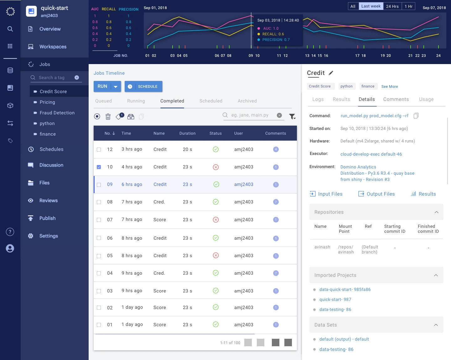
A holistic view of the platform’s complexity.
THE BIGGEST CHALLENGE
It was the first time that I tackled a data science platform, A field I knew a very little about. Every time I come across a Jira ticket or a research doc, I used to rush to my product manager ( Avinash, really a great guy though :) ) to know the meaning of jargon words shouting on my face. But the team put enough trust on me & gave me enough time to learn. I spent almost a week going through the company’s in-house university course to know every in & out of the product. I got a bit easy start after that but still every day was like a new chapter to my knowledge on how data science really works. That time I came to know about how complex this field is though it may seem all fancy from the Forbes articles.
SECONDARY CHALLENGES
As the product was running in the hands of real customers already & had an existing old design pattern set. Therefore no matter how big UX problems I measured on my end, There was never a quick stop & fix solution. Also due to small team size, The availability of tech team to implement these changes was a core challenge. The team was already very much busy in keeping the platform steady.
As quite visible from few of the screens that you’ll see on this article have difference in the weight iconography & bad colour contrasting. These are the examples of few of the things which remained there for a long time due to many of the secondary challenges & took their time to get replaced with better structure. For example - You can notice the difference in the left navigation bar in some screens from before & after the fixes were being made.
LET’S DIVE INTO WORK
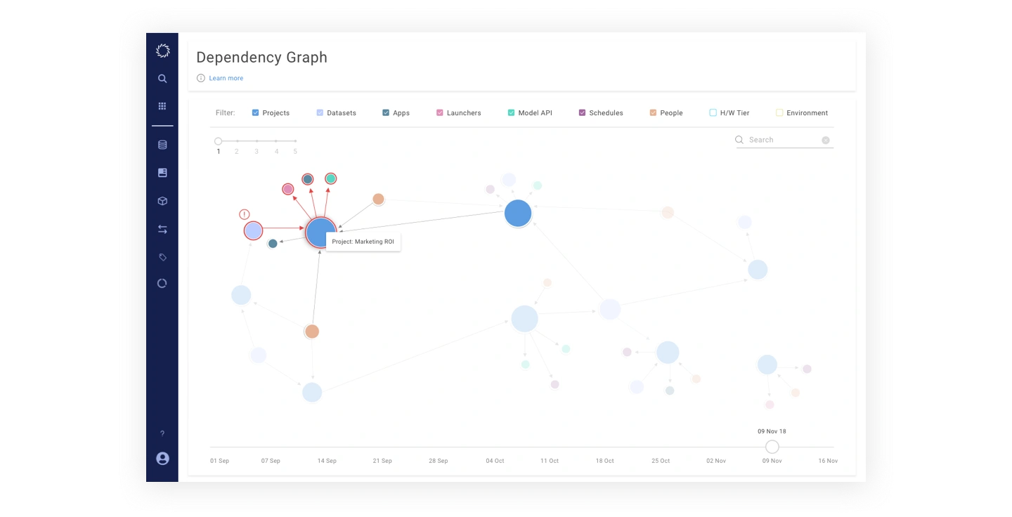
Project Dependency Graph -The mapping of the key parameters on the platforms was needed to be shown in an efficient way that provides a glimpse of company’s investment in projects on various ends like people, tech etc. So the following feature was built.
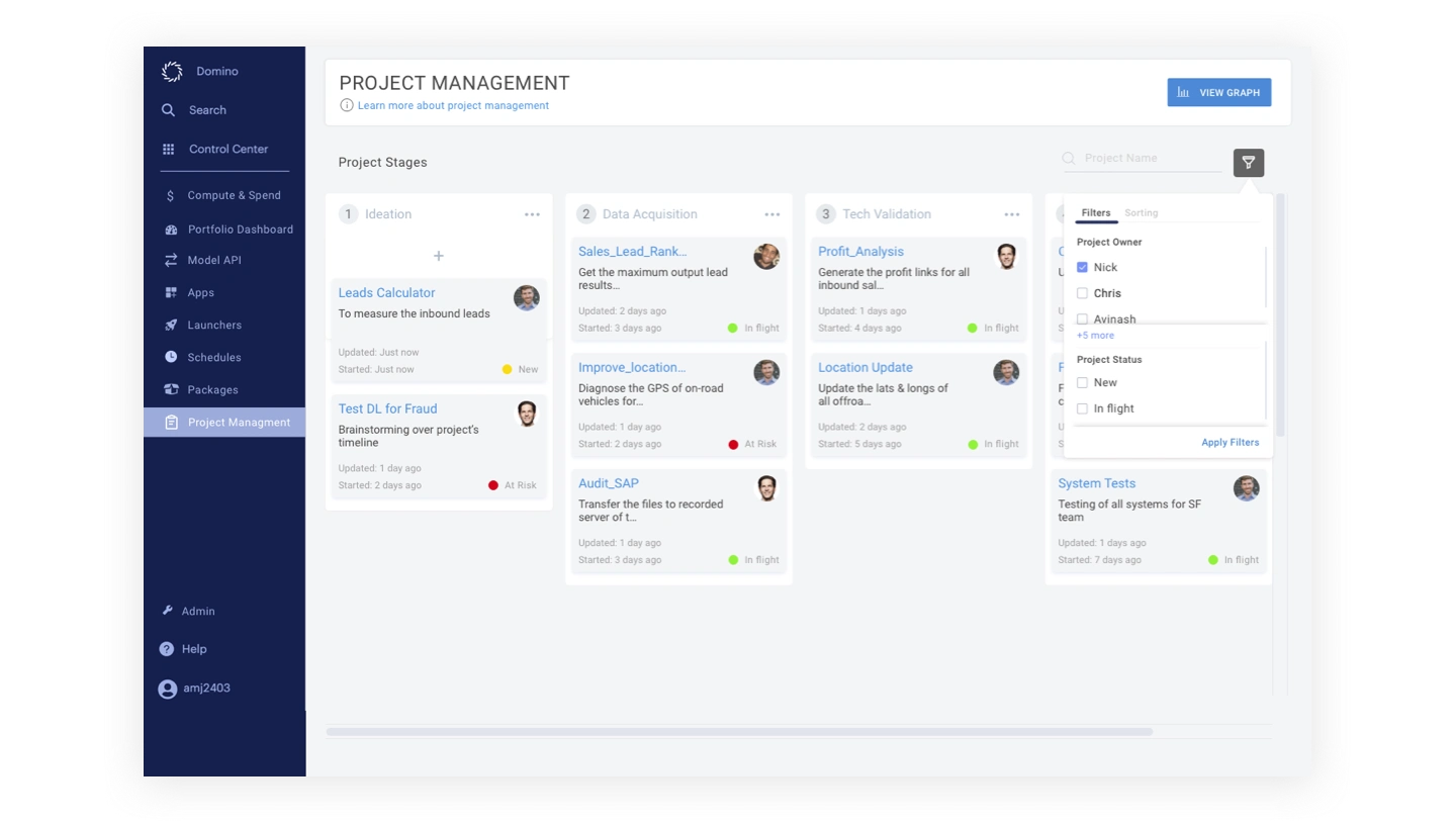
The above feature was built to bring the workflow of everything related to data science in the team on a single platform. The usual cycle of putting everything on Jira was making it difficult to monitor the company’s data science projects as they used to get mixed with other development efforts..
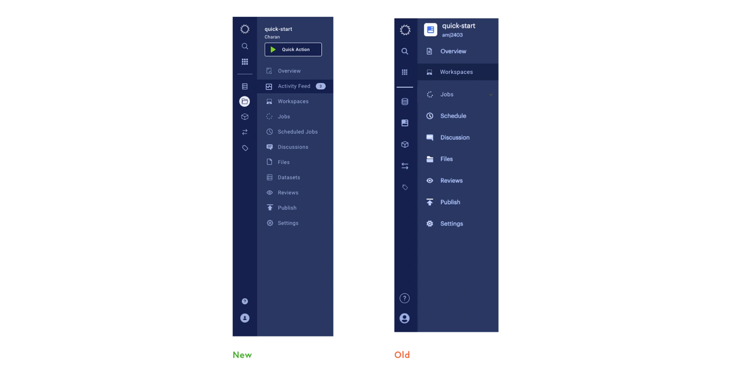
The updated left navigation panel with the addition of new features and more intuitive user interface.
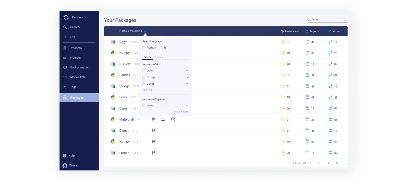
This features enabled Data scientists to manage all their data packages under one roof.
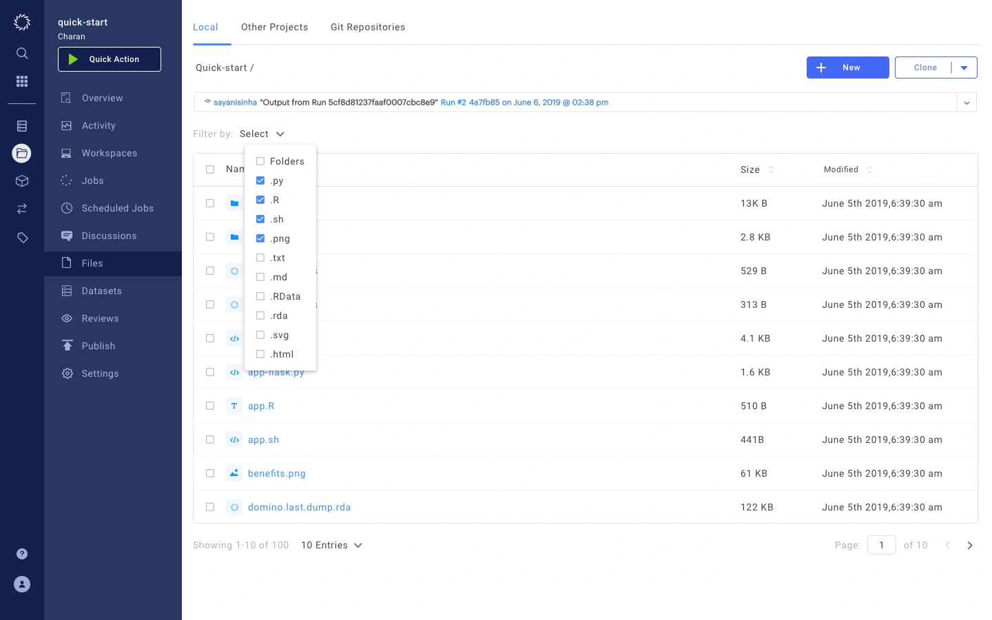
The files manager view inside a project. I designed this feature from scratch based on the user inputs from customer success teams and focus groups.
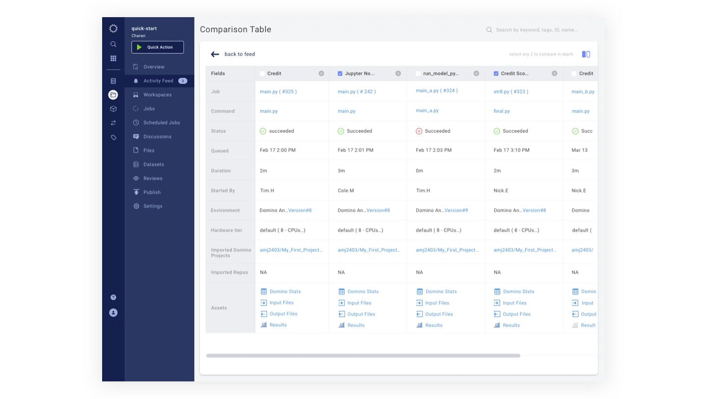
Jobs ( scripts run ) comparison table enabled the team to get an overview of all the jobs they ran for a project.
BRAND GUIDELINES
The sales & digital marketing team both were looking for alignment in their pitching content to the customers. Seeing the importance of the matter, I dedicated 2 sprints to set the branding guidelines to be followed by the whole team.
Logo
A set standard for all the docs/communication for using the company logo.
Colors
We updated the color palette using some of the existing brand colors keeping accessibility in mind.
Typefaces
This was dedicated to put standards in typefaces of everything going out on customer pitch decks, social media.
Typography
These typography standards served with colour guidelines for a greater accessibility scale.
Icons & Shapes
The standards for iconography & graphic shapes for the main analytics platform.
THE IMPACT
This product served as a boost to my understanding of the data science world. The bigger satisfaction factor was to see the implementation of the majority of all these efforts in the actual running product. Seeing the people at giants like Honeywell, Bayer, etc using the features that I contributed to solving the world’s real-life problems is surely a feeling to behold.
Later on, The team decided to talk about the elephant in the room. A better design system for the whole organization, which surely is a case study of its own. You might see it soon in a new post. I really appreciate your time for reading upto this very last word :)
Like this project
Posted Jun 8, 2023
Scaling the design language for one of the world's fastest growing data science SaaS.

