Logo & Stationery Designs
Elevating Human-Centric Consulting with Distinctive Design
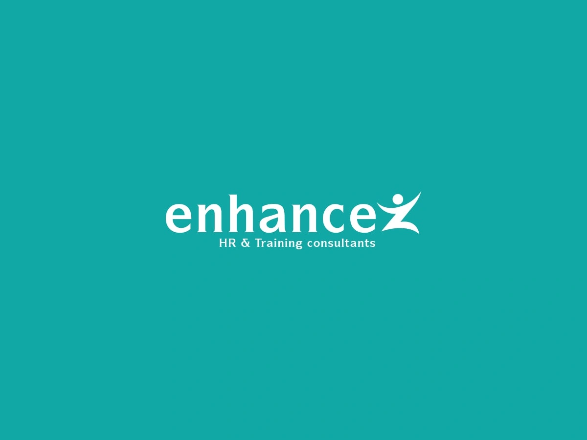
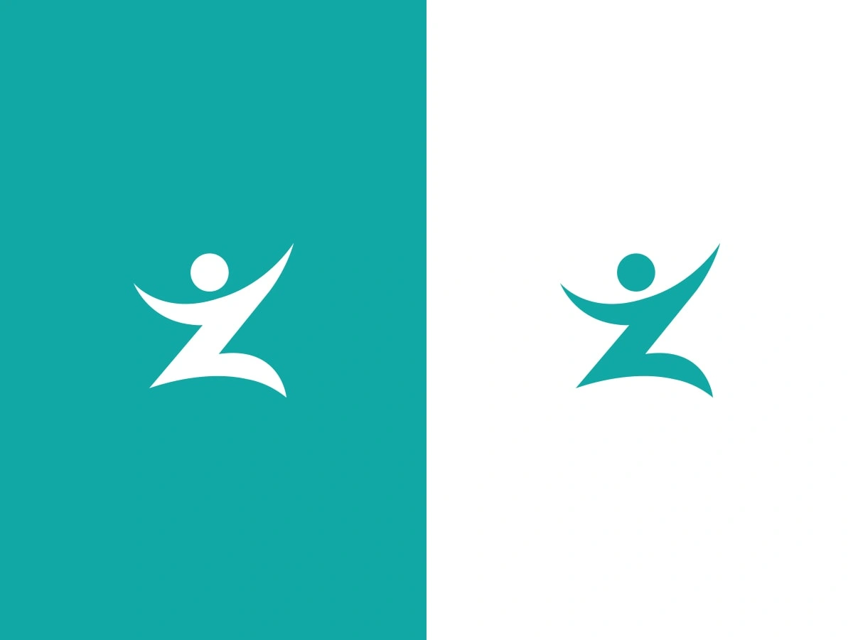
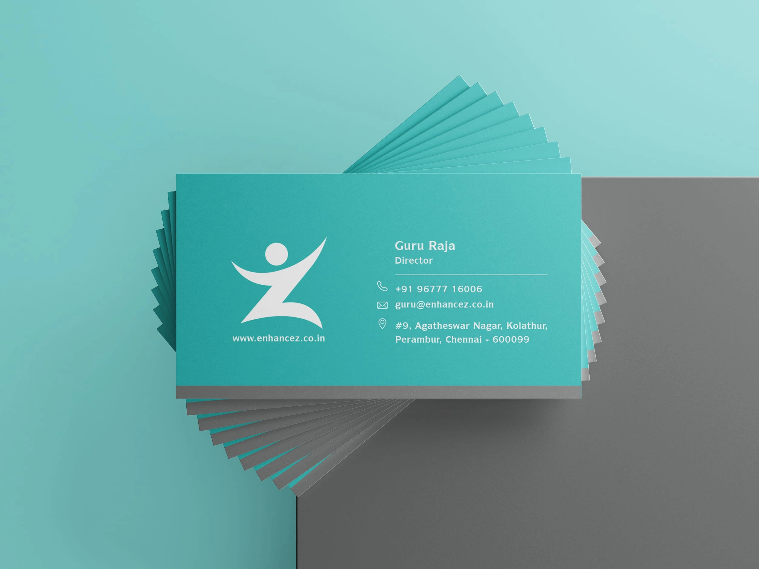
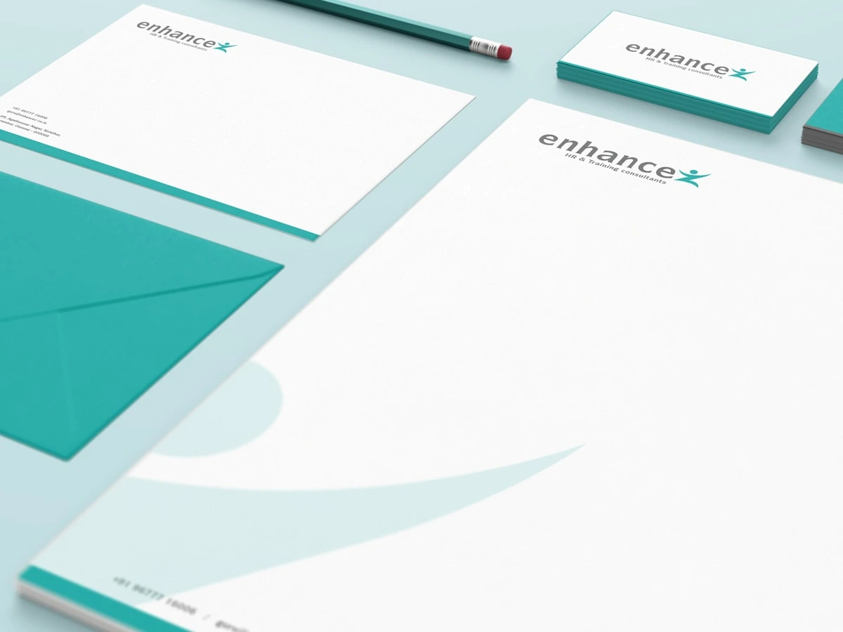
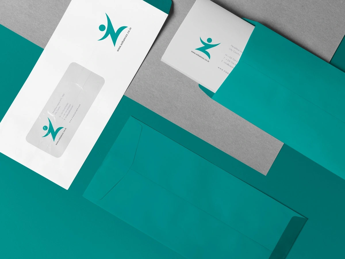
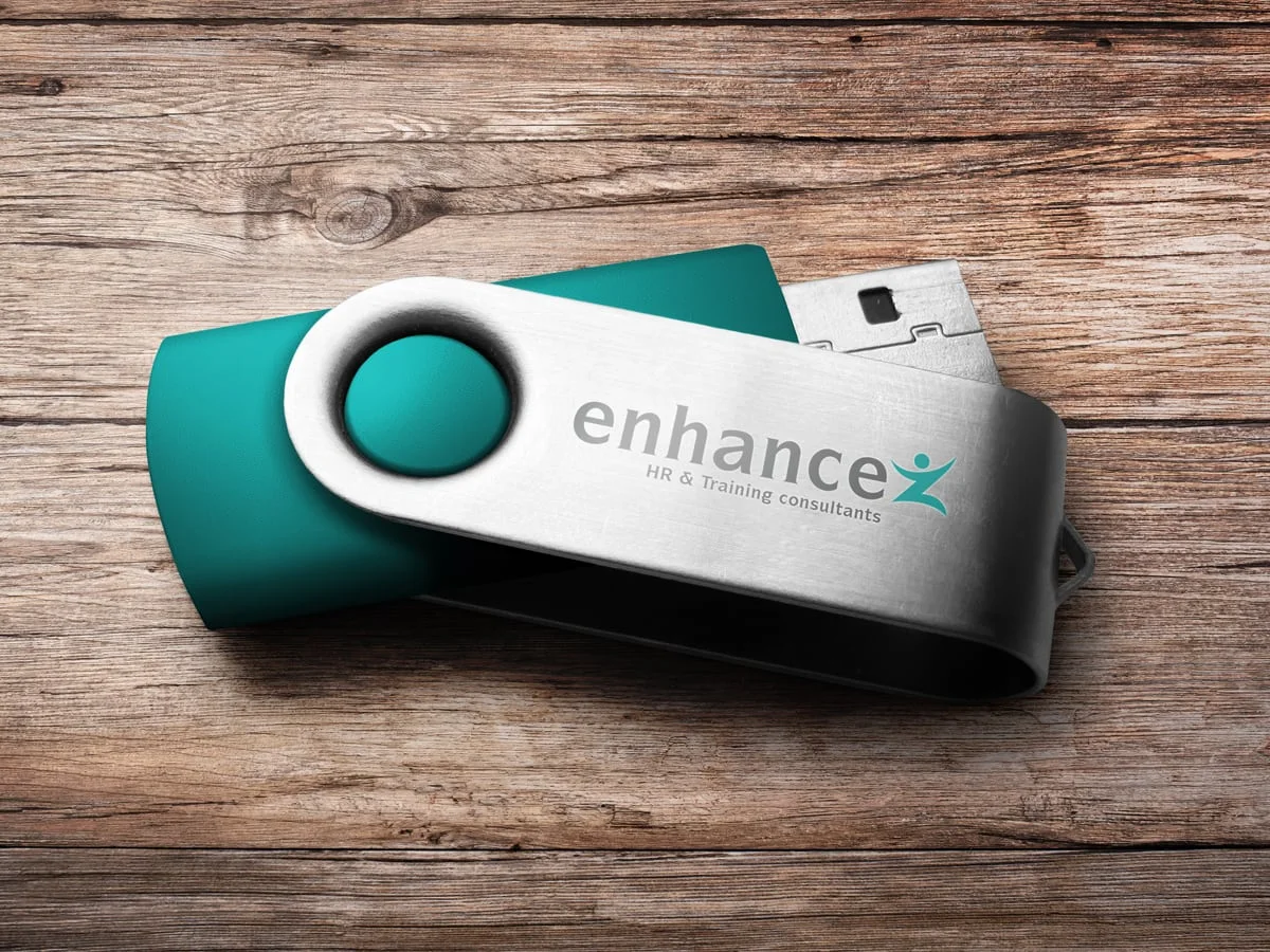
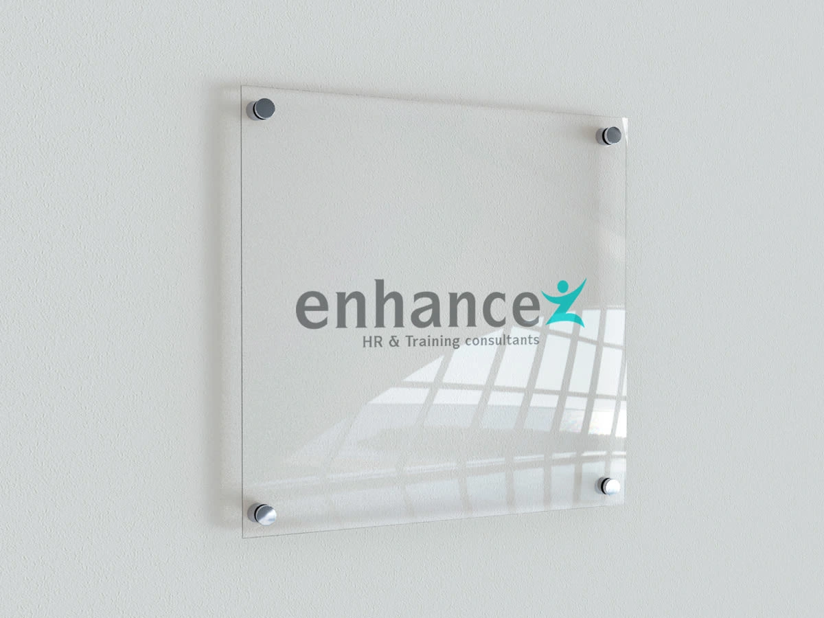
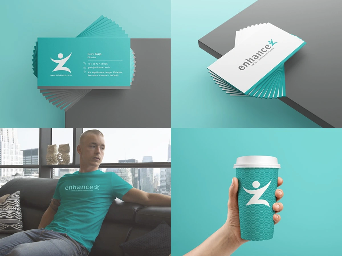
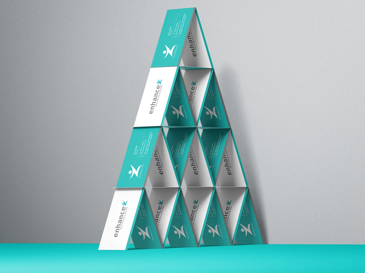
In crafting the logo and stationery designs for Enhancez, I tackled the challenge of ensuring 'Enhance' takes center stage in memory. The letter 'Z' doubles as a human icon, seamlessly integrating with the wordmark while also serving as a distinctive standalone symbol. The chosen light teal shade not only embodies professionalism but also signifies growth and tranquility. This deliberate color choice, coupled with the dual functionality of the 'Z,' creates a brand identity that is not only visually appealing but strategically memorable. Enhancez stands poised as a brand that resonates with the essence of human-centric consulting, ready to leave a lasting impression in the HR industry.
Brand Identity
Like this project
Posted Dec 12, 2023
Strategic logo crafting for Enhancez 'Z' seamlessly integrates as a human icon, embodying professionalism, growth, and tranquility.

