Dos tazas café | Brand identity
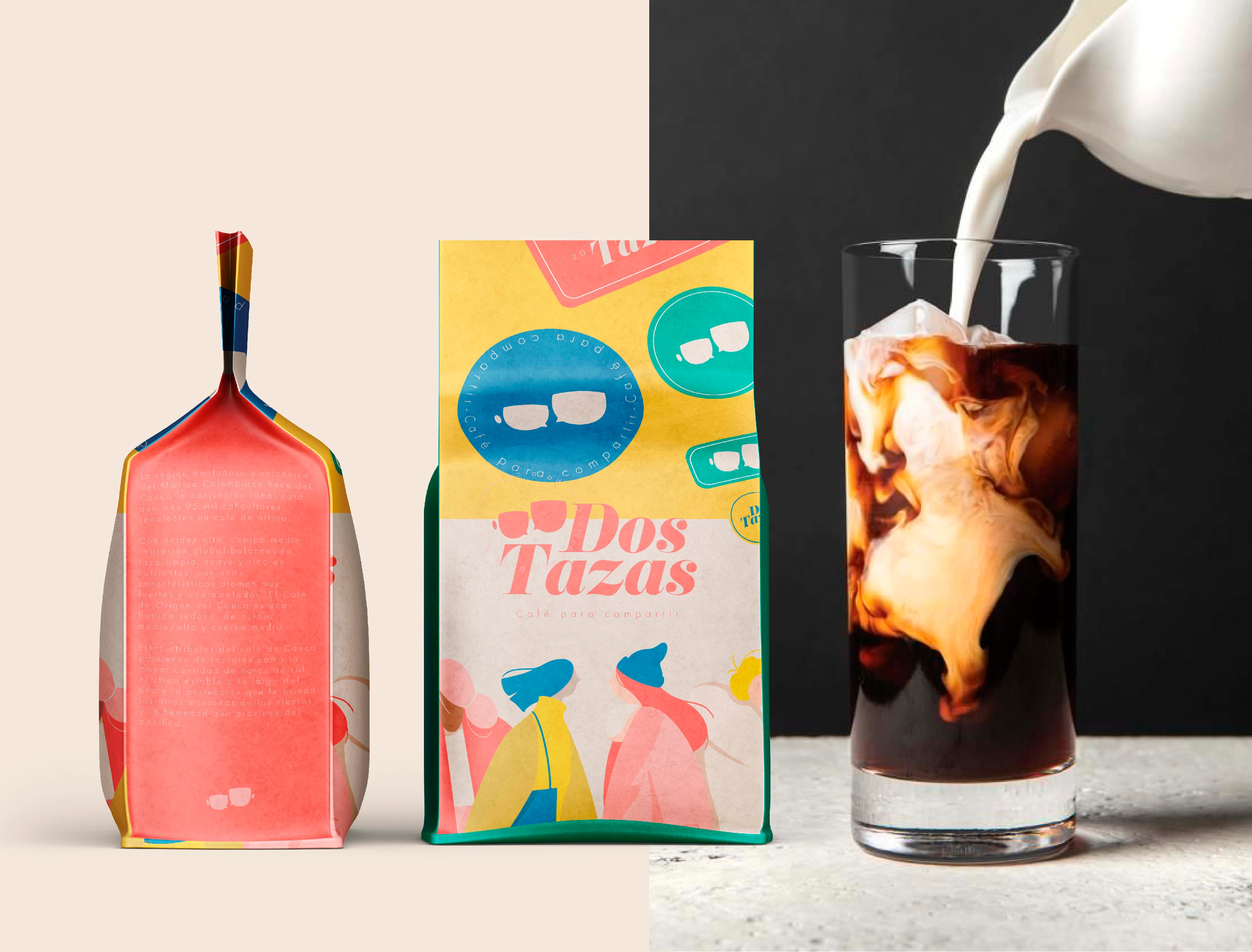
For the "Dos Tazas" brand identity project, the main objective was to create a fresh and appealing identity that would captivate the younger demographic. The focus was on portraying "Dos Tazas" as a coffee brand that goes beyond the typical daily consumption, targeting those who enjoy coffee on special occasions.
To achieve this, the brand identity was carefully crafted to connect with people and evoke a sense of exclusivity and indulgence. The coffee's origin in Valle del Cauca, Colombia, with its distinct acidic flavor, nutrient-rich composition, and special aromas, formed the foundation of the brand's story.

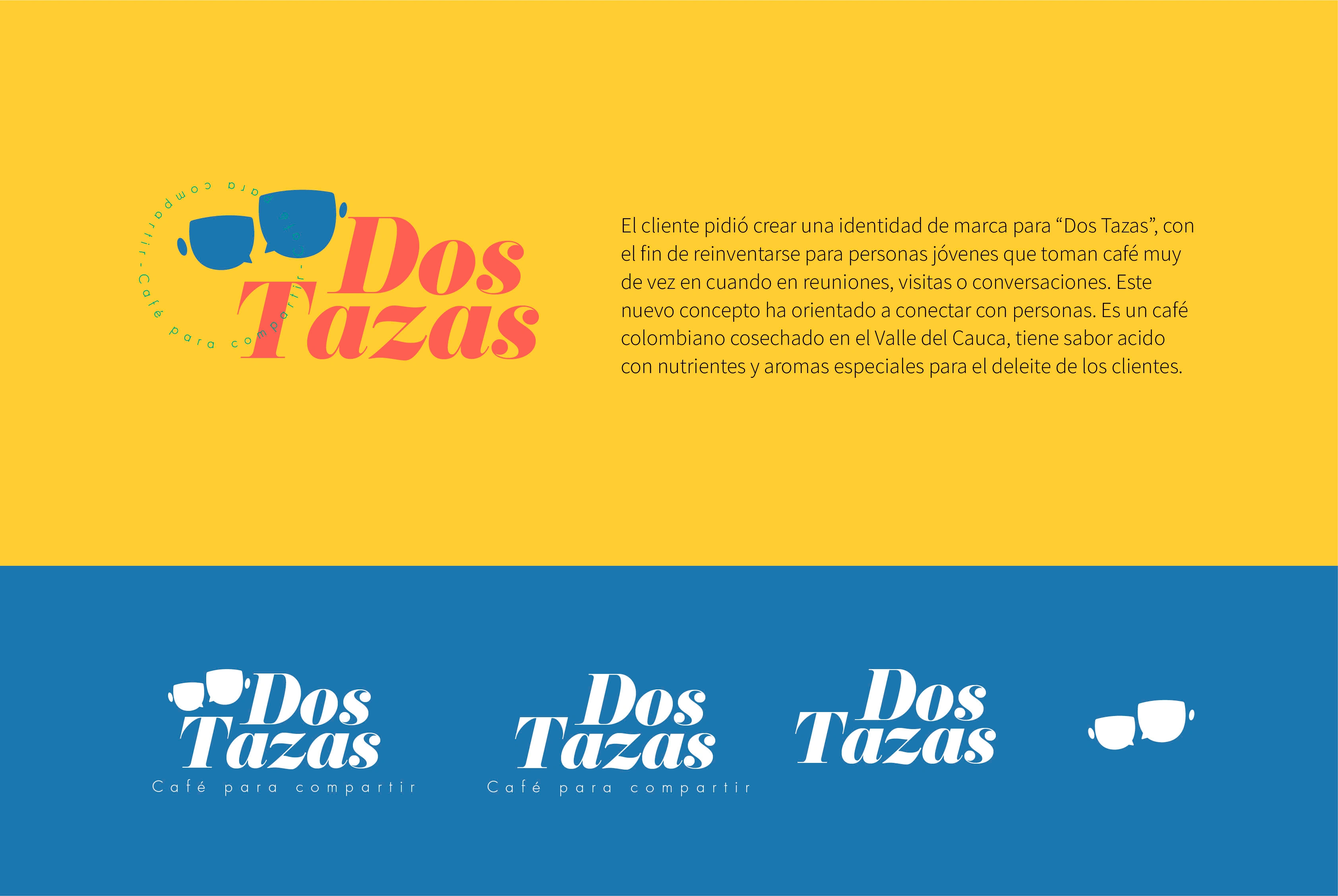
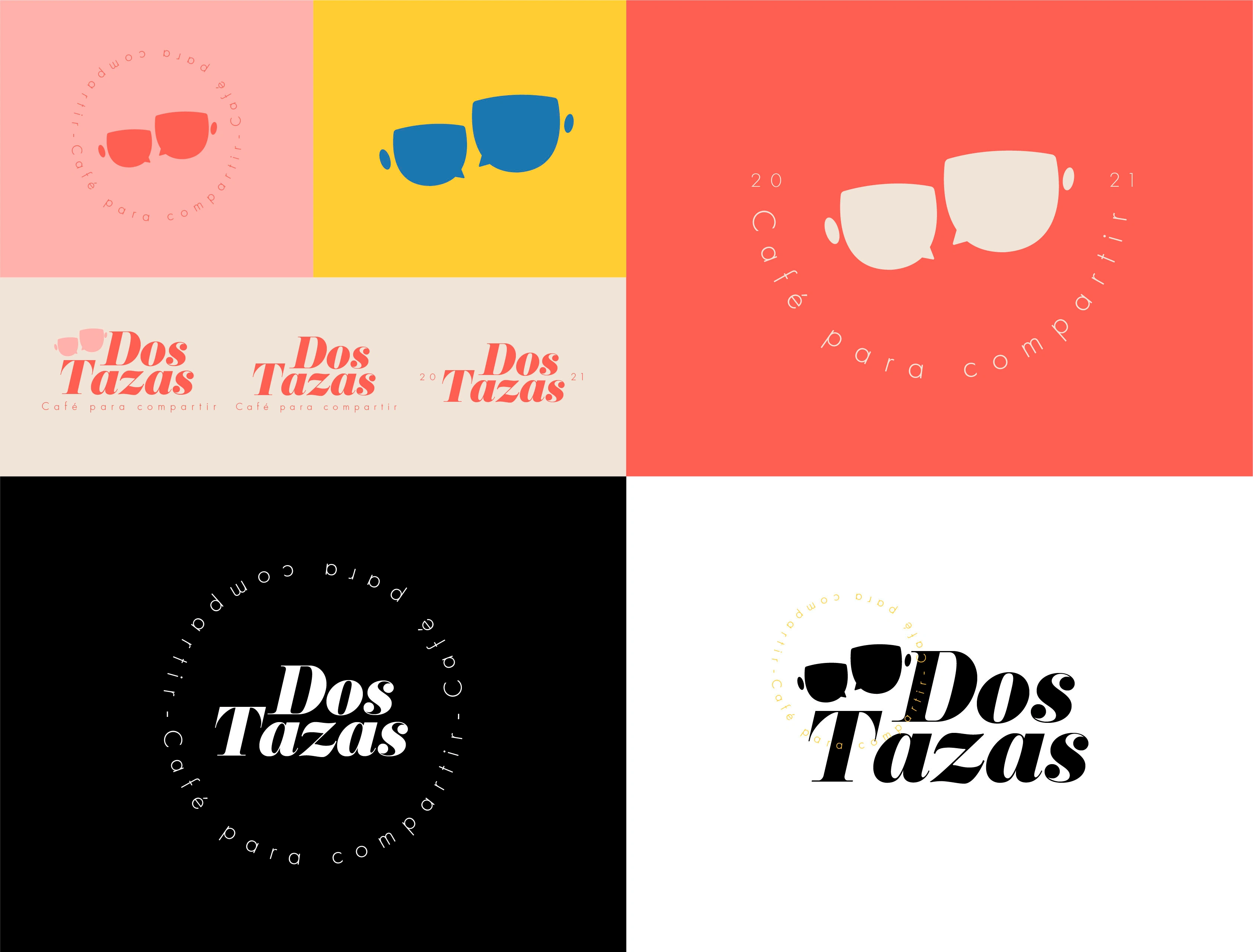
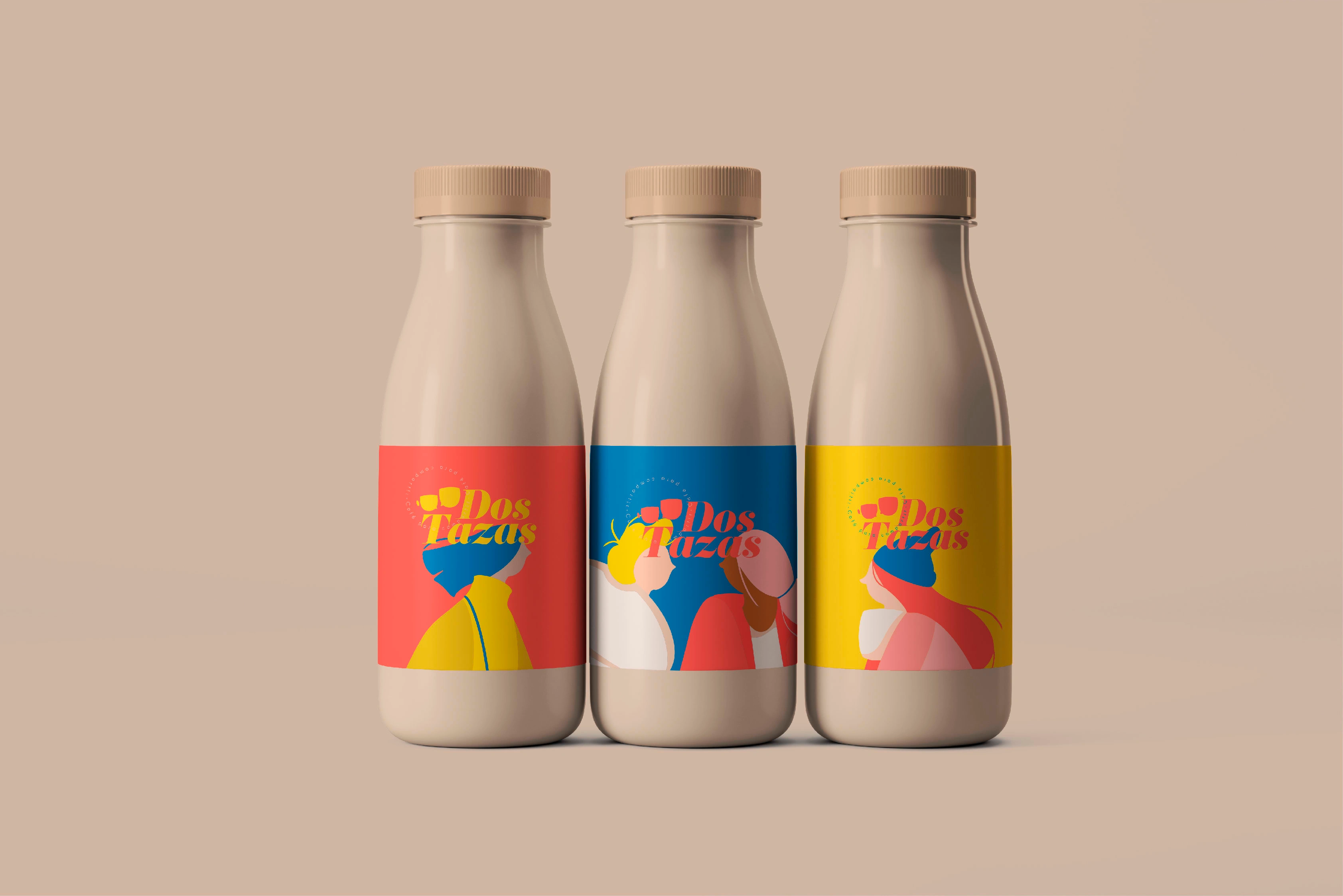
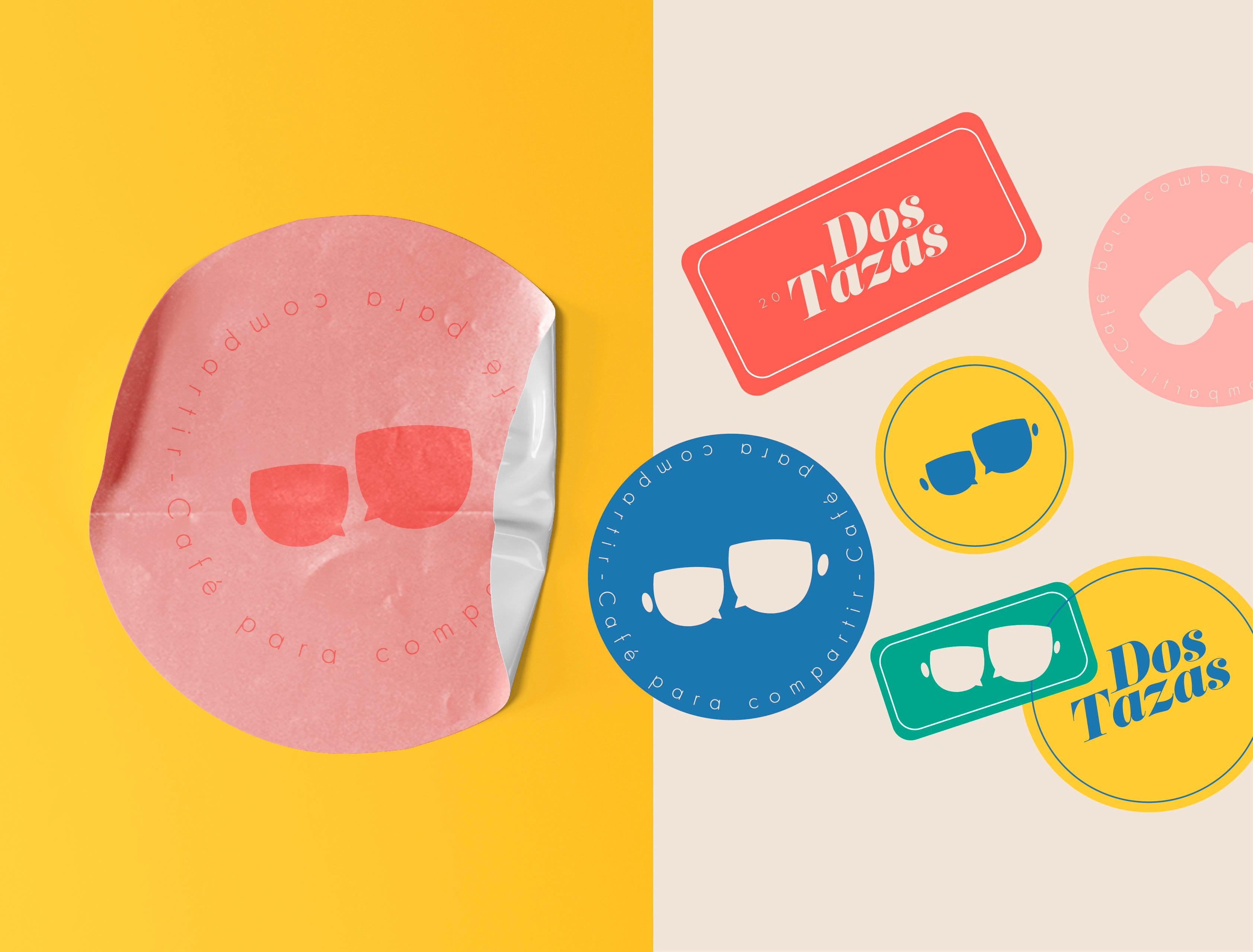
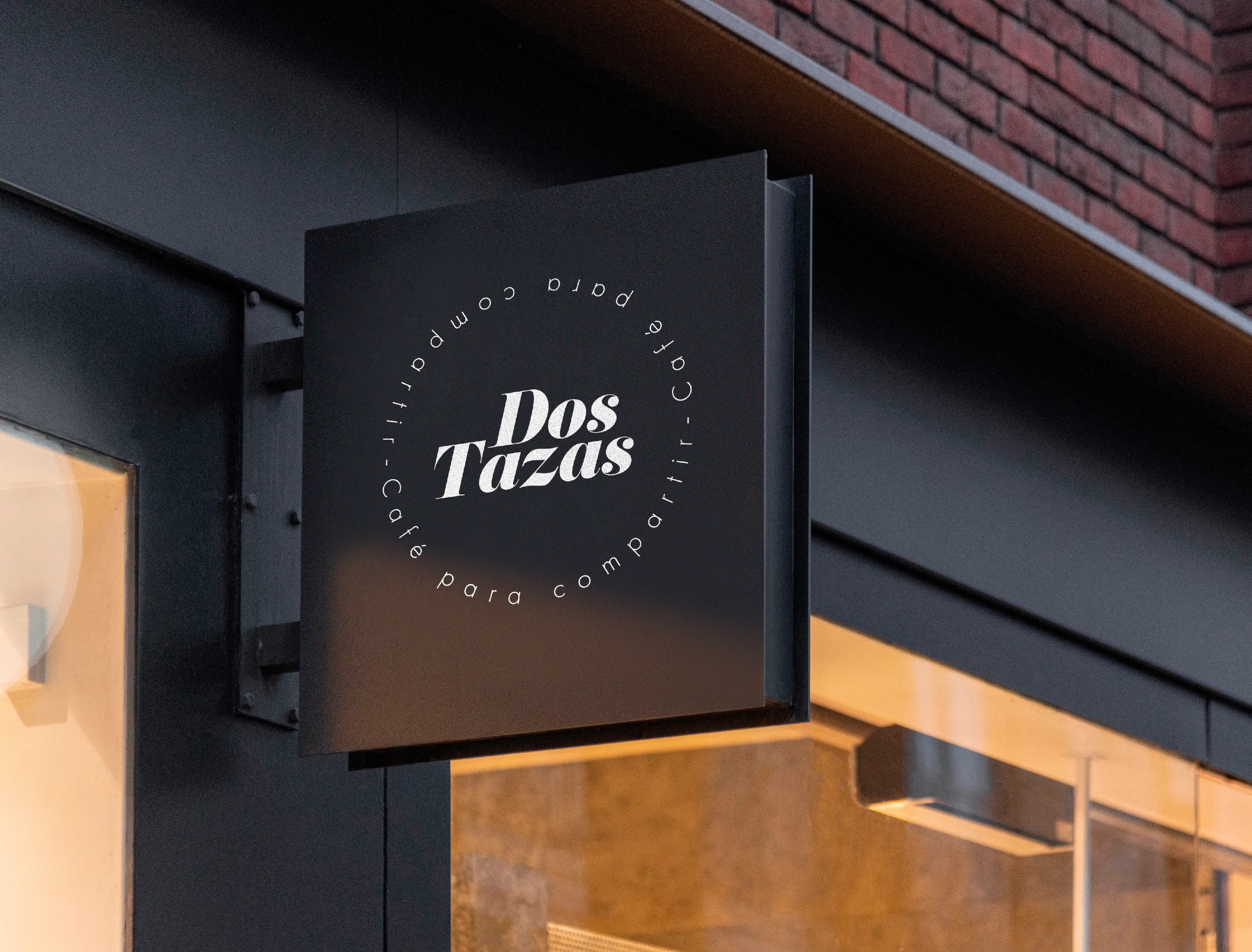

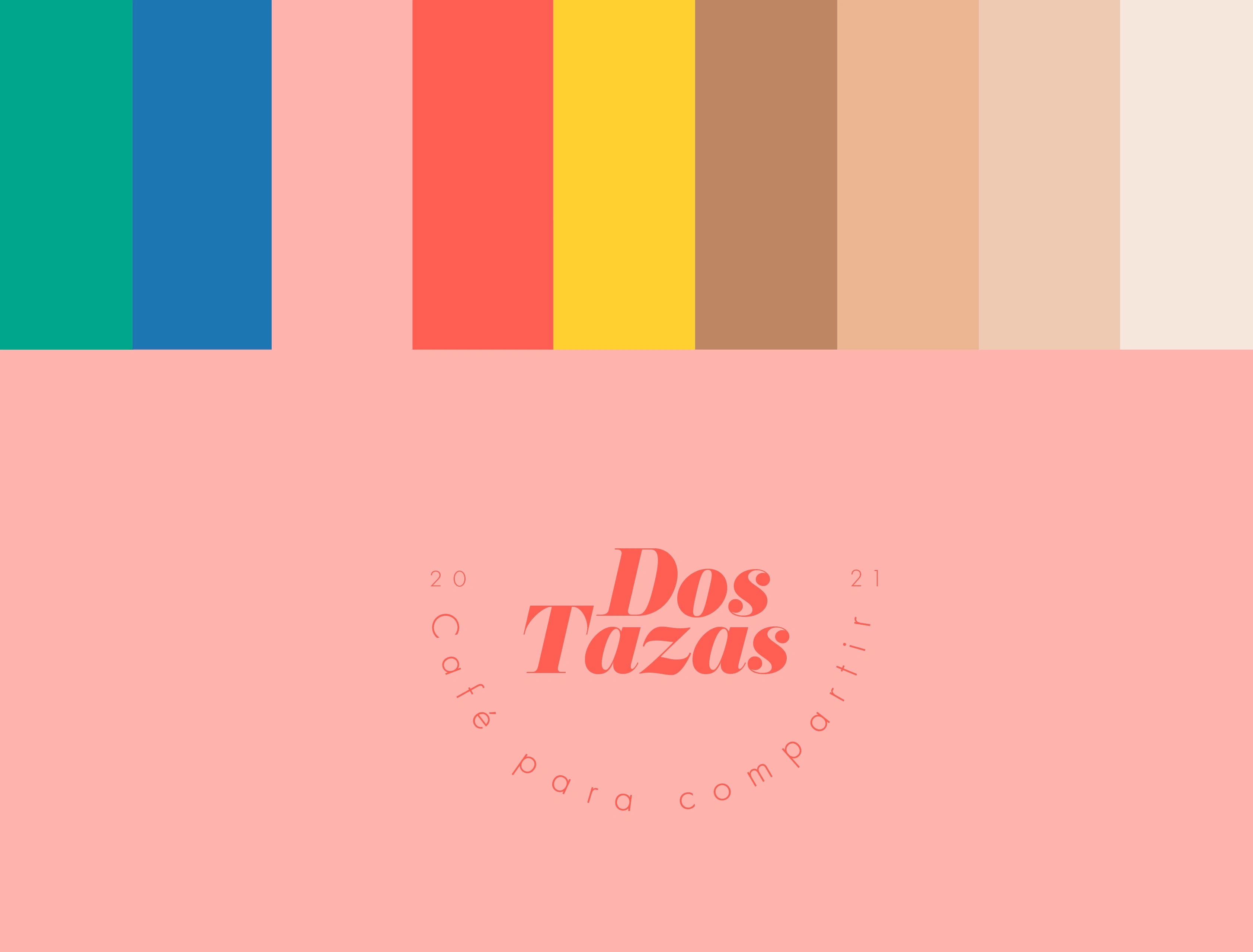
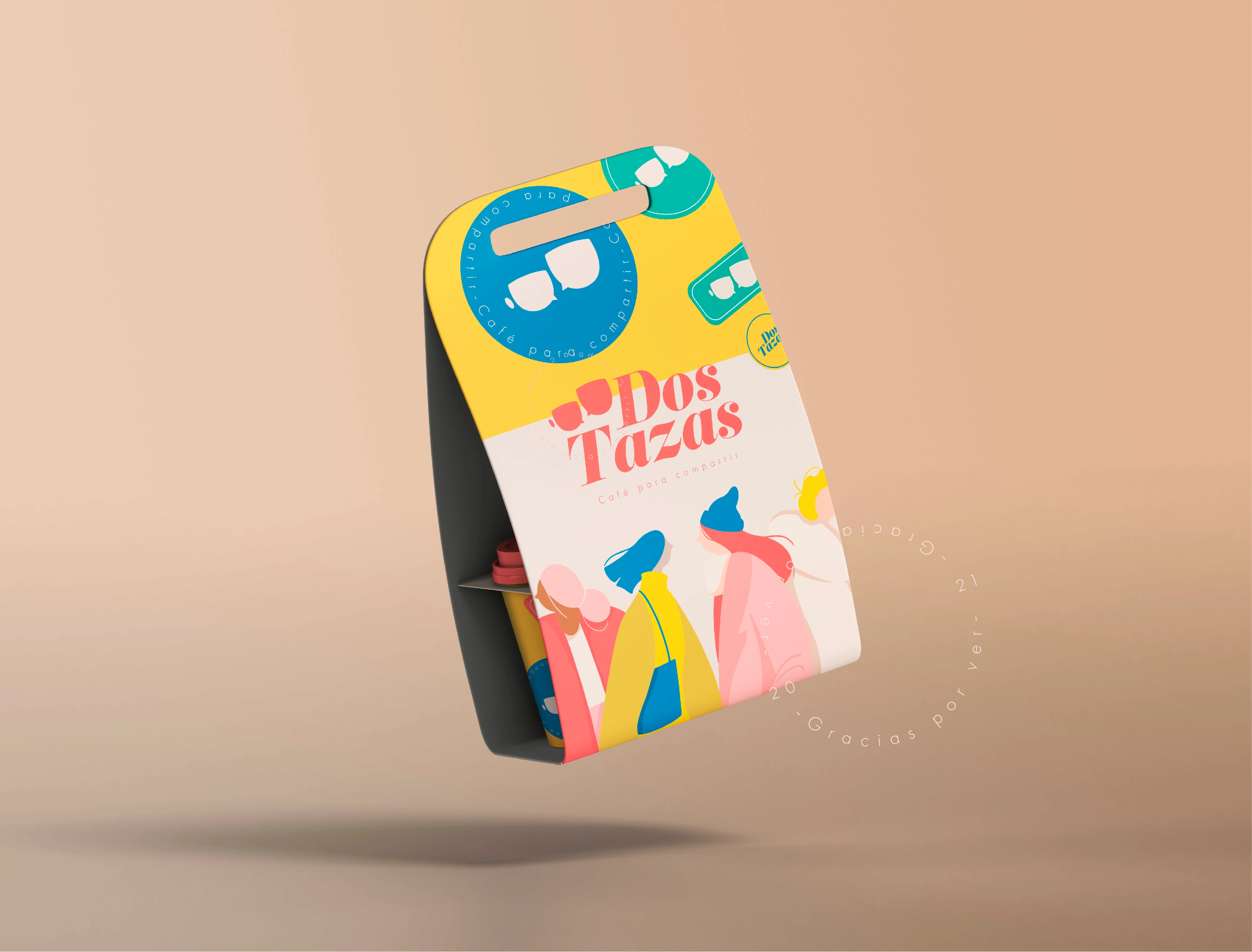
In terms of design, modern colors were chosen to align with the preferences and aesthetics of the target audience. These colors aimed to convey a contemporary and vibrant vibe that would resonate with young individuals seeking unique coffee experiences. The overall visual identity was crafted to create an emotional connection and appeal to the senses of the customers.
Through a thoughtful combination of brand elements, including the logo, typography, and visual assets, the "Dos Tazas" brand identity successfully communicated the essence of the coffee and its appeal to the young coffee enthusiasts who value occasional coffee experiences during social interactions.
Like this project
Posted Jul 5, 2023
"Dos Tazas" brand identity: Fresh & exclusive, targeting young coffee enthusiasts. Modern colors, captivating design. Reinvented for special coffee moments.
Likes
0
Views
14


