Visual Identity Design | Ellipsis Creative Studio

Zaoui Ali Youcef



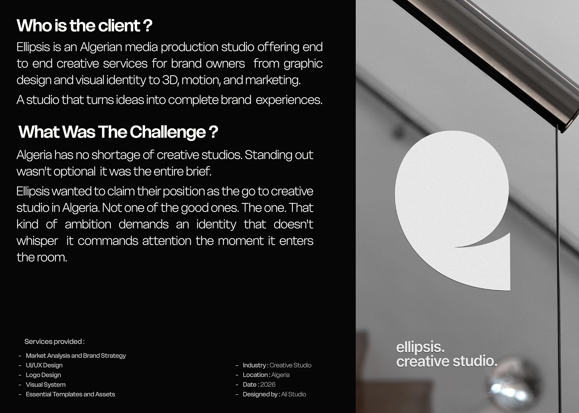
Nothing Here Was an Accident
A look into the process that turns strategy into identity.
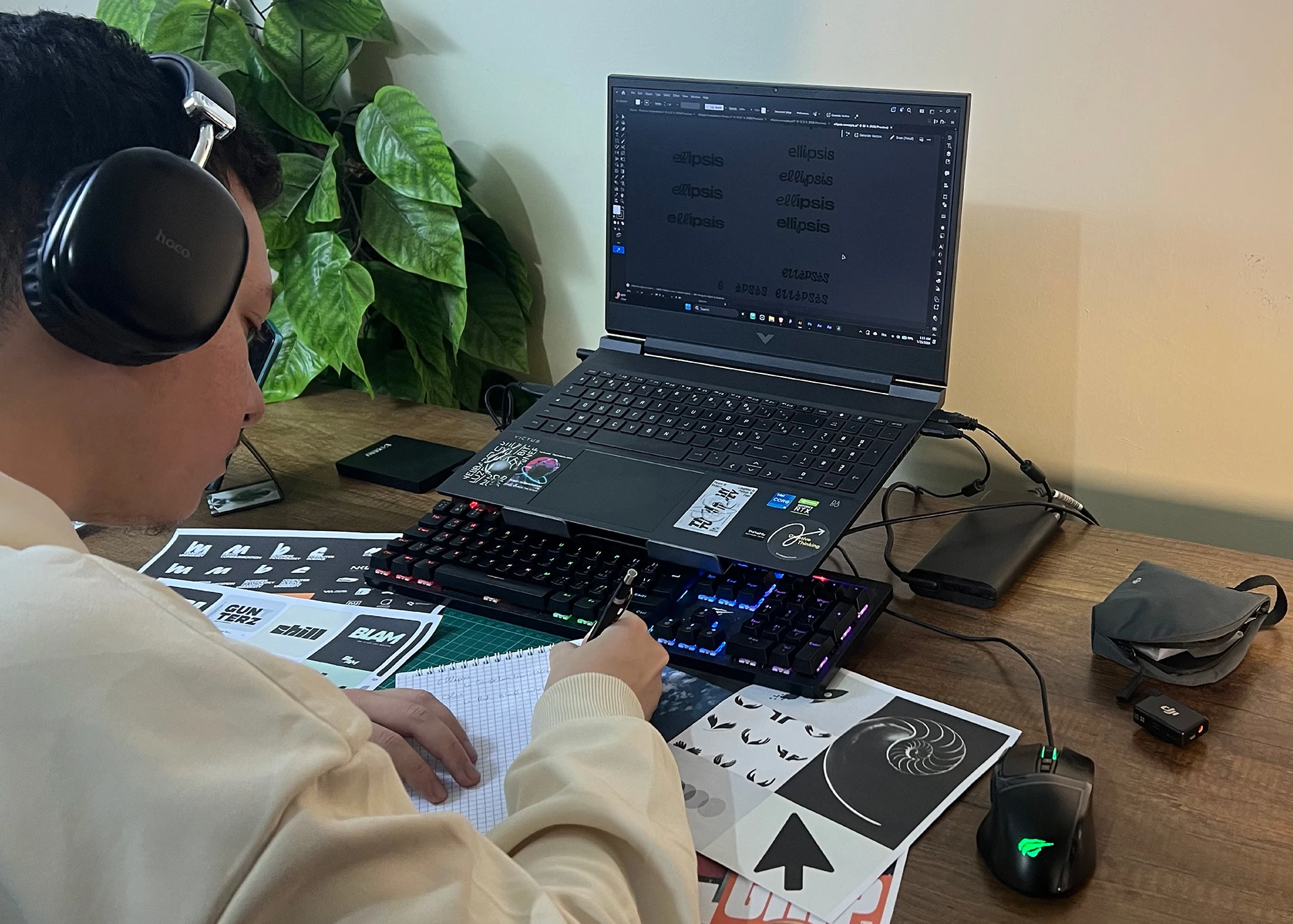
Phase 01 : Research
I need to understand the brand from the inside out. How it should feel, how it should be perceived, how it should speak. The story behind it and the beliefs it stands on.
Phase 02 : Competitor Landscape Analysis
I analyze brands operating in the same space their marks, their colors, their type and identify what's been done, what's overused, and where the gap is. I bring the client into that conversation before anything gets designed..
Phase 03 : Strategic Direction & Design
Research becomes vision. Mood board, type, color, imagery all validated by the client before the first concept is drawn.
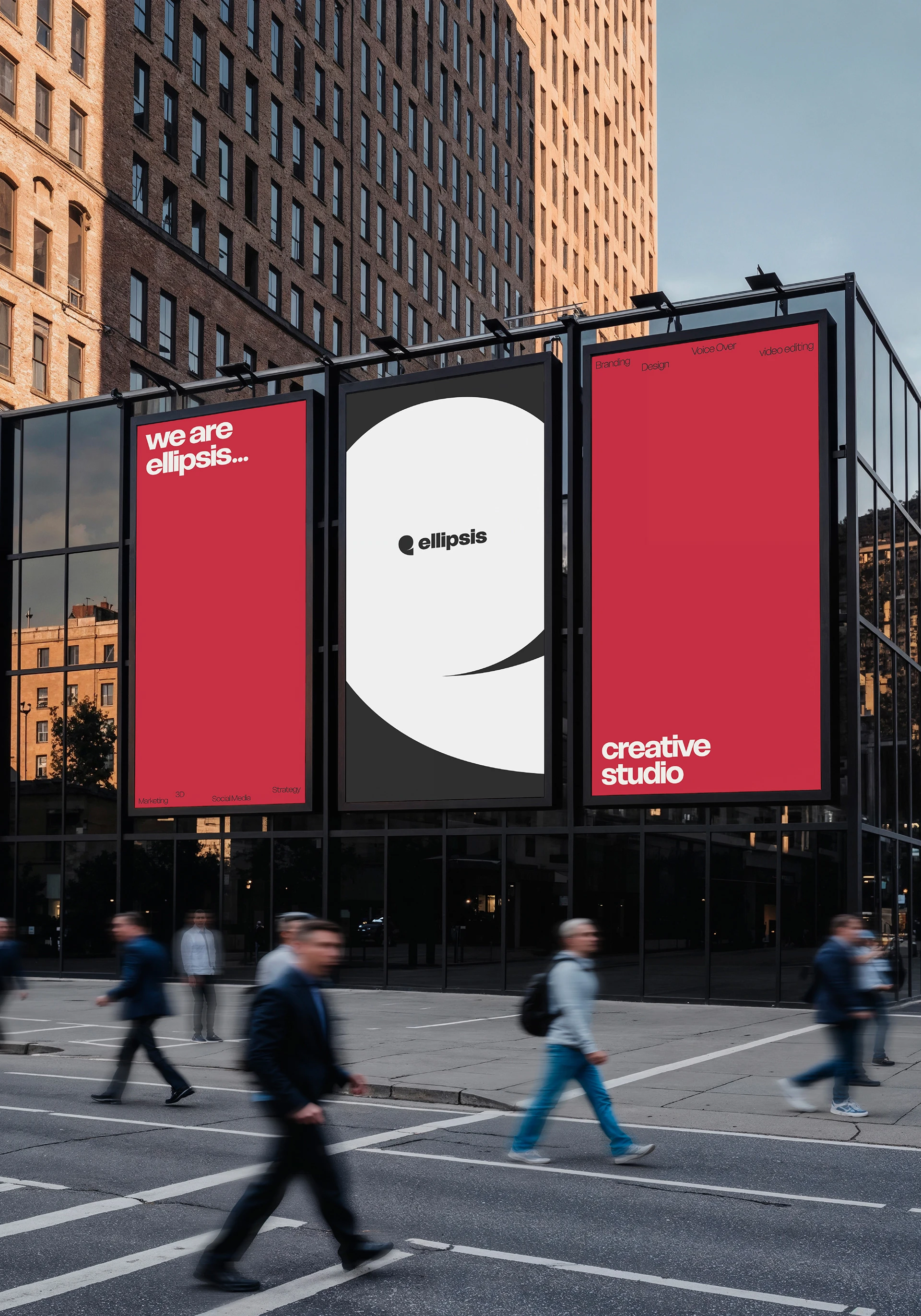
Shaped by nature
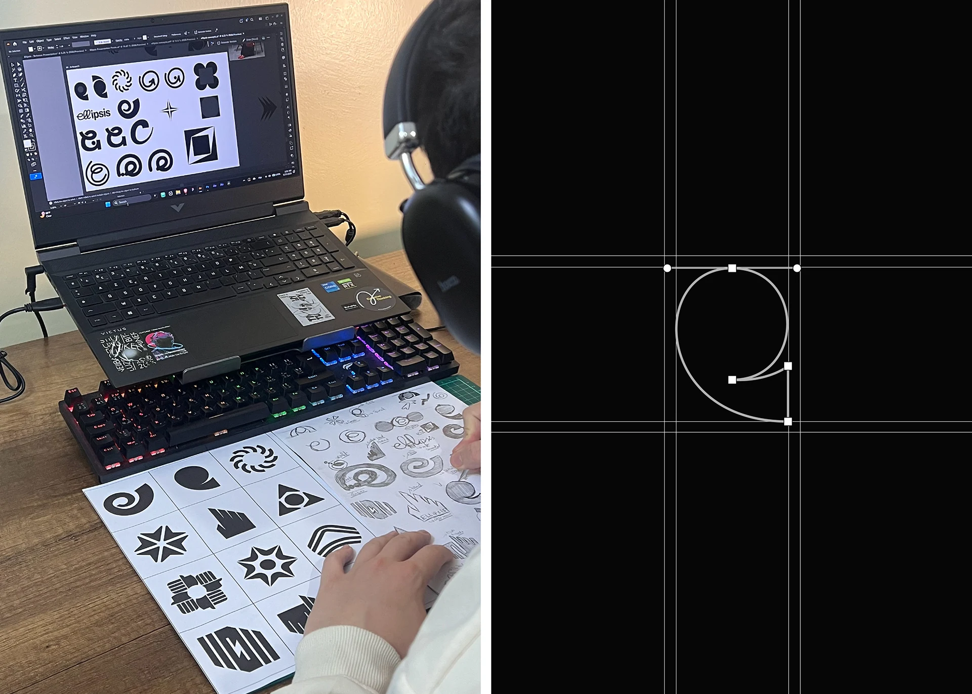
The idea behind the logomark
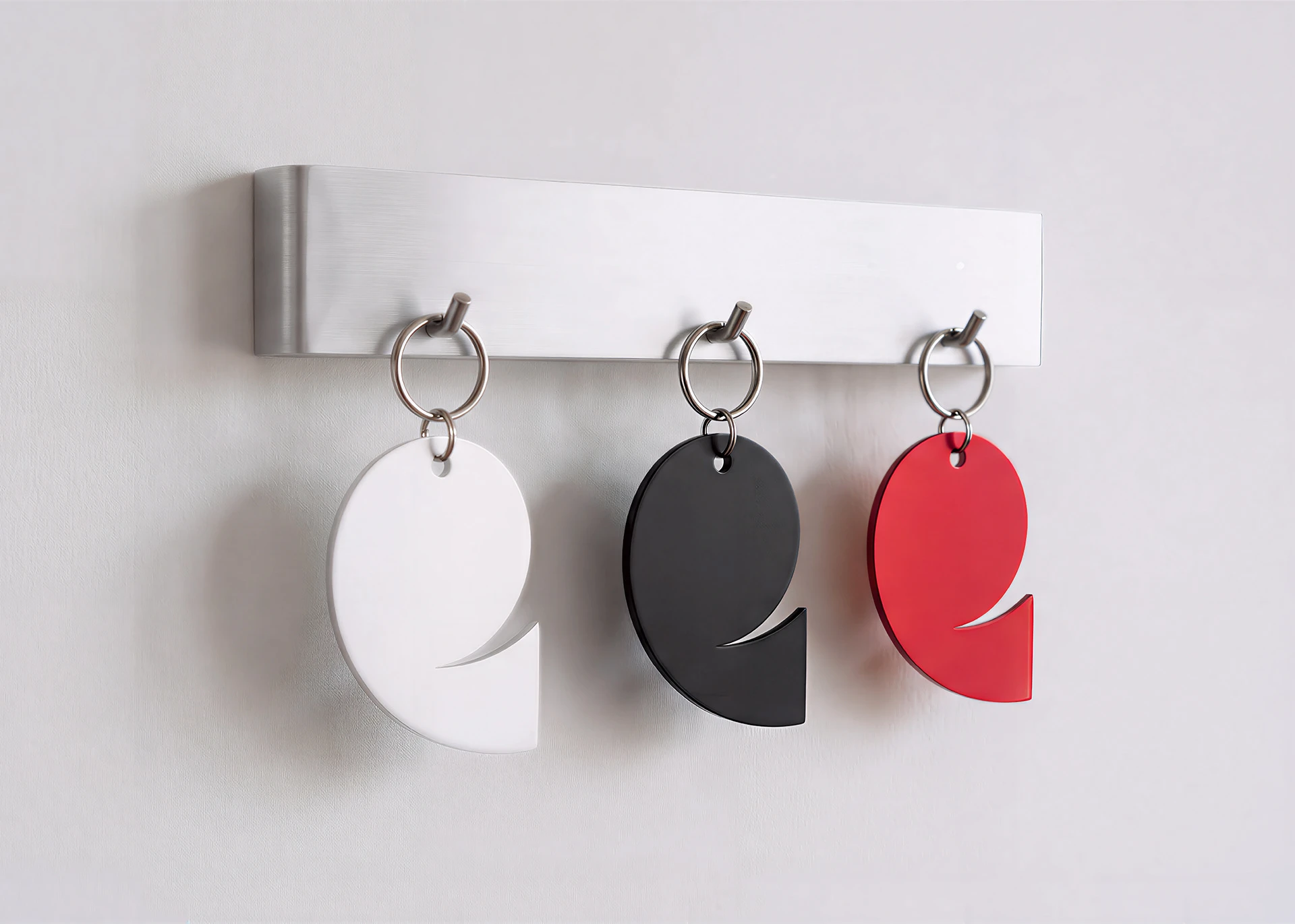
The logomark is inspired by the sea spiral a creature whose form is governed by the golden ratio of 1.618. Its perfectly curved, naturally balanced structure moves from thin to thick in a single continuous motion a visual metaphor for stability, precision, and constant growth. A shape that doesn't chase balance. It is balance.

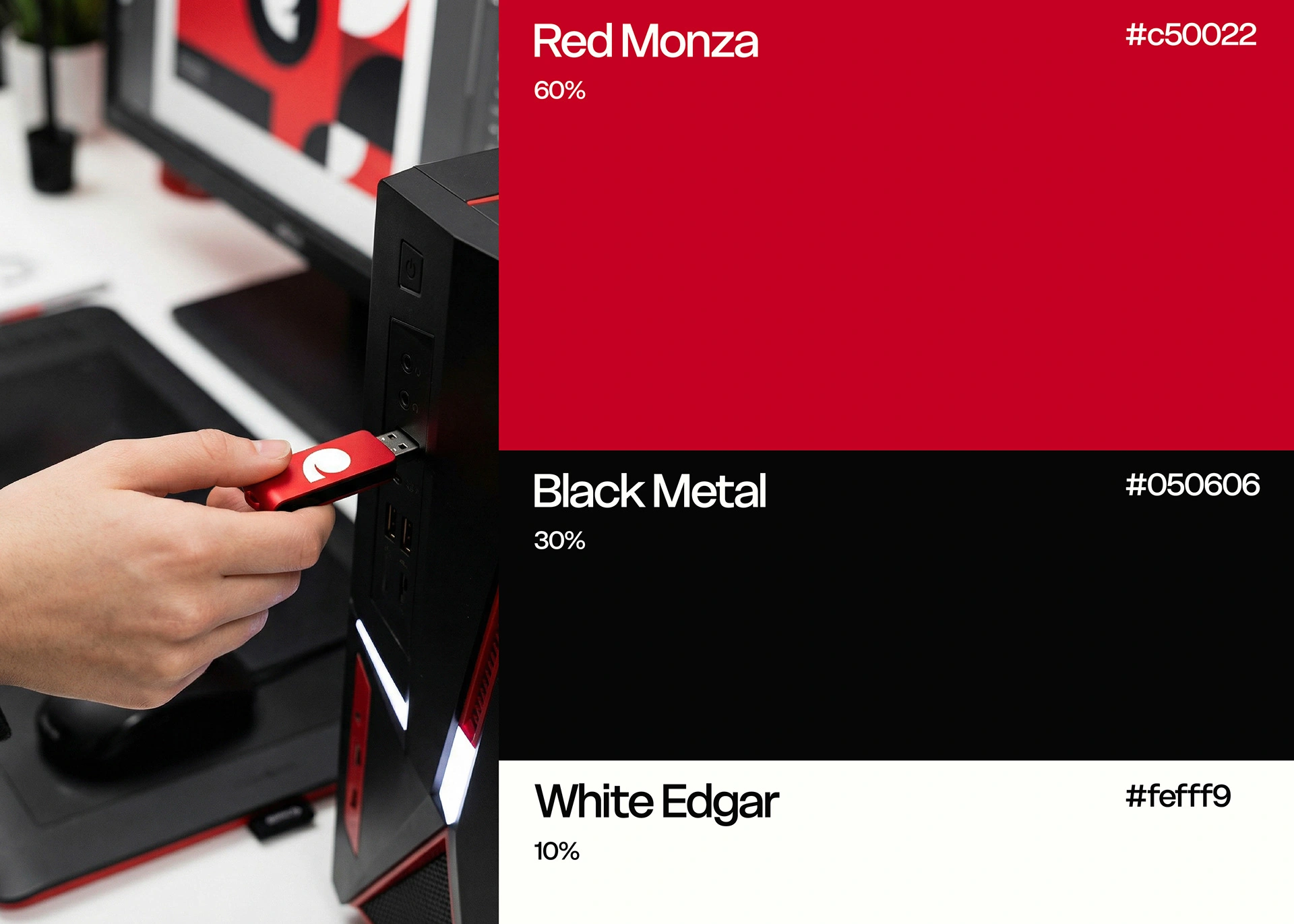
Color palette
Bold by choice.
The palette is built around Red Monza a deep, non-linear red that carries weight without shouting. Paired with Black Metal as its anchor and White Edgar as a breath of air, the three colors follow the 60–30–10 rule a principle that creates visual harmony, hierarchy, and a sense of bold minimalism that feels intentional at every scale.
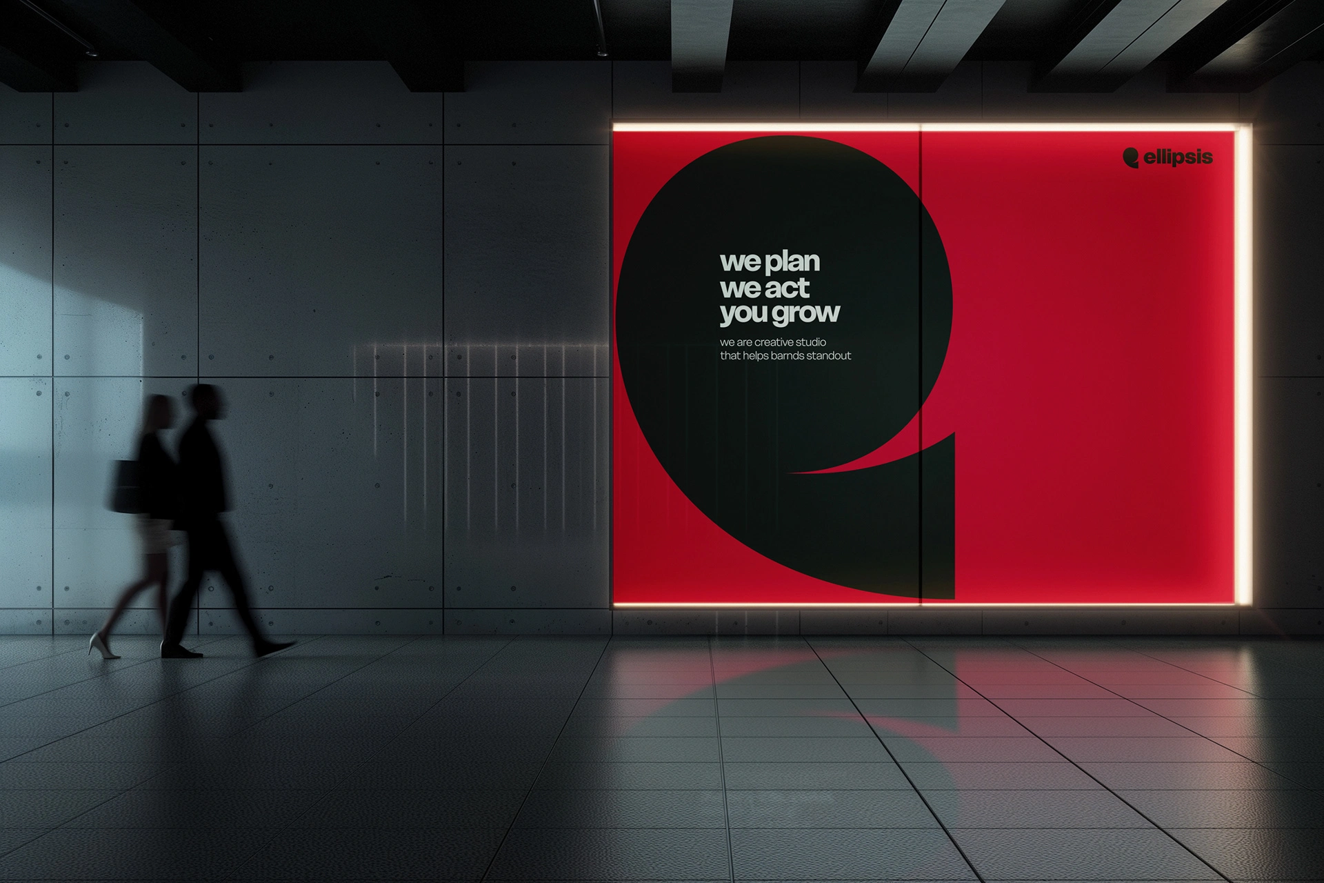

The typeface
Sharp. Bold. Deliberate
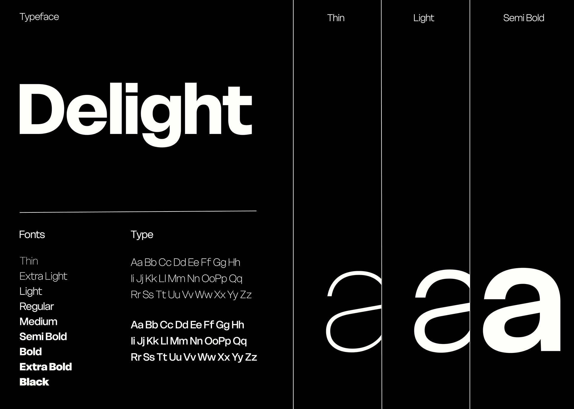
Delight was chosen for its sharp edges, bold weight, and unapologetic presence. A typeface that doesn't blend in it anchors every word with confidence. It mirrors Ellipsis's personality: precise, commanding, and built to be remembered.
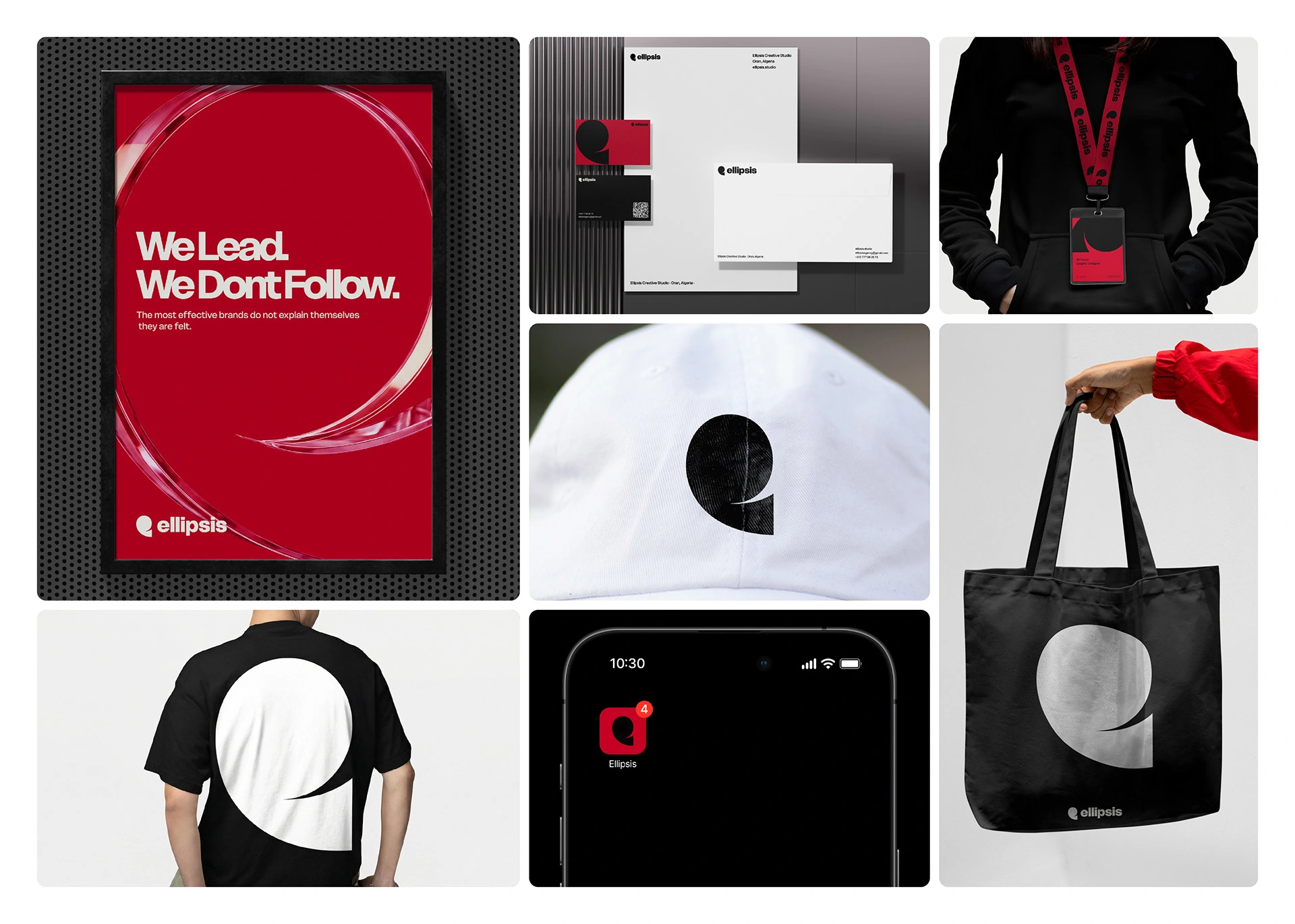
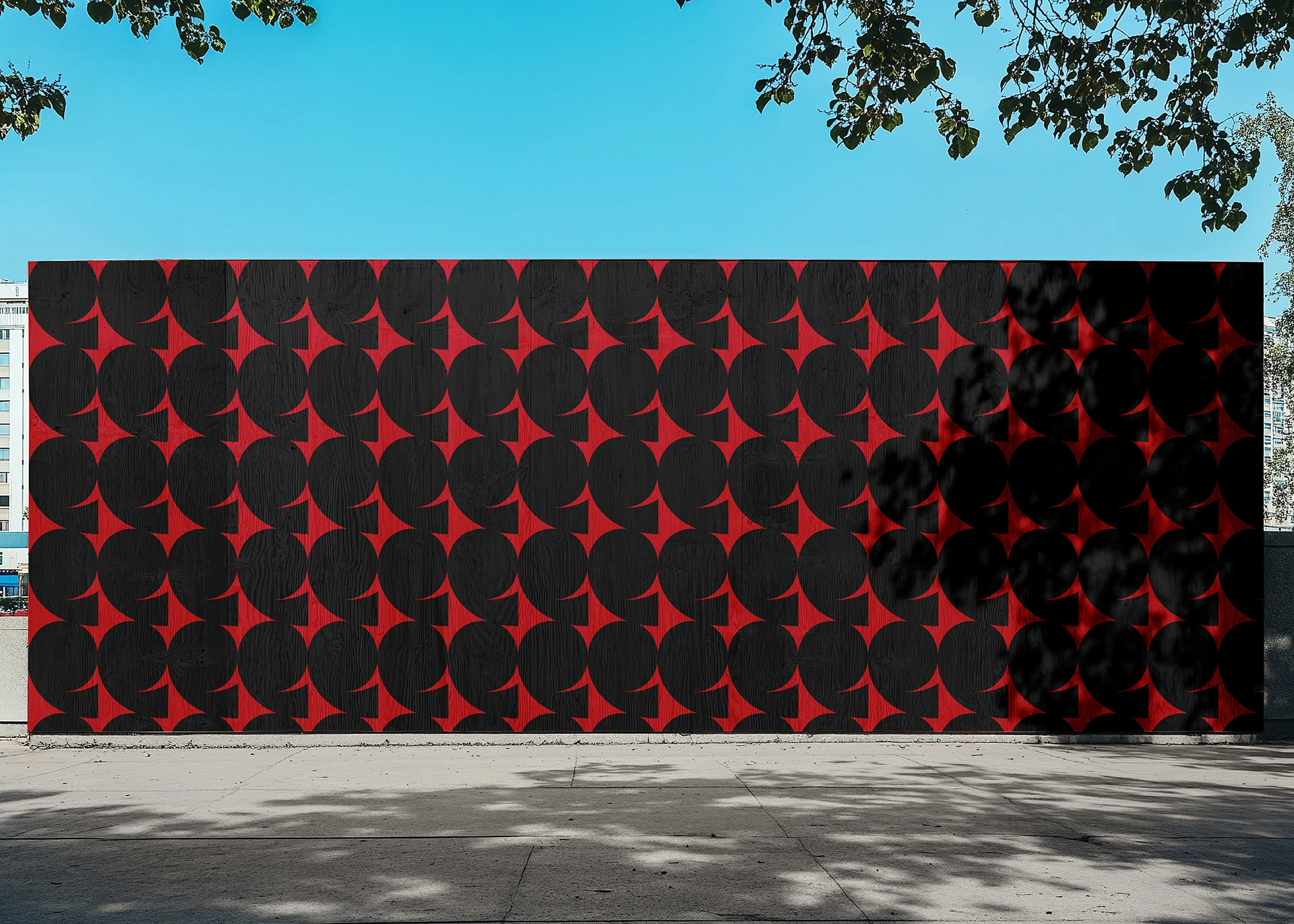
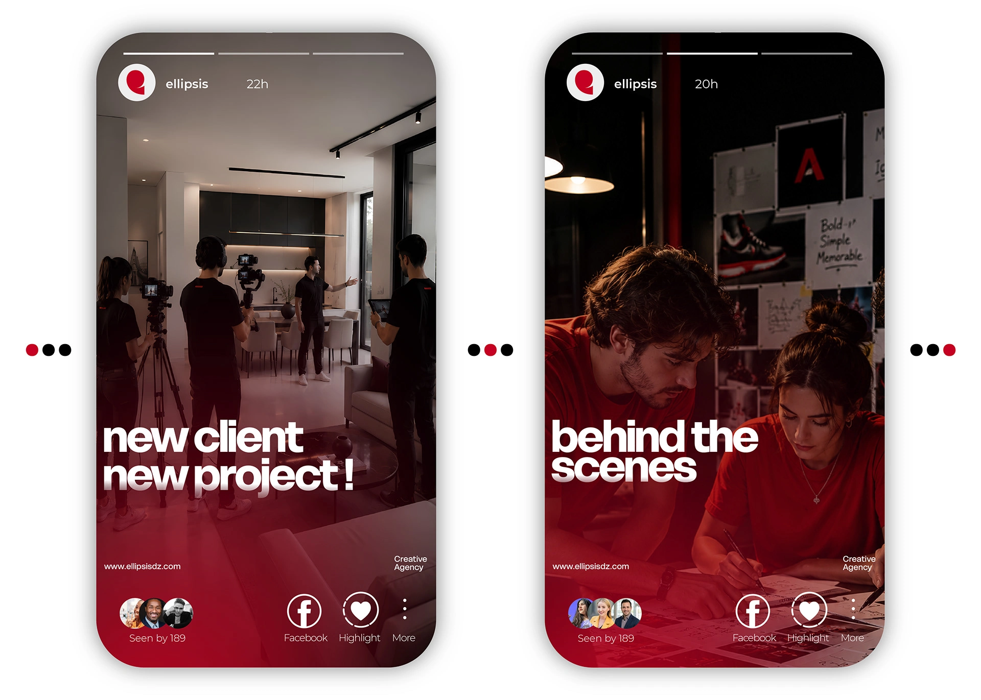
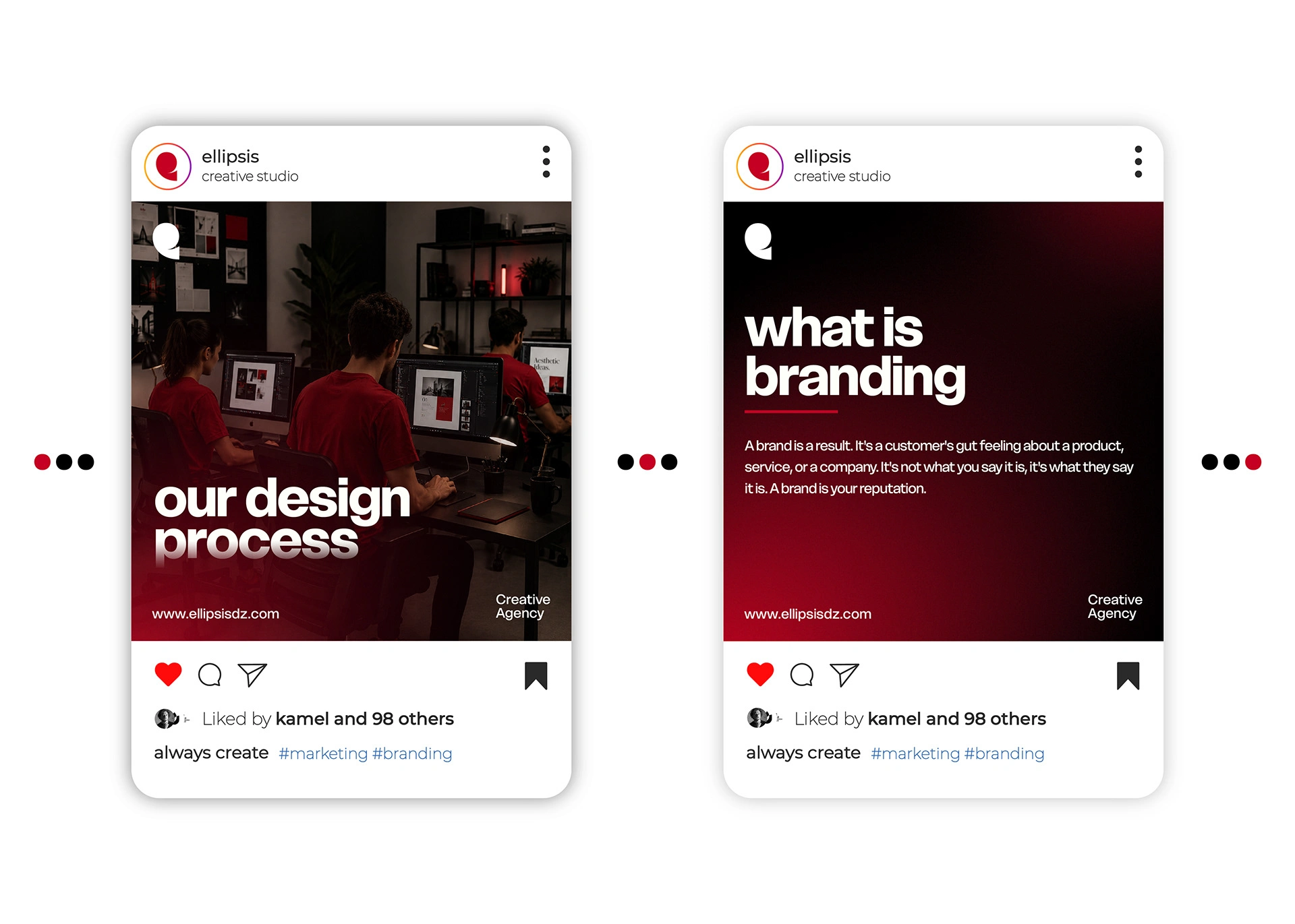
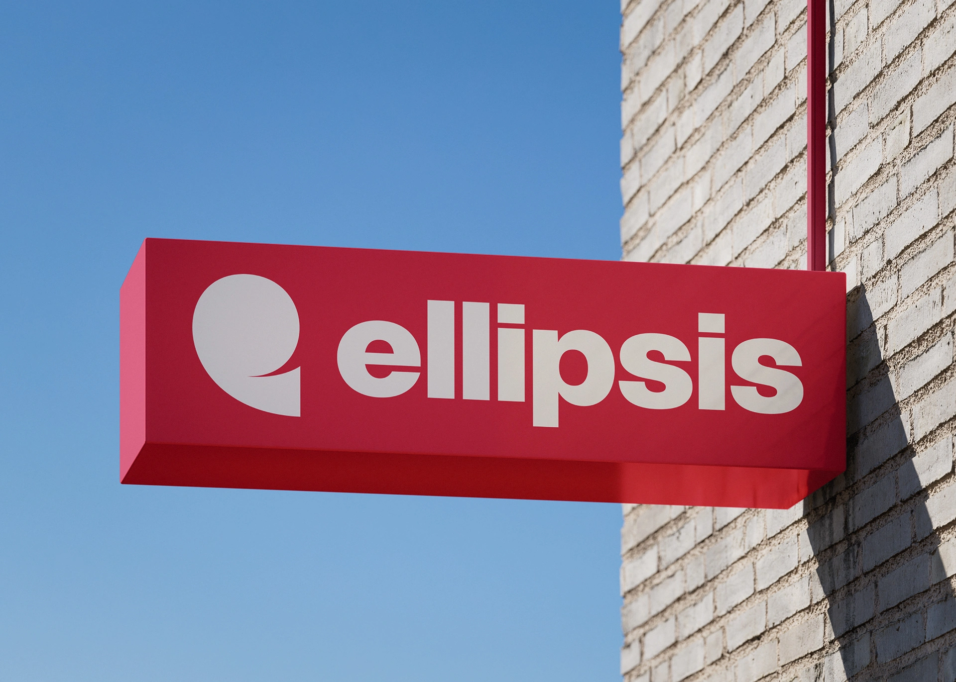
Identity in application
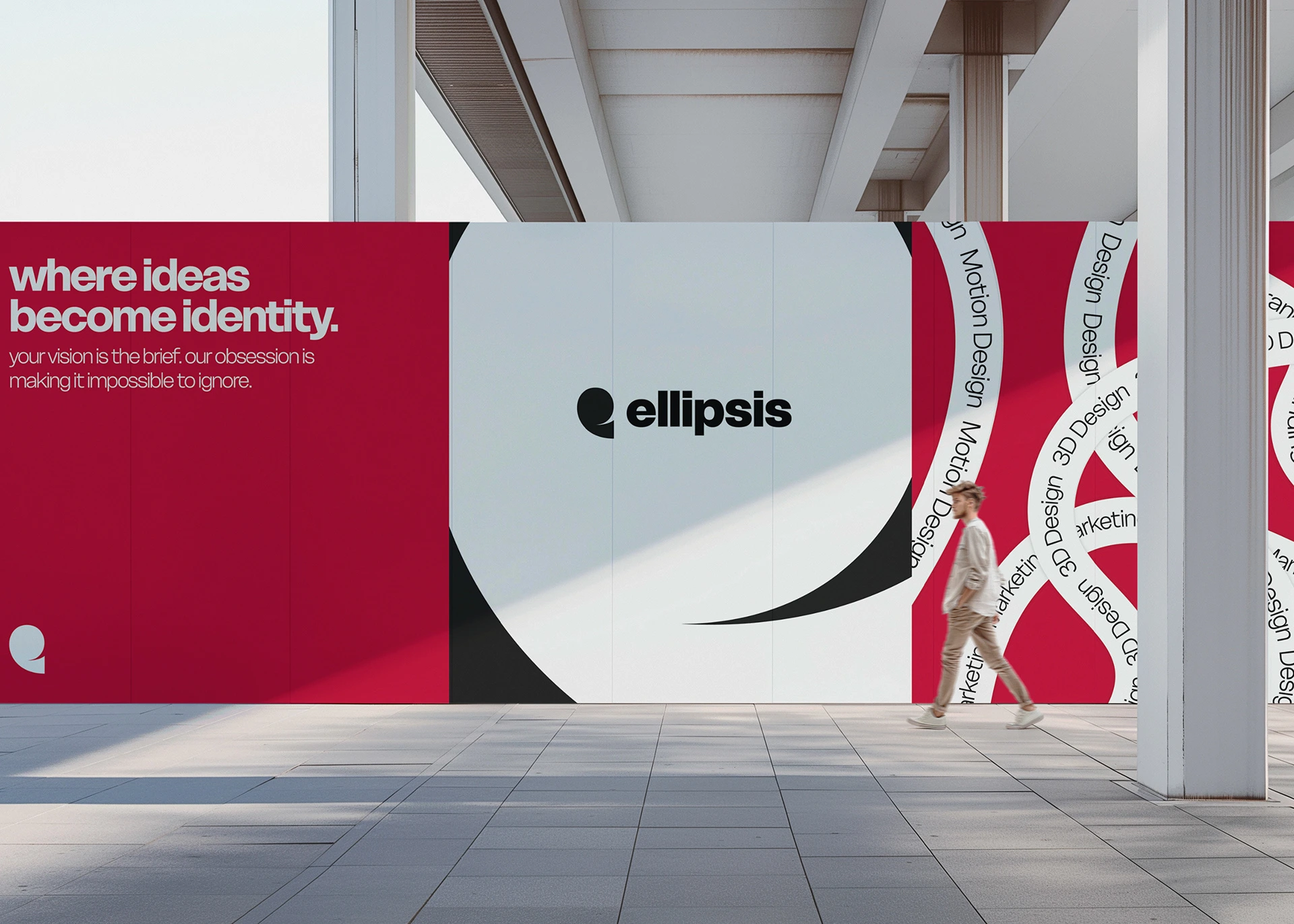
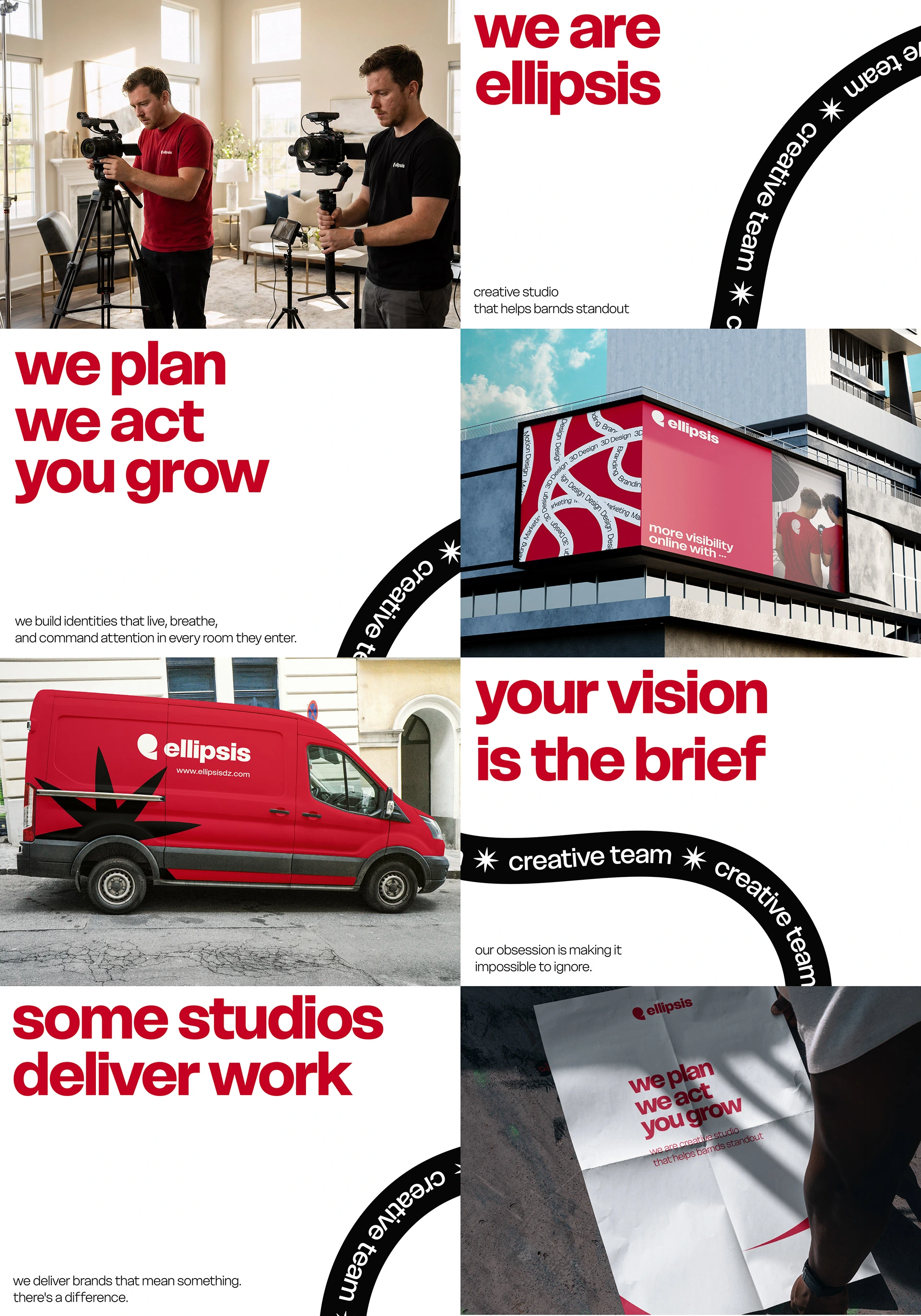
Built to live everywhere.


Like this project
Posted Jul 20, 2026
visual identity designed for Ellipsis Creative Studio, blending minimal aesthetics, strategic branding, and bold visual storytelling.
Likes
3
Views
12
Timeline
Oct 23, 2025 - Dec 8, 2025