Yabut Arkiscapes Logo Ideation
Done between other projects from September 6 to 14 2023 this was the creation from start to finish of a logo for my father's solo ventures in Architecture. With a focus on how a structure's relationship to the people inhabiting it is just as important as the structure itself, the idea of a home relative to the owner was of high importance when coming up with the design.
ORIGINAL LOGO
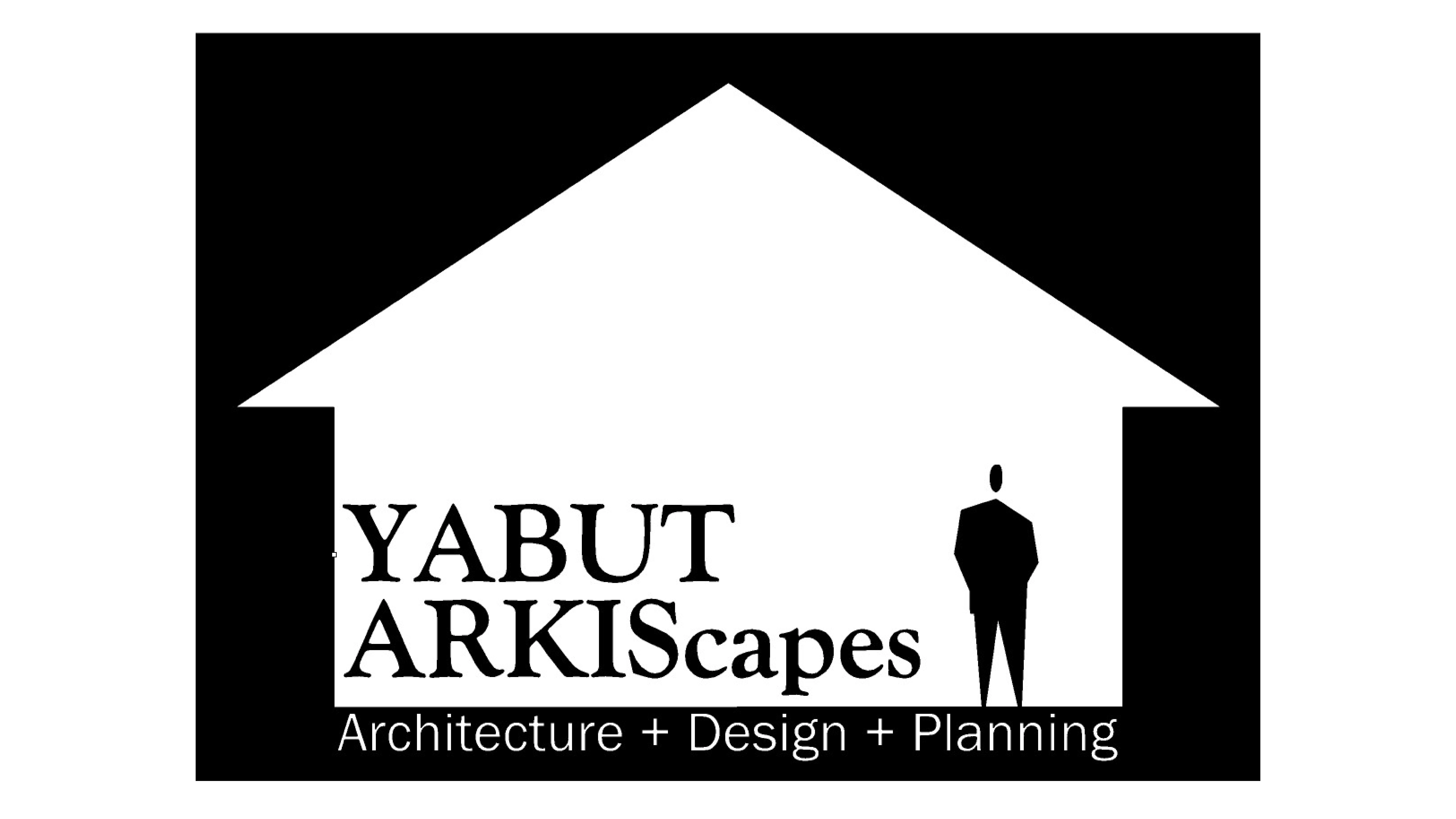
ORIGINAL LOGO
The logo used before this project had the shape of a house be the main visual, using the negative space for the text and a human figure. With a line of what the client does under everything. Problems to be solved with this logo was the overwhelming negative space, as well as trying to make the logo stand out a lot more visually within a more squared dimensions over the rectangles shape it was at the time.
The line of Architecture + Design + Planning seen in the original logo will be cut entirely in order for the logo to look more standalone when shrunk into papers and such. Keeping it would have meant an extra line of text that further cluttered a logo that we're already trying to downsize.
INITIAL IDEAS
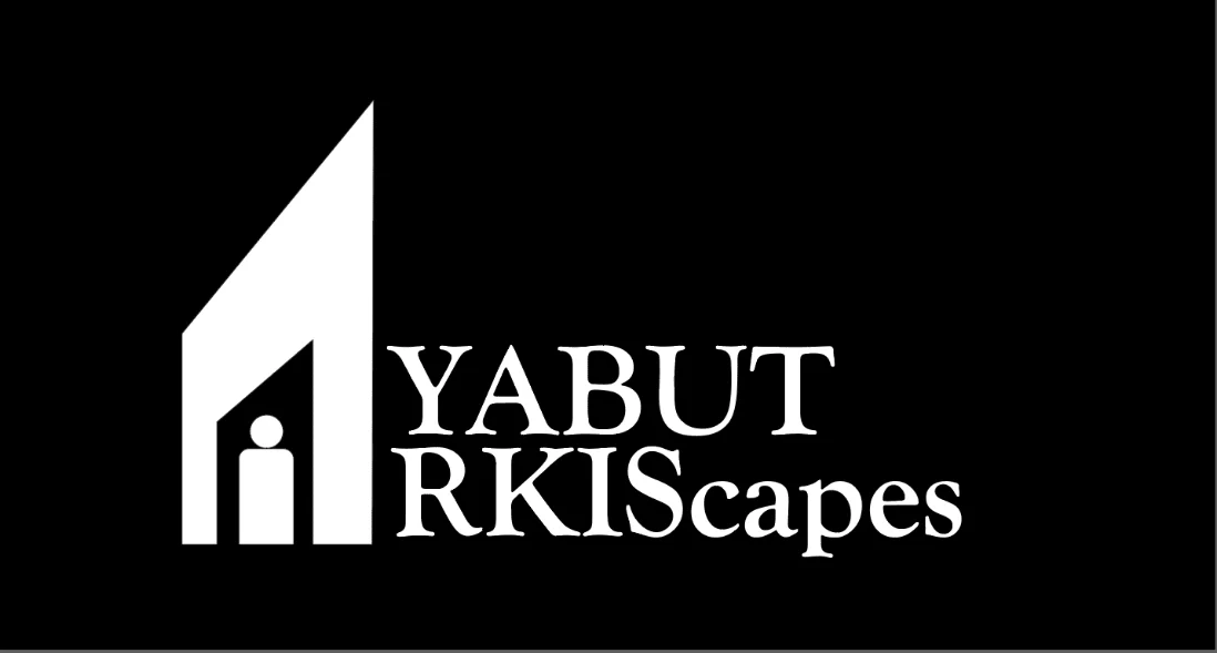
FIRST CONCEPT
The first idea came about with the concept of the façade of a home being the letter A in the name of the logo, with a silhouette of a person at the front entrance of the door. Ultimately in only showing one side of the house as well as the human figure being very flat compared to the implied 3d space of the facade, it didn't paint a clear picture that we're supposed to see a whole home. While this initial concept was scrapped we can see that almost all future renditions of the logo borrow from this initial concept. From that, there were four more concepts that branched out into several more renditions each with a different focus.
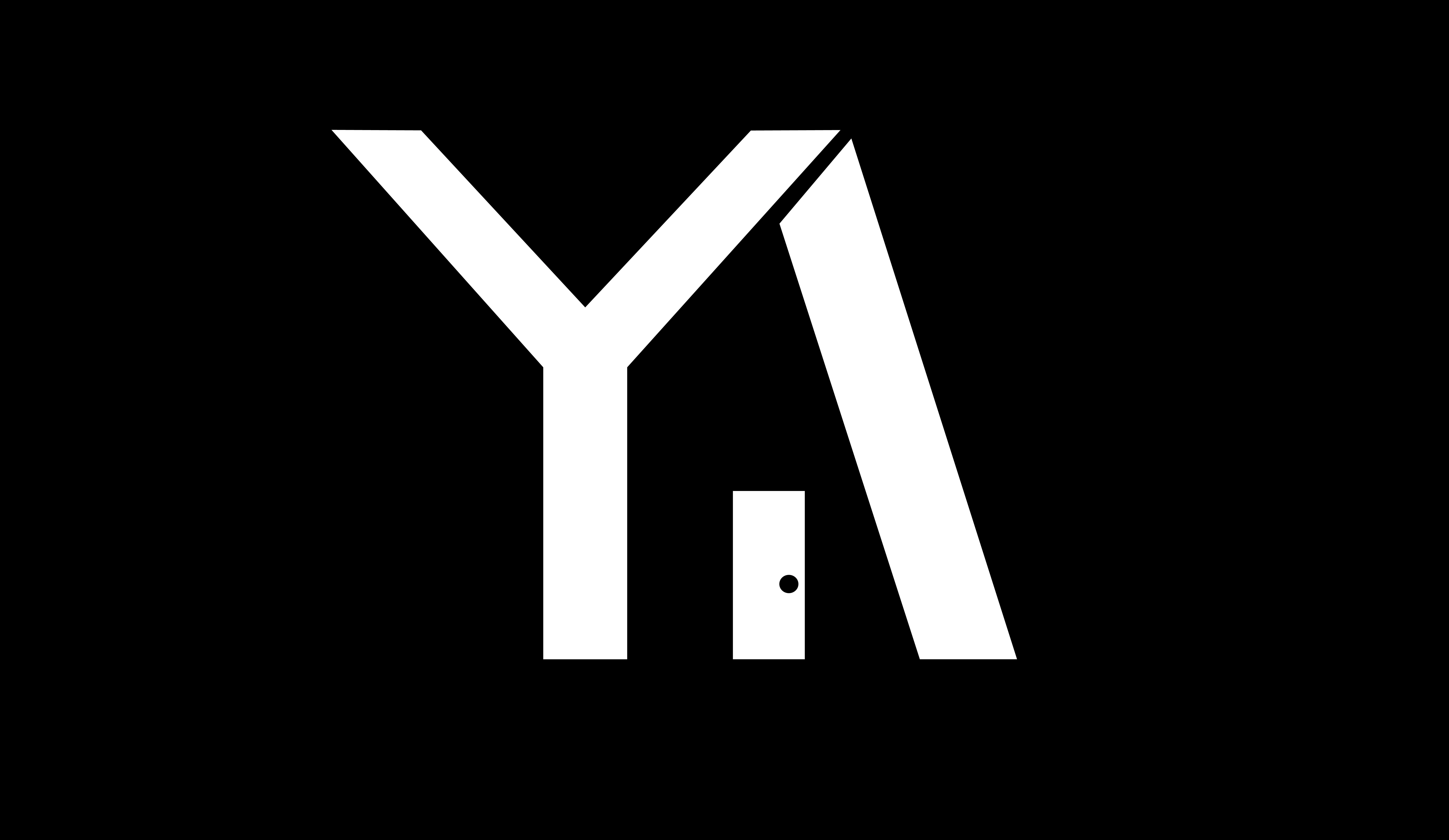
INITIALS CONCEPT
Very quickly going over a concept that was made in between the first and second was the idea of using the initials to create a logo. Merging the Y and A from Yabut Arkiscapes and using the space in between to imply the entrance of a home. While I think this direction works to a certain extent, it was ultim fately scrapped before any more developments due to how it lacked in showing of the company's ideologies. In particular the lack of human form/figure was something that went against what the client had wanted.
The first set came directly after the original idea, trying to answer the problem of better defining the shape of the home. The first thing done was move the lettering below the icon; in the initial concept having the lettering beside the icon made it so that the shape of the home wouldn't be filled by the imagination because of the imaginary shape being blocked. While the clarity of the home was improved by this change, it being in the center makes it awkward once the full shape is seen, the same issue is present when moving the logo to the left. From the issue of filling out the shape the next two concepts were made.
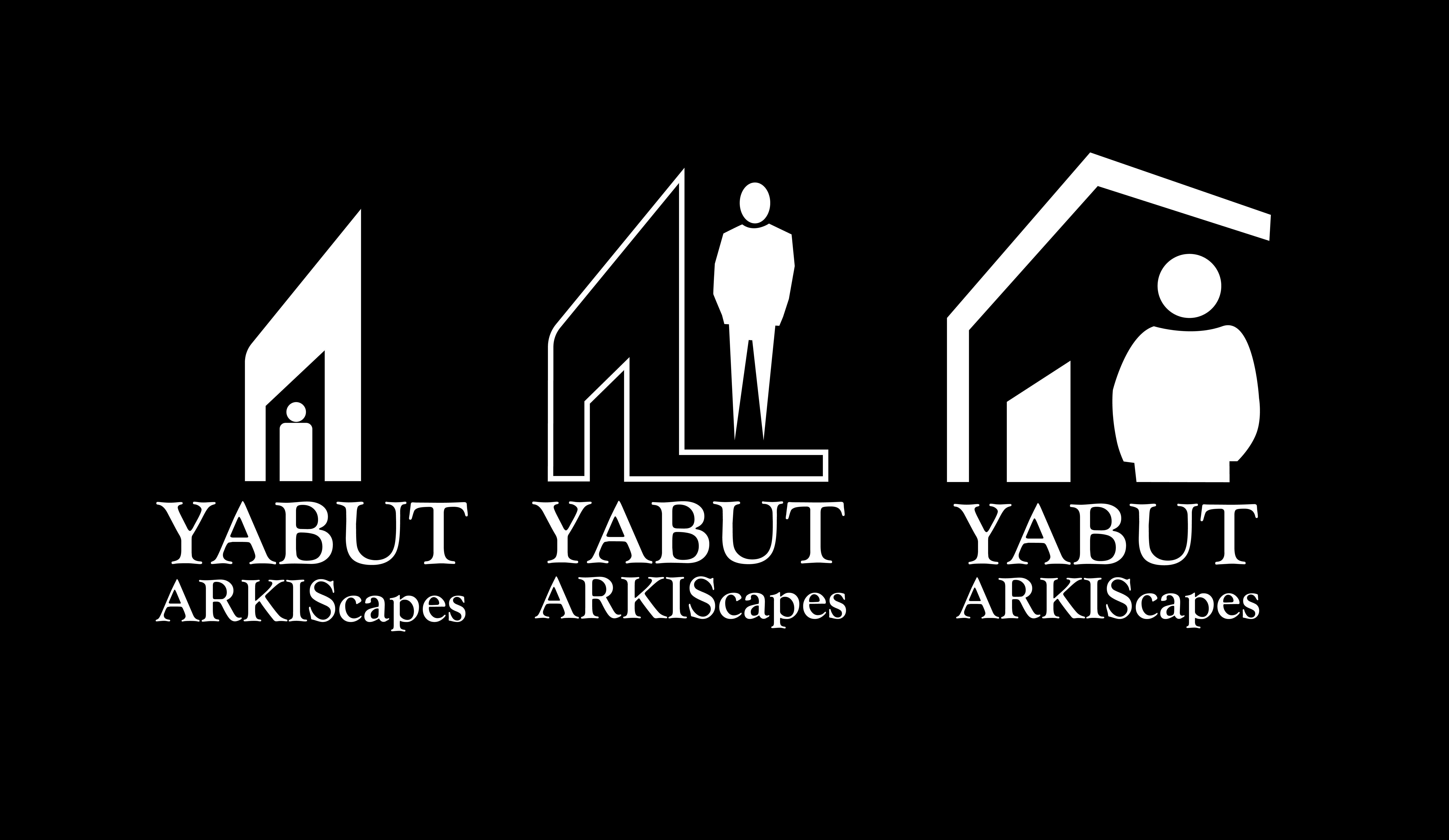
SET 1
With both of these ideas different shapes for the human figures were made with the intention of keeping the form simple but making it more personable. These figures as well were used to fill out the negative space that would have been there by moving the facade to the left side, additionally in both extra shapes were added to fill out the shape of a 3D home. One using outlines for the home and filling out the bottom part of the home, double serving as a base for the human figure, and one completing the roof and instead using thick lines over negative space and outlines. While a step improved from the original concept from a visually clear perspective, it didn't properly convey the human figure's relationship with the home. With simply overlaying the human form over it, from a design perspective the intention of the figure wasn't exactly clear.
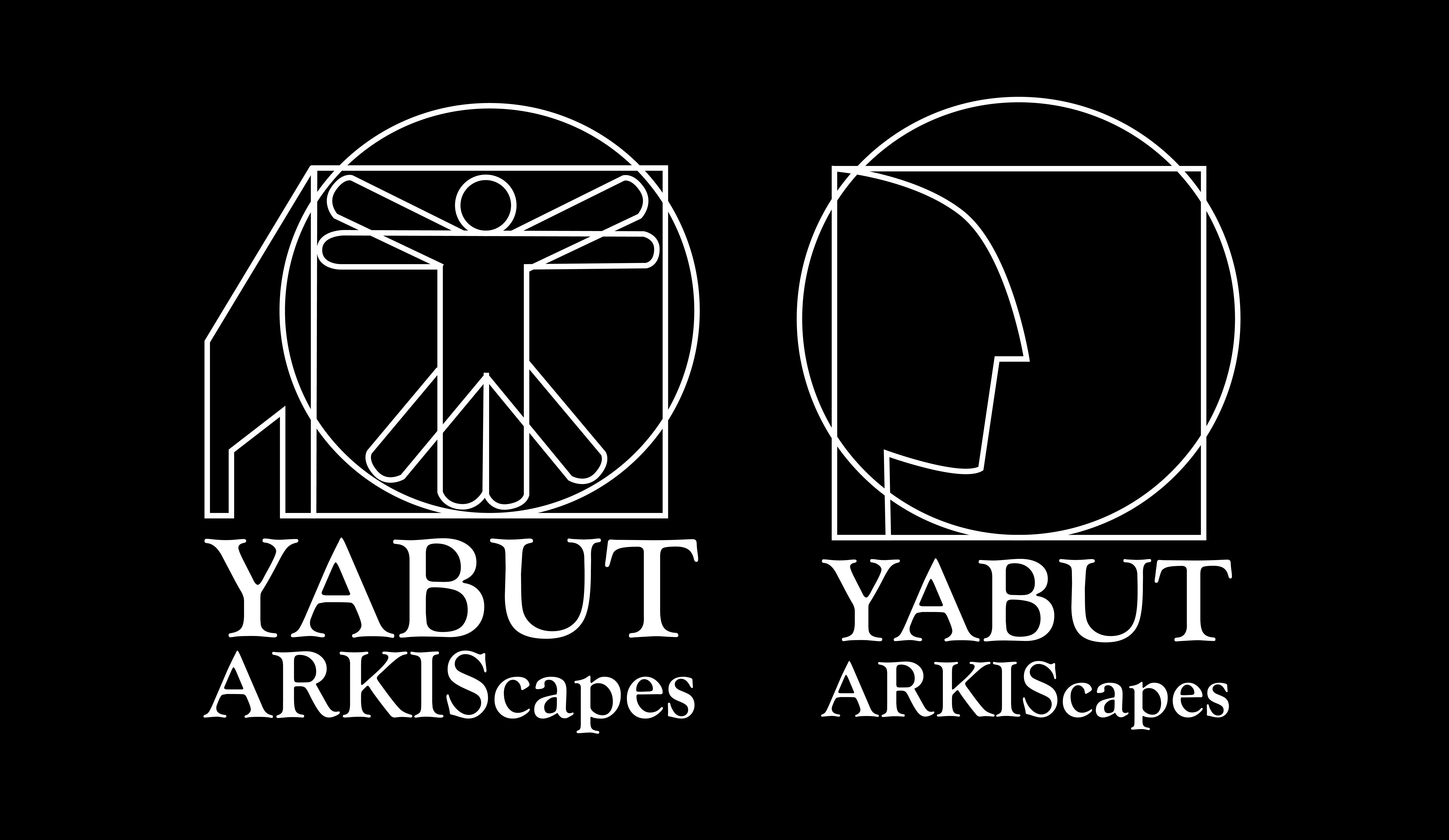
SET 2
That issue again was tackled in the next two sets of designs, which both try to take more abstract ideas. The second set was to take inspiration from the Vitruvian Man by Da Vinci. Simplifiying the human figure as to not visually overwhelm as well as using the square seen in the original Painting as another side to the house, filling out the shape of the home made in the first concept; this passthrough of this concept uses the ide of the vitruvian man as as way to show how man fills out the space of a home themselves. A good direction conceptually albeit visually cluttered. The next concept was heavily simplified from the last one, still using the square and circle from the Vitruvian Man and cutting the entrance to the house, and opting for the profile of a man rather than the full human figure. This concept was done more out of playing around with the shapes that I've been using rather than following any design philosophy or concept for the client.
SET 3
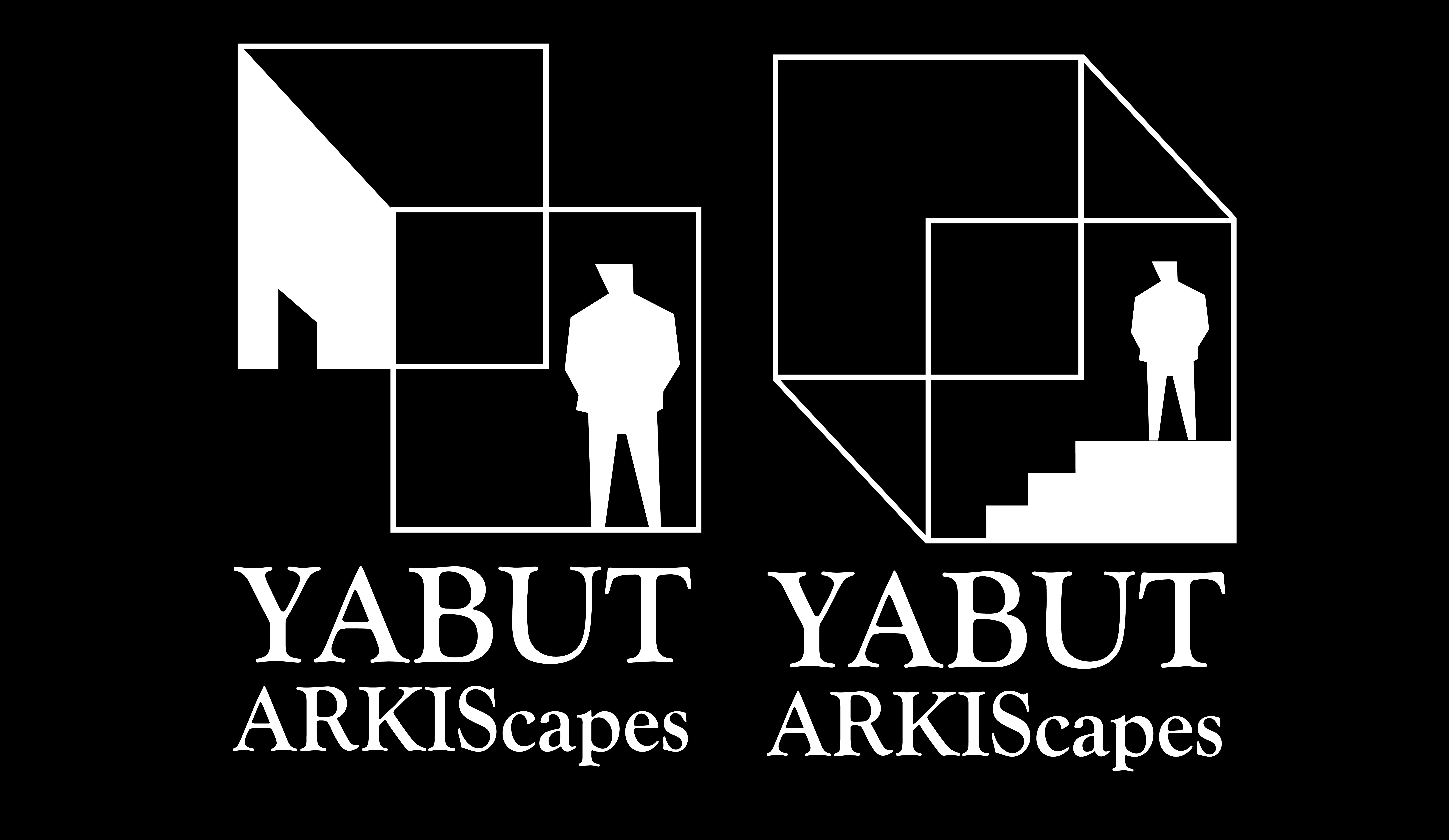
Finally the last set of designs took an even more abstract concept, focusing on the flexibility of a home relative to the person living in it. Using two simple squares to imply a 3D space rather than showing the front of the home outright meant that a viewer/potential client can look at the logo from different perspectives and see a new shape everytime. Is the man outside the house? Inside? Upstairs? Downstairs? The abstraction of the home makes it so that its up to the viewer on what kind of home this is. Even the more visually concrete dimensions of the home such as the entrance seen in the original concept (shown in the left design) can be looked at from either an angle looking upwards or downwards, opening even more dimensions for the home to be looked at. The concept with the stairs completes the cube while keeping the abstraction of the stairs being either closer to the outside or inside of the home. A very promising concept.
FINAL CONCEPT
CLOSING IN ON FINAL DESIGN
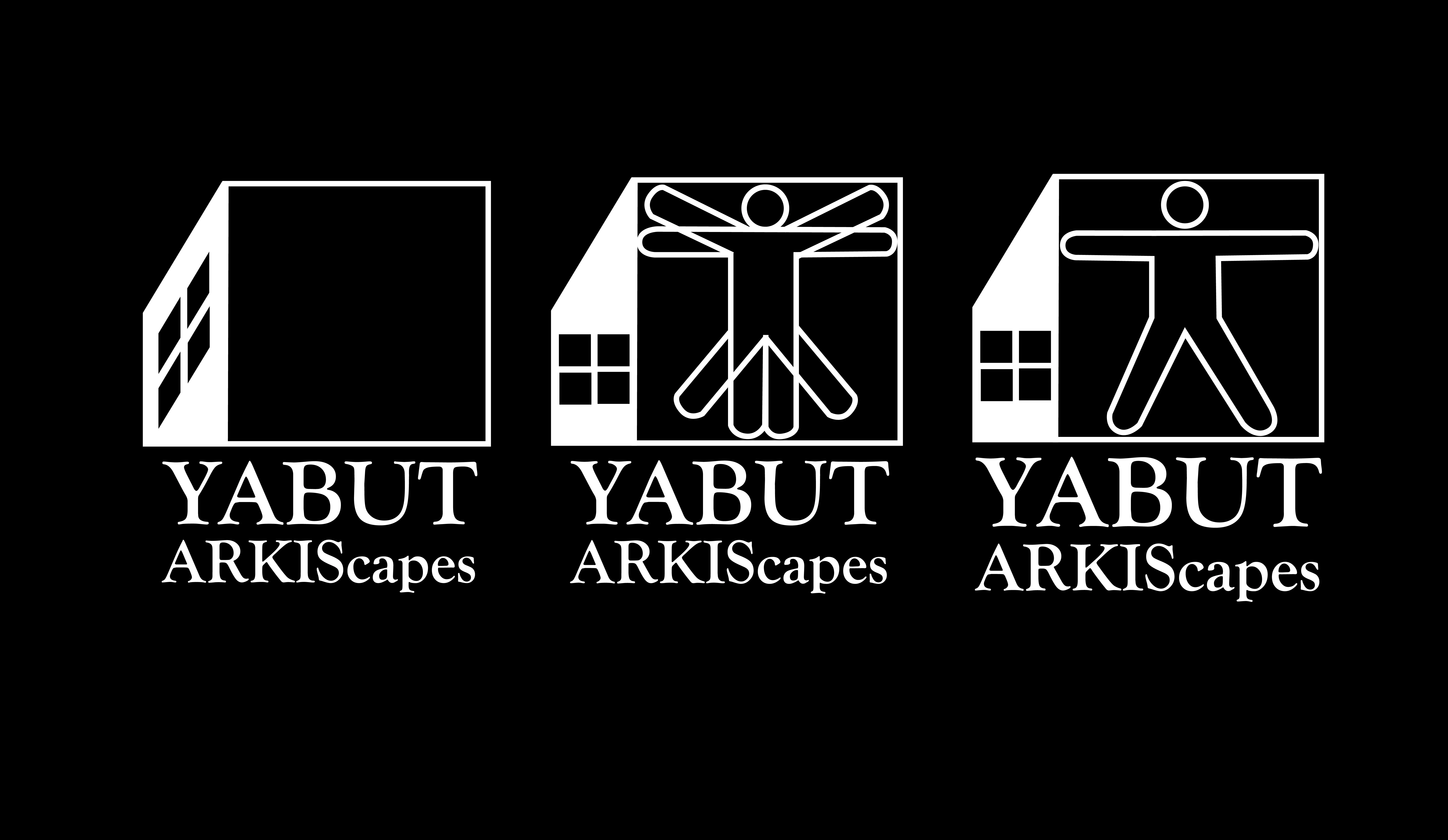
Ultimately what was decided on by the client was closer to the second set of designs inspired by the Vitruvian Man. Cleaning up visually first from the lefthand space, using opposite colors to fill it out instead of the outlines seen before. Another way to fill the space was to replace the front door seen on the left side of the home with a window. The door, while at a glance while works, creates an awkwardness when looked at a bit too long, the flatness at the base possibly reading as looking at the house from an almost impossible angle. The first rendition of the windows also had a more 3D approach but had the same problem as the opening door, so it was further developed into looking more 2D, making it instantly clear what it is without looking too confusing.
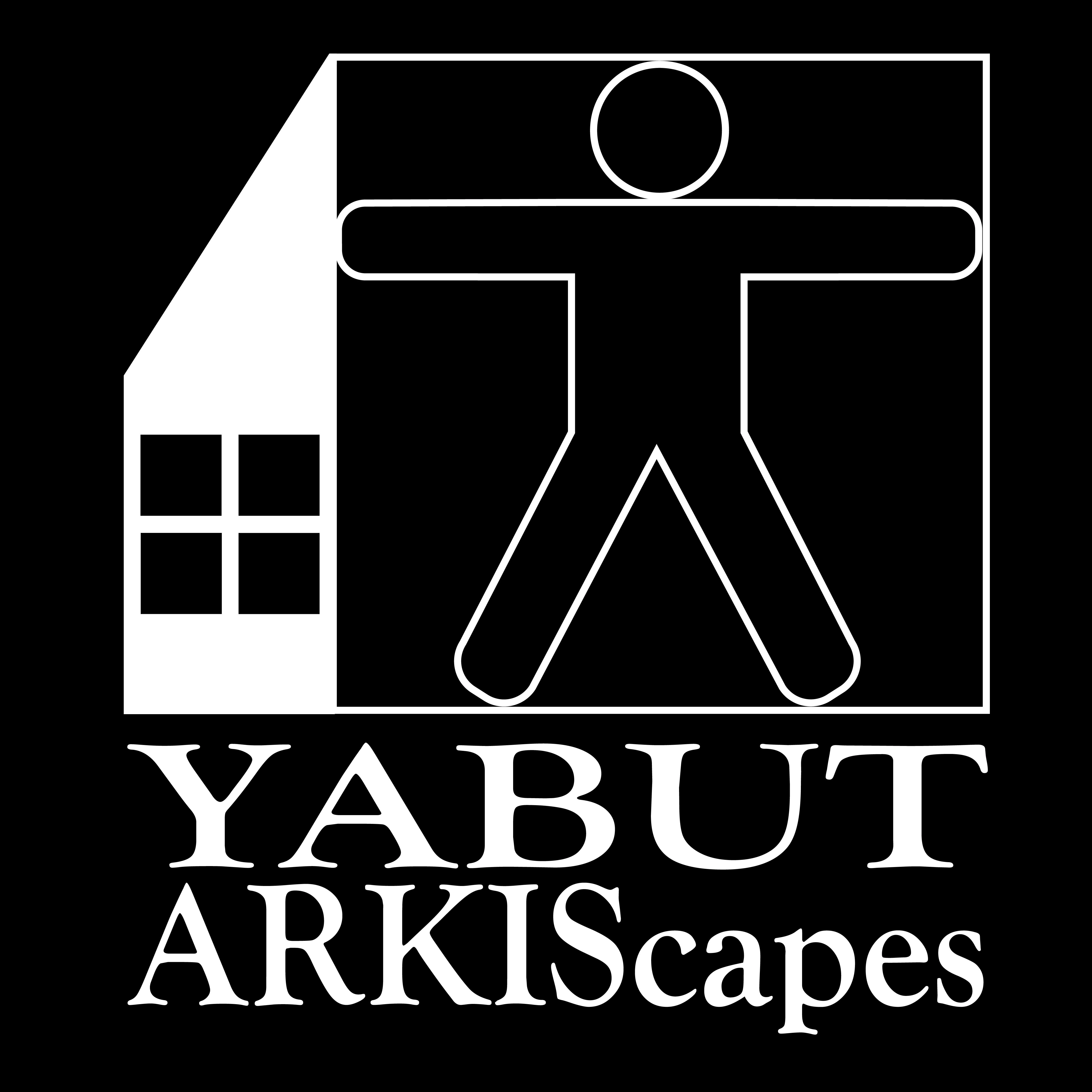
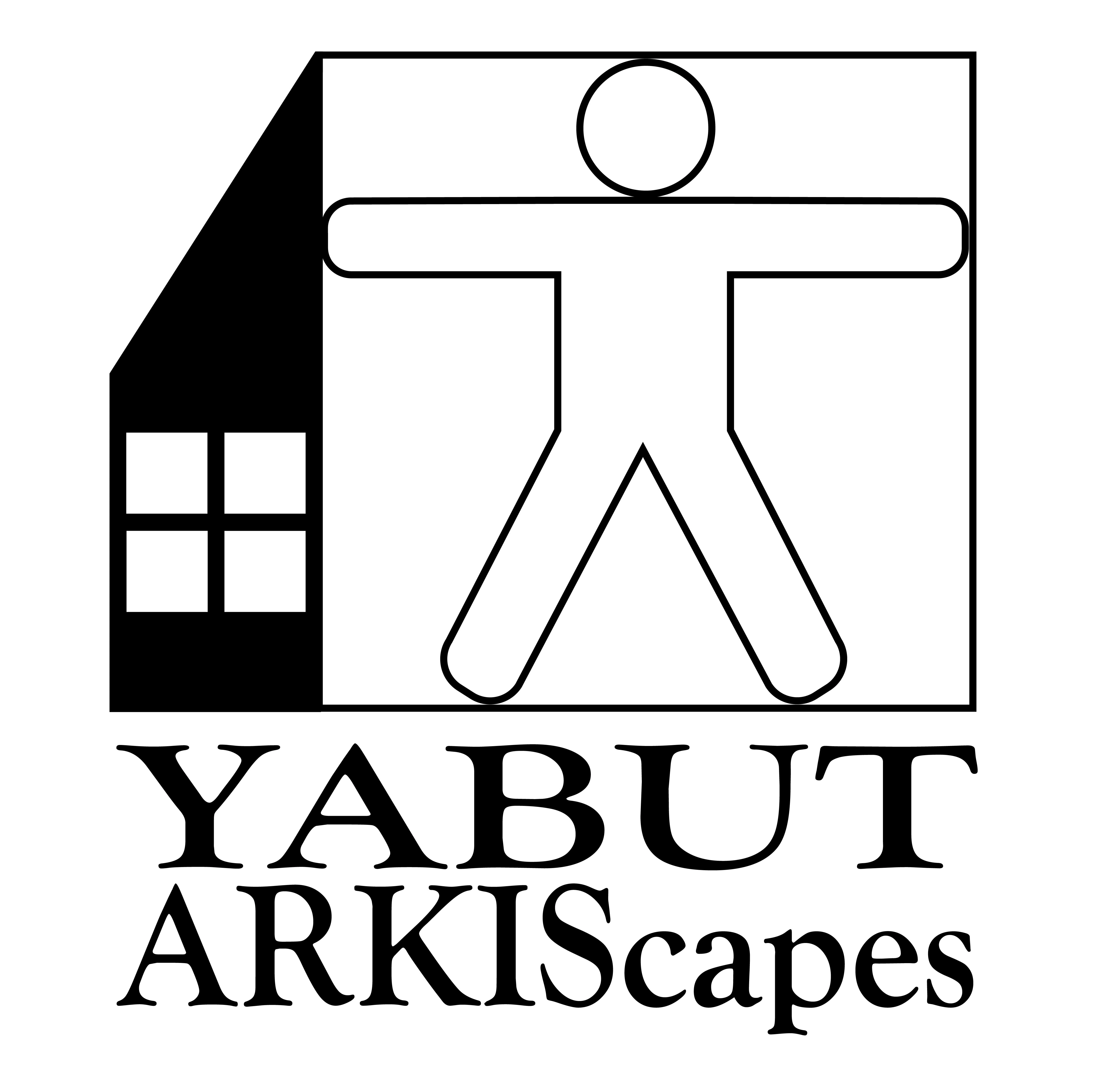
The issue of visual clutter was solved by in a way scrapping down the figure to the core of how it serves the logo itself, that being the idea that the figure, much like a human in their own home, fills out a house themselves. The circle was first cut and the proportions angle of the human soon after, instead becoming the human form stretching out to fill the home. After more cleaning up the final renditions below were made.
Like this project
Posted Oct 11, 2023
Logo work done for my Father's solo architecture venture.
Likes
0
Views
9
