Creation of 'One More Chapter' Café Concept
Aneri Shah
About The Brand
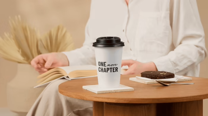
One More Chapter – Brew, Coffee, Books
ONE more CHAPTER is a café concept built for people who always say “just one more page” and “just one more sip.”
It blends the calm of a bookstore with the warmth of a neighborhood coffee spot — a place where time softens and distractions fade.
The brand celebrates quiet rituals: holding a warm cup, turning paper pages, sitting a little longer than planned.
Brand Philosophy
Life moves fast. This place doesn’t.
ONE more CHAPTER is designed around slowing down — choosing depth over noise, comfort over rush, and presence over pressure. Every detail is intentional: from the monochrome interiors to the simple typography, from open bookshelves to soft seating that invites you to stay.
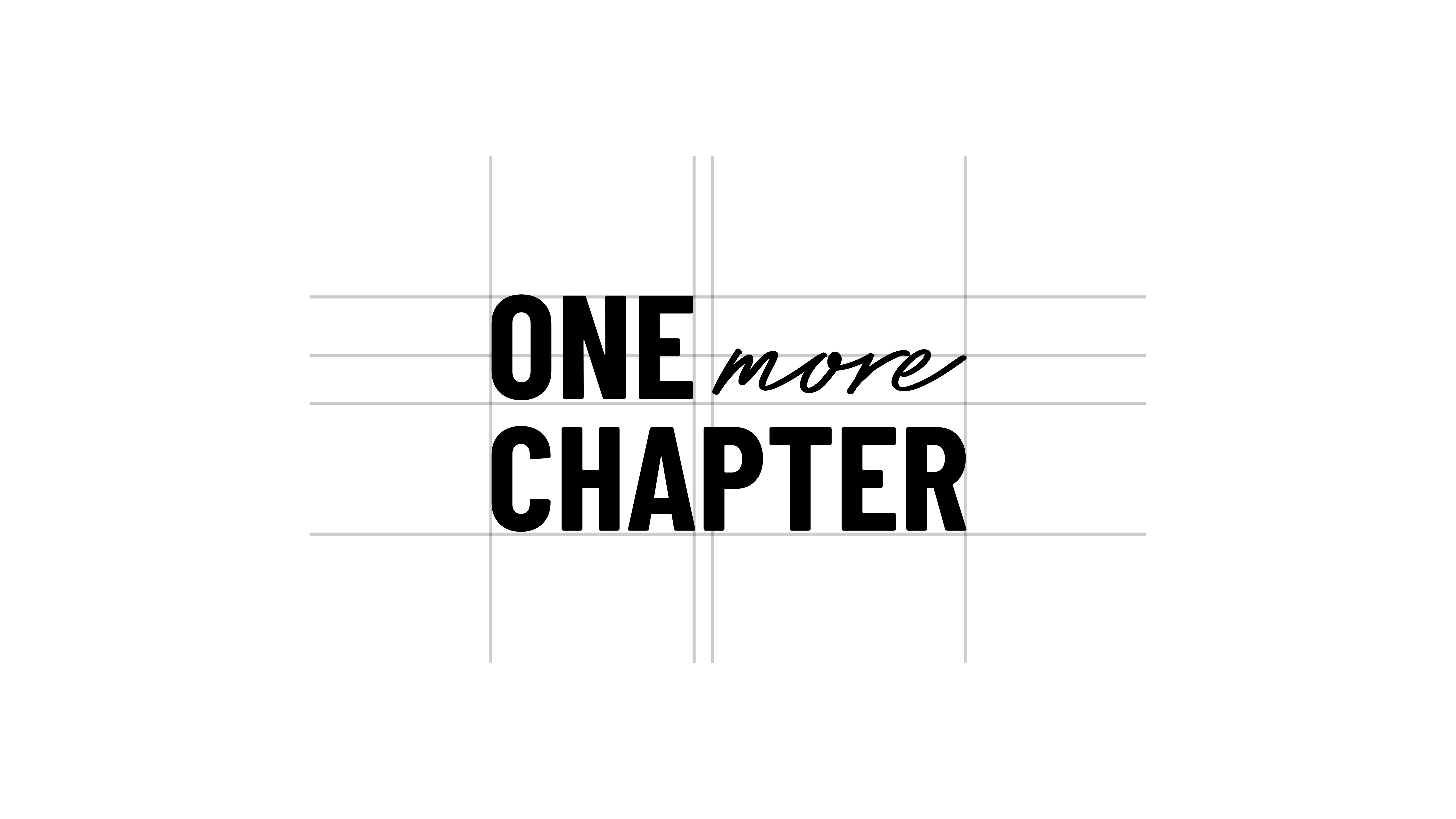
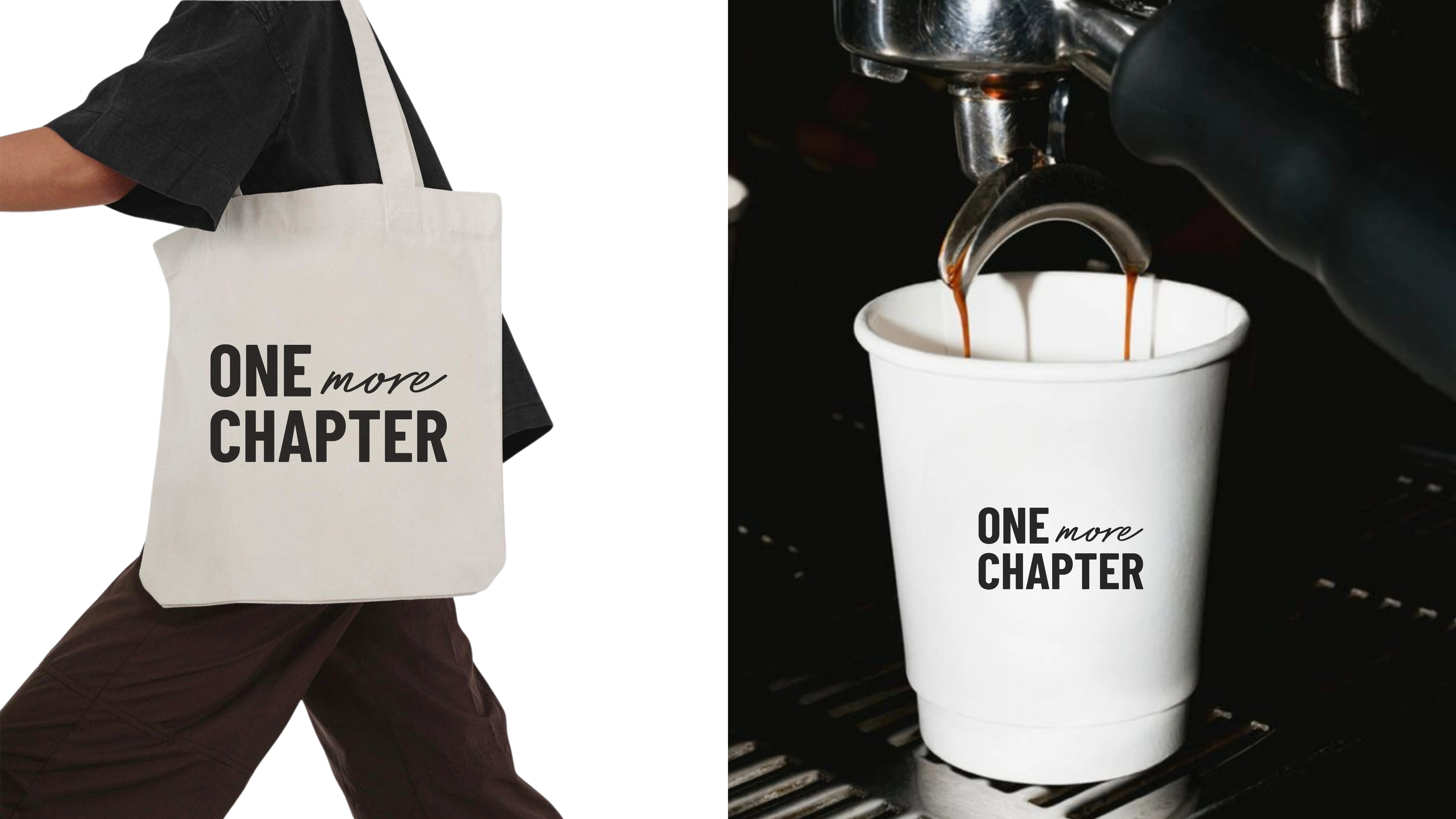
The ONE more CHAPTER logo combines bold typography with a soft handwritten accent to reflect the balance between structure and comfort. The strong uppercase letters represent clarity and confidence, while the script “more” adds a human, intimate touch — like a quiet promise to stay a little longer. Designed on a clean grid, the logo is minimal, timeless, and versatile across print, packaging, and spatial branding.

Like this project
Posted Jan 22, 2026
One More Chapter is a cozy café where great coffee meets readers. A warm escape to slow down, turn pages, and always stay for just one more chapter.