Crypto Trading Platform Design
Tawfiqul Emon
Verified
Title:
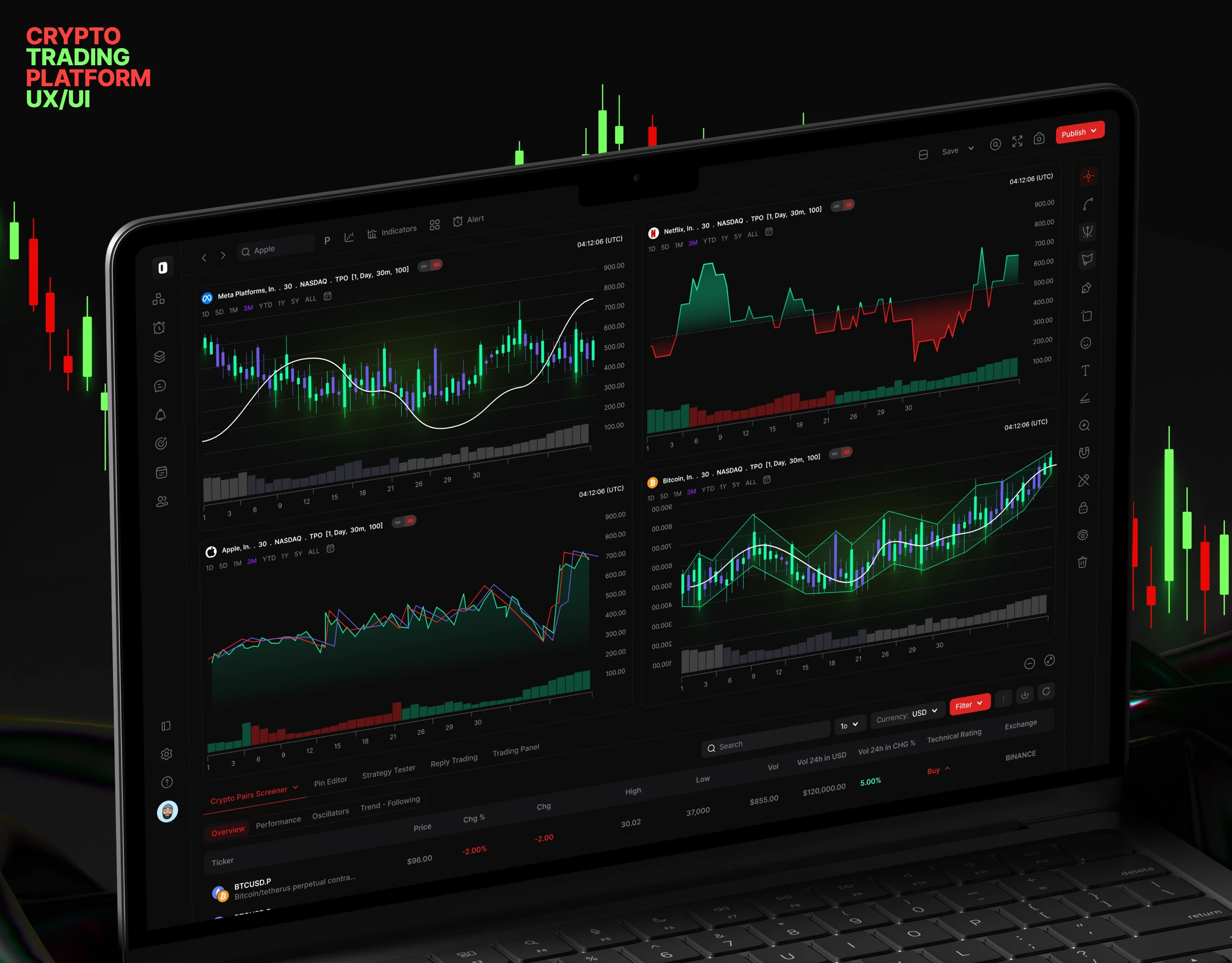
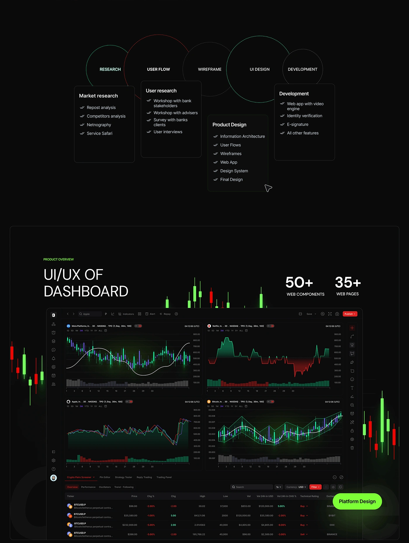
Dark Mode Dashboard UI – Trading Platform Design
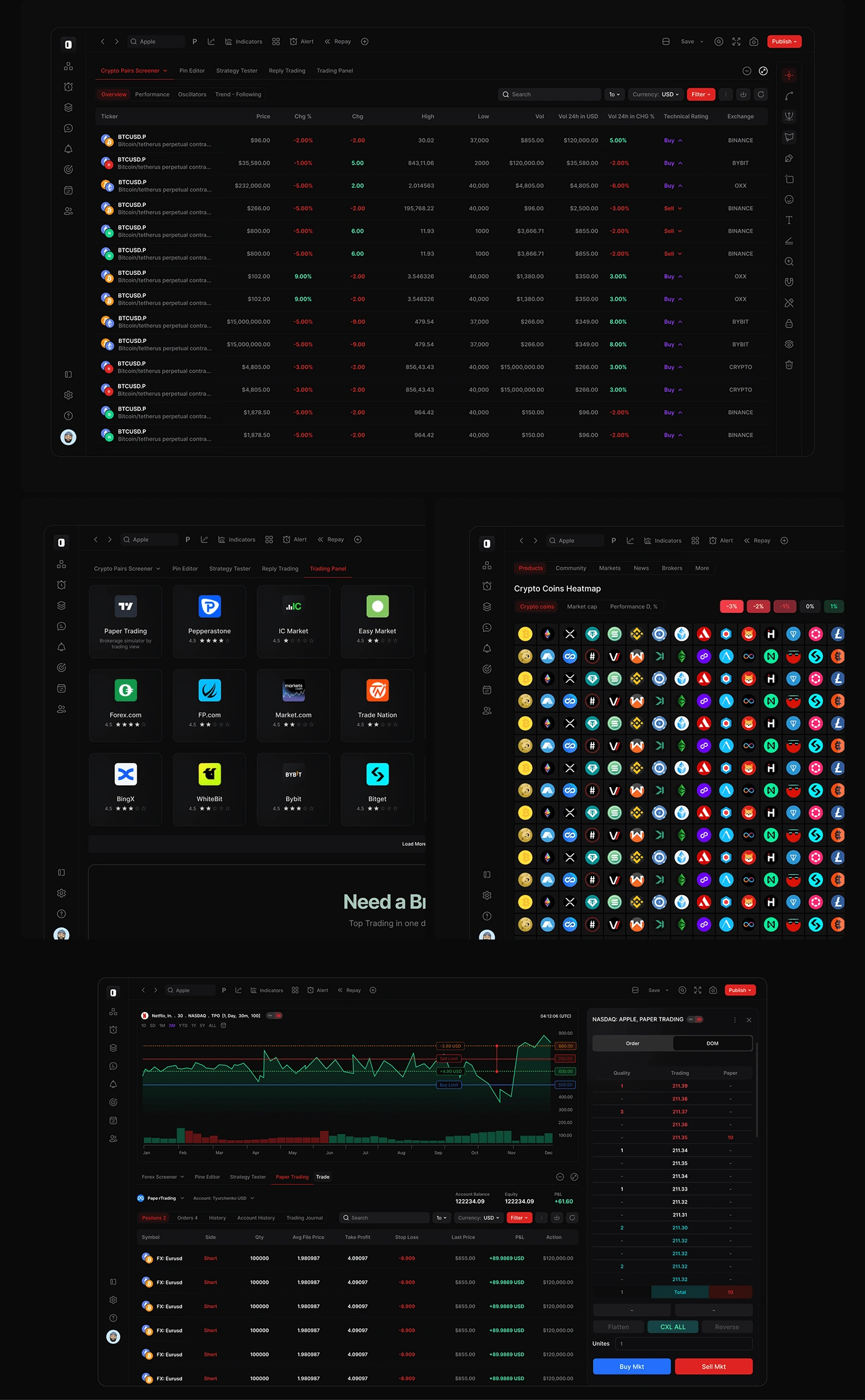
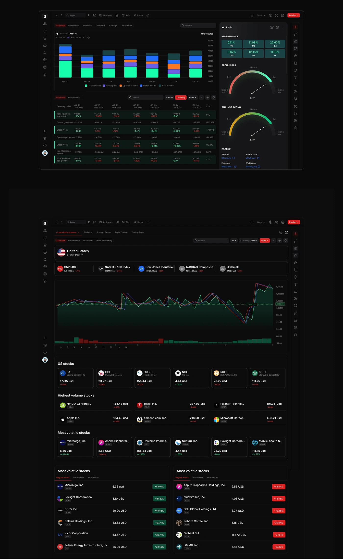
This design is a full dark-themed dashboard UI created for a trading and analytics platform. The interface includes over 50 reusable web components and 35+ detailed pages. I focused on building a modern, clean look using a dark background with bright neon highlights to make charts, numbers, and buttons easy to see.
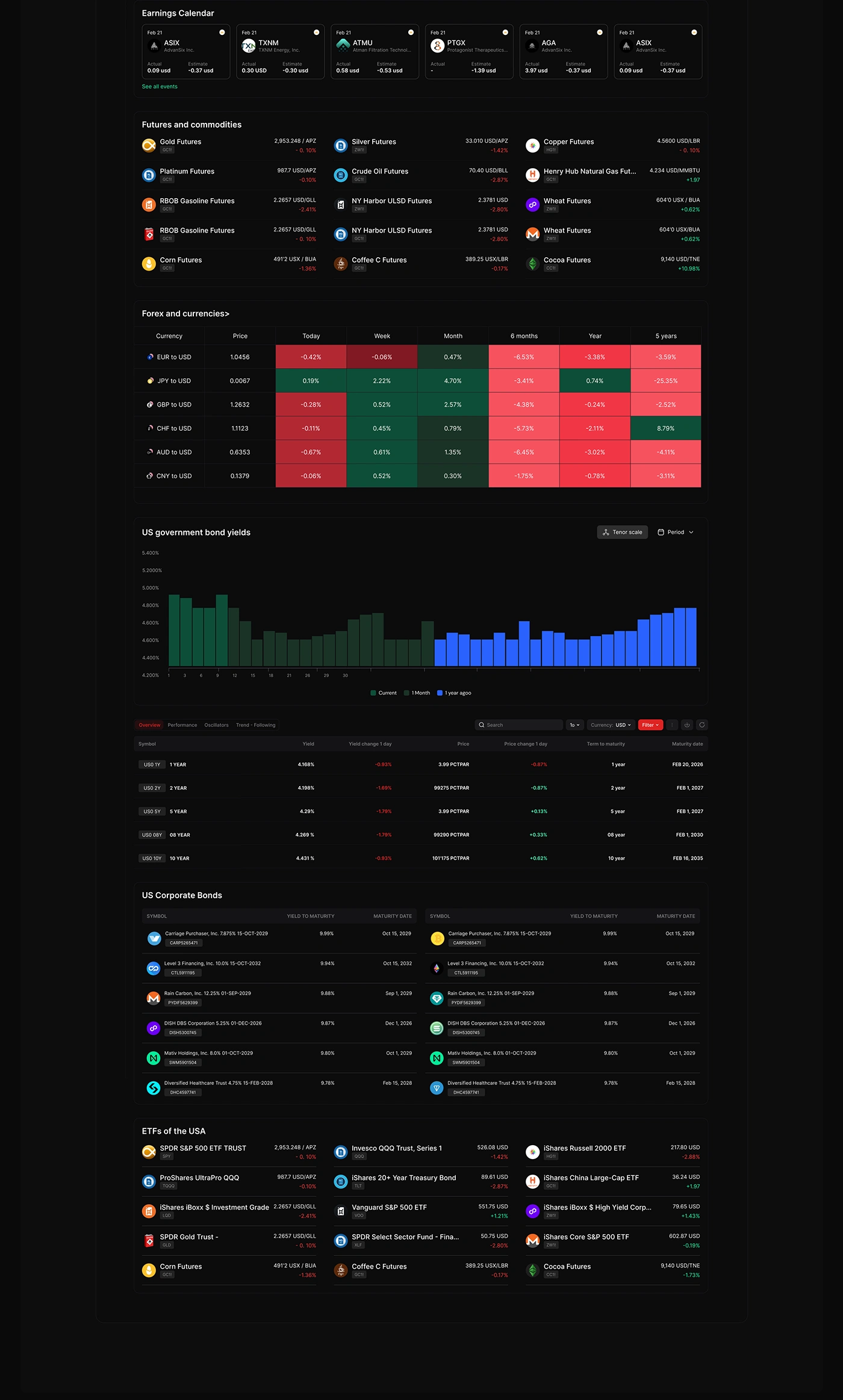

The layout follows a clear grid system with consistent spacing and alignment, helping to keep the interface organized even with a lot of complex data. Rounded elements, subtle shadows, and glowing effects were added to give the design a sleek and high-tech feel.
The charts use strong colors like green and red for fast visual feedback, while typography is kept simple and readable. The side navigation and top bar are designed to be minimal but functional, keeping the user focused on the data. Overall, the design is bold, professional, and made to support fast decision-making in a high-performance environment.
Like this project
Posted May 28, 2025
Dark UI dashboard design with bold charts, neon accents, 50+ components, and clean layouts for a modern, pro-level trading platform.
Likes
0
Views
28
Timeline
Oct 24, 2024 - Ongoing