Brownvase | Website Development & Branding

Nara Vajaphattana


Role: Lead Branding & Web Designer
Team: Co-Founders & Lead Developer

Project Brief
Brownvase is undertaking a comprehensive website rebranding to better align with its mission of empowering doctors through financial literacy and community health. With a vision of seamlessly blending finance and wellness, the brand faced significant challenges in harmonizing these two distinct industries to effectively resonate with their audience.
Their mission is to provide accessible financial education, innovative wealth-building strategies, and a vibrant community to help healthcare professionals achieve their financial goals and enhance their overall well-being.

Our Focus
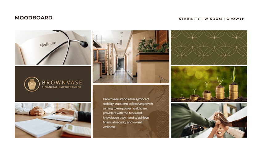
Our re-branding project at Brownvase centered on reinforcing our historical roots in collective money management, symbolized by the name "Brownvase." We focused on highlighting our core values of stability, trust, and collective growth, with the goal of empowering healthcare providers through enhanced financial tools and knowledge.
Our Design Goal
Our aim was to create a cohesive brand identity that aligned seamlessly with our mission to support healthcare professionals in achieving financial security and overall wellness.
Design Strategy
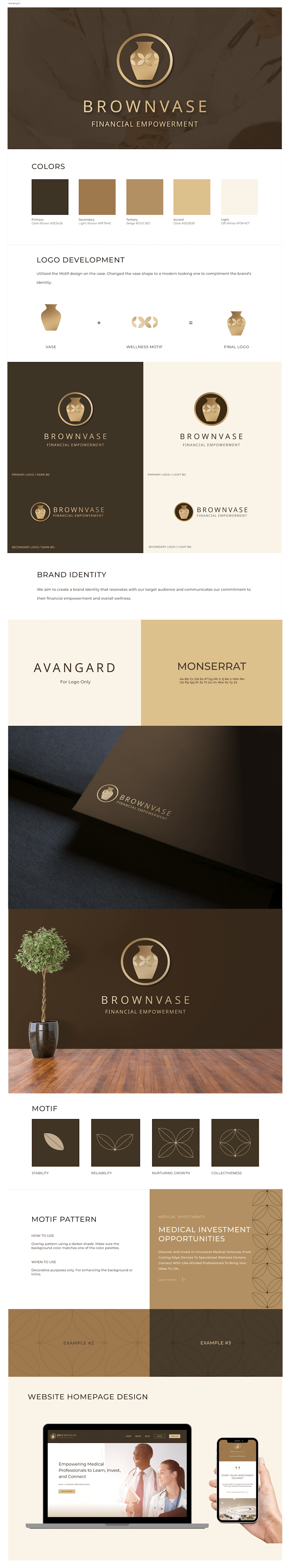
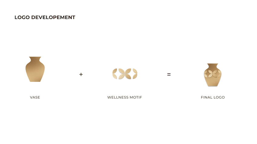
Brownvase is a platform dedicated to empowering healthcare providers with comprehensive financial education, innovative wealth-building opportunities, and a supportive community network. The name "Brownvase" embodies our core values:
● Brown: The communal and earthly color symbolizes stability, reliability, and support, reflecting our dedication to being a dependable resource for healthcare professionals.
● Vase: Represents collectiveness and nurturing growth, illustrating our commitment to fostering a supportive community that helps healthcare providers thrive financially.
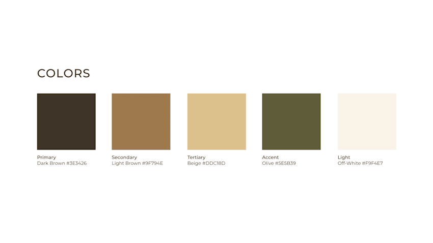
Colors: This concept focuses on wellness and nature. The visuals evoke a sense of being grounded and supported. Warm-toned images bring a feeling of calmness and approachability to the brand. Collectively, the earthy-toned palette was curated to reflect stability, wisdom, and wellness.
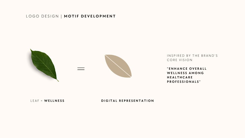
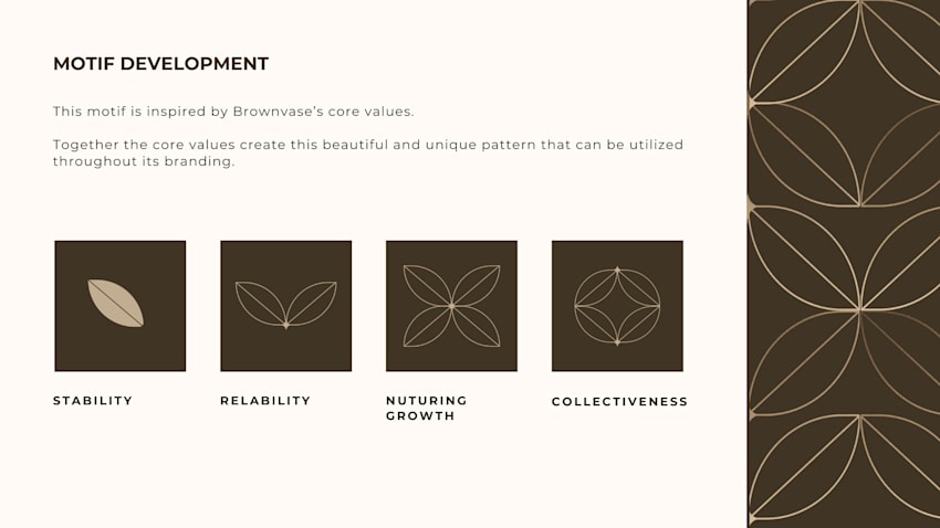
Motif Development
To give the brand a distinct identity, we created a unique motif inspired by Brownvase’s core values. This intricate pattern reflects stability, trust, and collective growth, embodying the brand’s commitment to financial empowerment and community support.
By integrating these values, the design creates a visually striking element that can be used throughout the branding, enhancing the brand's appeal and reinforcing its core principles for a cohesive and resonant presence.
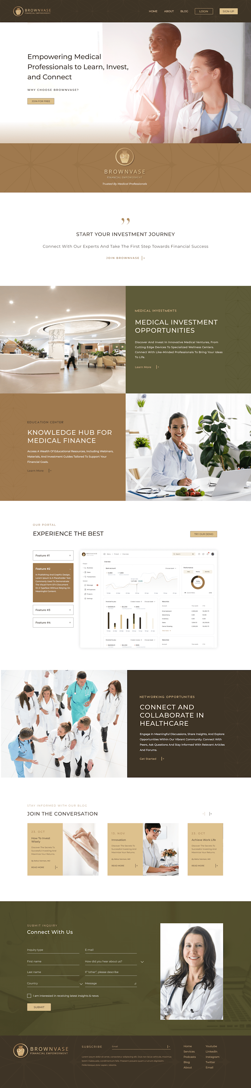
Website
- WCAG Compliance: The site was rigorously designed to adhere to the WCAG criteria ensuring it was accessible to all users.
- User-Friendly Navigation: Simplified navigation and intuitive interface design were prioritized to facilitate an effortless user experience.