Mobile App Design - BiteBliss Meal Planning App
Category: End-to-End Mobile App Client: BiteBliss Duration: 6 weeksOverview
An app that simplifies decision-making, restructures meal planning, and promotes healthier food choices for users.
Problem
85% of people struggle to figure out what meals to cook themselves throughout the day. This means that people will often repeat meals out of convenience or a lack of inspiration. Additionally, individuals often don’t factor in things such as protein, fiber, calcium, or other macros.
Impact
100% of people agree that they could or want to eat healthier but have no idea where to start. This leaves them feeling overwhelmed, helpless, or ashamed of their current food choices.
Solution
A comprehensive mobile application designed to transform meal planning into a seamless and enjoyable experience. Empowering users to efficiently plan meals, manage food budgets, and discover quick, easy-to-prepare recipes. While also simplifying the process of compiling ingredient lists and monitoring monthly expenses.
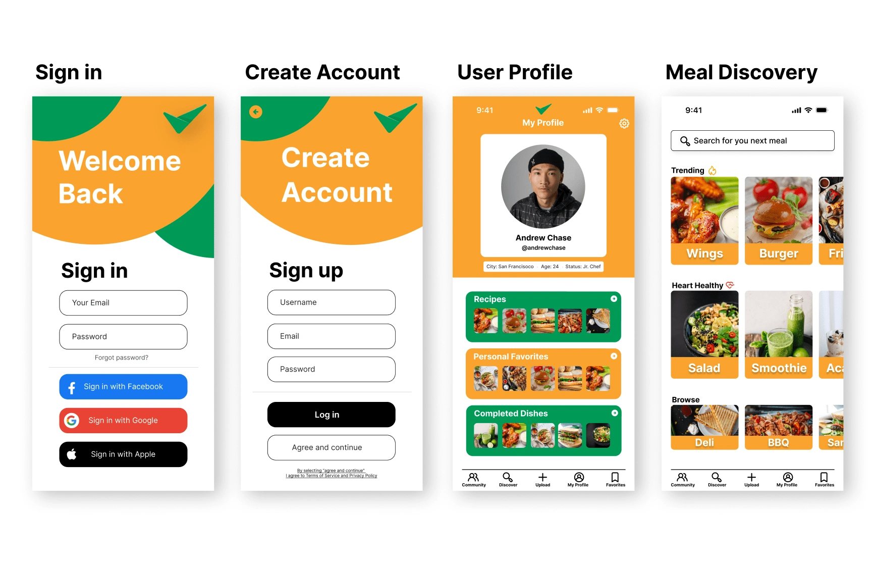
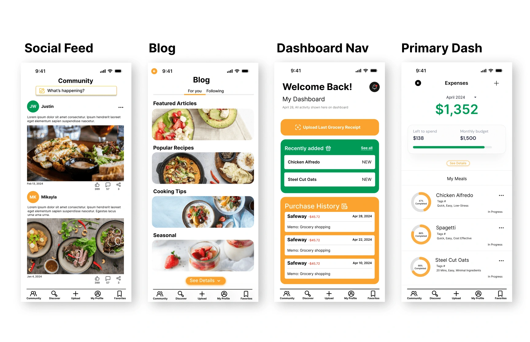
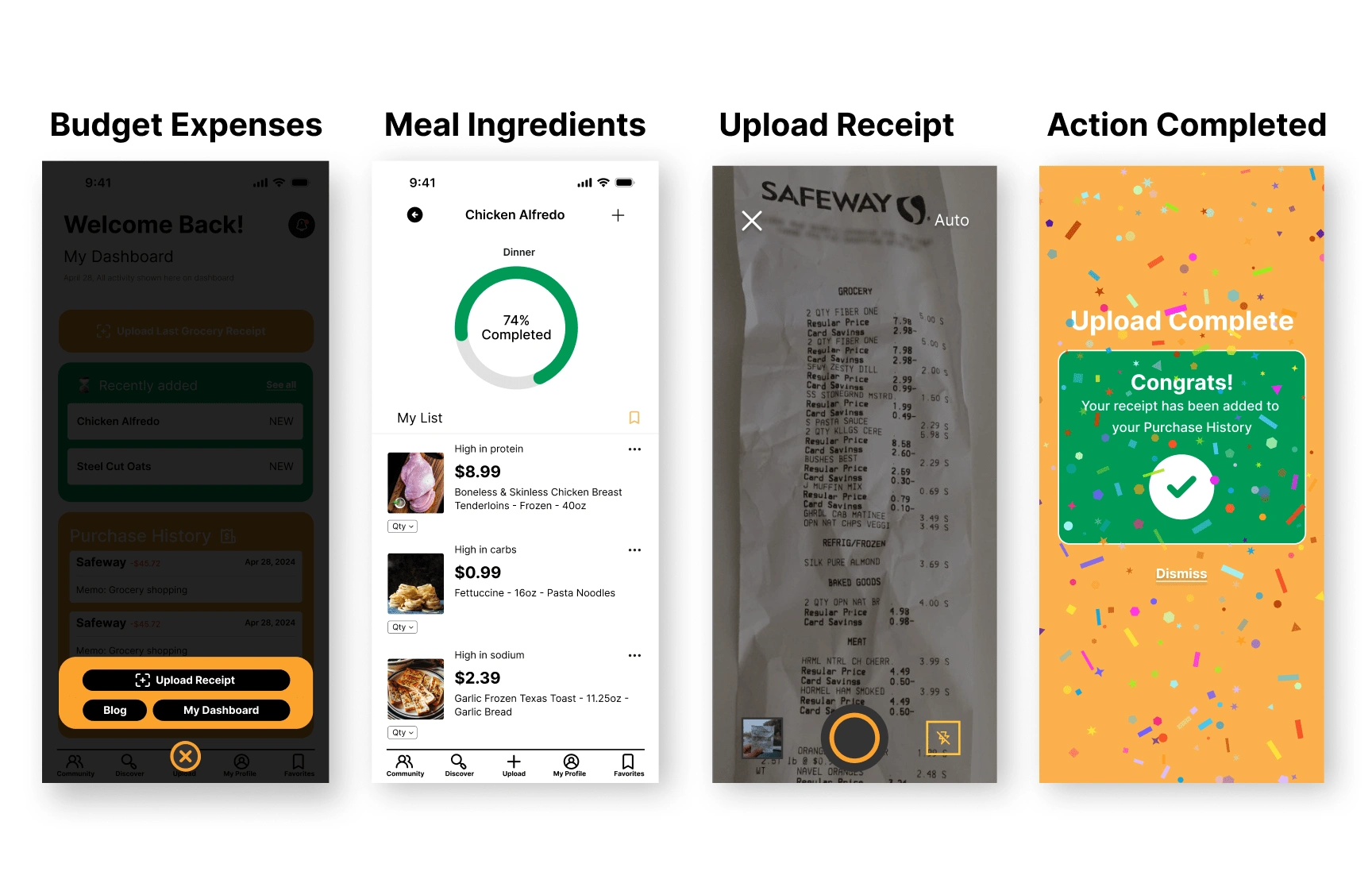
View Deliverables: Click Here
Understanding the Current Market: Competitive Analysis
I put together a comprehensive analysis of three leading market players, evaluating their competitive advantages and areas for improvement. Additionally, I identified potential opportunities for growth and foreseeable risks.
Takeaways:
HelloFresh leads with a broad meal choice and user-friendly platforms but needs to address pricing and sustainability to enhance competitiveness.
Blue Apron's culinary expertise is noteworthy, yet it could benefit from expanding menu options and improving its price strategy to retain customers.
Cratejoy's diverse subscription model shows high market potential, but it faces challenges with market saturation and quality control, indicating a need for service diversification and improved seller vetting.
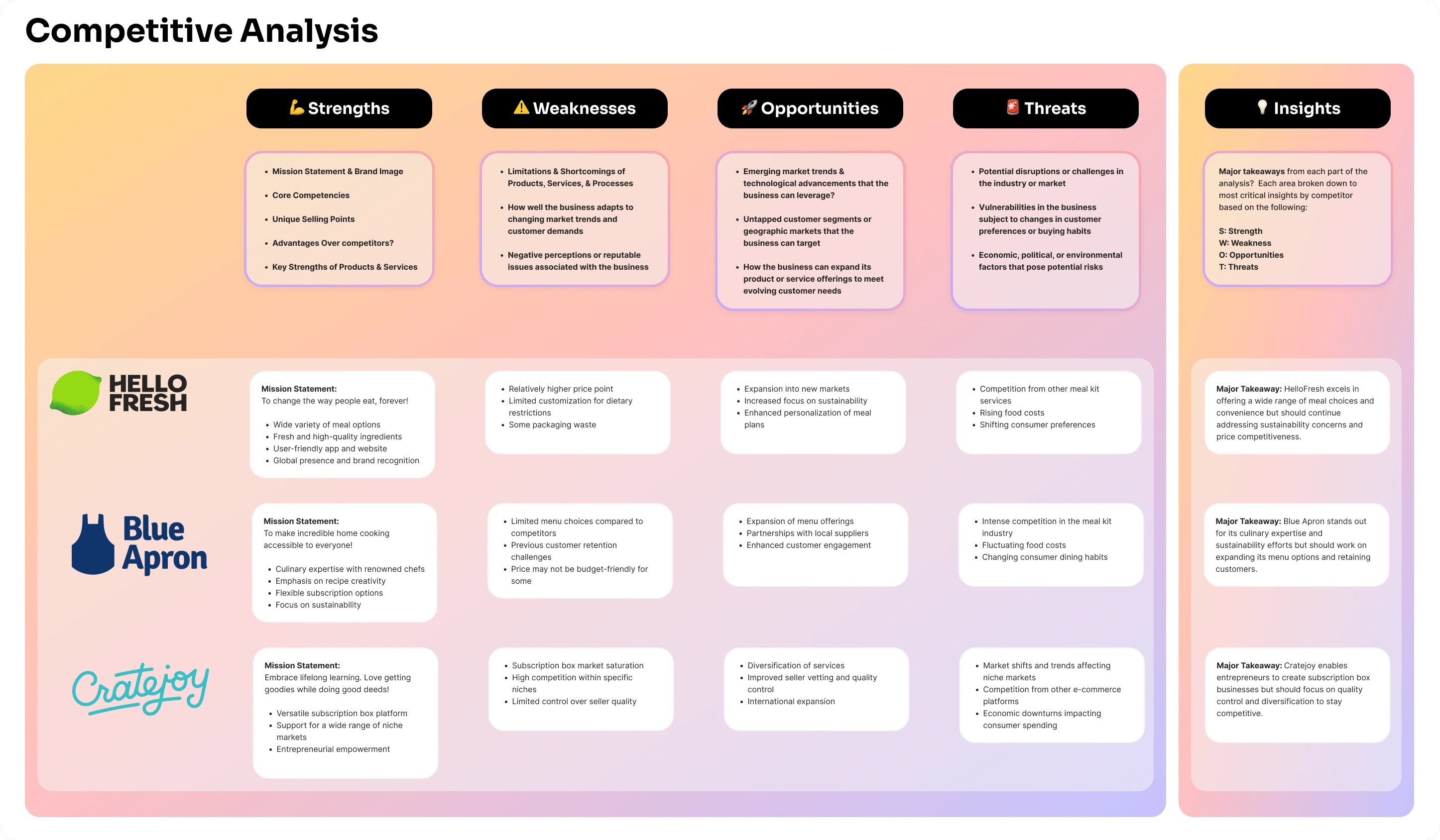
3 major powerhouses that specialize in food delivery & services
View Complete Analysis: Click Here
Putting a Name to the Face - Highlighted Persona Profile
Next, I crafted three unique user personas for BiteBliss to encapsulate a spectrum of user characteristics and requirements:
Jessica is a college student with a hectic class schedule
Anita is a mom with a full schedule and two kids
Michael is a busy professional with little spare time.
These profiles helped make sure my design stayed focused on what users really need and want.
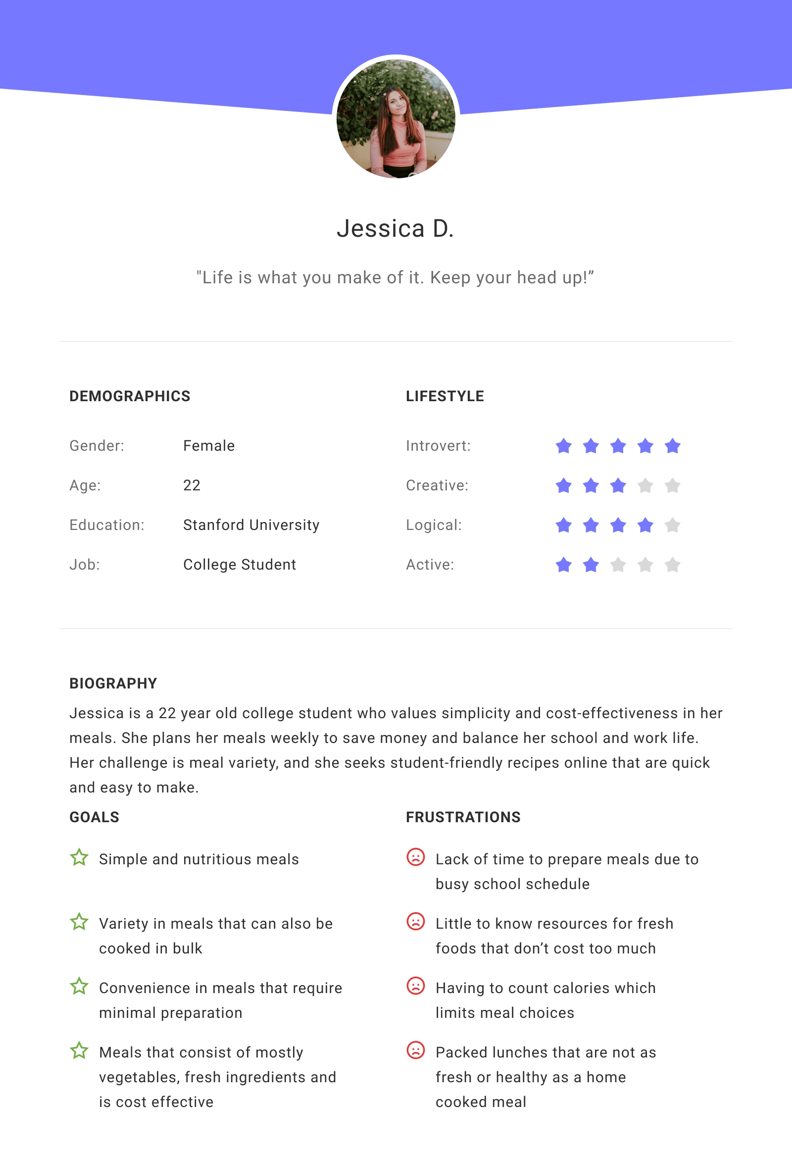
Jessica was the perfect user profile to aid in my development of a user journey allowing me to accurately capture how she can achieve her meal planning goals.
Dream, Design, Innovate: Navigating the Ideation Landscape
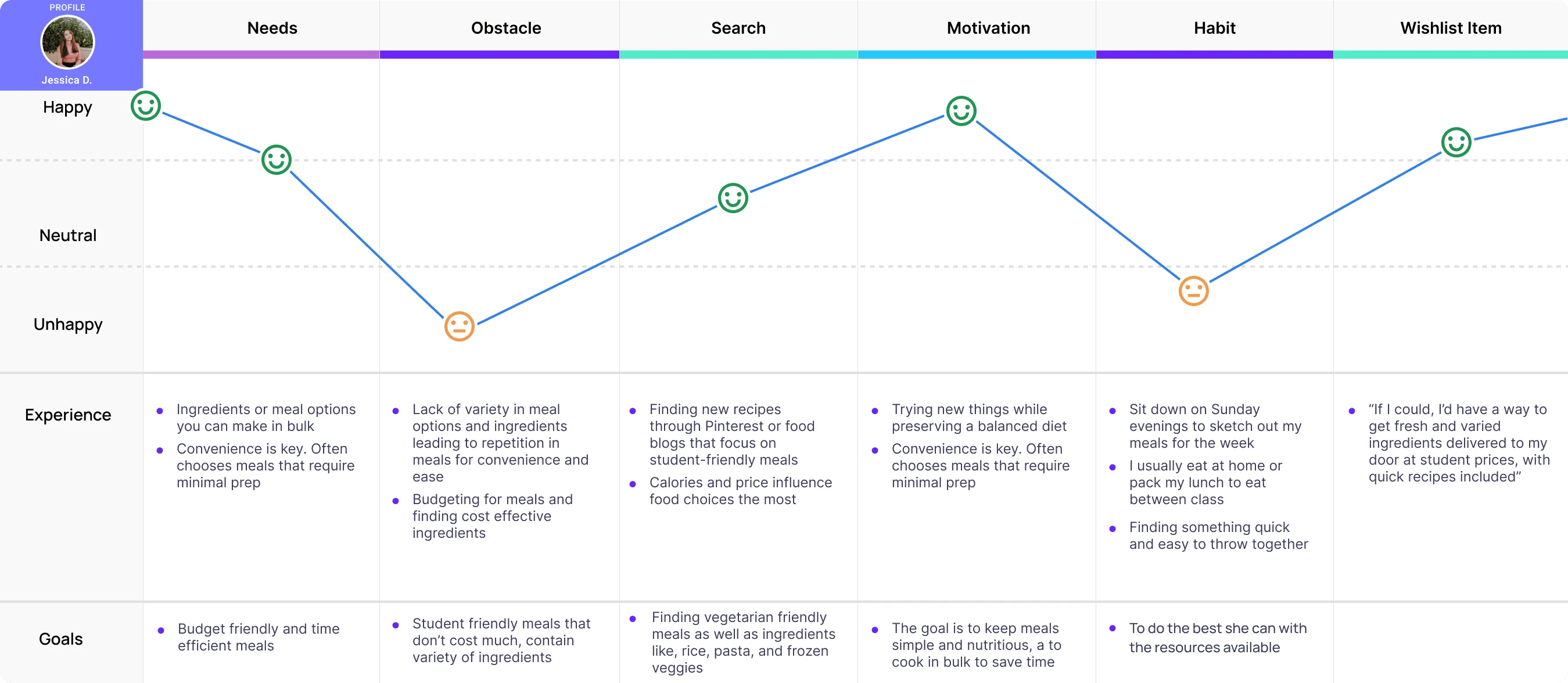
View Jessica's User Journey: Click Here
Jessica's Journey Wishlist
Jessica values bulk meal options and minimal prep time for her active college lifestyle, indicating a need for simplicity in meal planning.
She faces an obstacle with repetitive meals and seeks variety within a student budget, pointing towards a gap in affordable, diverse meal solutions.
Her wish is for a service that delivers a range of fresh ingredients and easy recipes right to her door, suggesting an opportunity for BiteBliss to provide targeted meal kits for students.
Sketches
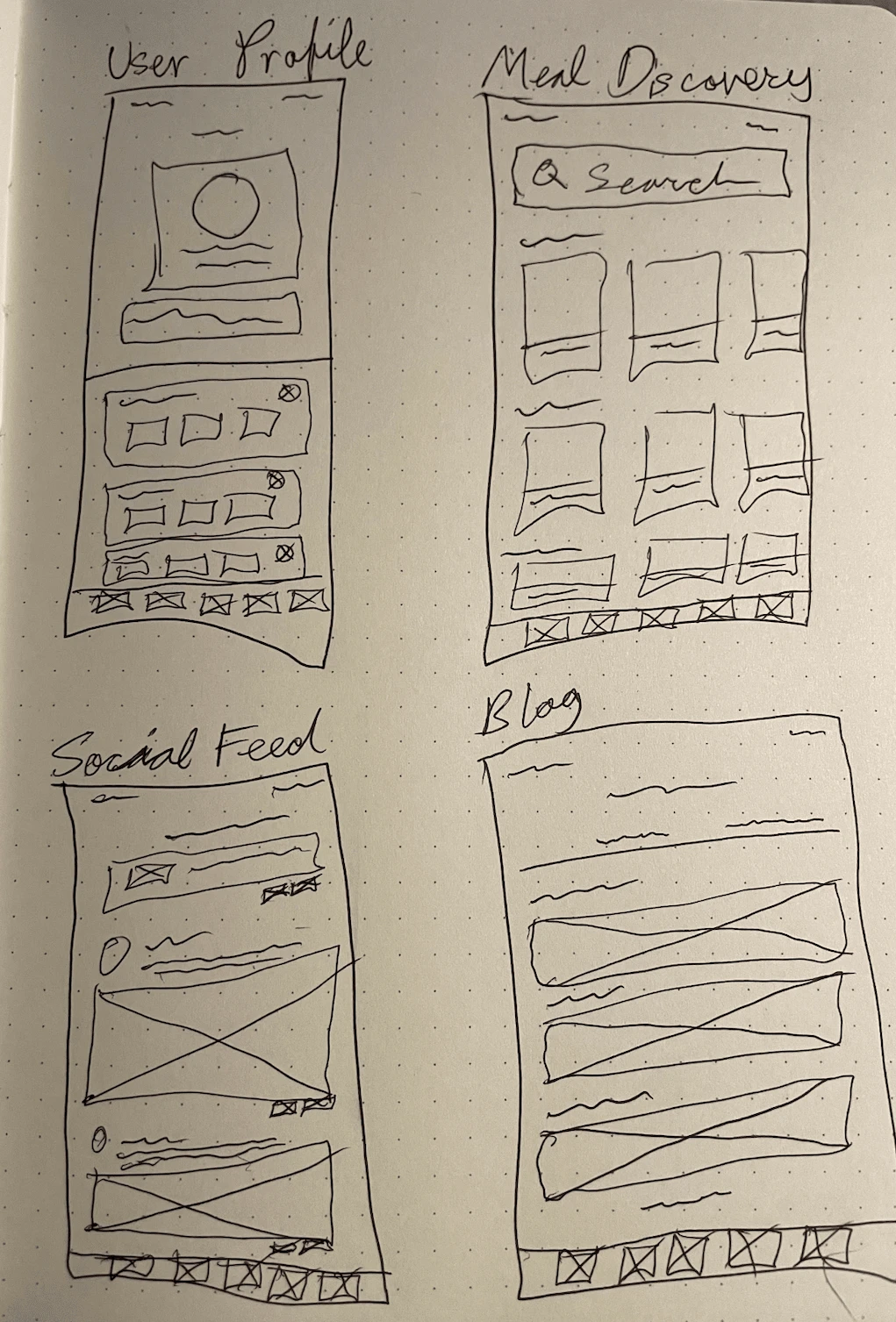
After concluding the user journey. I began to ideate and dream up what the mobile wireframes could look like on paper. Conceptualizing the app's interface through sketches helped me get my creative juices flowing and helped me envision what each individual screen would look like in the next phase.
Usability Tests
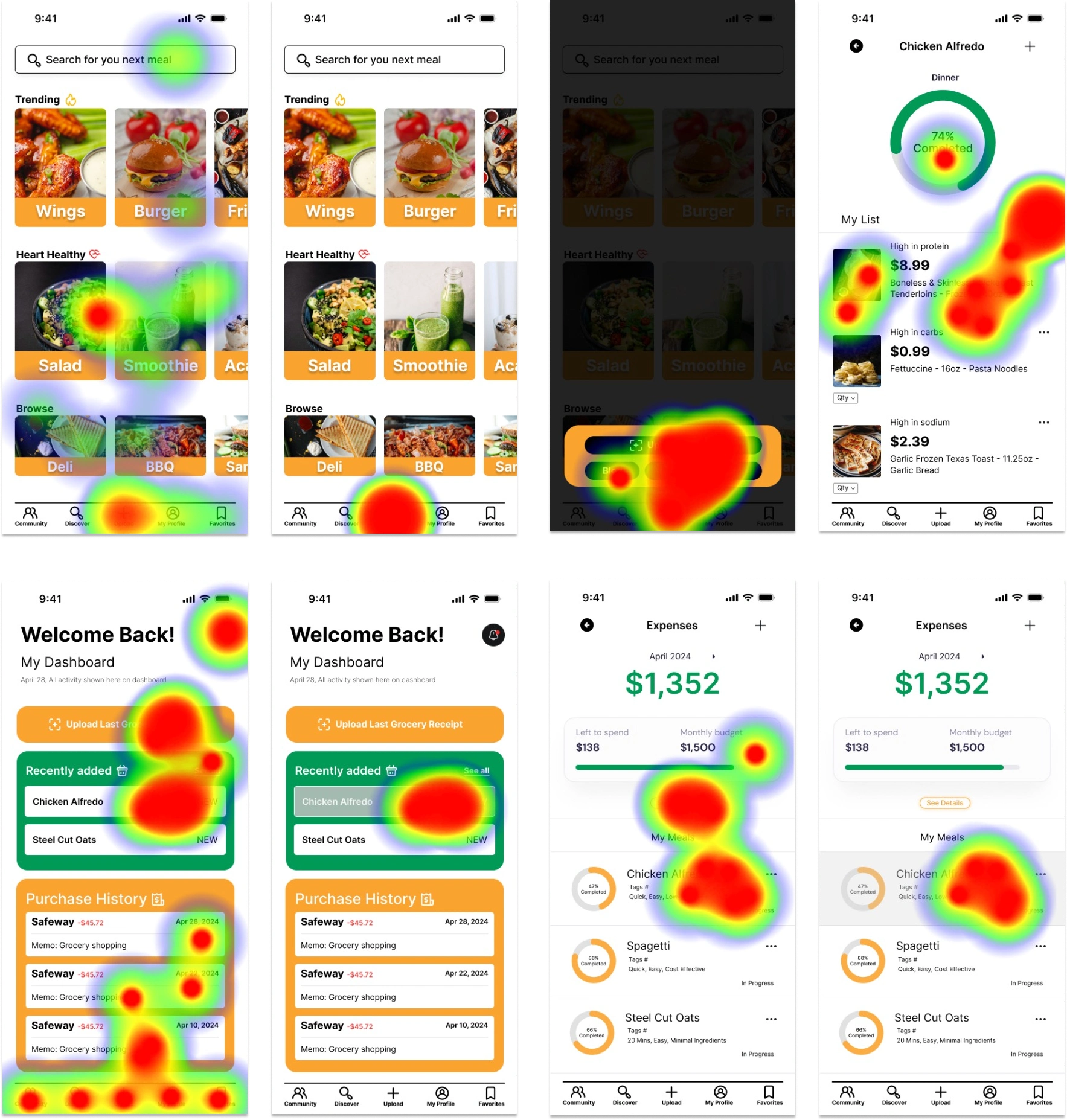
I conducted a usability study using Maze, I had five participants interact with the app to see if they could get through it from start to finish. The goal was to monitor their usage, gather insights into any challenges or suggestions they encountered, and integrate their input into the ongoing design refinement process. Ease of use and functionality were also very important to me.
Great Testing Results and Exciting Opportunities for Growth
After concluding remote usability tests via Maze which allowed for concise user research and testing data. Results showed that all users successfully completed their tasks, offering largely favorable responses and minimal changes.
When asked if users think an app like this will have a positive impact on users? If they would use or recommend this app to a friend? 100% of users said "YES."
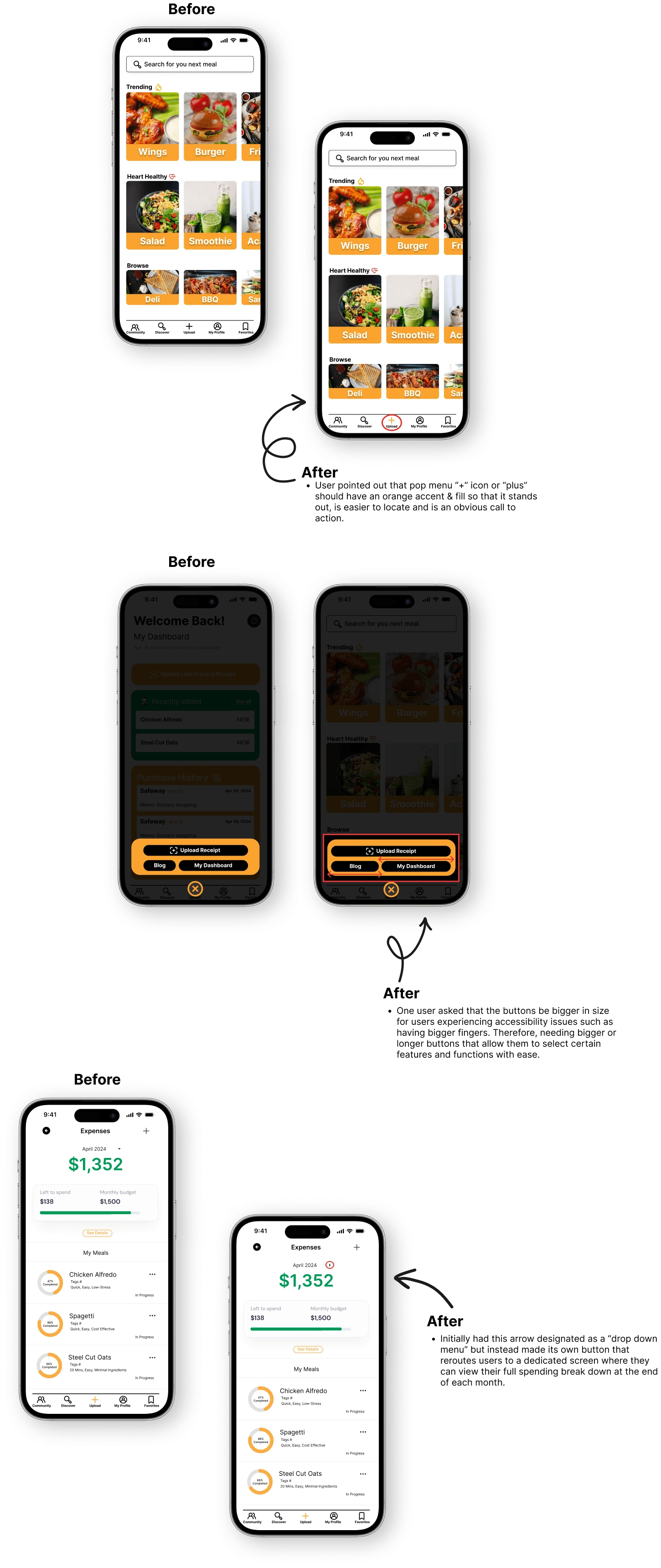
View All Revisions: Click Here
Reflection
My main goal was always to keep the app all about the user. I listened hard to feedback and poured effort into creating something that would resonate with different folks while remaining inclusive. This project really pushed my limits—it was probably the toughest app I've had the chance to work on. I'm genuinely proud of how far I've come. I've noted fewer mistakes and I'm getting the hang of this more each day. Sure, I've got more to learn – who doesn't? But I'm pumped to keep growing and take my design skills to the next level.
Next Steps
Moving forward, I'll be putting the revised designs through their paces and gathering more input to polish the user experience. Then, it's all about teaming up with a developer to bring these improvements to life.
Like this project
Posted Jun 23, 2024
BiteBliss - Where meal planning meets everyone's taste, time, and budget. A new way to plan meals via mobile app.
Likes
0
Views
15
