Designing an End-to-End Mobile App - Master Movers
Overview:
Helping eliminate obstacles that come with moving. While ensuring a seamless and organized transition for users."
Background
How can we demystify moving as a whole?
Over the years moving from city to city has changed in regard to what is available both physically and digitally when planning a move. 9.8 percent of Americans move annually. Leaving individuals feeling lost, and overwhelmed with such a big workload, very little help, and very little hope of getting it done in both an efficient and timely manner.
Problem
There are currently little to no resources to help with the moving process in its entirety. Leaving people feeling overwhelmed when moving. Because they find the process to be very strenuous and oftentimes don't know where to begin, or how to proceed.
Solution
I designed an end-to-end mobile app for users that supplies an array of services. These services are carried out by skilled professionals who can manage any task. Tasks are based on specific customer needs. To maintain flexibility, drive results, and guarantee customer satisfaction. We do this by:
Creating a friendly atmosphere within our site. Making it easy for users to find a specific task and book a tasker to carry out that task.
Offer in-app resources to help with the workload such as integrating a "packing checklist" for users.
Removing the stress of everyday mundane tasks by offering 3 subscription tiers for reoccurring tasks.
Tools
Mural
Figma
Optimal Workshop
Otter.ai
Project Type
This case study is a project completed during my UX design boot camp, showcasing my skills and progress in the field. While it is not a client-based project, it demonstrates my ability to apply UX design principles and processes to real-world scenarios.
My Role
Lead UX Designer & Researcher, User Experience, UI Designer, Wireframes, Prototyping, Usability Testing, Iteration & Final Revisions
Timeline
Overall: 8+ weeks
Discovery & Research: 2+ weeks
Design & testing: 6 weeks
My Design Process
Empathize
Define
Ideate
Develop
Deliver
Empathize
Empathize
Research Objectives
Find out why someone wants to move in the first place.
Determine the consumer's core issues. (assessment) This would be us trying to understand how the action of moving is going to affect the individual's life as a whole or as they see it.
Understand the thought process of an individual who may utilize resources, apps, or other information that would allow the individual to make his or her move easier or seamless.
Grasp if there are obstacles hindering the individual such as financial constraints, time constraints, or a lack of knowledge on this topic.
Research Questions
What are the biggest challenges individuals face when getting ready to move or are en route to move in the near future?
What are some unique pain points individuals experience when moving?
What websites do people use to find movers?
What are some of the most current or prevalent issues that are preventing people from finding help?
How are people documenting the information they find? (Bookmarking websites, saving certain apps, or listing on sites like Craigslist.)
Are people looking for professional help or for someone with general availability?
Do people plan on securing a vehicle of some kind to help them with the move?
Interviews
User interviews were conducted to better understand users' pain points and frustrations when planning to move. During these interviews, it was important to note any previous challenges the user experienced as well as their thoughts and feelings. This information would then be used to create the framework for a sustainable product that is beneficial to all.
I interviewed 5 people. Ages range from 25-80. Participants consisted of both males and females. All participants currently reside in the United States. The duration of the interviews was 10-30 minutes total. My findings:
5/5 users report feeling very overwhelmed with the moving process overall.
5/5 users report feeling both lost or stressed to the point where they don't even know where to start when acquiring help or seeking professional services.
5/5 users report that they would be open to having more resources or help logistically when undergoing a move.
Define
Competitive Analysis
I looked at three institutions currently dominating the market and assessed their strengths and weaknesses across the board. In hopes of figuring out benefits versus detractors that users otherwise might consider.
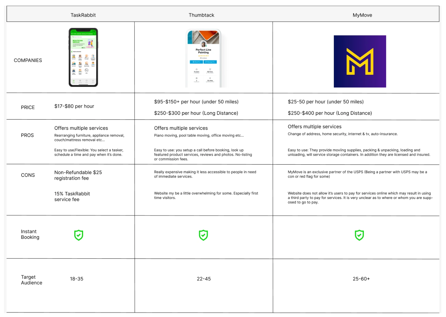
This resulted in a thorough analysis of competitors, I closely examined important features-assets, while investigating the approaches of these three main rivals: Through detailed research, I was able to pinpoint their goals, positives, and negatives, along with other insights.
Key Takeaways
Users are looking to do business with an establishment that offers reasonable or competitive rates.
That institution must offer diverse services specific to people's needs.
Mileage: long distance versus short-distance offerings matter.
Vehicle rental: is considered a positive so that users do not have to rent from a third party.
Availability is also important to users. Such as instant booking for the day of
Screen design displayed in a mockup
Upon examining market research, conducting competitive analysis, and taking into account user feedback, I developed a streamlined persona for Master Movers.
Personas
I created three user personas highlighting needs, frustrations, and personality. In order to define clear and concise solutions for that specific user based on his or her persona.
The decision to create personas stemmed from the need to effectively empathize with and address the diverse needs and challenges that users might face during a move. Personas provide a clear representation of various user types, allowing me to tailor the design to their specific requirements.
To construct the personas, I gathered data through a combination of user interviews, surveys, and market research. These sources provided insights into users' pain points, preferences, and behaviors related to moving. The data helped me create accurate and relatable personas.
For each persona, I specified key attributes including demographic information, motivations, pain points, goals, and preferences. Additionally, I detailed their specific needs, frustrations, and personalities. This holistic understanding allowed me to design solutions that resonated with each persona's unique situation.
& Feedback
The personas played a pivotal role in shaping the design process. By keeping the personas in mind, I could make informed design decisions that directly addressed the identified pain points and needs. The personas acted as a touchstone, ensuring that the design solutions were relevant and valuable to the end users.
I referred back to the personas at multiple stages of the design process. During the ideation phase, the personas helped generate ideas that directly tackled the challenges faced by each user type. As I created wireframes and prototypes, the personas guided the layout, functionality, and user flow to align with the preferences and behaviors of each persona. Even during testing, the personas provided a framework for evaluation, allowing me to gauge how effectively the design met the needs of different users.
Lastly, by consistently referencing the personas, I ensured that the design decisions remained user-centered and solutions were tailored to the real-world experiences and aspirations of the individuals going through the moving
Affinity Mapping
After conducting interviews. I took user feedback and data and organized it into an affinity map. To better establish/understand the user's pain points, challenges, and frustrations. Which will be used to figure out future solutions.
This map has been categorized into several categories and sub-categories showcasing the biggest needs to secondary needs in addition to highlighting key factors established by users in previous interviews.
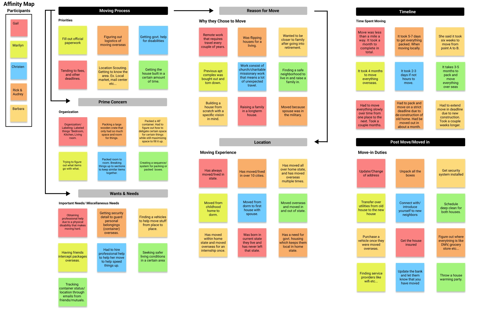
Organizing Observations
Using sticky notes, I organized the significant findings into clusters based on their resemblance and subject matter.
HMW? (How Might We?)
The common themes from my Affinity map assisted me in creating "How Might We" statements that helped direct my design choices.
How might we provide resources or knowledge for those planning a long-distance move?
How might we keep people on schedule when working around a deadline?
How might we decrease the underlying pressure or stressors for people experiencing a move?
How might we make people feel confident in their ability to properly organize and label items for a move?
How might we encourage users to collaborate with other people getting ready to undergo a move or have undergone a move within the last three months?
POVS (Point of View Statements)
Point of view statements help me brainstorm and tackle challenges resourcefully while staying centered on users, their needs, and insights about them.
I’d like to explore ways to help people move from one neighborhood within a 20-mile radius to the next with ease.
I’d like to explore a method for individuals to help them better prepare for a graceful move overseas as there is a lot to learn when moving to a new country.
I’d like to explore ways to help people who are overwhelmed better understand how to arrange their belongings while staying organized.
I want to explore methods to help reduce stress when preparing to move to a new city.
Ideate
Feature Prioritization Matrix
I put together a feature Prioritization matrix to explore different ideas to gain a better understanding of what is essential to have within the app versus desirable. Moving is already stressful enough. Therefore, I wanted to explore features that would help equip users by having our app take on some of that workload.
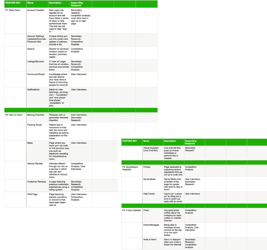
Broken down into four sections to help with the idea of maintaining but also leaving room to improve in the future.
Task Flow
To ensure ease of use from start to finish. I created a task flow to visualize better detailed steps users will embark on when navigating the app and features from start to finish. It was crucial to identify opportunities for improvement. In order to maintain clarity. I did this by creating a series of steps based on previous research that helped me anticipate the user's logical next steps, by eliminating unnecessary steps in the design. I can ensure a delightful experience among users that will be sure to contribute to conversion rates overall.
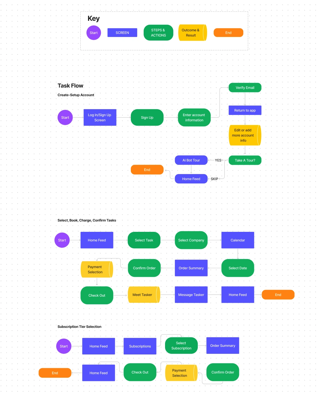
In this phase, I began the information architecture stage by putting together a task sequence.
User Flow
Once I was happy with the content organization, I began thinking about how users would inevitably interact with the app. In this case to accomplish the goal of creating an account. So I created a user flow that depicts the user's journey within our mobile application, showcasing the actions and outcomes at this particular stage, which was instrumental in identifying user information requirements. By incorporating user feedback, I refined and ultimately solidified the design while mapping and visualizing the user flow.
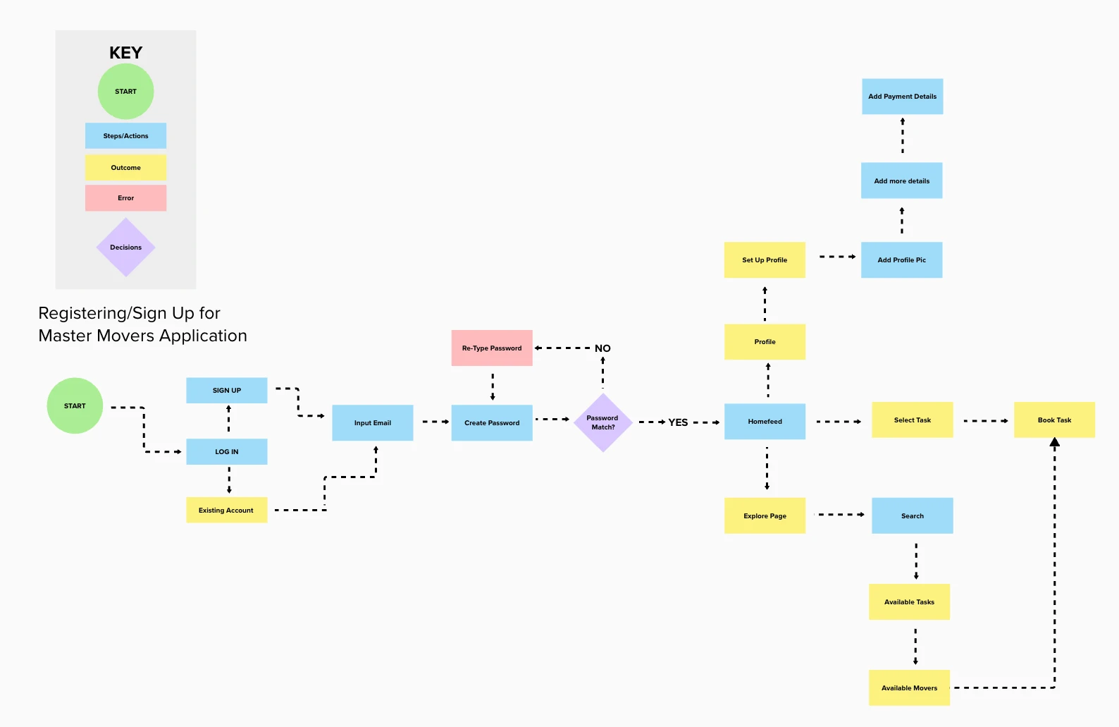
Aside from task flows, I developed a user journey representation that illustrates users' navigation within the app, relying on a sequence of actions and choices to ensure streamlined and user-friendly experiences.
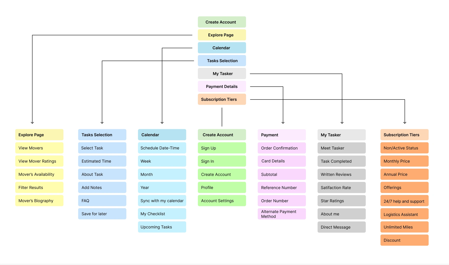
Finally, I crafted an app map to provide a deeper insight into the interplay of individual components within the app's overall layout.
Low-Fidelity Wireframes
For my low-fidelity wireframes, I began with nine key screens, including three that are essential for onboarding task flows.
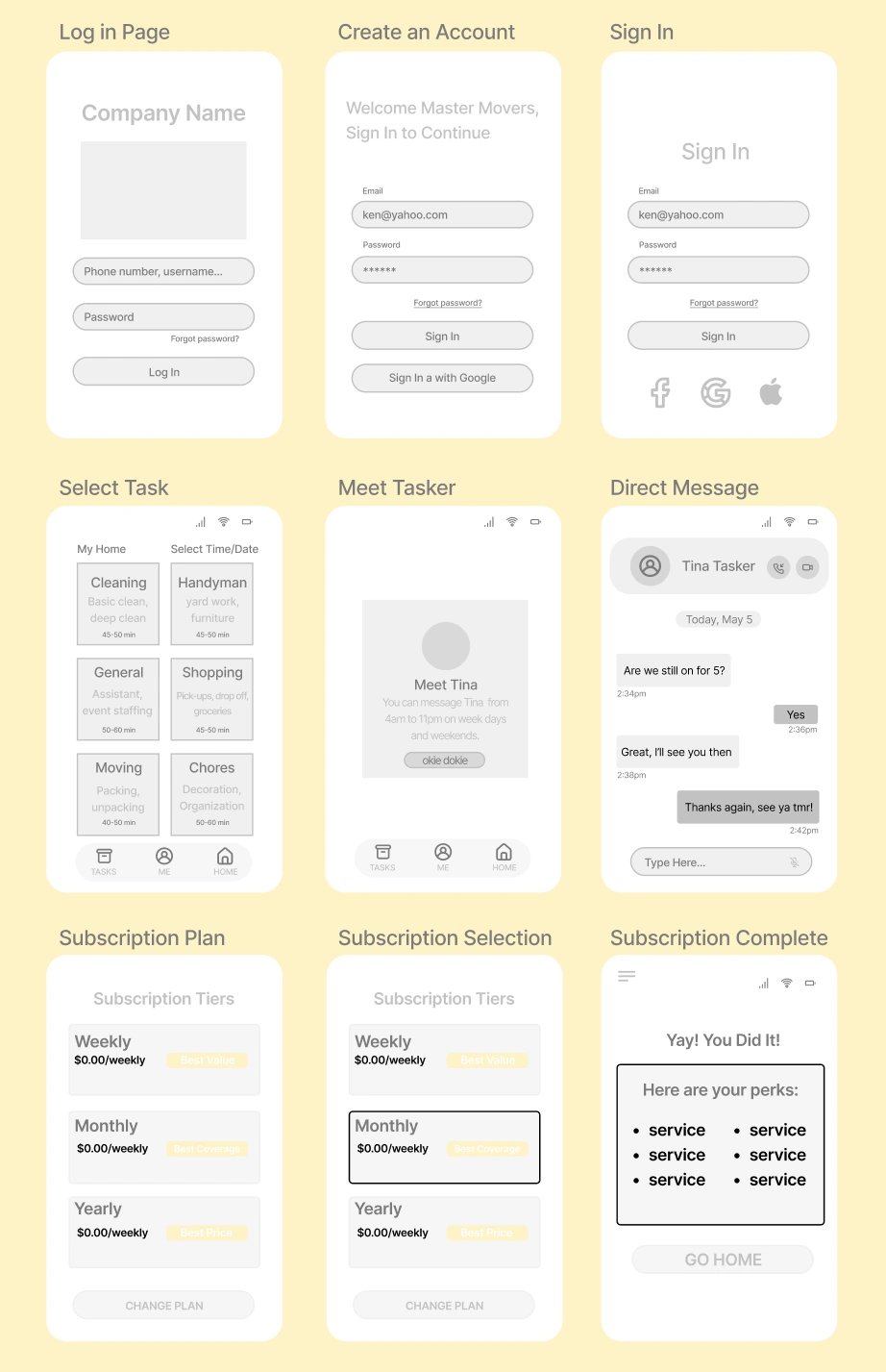
I was able to iterate on these wireframes and strategically craft them to emphasize primary user requirements and functionalities that occurred during the research phase.
My Main Focus
Create a simple, effortless, and user-friendly app outline.
Incorporate subtle details to illustrate the task selection process step by step, along with a three-tier pricing system aimed at retaining users through return visits and ongoing engagement.
Consistently engage in user testing for the wireframes throughout the project, seeking feedback and implementing refinements as needed.
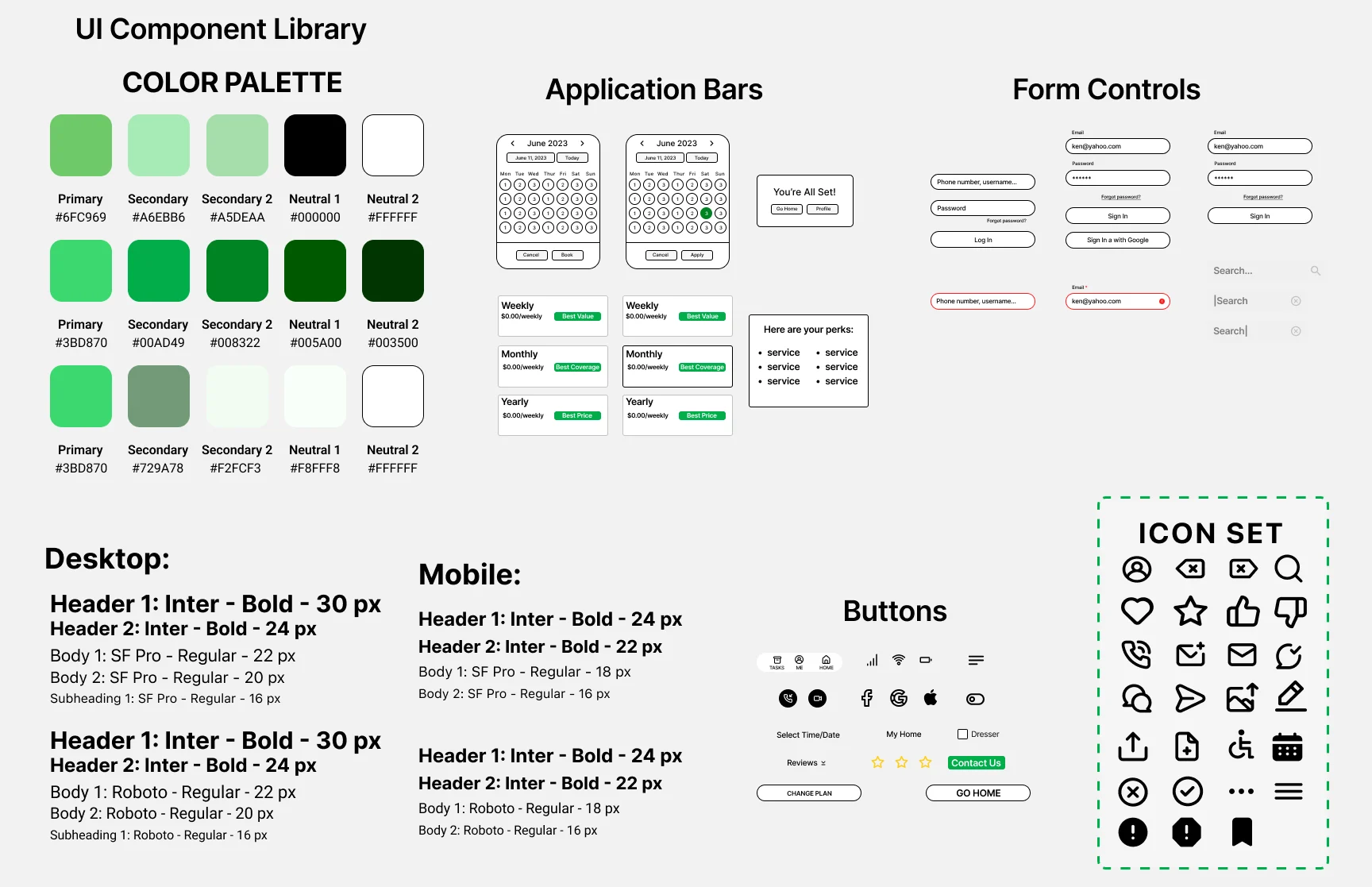
v When crafting my UI kit, I aimed for thoughtful detailing, particularly in the color palette, to steer clear of a dull or mundane appearance. Instead, I opted for colors and fonts that exude a sense of simplicity, consistency, and a welcoming feeling. Rather than overwhelming with excessive whitespace, I chose a refreshing forest green to instill a sense of renewal in users, aligning with the symbolism of growth associated with this color. White and black were deliberately chosen to complement the overall green, while a touch of purple was introduced to foster notions of creativity, dignity, and enchantment among our users. The outcome is a UI kit that radiates a youthful, independent, minimalistic aesthetic, poised to resonate with our target audience.
High-Fidelity Prototype
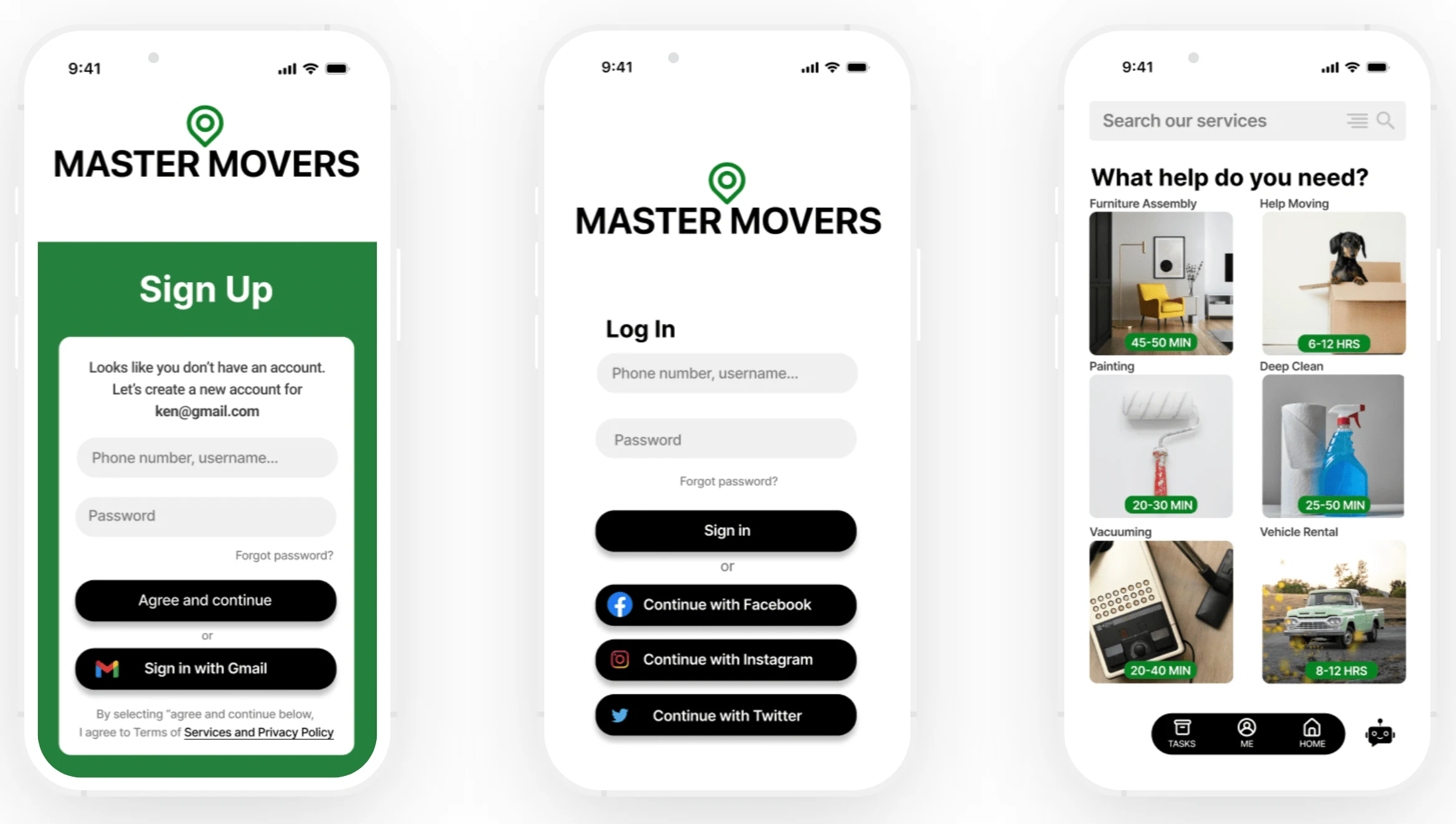
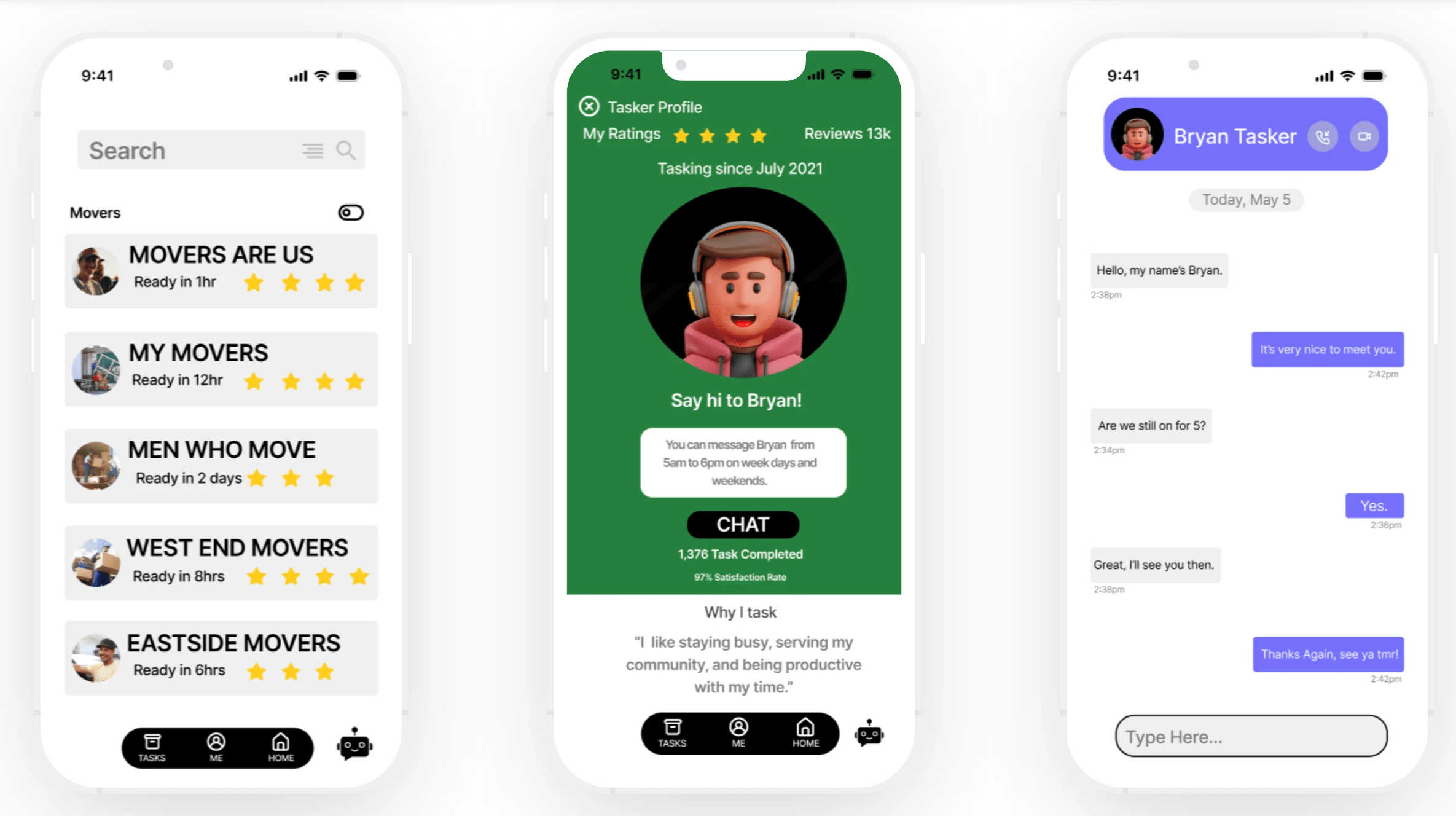
Hi-Fi Workflow
I constructed an interactive prototype with limited capabilities, intended for usability testing in the upcoming phase. The high-fidelity prototype encompasses the execution of seven core tasks outlined in the task flow.
Task 1: Create an account and go through the onboarding pages.
Task 2: Sign in if you have an existing account.
Task 3: Select a task via homefeed that lists tasks, estimated time, and a search bar.
& Process
Task 4: View or select a mover, moving company based on unique needs.
Task 5: Introduction to tasker, including biography, stats, reviews, and direct message capabilities.
Task 6: Book tasks via calendar, sync personal calendar, optimize checklist, and view upcoming tasks.
Task 7: Select a subscription tier for future services, (optional) order confirmation details, and payment summary.
Test & Iterate
Usability Testing
My objective was to gauge user sentiment and closely observe their interaction with the application prototype. I conducted usability tests using a text link and video chats, followed by post-session inquiries. This approach was applied consistently across all five participants. Key metrics included task completion times, noting distinctive pain points, and positive feature feedback in regard to app layout. Additionally, I quantified the task difficulty on a scale of 1 to 10. The process of testing users and synthesizing this data effectively emphasized the strengths of my design.
5 Participants
98% Test Succession Rate
Difficulty Rating: 2
100% Feedback, Questions, and Concerns
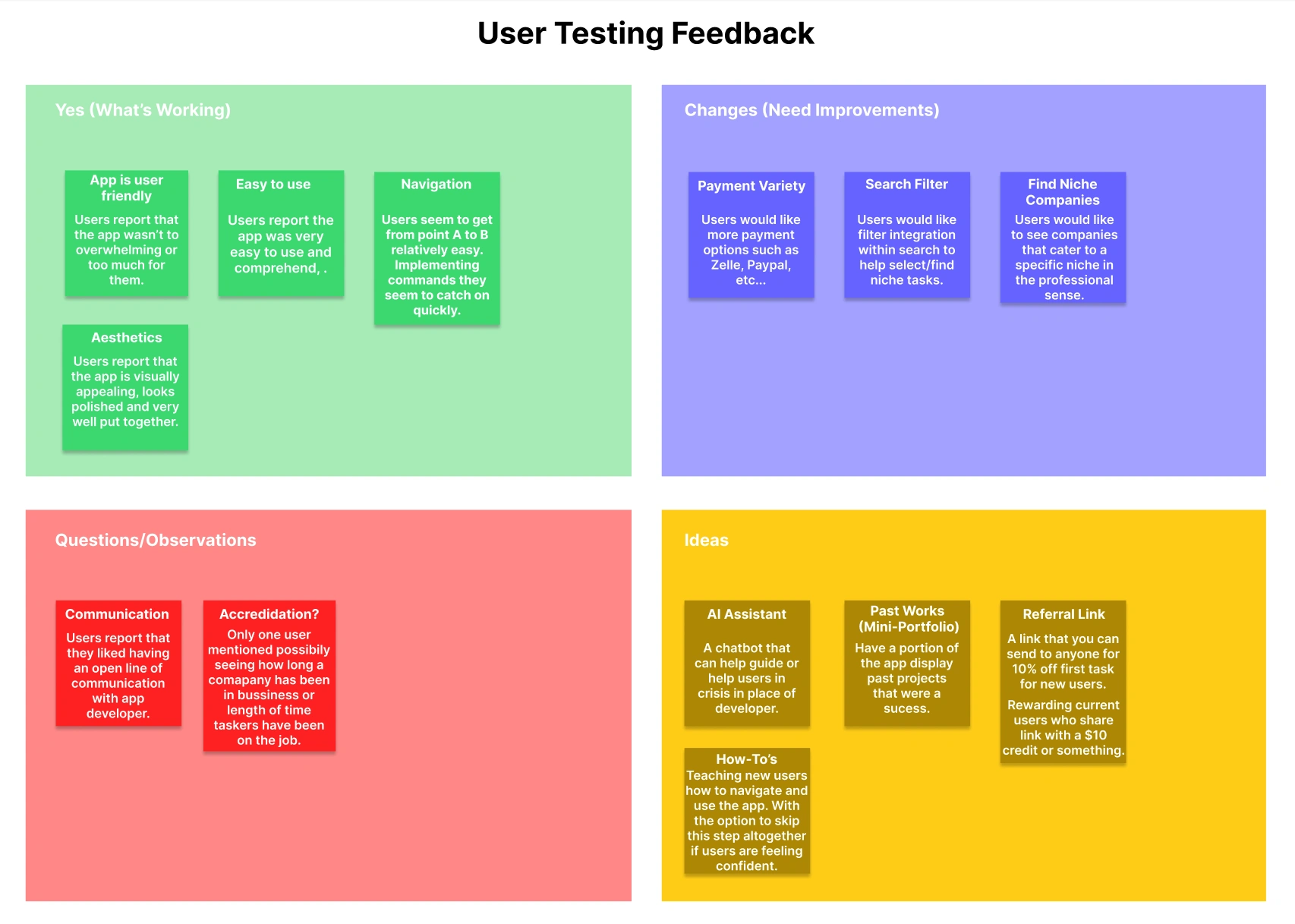
I organized user feedback to identify a common theme in four different areas. I then used that data to improve distinctive pain points throughout the application.
Iterations
After conducting user interviews and collecting data, changes and improvements were implemented based on user feedback. Here are a few of the changes that were made:
I added additional payment methods (PayPal & Zelle)
Added AI chatbot (which can also take you to a dedicated FAQ page or answer questions outright.)
After signing up, Chatbot will appear asking if you’d like a tour or tutorial of the app.
Added a referral link for 10% off subscription tiers when you link with a friend.
Added a dedicated filter in the search bar so users can look up tasks or companies based on a specific niche or specialty.
Individual User Usability Test Feedback Excell Sheet: https://docs.google.com/document/d/1vFATqGYWExTic43iDgLxT3nrAEHGL-hGmRC6UuRGRPY/edit?usp=sharing
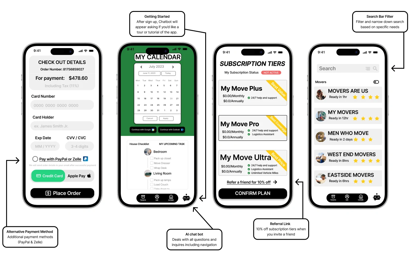
Revisions & Solutions
Final Thoughts
Reflection
I aimed to develop a complete mobile application, and I'm delighted with the outcome of the solution and design. Alongside interviews, usability testing strongly confirmed the app's substantial value, practicality, and effortless user experience. Users appreciated the app's professional appearance, even expressing a desire for it to be a real-life mobile application. Ultimately, I firmly believe that everyone deserves a more straightforward, less burdensome, and time-saving approach to planning and executing their move, regardless of their background or physical abilities.
Next Steps
Iterate on specific screens so they are congruent with the "dynamic island" for iPhone users.
Begin envisioning what a "tutorial" or in-app "tour" could look like for the user.
Perform another round of usability testing to check if this updated version connects well with users.
Handoff to a developer for app release into public offering.
Like this project
Posted Dec 24, 2023
Designing an end-to-end mobile application. A movers app that offers various services and tasks.
Likes
0
Views
14
