STATICMETHOD — Studio Website & Inquiry Experience

Marcel Weisshaar


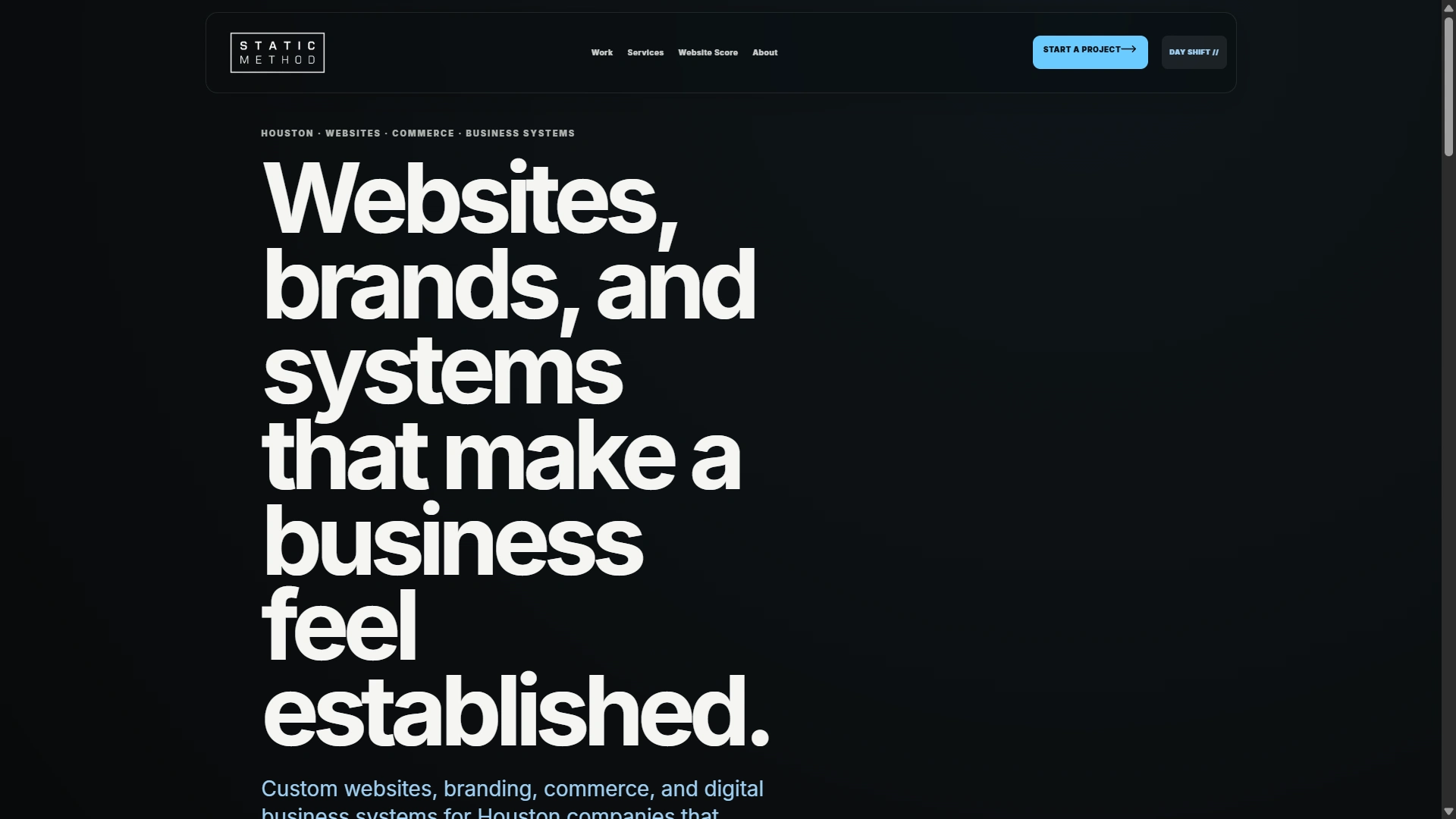
STATICMETHOD — Studio Website & Inquiry Experience
Self-directed project for my own studio. I handled the website strategy, copy, visual design, responsive front-end implementation, and inquiry experience.
The objective
A service website needs to explain the offer, show relevant work, and make the next step clear. I built STATICMETHOD around that sequence: first impression, selected work, service discovery, and a useful project inquiry.
A distinct, responsive identity
Oversized typography, restrained blue accents, and a consistent card system establish the visual language. Day Shift and Night Shift carry it across coordinated light and dark modes. On mobile, the typography adapts and a full-screen menu separates the main buyer actions from studio resources.
More than one way to begin
Visitors can explore projects and services before making an inquiry. The Website Score page provides another starting point for owners evaluating an existing site, with the assessment areas explained beside the form.
Business context before a finished brief
The inquiry page asks what needs to work better, rather than expecting a polished specification. It gathers business context and explains what happens next before the visitor submits their details.
Delivered
A live studio website connecting positioning, portfolio, services, and project intake in a consistent responsive experience.
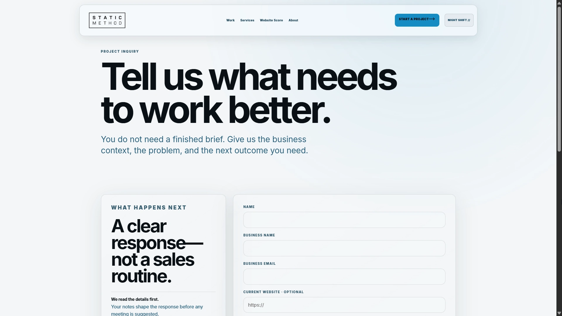
Project inquiry: business context first, with a clear explanation of what happens next.
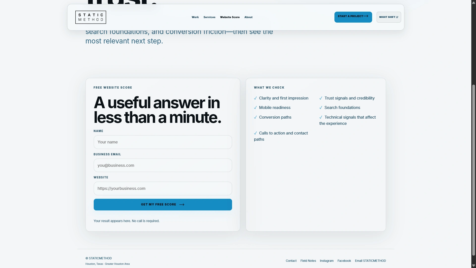
Website Score: an alternative starting point, with assessment areas explained beside the form.
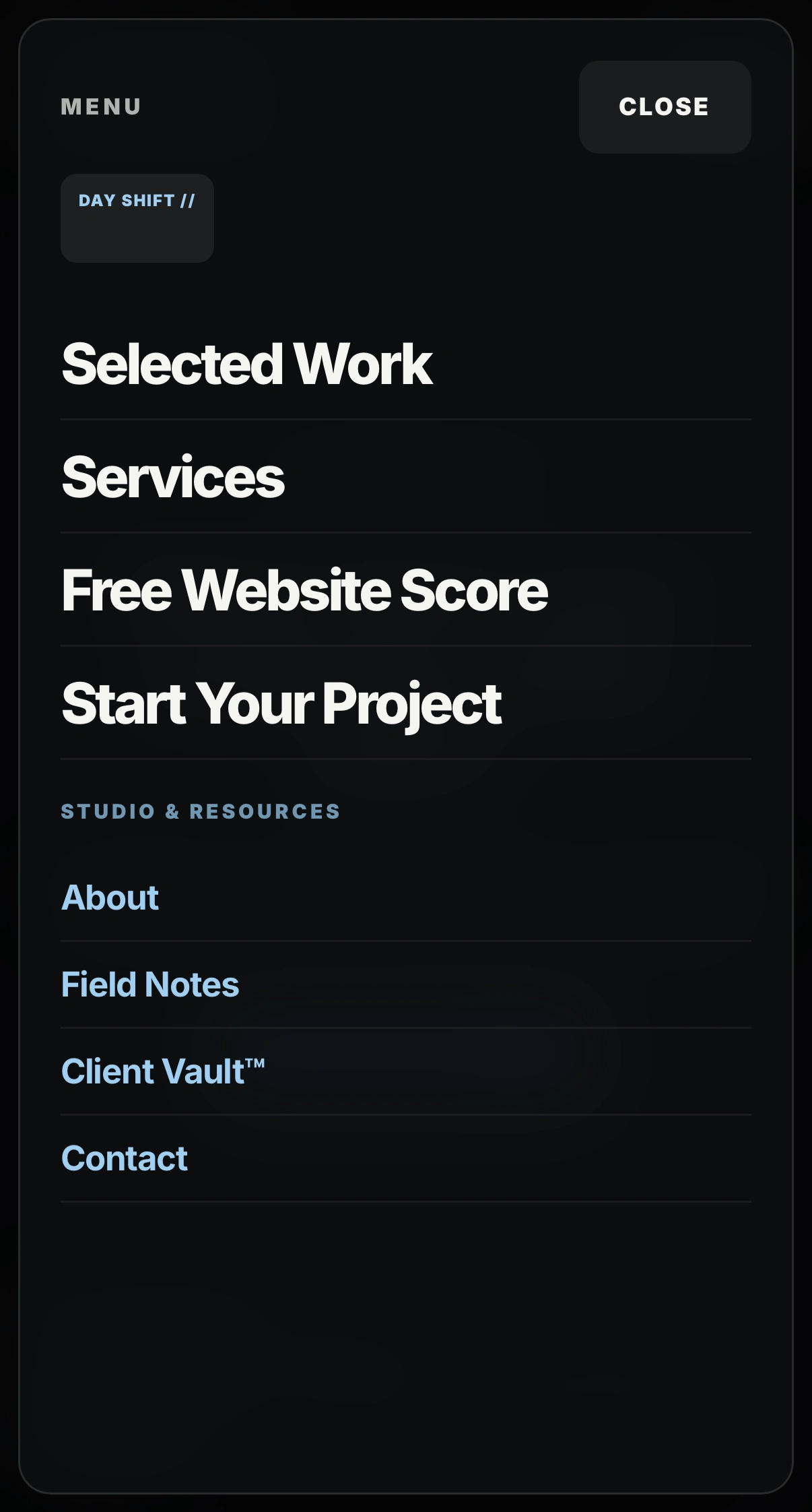
Mobile navigation: primary buyer actions separated from studio information and resources.
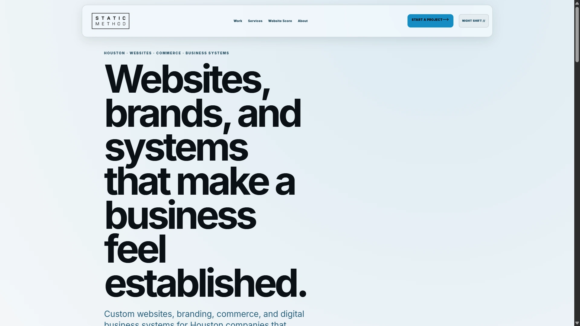
Day Shift: the same typography and visual system carried into the light-mode presentation.
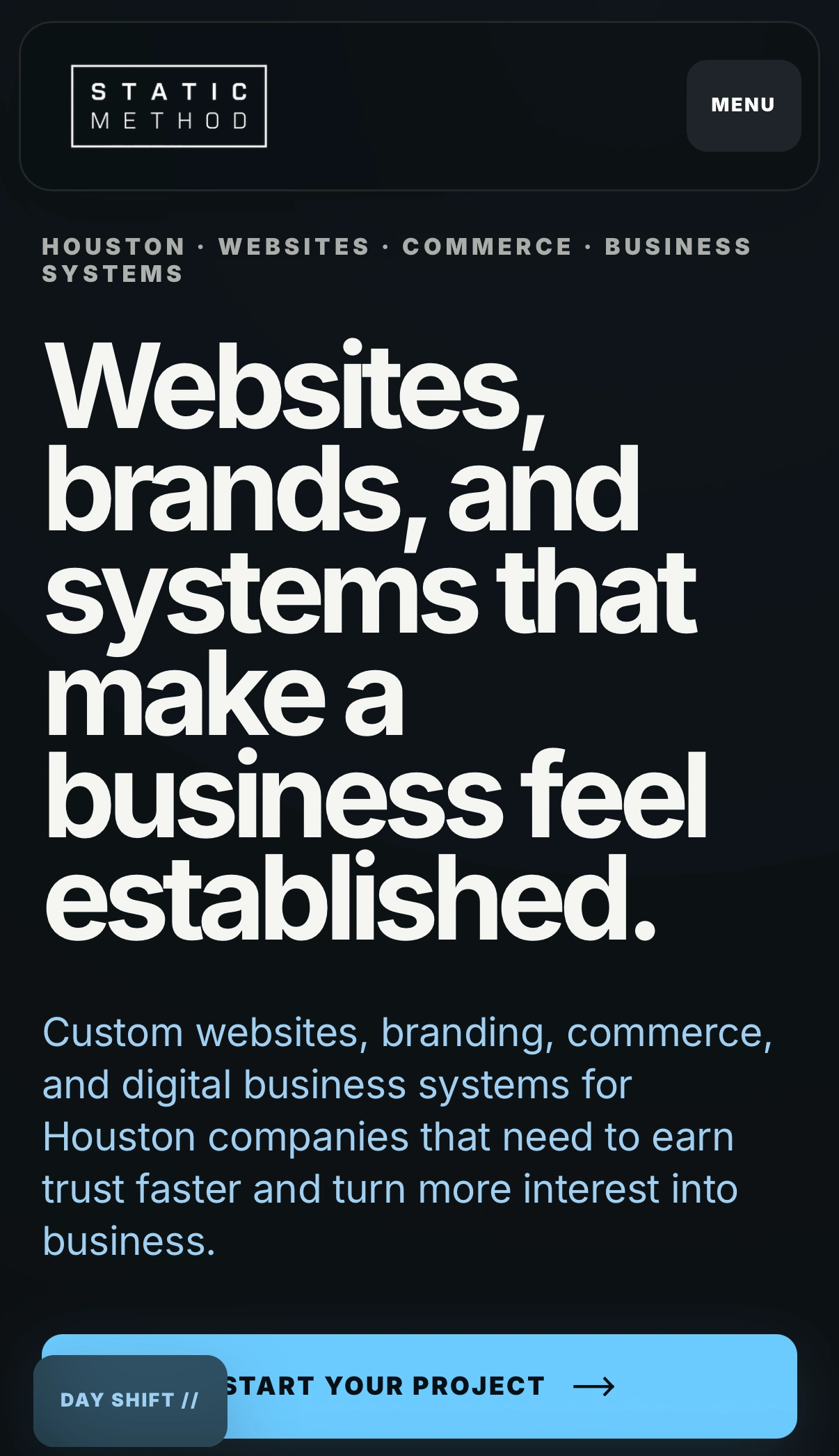
Night Shift on mobile: responsive typography and a direct project-inquiry path.
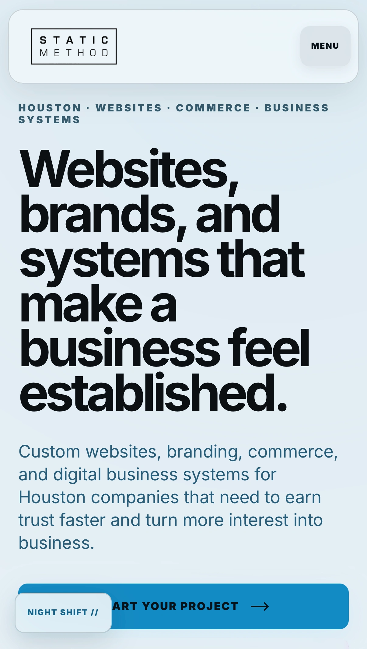
Day Shift on mobile: the same visual identity adapted to a light presentation.
Like this project
Posted Sep 14, 2026
My studio website: responsive design, coordinated day/night modes, clear service discovery, and a business-focused project inquiry experience.
Likes
0
Views
2