
Brand Identity · Logo · Visual System · Imagery & Art Direction · Landing Page Design · Interaction & Motion
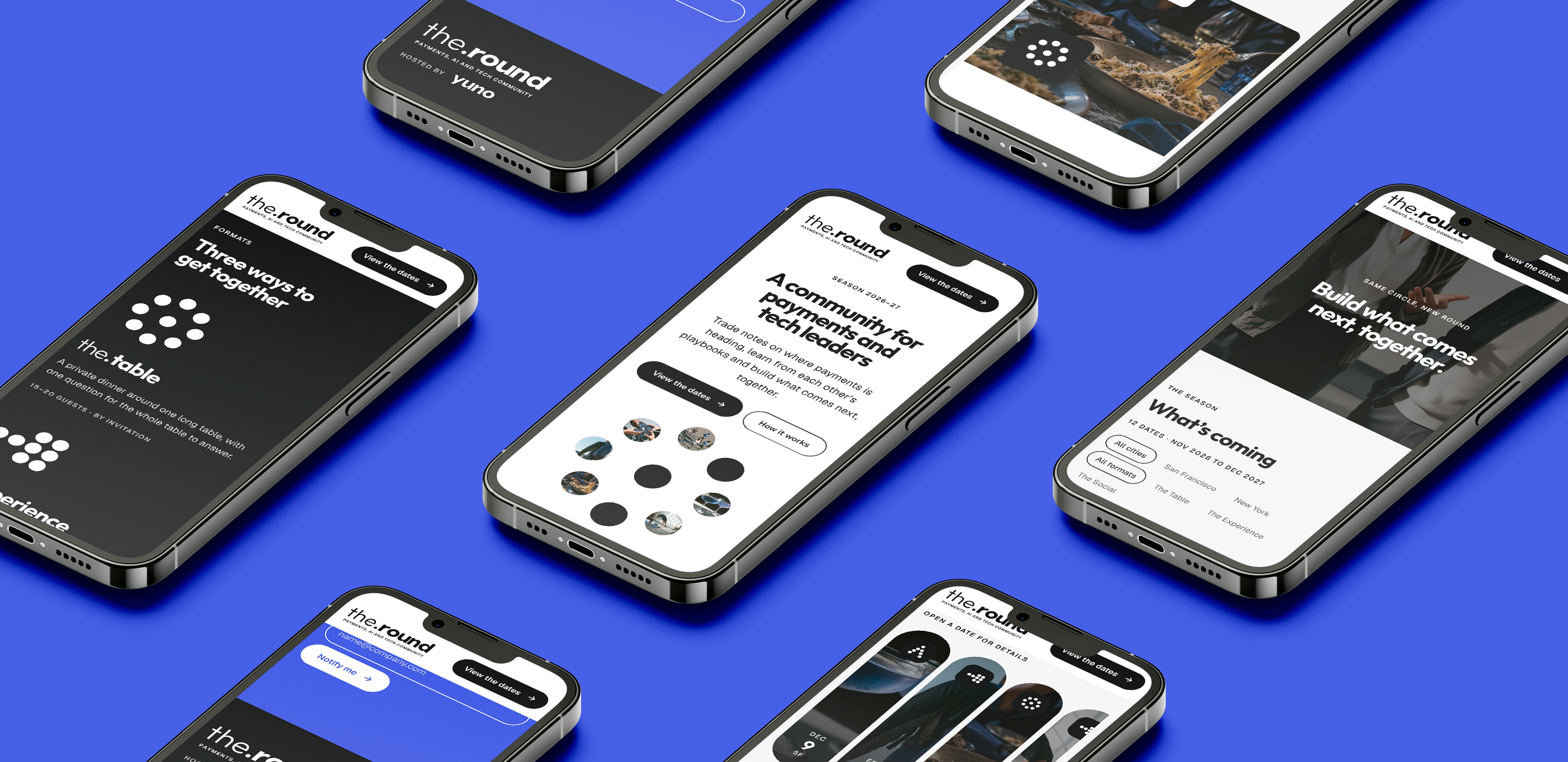
the.round is Yuno’s community for payments, AI and tech leaders, with dinners, group experiences and socials between San Francisco and New York. I designed the identity, the imagery direction and the landing page where members find dates and save their seats.
See the full case study here:
Challenge
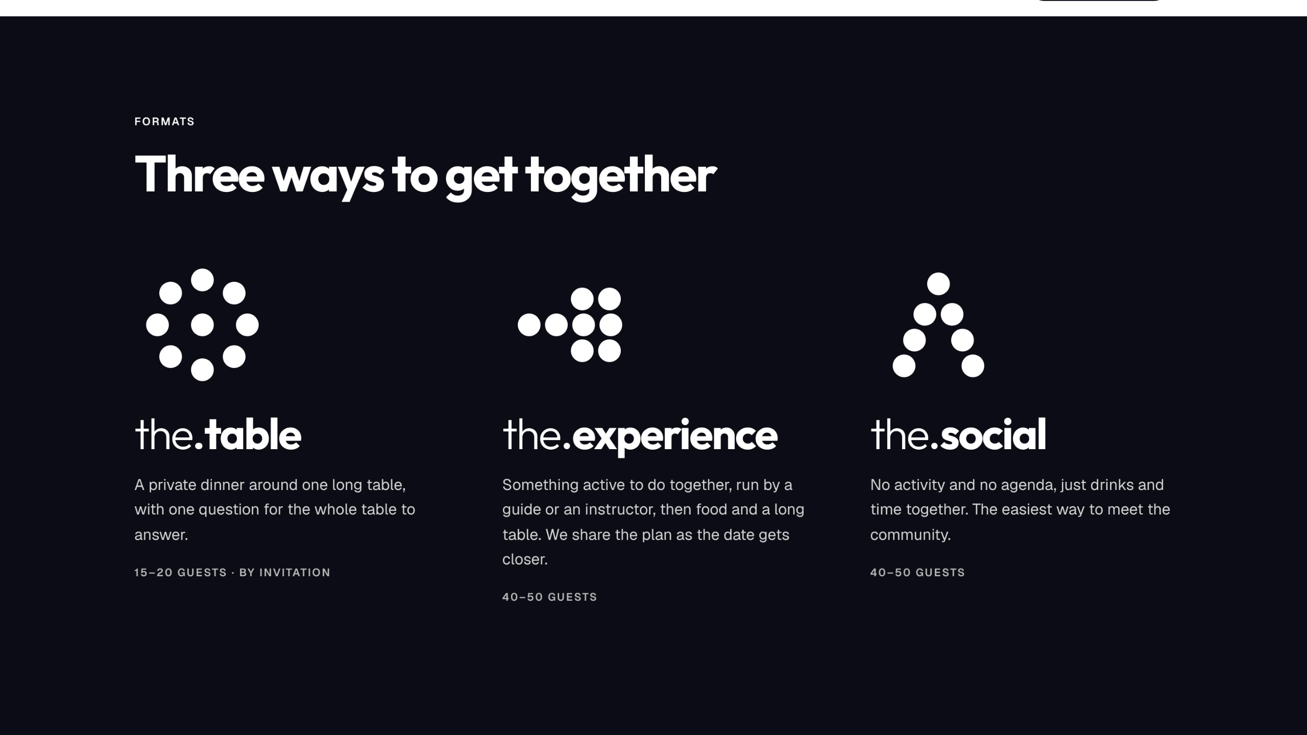
Yuno needed a community that felt separate from the company, warm enough for an invite-only dinner and still clearly part of the Yuno family. It also had to hold three very different formats under one name, without turning into three brands.
The logo comes from three places: the social circle, Yuno’s symbol, which is built from dots, and the letterforms of Yuno’s wordmark. In the.round, the dot between the two words is a person joining the circle. It is the smallest piece of the brand, and everything else grows from it.
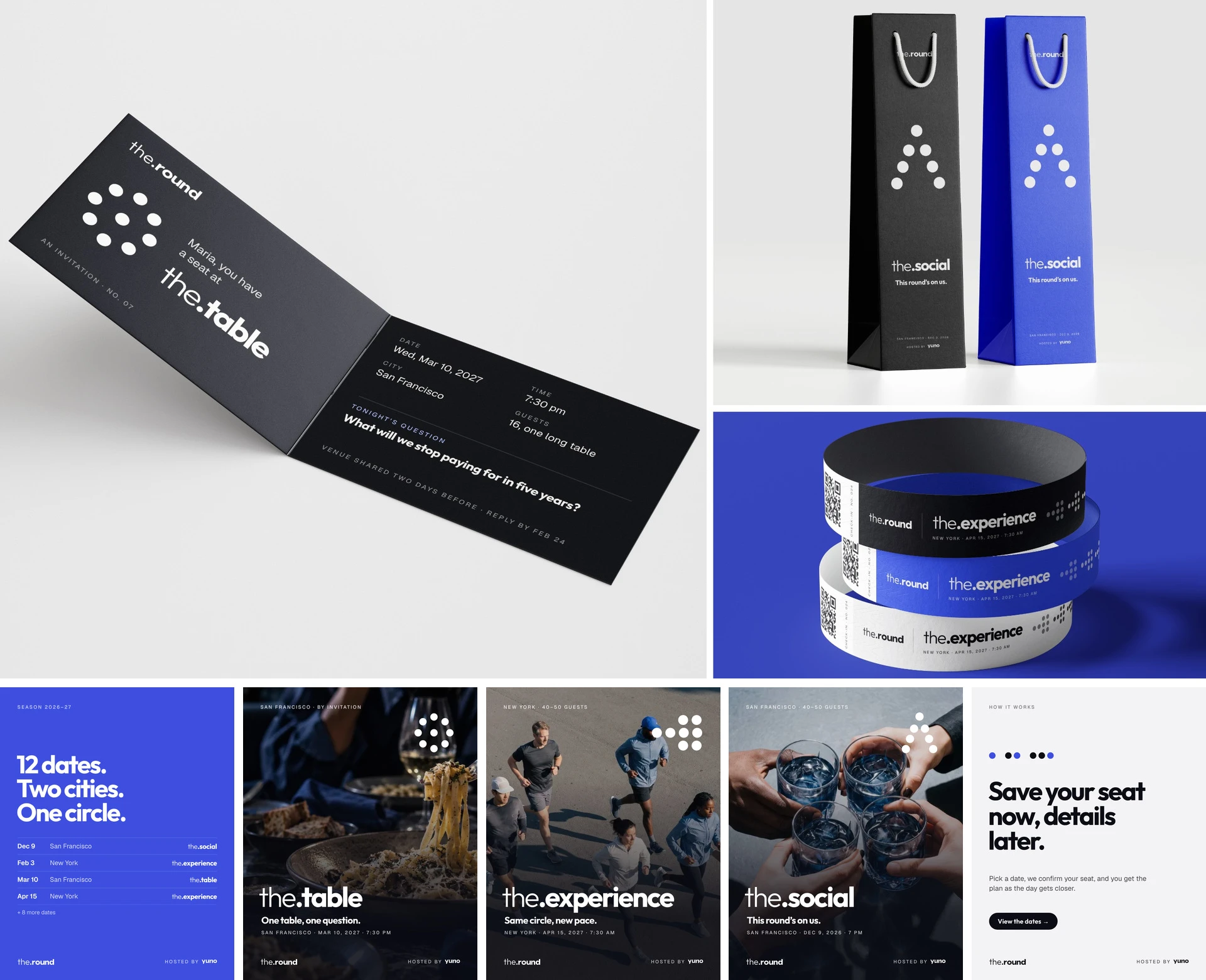
Imagery
Real gatherings that never look like stock: natural light, people mid-conversation and always one blue detail.
The Landing Page
The page works like a season calendar. Visitors filter by city and format, open each date as a card and save a seat without knowing the full plan yet. Every interaction moves in the same rhythm: titles rise, photos zoom softly, cards expand and dots rearrange, so the community feels alive before anyone shows up.
Outcome
One flexible system that works for a 15-person private dinner and a 50-person social, recognizably Yuno and clearly its own thing.
0 likes · 1 view · Nov 19, 2026


