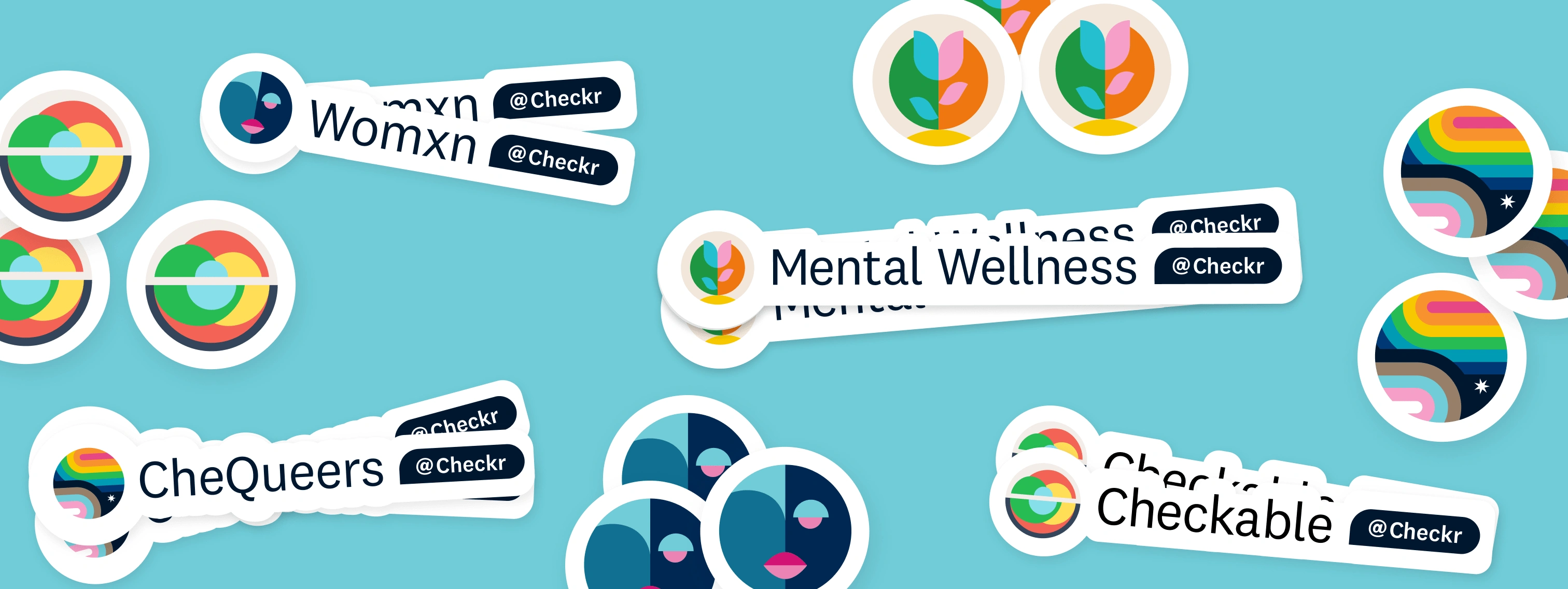
Employee Resource Group Logos at Checkr
Objective
Develop a visual identity system to create consistency across all logos for the Checkr employee resource groups. Collaborate with resource group leaders to ensure their logos represent the group. Logos must work across various sizes and swag application and be an extension of the Checkr brand utilizing an extension of the Checkr color palette and brand style.
Solution
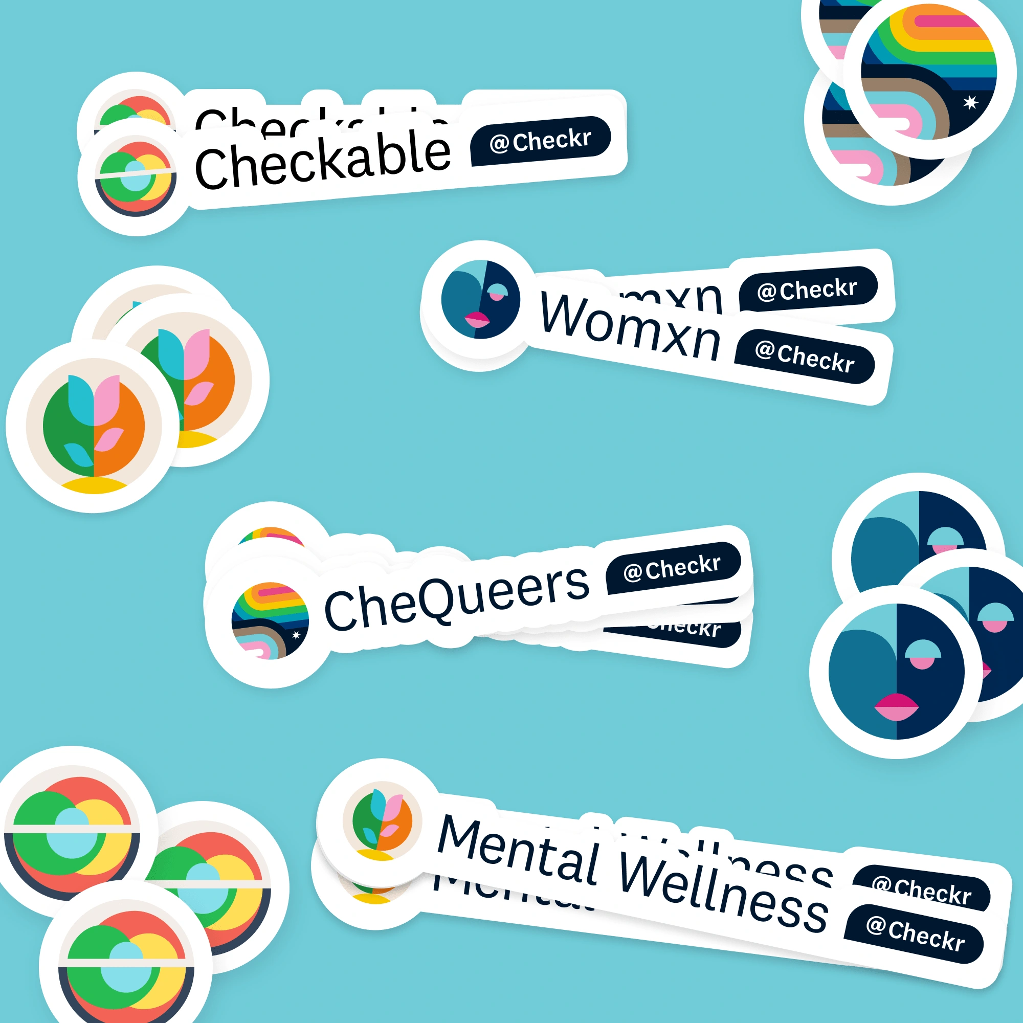
A circular badge symbol and word mark combined system based on geometric shapes and flat vectors. A color palette limited to the Checkr colors with modifications only for accessibility.
Role
Full ownership of design and execution, stakeholder management and process

Guiding principals
Clear: Clearly align with and represent the resource group. Not necessarily literal and staying away from stereotypical symbols.
Scalable: A system that can continue to expand as more groups are created.
Inclusive: Inclusive of the group and allies to the group. Celebrating the diversity that is Checkr and its employees.
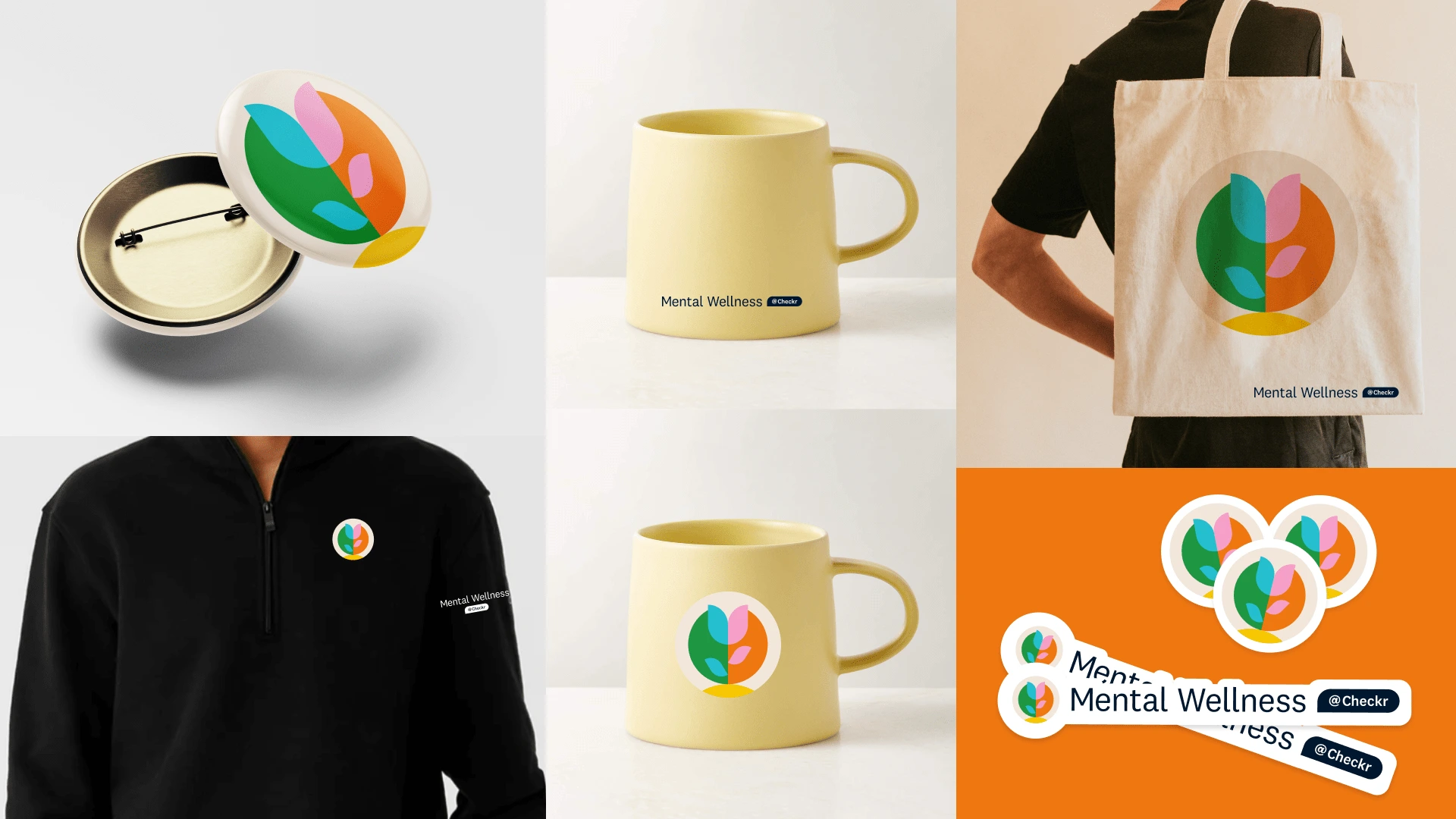
Detailed process | Mental Wellness at Checkr
Brief and Questionnaire
Before design began Employee Resource Group (ERG) leaders and members completed a questionnaire to inform the symbols, colors, and references to be used for the logo creation. We then discussed the survey results to align on key themes, and set expectations on the next steps of the process. As the goal was to create a system all logos within the system would have a symbol to represent the group accompanied by a consistent word mark treatment of their group name.

Initial explorations
The Employee Resource Group (ERG) leaders questionnaire resulted in the themes of balance and growth. Many sketches and directions were explored and reviewed internally (brand studio team) before these 6 initial symbol concepts were shared with the ERG leaders. After creation, feedback was gathered, and a preferred direction was selected.

Color iteration
The initial color direction was calming leaning into blue and aqua. After seeing this the group determined they wanted to bring more joy and happiness into the symbol and we arrived at a bold bright combination highlighting happiness and joy.
Finalization
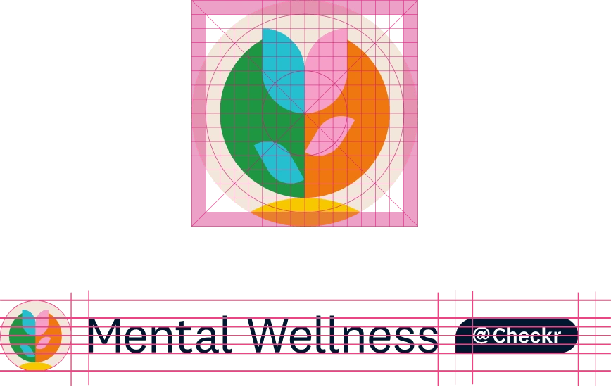
Once a direction for the symbol was established the finishing touches for aligning the symbol to the grid system created for the logo marks and creating the accompanying word mark were completed. The word mark was created to scale with a variety of names ensuring "Checkr" would be treated the same even without the use of the Checkr logo.
Process | Womxn at Checkr
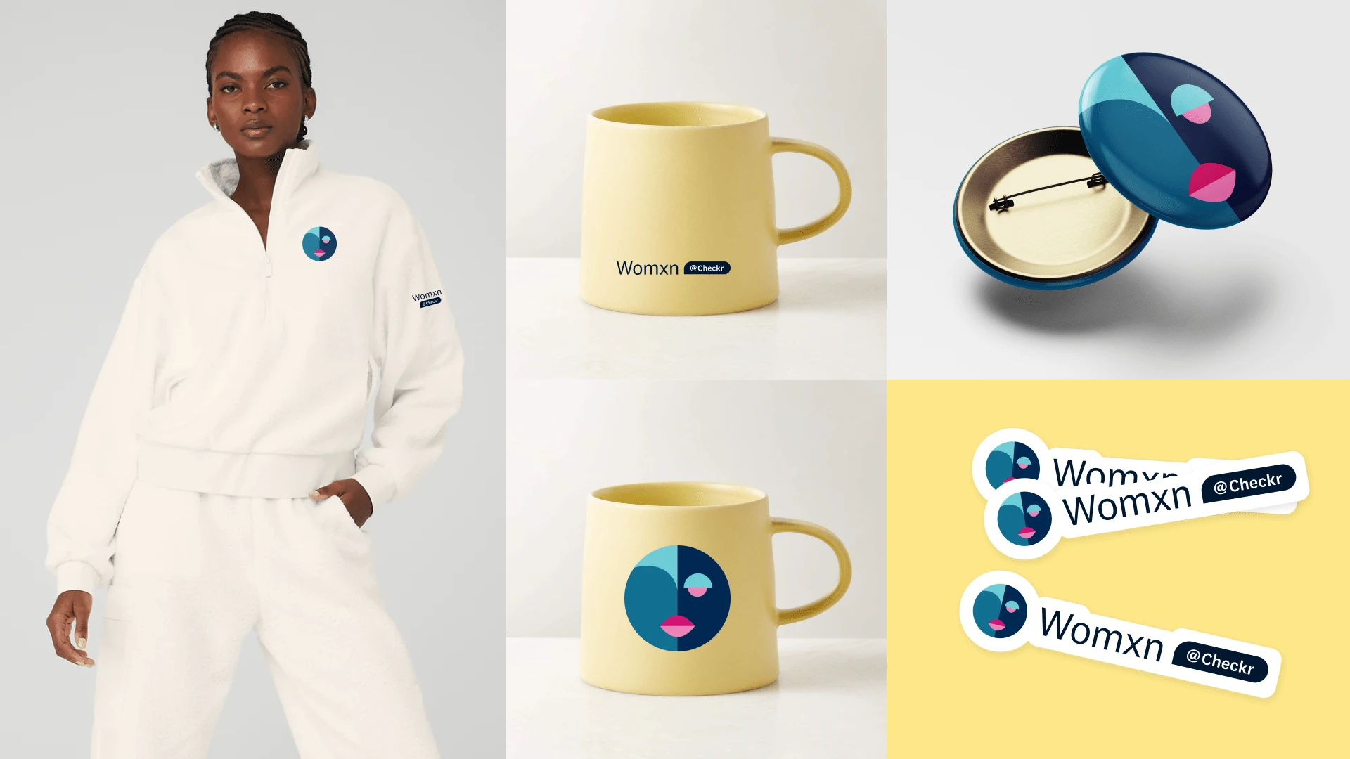
All logos followed the same process outlined above. questionnaire completion, v1 symbol exploration and feedback, color and symbol refinement, final logos shared.

Symbol creation and color exploration
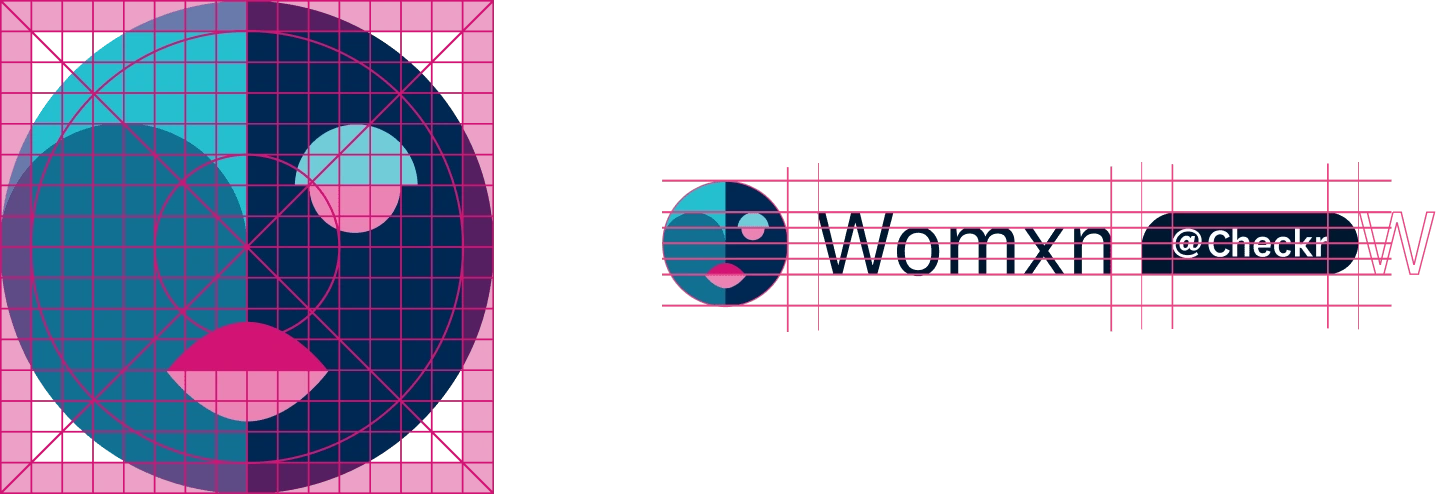
Womxn are redefining their role in the workforce. It is through support systems like employee resource groups and mentors that womxn are able to do more than ever before. This abstract face symbolizes the unimaginable yet recognizable. The incomplete facial features celebrate the incomplete vision of what the workforce looks like for women in the future. We get to define it. This symbol also acknowledges not every womxn is the same. Embracing and celebrating what makes us unique as individuals and womxn. Inspired by bold high contrast play on the standard “gendered” colors and neutral colors and the Checkr color palette.
Finalization
Once a direction for the symbol was established the finishing touches for aligning the symbol to the grid system created for the logo marks and creating the accompanying word mark were completed. The word mark was created to scale with a variety of names ensuring "Checkr" would be treated the same even without the use of the Checkr logo.
Like this project
Posted Jun 18, 2024
Develope a scalable logo and symbol system to be used for Checkr's employee resource groups. This employer brand project brought consistency across the groups.
Likes
0
Views
7
Clients
Checkr

