Wrapcart - logo design for a d2c brand

Abhishek Mitter



WrapCart is a vibrant D2C brand delivering premium skins and wraps for smartphones and accessories. Built for a generation that values personalization, speed, and visual appeal, the brand needed a bold identity to stand out in the fast-moving consumer tech space.
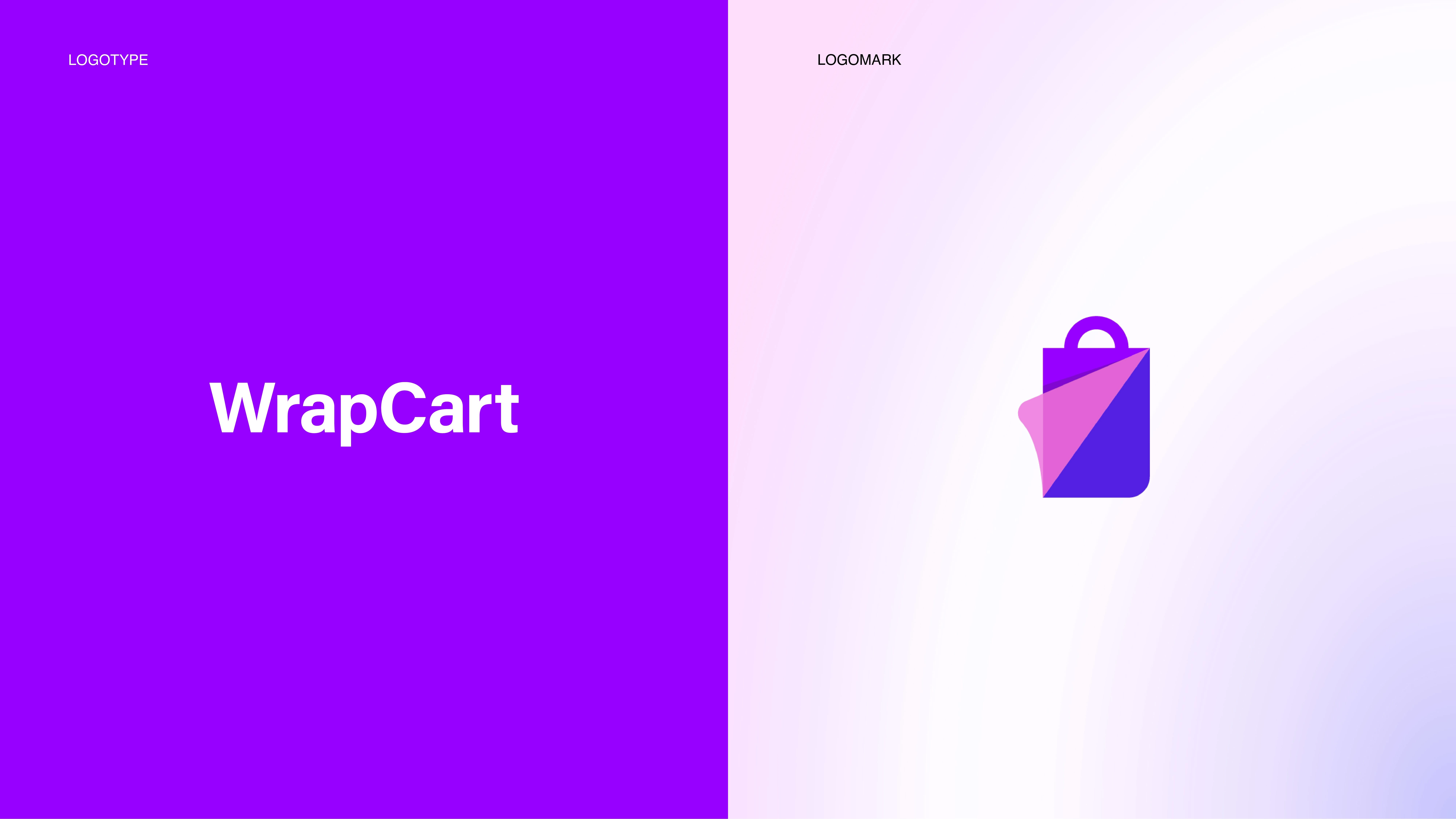
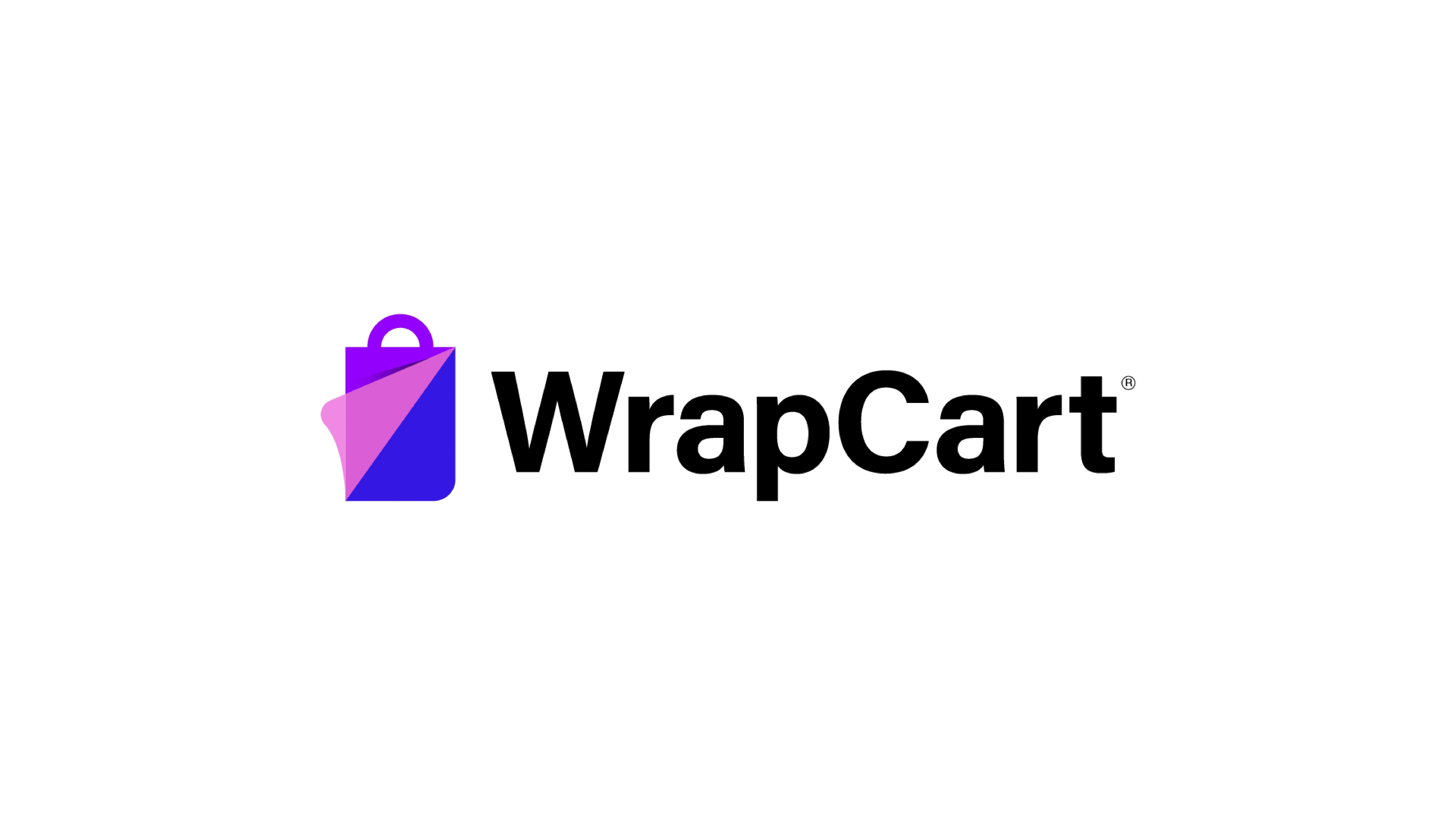
The name WrapCart is a fusion of “wrap” (the core product) and “cart” (the digital shopping experience)—a signal of function-first thinking with a consumer-friendly tone. Our challenge was to translate this into a visual identity that felt intuitive, youthful, and unmistakably digital.
We designed a geometric symbol that brings together two familiar ideas:
🛍 A shopping bag – representing convenience, commerce, and simplicity
📄 A peeling corner – capturing the tactile motion of applying a wrap
The final icon balances energy and clarity. The subtle 3D corner gives the mark dimension and metaphor, while remaining clean and scalable. Paired with a bold sans-serif wordmark, the identity communicates modernity, accessibility, and speed.
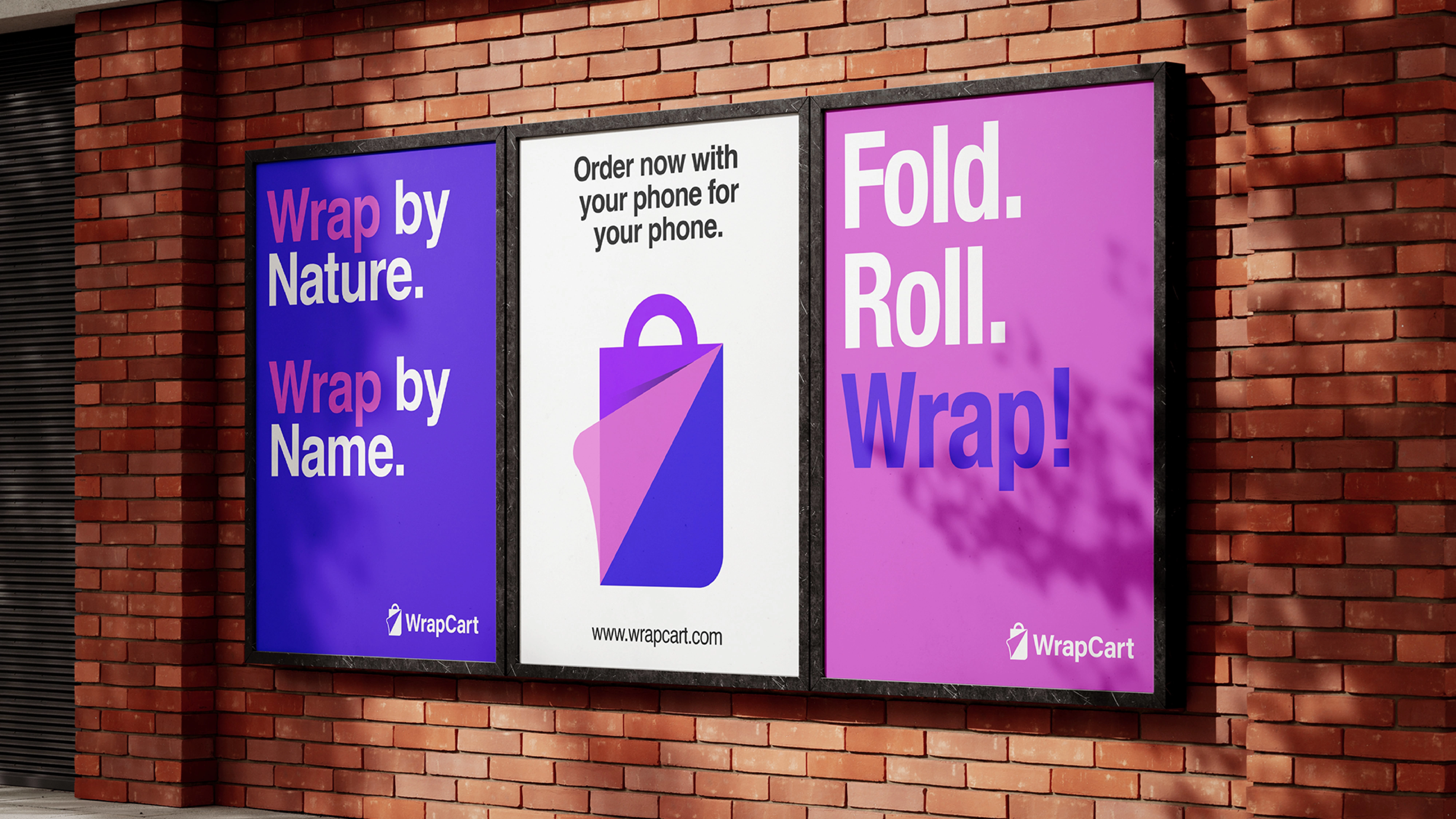
The visual system is powered by a vibrant gradient palette of electric purple and punchy pink—a deliberate move to connect with Gen Z and young millennial audiences. The color treatment not only pops on digital platforms but also reinforces WrapCart’s playful and progressive personality.
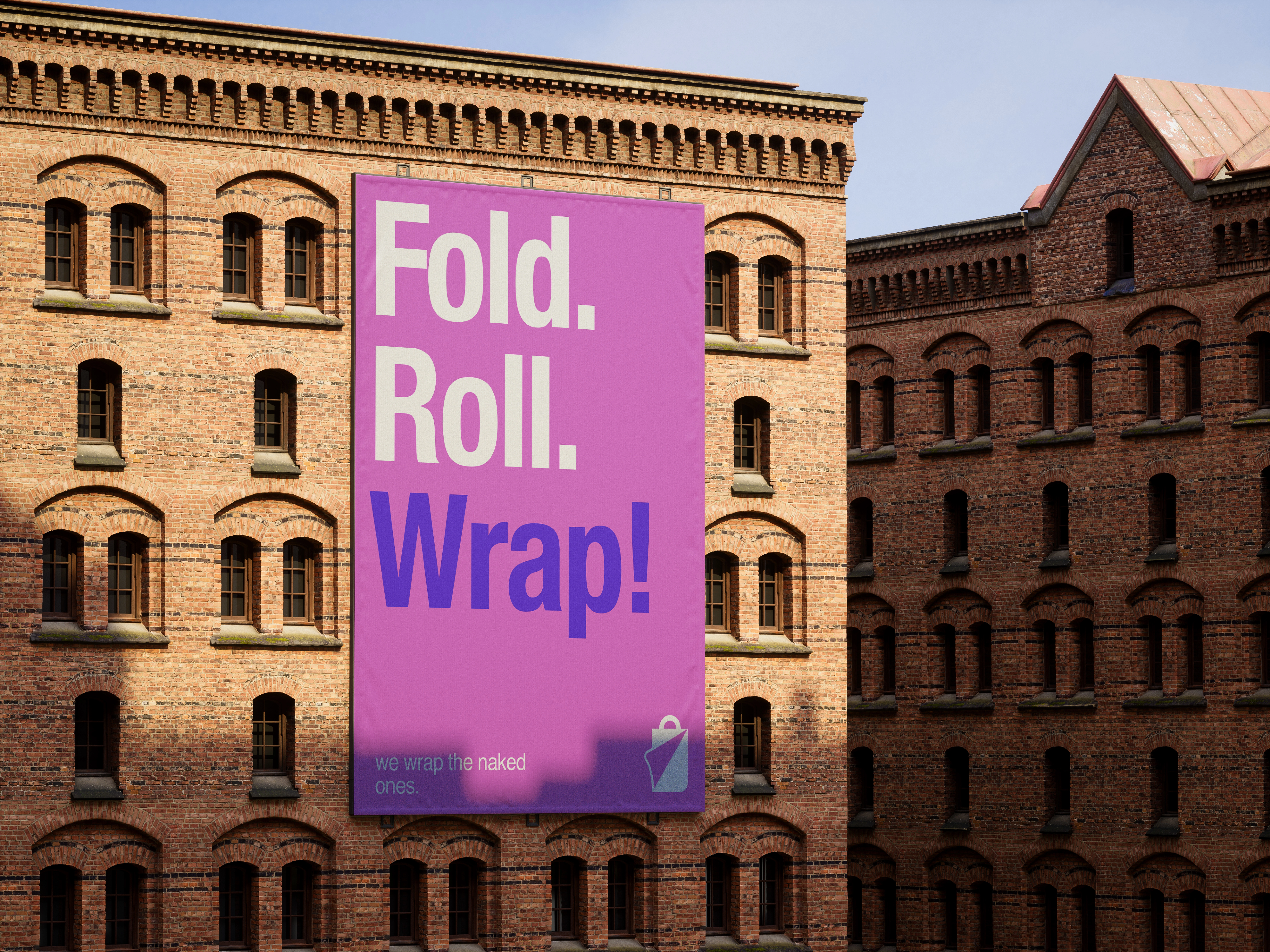
From billboard campaigns and product tape to social media and brand language, every touchpoint was designed to wrap the user in a bright, sticky, and unforgettable experience.


Like this project
Posted May 26, 2025
Our challenge was to translate this into a visual identity that felt intuitive, youthful, and unmistakably digital.