Quick conversion win from a
Michael Caesar
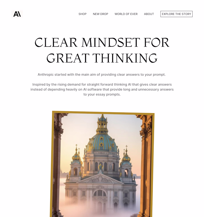
Quick conversion win from a recent client project 👇
I added an animated button to each card — not for aesthetics, but to make every section do something.
Instead of just presenting information, each card now:
• Reinforces its message
• Guides the user toward a clear action
The impact was immediate:
→ Better visual hierarchy
→ Clearer user flow
→ Stronger, more noticeable CTAs
It’s a small interaction detail, but this is exactly what turns a static landing page into something that actually converts.
Still refining it, but it’s already a big step up.
If you’re building a landing page and it feels “nice” but not effective, this might be the missing piece.
Open to taking on a few more Framer projects this month — feel free to reach out if you want something like this implemented.
Like this project
Posted Mar 30, 2026
Quick conversion win from a recent client project 👇 I added an animated button to each card — not for aesthetics, but to make every section do something. In...