
Full landing page design 😊
0
17
A small CTA tweak that makes a big difference 👇
I got feedback to add a subtle hover glow behind this animated button — so I tested it.
Now comparing:
• Without glow
• With glow
The glow version makes the CTA stand out more and feel more interactive, which can directly impact clicks.
It’s a tiny detail, but these are the changes that improve conversion without redesigning the whole page.
Which version would you go with?
Currently taking on Framer projects if you want this level of polish on your site. 🤝
1
40
Quick conversion win from a recent client project 👇
I added an animated button to each card — not for aesthetics, but to make every section do something.
Instead of just presenting information, each card now:
• Reinforces its message
• Guides the user toward a clear action
The impact was immediate:
→ Better visual hierarchy
→ Clearer user flow
→ Stronger, more noticeable CTAs
It’s a small interaction detail, but this is exactly what turns a static landing page into something that actually converts.
Still refining it, but it’s already a big step up.
If you’re building a landing page and it feels “nice” but not effective, this might be the missing piece.
Open to taking on a few more Framer projects this month — feel free to reach out if you want something like this implemented.
1
25
Creating a gold button for a client's website 😎
Is this something you would love to integrate into your website🤓
0
20
A client reached out to me X to redesign his AI Website, Findrio.
I took it from a Lovable designed homepage and turned it into a masterpiece on Framer with some interactive animated highlights.
Checkout findrio.framer.website (https://findrio.framer.website) and feel free to use their amazing AI services
0
21
Tablet view of a Medieval landing page design on Framer and Figma
0
27
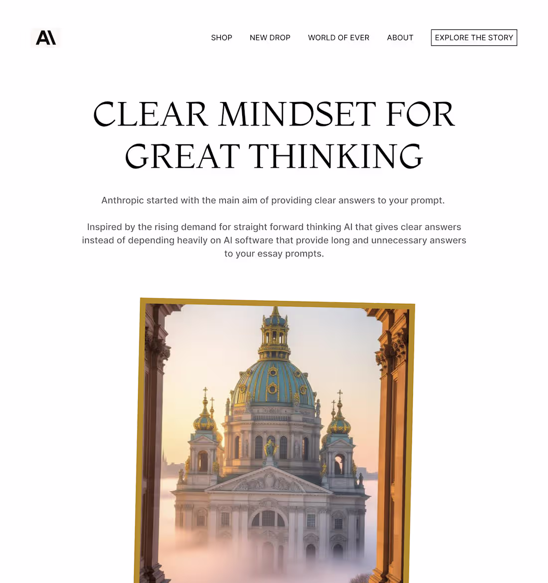
Clean, minimalist, simple landing page concept for Anthropic
0
27
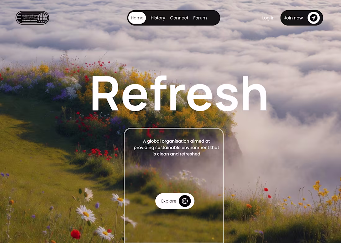
Currently working on an amazing website for an organisation on environmental sustenance 🍀🏞️
0
27

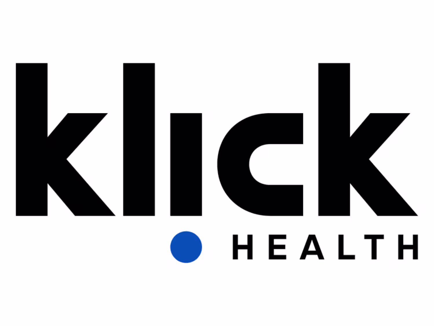
Responsive Health Website
1
4
Klick.com
1
3
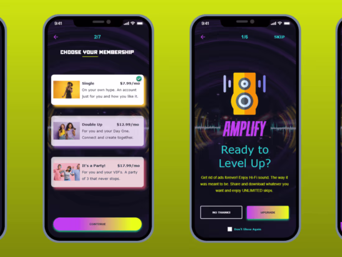
UX Research and Design: “Amplify”
1
4