"Building the Wrong Thing" to Perfect Alignment: Full Case Study
Simul Sarker
"Building the Wrong Thing" to Perfect Alignment: Full Case Study
“Our biggest fear is getting to the halfway point of a project and realizing we’re building the wrong thing. We need to know everyone is aligned from day one.” — A Project Manager
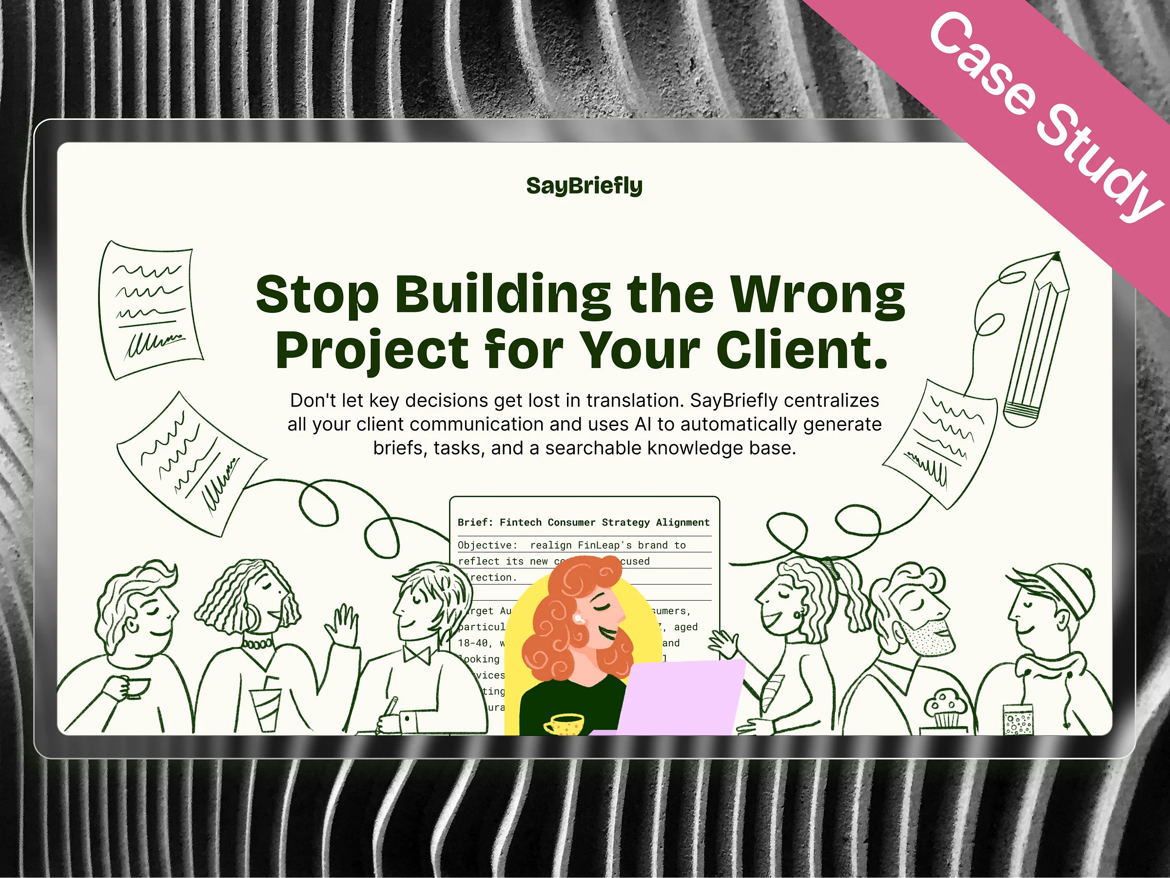
This case study breaks down the design of SayBriefly, the AI-powered platform that captures every client conversation from calls, emails, and Slack, and turns it into a single source of truth ensuring what’s discussed is what gets built.
Project: SayBriefly, an AI-powered platform for client project alignment.
My Role: Lead Product Designer
The Challenge: Teams operate in a state of communication chaos. Critical client decisions get lost across scattered calls and emails, leading to the ultimate fear: getting halfway through a project only to realize you’re building the wrong thing.
The Solution: An AI-powered workspace designed to create perfect alignment from day one. It captures and summarizes every client conversation, automatically generating a single source of truth so what’s discussed is what gets built.
In the world of client services, the most important conversations are also the most disposable. Critical decisions are made, brilliant ideas are shared, and then they vanish—lost forever in the digital ether of hour-long call recordings, sprawling email chains, and chaotic Slack channels.
This is the end-to-end design story of SayBriefly. I’ll dissect how I designed a unified workspace that transforms scattered client conversations into a single, actionable source of truth, ensuring what’s discussed is always what gets built.
The Audience: Who Suffers When Communication Fails?
My design was built for the two groups who feel the pain of project misalignment most acutely: the team on the ground doing the work, and the leaders responsible for the outcome.
The Project Team: Designers, Developers, & PMs
These are the people on the front lines, tasked with turning conversations into reality. Their biggest frustration is ambiguity leaving a meeting with unclear action items, which leads directly to wasted effort, endless revisions, and the demoralizing feeling of building the wrong thing.
Their Goal: To achieve absolute clarity. To walk away from every client interaction knowing exactly what needs to be done next.
The Business Leaders: Agency Owners & Directors
They are responsible for profitability and client satisfaction. For them, every miscommunication is a direct hit to the bottom line, leading to scope creep, blown budgets, and damaged client relationships that can threaten the entire business.
Their Goal: To ensure predictable success. To have confidence that every project will be delivered flawlessly, on time, and on budget, protecting both their revenue and their reputation.
The User Flow
I designed a user flow to guide teams from conversational chaos to project clarity. The journey is broken into phases to solve project misalignment.
Phase 1: From First Contact to Project Brief
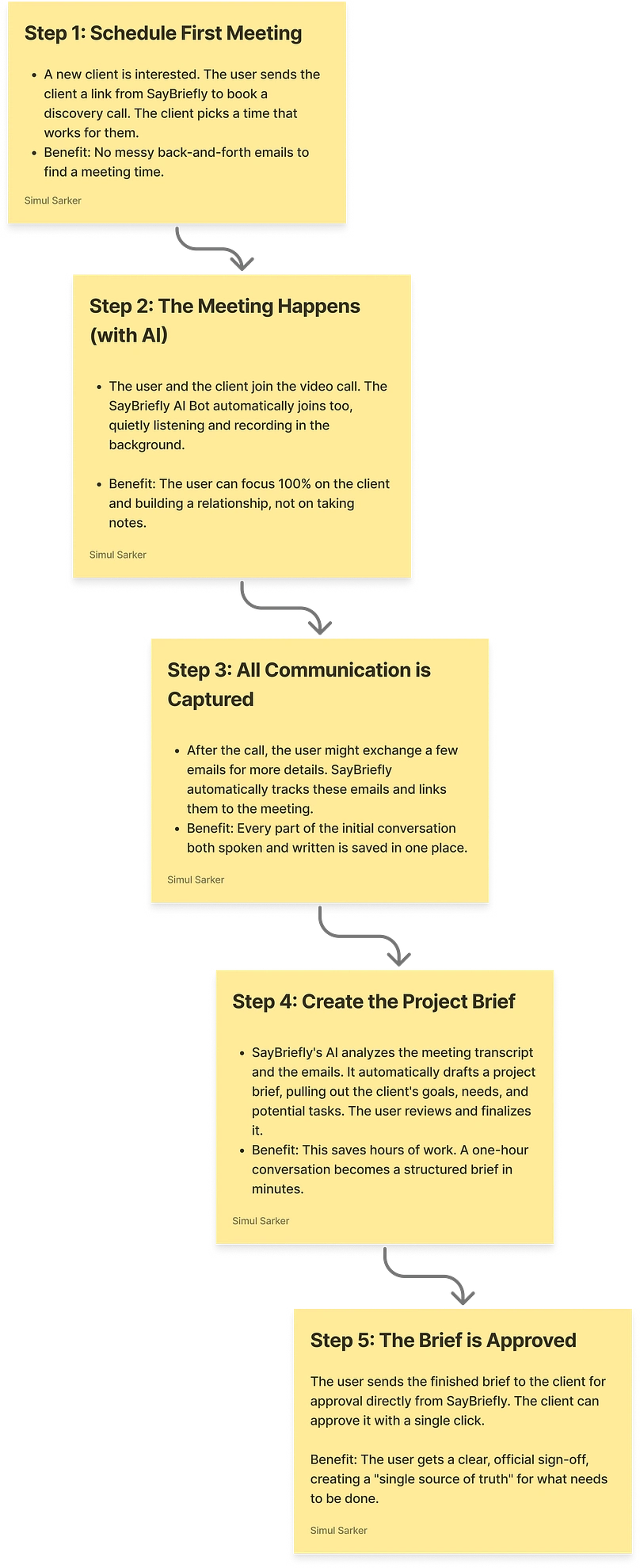
Phase 1 of the user flow I designed: From First Contact to Approved Brief. This diagram shows how the platform uses AI to capture scattered conversations and automatically transform them into a single, structured project brief, locking in alignment before any work begins.
This critical first phase captures scattered conversations and transforms them into a single, approved project brief. The goal is to lock in the plan and eliminate ambiguity from day one.
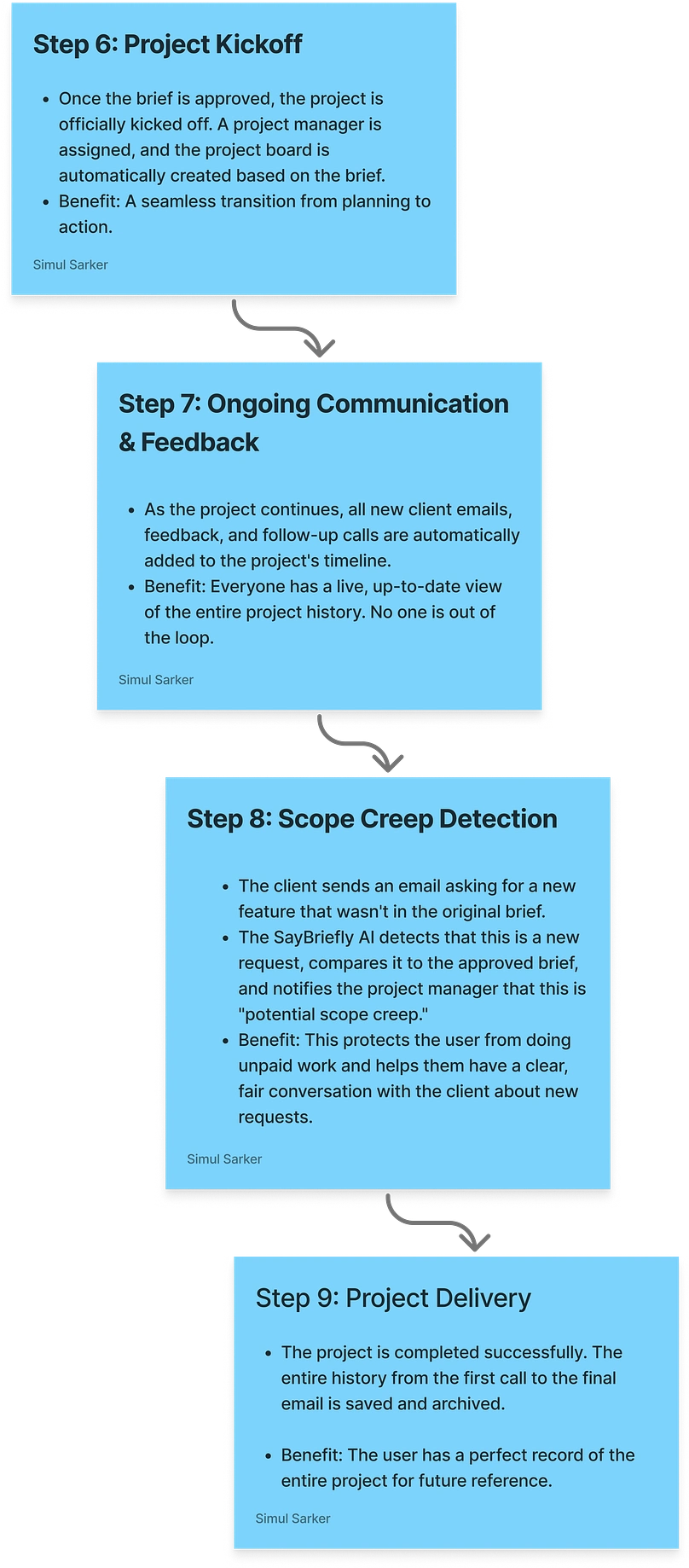
Phase 2: From Kickoff to Delivery
Phase
2 of the user flow: From Kickoff to Flawless Delivery. This part of the
journey shows how the platform maintains a single source of truth,
detects scope creep with AI, and ensures a seamless project delivery
with a perfect historical record.
This phase is about doing the work, managing communication, and protecting the project’s scope.
User onboarding
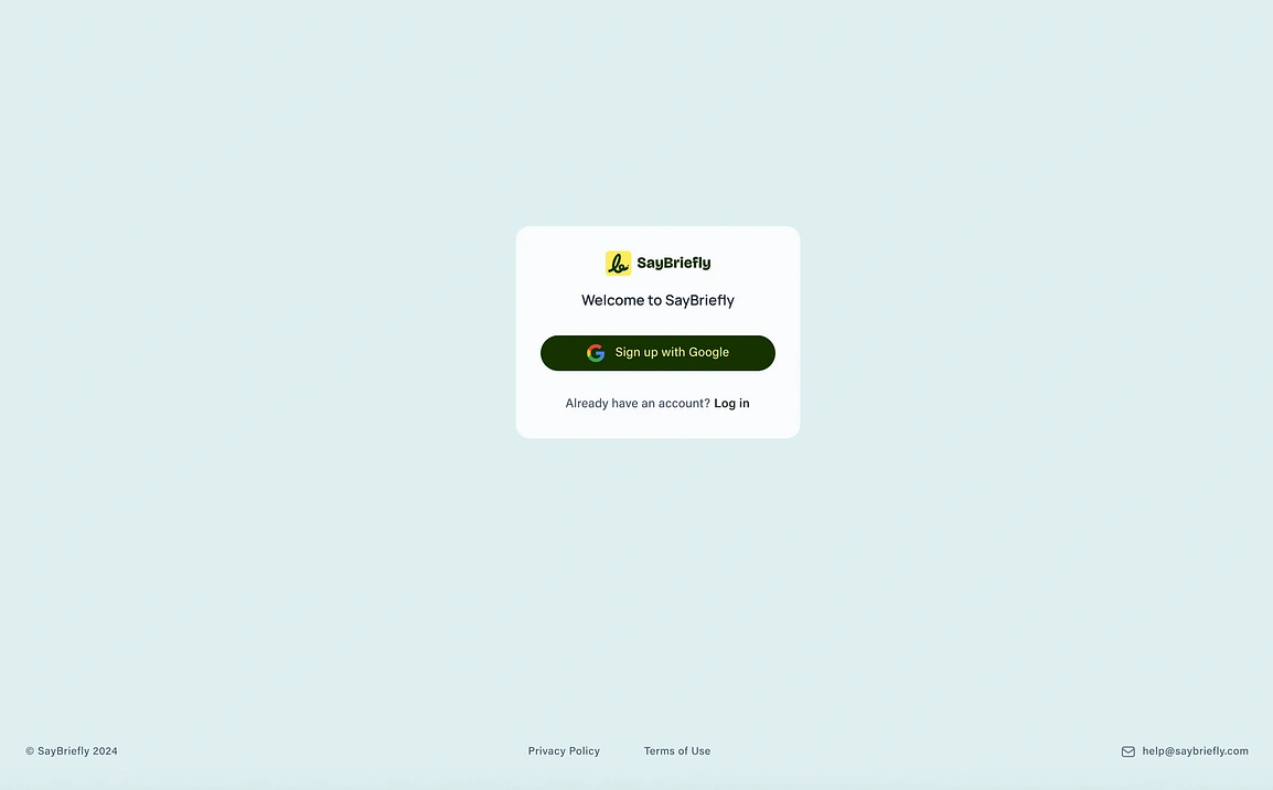
The
first step in the user journey is designed to be frictionless. I opted
for a Google single sign-on (SSO) to eliminate the need for manual
form-filling, allowing users to get into the platform instantly.
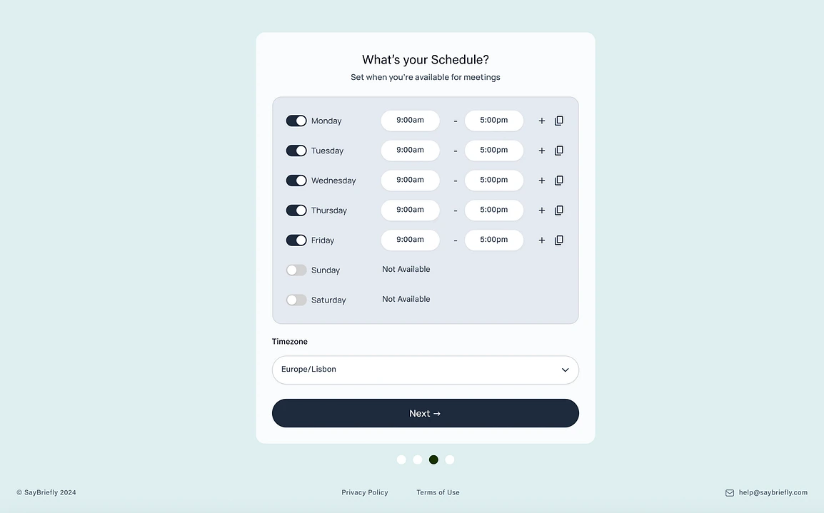
After
signing up, the user defines their core availability. I designed this
simple, intuitive interface to make it easy for users to set up their
meeting schedule, which is a foundational step for the platform’s AI.
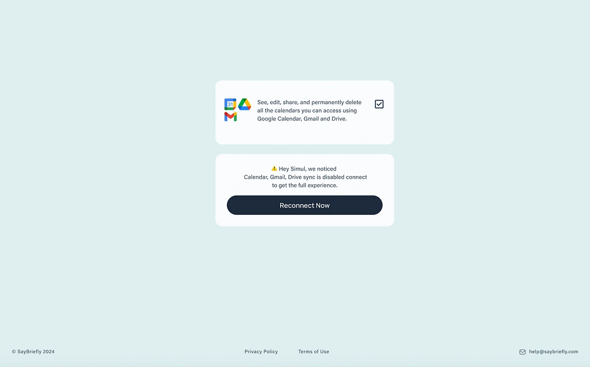
This
step is where the platform shows when the user didnt give access
properly saybrieflyis. I designed this screen to clearly communicate the
necessary Google integrations, which allow our AI to capture and
analyze conversations from every channel.
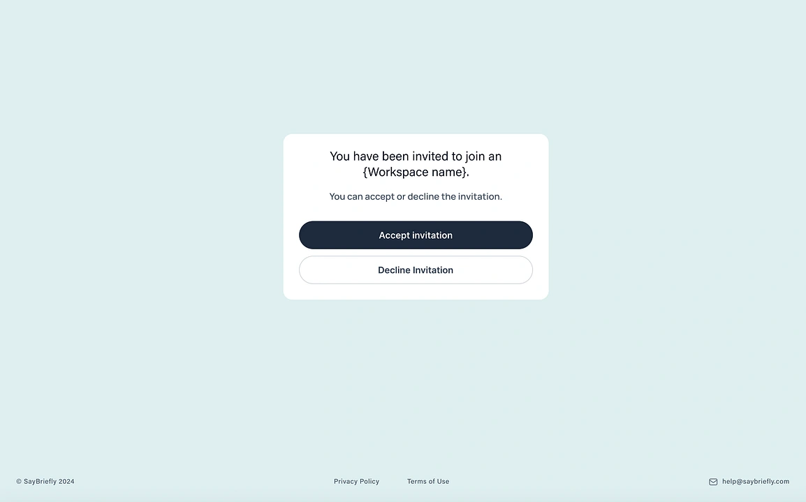
For
team-based workflows, a seamless invitation process is key. I designed
this simple and direct modal to make it effortless for new members to
join a project workspace and get up to speed quickly.
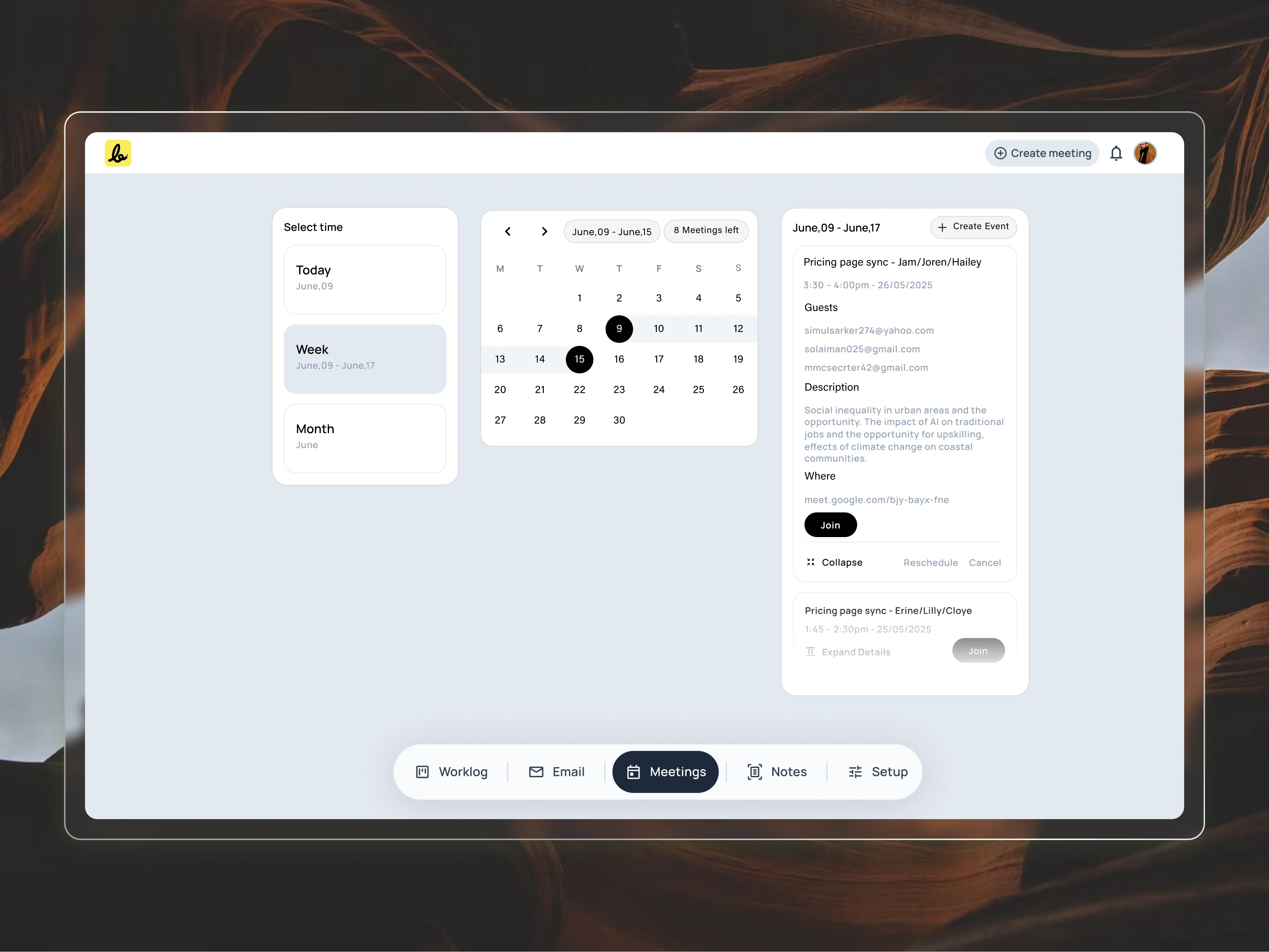
Clarity Over Clutter: A Calendar Reimagined
The goal was to replace the noisy, traditional calendar grid with a clean experience focused only on what’s important.
Agenda-First Design: The main view is a simple list of events, not a grid of empty hours. This keeps the user’s focus on their actual schedule.
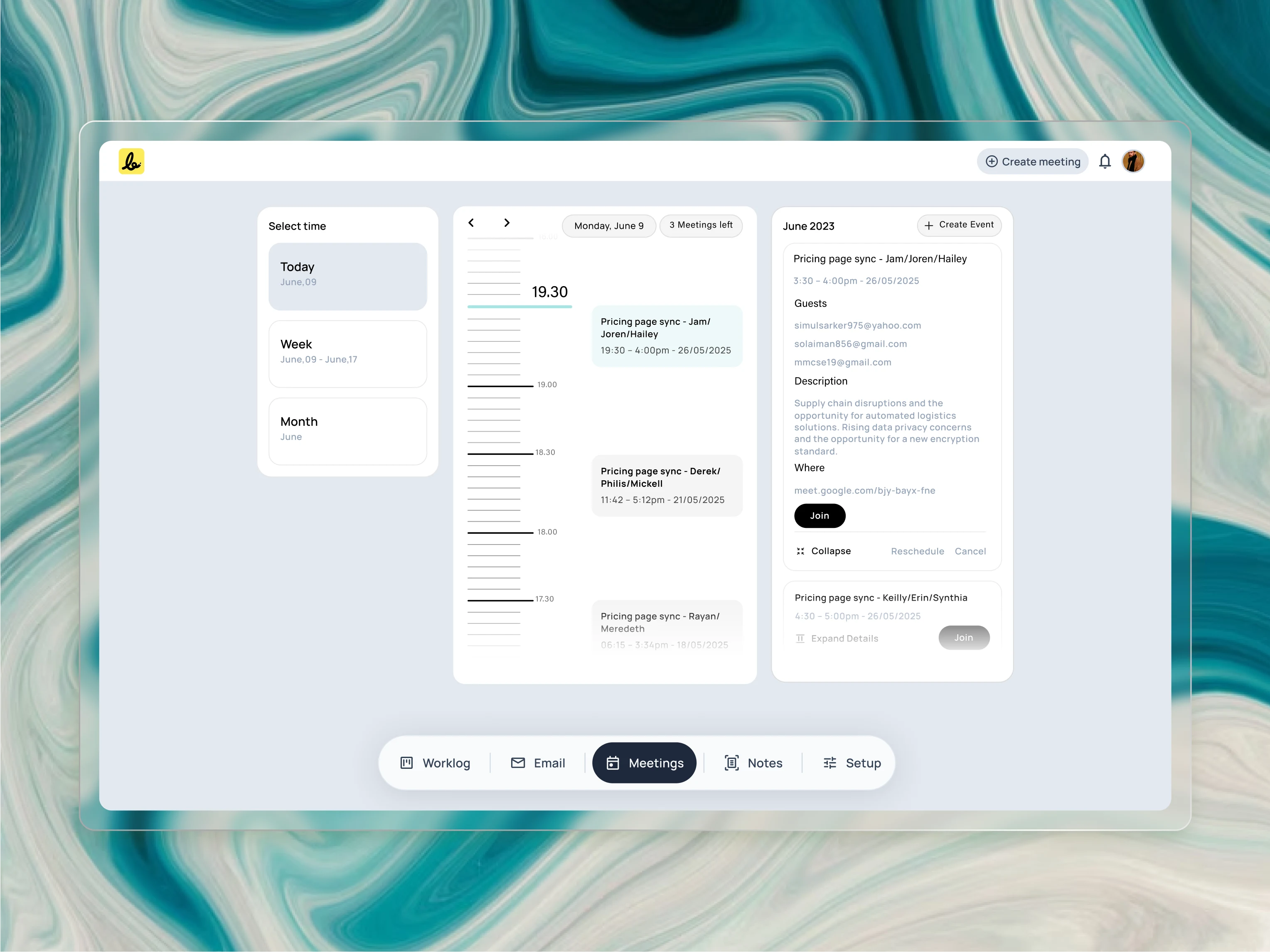
To
create clarity, I reimagined the traditional calendar. This “Today”
view uses a unique vertical timeline to help users intuitively feel the
flow and density of their day, focusing on the agenda rather than on
empty hours.
Visual Timeline for “Today”: The daily view uses a unique timeline to help users intuitively feel the flow and density of their day, which a simple list cannot do.
Get Simul S.’s stories in your inbox
Join Medium for free to get updates from this writer.
The
"Week" view is designed as a lightweight filter, not an overwhelming
grid. This allows users to quickly navigate to a specific day and see
their schedule without the visual noise of a traditional calendar.
Lightweight Navigation: The “Week” and “Month” selectors are compact filters, not overwhelming boxes, making it easy to look ahead without the clutter.
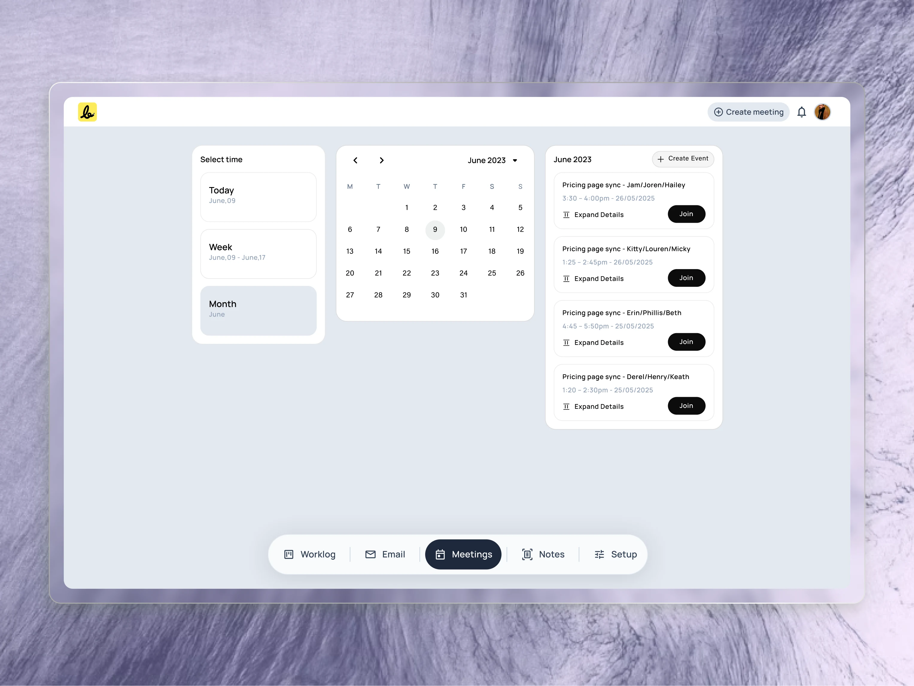
For
long-term planning, the “Month” view provides a familiar calendar grid.
I designed it to be a clean, compact module that works in harmony with
the agenda list, giving users a complete overview without clutter.
A Guided Setup for a Powerful Booking Page
To make a powerful tool feel simple, I designed the setup process as a guided journey across six clear tabs. This step-by-step approach allows a user to build a highly customized booking experience without any confusion.
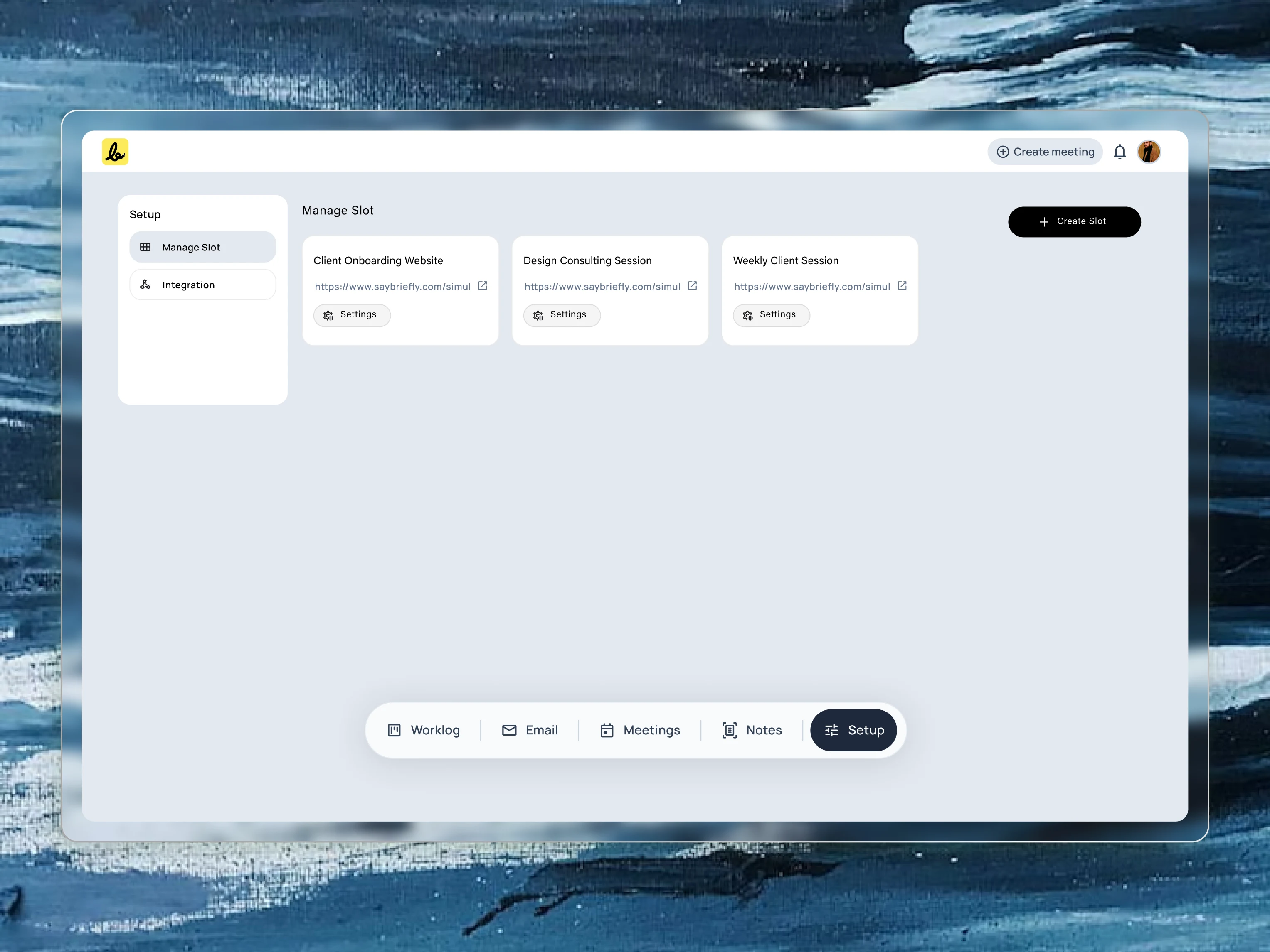
To
support users who offer different types of services, I designed a
“Slot” management system. Each slot acts as a reusable template for a
specific meeting type, like a discovery call or a weekly check-in. This
screen is the central hub where users can create and manage all their
different offerings.
General: First, the user defines the basics giving the meeting a title and setting its duration.
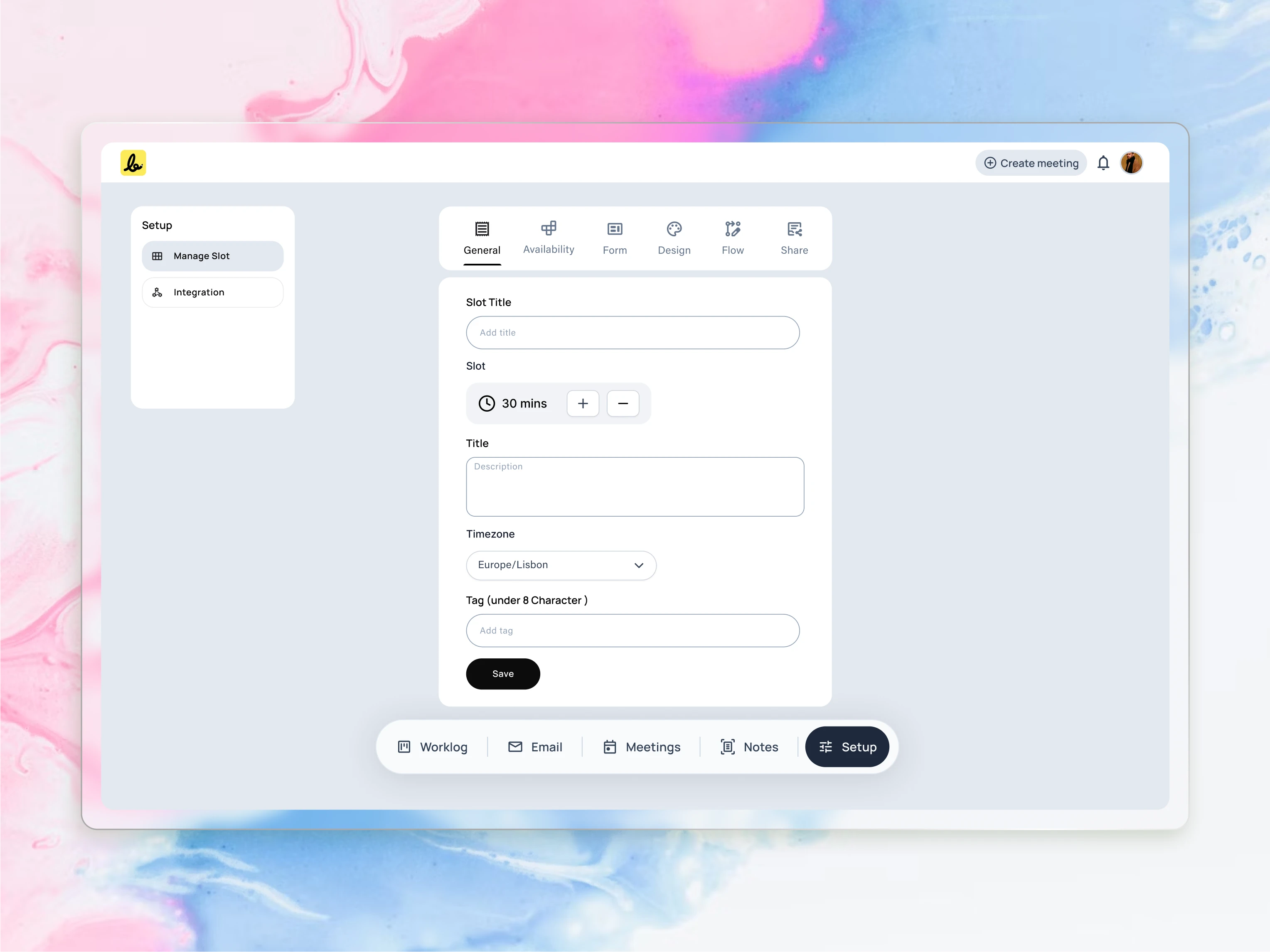
This
is the creation screen for a new “Slot,” or meeting template. I
designed this form to be a simple, single view where users can define
all the core details of a meeting type, from its title and duration to
its timezone.
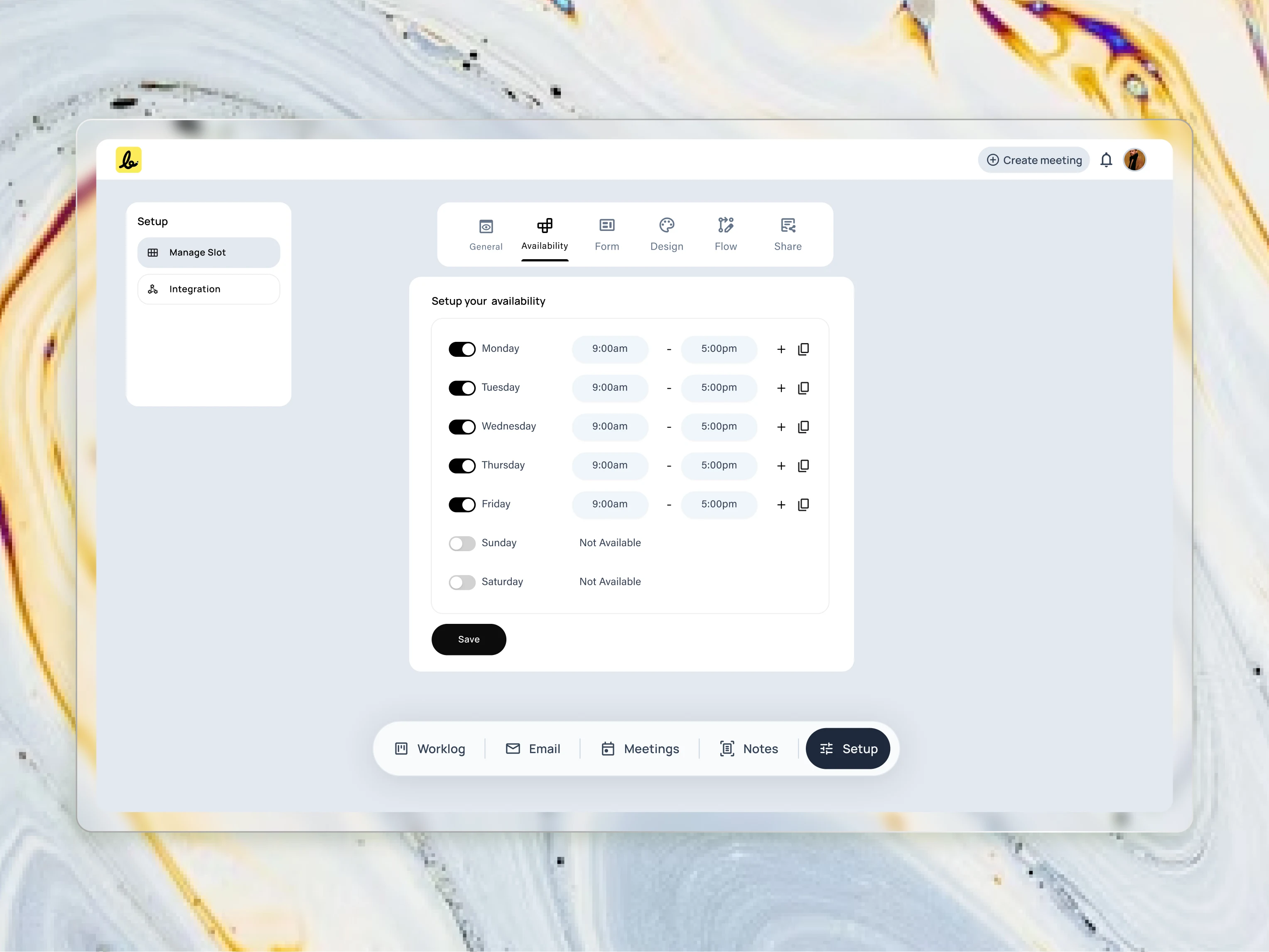
The
setup process begins with the fundamentals. I designed this clean
interface to make it effortless for users to define their core
availability, which powers the entire scheduling engine.
Availability: Next, they set their weekly working hours, creating the master schedule for when they can be booked.
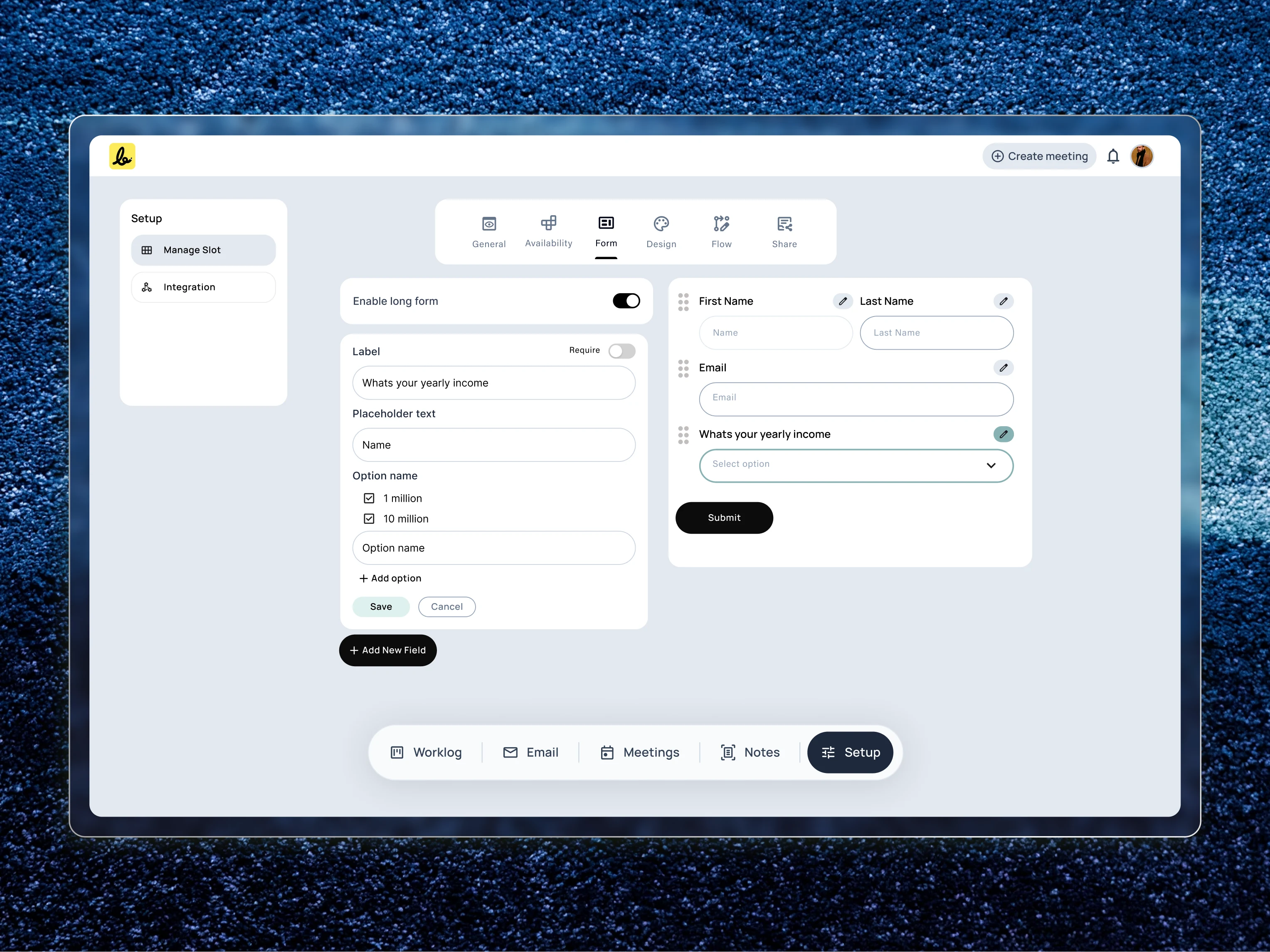
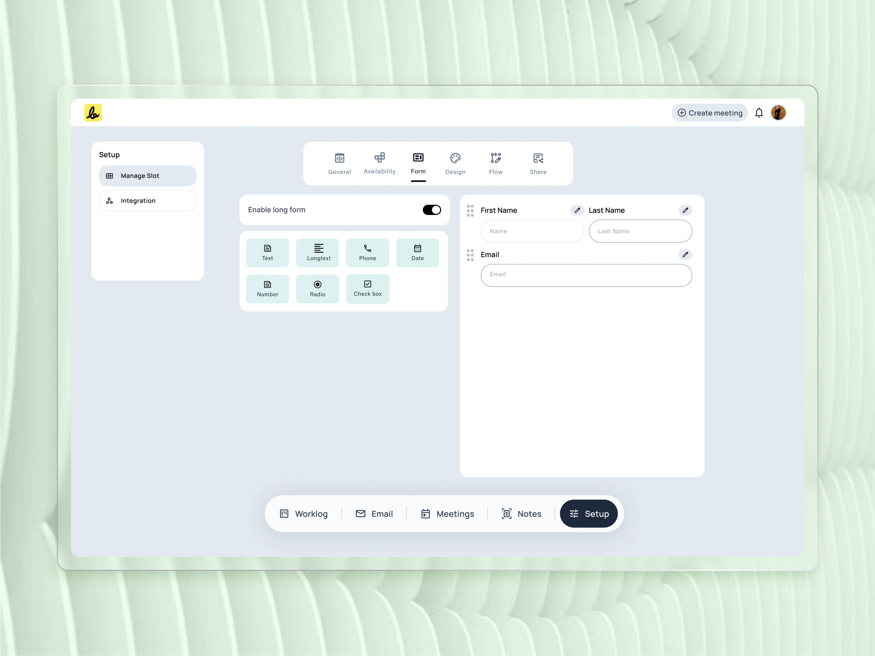
This
demonstrates the flexibility of the form builder. I included a wide
range of field types to empower users to create everything from a simple
contact form to a detailed pre-screening questionnaire.
Form: Here, the user builds a custom form with specific questions to learn about their clients before the meeting happens.
To
capture the right client information, I designed a flexible form
builder. This view shows how users can edit individual fields, giving
them granular control over the data they collect before a meeting.
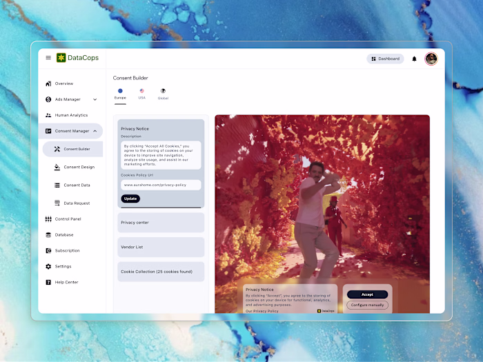
Design: The user applies their own brand colors, logo, and fonts to create a professional and trustworthy booking page.
Flow: This is where advanced logic comes in. The user can create rules to automatically pre-screen and qualify leads based on their form answers.
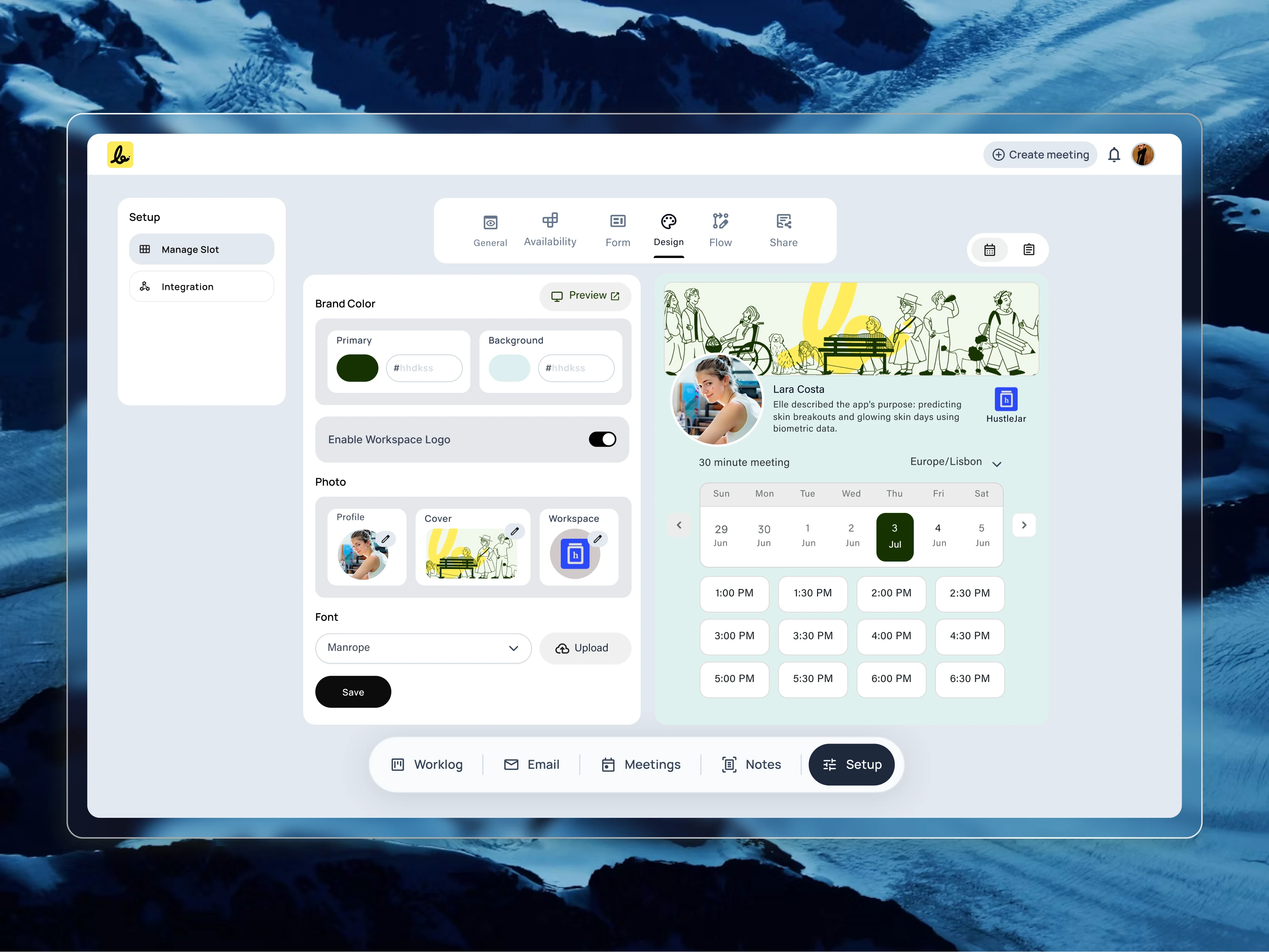
A
key insight was that the booking page needed to feel like an extension
of the user’s own brand. I designed these customization controls to give
users the power to create a seamless and professional client-facing
experience.
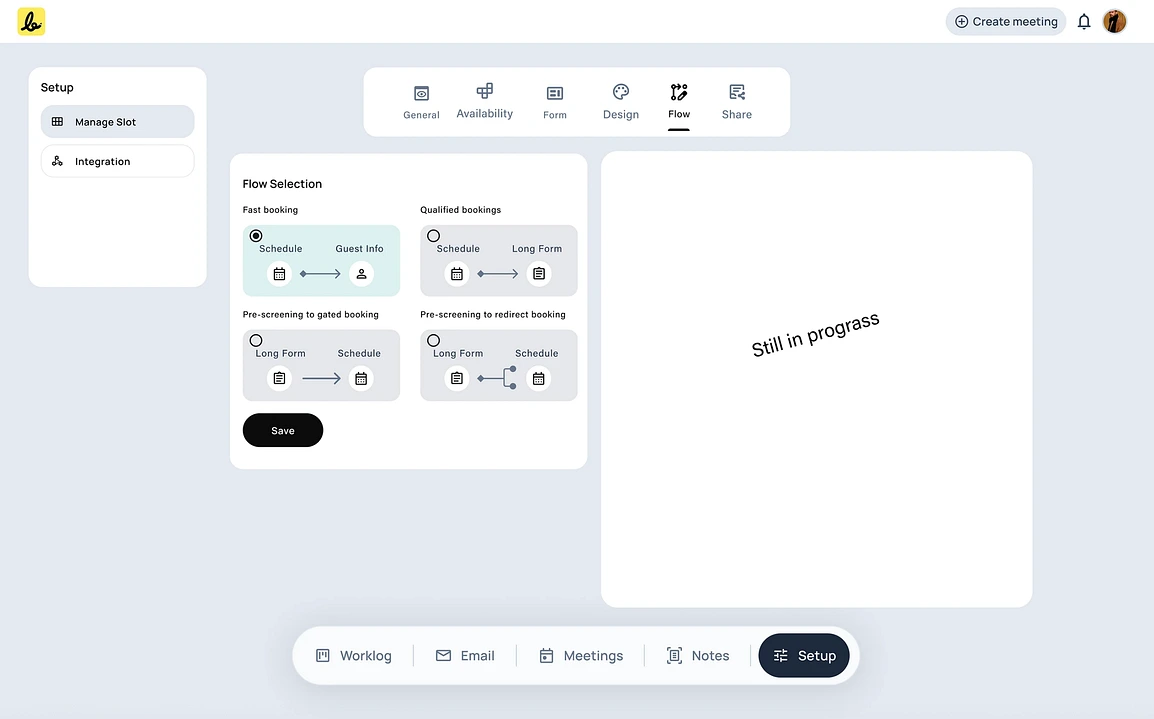
To
accommodate different user needs, I designed multiple pre-built booking
flows. This allows a user to choose between a simple, fast schedule or a
more robust flow that qualifies leads before a meeting.
Share: Finally, the user gets a clean link and a simple embed code to publish their intelligent booking page and start accepting meetings.
Here you go for the final public URL view
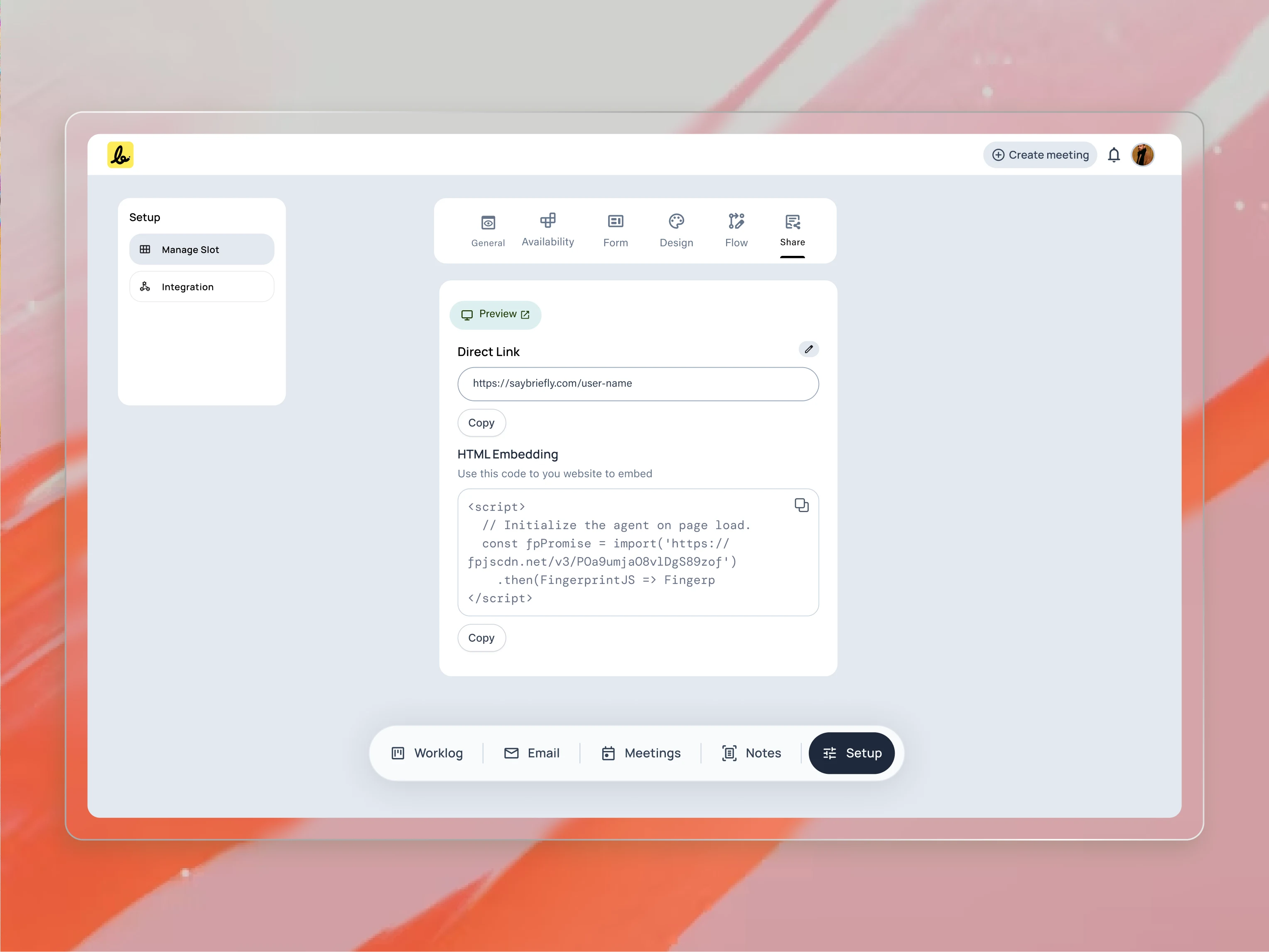
Once
the setup is complete, sharing is the final step. I provided both a
direct link and an HTML embed option to ensure users could easily
integrate their booking page anywhere, from an email signature to their
website.
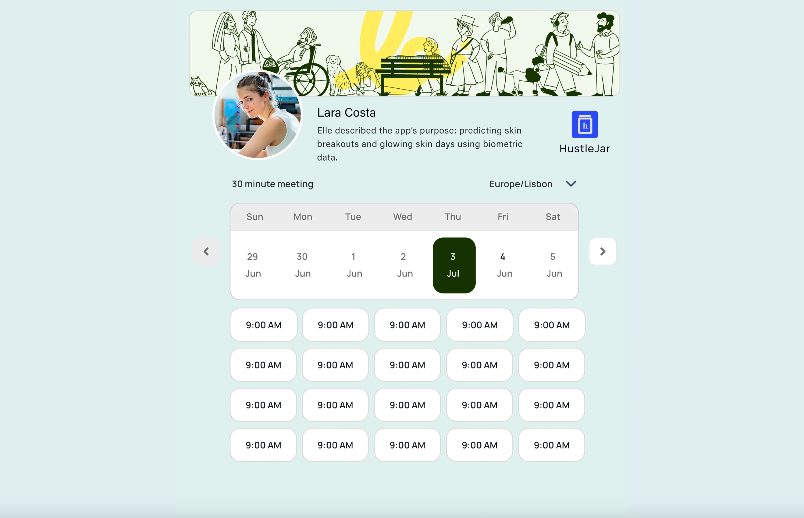
This
is the final result of the setup process: a clean, professional, and
fully branded booking page. I designed this to build trust and provide a
seamless scheduling experience for my user’s clients.
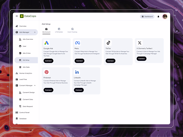
Keep the integration as simple as possible
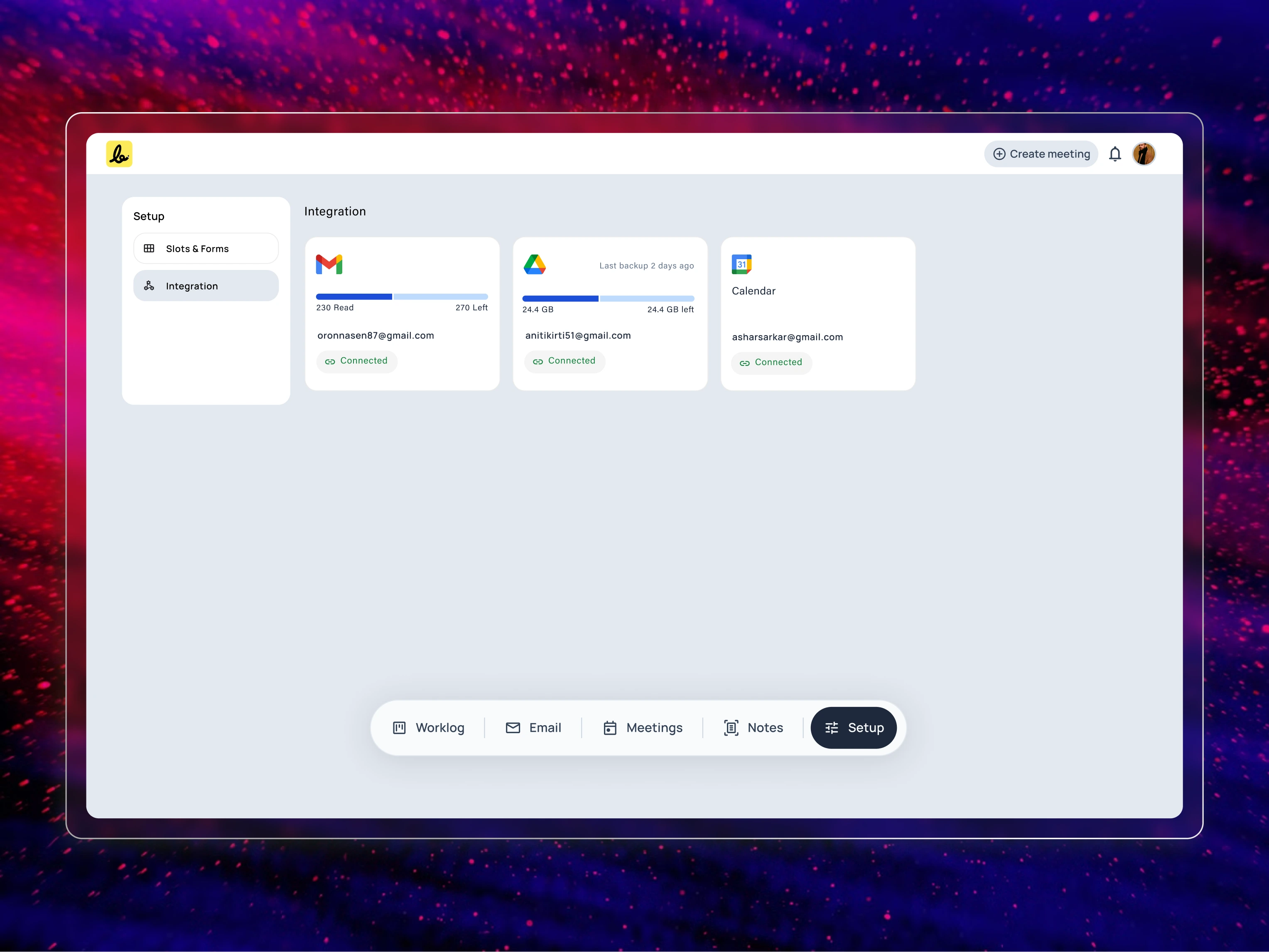
The
platform’s intelligence relies on seamless integration with the user’s
existing tools. I designed this clear, card-based interface to give
users an at-a-glance overview of their connected accounts and their
status.
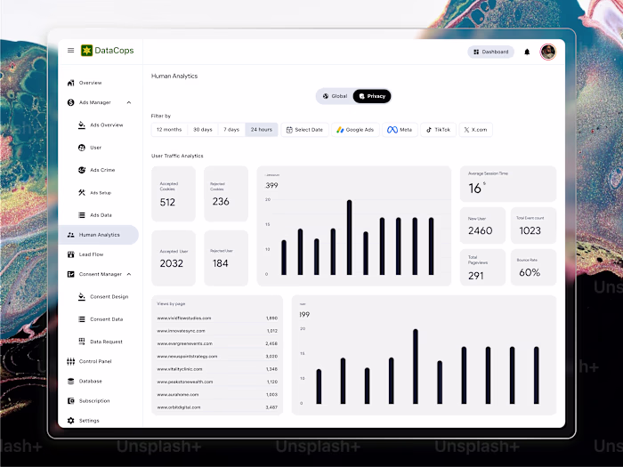
Meeting Intelligence: How the AI Tracks Changes Between Calls
When a user creates a new project in the system, SayBriefly instantly builds a dedicated workspace for it.
From that moment on, the system works in the background to automatically find and organize every ongoing communication for that specific project. This includes all future meetings, email exchanges, and notes.
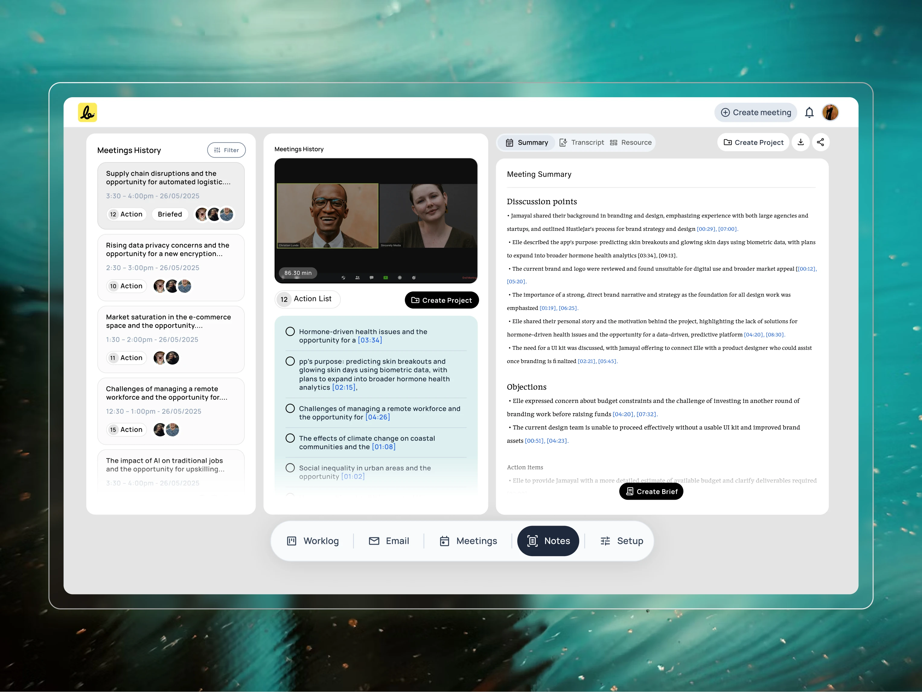
This
view demonstrates how the platform handles ongoing conversations. I
designed this interface to clearly display AI-generated notes with
revision and scope-based tracking, giving teams a definitive record of
what was agreed upon.
Everything is automatically filed in the correct project folder, so the user never has to worry about losing track of a conversation or manually organizing their work again.
The Briefing Space: Finalizing the Plan Before Kickoff
A project’s success is often decided before the first task is even started. To solve the problem of starting with a vague plan, I designed a dedicated “Briefs” space.
“Nothing kills creativity faster than contradictory feedback. When one comment on Slack undoes a decision from last week’s meeting, the entire project grinds to a halt. We need a single source of truth for what the client has actually approved.” — A Creative Director
This is where the client and the team work together to finalize the official project outline.
Here’s how it works:
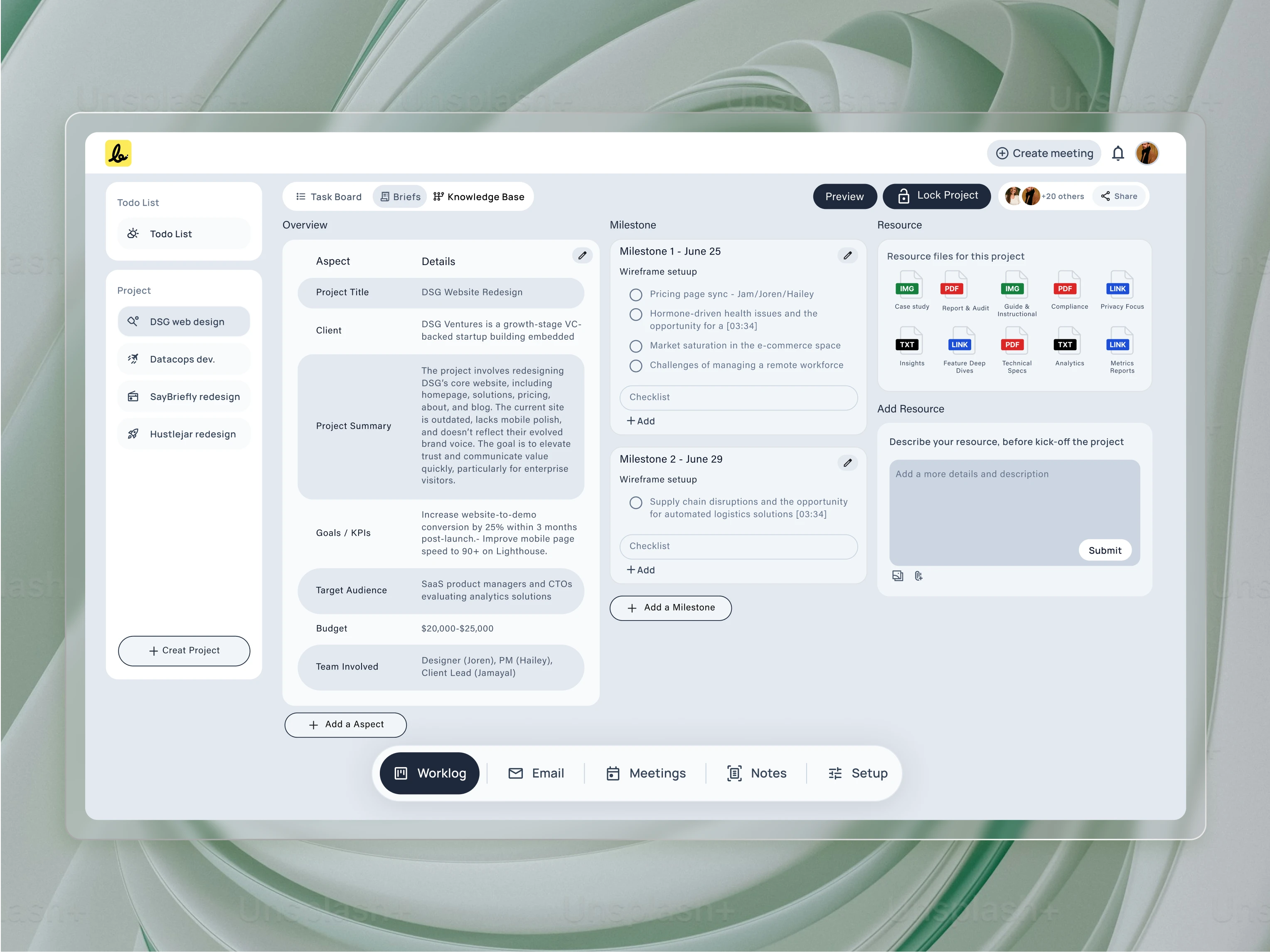
This
is the “Briefs” space, the single source of truth for the project. I
designed this three-panel layout to house the AI-generated brief, track
key milestones, and manage all project resources in one clear,
actionable view.
AI-Powered Draft: The system gathers all the key points from every meeting and email exchange and uses them to create an initial draft of the project brief. This saves hours of manual writing.
Collaborative Editing: This brief is a living document. The team and the client can view and refine the outline together, making sure every goal, deliverable, and detail is correct.
Final Approval: Once everyone is in agreement, the brief is sent to the client for a final, formal approval. This “locks” the brief and makes it the official plan for the project.
By finalizing the brief before the project kickoff, everyone starts with a shared understanding. This process creates a single source of truth that protects the project from confusion and future scope creep.
From Brief to Execution: The Smart Workspace
Once the project brief is locked, it becomes the intelligent heart of the project. The platform transitions from planning to execution, with the AI acting as a guardian for the agreed-upon plan.
Aligned Task Creation: The system automatically suggests tasks based directly on the locked brief. This ensures that all work, from day one, is perfectly aligned with the client’s approved goals.
Continuous Tracking: The AI keeps working in the background, tracking all new communications including emails, Slack messages, Loom videos, and follow-up meetings. It constantly compares these new conversations against the locked brief.
Automated Scope Notifications: If a client asks for something extra, the system automatically detects it. It then sends a friendly, neutral notification to both the client and the user, flagging the new request as “out of scope.” This removes the awkwardness of having to bring up that difficult conversation, keeping the process honest and transparent for everyone.
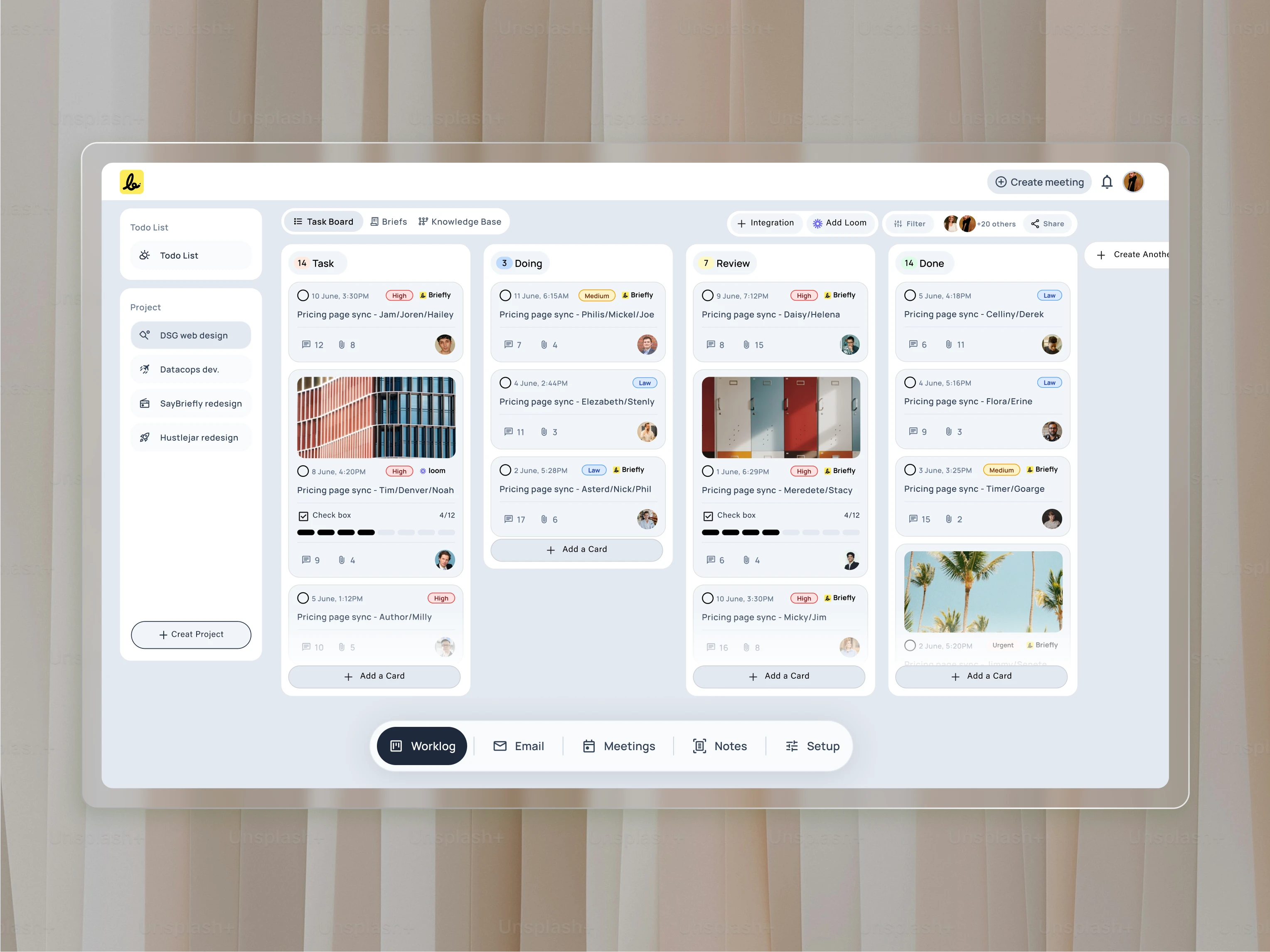
This
is where the brief turns into action. I designed this Kanban-style task
board to be automatically populated with tasks generated from the
approved brief, ensuring a seamless and accountable transition from
planning to execution.
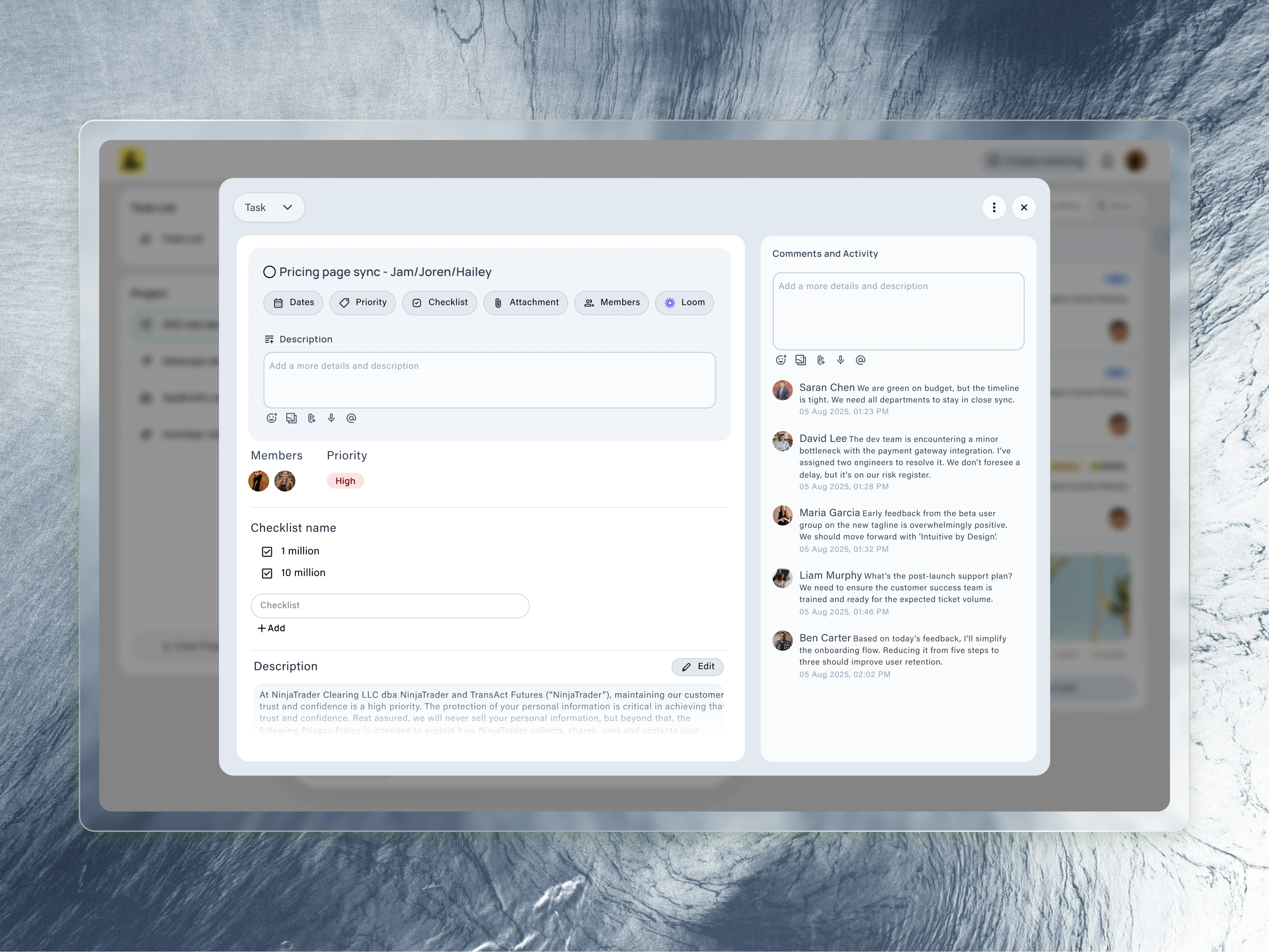
Every
task card expands into this detailed view. I designed this to be the
central hub for a single piece of work, containing its description,
priority, checklist, and assigned team members.

This
is where the platform’s AI truly shines. I designed this interface to
show how the system automatically generates a checklist from a meeting
recording, allowing users to instantly turn discussion points into
trackable tasks.
A To-Do List for a Calmer, Focused Mind
The biggest source of lost productivity isn’t the work itself, but the constant, distracting act of jumping between different apps from the calendar to email to a task list. I designed the Worklog — todolist to solve this by creating a true command center. The goal is to provide a single, focused screen where a user can see and do everything, without the chaos of context-switching.
The Worklog intelligently syncs information from the entire platform:
All Project Tasks in One View: It automatically pulls in the most important tasks from all of the user’s projects, creating a single, prioritized to-do list for the day.
Meetings as Actionable Items: Upcoming meetings appear here as to-do items, not just as appointments on a separate calendar. The user can see what’s next and join the call directly.
Communications That Need a Reply: The system is smart enough to identify important communications that need a response. A critical email from a client, for example, will appear as a task in the Worklog, ensuring a reply is never missed.
A Gentle Catch-Up: The “What I missed?” feature still acts as a safety net, gently bringing forward any unresolved items from the previous day, ensuring nothing falls through the cracks in this unified view.
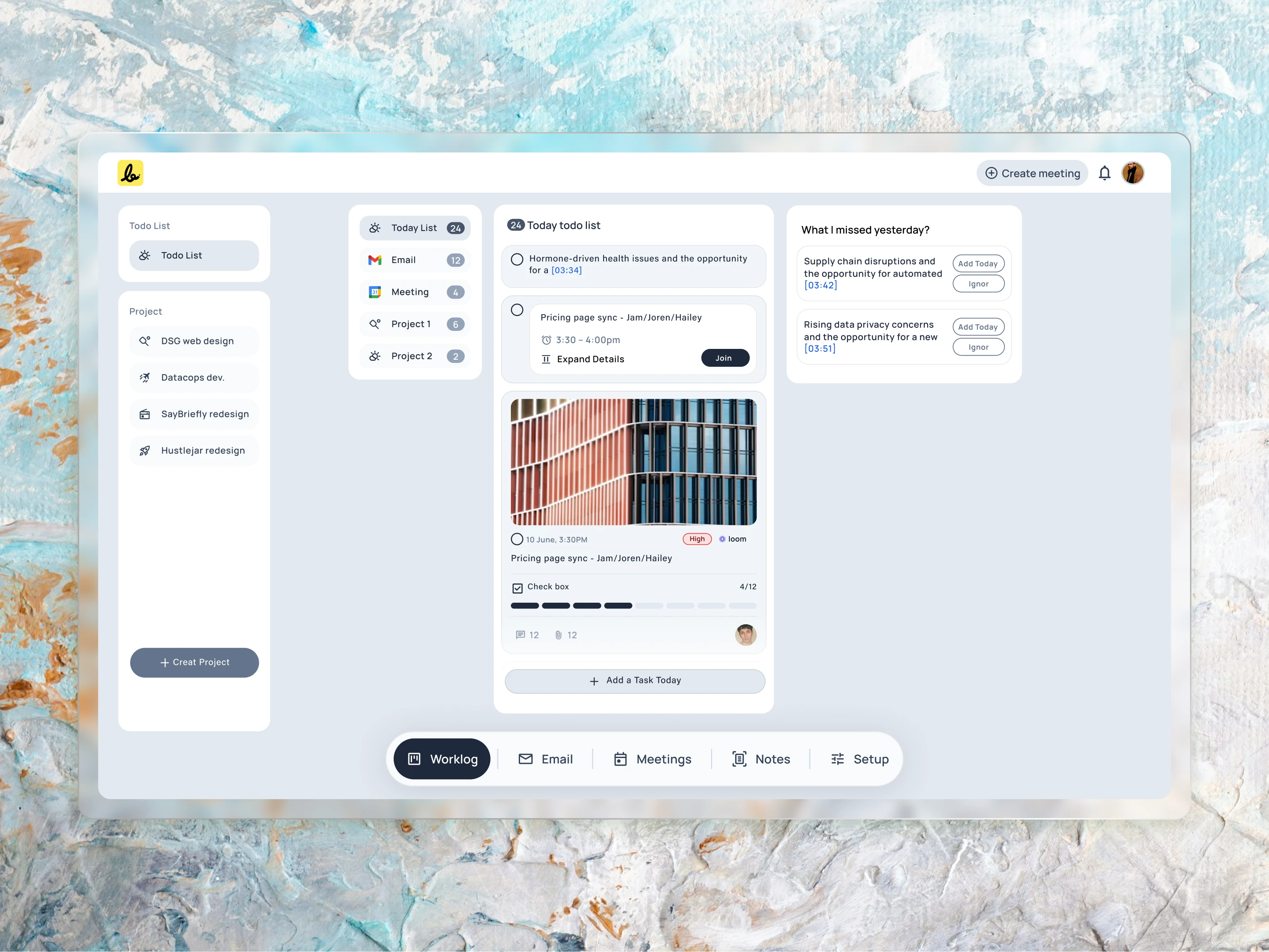
To
help users focus on what’s most important, I designed this “To Do List”
view. It provides a clear list of today’s tasks and includes a smart
“What I missed yesterday?” panel to proactively suggest overdue items,
ensuring nothing falls through the cracks.
This project is still in progress, but I have completed almost 90% of it. The project is scheduled to go live within 8–10 weeks, and I am very excited to see it live.
Ready to solve your next big challenge?
My passion is turning complex business problems into clear, successful, and user-friendly products. If you’re facing a challenge that requires more than just a surface-level design, I’m ready to help.
Connect me: simulsarker0007@gmail.com
Like this project
Posted Aug 16, 2025
Designed AI-powered platform for client project alignment.