CB2 | Brand and Web Design
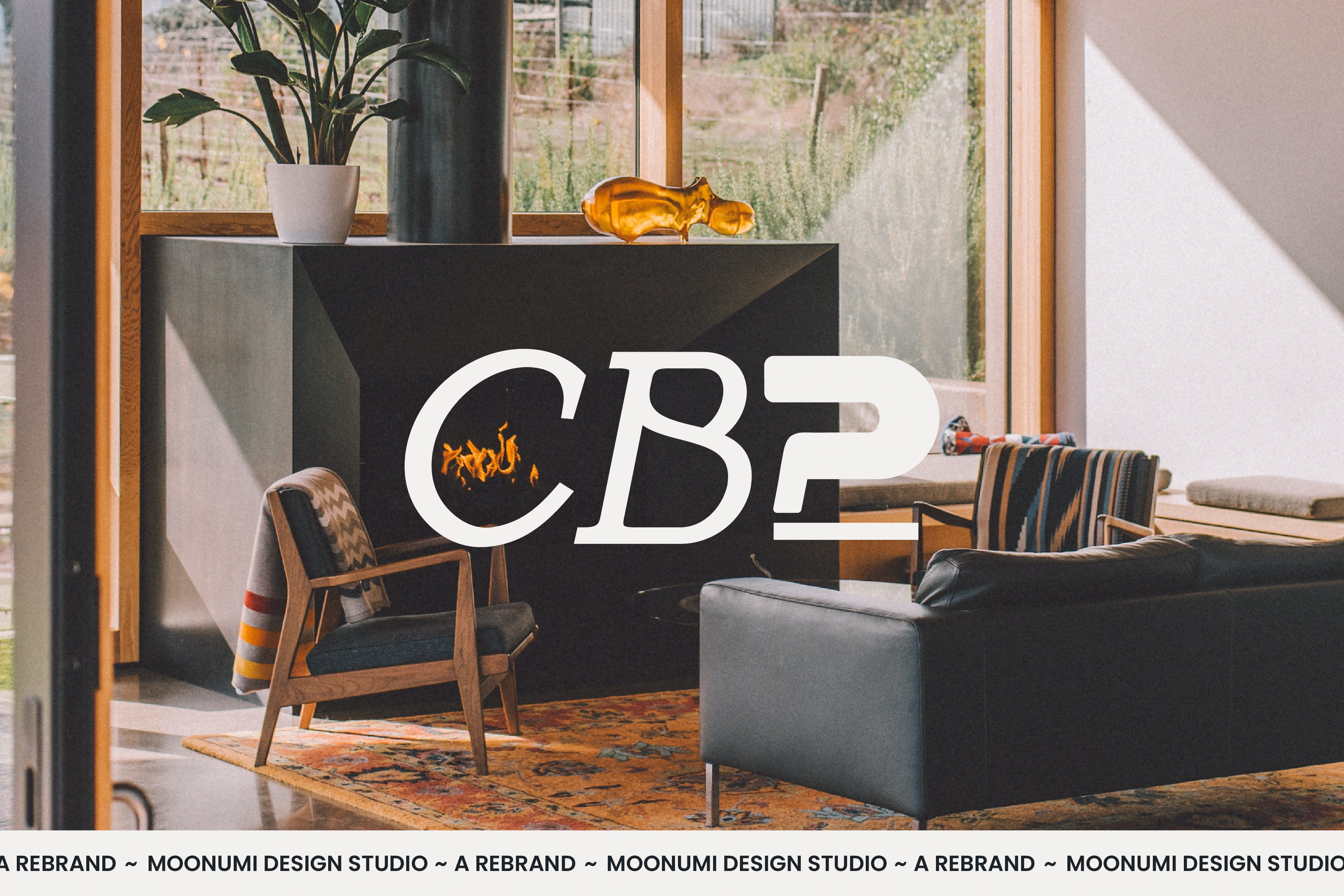
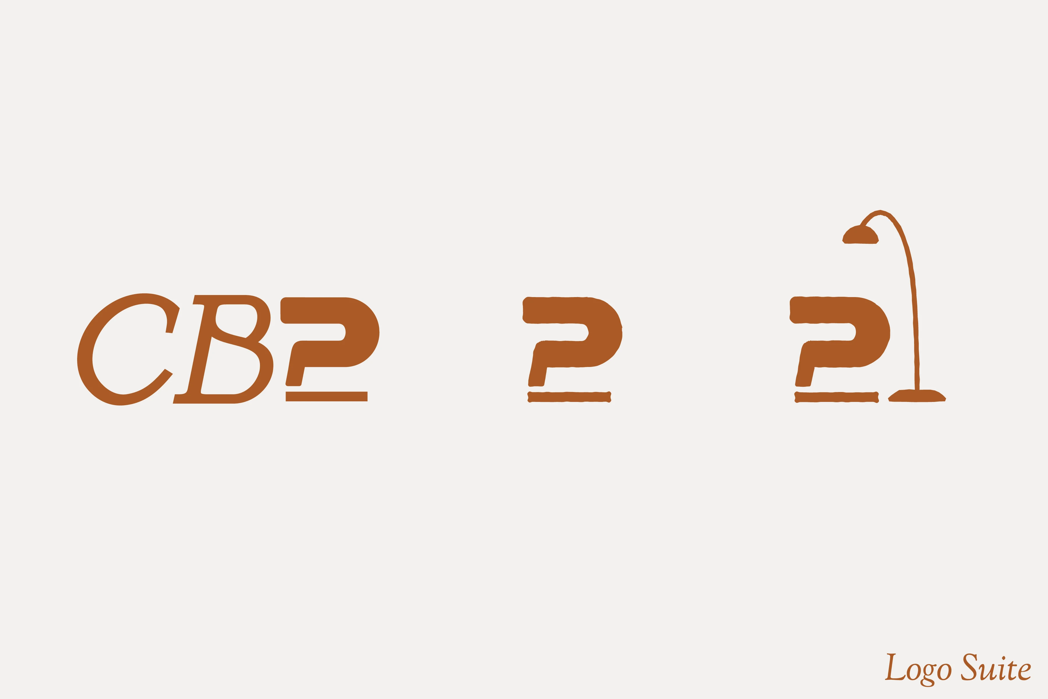
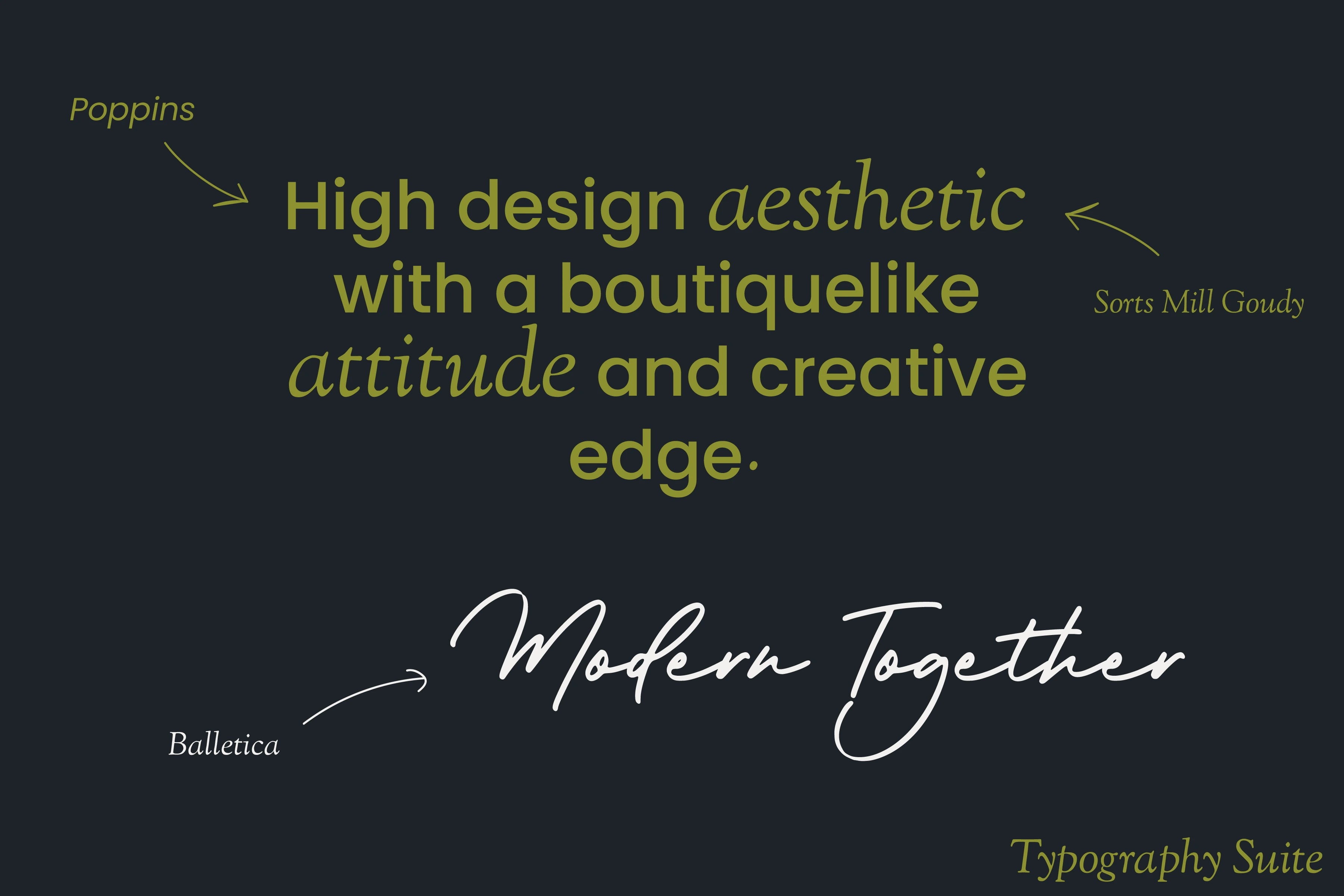
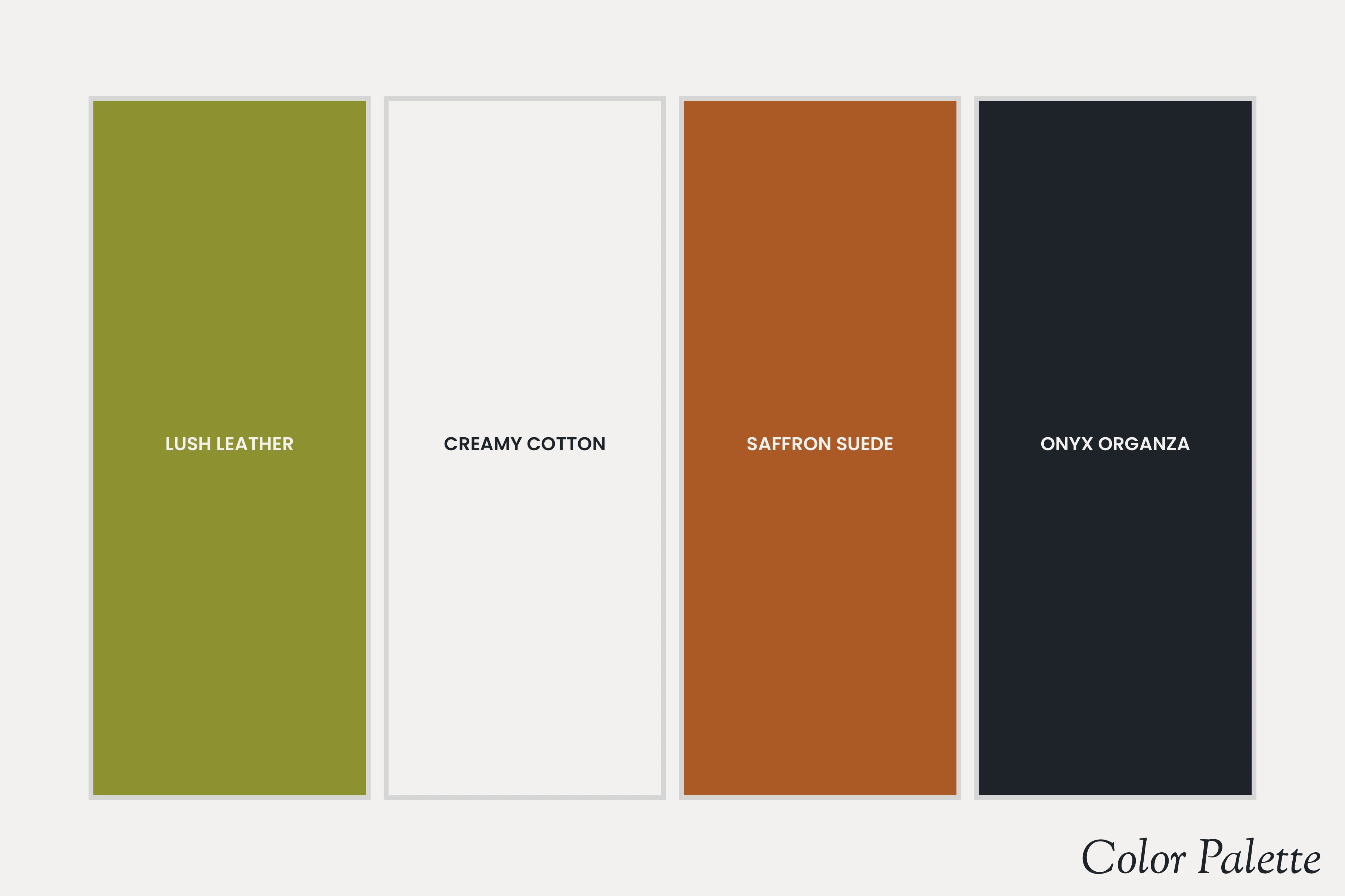
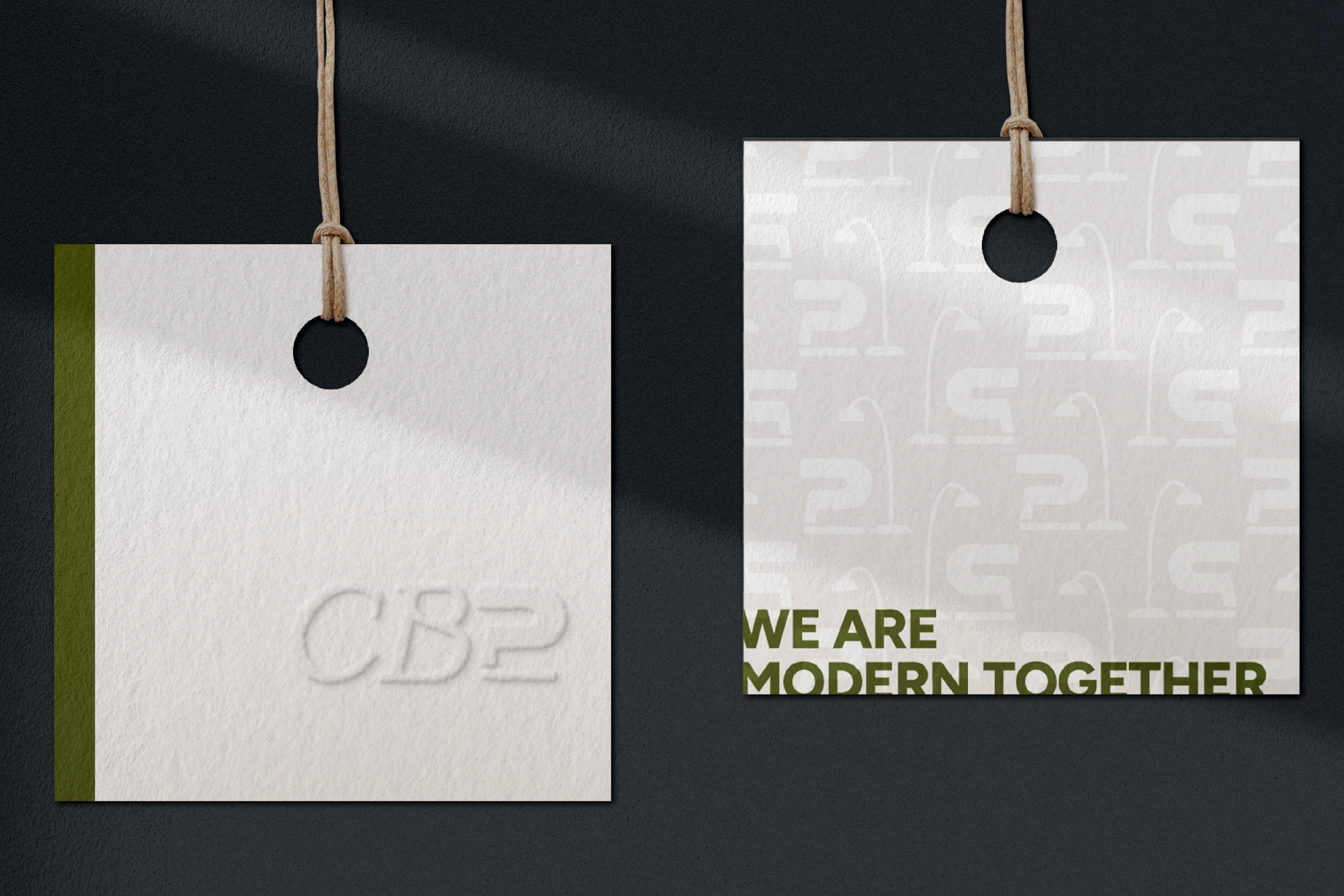
We love CB2! One of our favorite approachable, yet sophisticated, furniture brands with high quality pieces. However, we noticed that their logo and branding seemed a little...plain. It seemed to follow the trend of the very modern and simple (*cough* boring *cough*) sans serif logo with very little personality or flavor. There was no unique or distinct aspect to stand out amongst competitors. We thought we could add some...pizazz! We wanted this branding and collateral to emulate a friendlier, yet still modern and contemporary feel. This would make it easier to connect to their target audience, and help elevate them above their competitors in the furniture industry.

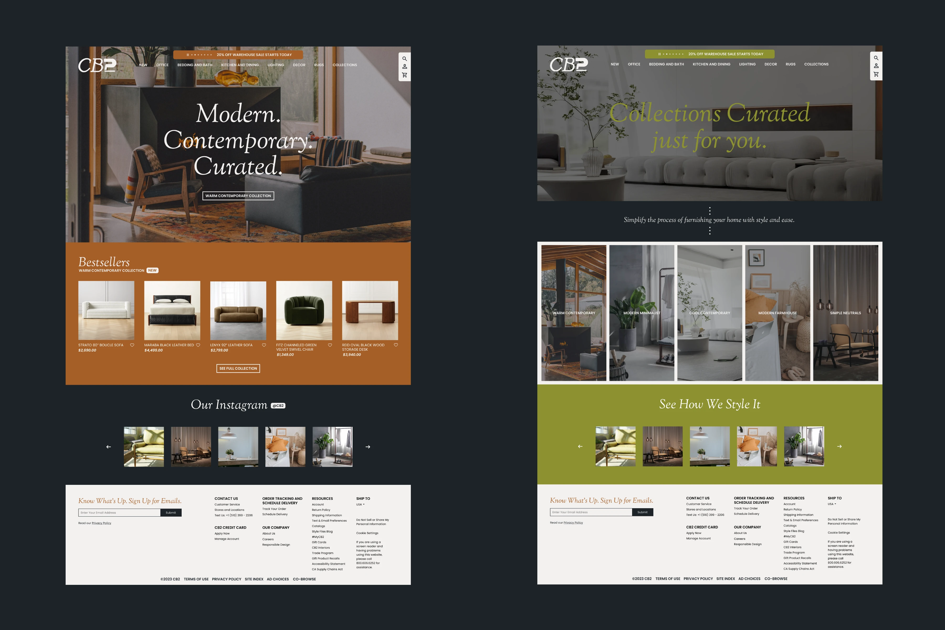
When visiting the official CB2 website, we noticed that it relied heavily on visuals from product photography, and the other elements were very secondary. The text and navigation bar seemed cluttered and confusing at the top of the page. Our main goals when redesigning the website was to add some more brand conscious elements and warmth in terms of style, as well as make the homepage easier to navigate for the customer. This took the website from overly simple/modern and cluttered, to more brand aware and less intimidating for the audience.
Like this project
Posted May 16, 2023
A rebrand and website redesign of the popular modern contemporary furniture brand, CB2.


