NOOK Brand Identity Design
Usama Mahmood
NOOK — Brand Identity Design
A self-initiated brand identity concept for a modern coworking and flexible workspace.
Overview
NOOK is a self-initiated brand identity concept built around one central idea — that a workspace should feel like it belongs to the people who use it, not the company that owns it.
The brief was simple: design a brand for a coworking space that feels warm, grounded, and human. Not another cold tech office. Not a corporate lobby. A place where independent workers, freelancers, and early-stage founders could genuinely feel at home.
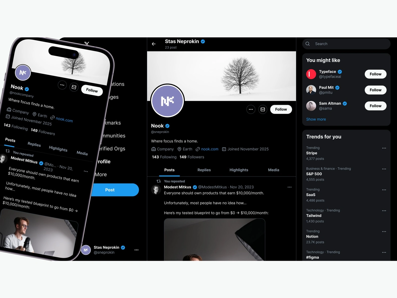
This project covers the full brand system — from initial concept and logo construction to color, typography, and real-world applications.

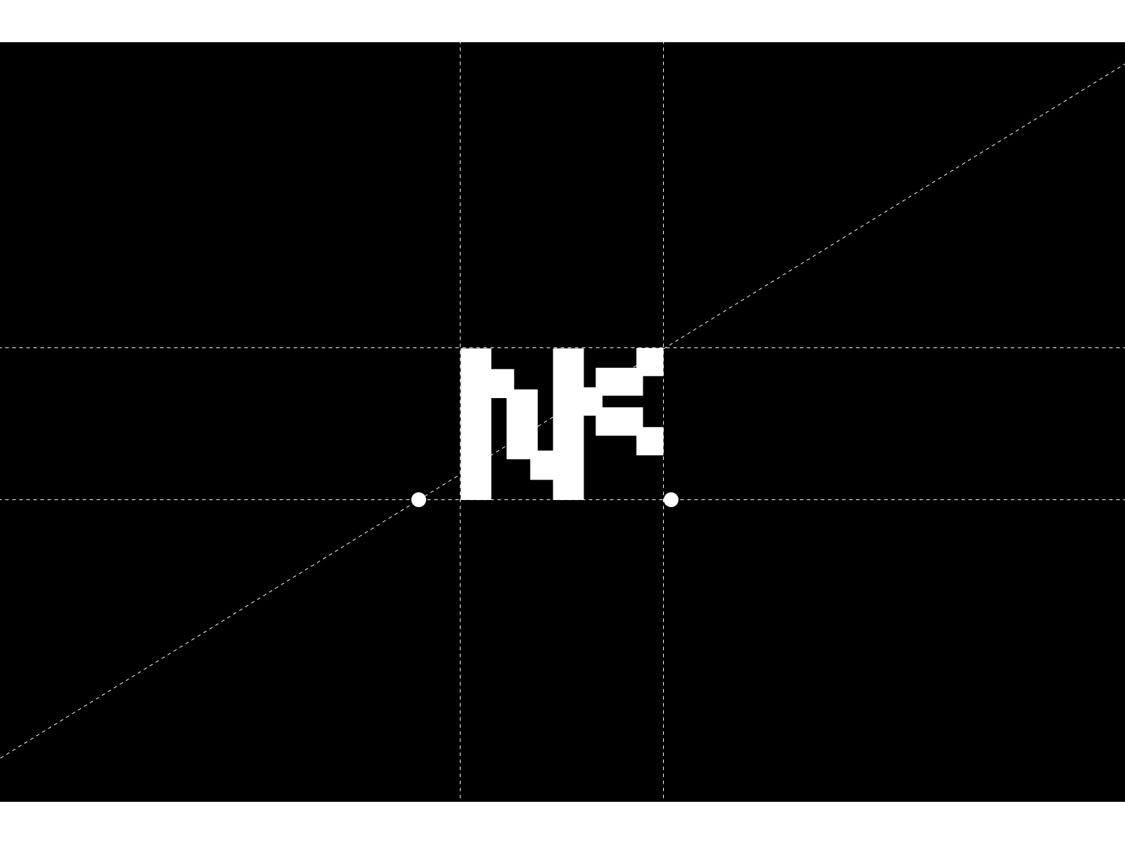
Logo Exploration
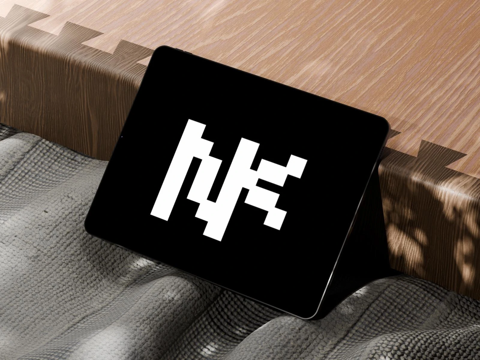
The logo went through three rounds of exploration. Early directions included a geometric abstract mark and a sans-serif wordmark. Both were rejected — the geometric mark felt too tech-forward, and the sans-serif felt too generic.
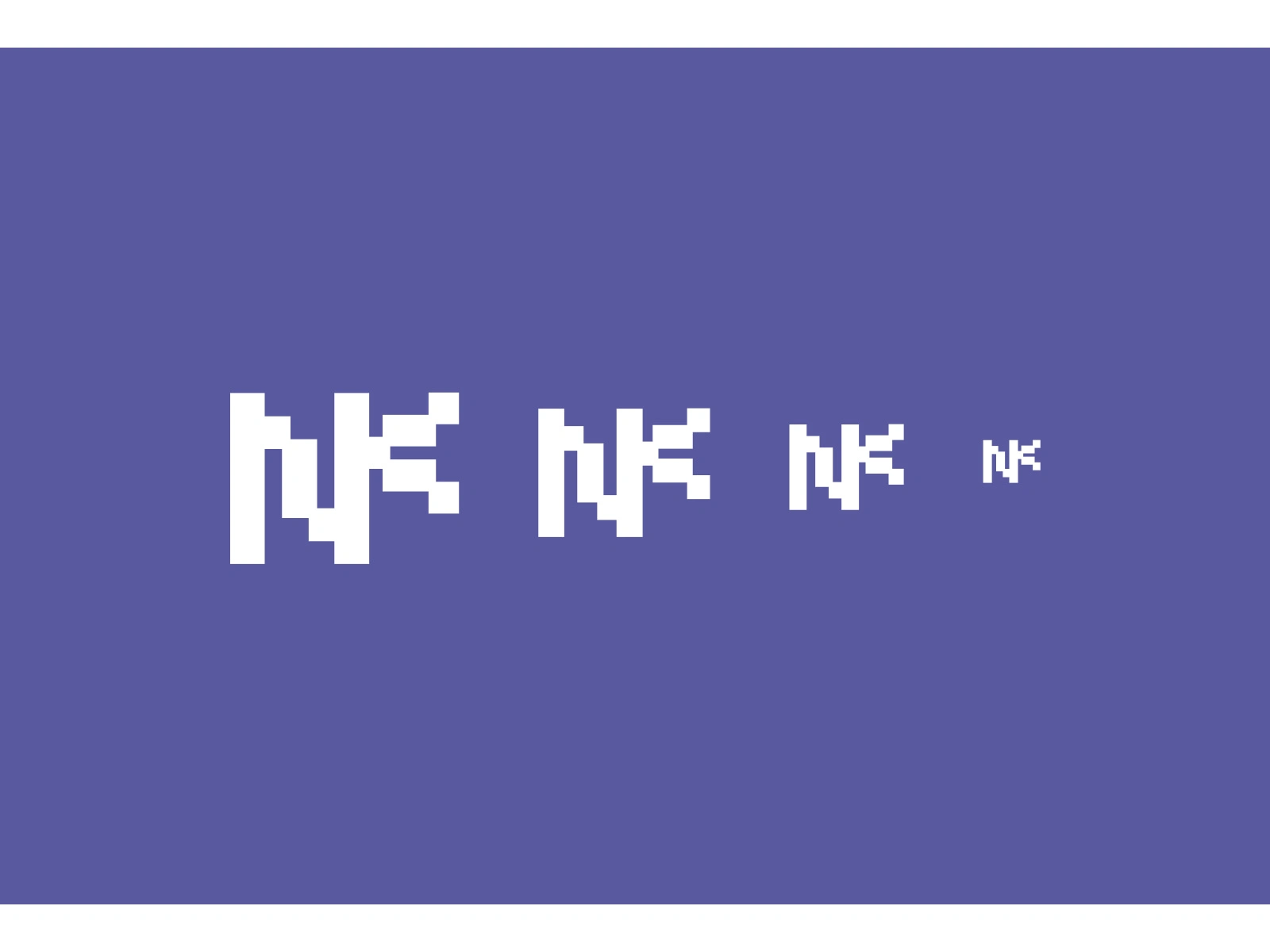
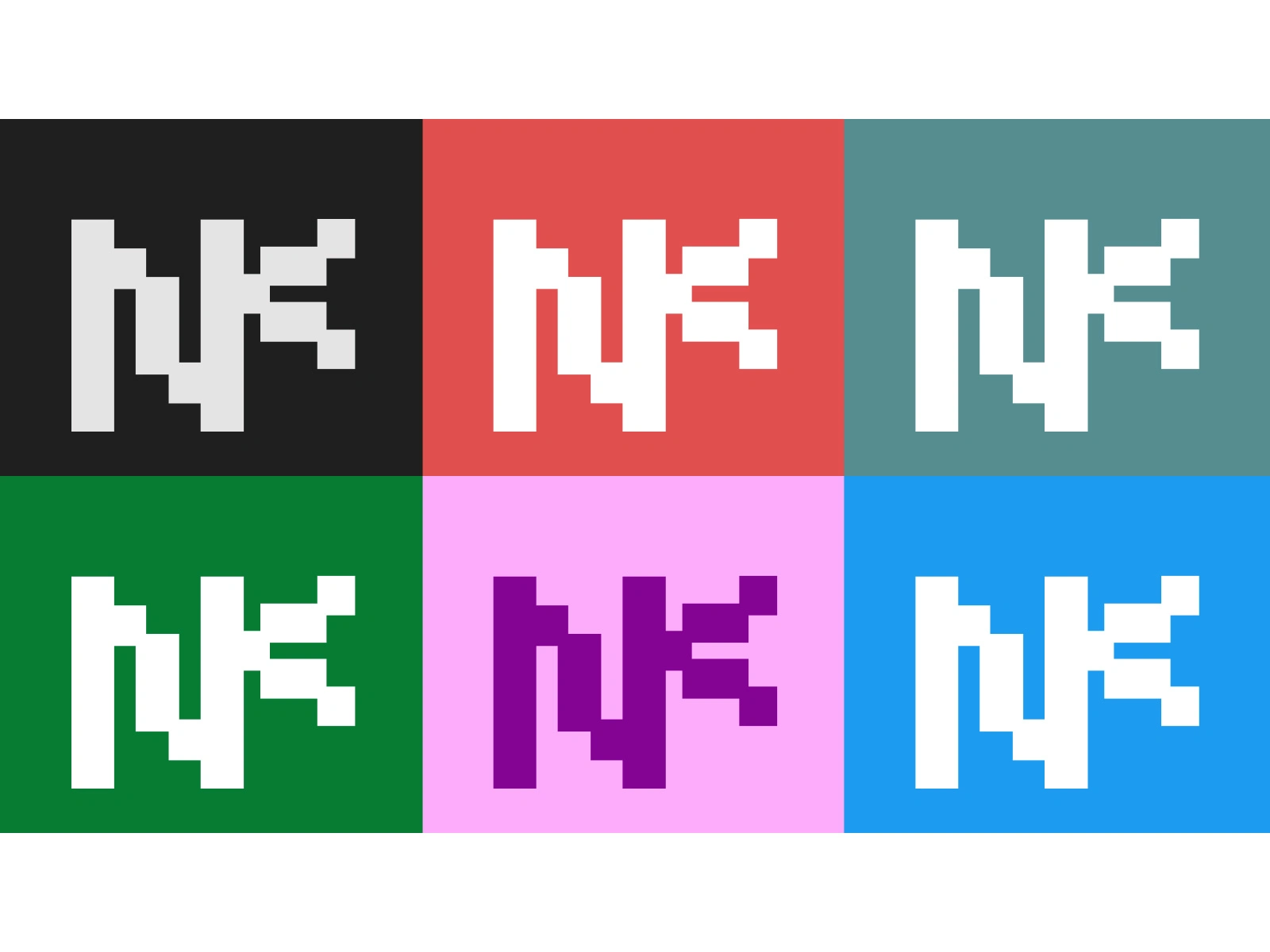
The final direction: an italic serif wordmark in Playfair Display. The italic cuts a confident, editorial silhouette. The weight is heavy enough to hold at small sizes. The single N lettermark is extracted directly from the wordmark for compact applications like app icons and stamps.
Like this project
Posted Mar 2, 2026
Developed NOOK brand identity from logos to application.
Likes
0
Views
2