VITAŌLIVA| Branding and Packaging
Emilio Gonzales
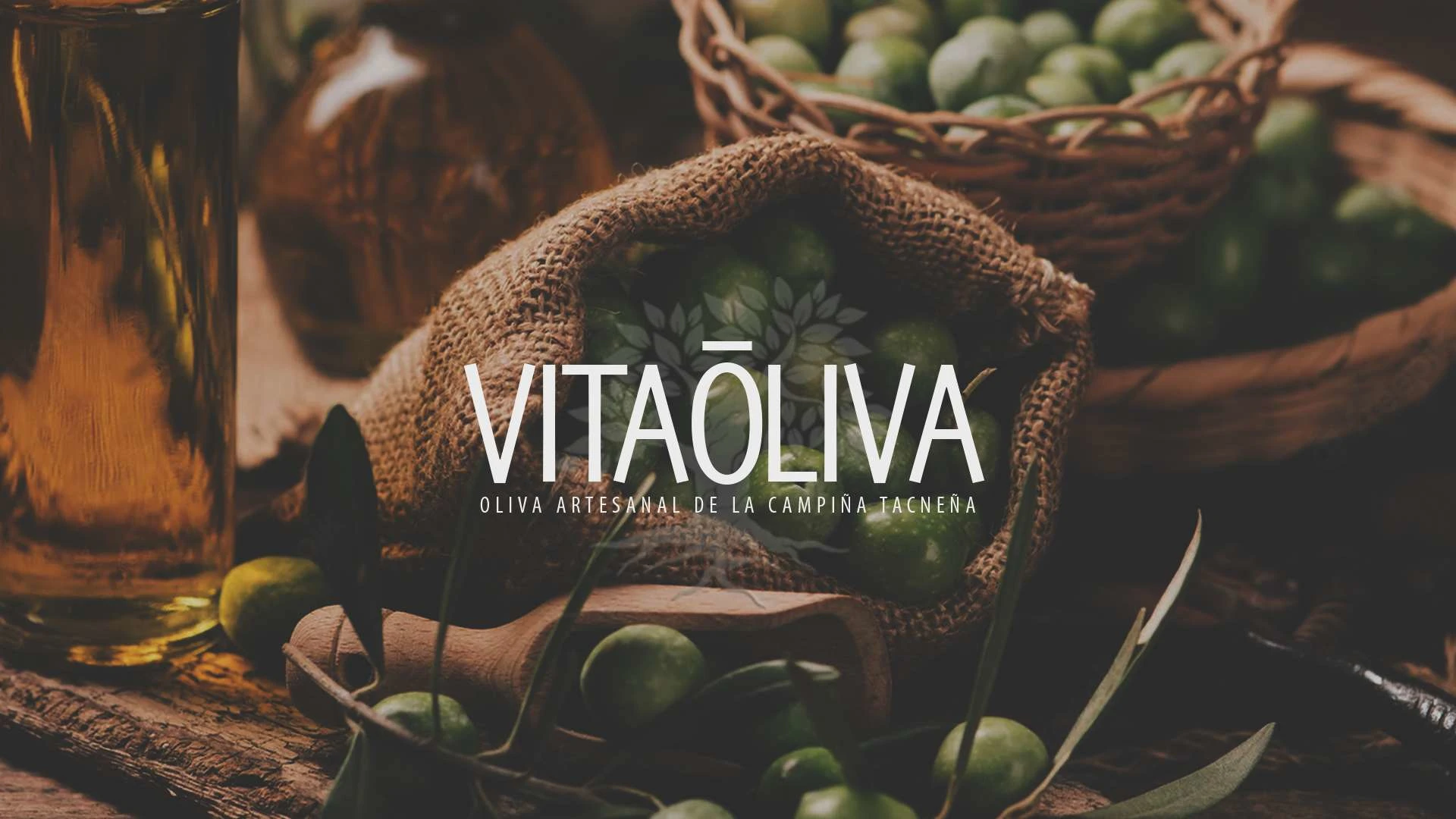
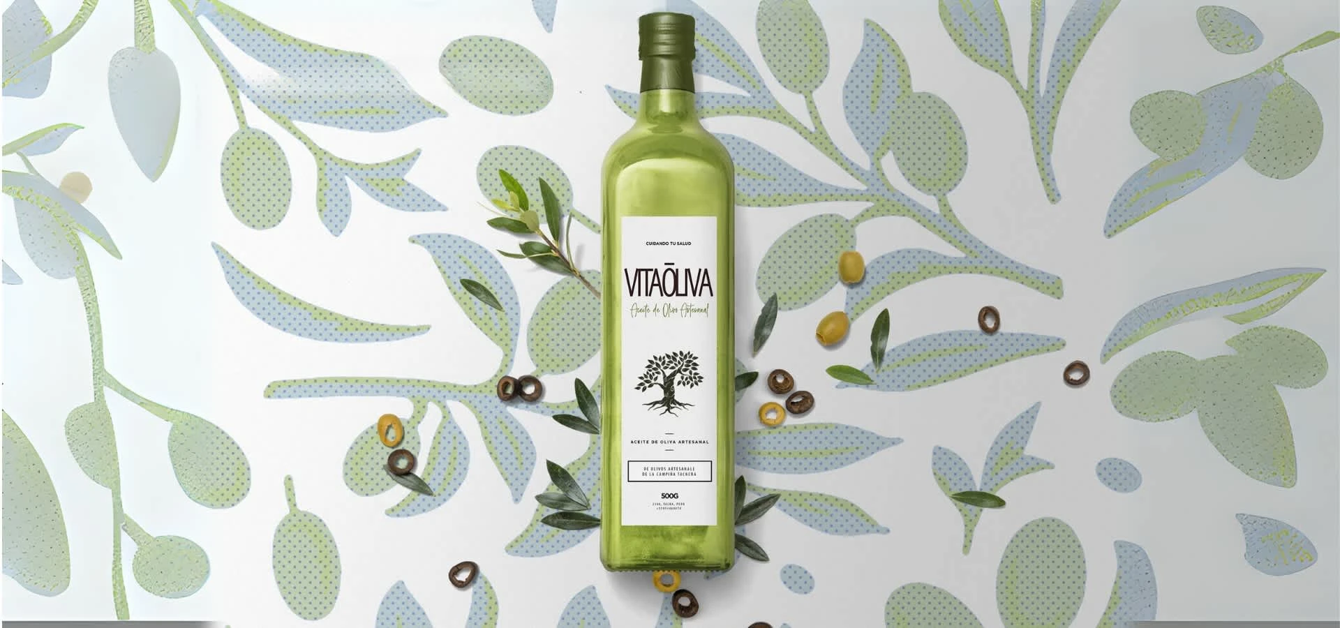
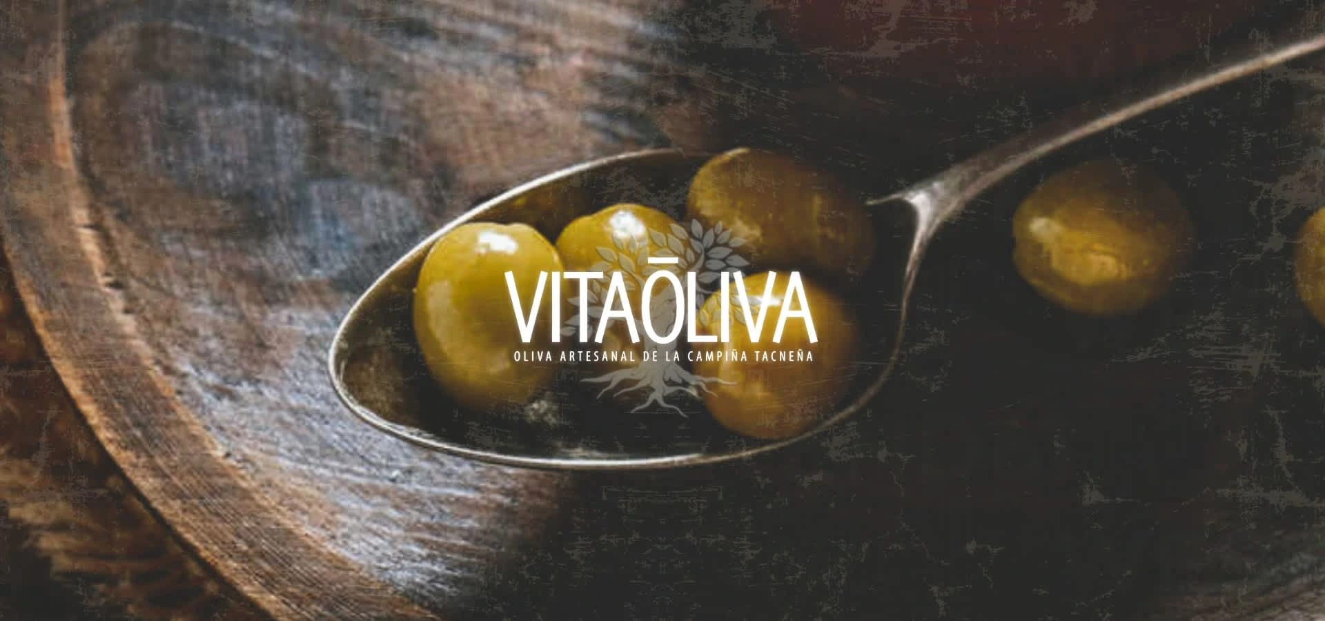
VITAŌLIVA is a Peruvian extra virgin olive oil brand that praises itself for its high-quality products. Their commitment to quality is evident in every bottle of oil they produce. The olives are carefully handcrafted and artisanally processed to preserve their natural flavor and nutritional value.
The brand name VITAŌLIVA draws its inspiration from two sources. The first is the Italian word "VITA," which translates to "life or to live" in English. The second is the Spanish word "oliva" which translates to "olive", reflecting the brand's most important resource, the artisanally picked olives used to make luxury high-quality extra virgin olive oil.
To further enhance the brand's identity and messaging, a complete branding package was necessary to effectively communicate the brand story and values to consumers. This included developing of an identity system, logo, packaging and so on.
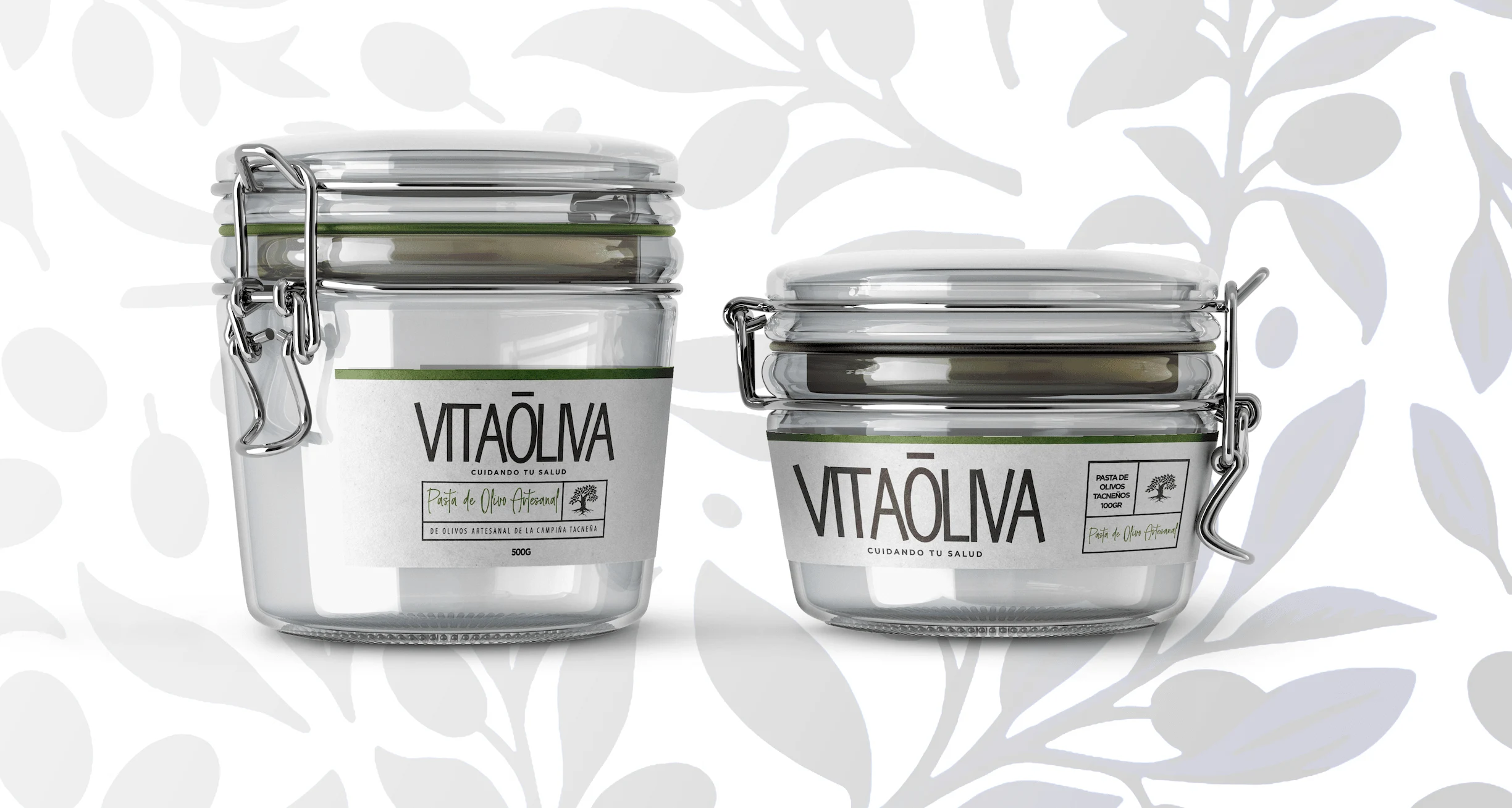
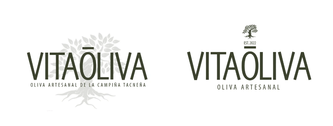
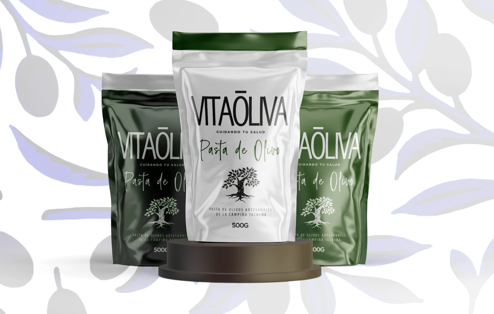
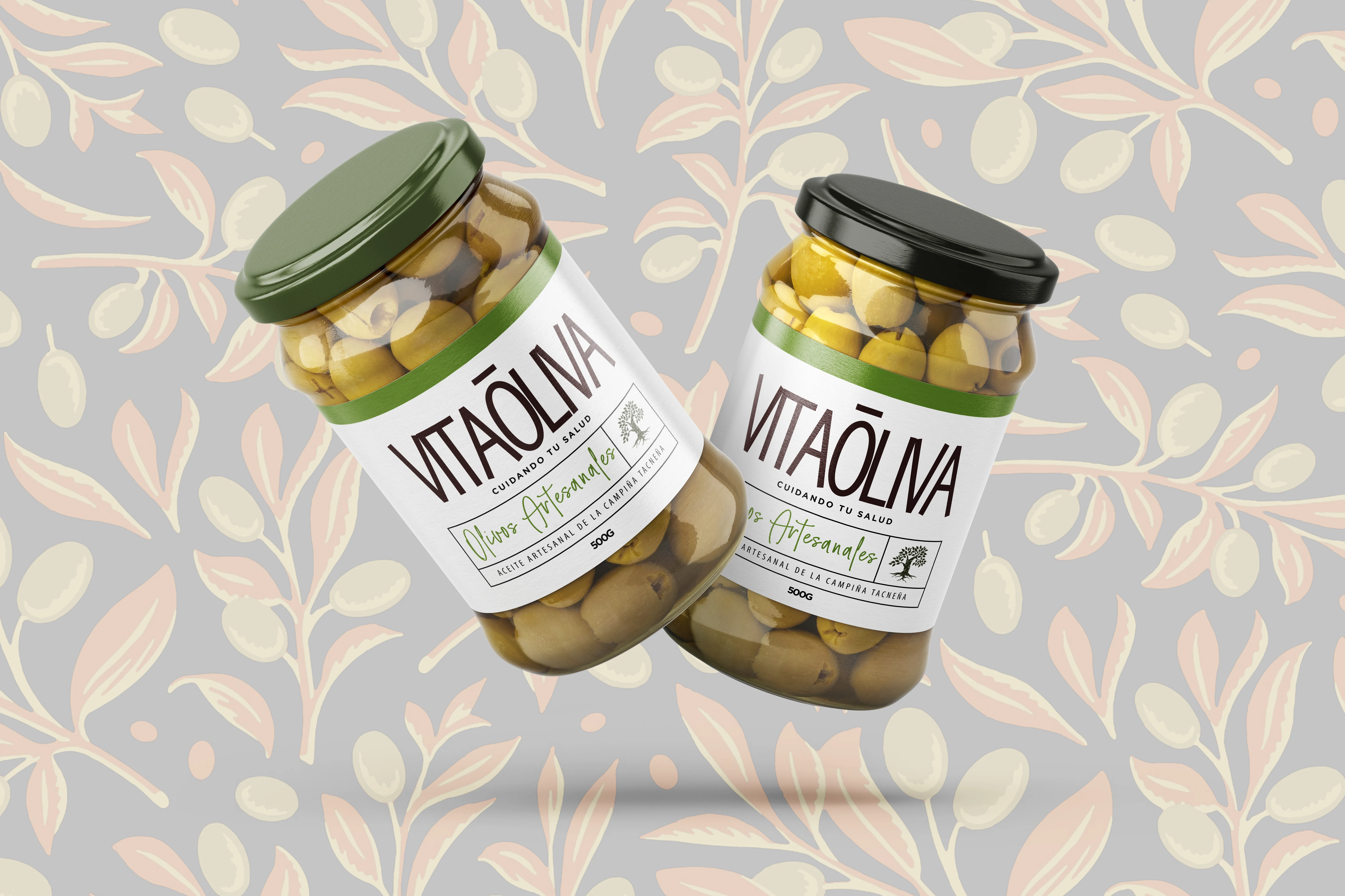
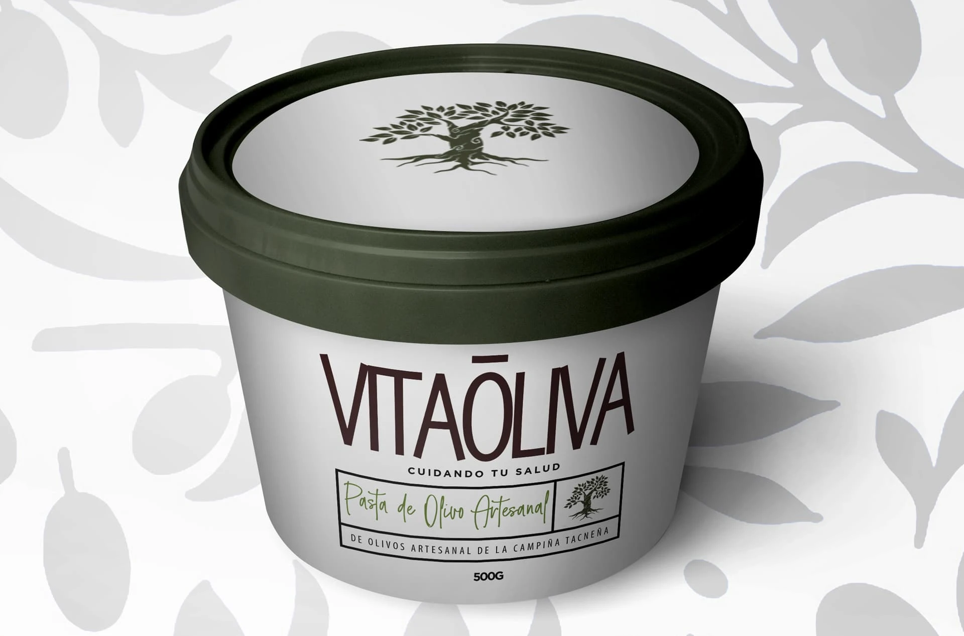
The utilization of a logotype in the visual identity aims to convey a sense of structure, simplicity, and consistency, while the subsequent tree symbol conveys nature, artisanship, and rusticness.
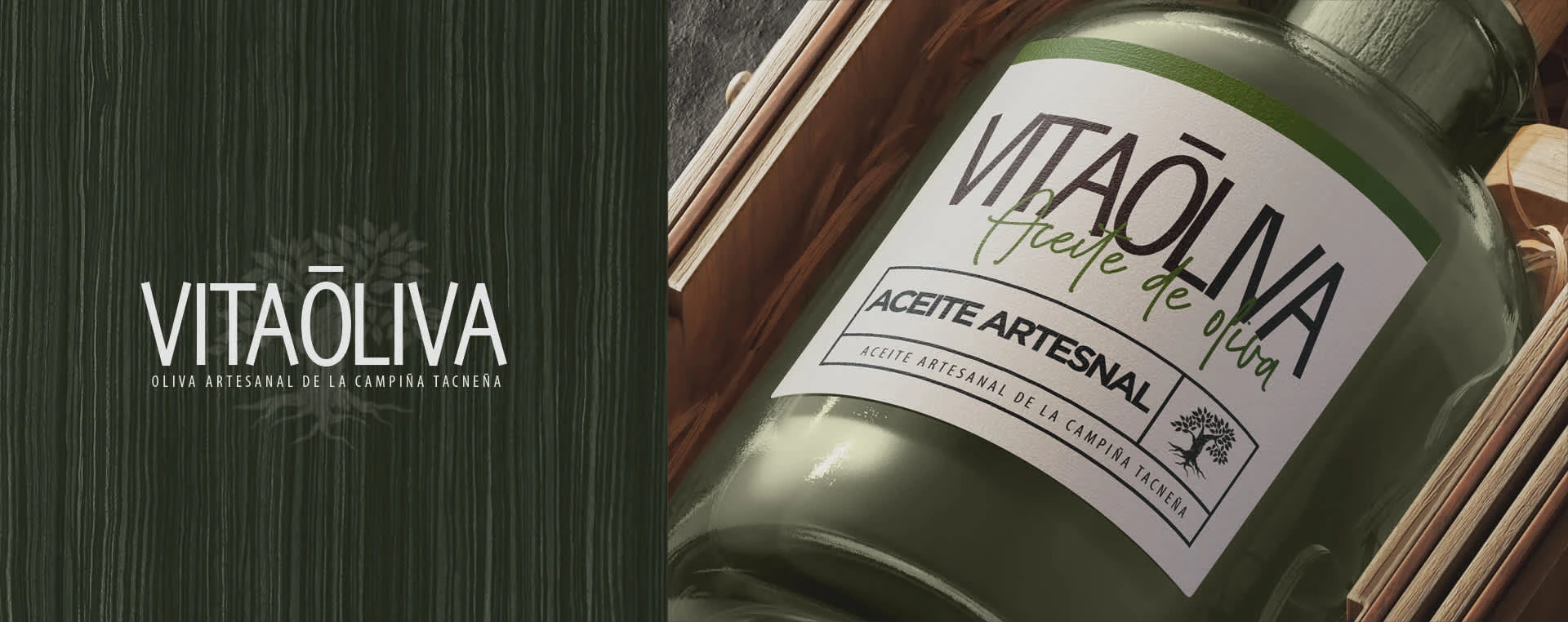
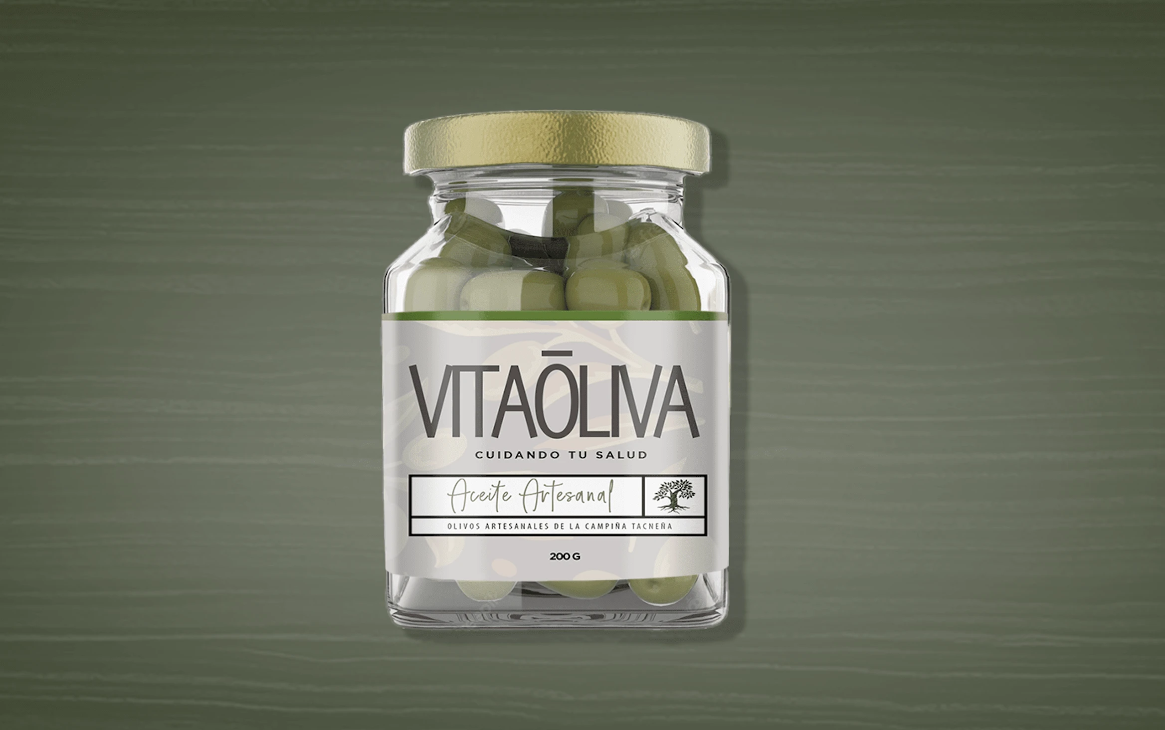
The reason behind using earthy shades of colors like green, orange, or brown in the identity is based on the visual and contextual similarity of the rustic scenery to that of natural green olives. It evokes a sense of naturalness and organic appeal in the design.

for viewing :)
Brand identity design / Creative strategy : Javier Emilio Gonzales
Concept design / Motion design : Javier Emilio Gonzales
Like this project
Posted Dec 20, 2024
VITAŌLIVA is a Peruvian extra virgin olive oil brand that needed the whole branding package to further enhance the brand's identity and messaging.