Landing Page Website Redesign
Elvis Obi
$5K+ earned
UX Audit for The BO Studio:
Conducted a comprehensive UX audit to identify usability gaps and conversion barriers. Delivered a detailed report with actionable recommendations, resulting in a 20% improvement in form submissions and a cleaner, more intuitive navigation structure.
A bold, responsive portfolio website built to showcase a design studio’s services, case studies, and brand personality through clean visuals and smooth UX.
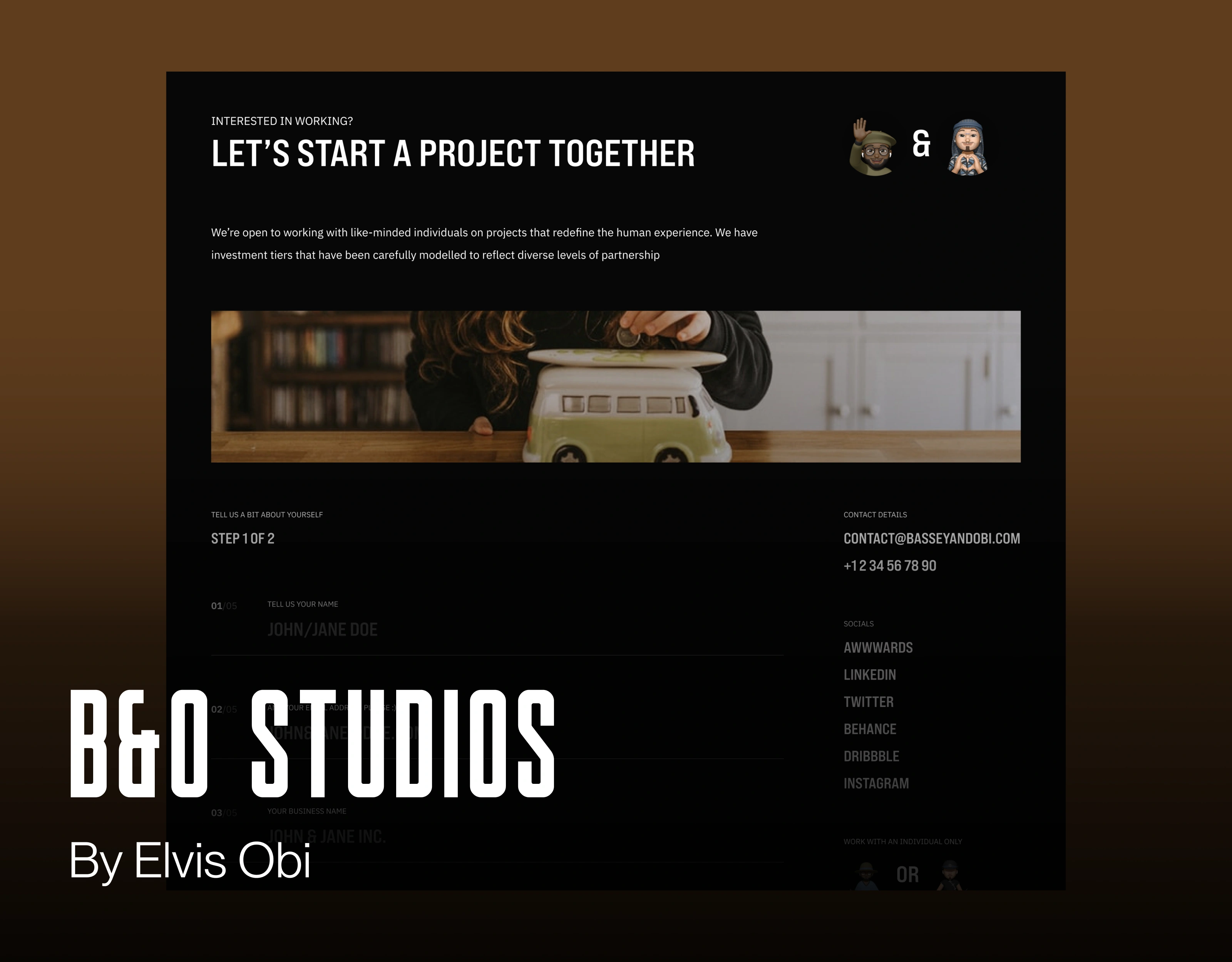
How the UX Audit Improved This Section:
The UX audit revealed that the project onboarding section lacked a strong emotional hook and immediate clarity. To foster connection, I recommended a more inviting headline (“Let’s Start a Project Together”) and a personal tone. I also suggested visual reinforcement through friendly character illustrations and a step-by-step form layout to make the process feel more approachable. Highlighting direct contact information and social proof links (Awwwards, LinkedIn, Behance, etc.) further built trust and reduced user hesitation.
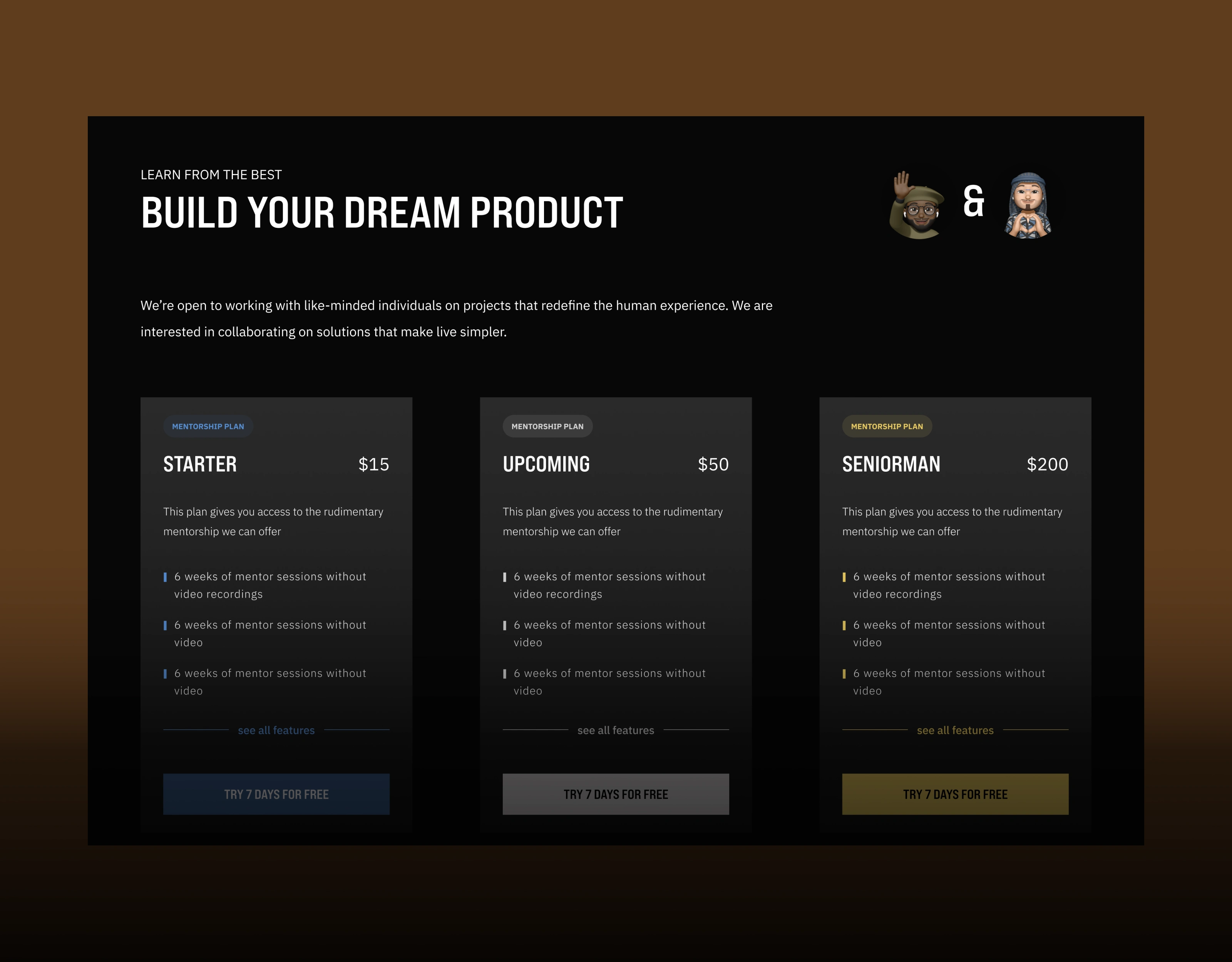
How the UX Audit Improved This Section:
During the UX audit, I identified that the mentorship pricing section lacked visual clarity and hierarchy, making it hard for users to compare plans easily. Based on this, I recommended clearer labelling of plans (Starter, Upcoming, SeniorMan) with consistent, bold headings, a uniform card layout, and colour-coded CTAs to guide purchase decisions. I also advised adding a 7-day free trial prompt under each plan to reduce hesitation and improve conversions. These changes enhanced the section’s scannability, boosted plan comparison rates, and increased free trial sign-ups.
A Video of the Website "Let's start a Protect Together" Section:
Thank you for reading :) Link to Framer Build: https://basseyandobi.framer.website/
Like this project
Posted Apr 26, 2025
Ran a UX audit to find usability gaps. Delivered fixes that improved form submissions by 20% and enhanced overall site navigation.
Likes
2
Views
855
Earned
$5K+
Timeline
May 23, 2025 - May 23, 2025
Clients
BO Studios