Brand Identity Design for Repleo Hydration Stick Packs

Mac Louis
Verified



Repleo Hydration: A Premium Brand Identity Built on the Salt Crystal
Brand identity, logo and motion for a performance hydration brand, built on the geometry of its hero ingredient, salt.
Logo animation in dissolving.
Overview
Repleo is a DTC hydration brand for active people and health optimisers. Its zero-sugar stick packs use a high-sodium formula (1,000mg sodium, 300mg potassium, 80mg magnesium) designed for daily use.
The Challenge
Repleo needed to look premium and effective, at home in a CrossFit gym and on a biohacker’s desk. It also had to stay accessible to the mainstream gym-goer who aspires to that lifestyle. It couldn’t read as a sterile medical supplement or an aggressive bodybuilder product. It had to feel like a daily habit.
The identity assets visualised.
The direction
Salt is the hero ingredient, so the identity starts there. The hexagon evokes the crystalline form of sodium chloride. I took that scientific foundation and refined it into a mark that is geometric but not clinical, and recognisable at stick-pack scale.

The logo
The logo
A couple of aspects were considered, but the main ones are that the brand is based on hexagons (salts), and the main 3 ingredients (Potassium, Sodium, and Magnesium).
The logo mark is built on a stroke; the 3 layers symbolizing the intersection of 3 main ingredients (Potassium, Sodium, and Magnesium) and visual metaphor for “triple-strength” of effectiveness, symbolizing the superiority in hydration over
basic water.
For ease of printing, a flat version is opted for, but the digital version further makes the logo express hydration, depicted by a flowing gradient, creating a depth of effectiveness in hydration.
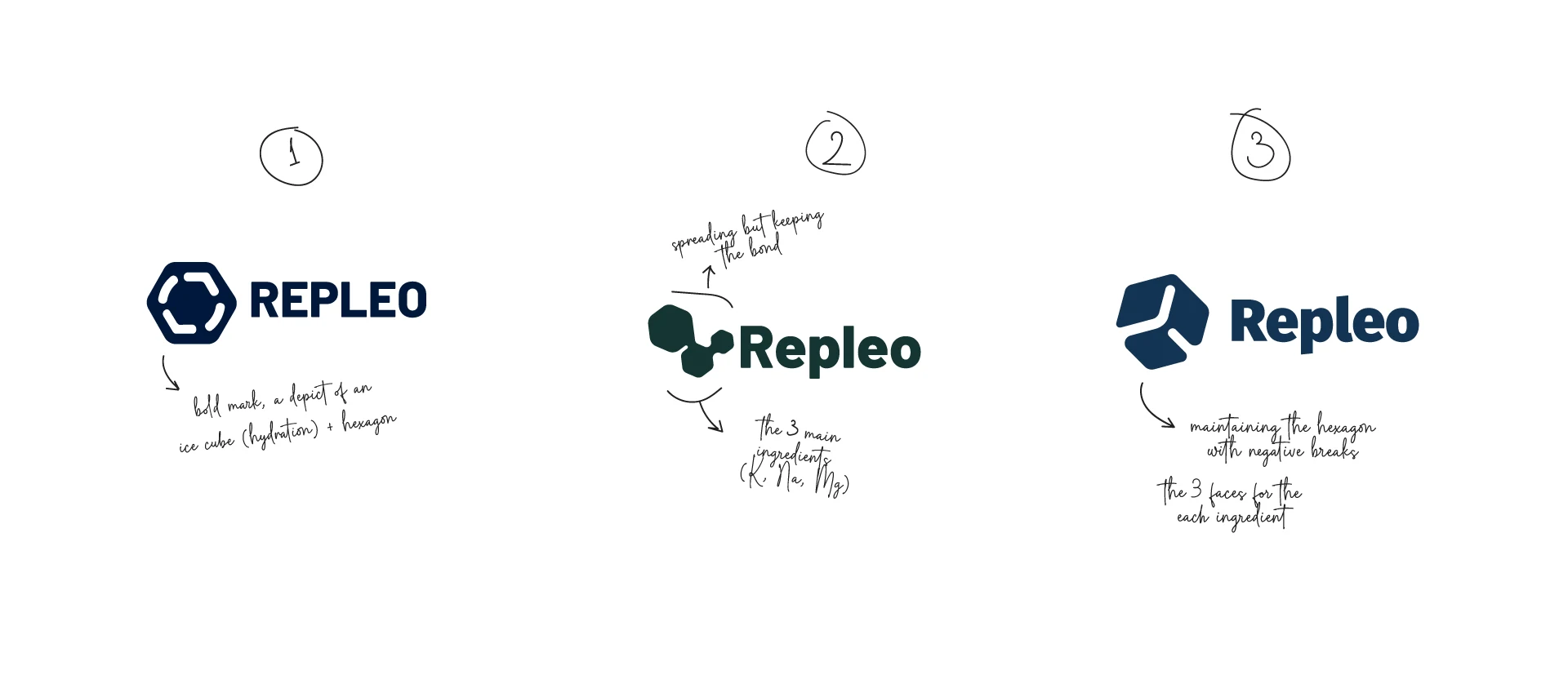
The dropped logo directions

The digital alternative of the logo
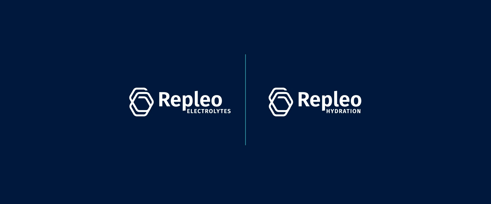
The brand's alternative logos
The Colours
Keeping the brand in the hydration line, I adopted aquatic blues as the brand's primary palette and expanded into various blues to give the brand freedom of expression around effective hydration.
For the brand products, the palette expands to cater to the flavours for the different stick packs. These support the main palette as the secondary and give further room for expression, but are appealing for intake too.
The salty gradients maintain the same discipline of the colours and give a glimpse of the brand's roots in hydration - salts fused for better hydration than regular drinking water.
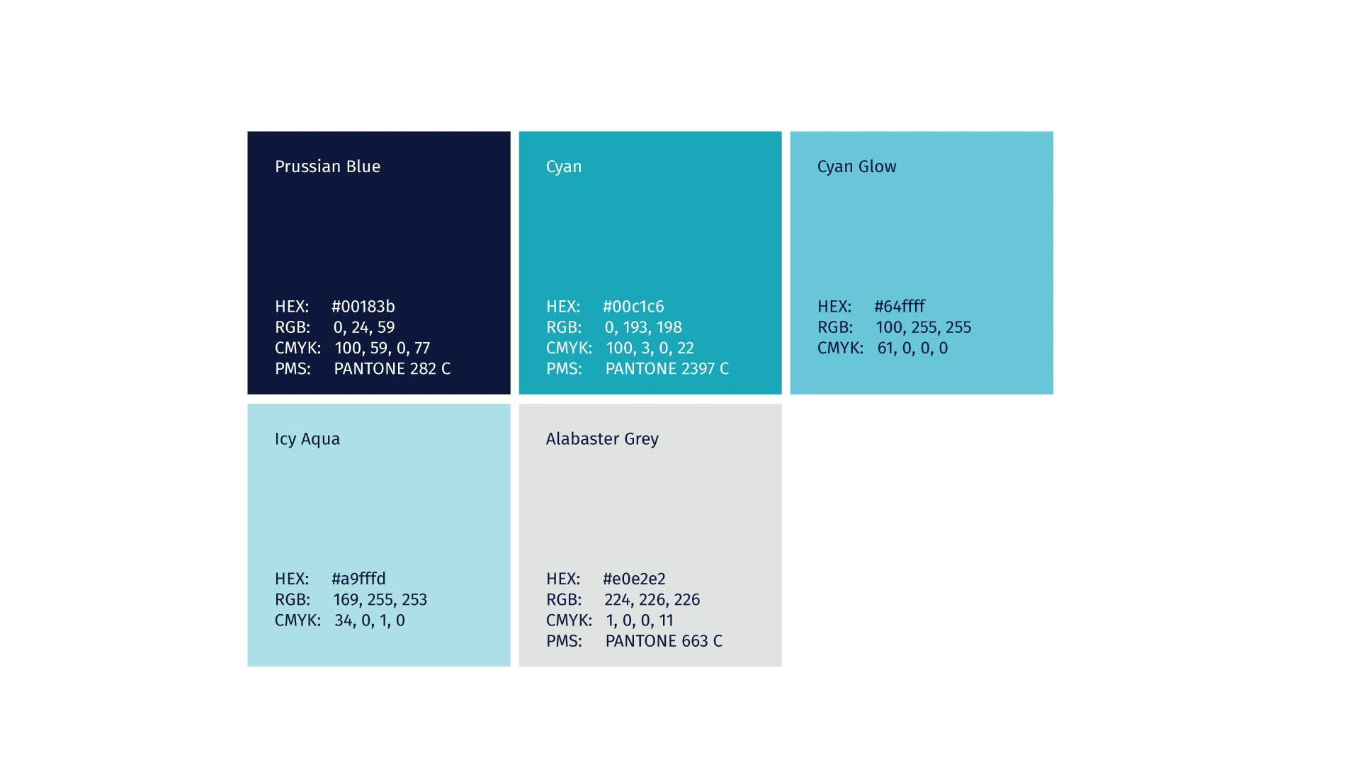
Primary Colours
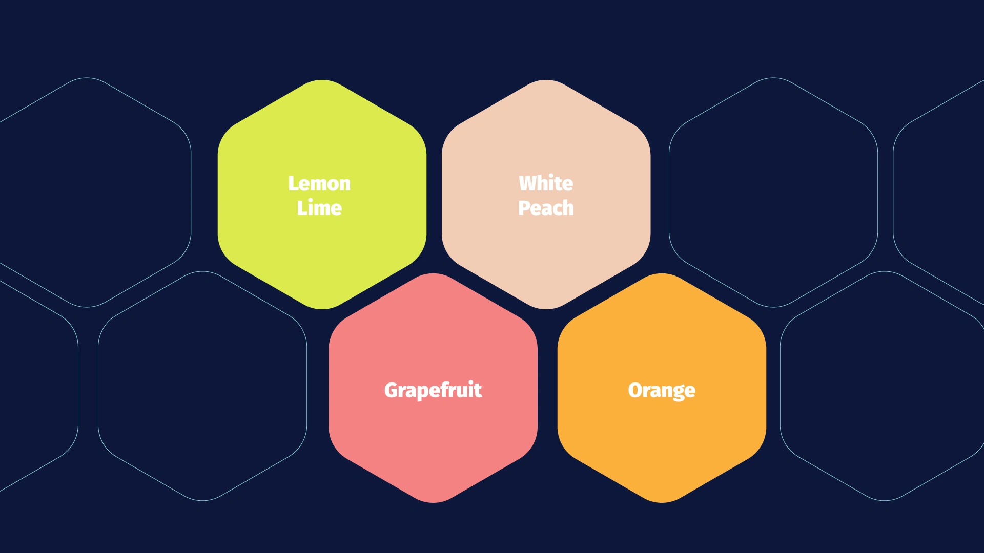
Flavours
The identity
The brand identity is designed to signal "premium efficacy" to the health-active person, but be accessible enough to the mainstream gym-goer who aspires to that lifestyle. A daily lifestyle habit to enhance hydration throughout the day, not a sterile medical supplement or an aggressive "bodybuilder" product.
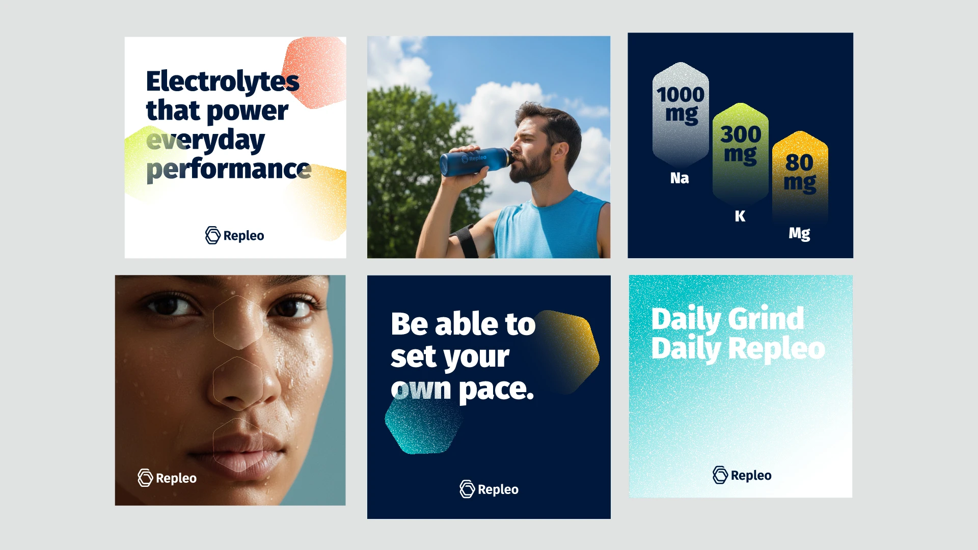
Assets visualized

Typography

Informational Story Templates

The icons

X/Twitter Header
Project Status
Repleo’s stick packs are currently in production and haven’t fully launched yet. This case study shows the identity, logo and motion work as designed. Professional product photography will be added once the first production run is complete.
Deliverables
Brand identity system for Repleo Hydration
Logo and brand mark, built on the hexagon salt-crystal concept
Logo animation and motion pieces (After Effects)
Stick pack design visuals
Colour palette and typography
Brand guidelines document
Production-ready logo files (AI, SVG, PNG, MOV)
Like this project
What the client had to say
He was doing a great job, giving me a really strong result, despite that I was a difficult client. 5/5 recommendations!

Jonathan Andreasen
Feb 15, 2026, Client
Posted Jun 10, 2026
Brand identity, logo and motion for a performance hydration brand, built on the geometry of its hero ingredient, salt.
Likes
0
Views
20
Timeline
Jan 5, 2026 - Feb 15, 2026
Clients
Repleo


