CARES Brochure Revitalization
Amy Houweling
Overview
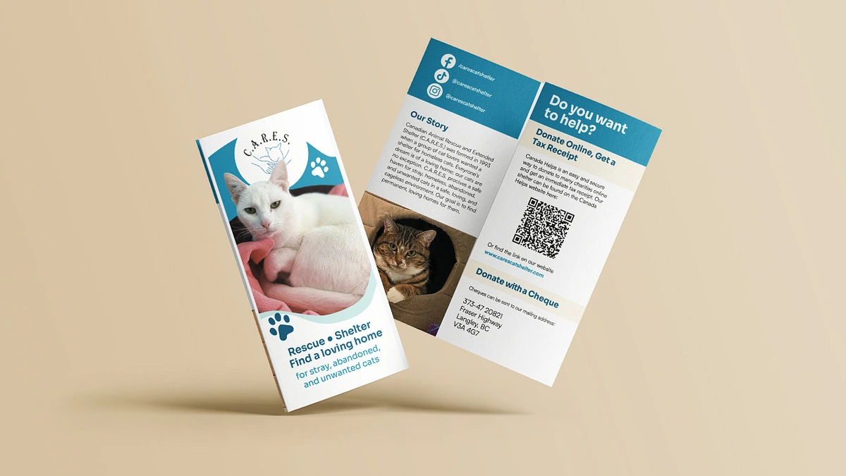
CARES (Canadian Animal Rescue and Extended Shelter) is a cat shelter located in Langley, British Columbia Canada. They are a no-kill shelter that works on finding abandoned and stray cats a home, as well as providing a home to cats who do not find homes with adopters. When I spoke to their director, she informed me that their current brochure was around 20 years old and had a few problems she wished to address. After interviewing her, the goals of the project became as follows:
- To revitalize the visual design of the brochure
- To convert the audience into volunteers and donators
Process
One of the main strategies to convert people into active contributors to the charity was to focus on communicating exactly who the organization was. If people could connect with it on a personal level, it would motivate them more than simply bombarding them with information about how to volunteer or donate. So, I started off with organizing everything I knew about the organization into digestible chunks.
After a session of brainstorming, the foundation of the organization I decided to communicate was the idea of “a home no matter what”. This evolved into two visual concepts I explored in mood boards:
The “new day” concept was based around the fact that adopters and volunteers would be giving these cats a second chance at life. It was to be fill with hope and freedom to inspire the audience. The “domestic life” concept was based around what CARES hopes for all their cats: that they get to live out their days in a comfy, safe, loving home. By focusing the design on that, the audience would feel connected to their vision and be compassionate towards it. The CARES branding included a sky blue, so I wanted to explore how to incorporate it into both concepts with these mood boards, as well.
Going forward I went “domestic life” to focus on the aspects of peace as well as connecting to the type of people who are a part of CARES’ audience. Cat lovers are often introverts and indoor lovers. CARES has an audience of elderly people, too. So, I took to opportunity to appeal to each of their affinities to connect the interests of the viewer to the vision of the charity.
After the first pass, only a few changes needed to be made. The director wanted some more saturated blues, so I adjusted the palette slightly. She also wanted the mission statement on the front page and more information about ways they want to receive help. So, the backside and inside flap became information about donation and volunteering, while the inside focused on getting the reader acquainted with the heart of CARES.
Like this project
Posted Sep 3, 2025
Revitalized CARES' brochure to attract volunteers and donors.
Likes
0
Views
4
Timeline
Mar 1, 2025 - Mar 14, 2025