Freer Police Brand Identity

Szatmári Zsolt


Project Summary
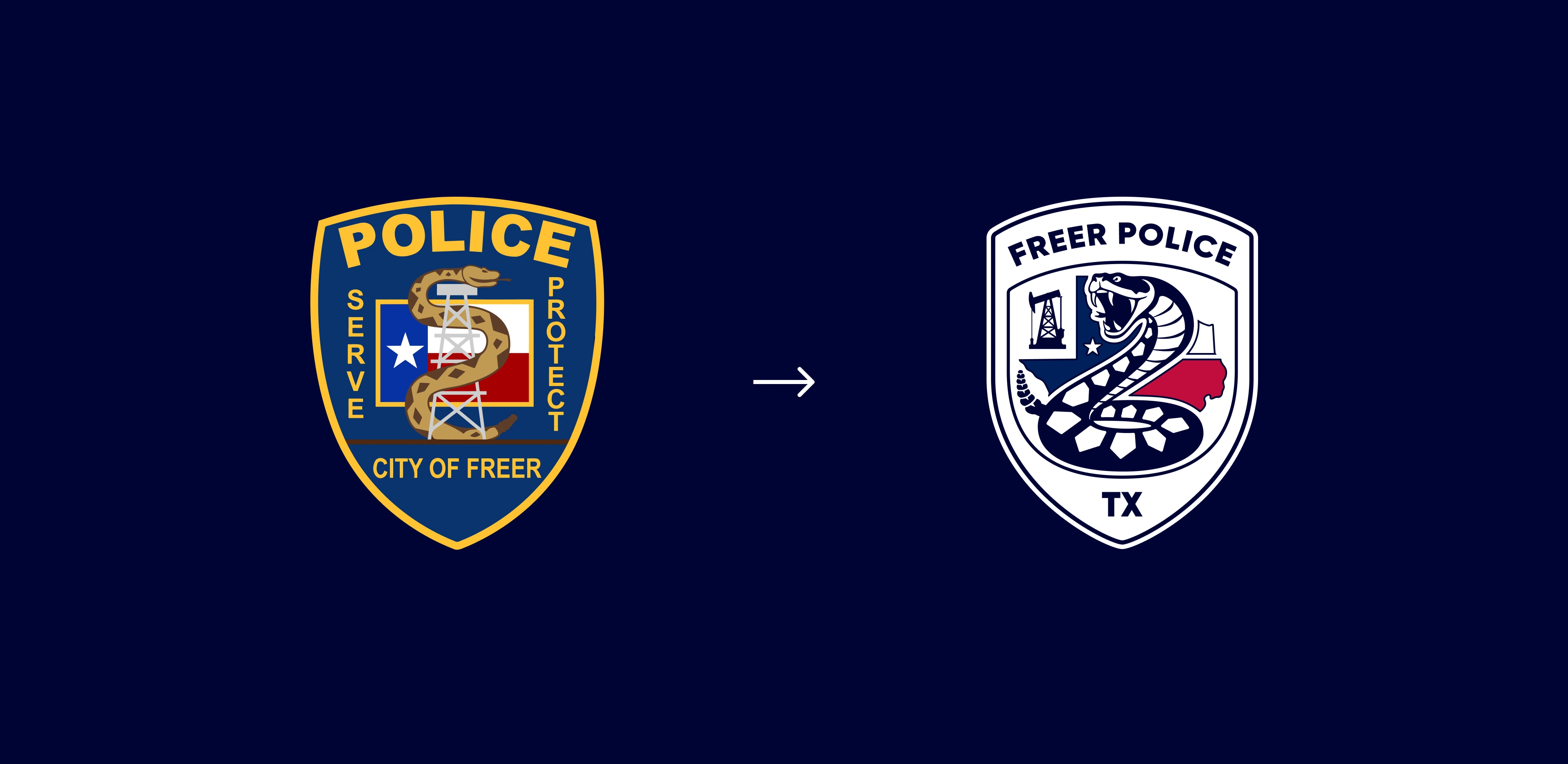
The Freer Police Department’s previous visual identity lacked consistency, scalability, and a strong visual presence across both digital and physical applications. The objective of this project was to create a modern, timeless, and professional brand identity that better represents the department’s commitment to integrity, service, and community trust.
Rather than simply redesigning a logo, the goal was to establish a complete identity system that communicates authority while remaining approachable. Every design decision was guided by functionality, clarity, and long-term usability, ensuring the new identity performs consistently across uniforms, vehicles, printed materials, signage, social media, and digital platforms.
Logo Construction
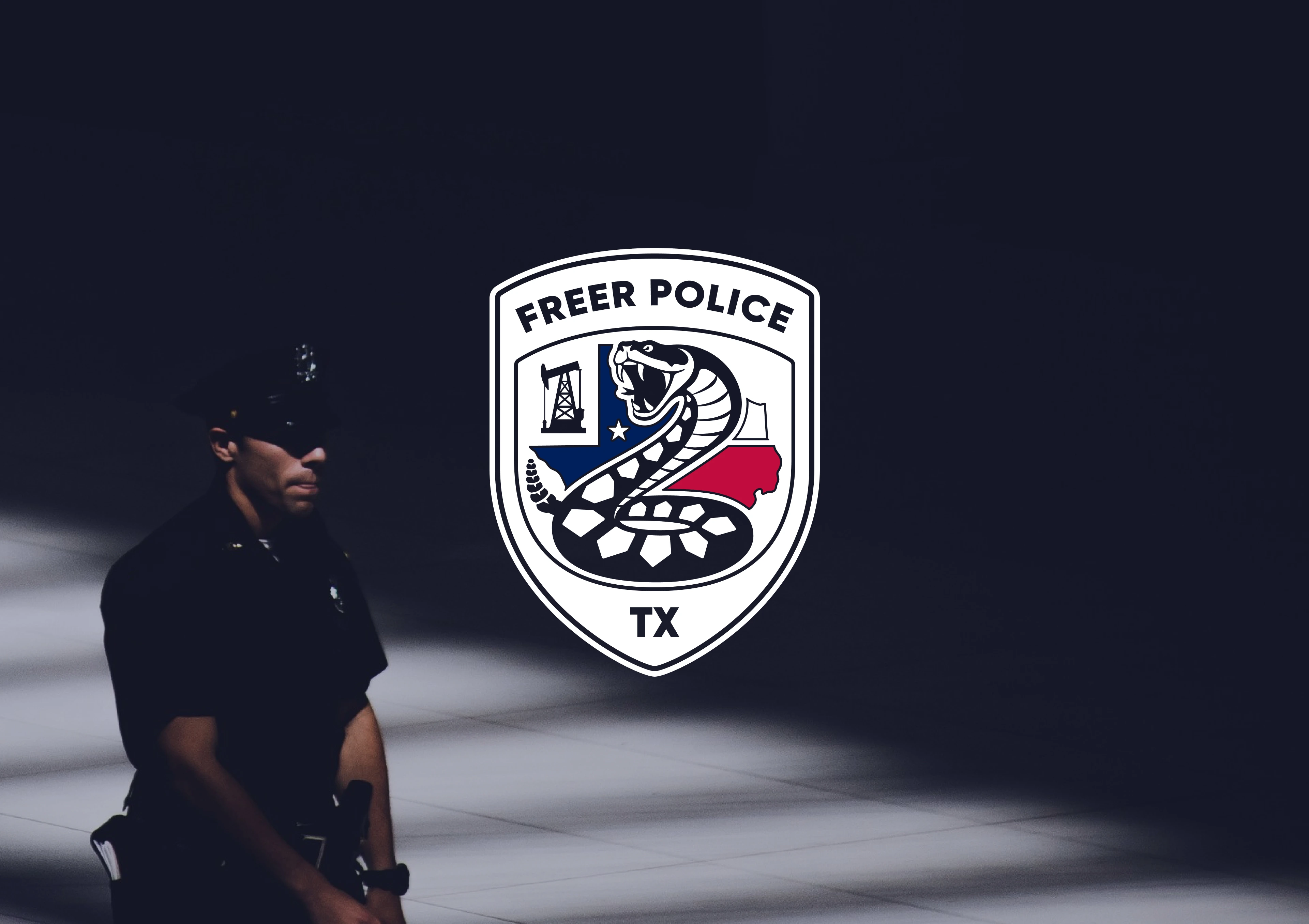
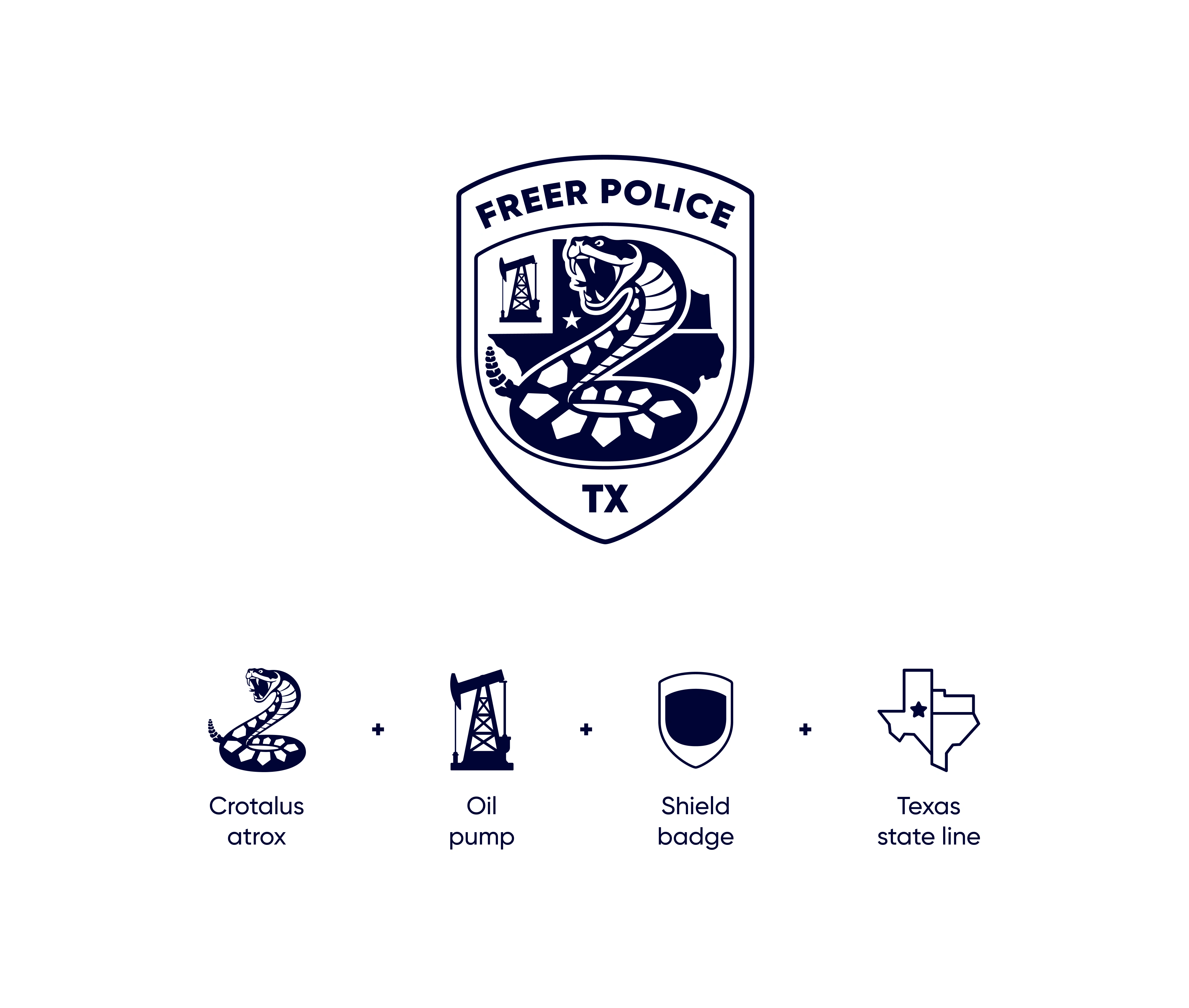
The logo was designed using a structured geometric approach focused on balance, simplicity, and long-term scalability.
The identity is built around four core elements that represent the Freer Police Department and the community it serves:
Crotalus atrox (Western Diamondback Rattlesnake) - A native species of South Texas, representing the region’s heritage, resilience, and distinctive character.
Oil Pump - A tribute to Freer’s deep roots in the oil industry and its historical significance to the local economy.
Shield Badge - A universal symbol of protection, service, and the department’s commitment to public safety.
Texas State Outline - Reinforcing the department’s identity and its proud connection to the State of Texas.
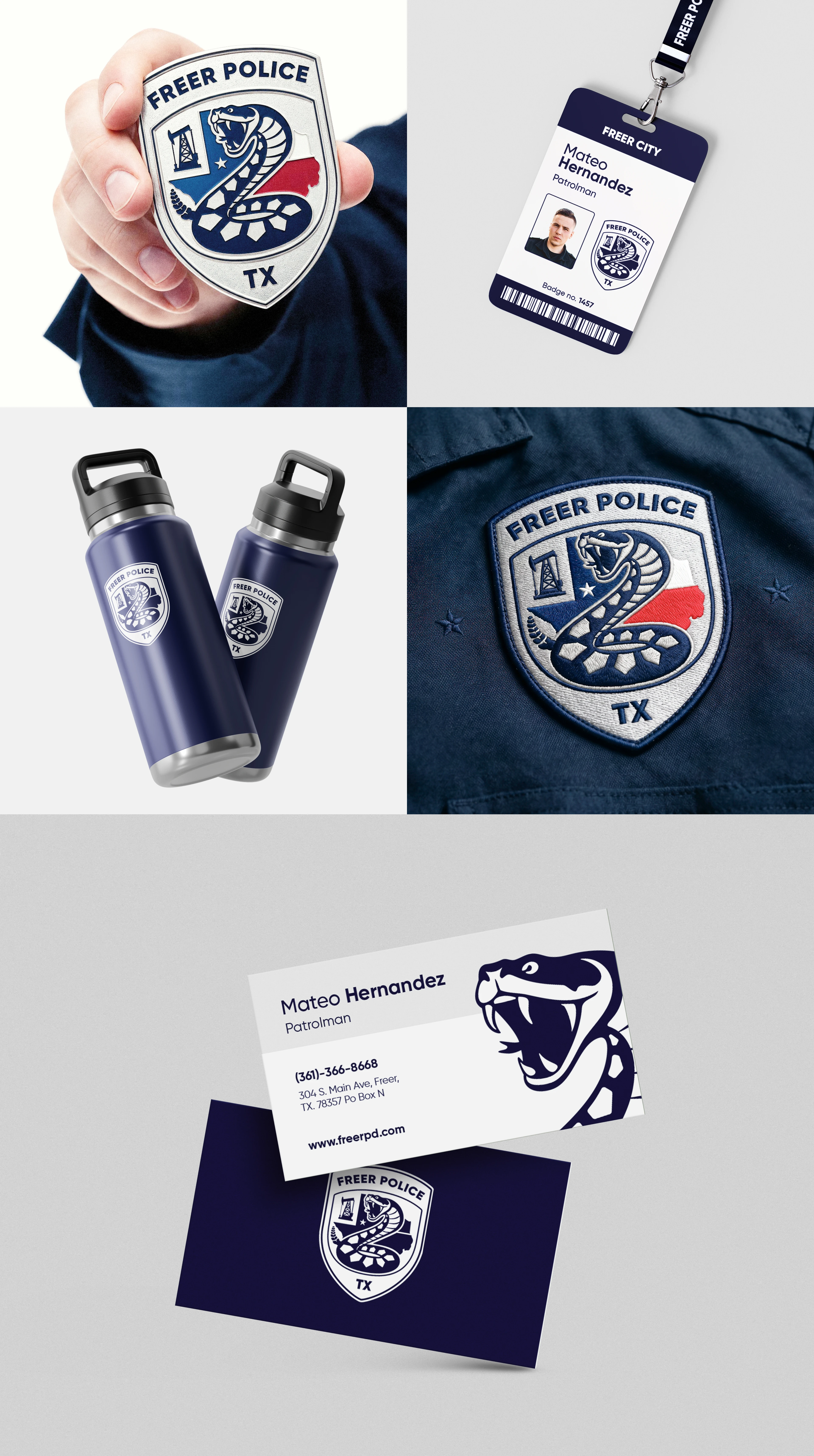
Every angle, proportion, and spacing relationship was carefully refined to create a harmonious logo that performs consistently across digital platforms, print, embroidery, vehicle graphics, signage, and uniforms.
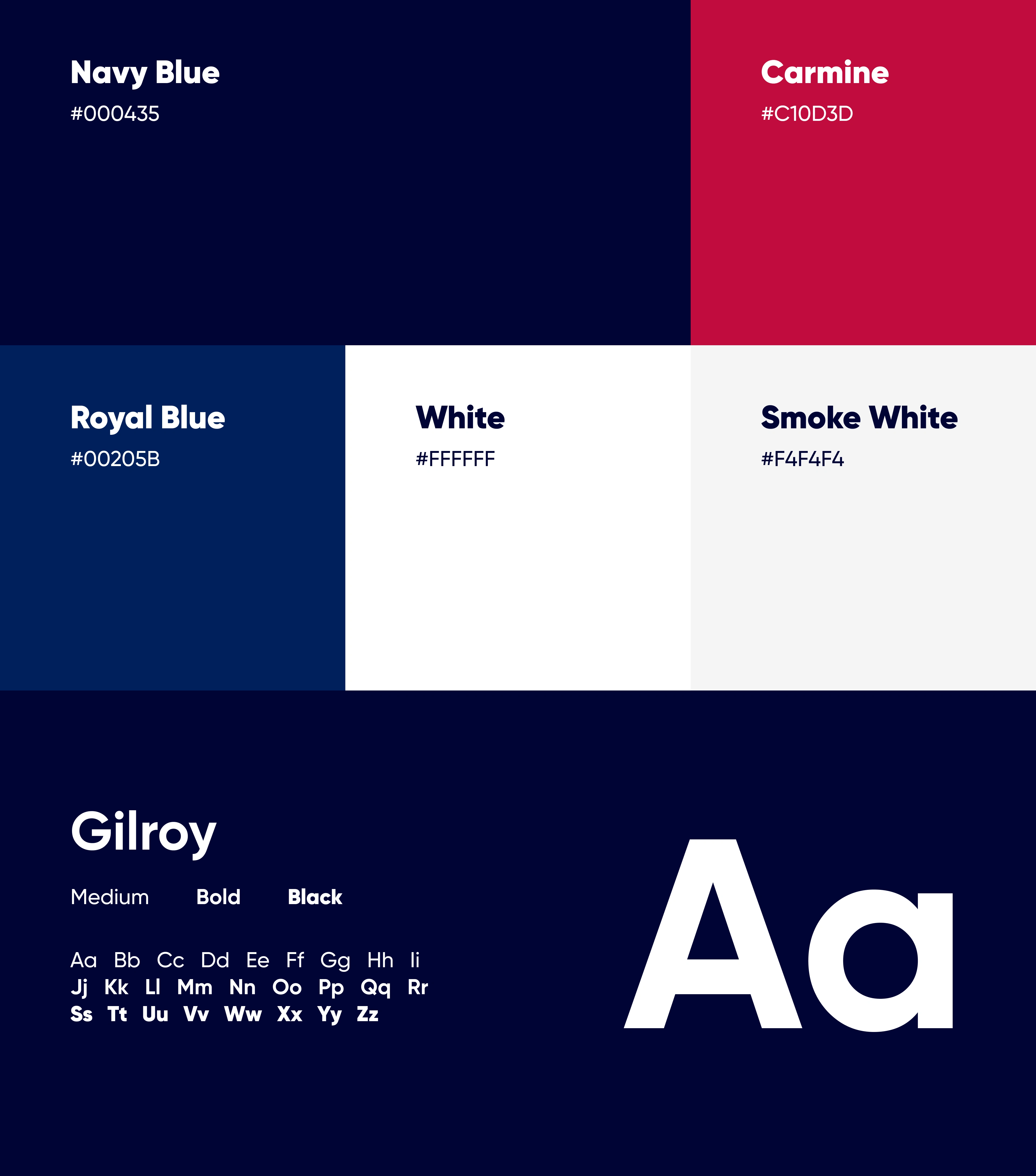
Color Palette & Typography
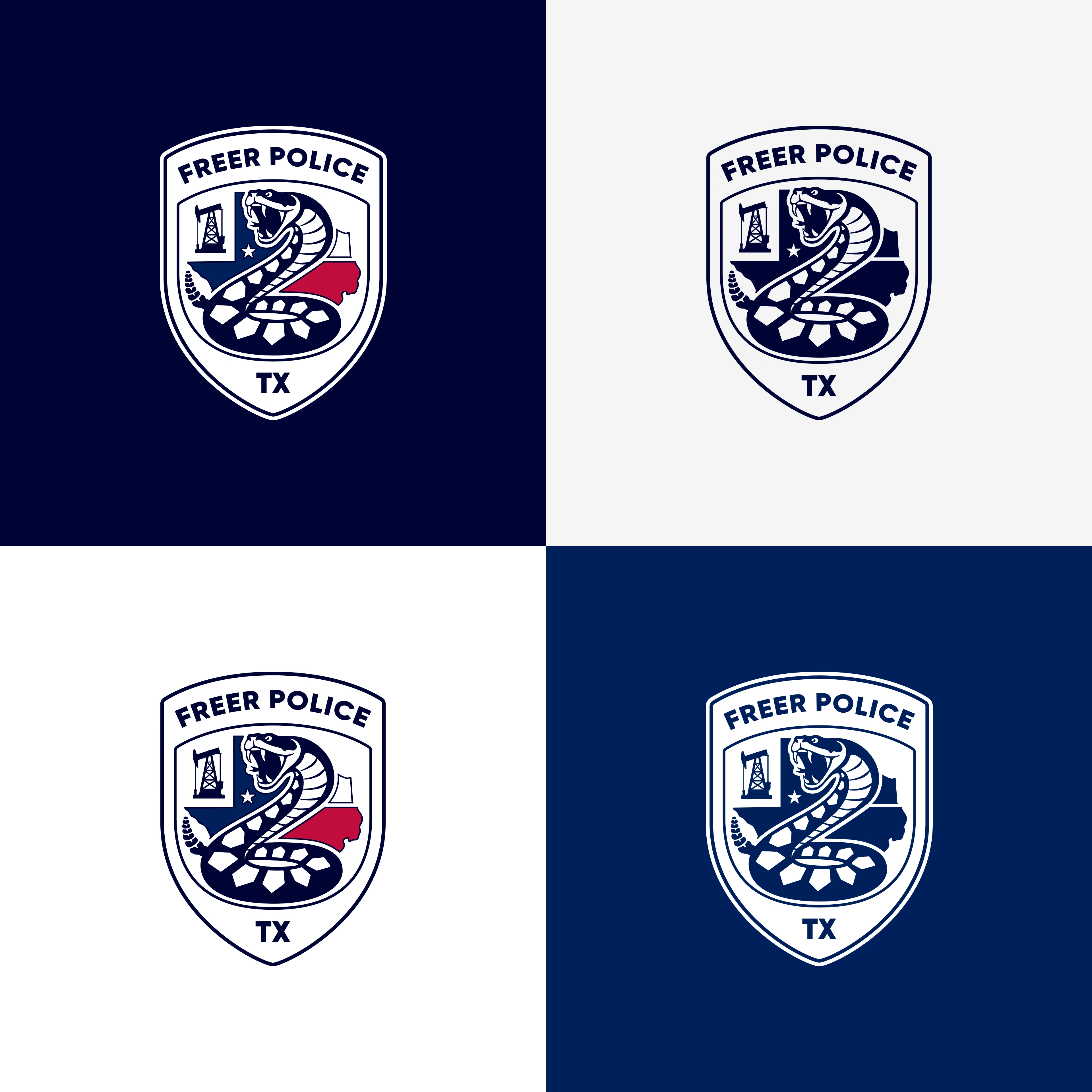
The color palette was carefully selected to reinforce professionalism, authority, and trust.
Deep navy serves as the primary brand color, symbolizing confidence, stability, and reliability. Supporting neutral tones provide balance and improve readability, while accent colors help emphasize important information without overwhelming the visual hierarchy.
The palette is intentionally limited to ensure consistency, accessibility, and strong recognition across all applications.
Typography plays a fundamental role in establishing a confident and approachable visual voice. A modern geometric sans-serif typeface was selected for its excellent readability, clean structure, and versatility across both print and digital platforms. The font family provides enough flexibility for headlines, body copy, signage, forms, and official communications while maintaining a consistent visual tone.
The result is a typography system that feels contemporary, authoritative, and highly legible in every context.
Before/After
The original logo contained numerous detailed elements that made it difficult to reproduce consistently across different sizes and mediums. While rich in symbolism, its complexity reduced legibility and recognition, especially in digital environments.
The redesigned identity simplifies the overall composition while preserving the department’s heritage and authority. Cleaner geometry, balanced proportions, and refined typography create a mark that is instantly recognizable, highly versatile, and suitable for everything from business cards to vehicle graphics and large-scale signage.
The transformation demonstrates how thoughtful simplification can significantly improve usability without sacrificing meaning.
Like this project
Posted Aug 18, 2026
A complete visual identity refresh for the Freer Police Department, focused on creating a modern, trustworthy, and community-centered brand. This case study explores the strategic thinking behind the redesign, showcasing the new logo, typography, color palette, brand applications, and the design decisions that strengthen recognition, consistency, and public trust.
Likes
0
Views
0