Javurek - Small Branding Project
Petr Bilek
Overview
I had the pleasure of creating a brand identity for Javurek, a family-owned company specializing in timber framing and wooden home construction. From the first sketch to the final mark, my aim was to celebrate craftsmanship, safety, and heritage.
Client Brief
Javurek wanted a logo that would:
• Evoke the reliability of traditional carpentry
• Reflect a Canadian spirit through subtle symbolism
• Work crisply in both digital and print environments
Concept Development
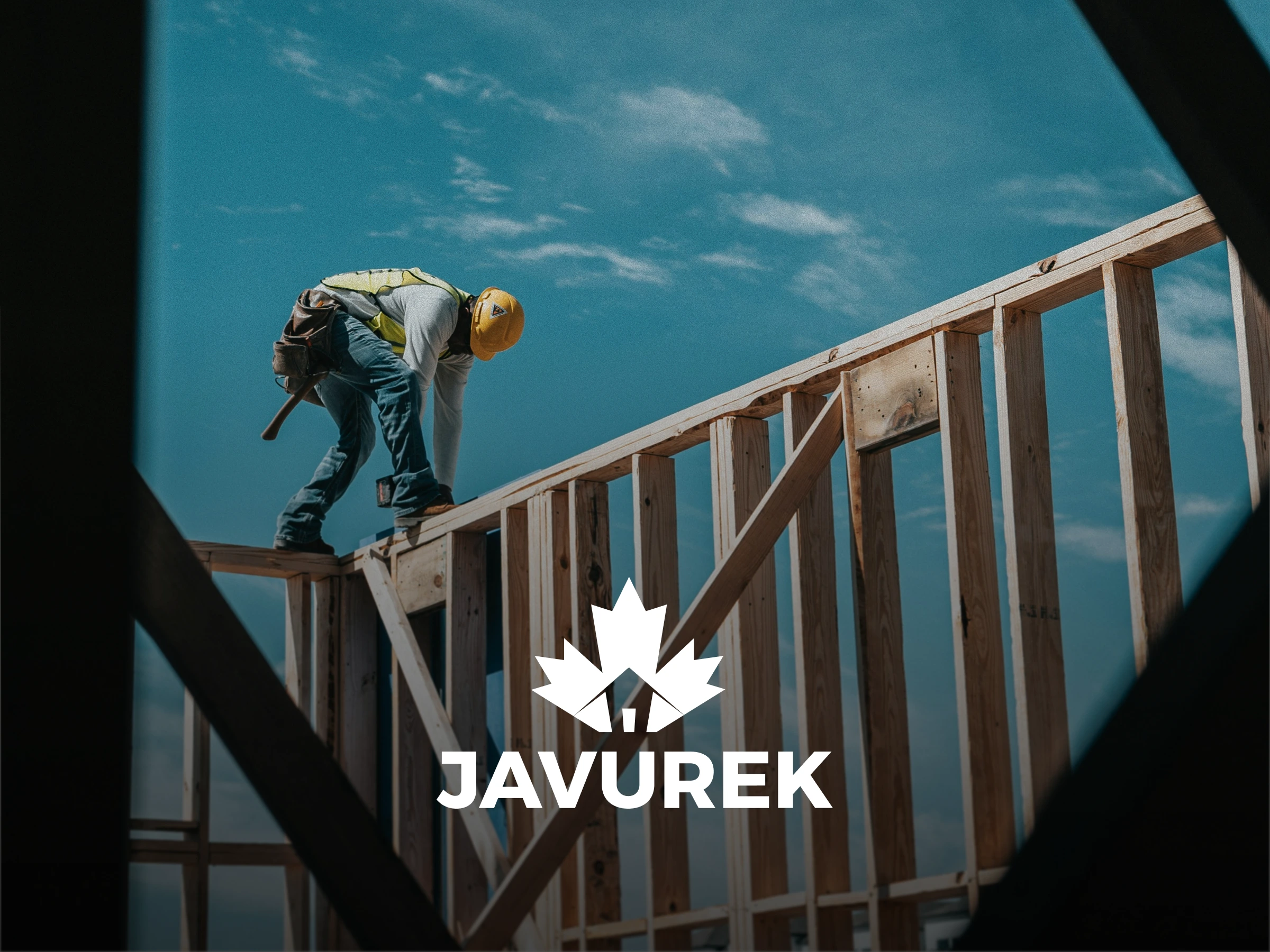
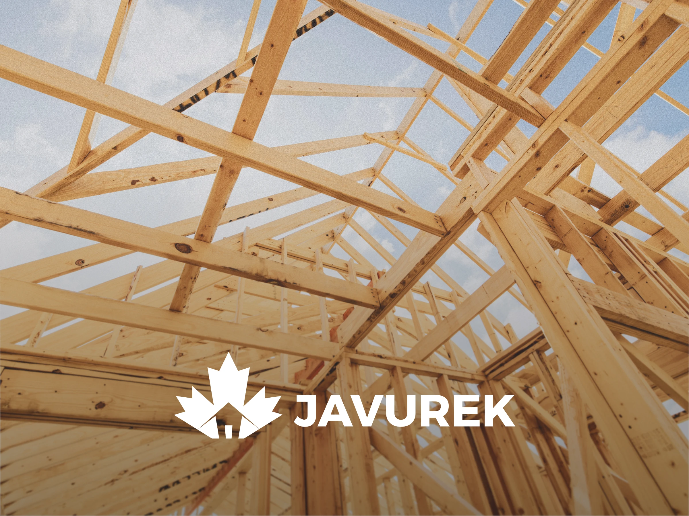
At the heart of the logo sits a stylized maple leaf—an homage to Canadian roots. I replaced two of its lobes with subtle hammer silhouettes to nod toward carpentry. Negative space between the leaf’s segments reveals a pitched roof shape that speaks directly to home building. This interplay captures both the raw materials and the finished structure in one cohesive form.
Reflection
I am proud of how the Javurek logo tells a story of tradition, family values, and skilled workmanship. In every angle and shape you see the alignment of beams just as you see the bond between a design and its maker.
“Design is not just what it looks like but how it works for the people who build with it.”
Like this project
Posted Aug 5, 2025
Branding project of company Javurek. Incl. Moodboarding, color selection, theming and final logo.
Likes
0
Views
4